
A celebration…
—
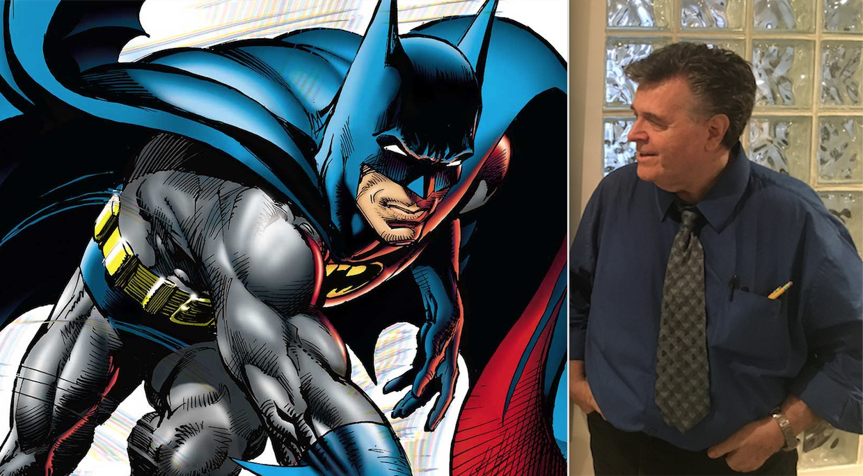
UPDATED 4/29/22: Neal Adams, comics’ greatest artist, has died at the age of 80. Here, we re-present this birthday piece from 2018. For a series of interviews and tributes to the groundbreaking creator, click here. — Dan
—
Hey, guess what! Neal Adams turns 77 today!
And the guy is still cranking it out, making art like you and I breathe.
It’s no secret that Adams is my all-time favorite artist. His work had a profound impact on me as a kid growing up in the ’70s. I mean, he was it.
As I like to say, Adam West made me a Batman fan, but Neal Adams cemented me as a comics fan: His art gave me the first hint that there was more to the Caped Crusader than what the go-go TV show had to offer (as much as I love Batman ’66).
His photorealistic style was mesmerizing and chasing down all the issues he worked on was the dominant quest of my early days as a collector.
I’ve been fortunate enough to not only meet Neal but to interview him on multiple occasions, to pick his brain and get a lot of insight into his art. Those are some of my fondest moments working on 13th Dimension.
As his birthday approached, I wondered what kind of tribute to put together since I’ve covered a lot of ground over the last several years. Then I remembered how much fun it was to put together my ranking of Carmine Infantino’s 13 Best Batman Covers. (Click here. You’ll dig it.)
Hey, go out on a limb once, might as well go even farther out, y’know?
So here are NEAL ADAMS’ 13 GREATEST BATMAN COVERS – RANKED. (Plus, as a bonus, I’ve included links to interviews where I’ve spoken to Adams about those particular covers and issues.)
Right on.
—
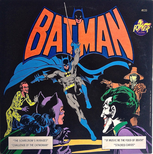
13. Power Records LP, 1975. I’m starting right off with a wild card. Art is subjective and we as viewers bring to it a certain personal history that can influence our perspective. You’ll see a number of choices on this list that speak as much to my own experience and reactions as to Adams’ technical prowess. Anyway, this album cover is a very basic, no-frills tableau but it’s highly effective in atmosphere and concept – and perfect for setting the mood for the record’s four stories. On top of that, Adams didn’t draw the Riddler, Catwoman or Scarecrow in the comics, so that’s a big bonus.
—
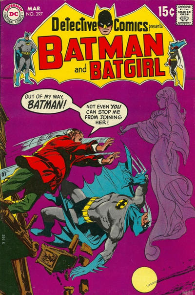
12. Detective Comics #397. This is flat-out unhinged, and a prime example of Denny O’Neil and Adams’ gothic sensibilities. You can practically smell the mad panic of the guy on the left — because, after all, if you’re a middle-aged fat guy, you’d have to be an adrenalized maniac to ram through Batman like that. Believe me. I should know. (Click here to see what Adams has to say.)
—
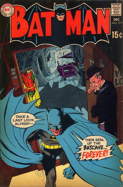
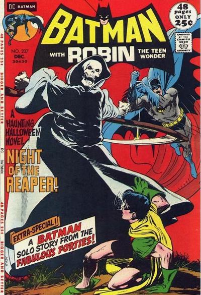
11. Batman #217. OK, maybe not Adams’ most technically proficient cover, but it’s hugely important. I have to include it because this is the issue where Robin left for college and Batman truly entered the Bronze Age. This has always been a big deal to me.
—
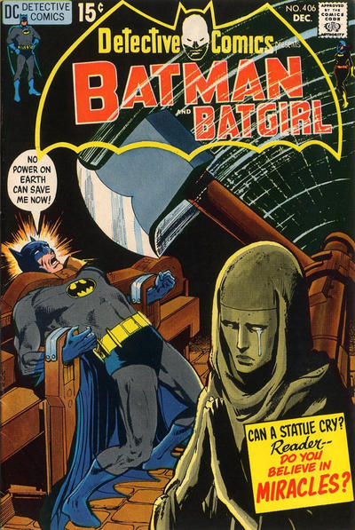
10. Detective Comics #406. This is one of the first comics I ever remember seeing on the spinner racks – and one of the first indications that maybe Batman doesn’t get out of all the traps like he does on TV. One of the keys to a great cover is unsurmountable danger, that palpable, anxious feeling THAT YOU JUST HAVE TO FIND OUT WHAT HAPPENS NEXT. Phew. I’m breaking out into a cold sweat here. Big bonus points for the transparent logo that helps sell the movement of the giant ax and the creepy negative version of the Bathead. Sweet. (Click here to see what Adams has to say.)
—
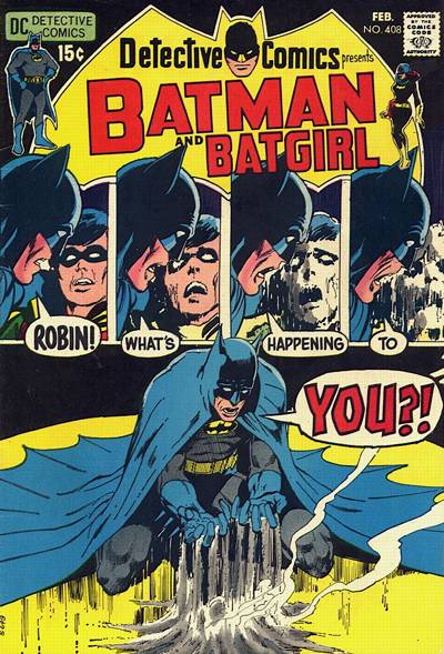
9. Detective Comics #408. Batman and Detective were practically horror comics during much of the early ’70s and this issue and cover are prime examples. I remember seeing it as a wall book at a comics kiosk at the late, lamented U.S. #1 Flea Market in New Brunswick, N.J., before I could afford to buy a copy. I would just stare at it. I seem to recall Adams telling me that he’s not really a fan of paneled covers. But damn, this thing smokes. (Click here to see what Adams has to say.)
—
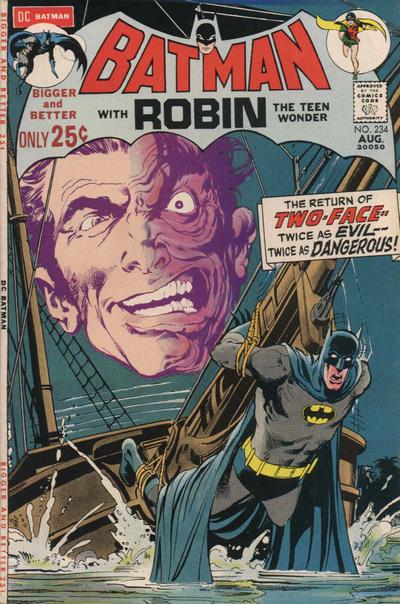
8. Batman #234. Another one that gets more points for historical impact than for design, though a lovely design it is. Two-Face had for the most part been persona non grata for decades, other than a quicky appearance in World’s Finest some years earlier. This issue – and cover – boldly proclaimed his return to prominence and he’s been an A-Lister ever since. On a personal note, this may have been the final Adams-penciled issue I collected, completing my run. I can’t be 100 percent sure but I’m reasonably certain.
—
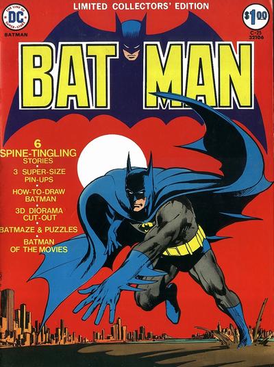
7. Limited Collectors’ Edition, C-25. One of the most famous Batman images ever, this is an altered version of a full-page illustration from Batman #251. You cannot deny its impact. It just so happens there are a number of covers I like more. That’s a testament to Adams’ enormous skill, come to think of it. (Click here to see what Adams has to say. He also talks about it here.)
—
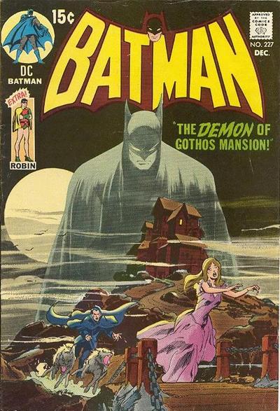
6. Batman #227. Brilliant. Thoroughly improves upon the Golden Age cover that it homages – itself a classic. I’m not an artist so I don’t speak the language of the technique involved but the practical effect of making Batman appear ghostly over the action is utterly smashing. (Click here to see what Adams has to say.)
—
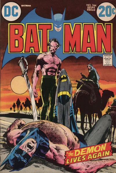
5. Batman #244. My God, this is getting tougher and tougher. There is so much that’s right here, from the way the red-and-gold BATMAN hovers in front of the pale blue bat to the glorious sunset colors to the actual action itself. Or rather the aftermath of the action. Where Detective #406 makes you rush to see what happens next, this cover makes you ask WHAT THE HELL JUST HAPPENED!? Never mind that there are two sets of Batpants and Ra’s al Ghul’s sword isn’t really shoved into Batman’s chest. This is drama, friend. Drama! (Click here to see what Adams has to say. He also talks about it here.)
—
4. Batman #237. Ask me again tomorrow and I might flip this with Batman #244. Equally terrifying and alluring with that bright, blood red background that just screams feverish chaos. This, I believe, was the first Batman cover I ever saw on the spinner rack and, like Detective #406, made me question the idea that the Masked Manhunter always escapes. (Detective came out first but I saw this issue of Batman first. I’m sure of it.) (Click here to see what Adams has to say. He also talks about it here.)
—
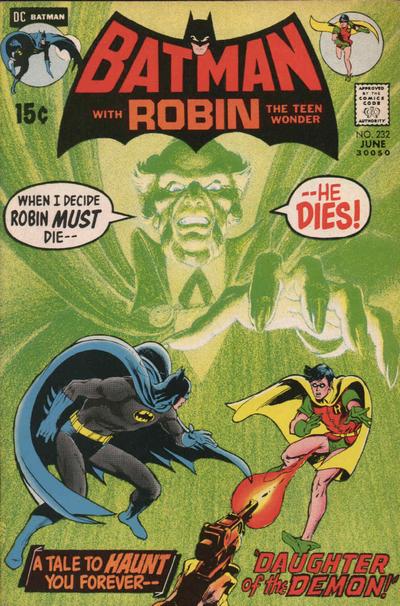
3. Batman #232. OK, now we’re getting down to it. This is a visionary cover, taking the layered concept of Batman #227 and intensifying it with a lurid neon green that begs you to look. You cannot avert your eyes. It’s a remarkable way to announce the arrival of a villain who would loom large over Batman’s world for the next 45 years or so. (Click here to see what Adams has to say. He also talks about it here.)
—
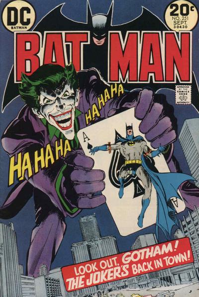
2. Batman #251. The idea of taking an important character and blowing them up to gigantic size has been a cover trick since the earliest days of comics but this is one of the boldest ever executed. The Joker had been sidelined for several years and there was no bigger way to proclaim his return than by having him straddle Park Avenue in Midtown Manhattan Gotham City, having overpowered Batman in colorfully impossible fashion. This is Adams at the height of his abilities, giving us an over-the-top image that is extraordinarily powerful and even a little frightening. (Fun fact: I walk through this intersection every Wednesday on my way to the comics shop!) (Click here to see what Adams has to say. He also talks about it here.)
—
1. Limited Collectors’ Edition C-51. Adams takes Batman #232 and, remarkably, makes it even better. Sure, he had the advantage of the larger, treasury size and the landscape wraparound, but he takes full advantage of both: Batman’s never looked more anguished, with every muscle taut, about to explode. Talia looks magnificent and yet inured to the fury and pain of her “beloved.” Robin’s body in the foreground is so big it adds a level of dimensional perspective that makes it appear life-size. And of course, Ra’s al Ghul’s ghastly, ghostly image presides over it all, the very picture of evil and cruelty. Even the color change from Batman #232 is significant: The brown tones change the mood from shock to pain and mourning. This cover is, in every sense of the word, a masterpiece. (Click here to see what Adams has to say. He also talks about it here.)

—
OK, so I know what you’re thinking. You’re thinking, “Dan, great list but you left out (your favorite missing cover here)!” That’s the amazing thing about Adams. There’s so damn much to admire. And that’s cool. So if a fave of yours isn’t here, feel free to note it in the comments. Because it’s all great work.
—
MORE
— NEAL ADAMS Picks 13 of His Favorite Covers. Click here.
— The Complete NEAL ADAMS INTERVIEWS Index. Click here.
— The Complete NEAL ADAMS MONTH Index. Click here.
—
Cover images and credits from the majestic Grand Comics Database.
June 15, 2018
Great selection! I recall my first exposure to Neal Adams’ version of Batman was the cover to Brave and Bold #75. I was collecting B&B regularly at this point (late 1967, early 1968) and was struck by his cover for #76 as well. But what sold me was #79, the Batman/Deadman team up. Whoa!!!!!! I was fan from that point on and started “swiping” Adams panels in my own homemade comics!
June 15, 2018
That’s great! I considered B&B but his solo covers all won out for me…
June 15, 2018
In the early 70s, my family and I lived in Queens and my parents used to take my brother and me to an antiques store that had a bunch of comics in the back. They were all 25 cents and were in pretty bad shape. We each got to pick out a dollar’s worth and I’m pretty sure I picked up copies of #11 and #9 there. I got both treasury editions off the newsstand and #5 is one of the first comics I ever bought and it’s my all-time favorite cover, regardless of the title. Oddly enough, even though I collected for years and Batman was always my favorite character, I’ve never owned a copy of either #8 or #2. Pretty sure I have the rest, though (maybe not the record).
June 15, 2018
I love hearing stuff like this, Andy. Thanks for sharing!
June 16, 2018
Great list! The Treasuries are indeed gorgeous inclusions.
June 17, 2018
Those are some great choices, but I would also throw Detective 403, 405 and 412 into the mix.
I’m glad you included that Power Records cover. It is beautiful and was one of the earliest Bat-Items that I owned. I like the back cover as well. The cover to the Stacked Cards book and record set is a nice one, too.