If Only AURORA’s 1965 WONDER WOMAN Model Got Her Own COMIC SCENES Issue
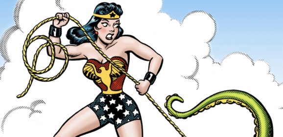
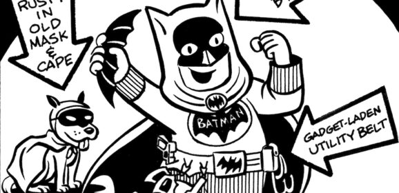
A MORRISON MONDAYS 85th anniversary salute to the Amazing Amazon! By BILL MORRISON You wouldn’t know it to look at Wonder Woman, but this Wednesday, October 21, she will turn 85 years old! To celebrate the anniversary of her first appearance in All-Star Comics #8, I dug out a drawing I did when Princess Diana was only in her 60s and colored it up especially for 13th Dimension! Even casual fans of the Princess of Paradise Island will probably recognize the source of my inspiration for the drawing, the Aurora Wonder Woman model kit from 1965. My drawing was done on Duo-shade board, an old graphic arts product that many comic artists used to use to create shading lines and cross hatching in their drawings through a chemical process. Nowadays, artists can create the same effects digitally, which is why they haven’t made Duo-shade since 2007. I was curious to see how it worked, and chose Wonder Woman as the subject for my experiment. When I was a kid, a high percentage of my weekly allowance was spent on Aurora model kits, and I built and painted nearly all the monster and superhero models they offered. Wonder Woman was one of my favorites, and I especially loved the Murphy Anderson box art of Diana binding a giant octopus with her Golden Lasso of Truth. My original model is long gone, but I kept the box all these years. It’s a classic image of an iconic character who’s only become more popular as the years have rolled by. In 1965, she was a comic book superstar, but not much more. Today her resume includes a hit live-action TV show and multiple blockbuster feature films, along with starring roles on several animated series and loads of merchandise. So, happy anniversary to the Amazing Amazon, and may your adventures go on for decades to come. Random thought: I wish Aurora had done a 1970s Comic Scenes reissue of the kit, complete with a comic story that explains the situation depicted in the model, like they did with Batman, Superman, Spider-Man, etc. I’ve always wanted to know what information Wonder Woman was trying to coax out of that octopus with her lasso. Maybe some dirt on Aquaman? Or possibly the phone number of the Sea King’s agent, so she could call and ask...
Read more