
Going out with a flash of lightning…
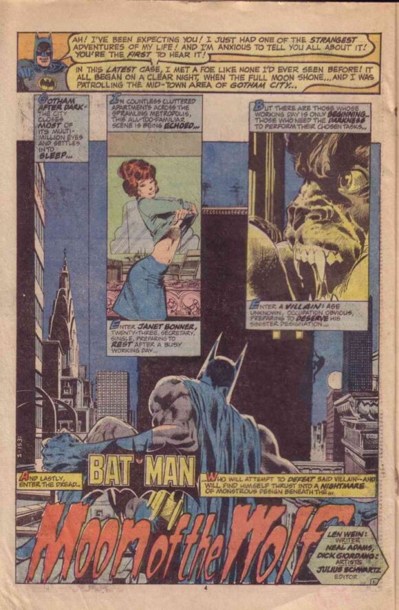
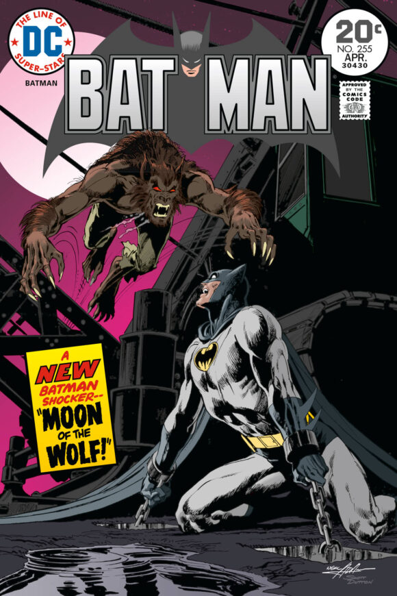
Batman #255 came out Dec. 28, 1973 — 50 years ago. To readers of the time, it simply featured yet another gorgeously illustrated Batman story by Neal Adams and Dick Giordano (written this time by Len Wein) — Moon of the Wolf. But what wasn’t immediately clear to the average fan was that it marked the end of a relatively brief but extraordinarily influential era — Adams’ classic, six-year period redefining the Darknight Detective.
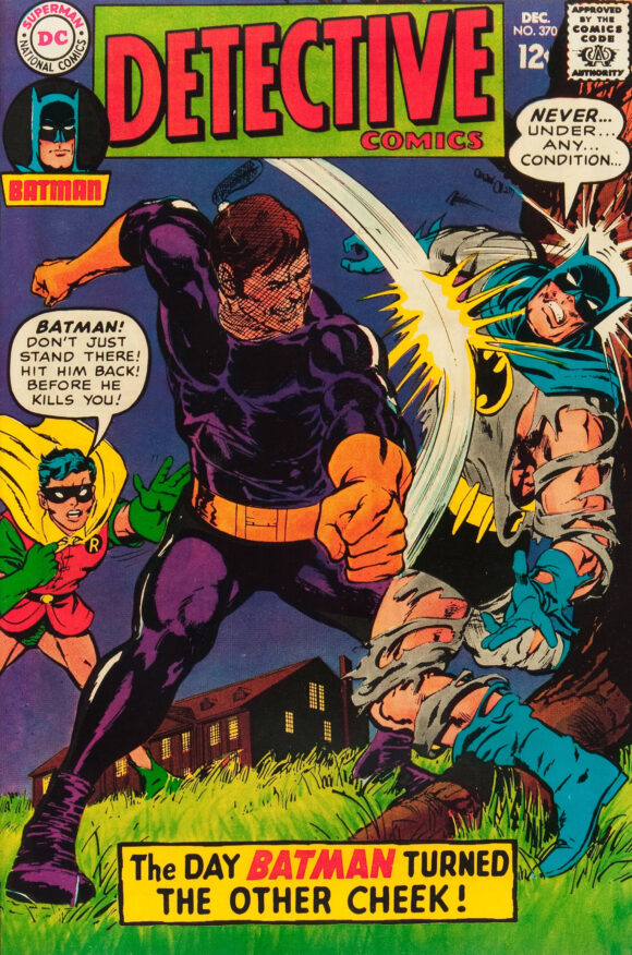
The late Adams’ first foray into Gotham was published on Halloween 1967, inking over Carmine Infantino’s cover for Detective Comics #370. He was adhering to the Infantino-driven house style but you could already tell he was itching to do what he did best — portray characters as actual people and bring his photorealistic style to the comic-book world as he had to the Ben Casey comic strip.
Adams’ artistic journey from the late Silver Age to the Bronze Age has been well documented here and elsewhere: the covers, the stints on The Brave and the Bold, Deadman, Green Lantern/Green Arrow, Batman and Detective, and so forth (not to mention his work for Marvel and others). By late 1973, he’d moved away from regular comics work in favor of his lucrative Continuity Associates and, finally, with the publication of Batman #255, Adams’ time with the Caped Crusader in regular comics was at its end. (He and his Crusty Bunkers continued with merchandising work and he did some covers later in the ’70s, but it would be decades before he returned in full force, with Batman: Odyssey.)
It was a tenure of remarkable creativity, mostly with writer Denny O’Neil. In this fertile period, O’Neil and Adams delved into Batman’s gothic roots, with stories that frequently crept to the edge of the supernatural. More notably, they introduced Ra’s al Ghul, defined Talia, brought Two-Face back for modern readers and, perhaps most influential of all, returned the Joker to his cold-blooded, homicidal roots.
Moon of the Wolf is a classic, with a straightforward plot: A man named Anthony Lupus is turned into a werewolf by the evil Professor Milo (a Wein favorite) and Batman has to take care of business. In Wein and Adams’ hands’ Lupus is, like Lon Chaney Jr.’s character in 1941’s The Wolf Man, a tragic figure, a man who wishes not to be a feral beast and is anguished with every transformation. The climactic battle between Batman and beast takes place in a driving rainstorm, a powerful and memorable set piece:
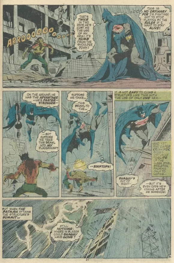
If you’ve not read the story, I won’t give the ending away, even though it’s been five decades.
But I would like to discuss the cover, which has long been a topic of conversation among the Adamscenti.
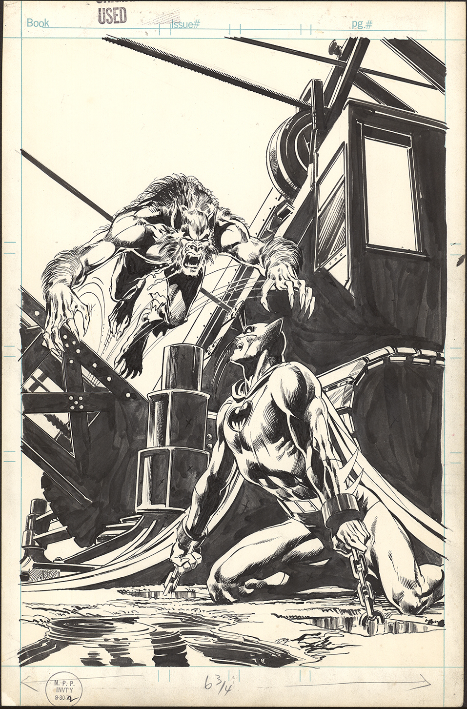
Given Adams’ brilliant cover work, there’s an irony that the Batman #255 front underplays one of his most dramatic images — a chained Darknight Detective set upon by the werewolf:
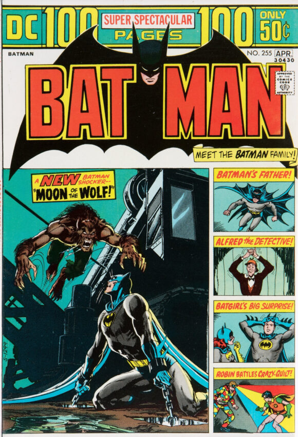
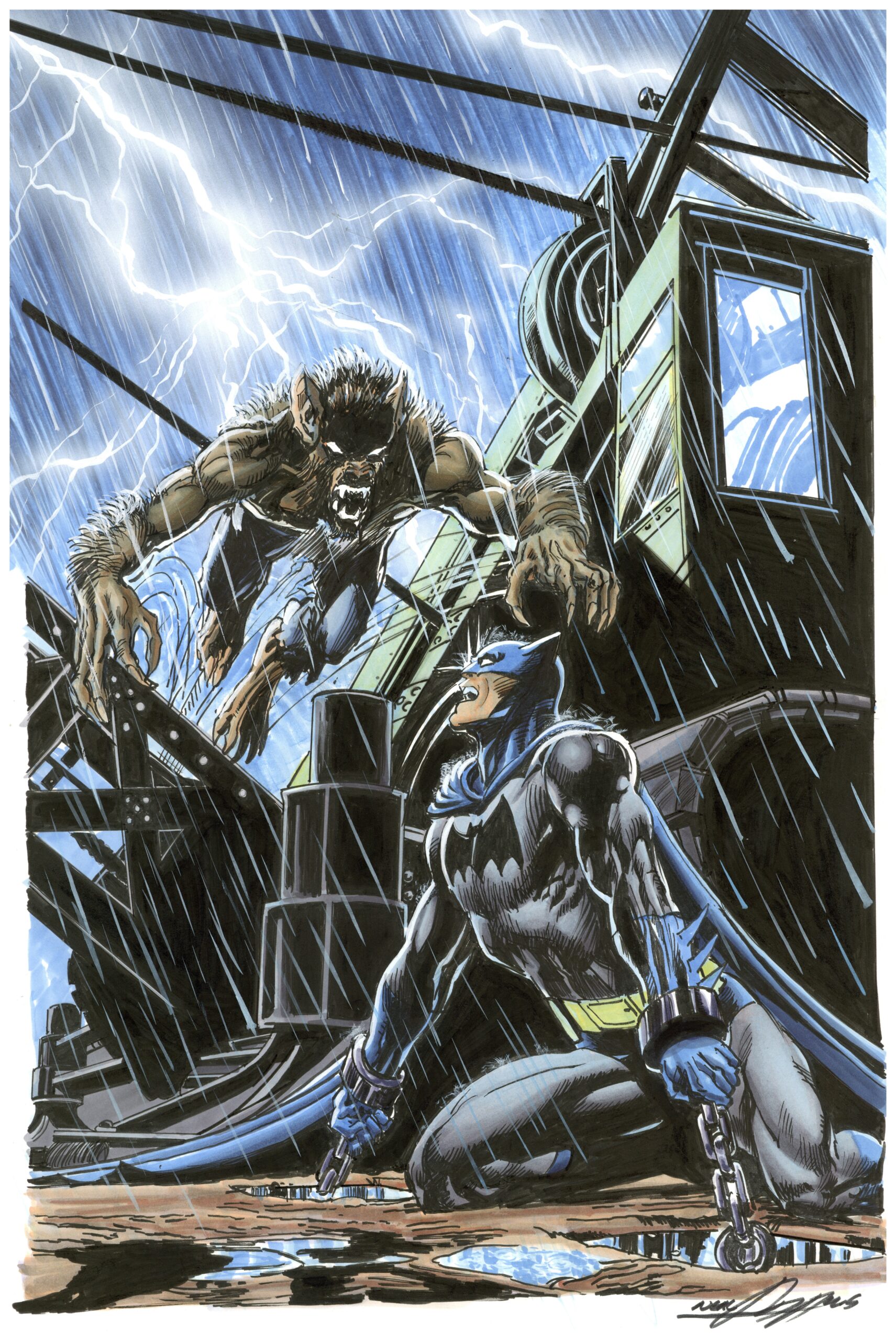
DC was just embarking on its 100-page format for ongoing series and by necessity, the primary image shared space with a group of vignettes or floating heads. Sometimes it worked, sometimes it didn’t. In the case of Batman #255, which on the whole has a colorful and inviting cover, fans have long been frustrated by the dimensions of Adams’ illustration, which is far more dramatic in its full size — and will be included in the upcoming Neal Adams Classic DC Artist’s Edition:
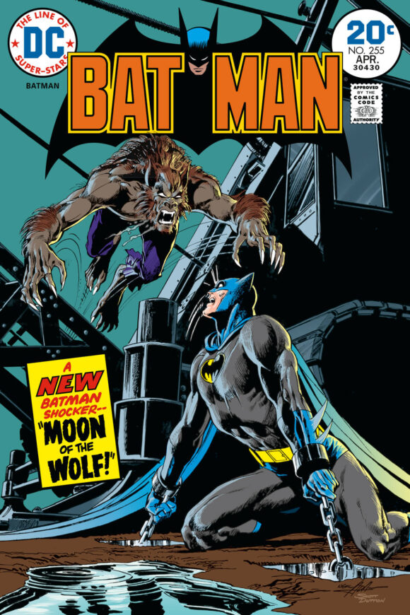
Illustrators like Scott Dutton, who is well known for coloring or recoloring classic comics images, have even imagined what Batman #255 might have looked like without the 100-page format:
Hell, even Adams himself made a point of recreating the image, which is available for sale as a giclee at NealAdamsStore.com:
“This was one of Neal’s favorite Batman stories, certainly artistically,” Peter Stone, Neal’s son-in-law and a 13th Dimension columnist, told me. “He would have liked to have inked it himself, but time did not permit. He had inked Batman #251 with the Joker and that ate up more time than he wanted. He was getting more and more upset with DC because his art was everywhere and for everything he found, he sent a bill to DC. They, of course, ignored it.
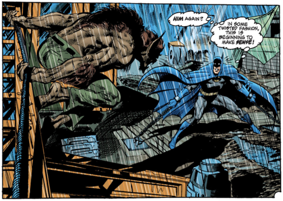
A recolored panel from Batman #255
“There are so many interesting images in this issue… When Neal was considering creating motion comics for potential sale to DC Comics, this issue was the first one he started work on. He actually created the entire sequence of Batman confronting Lupus and being knocked out with gas… leading to our hero chained to the ground at a construction site. Neal loved this issue artistically because he had (in his words) spent a lot of time drawing more sedate stories. Len gave him a chance to draw a new villain who was exciting and feral, so when he was looking for possible images he could recreate for sale, the werewolf story sprang immediately into his head.

“He liked the composition of this piece because it was always very attractive to him… the kind of Batman image that got his juices flowing. And he got to ink it himself — always a bonus.”
Because it was written by Wein and came months after the seminal Batman #251, Moon of the Wolf has long felt to me like an epilogue to Adams’ classic run — and it would be a fitting inclusion to DC’s Facsimile Edition program, or more specifically as a “Faux-simile Edition.” As you know, DC recently reprinted Batman #428 — but instead used the material produced in case Jason Todd survived a 1988 telephone poll. The issue has been such a success, a second printing is coming Jan. 30, with two new covers:
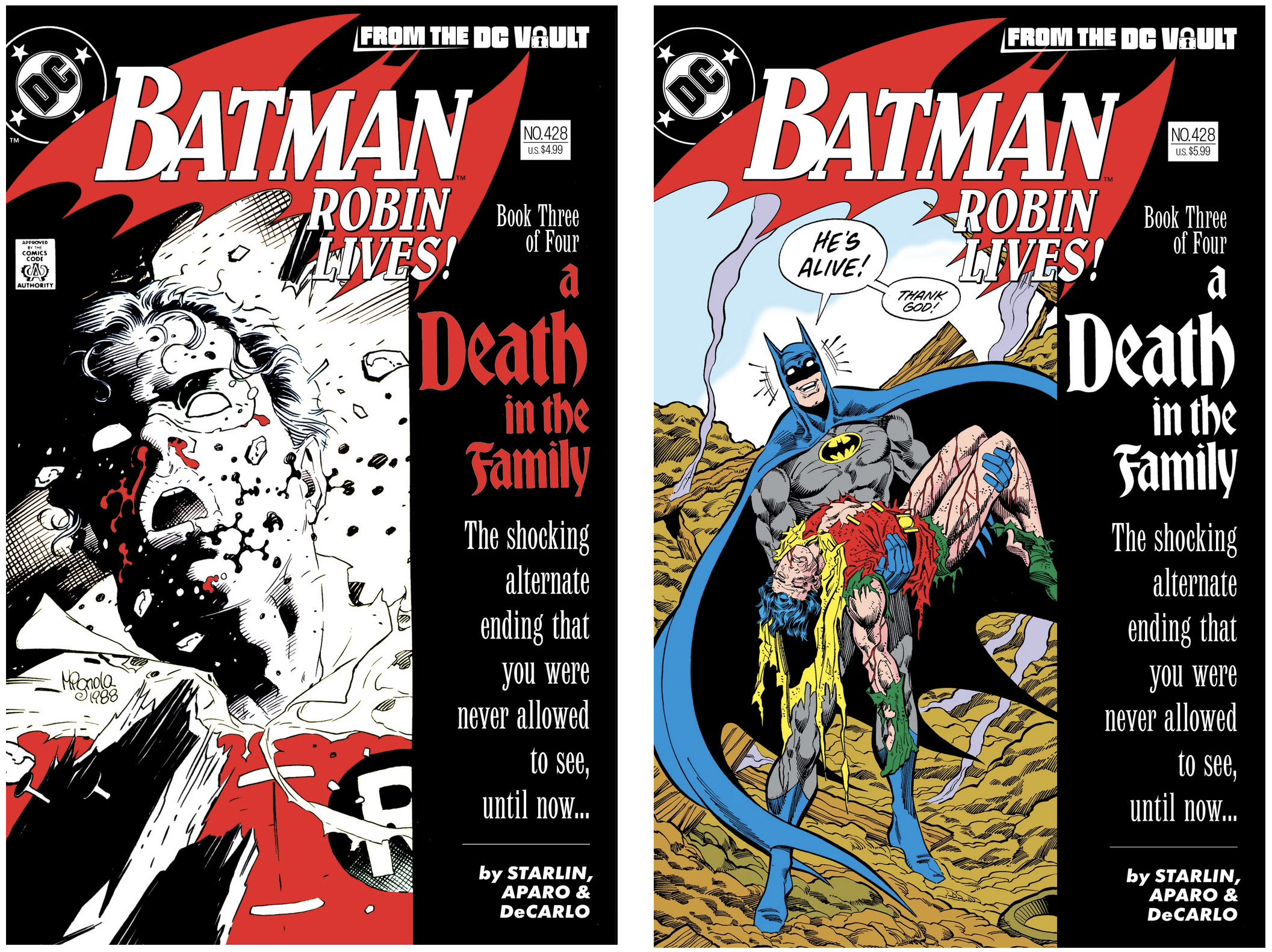
Since the publisher — which clearly has Adams on the brain — went to all the trouble to create that “From the DC Vault” logo, why not give us a Batman #255 “Faux-simile” that reprints just the lead story but with a cover that includes Adams’ full image, similar to what Dutton created?
I’m willing to wager it’d sell — and pretty well, too — as a fitting salute to the end of a very important era.
—
MORE
— Classic BATMAN-RA’S AL GHUL TREASURY EDITION to Be Released As a Facsimile Edition — IN FULL SIZE. Click here.
— NEAL ADAMS’ Classic DC ARTIST’S EDITION Gets Release Date. Click here.
December 28, 2023
Out of all the 100 page format comics of the period I think Detective Comics was alone in keeping the full-page cover image and those covers (438-445) were much stronger as a result.
December 28, 2023
RE: Out of all the 100 page format comics of the period I think Detective Comics was alone in keeping the full-page cover image . . .
Yep–and I very much agree as to the strength of those covers. And credit for that excellent design decision and superior design sense goes to the late, great Archie Goodwin (1937 – 1998) who was the editor in charge for those issues of Detective Comics–and the writer for the introductory Batman story (and the superb Manhunter run)..
December 28, 2023
I’ve always loved the splash page of the Moon of the Wolf story–here esp. the incredible photo-realistic detail of our Wolf-man provided by Adams and Giordano (esp. as I was a college art major rediscovering my comic collection in the 1980s–loving the detailed illustrative work of Adams / Giordano and esp. Jim Aparo during what I consider his classic illustrative run from c. 1971 to 1976). One of the other pages that also stand out from Moon of the Wolf is p. 9 for those fantastic photo-realistic renditions of Prof. Milo too).
It even looks more impressive in the original comic (which I have–as bought at the time as a 4th grader in late 1973) than in the garishly colored reprints I’ve seen for Batman and others (esp. as the latter tries to do that awful, more 3D-type coloring that always looks overdone–and of which I can’t stand).
The former owes to that better quality off-white newsprint and continued use of metal plates for printing (before the use of the cheaper more yellowish newsprint and plastic plates that were clearly in use by say 1976 – 1977 for comics in trying to economize in the inflation prone 70s–and when Aparo started to shift to a thicker outline and less detail out of necessity, IMO).
The superior newsprint helped to subdue the coloring just enough that aided the photo-realism as well as, in combo with still-metal plate printing usage, that allowed those exquisite fine-lined details to hold up so well. That detailed inking gives a strong 3D presence to the flattened blocks of subdued coloring that is far more effective and aesthetically satisfying 3D modeling than those garishly 3D-colored reprints I’ve encountered too often of late.
And a PS: I’m glad, really, that Giordano inked this has he had the far better finesse for detail–Adams, IMO, was not his own best inker for his great line work as being a little too loose (i.e., sloppy) with the brush. Giordana really aided in that excellent photo-realism.
December 28, 2023
As a 16 year old in 1973, I scoured the comic racks at our small-town candy store regularly in the hope that a new Neal Adams story would appear.
I recall Moon of the Wolf vividly, including Neal’s remarkable depiction of Dr. Milo’s image refracted in a wine glass. I also lamented the shrunken size of Neal’s great cover image!
Neal Adams’ work is still pure magic, even after all these years.
December 29, 2023
I remember reading this one when it came out! Loved it! And I loved the 100 page issues—made my growing-up years a Golden Age!
December 29, 2023
Great article, man! I bought that 13 x 19 print for framing!
December 29, 2023
Thanks! And good for you!
December 29, 2023
This was the only Adams Batman comic book that I bought when it first came out. I was 8 years old at the time, and just missed out on the earlier stuff, which I’ve been collecting on and off since. It’s still, IMO, his best-drawn single issue of Batman or Tec. I still have the copy I bought back then – the cover came off decades ago, so I don’t worry too much about that particular image!
Thanks to William R for his reply above regarding paper and plates. I, too, much prefer the originals to any recoloured reprints, except perhaps for the old over-sized Collectors’ Editions.
January 3, 2024
Great article. I love the first Scott Dutton 20 cent cover! It looks fantastic!