
The Bronze Age Marvel stalwart was born 74 years ago, on March 6, 1950…
By CHRIS RYALL
Al Milgrom was one of the mainstays of the Bronze Age Marvel Universe. For a while, he was seemingly everywhere at all times – providing covers for numerous titles a month; penciling series like The Avengers, West Coast Avengers, and Secret Wars II; writing and penciling Spectacular Spider-Man; editing and Editori-Al’izing on the pages of Marvel Fanfare; inking the pencils of artists like Jim Starlin and many others; and on and on.
If you were a Bronze Age kid, Al Milgrom truly exemplified the spirit of Marvel. And it’s with that general omnipresence in mind that we celebrate Al’s birthday. Al has been feted here at 13th Dimension a few other times, so once again, I made an effort not to repeat many past covers, and kept the focus only on annuals or other double-sized issues. (Which meant I also had to leave out showcasing some of my favorite covers with Al’s inks, such as the Jack Kirby-penciled Iron Man #80).
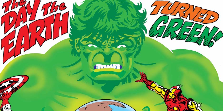
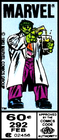
Before we jump into the 13 COVERS, one added bonus: Al’s corner-box art for The Incredible Hulk #292-300 deserve their own special commendation for the way the images emulated the story being told in those issues. As the Hulk’s intellect started to slip from Bruce Banner’s control into savagery once again, so too did Al’s corner boxes.
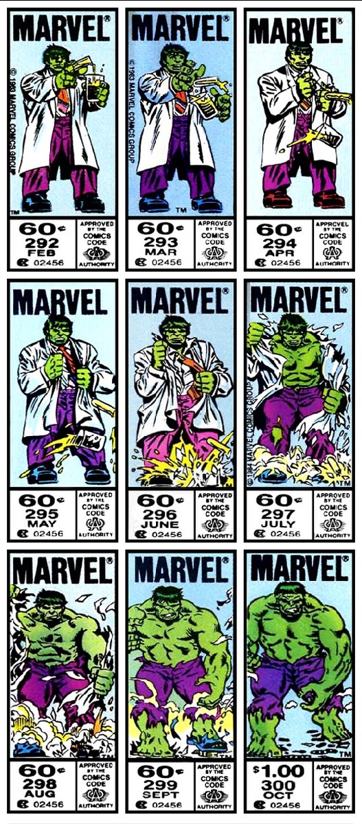
The static images here are fun enough but dig this gif:
—
The Avengers Annual #10. That’s right—we’re leading with the too-often-maligned cover to one of the best single issues produced in the Bronze Age. Al was periodically tapped to produce a cover with due haste to help a comic meet its deadline, and so the story goes with this comic. Which also isn’t helped by the fact that the interiors were drawn by the great Michael Golden at the peak of his considerable powers.
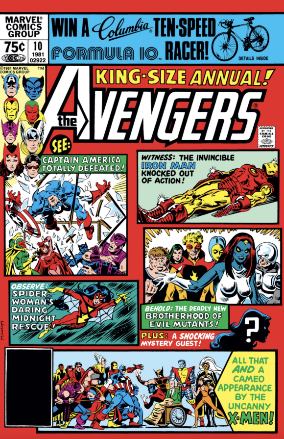
Any cover with multiple images on it has a more challenging time dazzling readers than one single, impactful image. But I’ve seen the Michael Golden commission piece that presents his take on what a cover for this issue could have been, and it doesn’t work as well for me as this. I like this cover, and I like the positive association I have with this fantastic comic any time I see it. So this isn’t meant as damning with faint praise, it’s meant as actual praise for Al’s work here. This comic wouldn’t be the same without it. And with it, with all the pieces of this comic in place as they are, it’s a truly legendary issue. (Dan adds: A Facsimile Edition is coming!)
—
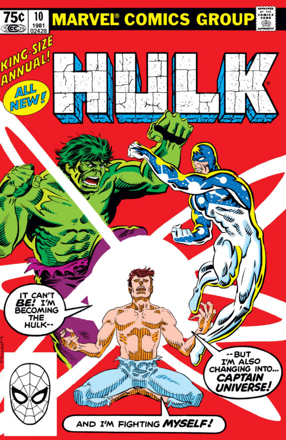
The Incredible Hulk Annual #10. One of my favorites of this era. I was still somewhat new to collecting Hulk comics, although I’d read earlier issues thanks to my brother’s collection. Still, this issue was mine, and so it looms large and positive for me. It’s a great and also intriguing image with really nice composition and unique finishes. I had no idea who or what Captain Universe was at the time but this cover made me want to find out.
—
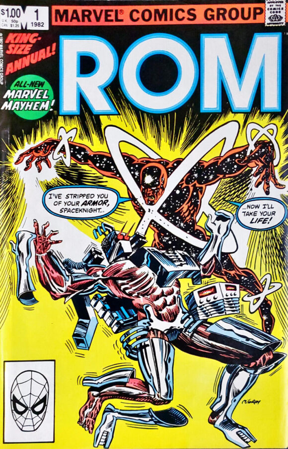
Rom Annual #1. I realize that if there was a drinking game built around taking a shot every time I mentioned Rom in any piece, all readers would quickly get drunk, but I had to call out this one. Al created a number of nice Rom covers but this one was irresistible. Even more impressive that he made such a striking image fit underneath the series’ massive logo and trade dress.
—
West Coast Avengers Annual #2. I have such a soft spot for the work Al and writer Steve Englehart did on this series, and this cover is an especially fun one with the wide array of characters from both the East and West Coast branches of the team.

—
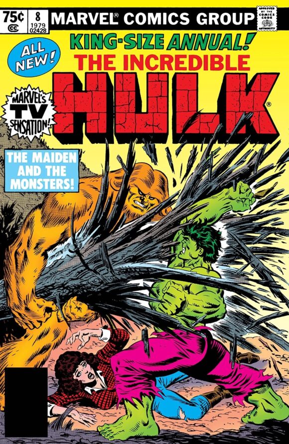
The Incredible Hulk Annual #8. Al contributed a large number of Hulk covers, and this one gave me all I need in a comic—hulking creatures fighting it out. I kinda feel like the caption box was one element too many, and I never love captions that create bad tangents with the art—especially when I just want to see more of the art—but it was the era of cover copy so here we are. It doesn’t detract too badly.
—
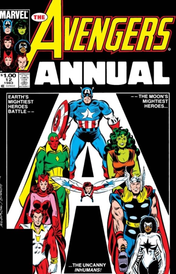
The Avengers Annual 12. The 1983 Marvel Annuals all took this visual approach, and Al and inker Joe Sinnott made it work really well. This is among my favorite lineups of the Avengers (minus Starfox, anyway), and any comics cover that puts the best Captain Marvel, Monica Rambeau, front and center deserves extra applause.
—
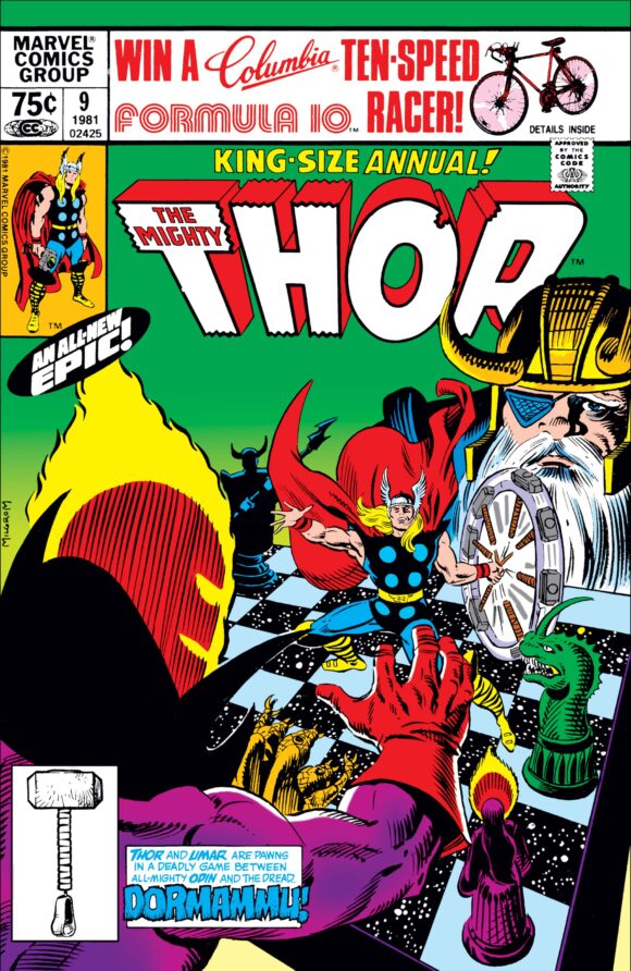
Thor Annual #9. I’m a sucker for any cover that shows characters in a chess match and this one does so in dynamic fashion. Plus, as a parent, I can relate to Odin’s chagrin at his kid messing with the game pieces like Thor is here.
—
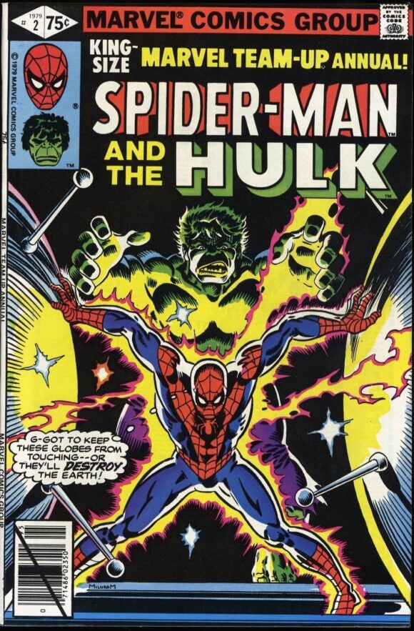
Marvel Team-Up Annual #2. One thing you notice about so many of Al’s covers is his mastery of symmetry and framing. This is just a great cover, from the placement and poses of the characters, to the lighting, to that expression on the Hulk’s face.
—
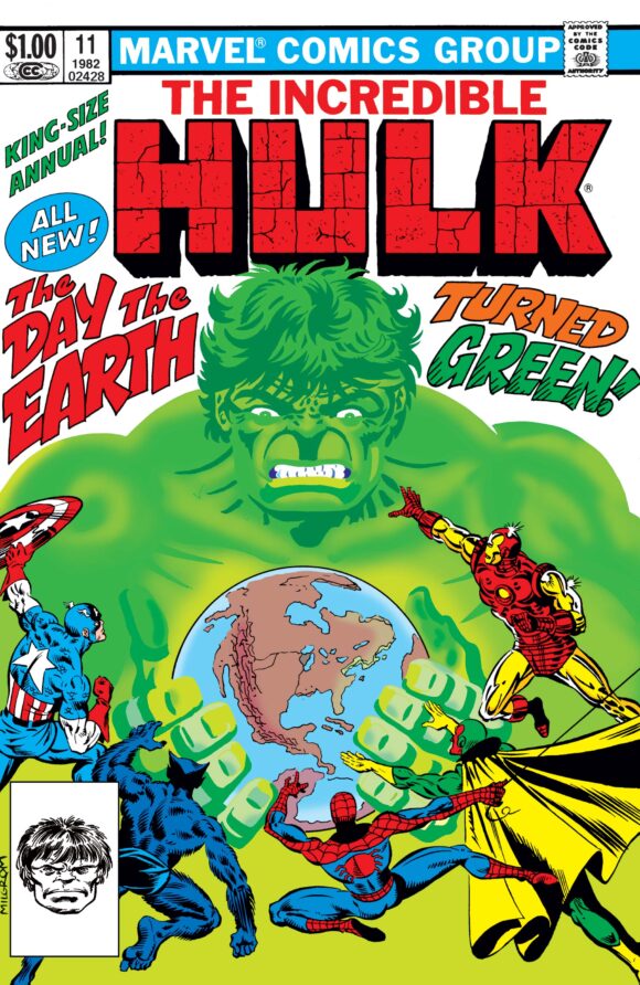
The Incredible Hulk Annual #11. One more Hulk image, since this one too manages to fit in a lot of characters in a unique way, and the color holds on the Hulk make him stand out in a really fun fashion. I think this one too might’ve benefitted from less cover copy but either way, it’s striking.
—
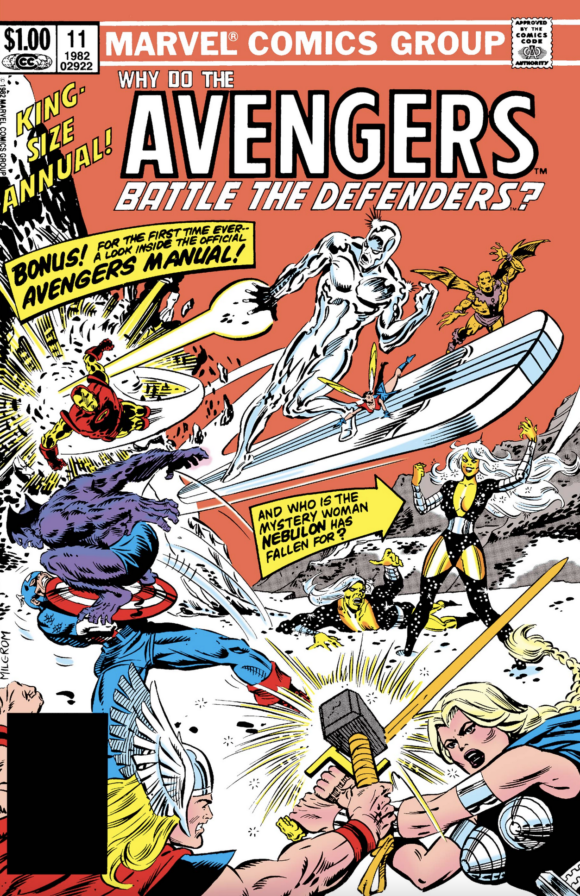
The Avengers Annual #11. Sometimes it’s just all about when you read a comic as much as what’s on or in the comic itself. This one hit me at the right time in the right way, and I appreciate the orange sky, since orange isn’t the most common of background colors but it works well. There’s a ton going on here and lots of characters and poses to wrangle but wrangle ’em Al did!
—
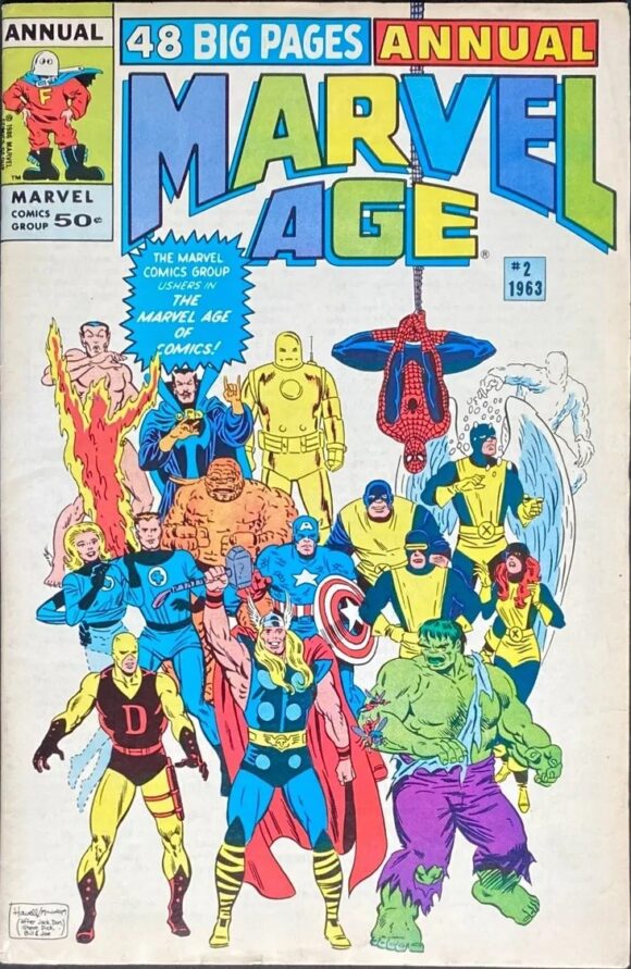
Marvel Age Annual #2. OK, this one does break my rule of only presenting covers Al penciled but it’s worth it—I love the retro feel here, and Al’s inks do a lot to provide that sensibility over Richard Howell’s pencils. Even as a kid reading this one, this version of these characters were already a thing of the past so it was great to see them all portrayed here. Incidentally, this is an alt cover, which contrasts well with the Ron Frenz/Joe Sinnott cover that showcased all the then-modern 1980s versions of the characters.
—
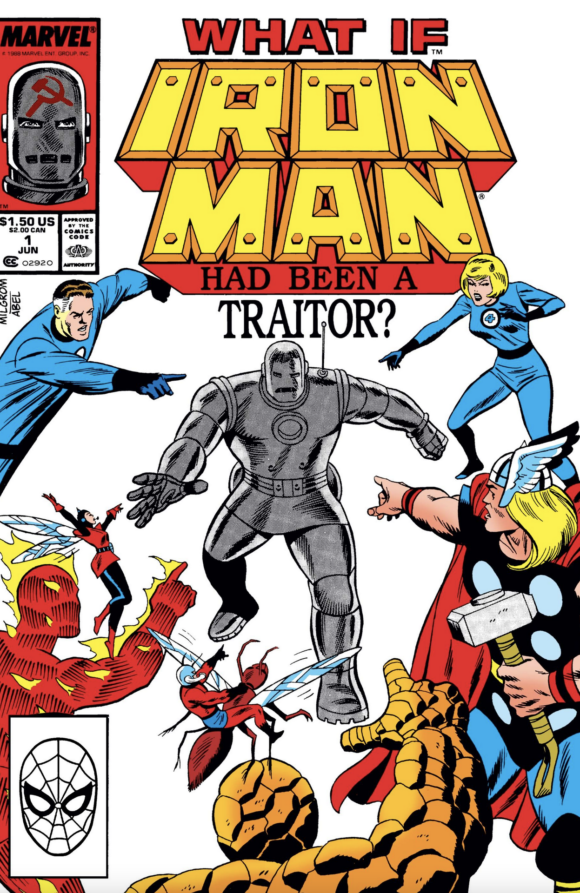
What If? Special #1. After being a fan of pretty much every one of the previous 47 issues of What If?, this cover was a welcome sight since it heralded a return to a series I’d been missing greatly.
—
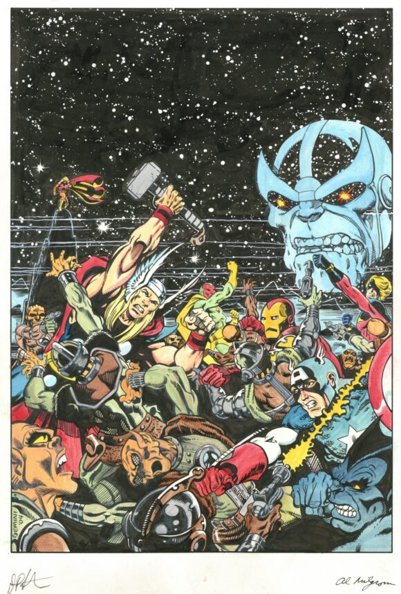
The Avengers Annual #7 (recreation). This one completely breaks my rule in that it’s not only not penciled by Al (rather, Jim Starlin) but it’s also not even a cover itself; it’s a recreation of Starlin’s cover for Avengers Annual #7 (which was not inked by Al). Still, it deserves inclusion here not only because it’s a great image in its own right, but also as a way to showcase Al’s inks over his frequent collaborator Starlin. Al, especially over his own pencils, tended toward thicker lines but his work with Starlin always showed a particularly deft touch and delicacy. I love their pairings in any form — printed cover, commission, or beyond.
Thanks again for so many landmark contributions, Al! Happiest of birthday wishes to you from all of us at 13thD and comicdom assembled!
—
MORE
— 13 COVERS: An AL MILGROM Birthday Celebration — 2022 EDITION. Click here.
— 13 COVERS: An AL MILGROM Birthday Celebration — 2021 EDITION. Click here.
—
Chris Ryall is the co-owner/publisher of Image Comics imprint Syzygy Publishing. His latest series is Tales of Syzpense, out now. Subscribe to his Substack of the same name!
March 6, 2024
My favorite Al Milgrom run was the one on GUARDIANS OF THE GALAXY he did with Steve Gerber. I told him that at a signing we did on a store in Long Island and he looked at me like I was nuts.
March 7, 2024
You know, I’ve still never read any of that and really need to fix that immediately.
March 6, 2024
Great list! And that Hulk corner box GIF is awesome!
I agree on Avengers Annual #10. I’ve always liked that cover, and I can’t help but look at it and remember how good the interior is.
Also, I agree that Monica Rambeau was a fantastic character – when she was written by Roger Stern. Unfortunately, she sort of lost her way after he left the Avengers.
March 7, 2024
Yeah, agreed. The story goes that they decided Monica was too powerful but she’s never really been written as well for a long string of issues as she was during Roger’s Avengers run.
March 6, 2024
I was introduced to his work via his early 1980s run on PETER PARKER, THE SPECTACULAR SPIDER-MAN….I was especially taken by the issues that were the first couple appearances of CLOAK & DAGGER….
March 6, 2024
Love Milgrom. I too love his Guardians of the Galaxy. Also love his work with Ed Hannigan on Spectacular Spider-Man.