
Interesting…
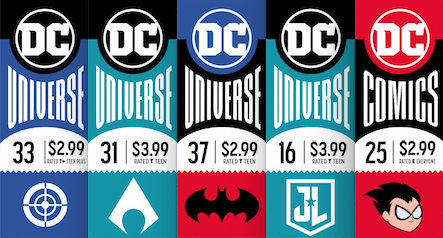
We’ve been having a good ol’ time poring over DC’s new-look corner boxes the last few weeks because it’s just the kind of thing comics fans really fetishize.
And it’s not just the aesthetics, either. These little guideposts give you an idea of how the company sees itself, too.
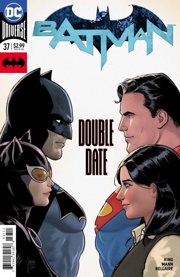
One of the major parts of these boxes is the logo at the bottom that tells the reader what family of books the title belongs to. If it has a Batlogo, for example, it’s a Batman book, such as Detective, Batgirl, Nightwing and so on. I personally don’t need that kind of indicator but I understand it as a marketing technique.
Anyway, I’ve been perusing each week’s covers — you can find Week 1 here and here and Week 2 here — and something jumped out at me as we enter Week 3 on 12/20:

Harley Quinn does not have a Batlogo. Instead, she has the Suicide Squad logo (which is also used for Deathstroke).
Hunh.
Now, of course, the first thing that comes to mind is corporate synergy: Margot Robbie’s Harley is probably the one thing everyone liked about the Suicide Squad movie, which is still evidently getting a sequel. (DC’s main Justice League title uses the movie logo.) Harley is also front and center in DC’s Suicide Squad book and her solo title has had little to do with the Batman universe overall.
So on the face of it, it makes a lot of sense.

But Harley was conceived and developed as a member of Batman’s world, so I have to admit I cocked my head when I saw that gunsight instead of the Batlogo.
That said, to a very large degree, Harley has morphed into something else entirely: She’s probably the only DC character created in the last 25 years to become a bona fide pop-culture phenomenon, regardless of her roots. She is very much her own thing now — and that’s really cool.
Hell, I’d argue she demands her own corner box logo. But I get the marketing forces at play here.
Either way, she’s clearly graduated from Batman supporting player. It’s just interesting to see DC make that official in this small, but telling way.
—
Other trends this week:
— I know that all this is still a shake-out cruise, but the Batlogo itself has changed.
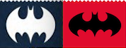
The one on the left is the one Batman and Nightwing shared in Week 1. Since then, the Batbooks have been using the one on the right. I prefer the one on the left. The one on the right may be more classic but it’s also a bit more pedestrian.
—
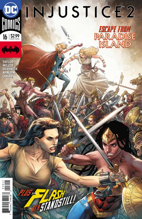
— The non-canon/digital-first Injustice 2 again has a distressed Batlogo. I can’t figure out why it doesn’t have a more generalized emblem, or at least one that changes issue to issue. Injustice 2 is about a whole world of characters.
—
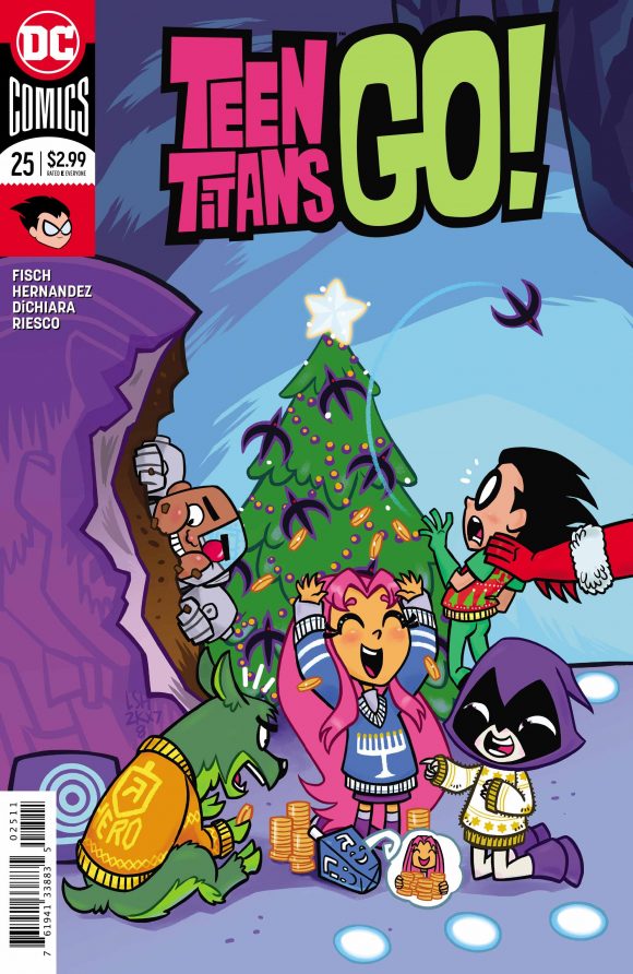
— I love floating heads, so I love the Teen Titans Go! logo. I hope they rotate these.
—
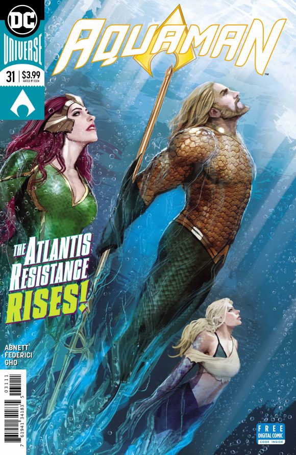
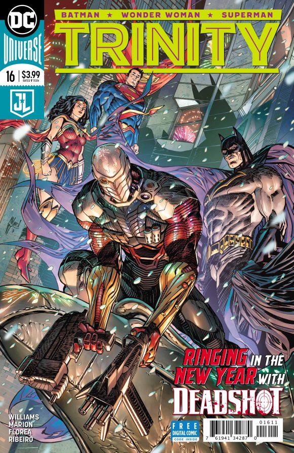
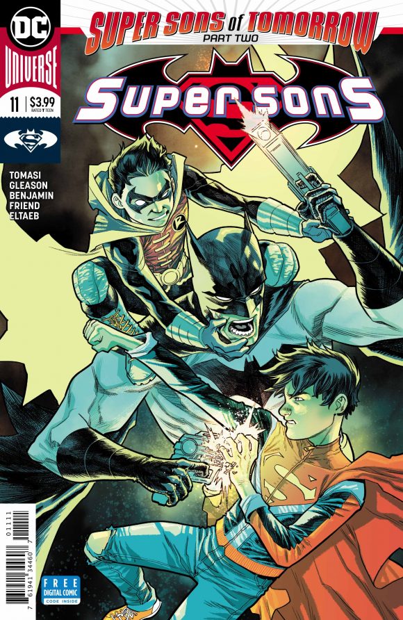
— Debuts: Aquaman; Trinity, which gets the Justice League logo; and Super Sons, which gets the Superman/Batman logo that the book has repurposed.
—
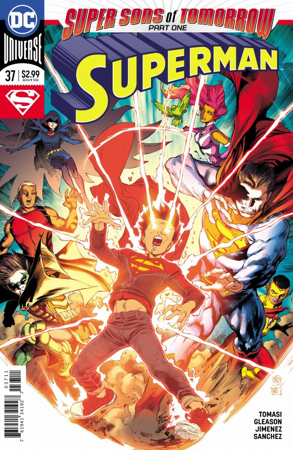
— Speaking of Super Sons (and Superman): We’re getting our first look at how a crossover is handled, with a banner atop the cover.
—
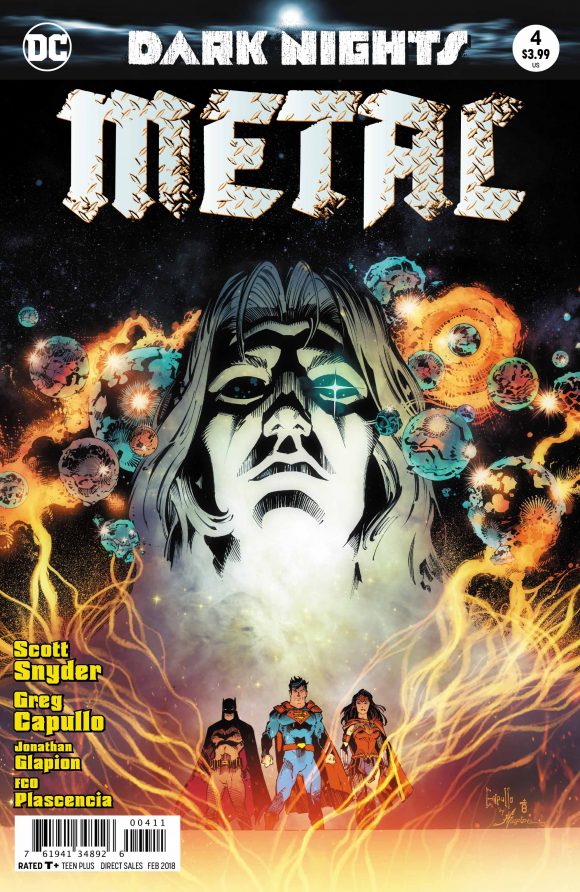
— Metal is very much a DC Universe title but it doesn’t get a corner box. I assume that’s because of the existing Dark Nights trade dress and the publisher has decided to keep it consistent for the book’s run.
—
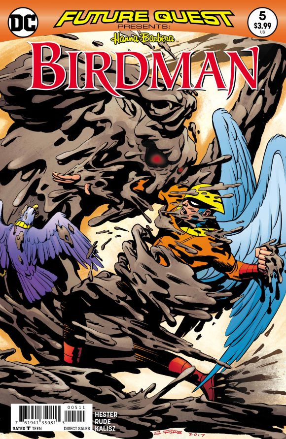
— Last week, the Hanna-Barbera books got corner boxes. In Week 1, they didn’t. In Week 3, Future Quest Presents does not. Like Metal, I’m guessing it has to do with the overall logo design. Still, I’m kind of surprised by this one.
—
MORE: 13 DC Logos — RANKED. Click here.
NEXT: Week 4!