
A Bronze Age BACK TO SCHOOL showdown!
By CHRIS FRANKLIN
In late summer of 1980, I went school shopping for the first time. I was soon to enter kindergarten and in among the ritual of buying pants, shirts, shoes, a backpack (I chose a Peanuts model), there was the all-important selection of the lunchbox, or lunch kits as the manufacturers often called them.
For kids, the lunchbox was essentially a metal billboard advertising your favorite characters, TV shows, and movies, designed to keep your bologna sandwich safe until lunch time.
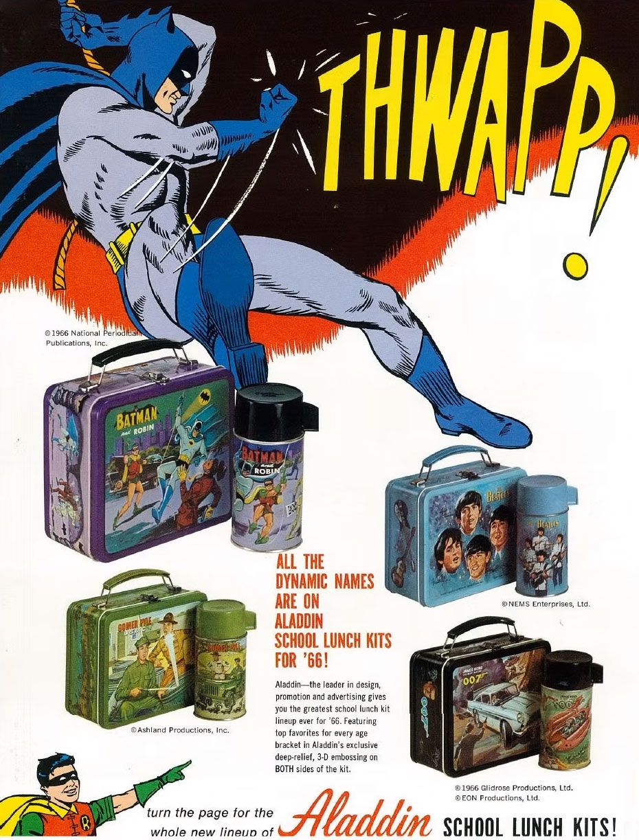
Aladdin Industries was no stranger to superhero lunch kits, or aping comic art. In 1966, they redrew part of Gil Kane and Murphy Anderson’s cover to Batman #178 in this ad promoting their new Batman, Beatles, James Bond and Gomer Pyle lunchboxes.
That year I chose Aladdin Industries’ Super Friends model, which had been in production since 1976. It was a hard decision, because sitting next to it on the shelf was their Superman: The Movie lunchbox. As much as I loved that film (it’s still my favorite movie of all time), I couldn’t argue that the SF box had MORE of the DC characters I loved from comics and TV. Most importantly, Batman and Robin.
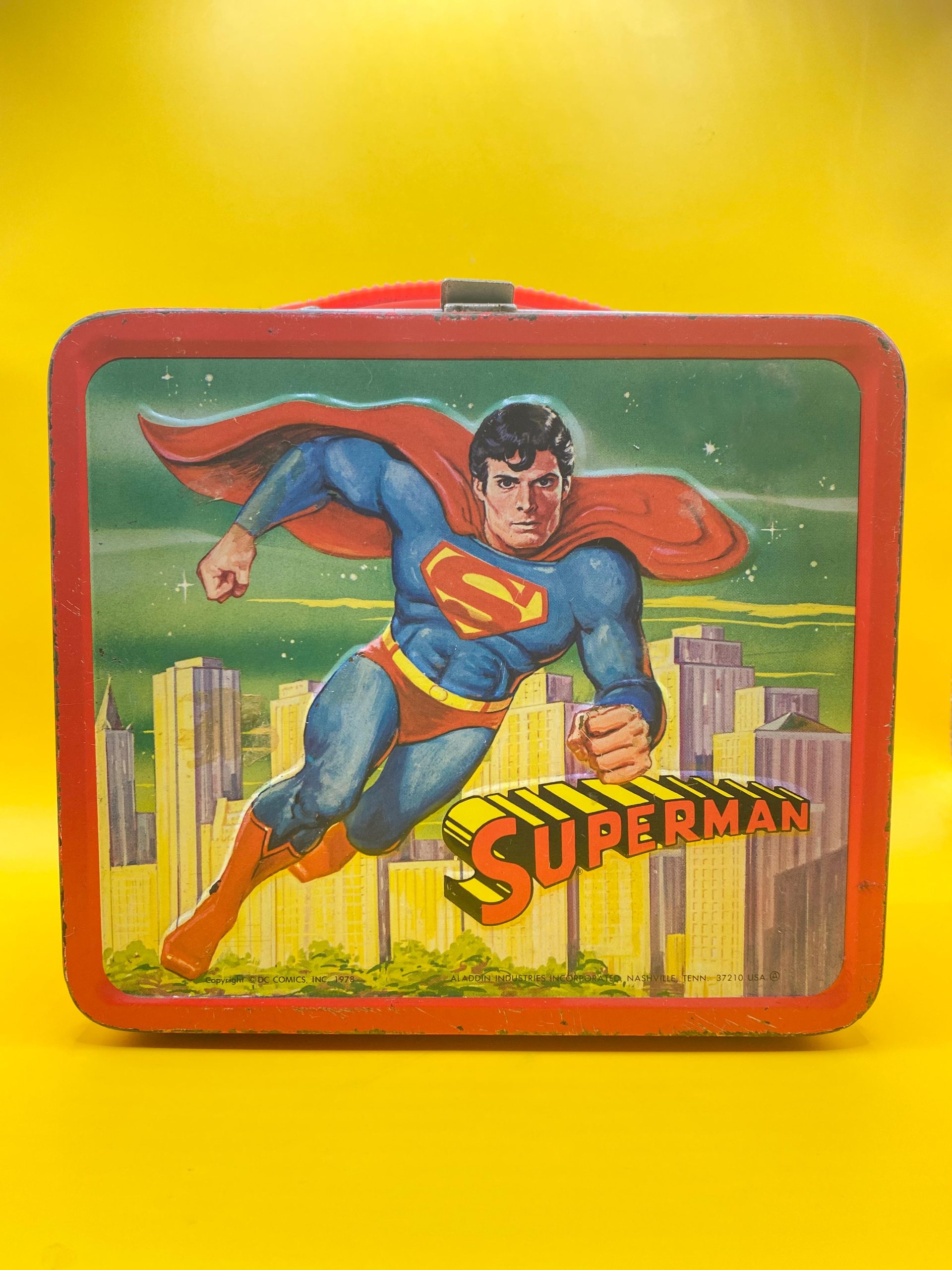
The Superman lunchbox I left behind… for decades!
Years and several lunchboxes later, I came across something that blew my mind on several levels. Circa 1984, I was riding my bike down an alley near my home. There along the paved alley street, sitting in the grass was another lunchbox — a Marvel Super Heroes box with a similar design to my beloved Super Friends version (which I still owned), also produced by Aladdin.
I had never considered stealing anything in my life, but this abandoned metal box tempted me. I rode past it several times. Went home, and came back, riding by again, thinking how easy it would be to make it mine. I even revisited it a few days later, and IT WAS STILL SITTING THERE! Whoever owned this clearly didn’t deserve it, treating it like this! But all those comics I read had given me a gushy moral center, and I couldn’t do it. So, it evaded me for another four decades until I bought it at a toy show just a few years ago.
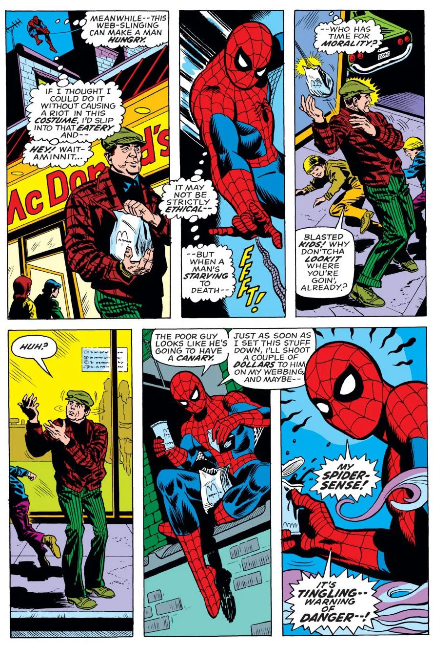
Spider-Man never stole a lunchbox, but he did steal a guy’s lunch, or dinner maybe! From Amazing Spider-Man #141 by writer Gerry Conway and artists Ross Andru and Frank Giacoia.
Now owning the two, and displaying the similarly designed boxes side by side, I began to wonder, what would I have done if I’d had to choose between them on that fateful day in August 1980, or perhaps a few years earlier? Would I have gone with the DC model, or the Marvel? What would other comics-loving kids have done in 1976 or in the years shortly thereafter? Which box is better? Which had the better artwork, the better character selection? Who would triumph to house your Campbell’s Chicken Noodle Soup in its thermos?
Let’s break them down, panel by panel, and match them up to find out! (Shades of COMIC BOOK DEATH MATCH! — Dan)
—
THE FRONT LID
DC: The front lid (or maybe you prefer top lid) of the Super Friends lunchbox features Superman, Batman and Robin soaring high above a cityscape, with Wonder Woman in the center, dominating the image. This was 1976 after all, and the Lynda Carter Wonder Woman TV series was a smash hit, propelling the Amazing Amazon to new heights of popularity.
This is also the first indicator of a fact that I never gleaned onto until decades later: this lunchbox was specifically crafted to appeal to girls. We shall see the female DC characters get more prominent positions than typical on nearly every side of this lunchbox, not to mention the magenta trim. Like most metal lunch boxes, both the front and back panels have embossed, raised areas, usually around the figures in the artwork. The names of each character are also displayed next to them in a comics-like font. The classic and endearing telescoping Super Friends logo is put to effective use.
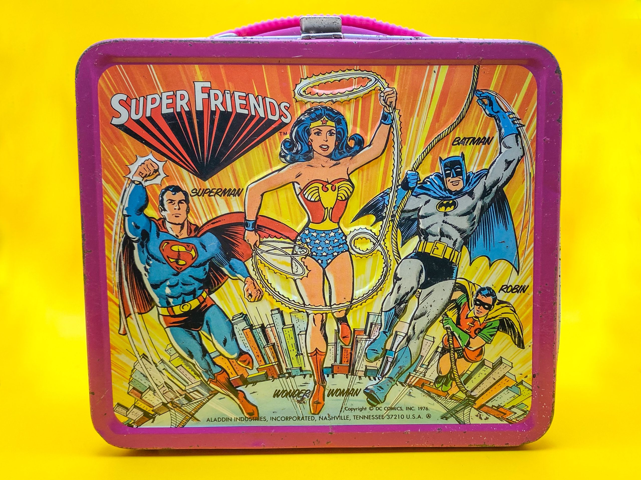
I should note, of the five original Super Friends from the cartoon series, Aquaman is missing here, as is often the case with the maligned Monarch of the Oceans. He’ll pop up later, though. The artist captures the DC house style and brush strokes of artists like Murphy Anderson, who drew the original images that both Superman and Wonder Woman were based on, for the small vignettes used on DC covers in the early ’70s. Batman is lifted from the classic pin-up image Anderson inked over Carmine Infantino, and Robin is an adaptation of an Infantino/Joe Giella drawing.Anderson himself would contribute art to Hallmark’s recreation of this lunchbox in both smaller form and Christmas-tree ornament size in 1999.
The overall presentation with the bright radiant burst behind them and the tiny, curved Earth below makes for a heroic and dynamic tableau. But what could Batman and Robin be swinging from at this height? Holy vertigo!
—
Marvel: First off, let’s examine the title used on this lunchbox: “Marvel Comics’ Super Heroes.” Notice the possessive version of “Comics.” Interesting, and the only example I can think of. Also, there was no set Marvel Super Heroes logo used on merchandise at this time, so we’re stuck with a pretty generic font. The artwork has some nice lifts from John Romita on Spider-Man (who is front and center, and seems to be swinging from a standard rope, not his web); Jack Kirby on Thor; and John Buscema on Captain America (from Avengers #58, specifically). Beside the comics, Cap and Thor still had reruns of the 1966 Marvel Super Heroes (barely) animated series kicking around, and Spidey was not only in perpetual re-airings of his 1967 cartoon, he was also appearing in live action on The Electric Company.
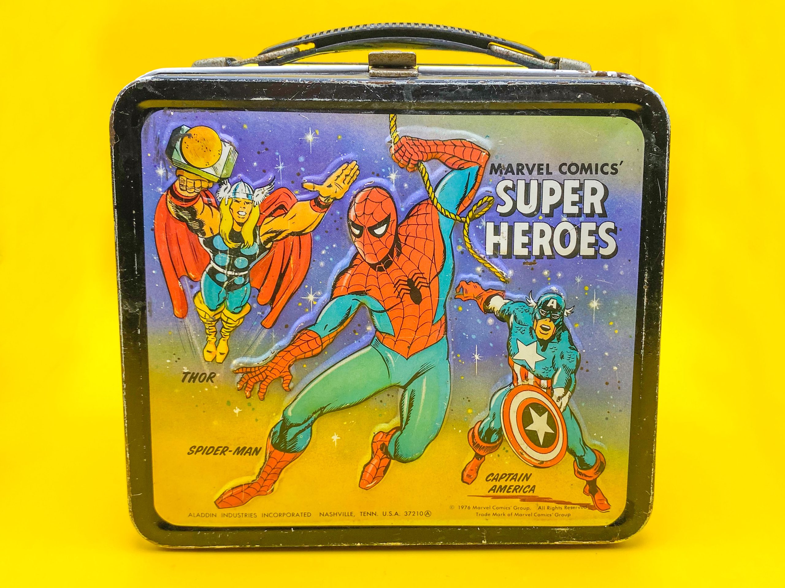
The background seems to be some abstract, gradient spacescape. The figures look good, if less polished than their DC counterparts, but the whole image doesn’t hang together. It’s like the three heroes aren’t really interacting. A few years later, Thor would have definitely been bumped for the Hulk due to the popularity of his TV series. By no means a bad design, but the characters do all the heavy lifting.
Winner: DC. The background is a bonus, but these are four of the most famous and enduring superheroes of all time. It may be a different story with the same characters today, but we’re talking 1976.
—
THE BACK
Marvel: Let’s give Marvel a chance to go first this time. This is more like it! A great image of Marvel’s First Family, adapted from various sources. The Thing and Invisible Woman are reworked from the John Romita cover of Marvel Treasury Edition #2, while the Human Torch hails from The World of Marvel poster, drawn by John Buscema. Mr. Fantastic is adapted from Kirby and inker Joe Sinnott’s cover for Fantastic Four #59.
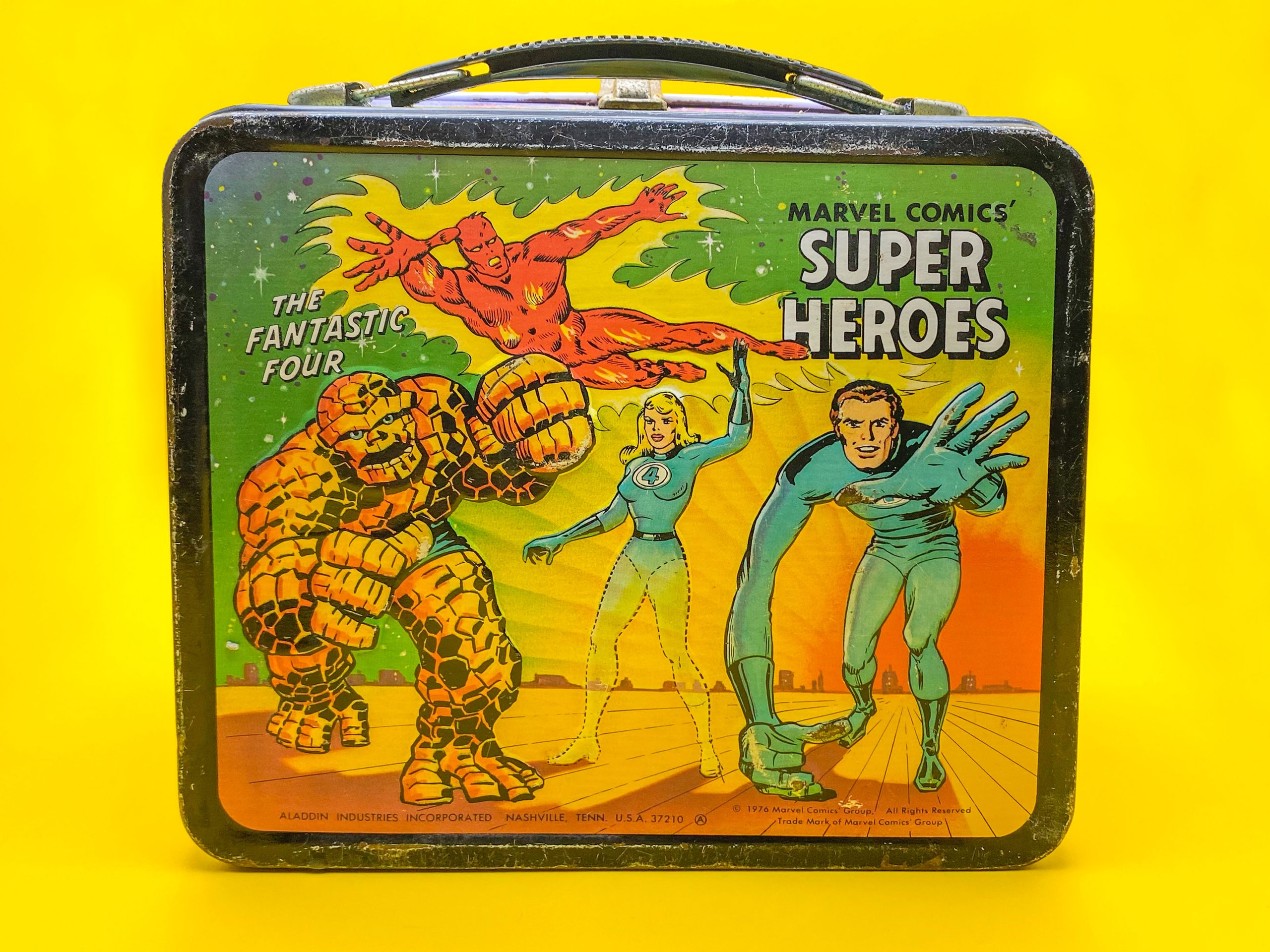
The city backdrop and horizon line really make this seem like an exciting, cohesive scene. To non-comics readers, reruns of the FF’s first animated series from 1967 were probably around in some markets, so their placement on the back makes perfect sense.
—
DC: What a random pairing; Batgirl, Flash and Green Arrow! But it’s great to see Batgirl front and center, again calling to that emphasis on the female characters. She seems to be quasi-based on her cover debut in Detective Comics #359 by Infantino and Anderson. Flash doesn’t look familiar to me, although he reminds me of Ross Andru and Mike Esposito’s short run on the character.
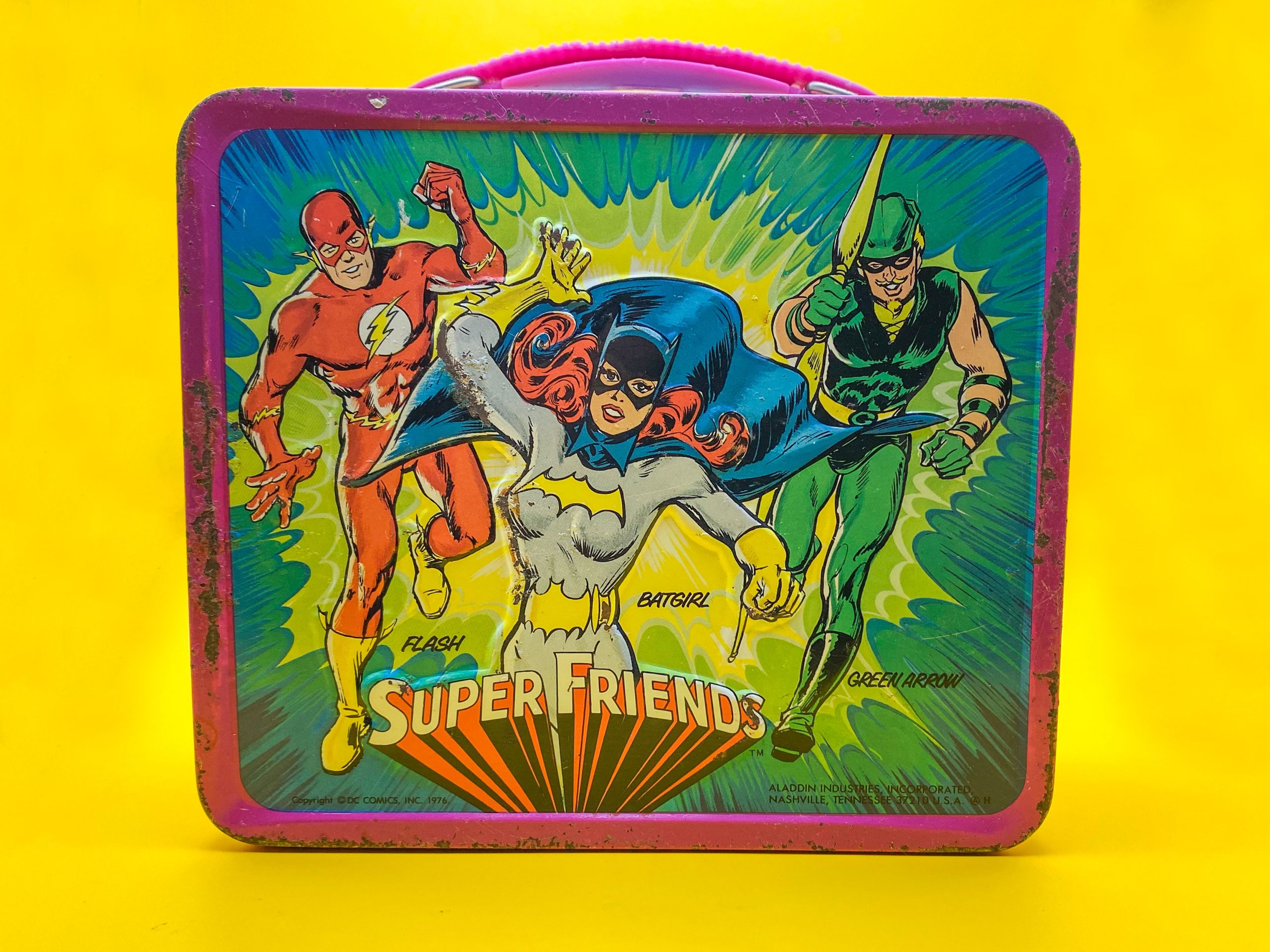
Green Arrow is borrowing his Hard Traveling pal’s pose, swiping the classic Gil Kane Green Lantern image we’ll see later on this very box. Flash and GA are obviously Justice Leaguers, but Babs was never a joiner. The men both appeared as a guest on the only season of Super Friends produced at this time (which reran for the years following), but Batgirl never made it onto the show. Of course, she could still be seen in reruns of the live-action Batman TV series, and the Filmation cartoon that followed.
Winner: Marvel. Family tops random gathering every time!
—
THE TOP
DC: Who is Kitten, you might ask? Good question! This is a bafflingly deep cut, as the character had only debuted in the comic book Super Friends #1, on sale Aug. 26 of that year. So, either this was probably her first appearance ANYWHERE, or this lunchbox was copyrighted 1976 but released for sale the following year. Either way, Kitten, the protégé of Wonder Woman’s longtime foe the Cheetah, only appeared in the first two issues of the comics series.
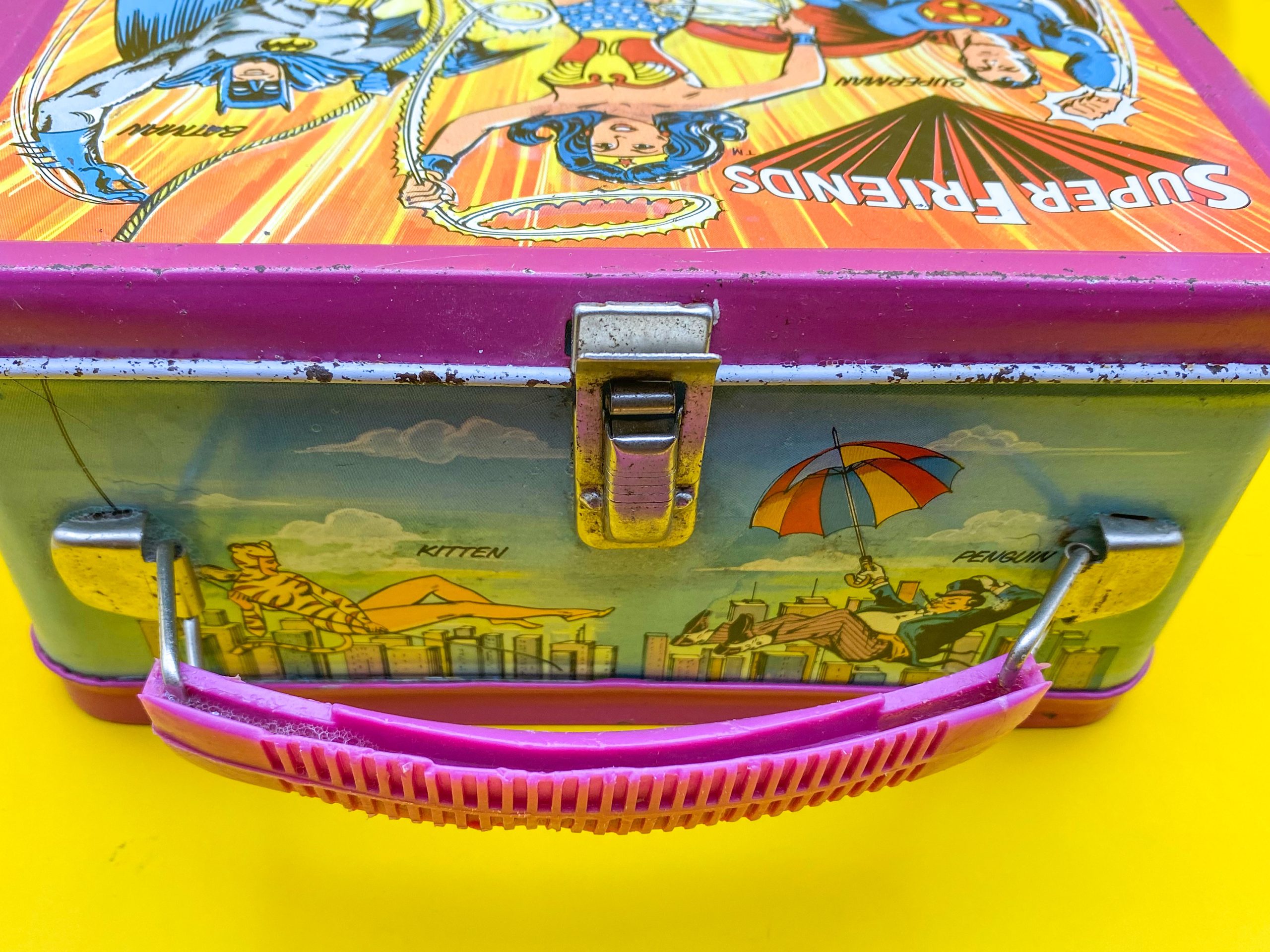
For years I assumed someone at Aladdin got Cheetah’s name wrong on the lunchbox, but no, they just dug deep into the well of DC characters here! At least we have the venerable and well-known Penguin, lifted from his classic Infantino/Anderson pinup pose to balance out this novice! And they both look nice floating and swinging above a city skyline.
—
Marvel: Any comics fan knows these three, even if their general audience cachet was still decades away. Hawkeye, Vision and Wasp were perennial Avengers, and these are some classic poses for them. Hawkeye’s is the same as his 7-Eleven Slurpee cup, for instance. The star field background continues, and Janet is a bit large to have her wings, but we must be able to see her, right?
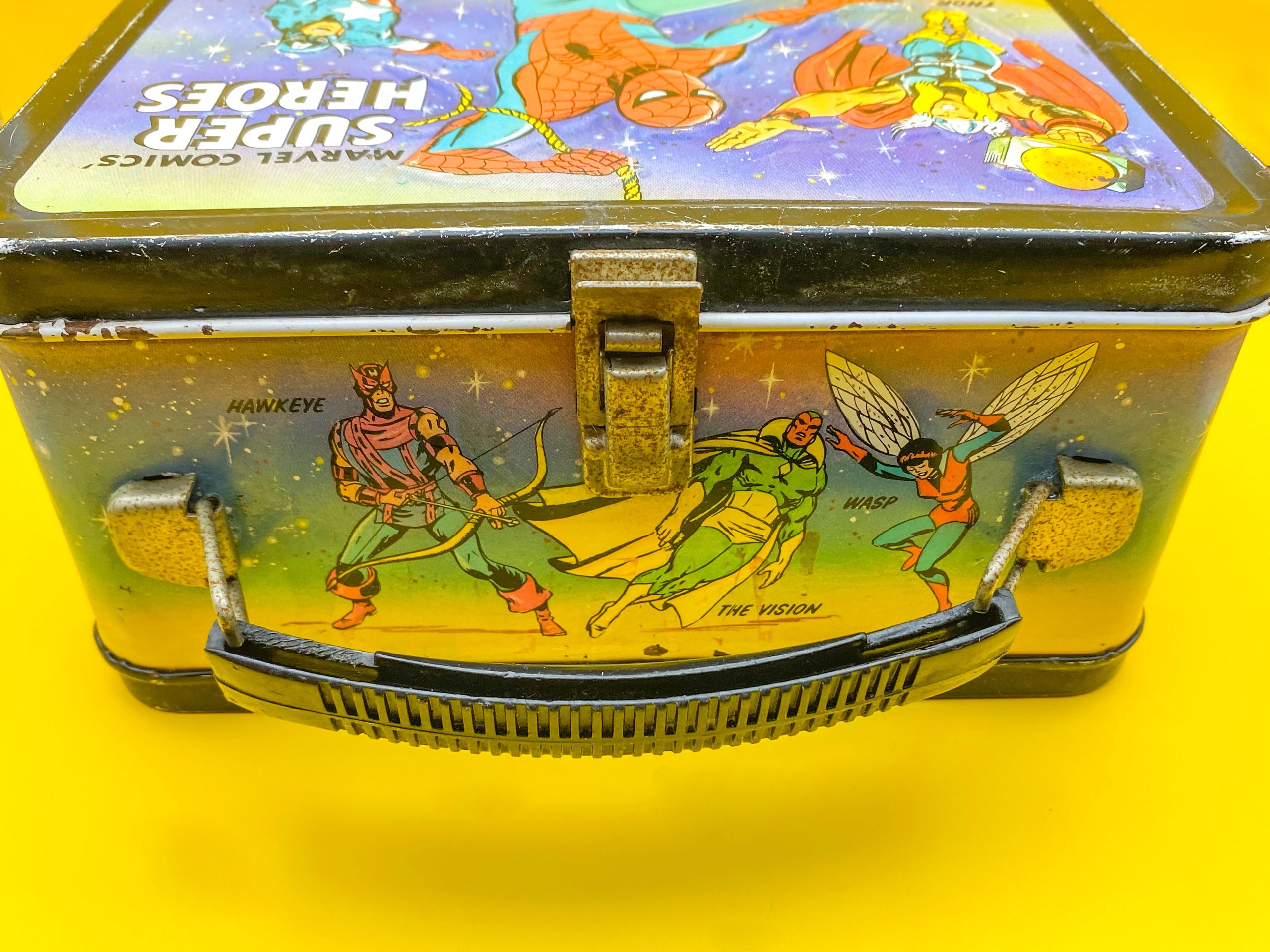
Winner: Marvel. Three core Avengers top a no-name villain, even with one of comics’ most famous rogues to support her.
—
THE BOTTOM
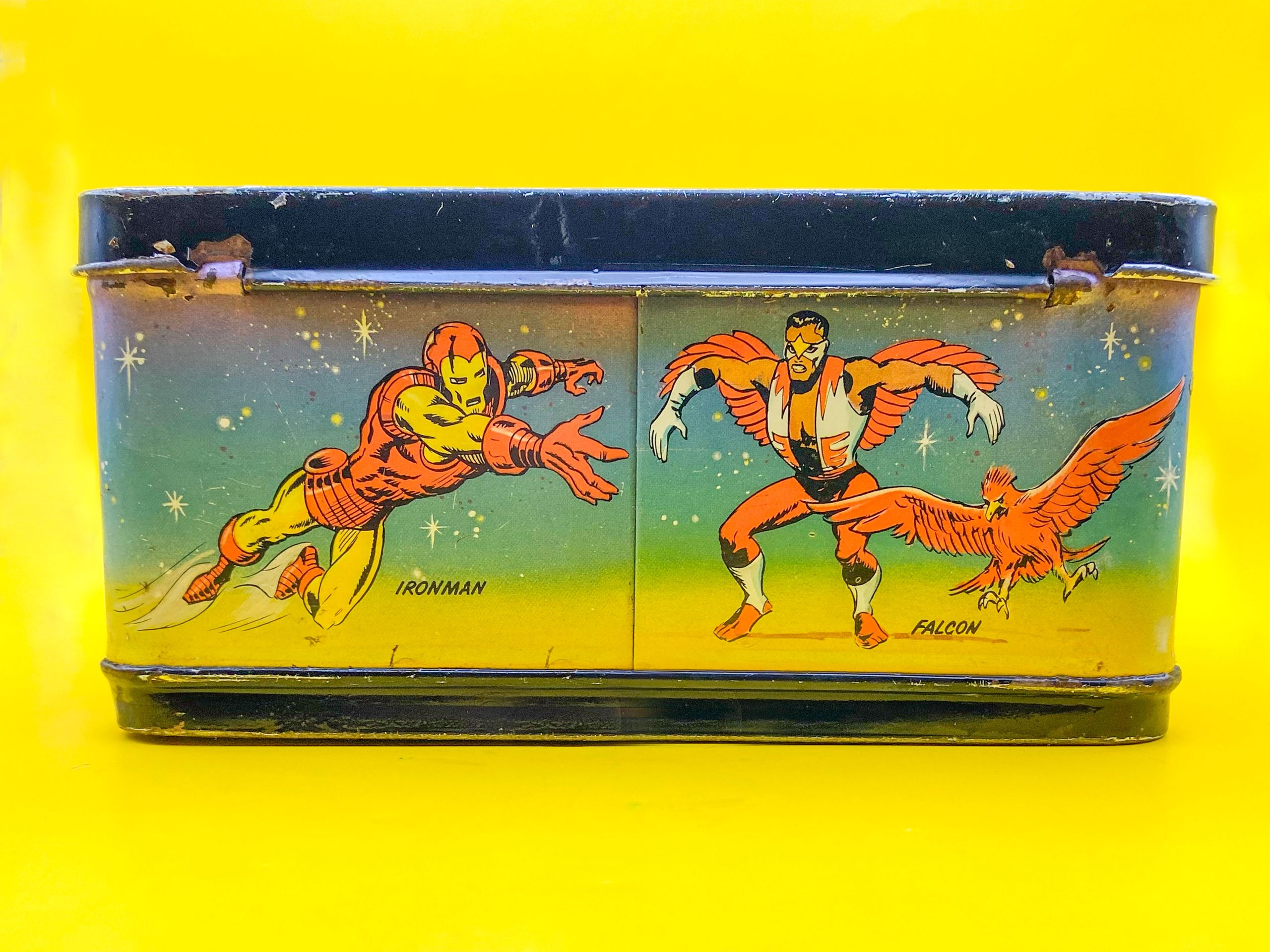
Marvel: In 1976, Iron Man was not the global phenom he is now. Sure, he’d been part of the ’60s Marvel Super Heroes cartoon, but even his comics title was often a light seller compared to other Marvel stars. Falcon was in the heyday of getting co-billing in Captain America’s comic, but he’d yet to be promoted to movie star, or the Captain himself. Still, they were Marvel heroes worthy of making it into Mego’s World’s Greatest Super-Heroes toy line (and they are two of the nicer figures in that range). Not sure about Sam’s “chicken dance” pose, but at least he has Redwing with him!
—
DC: That missing Super Friend anchors the bottom alongside two fellow Justice Leaguers, and all three were part of Filmation’s Superman/Aquaman Hour of Adventure. Aquaman is in his ubiquitous swimming “U” pose drawn by Murphy Anderson for cover corners, and used everywhere in the ’70s. Green Lantern is in the aforementioned Gil Kane pose his buddy Ollie swiped for the box’s back. Hawkman is surprisingly NOT flying and is wearing his short-lived ’70s bucket boots. But getting three heroes is a lot like the top of the Marvel box, so…
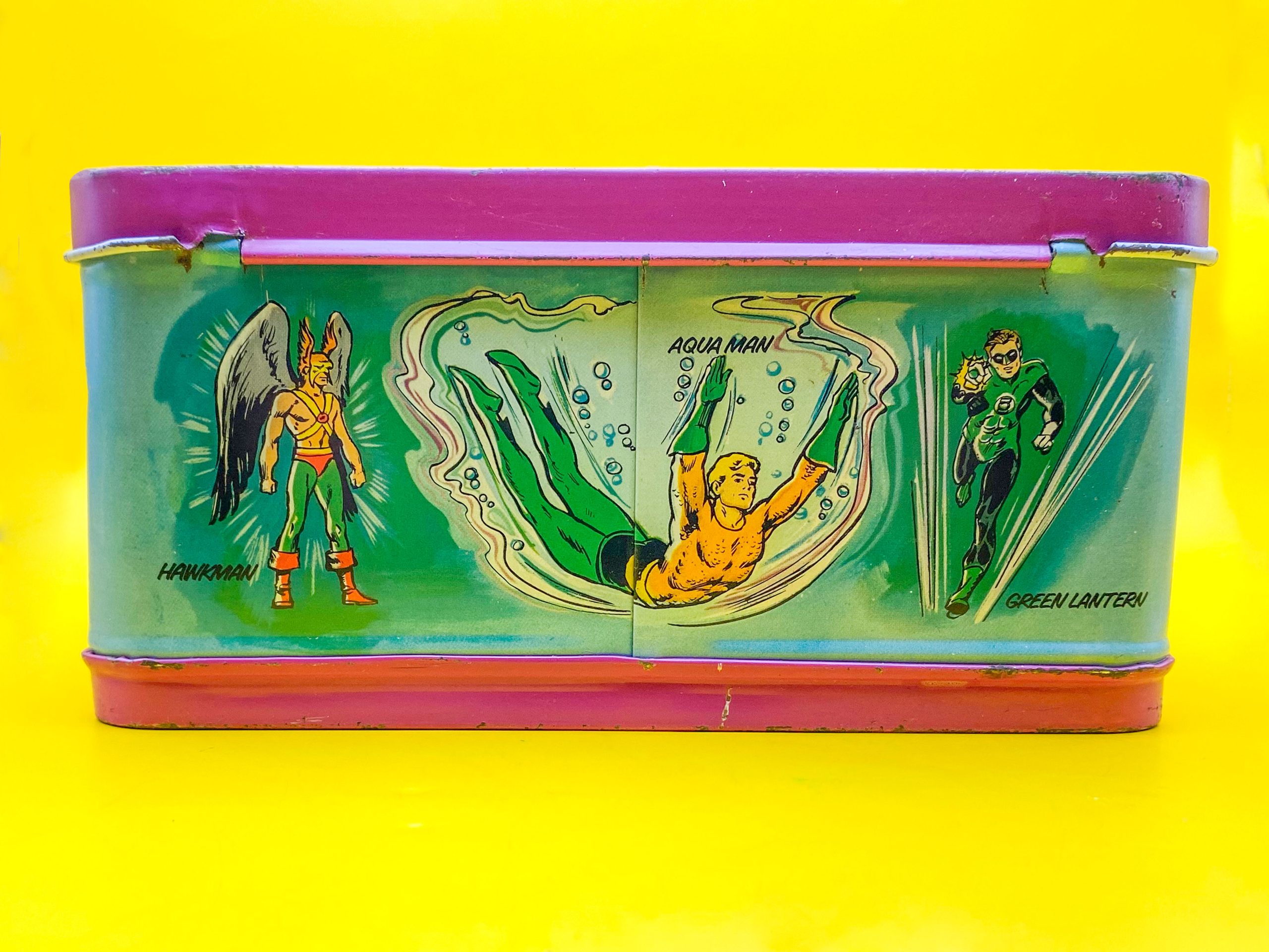
Winner: DC. Nothing against Tony and Sam, but overall, these DC guys were bigger draws in 1976, and this is a Super Friends lunchbox, so you got to give Arthur his due.
—
RIGHT SIDE
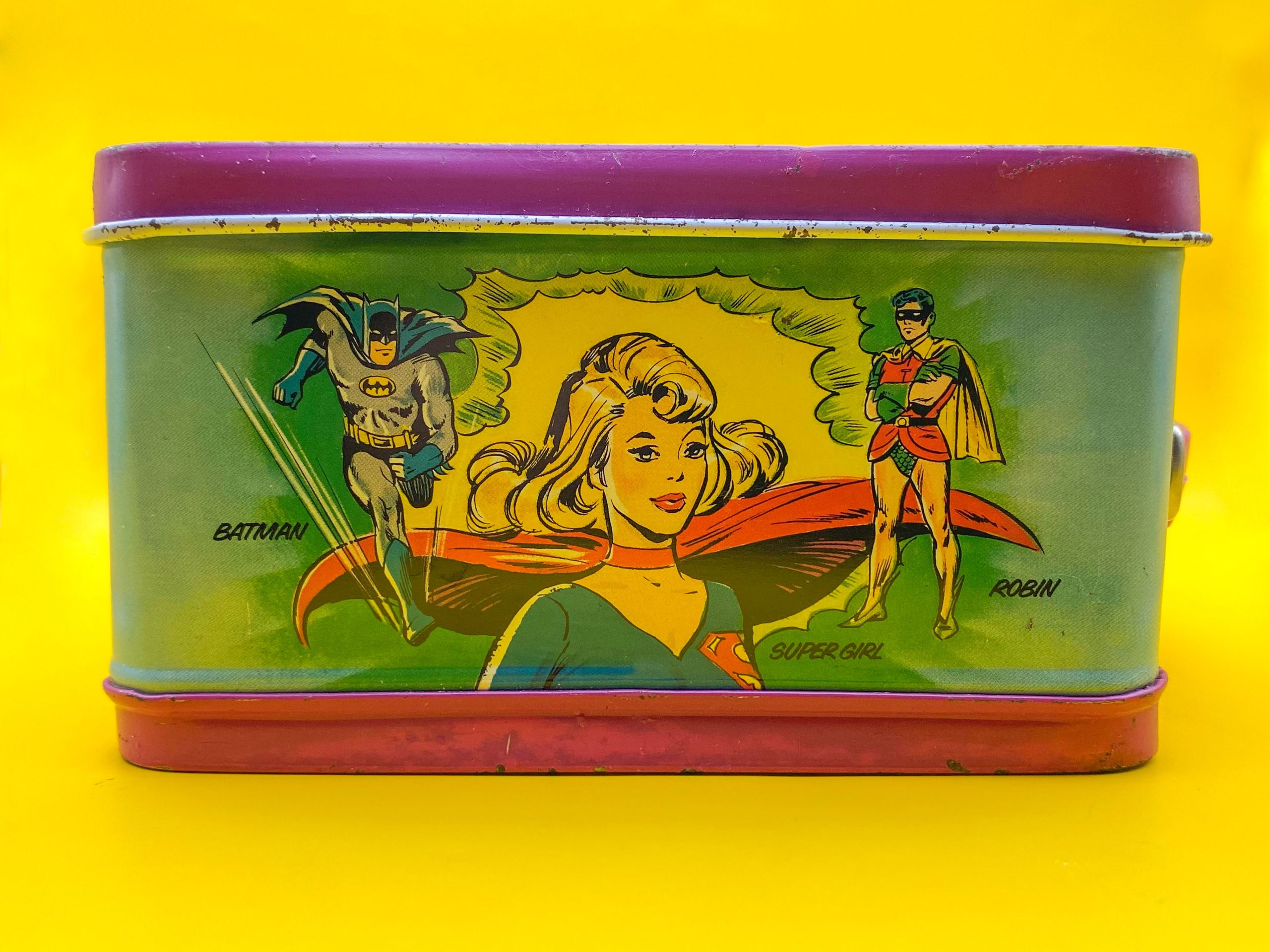
DC: If you ever doubted the continuing influence of Batmania, look no further. The Dynamic Duo appear on this lunchbox TWICE. Batman is in his classic Infantino/Giella running pose, while Robin is lifted from the iconic Infantino/Anderson pinup of the standing Caped Crusaders. Curiously, they flank a large bust of Supergirl! It’s great to see Kara here in her oft-repeated classic ’70s image (as seen on the Pepsi Super Series “moon” glass for instance), but it’s an odd choice. Wouldn’t it have made more sense to put Supergirl on the back with Flash and Green Arrow, and let Batgirl form the Terrific Trio here? Either way, it looks great. The art on Supergirl is particularly strong.
—
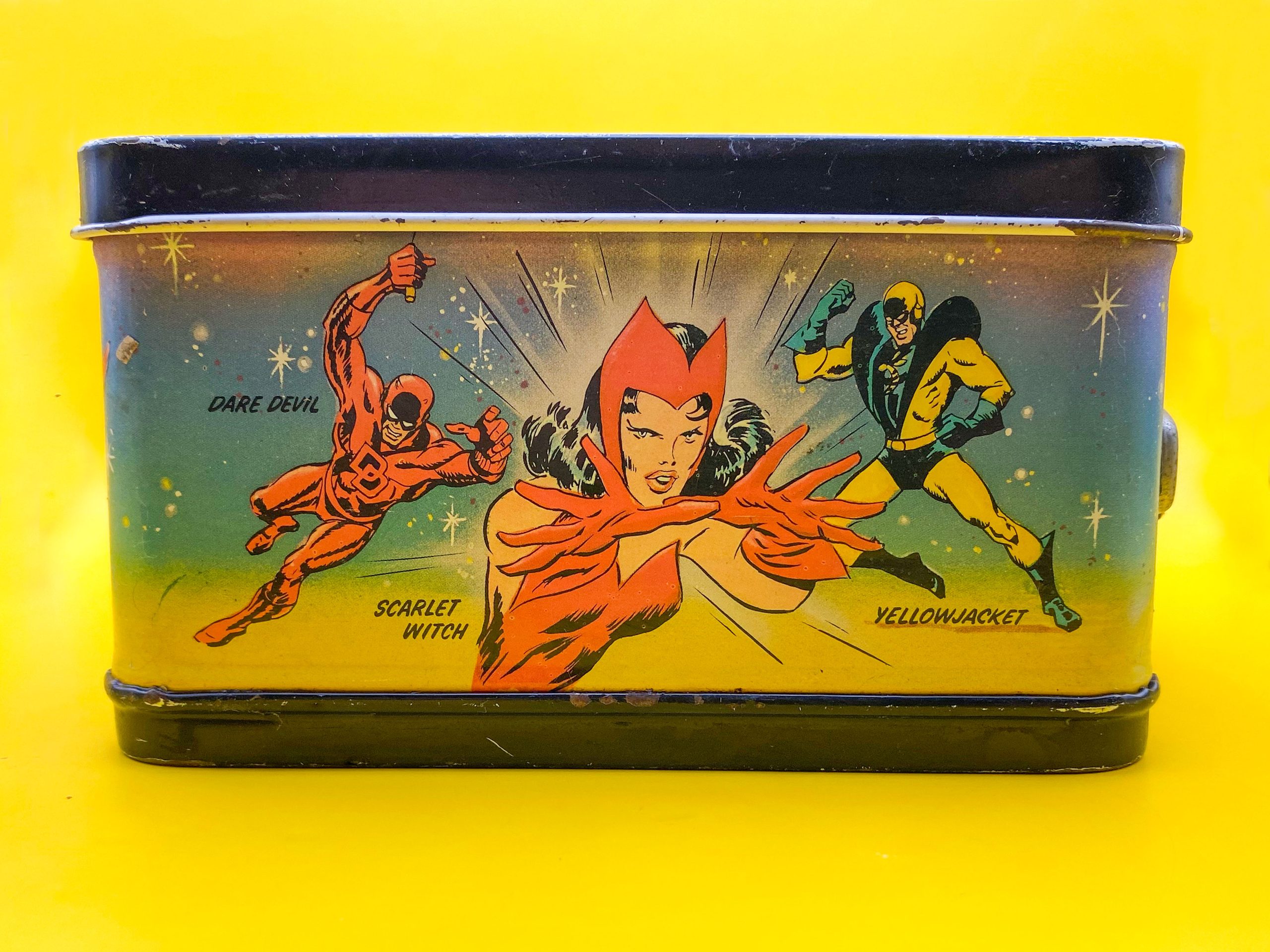
Marvel: Two Avengers and another non-joiner festoon the right side of the Marvel box. There’s a bit of symmetry with the DC box here, since the Scarlet Witch image was also used on a collector beverage vessel, namely Wanda’s 7-Eleven Slurpee cup. Daredevil hails from Gil Kane and Frank Giacoia’s cover to Marvel Two-In-One #3. Hank Pym was in Yellowjacket mode during this period, and his boastful pose comes from John Buscema and George Klein’s cover to Avengers #59. It’s a striking combo, but the art is a bit rougher than some of the other images on this lunchbox.
Winner: DC. The Super/Bat combo is odd, but it looks great. And this is 13th Dimension, so Bat-biases are to be expected!
—
LEFT SIDE
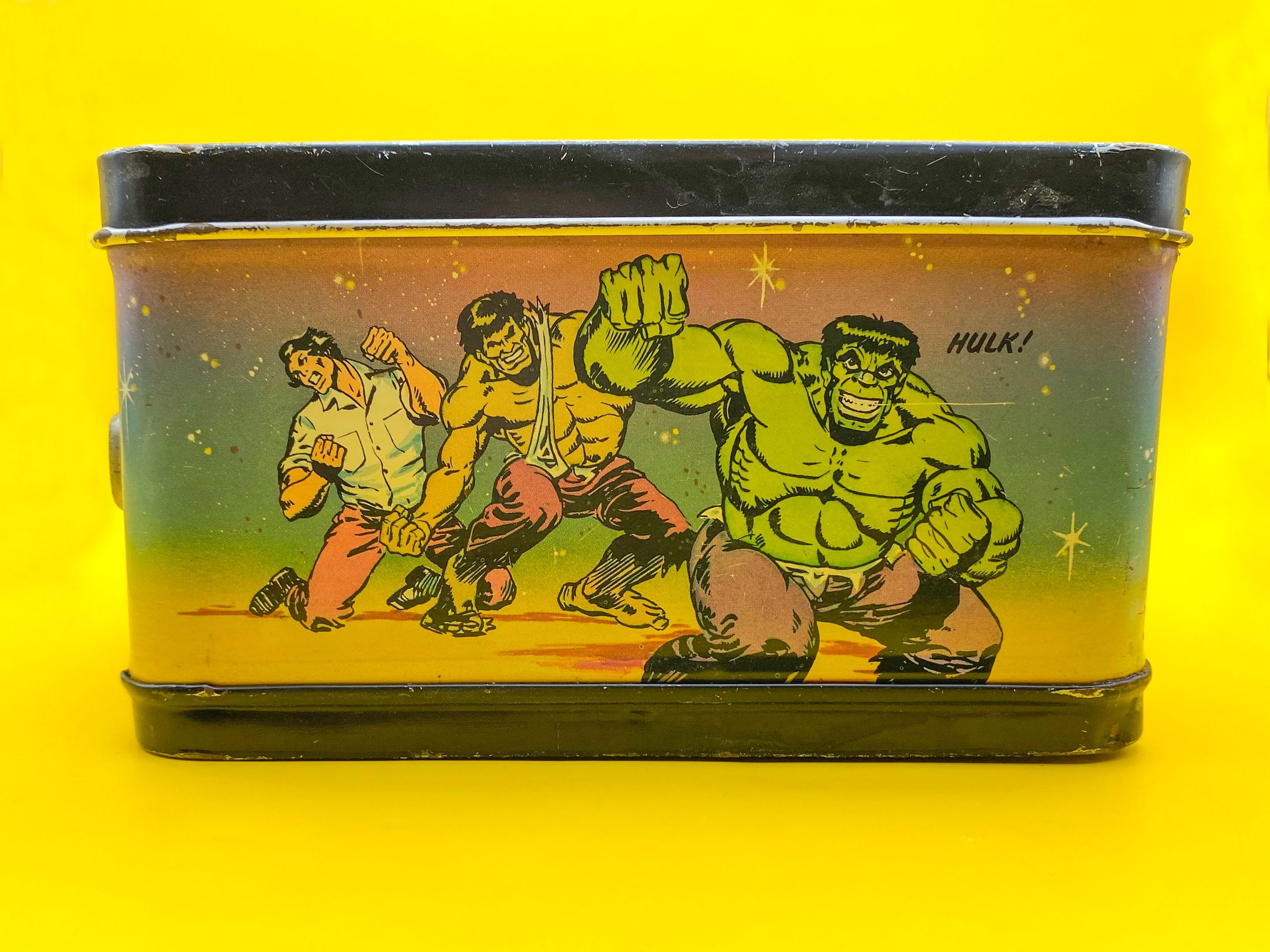
Marvel: Sing it with me: “Doc Bruce Banner, belted by gamma rays, turned into the Hulk…” A year before he’d become a bona fide TV star, the Jade Giant smashes the left side of this lunchbox. The powerful art is lifted from Jim Starlin’s cover from Marvel Super-Heroes #47, but the box artist changed Hulk’s grimace to a grin, which makes him look EVIL. This same image would be reinterpreted on Aladdin’s 1978 Incredible Hulk lunchbox, which also features a similar design format. Maybe we’ll examine that here someday!
—
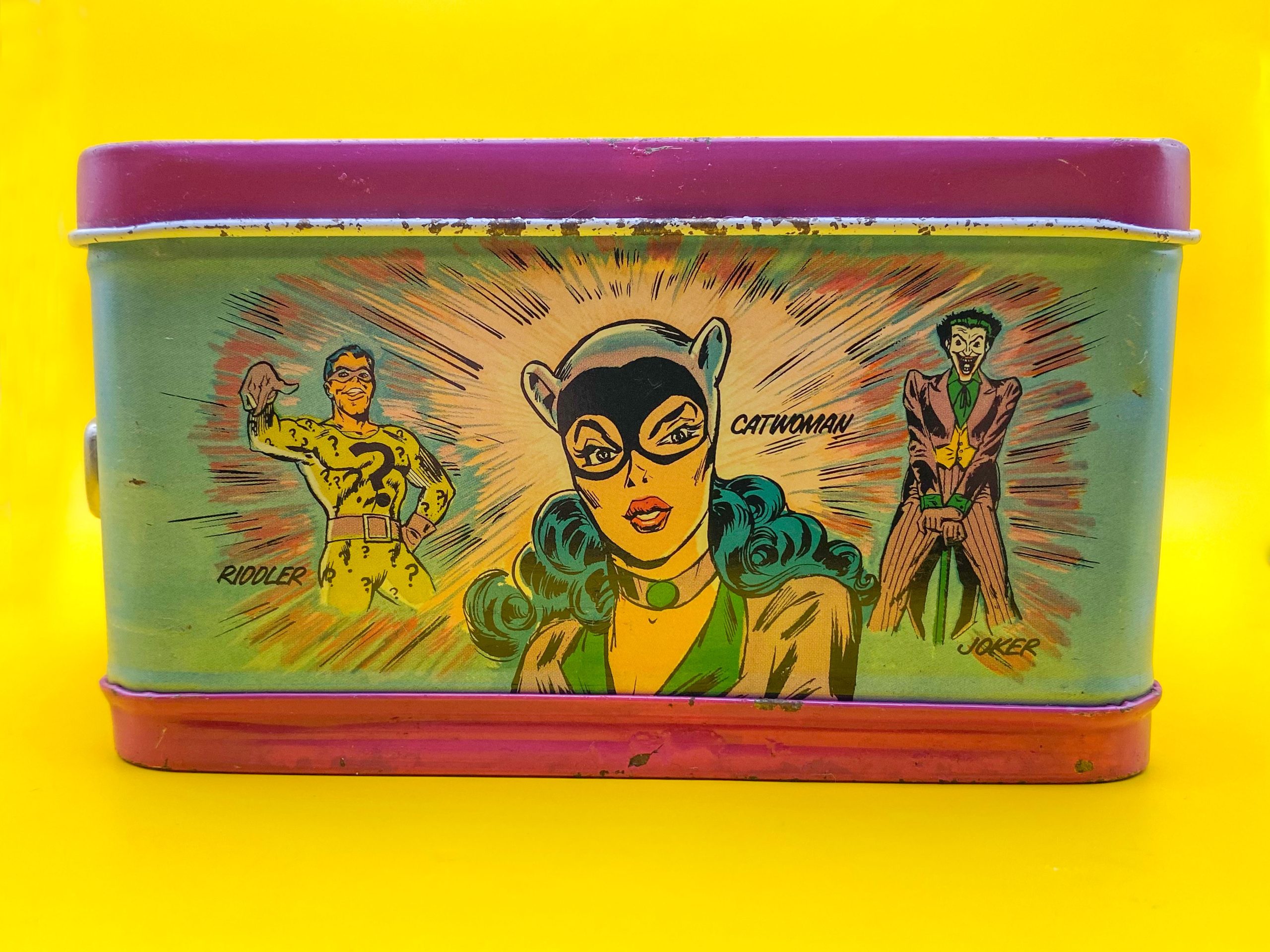
DC: Exhibit C in the proof that Batmania lived a decade later. C… for Catwoman! The Princess of Plunder continues the female domination of this box, but she brought two of her United Underworld cohorts along with her. Selina Kyle’s alter-ego appears to be redrawn from an interior page of The Joker #9 by Irv Novick and Tex Blaisdell. Speaking of the Clown Prince of Crime, both he and the Riddler are of course lifted from their legendary 1966 Infantino/Anderson pinups.
Winner: DC. This was a very close one. But I’m giving it to DC because we get six villains on this box, and they get to conquer the top and the side. Plus, again… the Bat-bias! But don’t worry, as I said, Hulk gets a whole lunchbox to himself two years later.
—
THERMOS
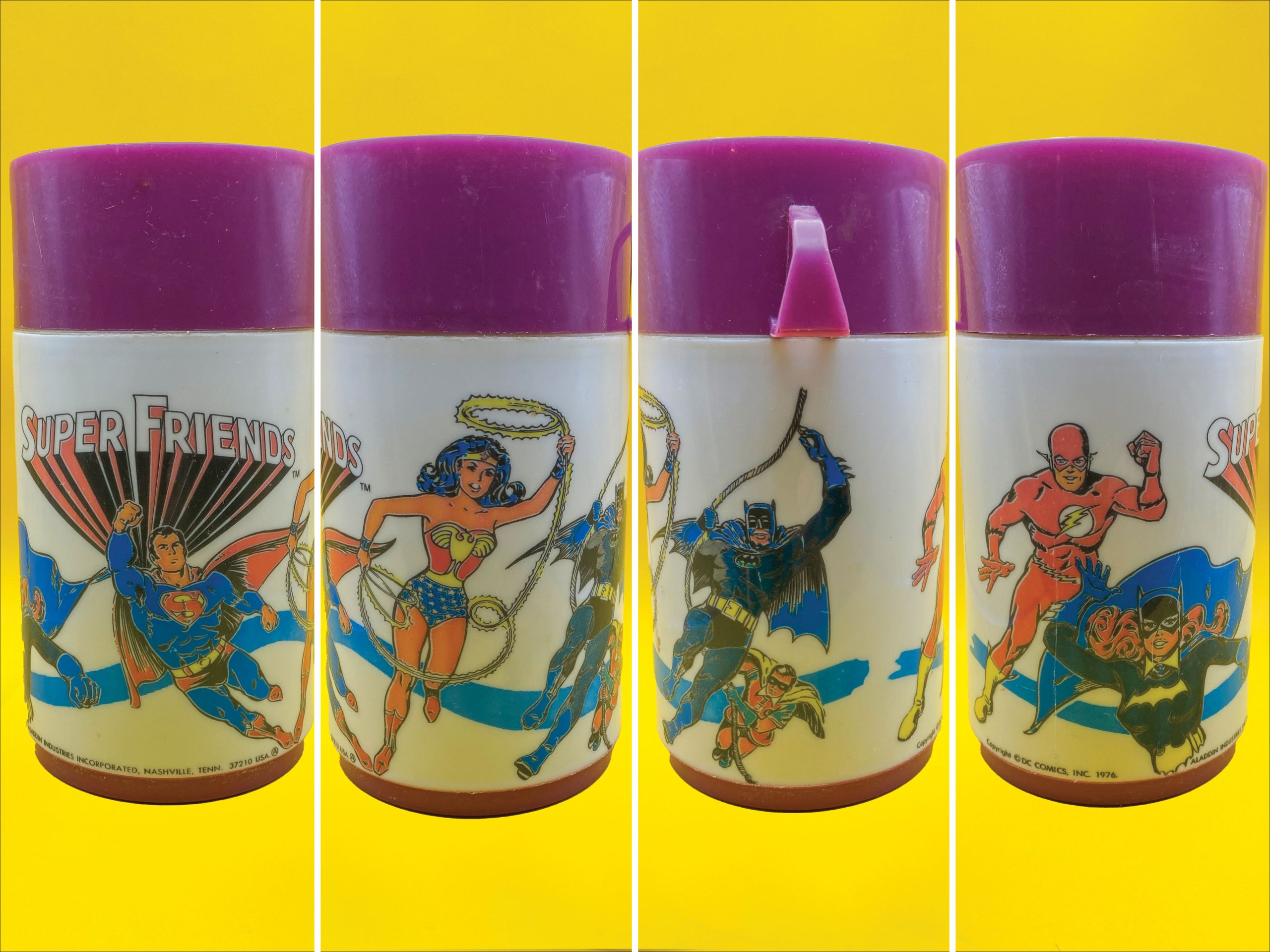
DC: Before we get started, I know technically Thermos is a brand name, and only containers made by Thermos should use that name (like Band-Aid, Q-Tips, etc.). Everyone calls the containers that lunchboxes come with a thermos whether Thermos or rival manufacturer Aladdin made them. This thermos repeats the figure work on the front lid and back, minus Green Arrow. There’s a blue swoosh behind them, and Batgirl has some odd coloring choices going on with blue gloves and a yellow collar. Batman’s colors seem to shift mid-costume as well.
—
Marvel: Whereas DC gave us 6 heroes and recycled artwork, Marvel does them one hero better and gives us mostly new images! Captain America is the odd man out, but everyone else gets a new image, and many are iconic. Vision is lifted from his John Buscema-drawn cover debut in Avengers #57. Iron Man is pulled from Issue #60 of his original title, drawn by Romita, and reused on Mego’s packaging as well. Ol’ Jade Jaws is pulled from the Incredible Hulk #171 cover by Herb Trimpe, which was also adapted as Power Records book-and-record set. One could argue some of these should have been used on the lunchbox itself!
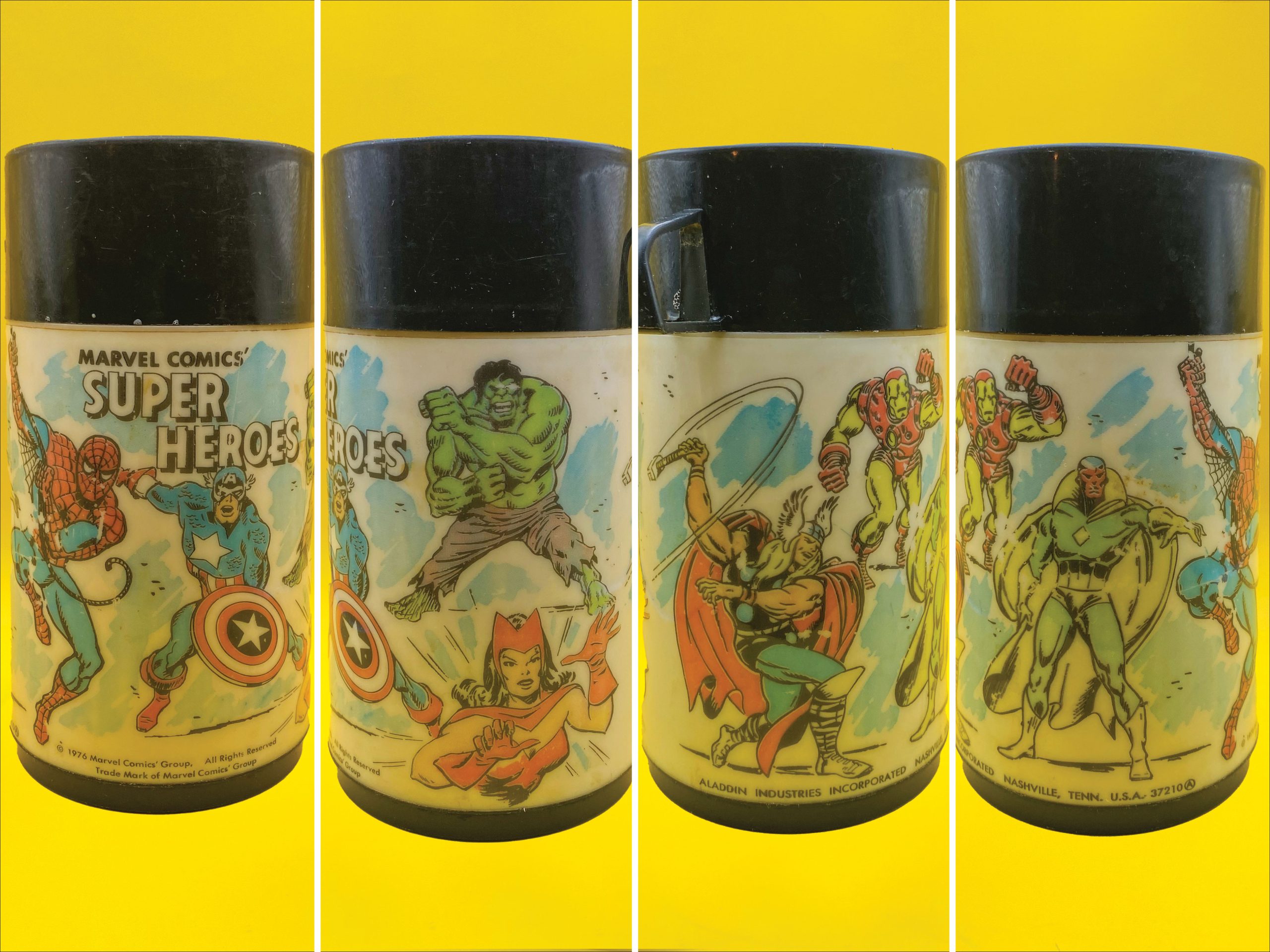
Winner: Marvel. The use of different artwork and another hero push this one over the recycled Super Friends thermos.
—
CHAMPION: DC, 4-3
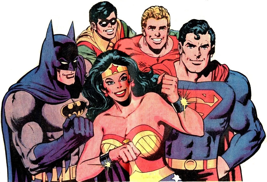
Clark Bar contest ad artwork by Dick Giordano
It was a close battle, but the Distinguished Competition beat the House of Ideas by 4 to 3. The overall aesthetic of the Super Friends lunchbox is just more pleasing, with the teal background on the sides, and the magenta trim really making it pop. The artwork is a bit more finely detailed and finished as well. But that’s not to say the Marvel box isn’t an all-time great. There are some powerful figures there, and it makes me wish Aladdin had made dedicated lunch boxes for Spider-Man, the Fantastic Four, and the Avengers.
Do you agree? Disagree? Which one did you have? Which one did you want? Be sure to let us know in the comments below!
—
MORE
— Dig These 13 Groovy VINTAGE LUNCH BOXES. Click here.
— BEYOND THE MOON (GLASSES): PEPSI’s Other Groovy DC Comics Drinkware — RANKED. Click here.
—
Regular 13th Dimension contributor CHRIS FRANKLIN is a graphic designer, illustrator, writer, and podcaster, who co-hosts and produces several shows on the Fire and Water Podcast Network, including Batman: Knightcast and JLUCast.

September 3, 2026
That Falcon illustration is definitely lifted from one of the Frank Robbins drawn issues of Cap. Even redrawn there’s no mistaking Robbins’ style.
September 4, 2026
Good call. I should have dug through my Robbins issues to verify, but someone was kind enough to do that below!
September 3, 2026
Poor guy. Spider-Man just completely YOINKED his meal.
I mean, he is doing his fair city of New York a favor, though. How’s a superhero supposed to run without any fuel in their engine? LOL
September 3, 2026
How delightful!
September 3, 2026
I understand your decisions but for me it was the Marvel box that I carried and the only one in my collection today. Funny story…I told my family that when I pass on, I want to be cremated and put into the Marvel lunchbox instead of some boring container and we all laughed. The following day we went to an antique store, and I found and purchased that exact lunchbox in a bit of excitement. Later that night, I began wondering if I just bought my own urn!
September 3, 2026
I remember being torn between a lunchbox featuring Jim and Artie from the Wild, Wild West or one adorned with images of NASA astronauts. As we were landing on the moon with surprisng regularity back then, I went with the space-themed metal box, which I carried to school until third grade. Although my NASA lunchbox primarily served to carry my afternoon meal, I also once used it to whack an annoying classmate, which then required me to ask mom for a replacement thermos as the blow had broken the glass liner inside mine. It shut that kid up, though, so it was worth it.
September 4, 2026
Ha, you proved the legend as to why manufacturers switched to plastic lunchboxes in the 80s! It was supposedly due at least partially to kids using them as schoolyard weapons.
September 3, 2026
Competition aside, these are all awesome and easily outdistance the ‘travel stickers’ lunch box I would (eventually) give up in favor of a plain brown paper bag.
September 3, 2026
Wait – Hawkman wore bucket boots at one time? I had no idea. Any thought on where and when he wore them?
September 4, 2026
Without looking it up, I’m thinking the Detective backups he had mid-70s.
September 3, 2026
A couple of things:
1. The Captain America image is by George Tuska, not John Buscema. The wings on the mask and the shape of the mouth are dead giveaways.
2. The Falcon’s “chicken dance” pose is a (badly) redrawn swipe of Frank Robbins’ illustration in Captain America #186. It’s an odd choice for the lunchbox (Falc was under the hypnotic control of the Red Skull at the time), and one I’m surprised they made for this lunchbox.
A good article overall, but I have to give the win to Marvel for this one.
September 4, 2026
Hey John, thanks for reading and I don’t begrudge your Marvel choice.
1. That does look like a Tuska face, but the pose is the same as Avengers #58, just with the shield swapped to the other arm so you can see the front of it. Maybe the artist did a combo of Cap images. https://marvel.fandom.com/wiki/Avengers_Vol_1_58?file=Avengers_Vol_1_58.jpg
2. Thanks for the Falcon info! As I said above I should have thought of Robbins. I think I have all of his Cap run too.
September 3, 2026
Call me a spoiled brat, but I had both lunchboxes.
Chris, I always enjoy your articles, and I’ve read your claim that you think the Super Friends lunch box was for girls before. I’m still not sure I buy that. No one was more “Girls have cooties” than me but my Super Friends lunchbox was my favorite.
I might have to pick a bone with you for choosing the Fantastic Four panel over the Batgirl panel. Dude, Batgirl is my crush, so I think she rules all. Well, Green Arrow is on it too, and he ruins all, so….ok. I’ll take your choice. Batgirl and Flash are cool, though.
I almost got in a fight over the Fantastic Four side of the Marvel lunchbox. One of my classmates wanted to know who the flaming guy was and where was Herbie the Robot. I told him the Human Torch was in the Fantastic Four in the comics and Herbie was only on the cartoon. “No,” he screamed, “Herbie is in the Fantastic Four.” He wasn’t having any of the Human Torch. I mean he had a, pardon the pun, meltdown about the Human Torch being on the lunch box.
September 4, 2026
Gotta love the passion of comic fans. Even pre-internet this guy lost it over HERBIE!
I think it’s a “stealth” girls lunchbox. It was meant to appeal to both genders, but the dominance of the female characters was unusual for the time, on something that wasn’t specifically aimed at girls. The Wonder Woman sleeping bag with other heroines (and Catwoman) for the same era, for instance.
September 4, 2026
“Even pre-internet….” sorry I’ve gotta correct you there. The framework of the internet started in 1969. Again, sorry. But it’s like nails on a chalkboard to me.
I refused to watch that cartoon exactly for the inclusion of Herbie. I understand now the rights were tied up with another network/project. (At least that is how I remember it. I think TwoMorrows wrote on this recently.)
That all said, I can’t rank the Super Friends at the top. Not with the non-show renderings. If you want to market the show, then use the show’s characters. Also the coloring on Batgirl flips to blue to yellow. Lazy. If I couldn’t find/have the BATMAN one I’d have to go with Marvel as my number two. After all that, I’m gonna get stuck with whatever generic was left over on the shelf at the Ben Franklin 5 and dime store.
Enjoy your writing, Chris. Keep ‘em coming.
September 4, 2026
OK
September 4, 2026
The transformed Hulk’s face resembles Steve Ditko’s version from Hulk’s first run.
September 5, 2026
I wonder if anyone has ever done custom-made lunchboxes inspired by TV superhero shows that didn’t inspire lunchboxes. The 60s Spider-Man or Challenge of the Super Friends, for example.