
It’s a full moon — but they don’t all have to be Moon Glasses!
By CHRIS FRANKLIN
Much has been written about the famed 1976 Pepsi Super Series of collector glasses based on DC Comics characters, or as they are commonly known among fans, the “Moon Series.”
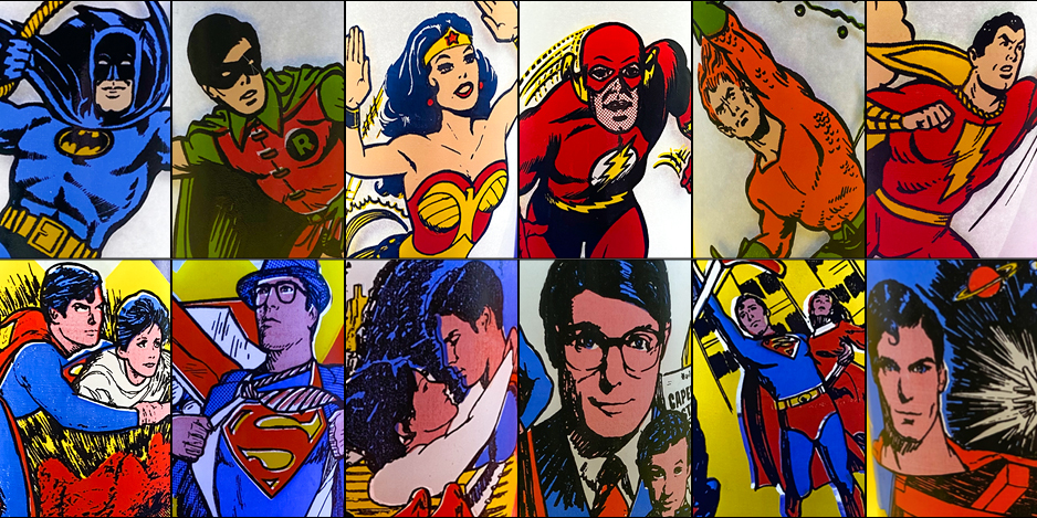
This name stuck because of the circular design, or “moon” behind every character. But that was just the tip of the ice cube when it came to Pepsi and DC promotional glasses in the 1970s. In 1978, Pepsi released not only a second set of comics-based Collector Series glasses, but they also made a similar set of vessels based on Superman The Movie.
As we did with the original series, let’s take a look at each of these sets and rank them, based on the criteria of artwork, presentation and which ones just visually ring from the cupboard, shall we?
—
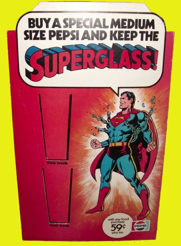
At first glance, the 1978 Pepsi Collector Series looks like a direct continuation of the previous “Super Series.” But a lot has changed on closer inspection. For one there are only seven distinct character glasses rather than 14, although there are variations we’ll discuss.
The number of different inks used on each glass is generally more limited than the first series as well. There are no villains present this time, and the heroes tend to stretch across the glass more. The biggest change is that the heroic action image isn’t replicated on both sides of the glass. Now on the back you have the character’s name logo, and their emblems.
There is also a second set of slightly smaller glasses with a different shape, rounded at the bottom. These variations seem to be much rarer and harder to find on the secondary market today. I rarely see them in the wild or on sites like eBay.
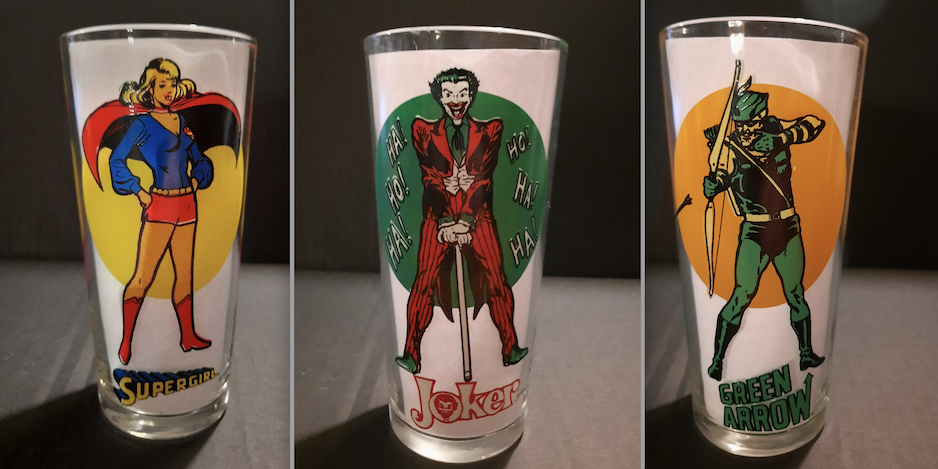
Moon glasses
Like the previous series, the glasses were seemingly sold at various restaurant chains that carried Pepsi fountain drinks. I know for sure they were available at some Pizza Hut locations, because my cousin bought me a set of the small round Superman and Batman glasses back in 1978 when I wasn’t quite yet 4 years old.
My Mom took the “Collector Series” name seriously and put them in her China cabinet for safe keeping. I never drank from them, which is probably a good thing, considering the amount of lead used in glasses at the time! Thus began my superhero memorabilia collection in earnest!
—
7. Aquaman. Poor Aquaman. The Sea King is often bringing up the rear among his Super Friends, or sometimes omitted, even in this era. Although I put this one at the bottom of the list, it’s still a nice glass.
The action shot is taken from Jim Aparo’s cover for Adventure Comics #451 (June 1977), with the face heavily redrawn, since Arthur was in a lot of pain there, due to a blast from Starro. Even the fish (sharks, really) reappear from the cover.
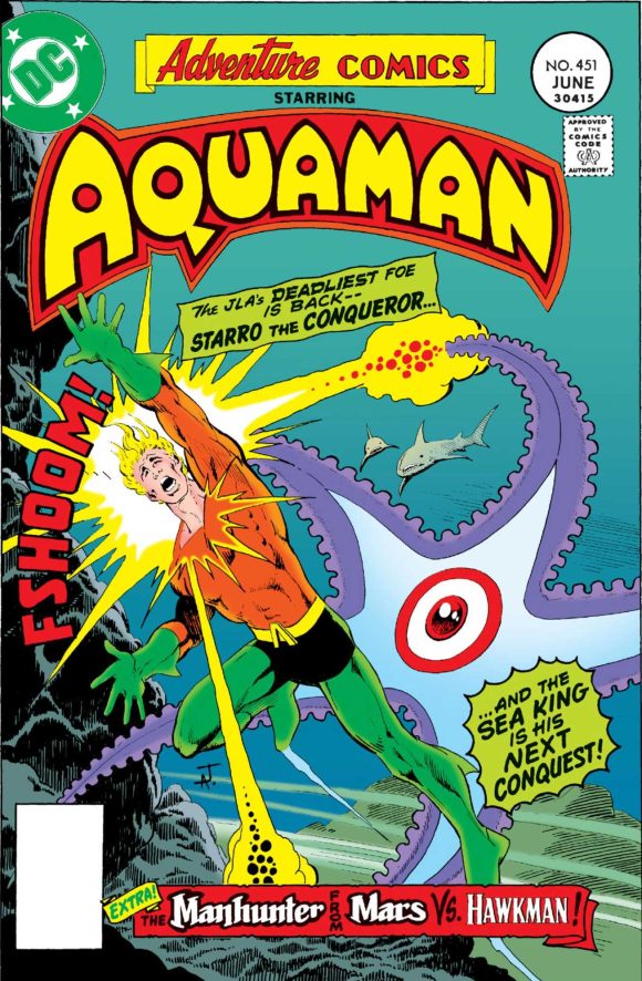
What sets this one back is the limited color. The lack of yellow gives Aquaman orange/red hair, and his distinctive yellow locks are one of the hallmarks of this maskless hero. The back gives us that classic Silver Age logo, and an interesting take on his “A” symbol seen on his belt buckle, with orange up top and black below. Almost as if you’re getting a close-up vignette of his belly and trunks!
—
6. Robin. Robin has stumped the band for now. I dug through every Bronze Age comic featuring Robin I could find, either online or in my collection, and I couldn’t source this image of the Teen Wonder holding a Batarang. If you recognize the source, please let Dan and me know in the comments!
This is a nice image of the college-age Dick Grayson, even if it is a bit bland compared to some of the others. The lack of yellow hurts it a bit, but you can just assume Robin is wearing his green cape from the cover of Batman #1 (1940).
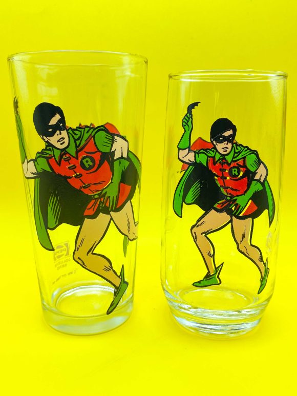
The back has the distinctive Robin logo that hailed from his long-running solo series in Star Spangled Comics in the 1940s and early ’50s, minus the “Boy” or “Teen Wonder” designations. The simple “R” symbol rests below.
—
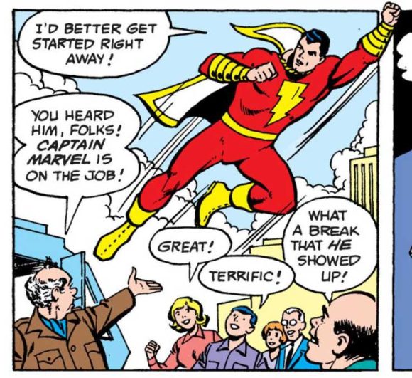
5. Shazam! The original Captain Marvel flies through Caucasian-flesh-color clouds in this image that I believe was redrawn from an interior panel from Shazam! #29 (June 1977) by Kurt Scaffenberger and Vince Colletta, with the artist sourcing a different Schaffenberger head.
The lack of white in his cape doesn’t bother me so much, because it reminds me of Mego’s 8” action figure from their World’s Greatest Super-Heroes line. The back has the logo from the masthead of DC’s Shazam! series, and the lightning bolt from the chest of the World’s Mightiest Mortal.
—
4. Batman. The Caped Crusader is depicted in the ubiquitous swinging pose by Carmine Infantino and Murphy Anderson, taken from the 1966 pinup set but used on every piece of merchandise imaginable for a decade and a half.
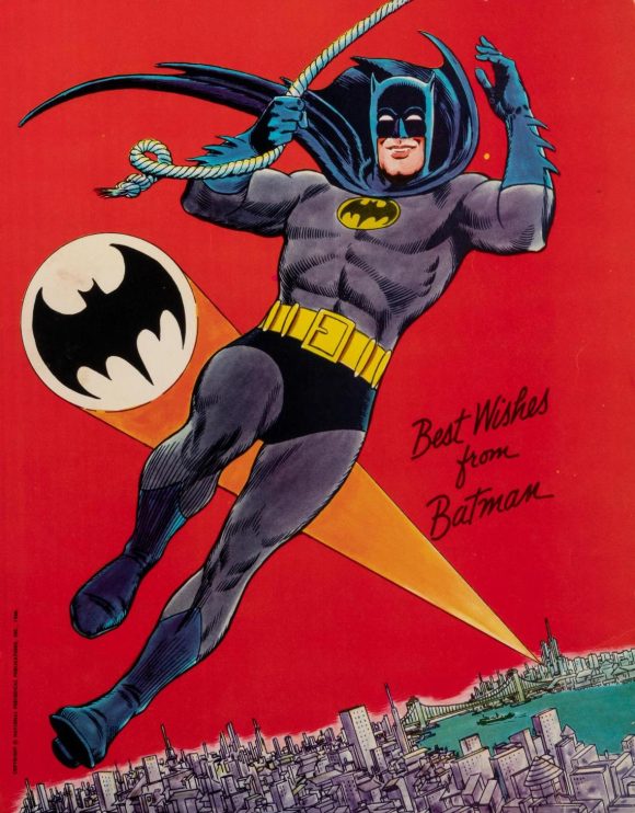
But Batman is feeling a little blue here, with the limited colors leaving him devoid of the gray of his bodysuit. It’s a wonderful image but makes for a somewhat dull presentation due to all of that blue. If Pepsi could have screened the bodysuit color back to a percentage of the blue, it would have popped more.
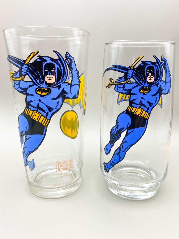
The back depicts one of the two most common ’70s/’80s Batman logos, and the rounded Batsignal, instead of the oval Bat-emblem. The use of the actual Infantino/Anderson art puts this one above some of the others, despite the monotone look.
—
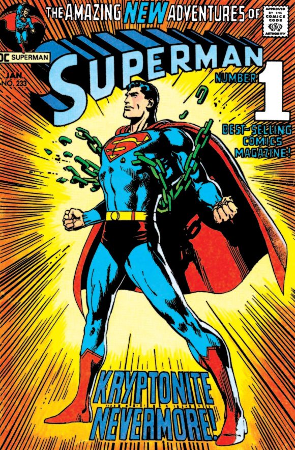
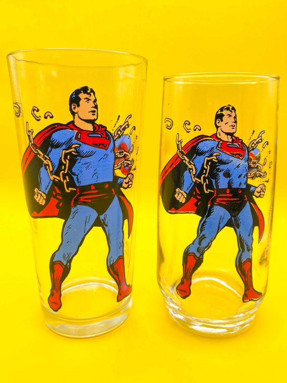
3. Superman. Based on Neal Adams’ iconic cover to Superman #233 (Jan. 1971), this redrawn and reversed image shows Superman bursting chains, but they aren’t colored green to indicate “Kryptonite Nevermore” like the cover.
The Man of Steel is depicted in shades of red, blue and Caucasian flesh, so no yellow for his belt or chest emblem on either side. My guess is the image was redrawn so Superman was facing to the right, and his pesky “S” symbol would require redrawing anyway.
You can see on my original, childhood-owned smaller glass that the printing of the black is much thicker, showcasing how the print quality of these glasses often varies from example to example.
—
2. Wonder Woman. The Amazing Amazon’s flying (or gliding on air currents) pose has a very convoluted history, it seems. I remembered that specific pose from somewhere, but I couldn’t quite place it.
Having put my deerstalker detective cap on, it seems to be partially based on Wonder Woman’s appearance in the July Justice League of America-themed page in the famous Super DC 1976 Calendar, illustrated by Neal Adams and Dick Giordano. The exact image from the glass seems to be lifted from a stamp included in the Wonder Woman Super Hero Stamps envelope issued by Celebrity Stamps in 1976, and also featured on the cover of the album they produced for those stamps.
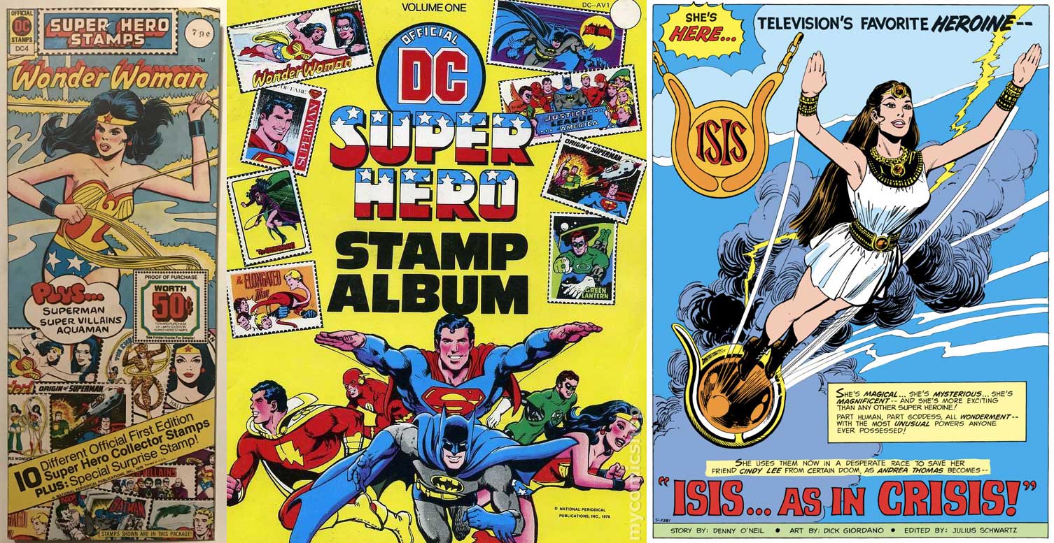
But it’s also VERY similar to the introductory splash-page pose of Filmation’s live-action heroine Isis, when she debuted in Shazam! #25 (Oct. 1976) illustrated by Giordano. This image was also more or less reused in a comic ad promoting CBS’ Saturday Morning line-up in 1977.
The image is powerful and dynamic, with Diana seemingly flying off the glass. The only demerits are for the lack of white and using a very dark blue to cover both the color of her trunks and the image outlines. The back has the ’70s Wonder Woman logo from the masthead of her comics series, as well as the long-lost eagle that once adorned her bodice, now replaced forever by the double W symbol.
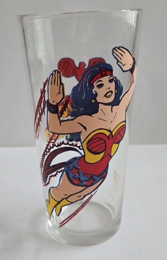
There is a rare error version of this glass that was issued, with Diana’s red and yellows reversed. It’s quite uncommon, and I have yet to snag one for my collection.
—
1. Flash. I recently included this glass in a gallery article covering Flash memorabilia in celebration of the 70th anniversary of Barry Allen’s debut in Showcase #4.
At the time, I thought the image came from an interior panel perhaps illustrated by Irv Novick. Nope, it’s redrawn from the Flash edition of the Super Hero Stamps envelope originally illustrated by none other than Neal Adams and Dick Giordano! Someone definitely softened up the lines a bit, but the pose is the same.
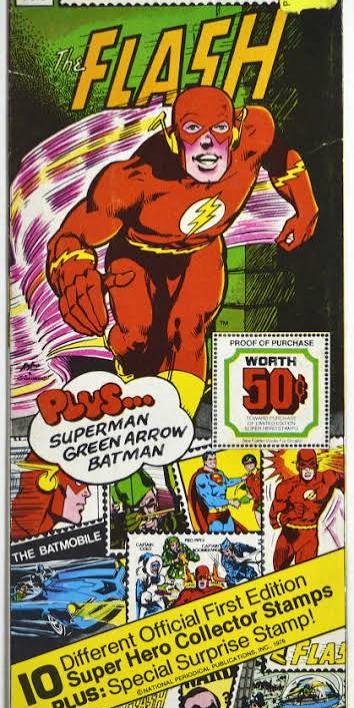
This is my favorite glass of the set because, for some reason, Flash gets all his colors here. Pepsi screened the red back for Barry’s skin and gave us the white of the circle on his chest insignia. The result is a perfect representation of the character, and an image that just says “speed.”
The back has the aforementioned chest emblem, and a logo that is not from the masthead of the long-running Flash title, but a similar one used on story interiors, and very reminiscent of one also used in the Golden Age.
—
That’s all seven but it wouldn’t be a 13th Dimension article if there weren’t 13 to rank — so click here for Pepsi’s six Superman: The Movie glasses!
—
MORE
— The TOP 13 DC Comics Pepsi MOON GLASSES — RANKED. Click here.
–– PEPSI’s Beloved SUPERMAN: THE MOVIE Glasses — RANKED. Click here.

August 28, 2026
I seem to have a fuzzy memory of that image of Robin being very similar to the pose he struck in an old ad for the Mego figures….hmmm….
August 28, 2026
I get more of a Filmation vibe from that Robin pose
August 29, 2026
Yes!
August 28, 2026
I always thought that the Robin image came from the 1968 Filmation cartoon, you know the scene where Robin throws a batarang as the narrator says, “….and Robin, the Boy Wonder!”
August 29, 2026
Hmmm…Charles and Russell I think you’re close. There may have been some inspiration there at the very least. Robin’s legs are crossed the whole time, and he’s more crouched down in that intro (and the animation that’s reused over and over). Maybe whoever drew this just based it on that?