Hey, it’s a full moon — so Chris Franklin rates the 1976 “moon glasses”!
—
UPDATED 10/6/25: Hey, it’s a full moon! The Hunter’s Moon! Perfect time to reprint this groovy piece from October 2022. Far out! — Dan
—
By CHRIS FRANKLIN
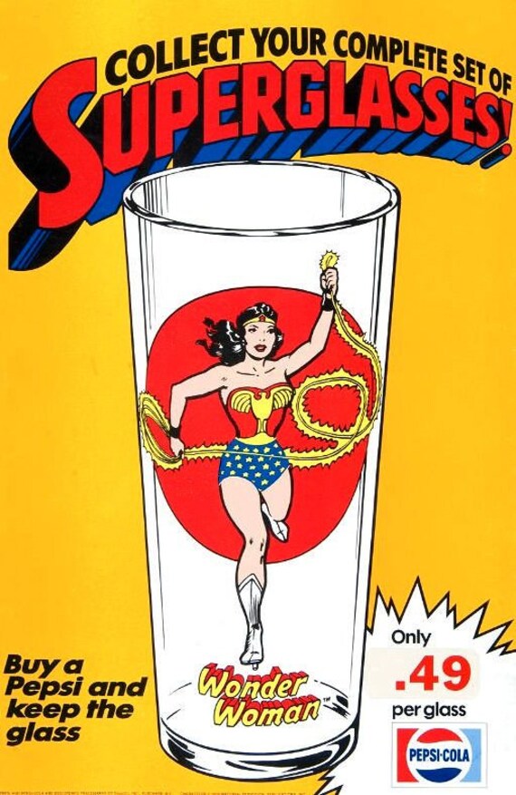
Coke or Pepsi? The eternal question that fuels the cola wars that still rage today. Its pretty obvious Coke won the war that Pepsi keeps on fighting, but DC Comics picked the “Choice of a New Generation” in 1976 when they partnered with Pepsi for a run of collector glasses. Offered at various restaurants affiliated with the soft drink company, they were officially called the “Pepsi Collector Series,” but this initial set of glasses is known in fan circles as the “moon glass” series, due to the circular shape behind every character. The same image is repeated twice on each glass. The advent of the full moon is a perfect time to talk about these wonderful artifacts of pop art!
There were 14 glasses in the set, so we’re going to break Dan’s format a bit here and throw a “runner-up” in the mix. The ranking is of course subjective, as these glasses are gorgeous, using iconic images by some of comics’ greatest artists. Ranking is based on presentation and how well the limited printing process used on the glasses suits the characters, etc.
So, pour yourself a soda, and drink up! Cheers!
—
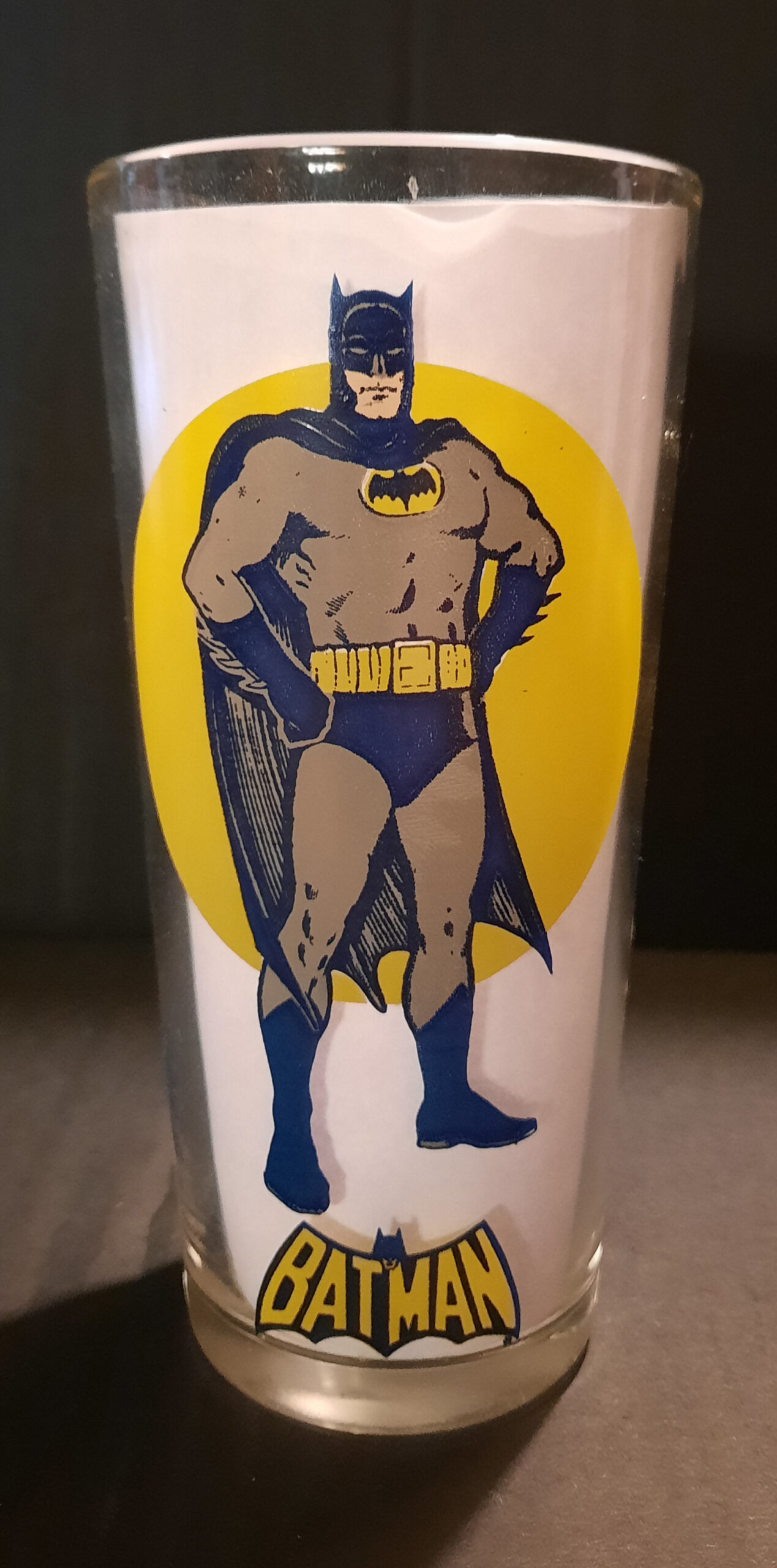
Runner-Up. Batman. What? Have I lost my mind? Am I trying to tick off Dan and lose my occasional writing gig? No, it’s just Batman’s glass looks kind of muddy! There’s no denying the Carmine Infantino and Murphy Anderson image of the Caped Crusader is iconic. It was slapped on about every product you can think of from posters to slippers. But the lack of any black outlines and shading make the Caped Crusader look like a blue/gray bruise compared to other glasses in this series. At least they used that sweet ’70s Neal Adams logo!
—
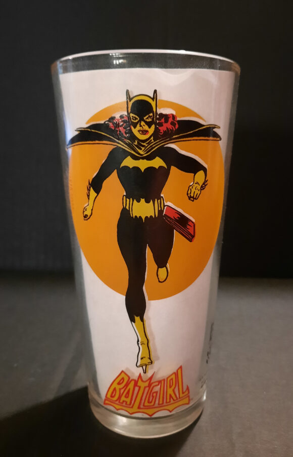
13. Batgirl. I swear I’m not picking on my beloved Infantino/Anderson art combo! This IS the iconic image of Batgirl, lifted right off her “Million Dollar” cover debut in Detective Comics #359 (Jan. 1967). But again, the printing lets this one down. There’s no blue, so Batgirl has a yellow cowl and cape! Other than her striking all-black body suit, she gets lost against the orange “moon” too. Her logo from the Detective Comics back-ups in the early ’70s looks nice in yellow with red trim, however.
—
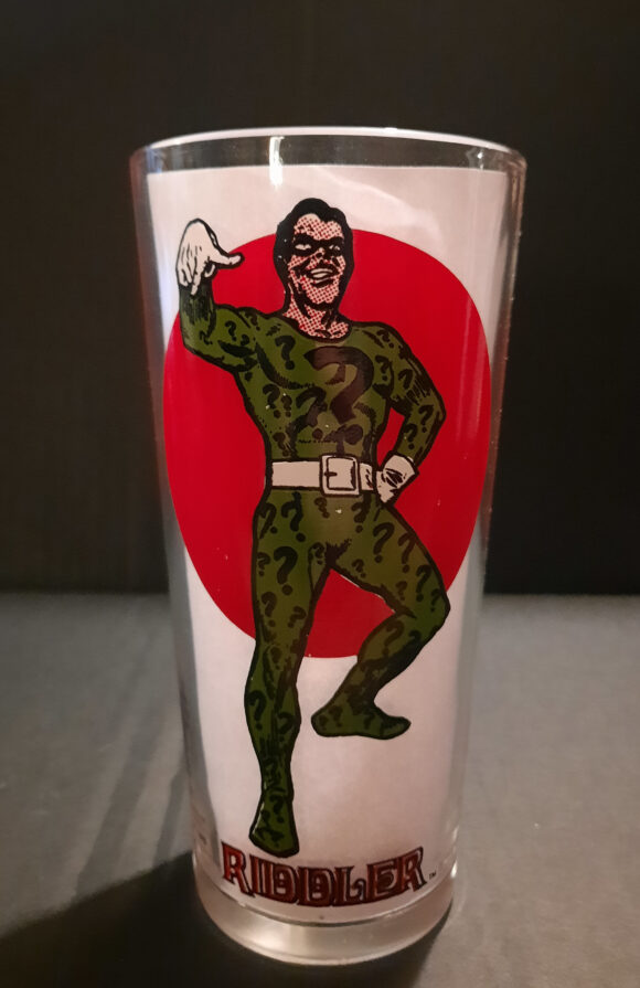
12. The Riddler. OK, so I sense a pattern here. But again, it’s not the art! One of many images pulled from the classic 1966 Infantino/Anderson poster set offered in DC Comics, this image of Edward Nigma made it onto Mego’s packaging and a zillion other places. But here Riddler seems to have borrowed Mego Action Jackson’s white belt! At least he accessorized with white gloves, but it’s after Labor Day, Eddie, so get to the back of the line. Hey, at least his green suit pops against that red circle!
—
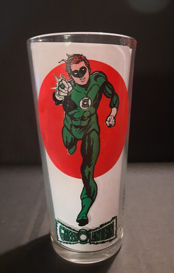
11. Green Lantern. This was a hard one to put so low on the list, because I LOVE this Gil Kane image from his later days on the ’60s comic series, after he started to break away from DC’s more conservative house style. But the colors really let this one down. Hal’s bodysuit is ALL green! And his hair is as red as the circle behind him, making him look more like a pre-agitated Guy Gardner in some ways. That sweet GL logo looks good, though!
—
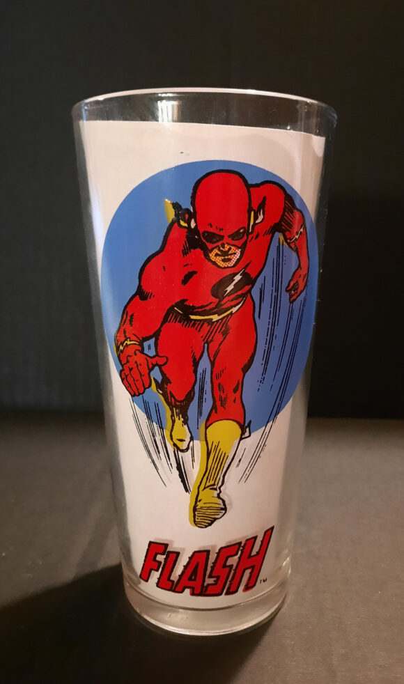
10. The Flash. Hal’s buddy Barry fares a little better, with this kinetic corner cover image drawn by Murphy Anderson, one of many we’ll see on this list. Barry’s striking red suit pops against that blue moon. But he’s got a black circle on his chest, instead of white! Is this the Reverse-Flash in disguise?
—
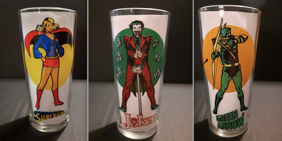
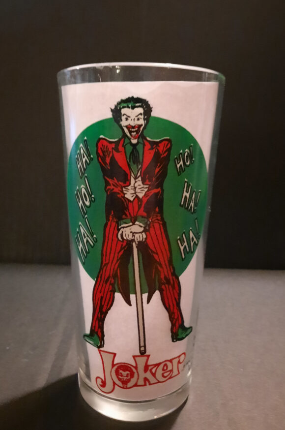
9. The Joker. The Clown Prince of Crime rarely looked as iconic as in this Infantino/Anderson image from that same set of 1966 posters as the Riddler. He’s even got his ’70s comic series logo at the bottom! His non-purple suit color SHOULD look a bit odd, but against the green circle, the red looks more like Cesar Romero’s magenta suit from the ’60s TV series. So, my brain lets it slide. Plus, he gets his HA-HOs on the glass as well. Not sure about those green shoes, though.
—
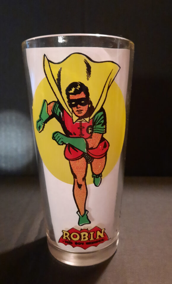
8. Robin. The Boy Wonder is looking good on this classic image by Infantino, this time with Joe Giella on inks. His costume colors look great, and he seems to be running right out of that yellow moon. He’s even got the 1940s logo from his Star-Spangled Comics solo strip! So why not a higher ranking? Dick Grayson’s gone blonde! The highlights in his hair make the Teen Titan tow-headed!
—
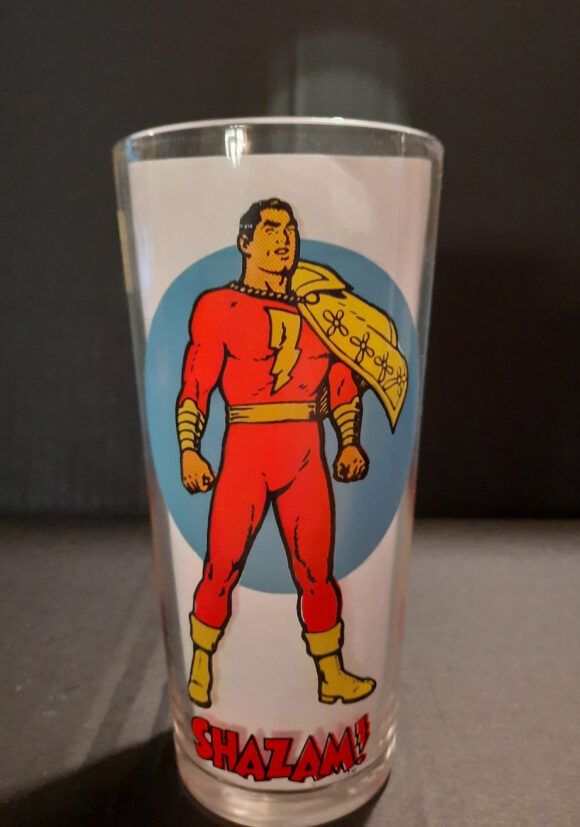
7. Shazam! The World’s Mightiest Mortal is looking mighty indeed in this image by his co-creator C.C. Beck, lifted from early issues of DC’s Shazam! comic series. The light blue moon behind him makes a wonderful contrast with all the red and yellow. His all-yellow cape is of course a concession, but since Mego gave Captain Marvel a similar cape, my fanboy OCD isn’t as triggered. The red “Shazam!” logo looks great as well.
—
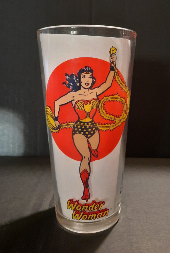
6. Wonder Woman. Wonder Woman gets us out from under the back half, as she lassos in a winning design, again from Murphy Anderson. Using black to replace her blue trunks honestly works pretty well, and it’s something George Perez would play around with during his brief Justice League of America run. A few points off for yellow stars, and the lack of her lasso’s loop at the top. But you can just look at this glass and hear Lynda Carter’s TV theme song, can’t you? And that’s a wonderful thing!
—
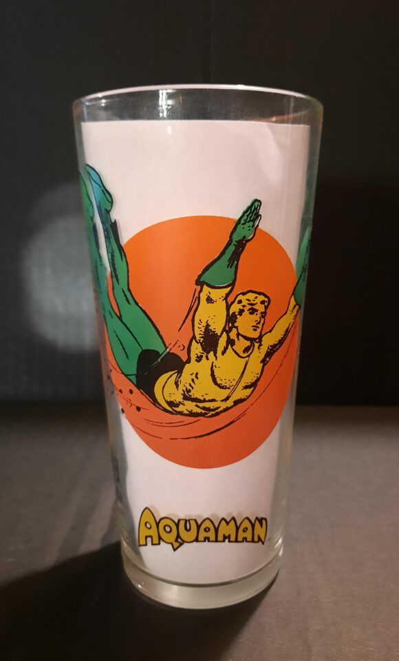
5. Aquaman. The Swift and Powerful Monarch of the Ocean is swimming in Pepsi! I imagine that’s what it looked like for kids who got this glass first run. We have another great cover corner piece from Murphy Anderson, with the Sea King making that unique “U” shape. The limited color palette doesn’t do too much damage to his look, even if his usually orange shirt is a bit yellow. I guess they saved that true orange for the circle behind him. That classic Aquaman logo has never been surpassed.
—
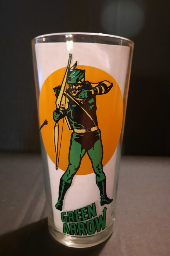
4. Green Arrow. The ’70s was a great decade for the Emerald Archer. He had critically acclaimed stories by O’Neil and Adams. He hooked up with Black Canary. He had a Mego figure, something he could rub in the face of his comics co-star Green Lantern! And he got a boss Pepsi glass, with yet another cover corner image by Anderson. The colors cheat a bit here, substituting yellow for light green in places, but the image is so striking against that light orange background, who cares? Not crazy about his logo being the other side of “Green Lantern and…” however.
—
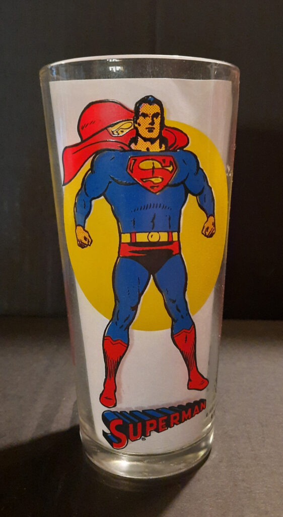
3. Superman. With a classic ’60s image by Curt Swan and George Klein, and a pitch-perfect color palette, you can’t go wrong with this image of the Man of Steel. It would be No. 2 if not for…
—
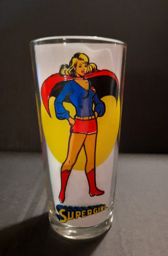
2. Supergirl. Kara trumps her cousin Kal-El on this list because of the art, which I believe is by Dick Giordano. Despite the static hands-on-hips pose, it’s such a dynamic image, with both her hair and cape flowing, replete in her ’70s blouse and hot pants! Too bad they didn’t use her more distinctive ’70s logo from her solo title.
—
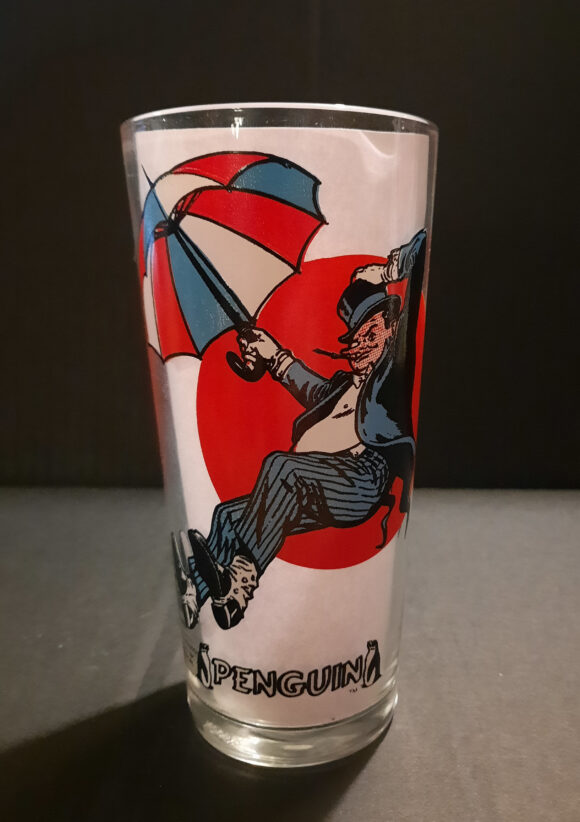
1. The Penguin. What? The Waddling Master of Fowl Play takes the top spot? Carmine Infantino and Murphy Anderson won in the end, see? But why? Well, first off, this floating Penguin illo, also from that famous 1966 poster set, is THE image of the Man of a Thousand Umbrellas for one. And two… ol’ Oswald Chesterfield Cobblepot is carrying a PEPSI umbrella! Yes, the colors of his brolly perfectly align with the glasses’ sponsor in a bit of corporate synergy that cannot be denied! The little logo with the two penguins on each side is really cute, too!
—
MORE
— HOLY BRAIN FREEZE! Dig These Groovy BATMAN Slurpee Cups. Click here.
— 13 Far Out MARVEL SLURPEE CUPS of the ’70s. Click here.
—
Chris Franklin is a graphic designer, illustrator and podcaster who co-hosts several shows on the Fire and Water Podcast Network, including Super Mates, which he produces with his wife Cindy. They are currently covering classic horror films and related superhero comics stories in their annual House of Franklin-Stein series. He also contributed columns to Jim Beard’s Subterranean Blue Grotto Essays on Batman ’66 – Seasons One, Two and Three.

October 9, 2022
We used to have a set of 4 of the Superman glasses. Alas, they were eventually all broken. I want them back!
October 9, 2022
Sweet. I remember having a couple of these. The Curt Swan Superman looks like the image that encouraged Supes to go on a diet.
October 9, 2022
I remember having a few of these as a little kid. The Robin glass is distinctively burned into my memory. I would rush home from school to watch Batman ’66 on weekday afternoons and always had to have my Robin glass with me in front of the TV.
September 29, 2023
I kind of like the off model colors. Gives some of the images a pop art look.
September 30, 2023
Me too!
September 30, 2023
I remember these! A friend of mine’s Mom had them. Me? I bought my Pepsi in cans. You would see these glasses in used stores and garage sales for years! Hey! Maybe the Joker picked out his own outfit—he IS insane you know!
September 20, 2025
Great article…..even if I don’t agree with #1. I have a collection of the glasses and am looking for a “super collector” because I have a question about one of the glasses. In my collection I have two Joker glasses. One is stamped 1976 National Periodical Publications Inc. like every other one I have seen. But the other one is stamped DC Comics and I have yet to find another one. Can anyone help a guy out? How rare is this glass?
October 6, 2025
I never noticed the different copyright notices, but I just checked, and my Wonder Woman, Robin, Riddler, and Shazam glasses are marked DC Comics. The rest are marked NPP. This was around the time Jennette Kahn came on board and moved for DC Comics to actually be legally known as DC Comics. Probably just a rolling change during production.
March 25, 2026
Are you interested in selling the joker dc one? My dad needs that one for his collection
October 6, 2025
Wouldn’t it have been cool is Wonder Woman’s lasso encircled the rim of the glass?
October 7, 2025
You should do an article on 711 slurpee cups from the 70s there were great DC and Marvel ones
October 8, 2025
Like these? Every year!
https://13thdimension.com/the-13-wackiest-dc-marvel-slurpee-cups/
https://13thdimension.com/13-far-out-dc-and-marvel-slurpee-cups/
https://13thdimension.com/13-far-out-marvel-slurpee-cups-of-the-70s/
https://13thdimension.com/holy-brain-freeze-dig-these-groovy-batman-slurpee-cups/
https://13thdimension.com/dig-these-13-groovy-marvel-and-dc-slurpee-cup-collections/
https://13thdimension.com/dig-these-far-out-1970s-spider-man-slurpee-cups/
https://13thdimension.com/50-years-later-the-top-13-original-dc-and-marvel-slurpee-cups-ranked/
https://13thdimension.com/13-great-dc-comics-slurpee-cups-that-should-have-been/
https://13thdimension.com/13-great-slurpee-cups-that-should-have-been/
https://13thdimension.com/13-more-great-slurpee-cups-that-should-have-been/
October 8, 2025
Not long and you can do an article on the top 13 Slurpee links.
October 8, 2025
I know!