
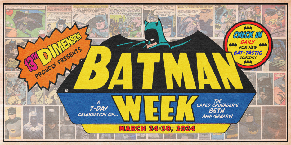
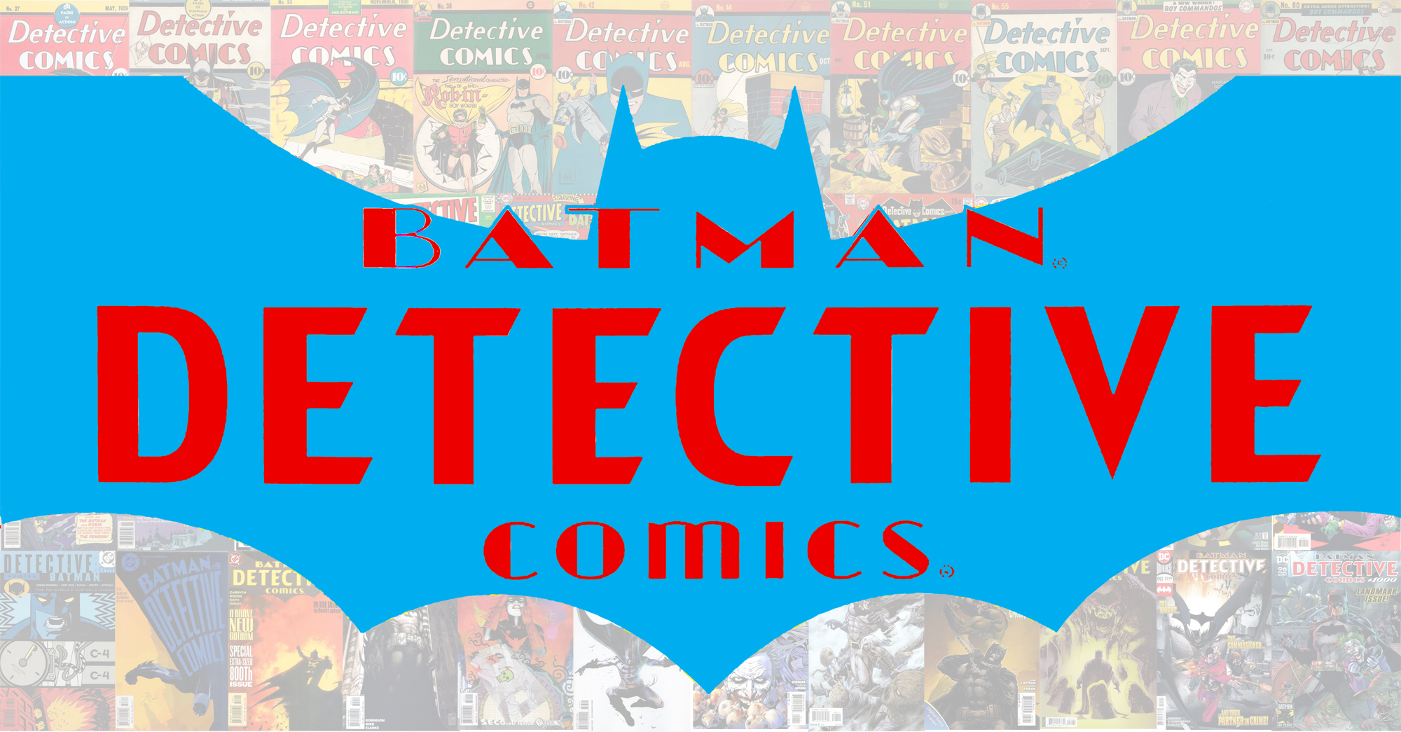
BATMAN WEEK: Detective’s banner has a history of ups and downs. These are the best…
—
Welcome to BATMAN WEEK 2024 — celebrating the release of Detective Comics #27, on March 30, 1939 — 85 years ago today! Over seven days, we’ve published all sorts of groovy and offbeat columns, features and cartoons that pay tribute to the greatest comics character in the history of mankind. Click here for the rest of the BATMAN WEEK features. You’ll be glad you did! — Dan
—
By WALT GROGAN
When 13th Dimension’s head honcho, Dan Greenfield, asked me if I wanted to do an article ranking the Detective Comics logos, I immediately said, “Yes!”, because I love logos! They’re one of the most important yet one of the underappreciated art forms in comics!
Thing is, I don’t get excited when I think of the logos of Detective Comics. There have been some great ones to be sure, but the words themselves don’t really excite me. It’s one of the problems with titles that started out as anthologies — including others like Action Comics, Sensation Comics, Whiz Comics and Adventure Comics.
Most of these comics were created without knowing that one of the features would eventually become the comic’s breadwinner. And, for Detective, that feature was the Caped Crusader, Batman! But prior to Batman’s debut in Detective Comics #27, the series was filled with non-superhero detective stories headlined by characters of various genres and periods.
As Batman became more and more popular, he was eventually spun off into his own comic but he never left Detective — which posed a problem. How do promote the comic’s most popular character with a title that only vaguely ties into him? Well, DC had to somehow incorporate Batman into the Detective Comics logo.
But, honestly, why bother keeping the title around? There’s nothing that really invokes Batman. That’s an easy question to answer: Detective is one of DC’s earliest comic books and the company is even named after that title — DC. A sense of history, nostalgia and reverence has saved Detective Comics from the chopping block.
Over the years, DC worked Batman into the logo — with varying degrees of success. So for this logo overview, I’m going to ignore logos that didn’t somehow include Batman. With that, here are THE TOP 13 DETECTIVE COMICS LOGOS — RANKED
—
13. DETECTIVE COMICS #38-53 (1940-41)
As Batman gained in popularity in Detective Comics, DC started to call him out in the logo. In this one, which was also used in Robin’s debut, DC maintained Batman’s earlier look even as they were standardizing a friendlier, often smiling Batman . The word “COMICS” is still emphasized here by being bolder and uppercase. The logo dominates the cover, because it often was the only part that could be seen on a rack. That’s also why the Batman stat was a necessary addition.
—
12. DETECTIVE COIMICS #700-741 (1996-2000)
The beveled Batman symbol and angled lettering leaves no doubt as to the star of the book. Shrinking “Detective Comics” down makes the name small but it contributes nicely to the overall look. The font was in use for the Batman books because of the Schumacher movies.
—
11. DETECTIVE COMICS (VOL. 2) #30-52 (2014-16)
A half silhoute and distressed text, while somewhat dated now, works well here by suggesting that Batman is casting his shadow over the book.The open lettering allows the art to show through.
—
10. DETECTIVE COMICS #683-690 (1995)
This one is a variation of a prior logo, in this case moving “Detective Comics” over the silhouette. While well done, it suffers by being too large, which caused it to be shrunk on the few covers it appeared.
—
9. DETECTIVE COMICS #1062-1082 (2022-Present)
Here’s a great modern take! The silhouette ties the logo together. It’s open and allows more of the art to show through! And the “D” of “Detective and “C” of “Comics” lets you know that you’re reading a DC comic, in case you forgot!
—
8. DETECTIVE COMICS #598-611 (1989-90)
“Detective” takes center stage here and while several of the letters have a subtle bat-wing motif, the letter “v” is doing all the heavy lifting and really draws the eye in and whispers, “Batman.”
—
7. DETECTIVE COMICS #776 -818 (2003-06)
Here’s a modern take using the Bat silhouette and emphasizing “Detective.” It’s definitely effective but due to its size, the silhouette was often outlined so that the cover art could show through.
—
6. DETECTIVE COMICS #579-596 (1987-89)
Another subtle one, but I like it! The bat silhouette around “Comics” is just enough to say “Batman”!
—
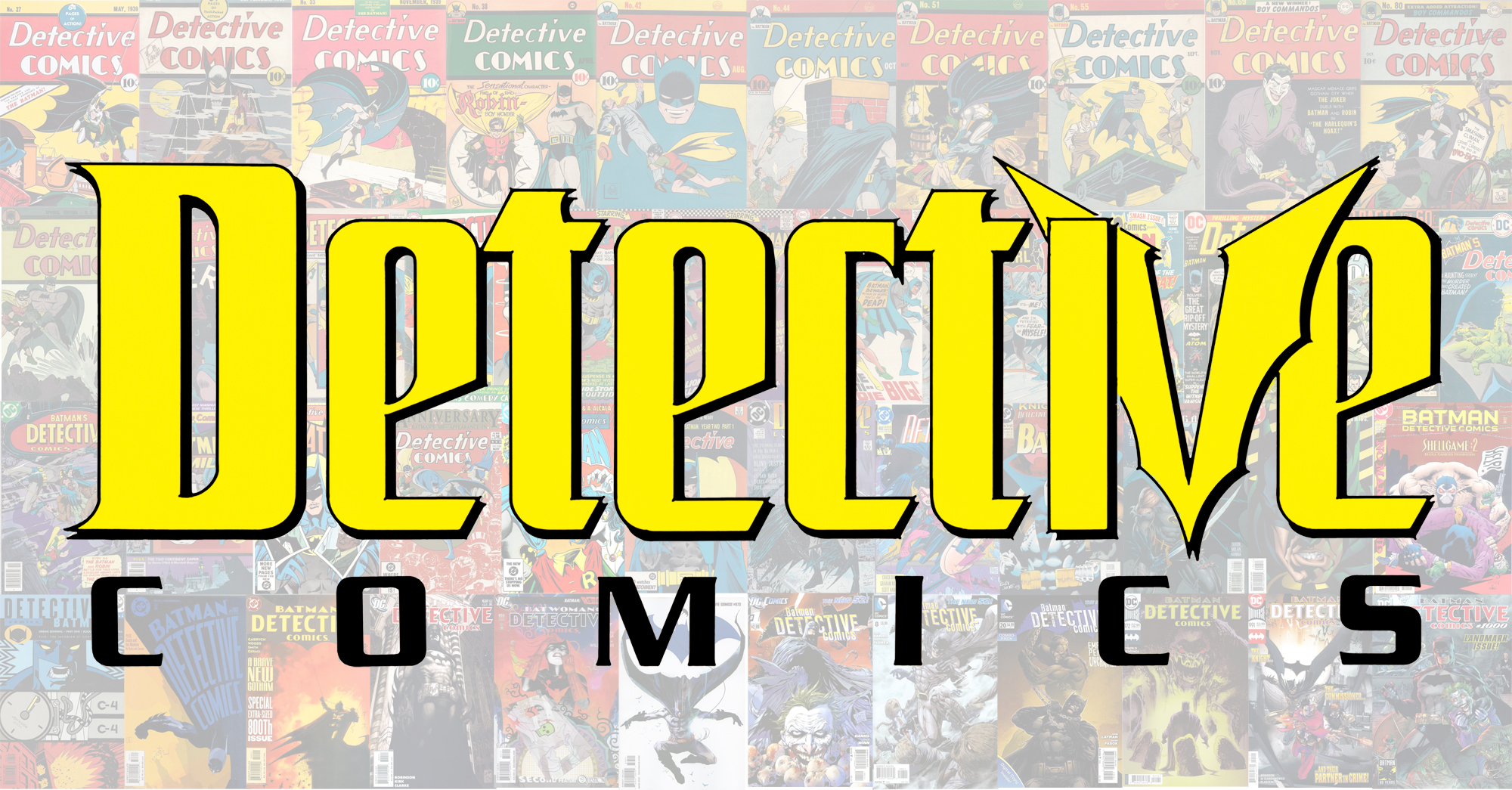
5. DETECTIVE COMICS #1001-1061 (2019-22)
I just love the logos that incorporate the full, straight-on Bat Symbol silhouette. This modern take does an excellent, effective job of tying Batman and Detective together and bringing home Bruce Wayne’s greatest skill!
—
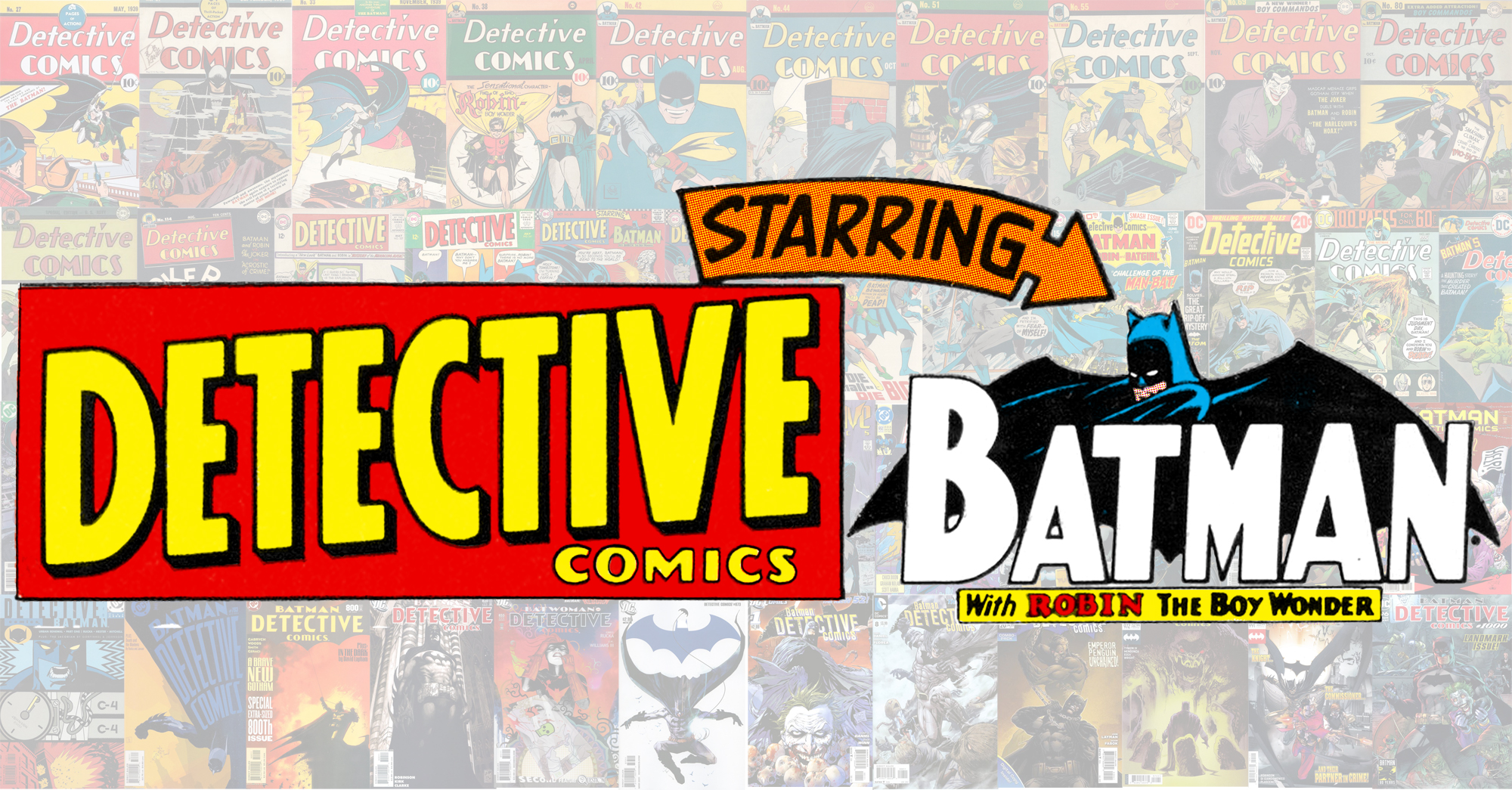
4. DETECTIVE COMICS #497-499, 501-566 (1980-86)
Yep, it’s simple. But I prefer this Batman logo to that of its sister mag at the time. Here, the “Batman” text is kept together rather than being separated into “BAT” and “MAN” by Batman’s head. It just works better. (Worth noting: The Batman part of logo headlined the flagship title on its own in 1970-71, and was used widely for The Brave and the Bold. It’s still prominent today in merchandising.)
—
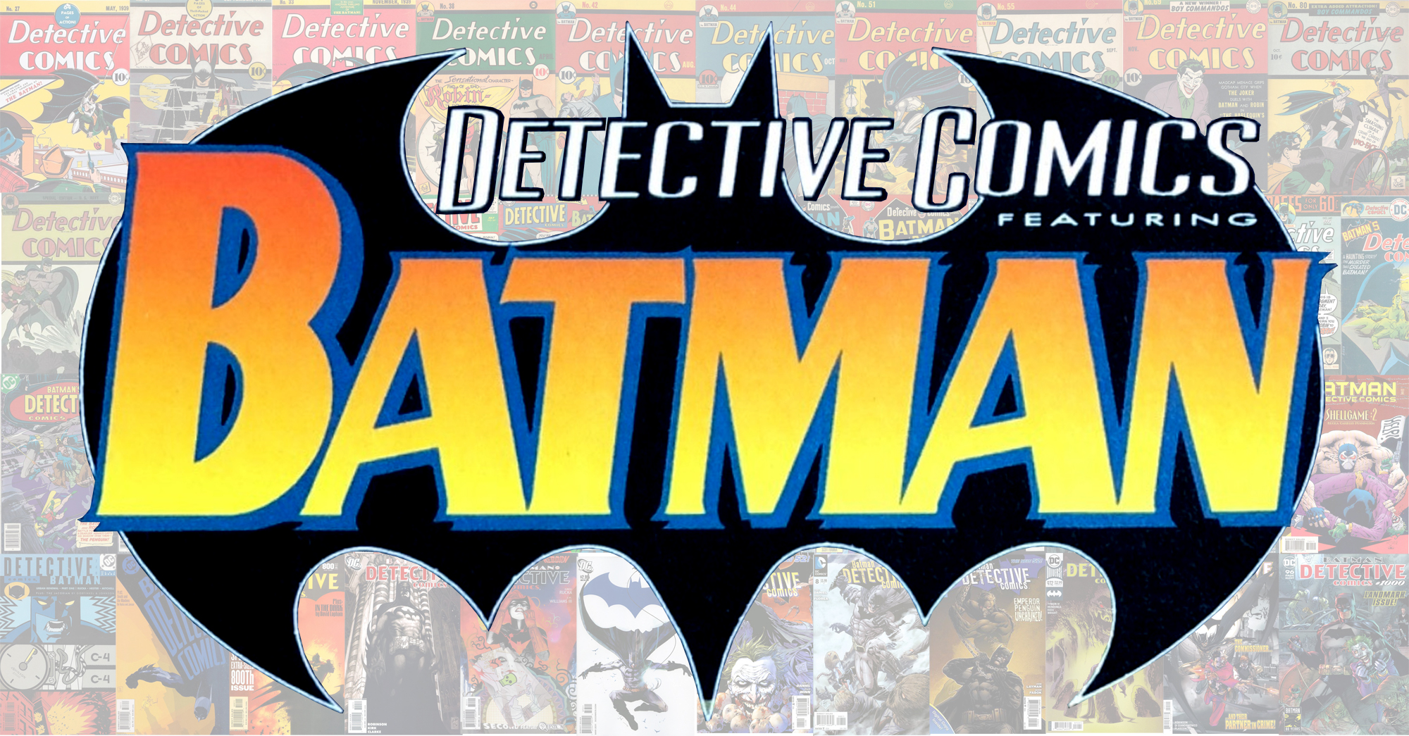
3. DETECTIVE COMICS #381-419 (1968-72)
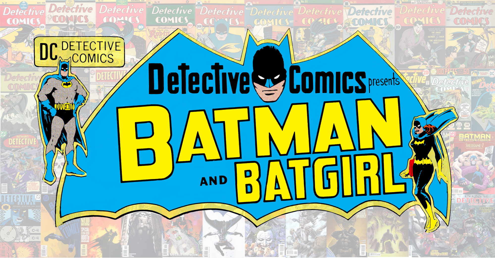
As I mentioned earlier, I love seeing the character featured in the logo either by including them directly in the design or by adding a character photostat. This hot mess of a logo has the best of both worlds! Yes, it’s a bit disjointed and has some questionable outlining, but it does stand out and catches the eye — which is the whole point! Over the course of this logo’s run, Robin was swapped out with Batgirl depending on who was in the back-up feature, and eventually the “Detective Comics” portion was moved outside of the logo and placed above it. Either way, the large “Batman” text really draws the buyer in.
—
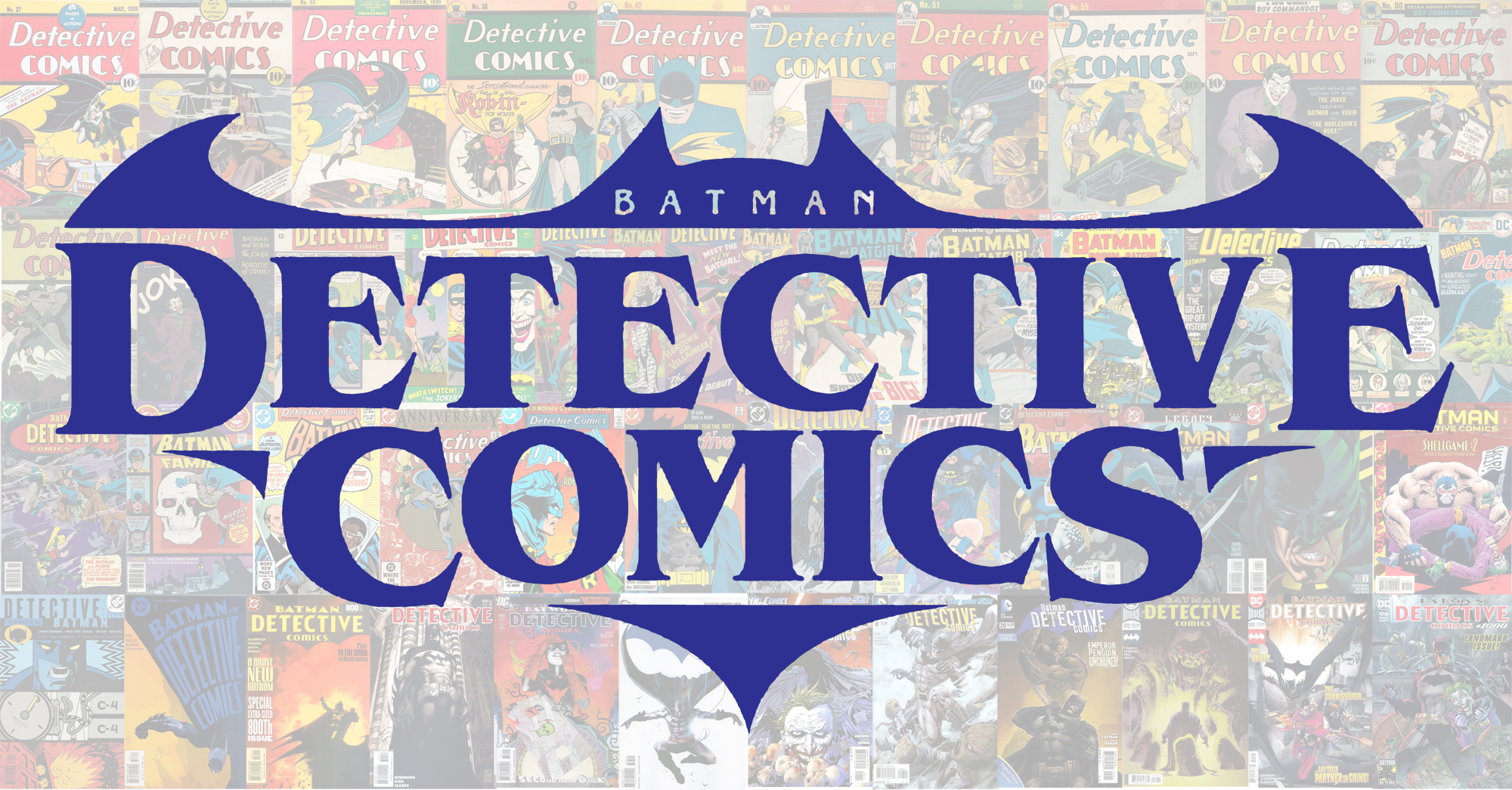
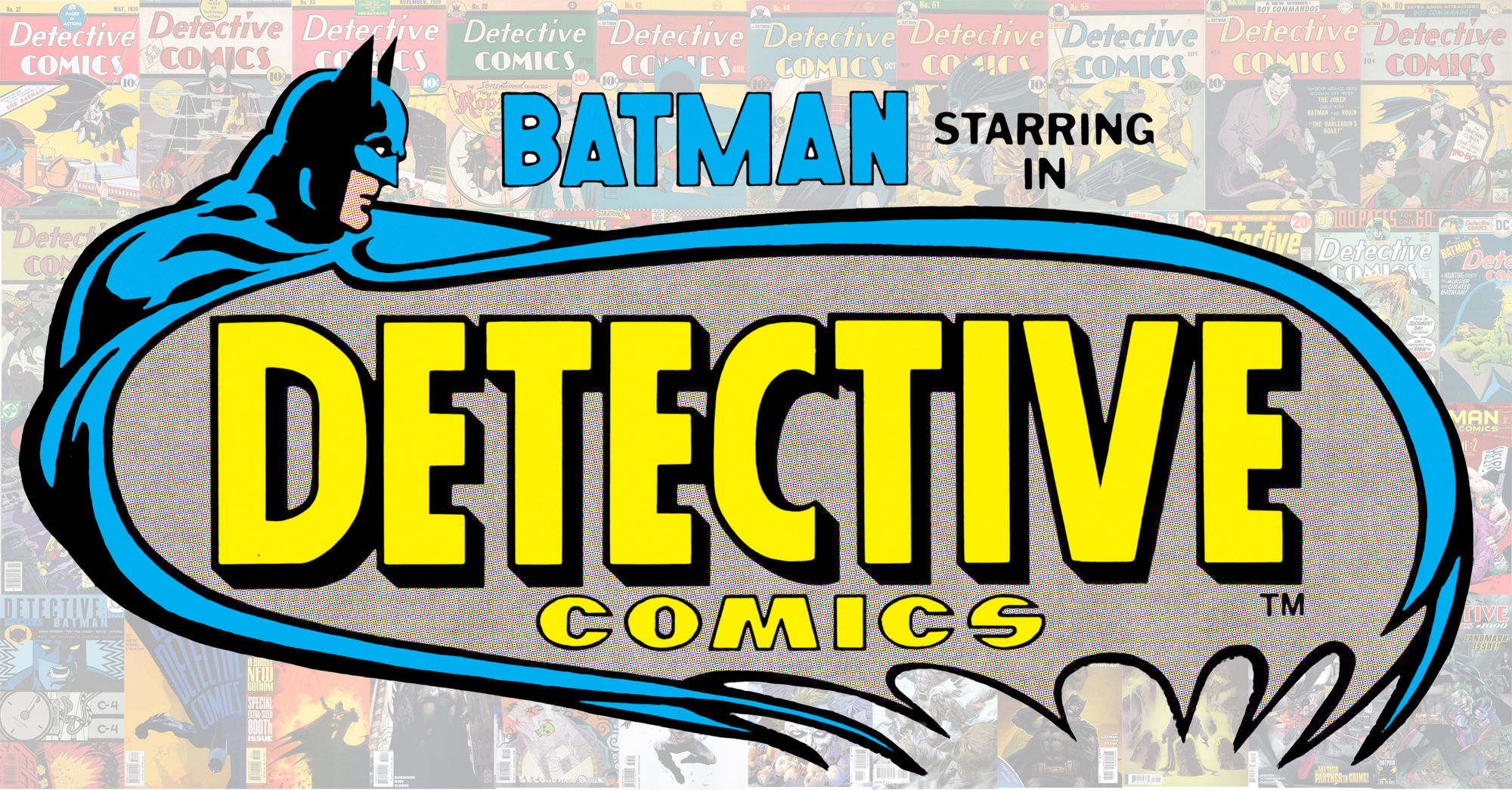
2. DETECTIVE COMICS #353-365 (1966-67)
With the 1966 Batman TV show in full Batswing, DC had to let readers know who was the star of this mag! Loyal Wednesday and Thursday night viewers knew that Batman, aided by the youthful Boy Wonder, was a detective but perhaps they didn’t know that the Caped Crusader led this comic, too! Combining Ira Schnapp’s Detective logo with Carmine Infantino’s Batman logo made the title stand out on the rack.
—
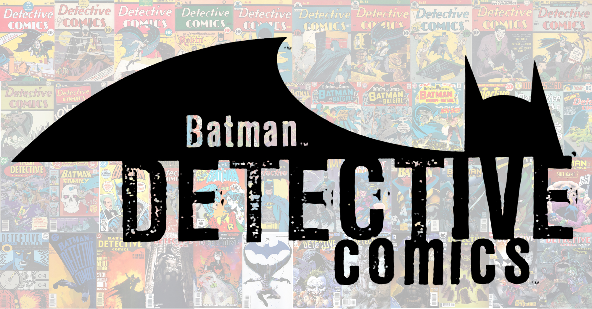
1. DETECTIVE COMICS #461-480, #484-495 (1976-80)
What’s not to like about this one? You’ve got the big, brassy “Detective” letters, and with Batman’s head and that sweeping Batcape there’s no doubt what you’re going to be reading! It was tinkered with slightly over its run but the concept remained intact for many years. Plus, I’ll always associate this with one of the greatest Detective runs ever, by the stellar team of Steve Englehart and Marshall Rogers!
—
MORE
— The BATMAN WEEK 2024 INDEX! Click here.
— The TOP 13 FIRST APPEARANCE BATMAN Action Figures — RANKED. Click here.
—
A 10-year-old Walt Grogan fell in love with the Big Red Cheese thanks to essays written by Dick Lupoff and Don Thompson in the paperback edition of All in Color for a Dime, released in 1970 and bought for him by his father off a paperback spinner rack in a liquor store on the South Side of Chicago. Walt runs The Marvel Family Web Facebook page devoted to all incarnations of the Fawcett/DC Captain Marvel and blogs about Captain Marvel at shazamshistorama.com.
March 30, 2024
Thank you, Dan. This was really fun and a trip down memory lane. I’ve seen comparisons of logos in the past but has 13th Dimension ever ranked others like Justice League/JLA, LOSH, Wonder Woman, etc.? I’ve visited this site for years now and just can’t recall any.
March 30, 2024
Funny you should mention that, JLH! I was going to pitch Dan on a JLA ranking!
March 30, 2024
And I will accept that pitch!
March 31, 2024
Don’t thank me! Thank Walt Grogan! (And, yes, more logo comparisons would be fun!)
March 30, 2024
I find logos very interesting and would love to see comparisons of those for other comics as well.
March 30, 2024
Hi Dan,
I will confess my favorite Detective Comics logo is in fact # 13–but as it was the one revised in the mid-1970s, starting in late 1973, when the late, great Archie Goodwin took the editorial reigns of the magazine, and writing the main story for about year before going back to Warren publishers I believe. The logo lasted to early 1976, even if the last few issues were modified to read “Batman’s Detective Comics”. But the sleek Art Deco font for the logo always looked great and worked very well for Detective covers (and as Art Deco as a design style will forever be associated with superheroes).
And my fondness extends to a few other areas of that mid-70s era and logo: the Batman portrait was more centered above the logo as rendered sternly by the also late, great Jim Aparo (who did the interior art of the first few issue–“A Monster Walks Wayne Manor” being the absolute classic as written by Goodwin and illustrated by Aparo).
And I associate the logo esp. from my childhood days of the 100 page Super Spectacular era of DC publishing, esp. as Goodwin had the best design sense for these Detective covers as featuring only one dominant central image with portrait medallions of the other heros starring in the issue at the bottom of the cover–and as very superior to that typical cover format for 100-pagers of the broken up tripartite montage design highlighting three stories at once, with the main one getting the larger panel.
And of course, as a side note, that era with its logo is when Goodwin and Walt Simonson’s fantastic Manhunter series appeared featuring a revived and then, when teaming with Batman himself, permanently killed-off Paul Kirk.
April 2, 2024
I’m with William, the Seventies version of the classic is my favourite, the bigger the better (see also Action Comics).
Great piece, Walt, let’s have more. For the stories behind so many logos, Todd Klein’s Logo Studies page is the biz!
March 30, 2024
Hi Dan,
And yes–I agree with your critique of logo # 3, which I actually like too as it has a great visual potential. But yeah, I could never figure out why DC never bothered fixing that misaligned, tilting “Batman and Batgirl” or “Batman and Robin” typography. Every single issue of Detective I have from ’68 to ’72 always has this misalignment. Curious.
March 31, 2024
Thanks, William, but Walt Grogan deserves all the credit for this piece!
April 2, 2024
Oops! My bad–I need to read more closely. But thanks for the heads up. Nice work, Walt. Again, I do think logo # 3 is one of the best–if DC would fix the misaligned lettering
March 30, 2024
Awesome job althoughI totally disagree with your ranks (hah). The Ernie Chan drawing of Batman on #1 always drove me nuts. It actually ruined covers drawn by better artists.
March 30, 2024
What about the logo used for Greg Rucka’s run?
March 30, 2024
Gotta agree with the # 1 pick personally. That was right when I started collecting comics in the mid 70s and Englehart, Marshall, Rogers, and Terry Austin were knocking it out the park at the time. Sadly, hardly anyone remembers that run anymore
March 30, 2024
Hi Hondobrode,
I confess, I have yet to read the Englehart / Rogers stuff featuring the Joker given how old I am now (though I do like both the writer and the artist). But I very much remember the run at that time as actively collecting Detective Comics. I esp. liked that late 70s era as associated with those great spy or espionage or manhunt stories (and as departing from Bat’s traditional rogues gallery) of Batman as the globally travelling detective as penned by the great, if no longer with us, David V. Reed (real name David Vern)–if occasionally put off by Ernie Chan’s artwork (a too-muscle-bound Batman and a horrible, if not lazy, rendering of his chest emblem, the classical bat within the yellow oval–esp. in how Neal Adams beautifully geometrized it).
April 2, 2024
But… but… that’s one of the best-known, most beloved Batman runs ever, I constantly hear it lauded.
April 2, 2024
It is. The problem is that for some reason, DC downplays it. I have my theories but that’s all they are. That run should always be in print, should have been an Absolute Edition by now, and would make a marvelous Artist’s Edition. But DC only reprints it very intermittently when it should be a cornerstone.
March 30, 2024
Those “Detective Comics” logos pack quite a punch.
March 30, 2024
#1 is a great pick, but my favorite is the variation that includes “BATMAN’S” within the cape.
March 30, 2024
Great post. Would love to see more logo posts