BRONZE AGE BONANZA: A surprisingly spooky month…
—
Welcome to BRONZE AGE BONANZA — our monthly series that looks at the greatest covers of the Bronze Age — exactly 50 years later. For more info on this feature, click here.
—
In looking at this month’s selections you’d be forgiven for thinking this is October instead of November. Lotta groovy creepiness in there, from artists like Luis Dominguez, Ken Kelly and Steve Ditko. That said, there’s plenty of superheroing too, courtesy of John Romita, Jim Aparo, Neal Adams and co.
Dig THE TOP 13 COVERS OF NOVEMBER 1973 — RANKED:
—
13. The Amazing Spider-Man #130, Marvel. A good but not great cover that’s pushed over the top by the first appearance of… the Spidermobile!
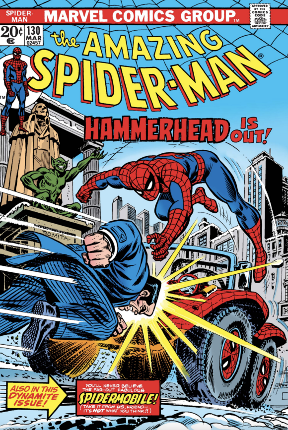
John Romita
—
12. Ghostly Tales #109, Charlton. “Just do some weird shit, Steve. Whatever you want.” “Uh-huh.”
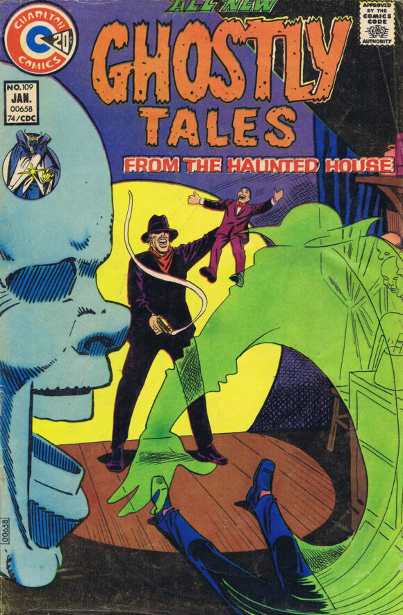
Steve Ditko
—
11. Tomb of Dracula #18, Marvel. It could be the most basic concept but Gil Kane could always be counted on to make a cover as dynamic as possible. That’s not exactly breaking news, I know. But damn, I feel like Jack Russell’s leap should be accompanied by a sound effect that goes “Ker-LUNGE!!”
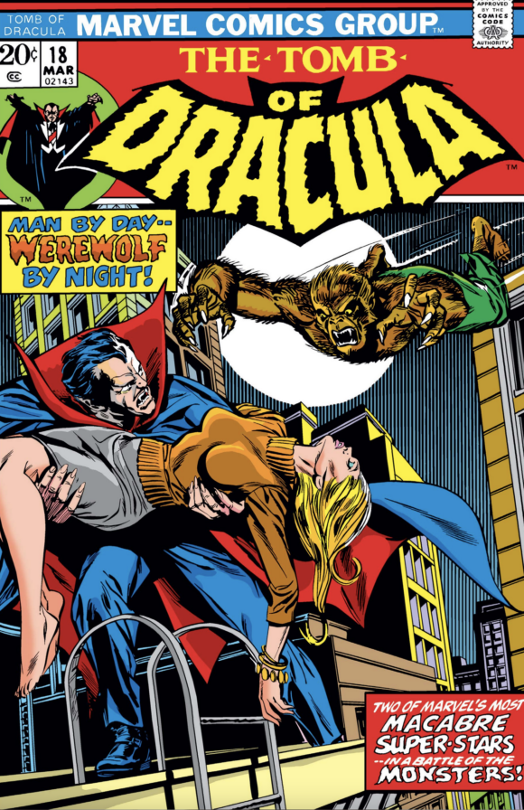
Gil Kane pencils, Tom Plamer inks
—
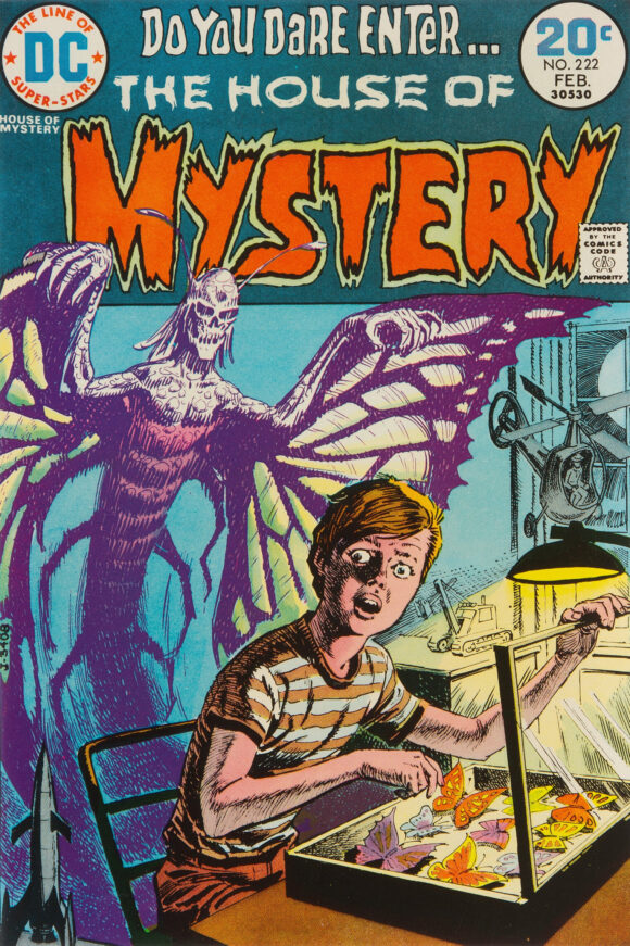
10. House of Mystery #222, DC. Harvey Bugs is about to get his after that fiasco with Marcia Brady. The first of three covers on this list by the great Luis Dominguez, who doesn’t get the credit he deserves.
Luis Dominguez
—
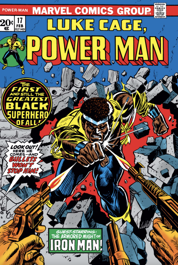
9. Power Man #17, Marvel. I feel like there are a million covers out there of Luke Cage doing exactly this. No matter, Kane and Dan Adkins make it kill. I don’t know how they made him look tougher than Superman but they do.
Kane pencils, Dan Adkins inks
—
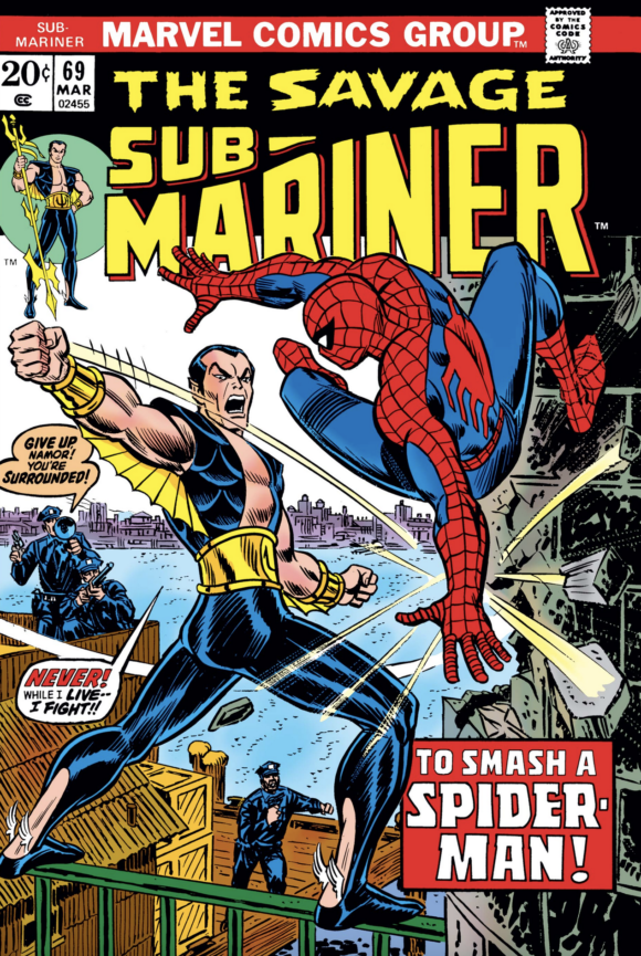
8. Sub-Mariner #69, Marvel. The second of three by Romita to make the list. I’m already on record as saying I love Namor’s ’70s outfit. So big points there. But it’s also a badass moment, with the Sub-Mariner making Spidey look like he’s way out of his depth. Kane gets the dynamism credits but damn, Romita makes you feel the force of that backhanded punch and his positioning of Spider-Man is absolutely smashing. And notice Subby’s balance — he’s standing on a rail! Far out!
Romita
—
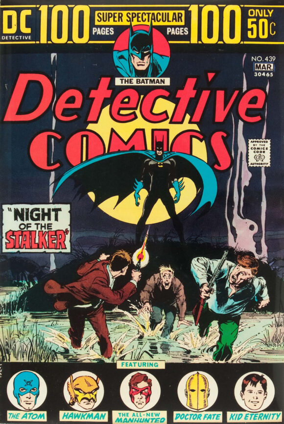
7. Detective Comics #439, DC. OK, I know I’m courting a little controversy here. This is one of Neal Adams’ last Batman covers from his classic era and it definitely works to a degree. But I’m putting it smack in the middle because I’ve always thought it fell a little short: Batman is too far away and while the concept is clear it feels a little rushed. On the other hand, you may feel completely differently, so feel free to move it up (or down) in your head. Great story, either way.
Neal Adams pencils, Dick Giordano inks
—
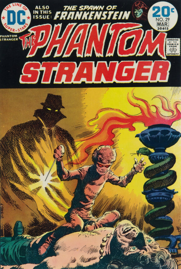
6. The Phantom Stranger #29, DC. Wow, that is sick. Luis Dominguez, once again. (Love the color palette, too. Dunno who the colorist was.)
Dominguez
—
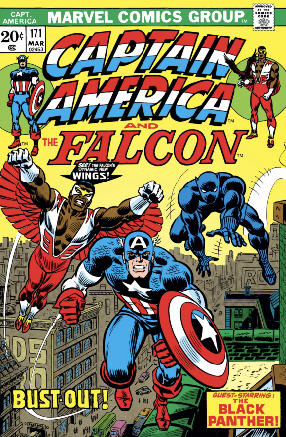
5. Captain America #171, Marvel. Falcon gets his wings! Totally completes the outfit. Anyway, a terrific “poster” cover by John Romita with three of Marvel’s best comin’ atcha. Right on.
Romita
—
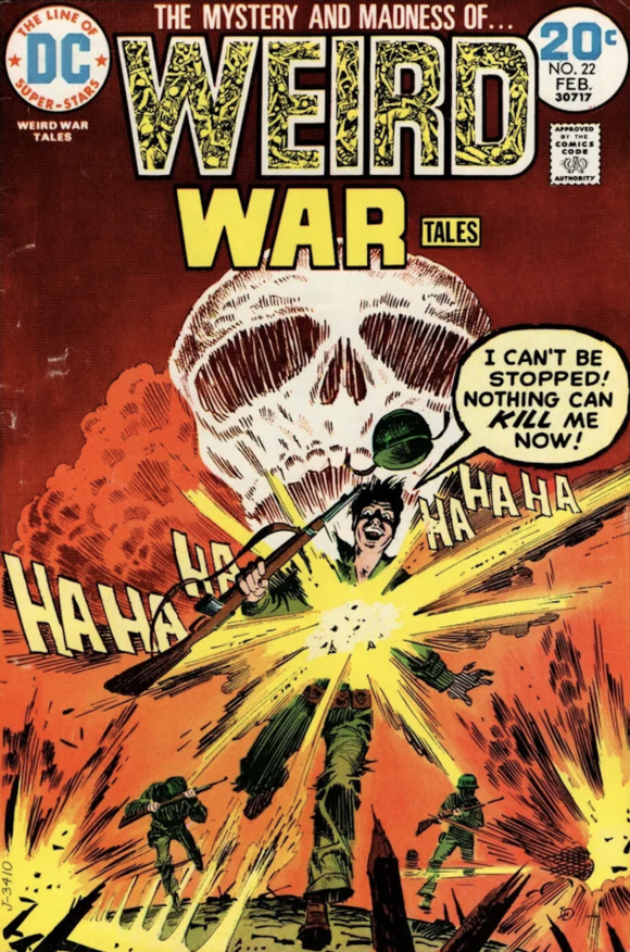
4. Weird War Tales #22, DC. Another great cover by Dominguez. The soldier is completely unhinged, the colors are apocalyptic, the explosions explode and you have the enormous death’s head looming in the sky. Add to that the logo, which I’m amazed ever got through the Comics Code. The horror and madness of war in one insane image.
Dominguez
—
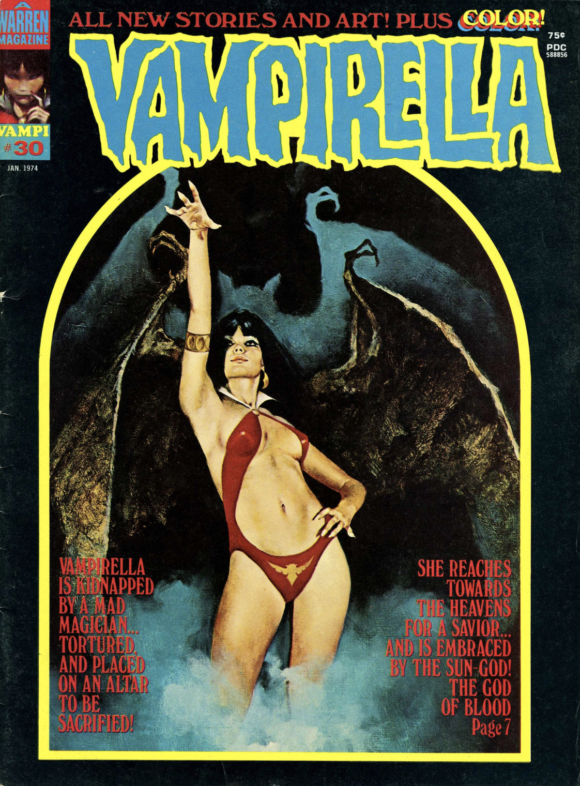
3. Vampirella #30. I’ll admit it’d be easy to include any Vampirella cover on this list whenever they pop up, so I have to grade on a curve. This is one of Enrich Torres’ most evocative, so it’s a must-include. I even toyed with making it No. 1. But you’ll see why I didn’t.
Enrich Torres
—
2. The Brave and the Bold #111, DC. Today, the Joker is his own franchise and he’s become ubiquitous to an obnoxious degree. (How can we miss you if you won’t go away?) But in November 1973, he’d only recently re-emerged after a lengthy absence — and as a mad killer besides, all thanks to Denny O’Neil and Neal Adams’ classic Batman #251, which came out five months earlier. So this team-up had legit shock value on its own merits.
But Jim Aparo ramps it up with a Clown Prince of Crime clearly enjoying himself, while the wanted poster on the wall reminds you that he is a demented madman. And Batman is so angry — not just because he’s trying to intimidate the cops but because he also has to defend this twisted bastard. (You know what kept it from the top slot? The generic “THE JOKER” typeface. DC had yet to come up with his classic Bronze Age logo, which would have put this cover in another category completely.)
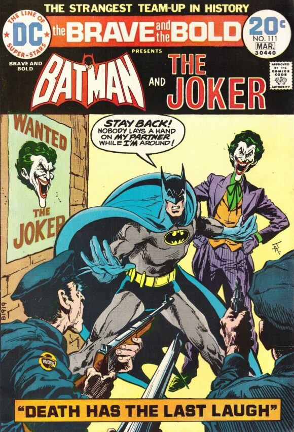
Jim Aparo
—
1. Famous Monsters of Filmland #104, Warren. I’ve always debated whether it’s fair to include magazines along with comics on this list. But the fact remains that the publishers were trying to reach the same audience and the buyer had to consider their choices. So here we are. But I think this might be the first time I’ve put a mag in the No. 1 slot because holy shit, this Ken Kelly piece is off the charts horrifying. It’s beyond repulsive but you absolutely cannot look away. A masterpiece in the disgusting and the most compelling cover here, by far.
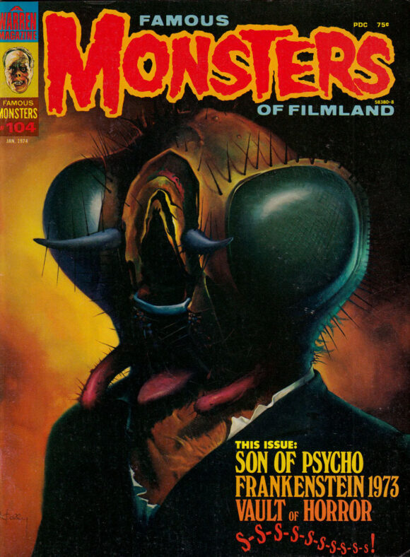
Ken Kelly
—
MORE
— The TOP 13 COVERS of OCTOBER 1973 — RANKED. Click here.
— BRONZE AGE BONANZA: The 1973 INDEX. Click here.

November 19, 2023
Hands-down this is my favorite feature on this site!
November 19, 2023
Hey, thanks, Jeff! I get a bang out of doing it!
November 22, 2023
Oh I bet you do! 🙂
November 19, 2023
I’d rate the Tec cover, if for no other reason, that it’s one of (if not the) only covers Adams did for the book with the classic logo.
As for magazines, given the higher production values I’m not sure it’s a fair fight (and where are the Mad and Cracked covers?). Have you considered a separate list each month for the mags: Mad, Cracked, Warren, FMoF, etc.?
November 19, 2023
I’ve always loved that classic Brave and Bold cover and I loved the story too. That particular issue brought me into the series. I’d put it #1.
November 20, 2023
Seeing Aparo covers always gives me the warm and fuzzies.
November 22, 2023
I want DC to publish a hardcover of nothing but Nick Cardy covers. How many can there be? 500? Less? More?
November 22, 2023
Nothing feels more like the magic that was the early ’70s than a Cardy cover. I’d buy this in a heartbeat.
November 22, 2023
For me the B&B cover is a clear #1! That issue continued the new Joker interpretation begun in Batman #251 and helped pave the way for the Joker to become the top villain in the DC universe.