
BRONZE AGE BONANZA: Wilson! Robbins! Adams! Kirby! Brunner! MORE!

—
Welcome to BRONZE AGE BONANZA — our monthly series that looks at the greatest covers of the Bronze Age — exactly 50 years later. For more info on this feature, click here.
—
George Wilson returns! Twice! Plus, Bob Kane in the Bronze Age, a Frank Robbins appearance, and your usual cast of characters, such as Nick Cardy, Neal Adams, Jack Kirby and so forth.
Dig the TOP 13 COVERS OF MARCH 1974 — RANKED:
—
13. Famous 1st Edition #C-28: Detective Comics #27, DC. The main art may have been 35 years old at this point, but this is all about the presentation. DC’s Famous 1st Edition series of treasuries properly gave these early, oversize Facsimile Editions the sense of grandeur and historical import they deserved. And in this case, the silver cardboard perfectly suits the original issue being spotlighted.
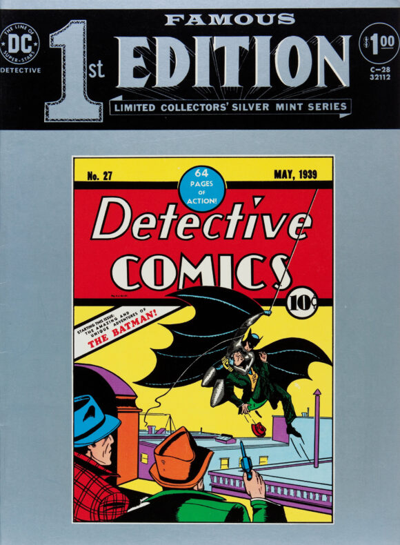
Bob Kane
—
12. Action Comics #436, DC. The gag is a classic one: Someone in Superman’s life gets powers. But what makes it work is the angular layout, the forcefulness of the speed that Nick Cardy gives Perry, and, just as importantly, the care given to the Metropolis skyline at early sunset. Kudos to colorist Tatjana Wood.
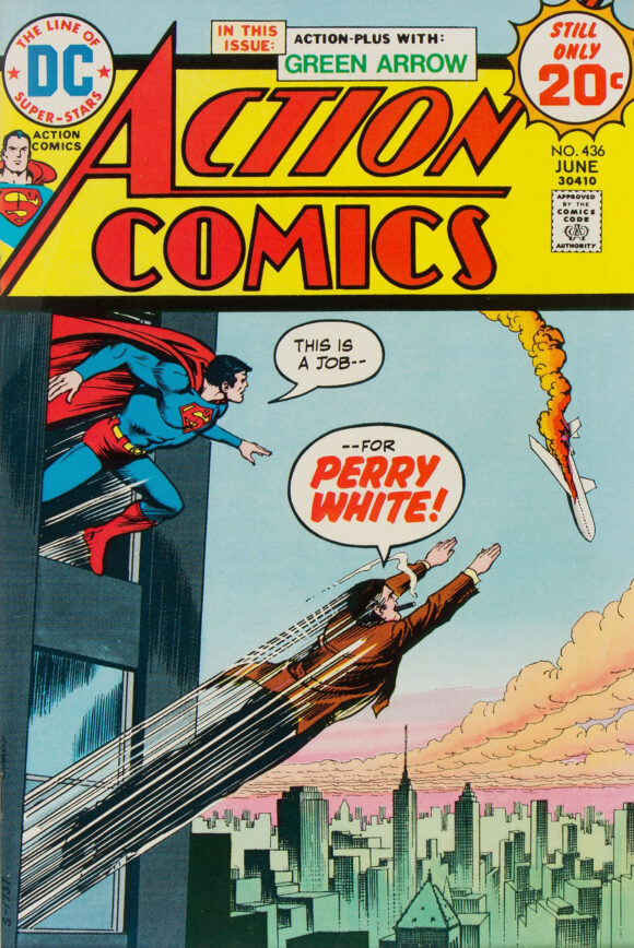
Nick Cardy
—
11. Limited Collectors’ Edition #C-27: Shazam!, DC. One of the greatest treasury covers of all time, with wonderful draftsmanship by Bob Oksner and a perfect primary-color tableau by Sol Harrison. I’d put it much higher but it’s essentially a remake of 1941’s Whiz Comics #22 by C.C. Beck and Pete Costanza. (I actually prefer this version.)
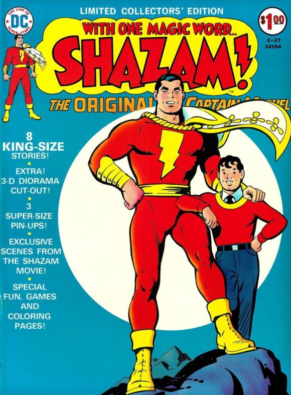
Bob Oksner
—
10. The Amazing Spider-Man #133, Marvel. I got this one when it was new and, to this day, I still don’t know why Marvel needs a Human Torch and a Molten Man. Nevertheless, this is an effective cover with Spidey legit looking like he’s in painful danger. And of course, a classic New York setting just amps it up a notch.
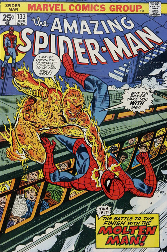
John Romita (but possibly pencilled by Gil Kane)
—
9. Worlds Unknown #7, Marvel. Total sentimental pick: I LOVE this movie and so much wanted this two-part adaptation. Didn’t get the issues until adulthood. Neverthless, while the image is a little static, it does capture that movie poster feel. Points for including scene-stealing Kali, and Caroline Munro’s Margiana.
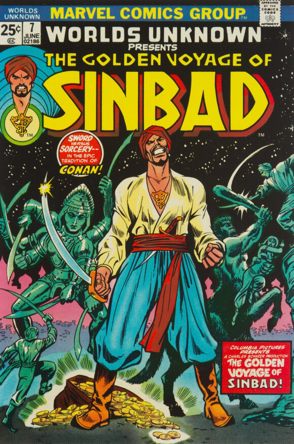
George Tuska pencils, Vince Colletta inks
—
8. Savage Tales #4, Marvel. A Neal Adams painted cover is almost always going to make this list. Not his best, but Adams’ not-best is still better than almost anyone else’s.
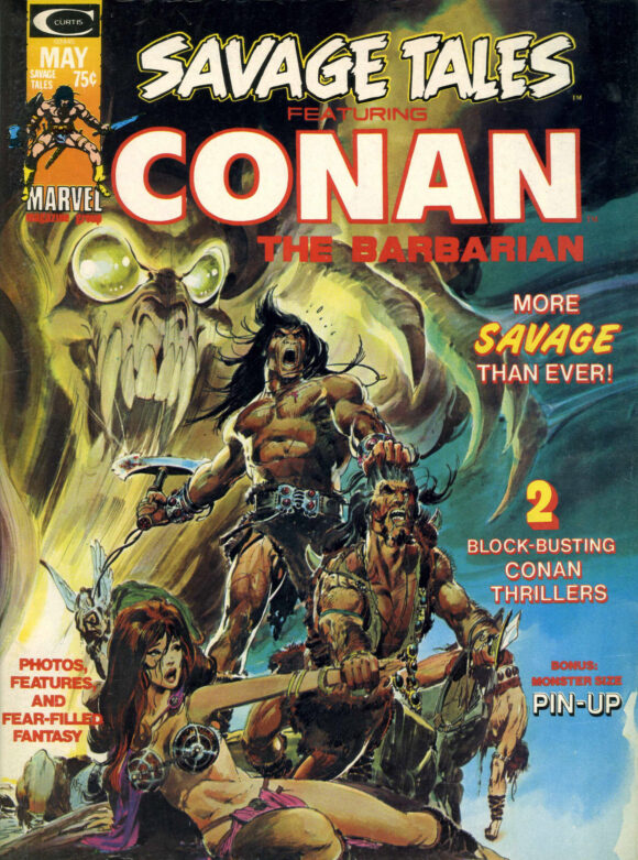
Neal Adams
—
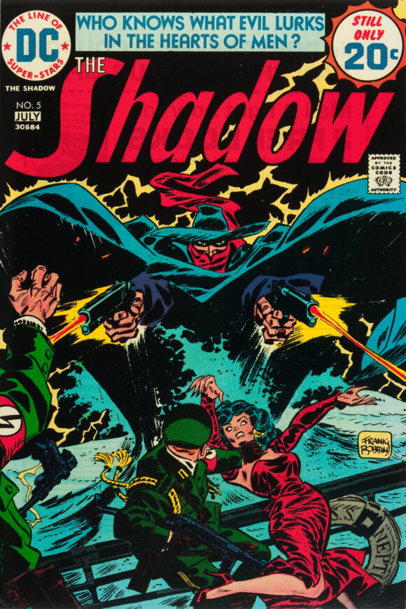
7. The Shadow #5, DC. When you think of DC’s 1970s The Shadow, you think of Mike Kaluta, which makes sense. But don’t forget the often-underappreciated Frank Robbins who brings it with one of his best covers of the Bronze Age. Damn, the Shadow is menacing — backlit by all that wonderful, exploding lightning. And look, Nazis getting the business end of his wrath!
—
6. Kamandi #18, DC. Think Kirby read Dune? I do.
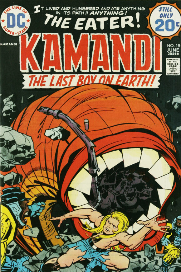
Jack Kirby pencils, D. Bruce Berry inks
—
5. Star Trek #24, Gold Key. Hey, it’s been awhile since we’ve seen our man George Wilson around these parts. This is just batshit bonkers with a fabulous grab bag of over-the-top, clashy colors. There is nothing about Wilson’s illustration that says “Star Trek” — but that makes it even more entertaining to look at.
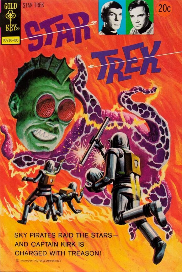
George Wilson
—
4. Mighty Samson #24, Gold Key. Wilson again! By the way, who do you think would win in a fight — sky shark or land shark? I gotta go with sky shark. That’s basic Warfare 101. I also like that this take’s place on C’Nal Street in N’Yark. Seriously!
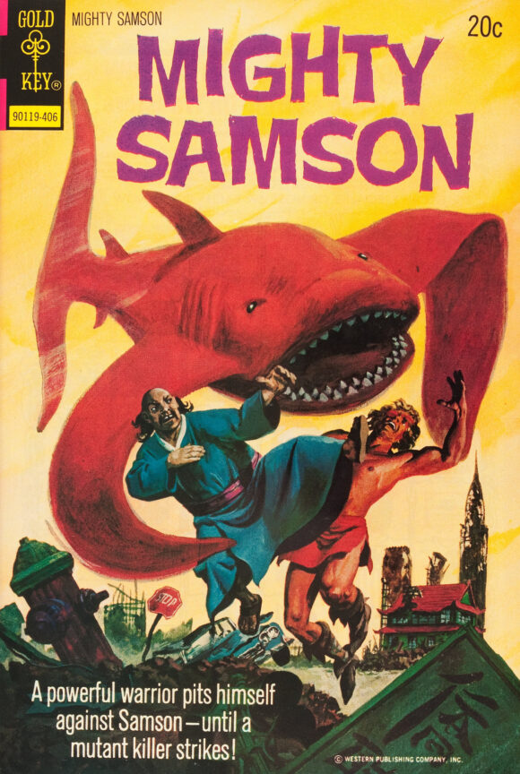
Wilson
—
3. Doctor Strange #1, Marvel. One of the classic Doctor Strange covers of the 1970s, which makes it one of the classic Doctor Strange covers of all time. Wanna put it higher? I won’t stop you.
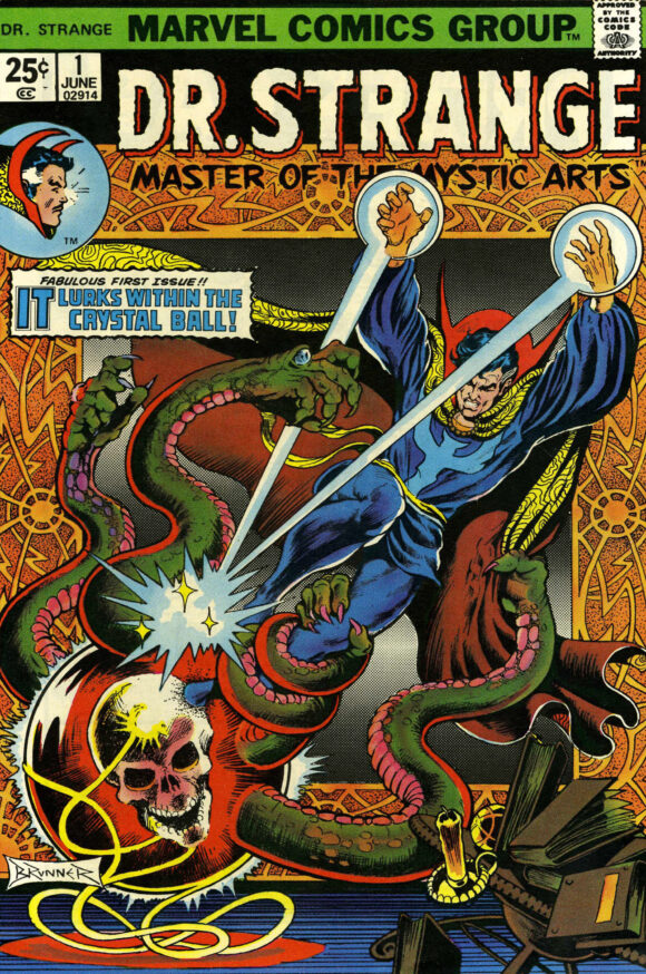
Frank Brunner
—
2. Power Man #19, Marvel. The title formerly known as Hero for Hire had been re-named Power Man by this time, as you can see, and it keeps the tradition alive, showing Luke Cage furiously bursting through a wall or a window, debris flying everywhere. But what really makes this cover is the first look at Cottonmouth — and you will get me with an illustration done in negative every time. Every. Time. You cannot look away from this. Fantastic.
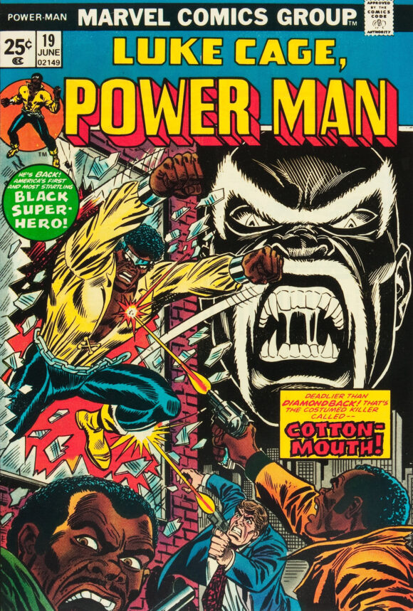
Ron Wilson pencils, Frank Giacoia inks
—
1. Superman #276, DC. As hero vs. hero covers go, this is one of the best you’ll find — and seeing Superman take on an ersatz Captain Marvel was such a tease. DC had already been publishing Shazam! but, other than on covers, the company was taking great pains to keep the Big Red Cheese out of the DCU proper, so this helped scratch the itch for all those fans who for decades wanted to see the Man of Steel go head to head against the World’s Mightiest Mortal. The primary colors pop, especially against that yellow background. And is it just me, or should DC have just thrown in the towel right here and said, “Screw it, we’re just gonna re-name him Captain Thunder. It’ll work out better in the long run.”
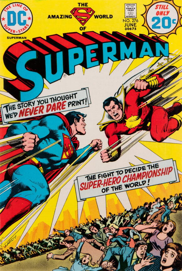
Cardy
—
MORE
— The TOP 13 COVERS of FEBRUARY 1974 — RANKED. Click here.
— BRONZE AGE BONANZA: The 1974 INDEX. Click here.
—
Comics sources: Mike’s Amazing World of Comics and the Grand Comics Database.
March 17, 2024
That Superman issue and a prior month’s Wonder Woman is where I started my voyage into the DCU. It was all Archie and Harvey comics before that. The 70s will always be my favorite period in comics, no doubt because that’s when I “discovered” them.
March 17, 2024
‘And is it just me, or should DC have just thrown in the towel right here and said, “Screw it, we’re just gonna re-name him Captain Thunder. It’ll work out better in the long run.”’
It’s not just you.
March 17, 2024
Nope, DC should have called him Captain Thunder from the get-go of the revamp. But here would have also worked. I first read the Captain Thunder story in a digest reprint, and was both flummoxed and enchanted by the changes made to the lore, especially him fighting a “Monster Society” that was comprised of the Universal Monsters!
March 17, 2024
It is such a great story.
March 17, 2024
I’ve wanted that Superman #276 cover as a poster for decades. The story’s great, too, and I even got a letter printed praising it a few issues later. And yes, I’d bump the Doctor Strange #1 cover up a notch.
March 17, 2024
“I still don’t know why Marvel needs a Human Torch and a Molten Man.”
I also remember as a kid not being able to to fully get my head around him, or how Spidey even fought him. I remember thinking, why aren’t you burning up?
March 17, 2024
I love the Nick Cardy, Neal Adams and Dr. Strange covers! Frank Robbins is not for me. My list would have included Conan #39 by Gil Kane.
March 17, 2024
Anyone else notice that Perry White didn’t bother to put down his cigar before leaping to help? What a guy!
March 24, 2024
That’s because its the cigar, a gift from some grateful alien teenagers, that is giving Perry his superpowers. This was the first Superman comic I ever bought and remains one of my favorites to this day
March 17, 2024
Superman: “Perry, what are you doing?!?”
Perry White: “Hold my beer, Superman. But not my cigar!”
March 17, 2024
Marvel needs a Molten Man and a Human Torch, because the Human Torch can’t be a villain. Besides, Molten Man wasn’t all hot when he started in the Ditko years. “It’s no picnic being punched by a molten fist, is it? Especially when you’re being kicked by a molten toe at the same time.” That (or words to that effect) were spoken by Molten Man in his first appearance and have stuck in my head since I first read it. I think I have a soft spot for Molten Man because ASM 28 is my favorite Spider-Man cover of all time.
Great coloring on Nick Cardy’s Action Comics issue.
March 18, 2024
I actually bought “Make Way For Captain Thunder” in an old drugstore! Loved it! Comics geek me (an expert a 13 years old) loved all the inside references. (“Willie Fawcett?!” Loved it!) I got to re-read it in a hardbound collection in the public library last year—it had lost none of its magic!
March 18, 2024
All of those reside in my collection, except the Gold Keys.