
Never used, but intriguing nonetheless…
I was poking around Neal Adams’ online store, which is very much still being operated by his family, when I came upon a groovy re-design of Batman’s costume.
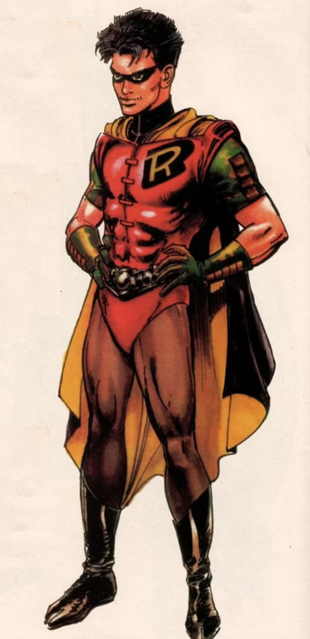
He submitted it to DC, but the publisher opted not to go with it. Which just goes to show you that even the best don’t get what they want all the time. (But hey, let’s not forget that Adams came up with two classic Robin designs — the second Earth-Two outfit and Tim Drake’s togs.)
I asked our NEAL ADAMS CHRONICLES columnist Peter Stone to give us the back story and he talked to his wife, Kris, Neal’s daughter, who provided some of the details.
Here’s the outfit — you can buy the $5,000 sketch here — and here’s Pete:
By PETER STONE
Neal was always striving to update Batman because he felt very strongly that nostalgia (while valuable and necessary) does not bring in new readers. Neal was never a fan of the TV show costume even though his 1960s Brave and the Bold issues were much more in that style than his later, longer-eared, longer-cape version for which he became famous. Neal’s Batman was more ninja-like. He saw Batman as the ultimate human athlete and not the heavy-set, bulky character Frank Miller drew.

The Brave and the Bold #93
After 1974, when Neal was boycotting DC Comics for better rates, better royalties and the return of art, he only drew Batman occasionally on covers. Around 1990, DC asked artists to submit designs for Tim Drake’s Boy Wonder outfit. Neal, of course, won, and Robin’s new costume was born. No more bare legs.
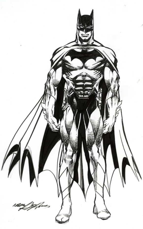
In that same vein, when Jim Lee was president of DC and was redesigning many of their main characters, Neal was in the swing of Batman: Odyssey. He was talking extensively with DC and saw an opportunity to create a new costume for the Darknight Detective: a modern take on Bats with a snazzy, updated utility belt and softer boots with the ninja toes for quieter movement. He submitted it to DC, expecting a positive reaction. He was told Jim Lee had already redesigned Batman but they appreciated his design.
So the drawing went into the art drawers for a rainy day. It’s kind of an amazing piece if you look at it carefully. No doubt it’s Batman, but it’s not the TV version or Neal’s Batman for the 1970s or even Frank Miller’s version from the ’80s. It does have Frank’s big black bat on the chest and Neal added some bulk to the character, but not to the degree of Frank or even Jim.
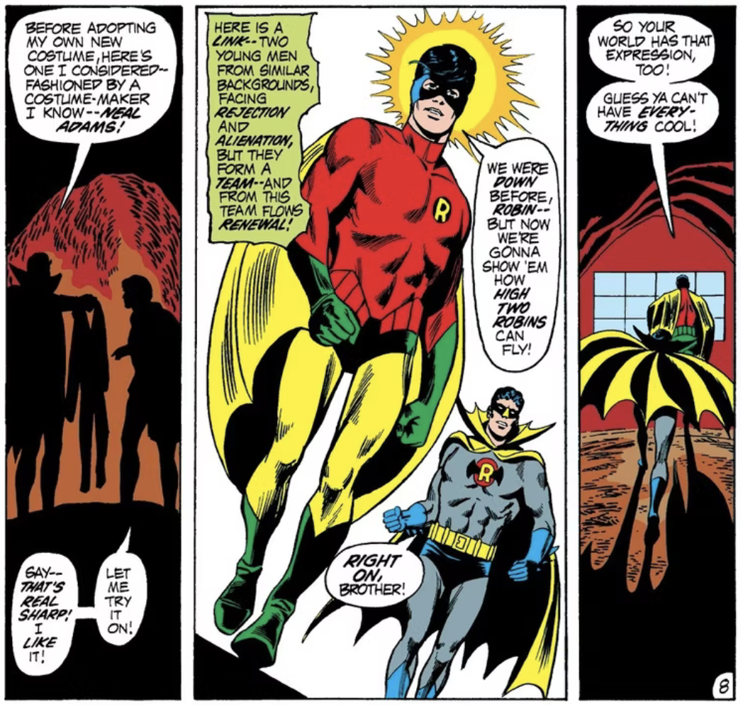
Justice League of America #92, by Mike Friedrich, Dick Dillin and Joe Giella
Neal designed, penciled and inked the entire piece. If you asked him, he would tell you exactly what everything on the new “belt” did as well as all the secret stuff you can’t see. In the end, he just wanted to make Batman modern with a taste of classic design.
—
MORE
— FIRST LOOK: The Main NEAL ADAMS CLASSIC DC ARTIST’S EDITION Cover — in HIGH RESOLUTION. Click here.
— Dig This Glimpse at the Upcoming NEAL ADAMS DC CLASSICS ARTIST’S EDITION. Click here.
—
Peter Stone is a writer and son-in-law of the late Neal Adams. Be sure to check out the family’s twice-weekly online Facebook auctions, as well as the NealAdamsStore.com, and their Burbank, California, comics shop Crusty Bunkers Comics and Toys.
February 29, 2024
Everything works great except the midsection. I like the belt but the variation on the bat trunks breaks the lines of the suit awkwardly.
February 29, 2024
An issue I always had with Neal’s later BATMAN, was the inclusion of the bat on the buckle. I thought it was unnecessary and redundant. The eye slots going from open to closed doesn’t work for me either.
February 29, 2024
Miller’s Batman was bulky mainly because he was much older.