
A birthday salute to one of Batman’s greatest artists…
The late, great Marshall Rogers was born 71 years ago on Jan. 22, 1950. Other than Neal Adams, I’ve almost certainly written more about Rogers than any other Batman artist.
I’m definitely not alone in my appreciation for his dynamic page layouts, detailed architecture and precise linework, either. Two generations of professionals have taken their cues from his Detective Comics run with writer Steve Englehart — an arc many consider to be the greatest Batman story ever, myself included.
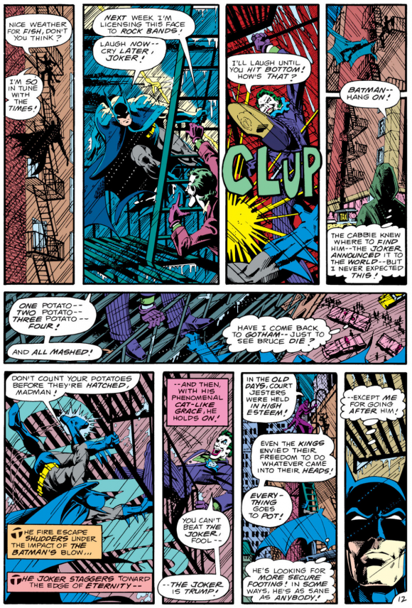
Rogers pencils. Terry Austin inks.
Among those artists is Sandy Jarrell, a longtime 13th Dimension favorite. Two years ago, for our 80th anniversary BATMAN WEEK, Sandy provided us with a few of Rogers’ covers that he rejiggered to feature the classic, Golden Age Detective Comics logo. It was an inspired choice when you consider just how much the Englehart-Rogers run borrowed from the era.
Well in the interim, Sandy has finished all six covers — and they are beauteous.
Check these out — and note some of the subtle coloring differences:
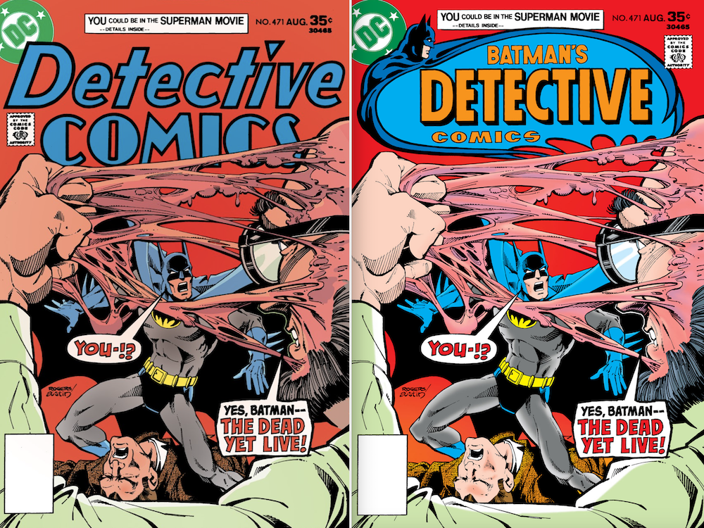
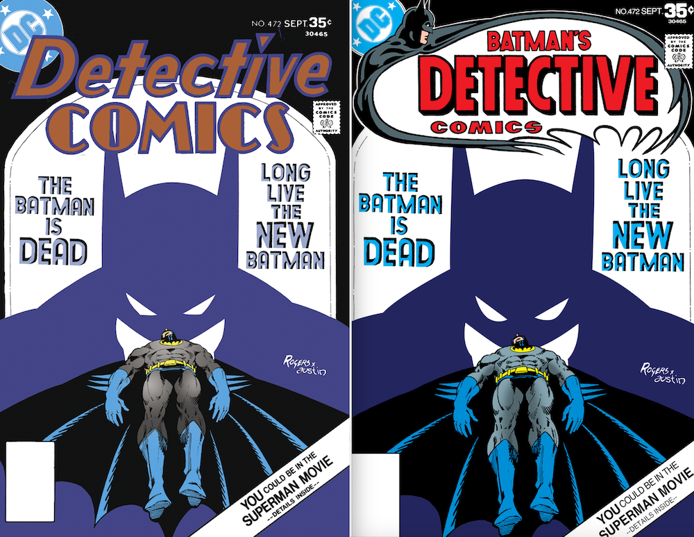
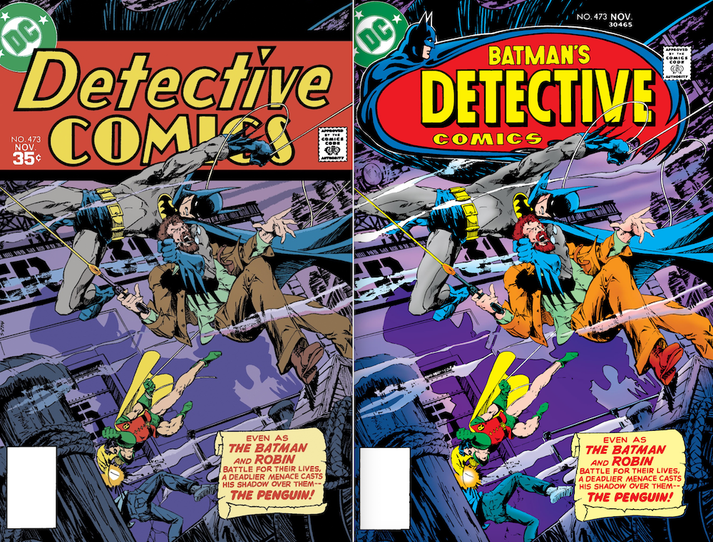
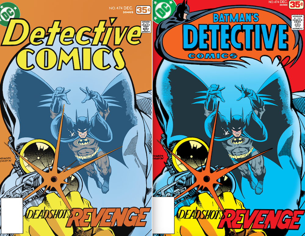
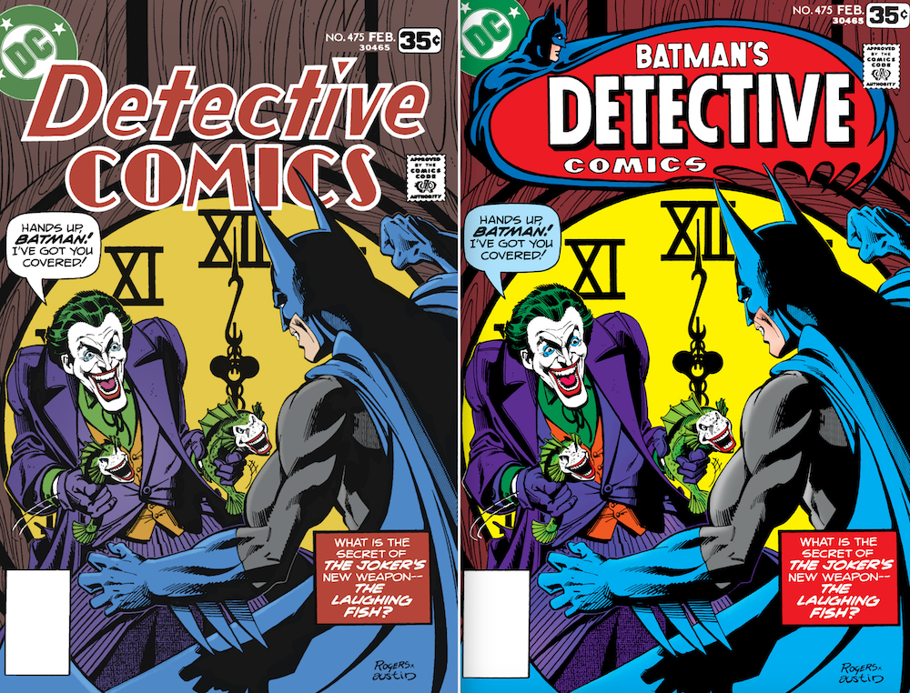
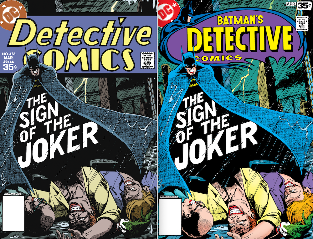
Groovy. Really, really groovy. (Five of the six covers were inked by Terry Austin, natch. Issue #473 was Rogers solo.)
“I was obsessed with these comics,” Sandy explained. “Hugo Strange! Monster men! They felt utterly modern, despite being loaded with Golden Age goodness. The classic logo that Archie Goodwin had reinstated was gone a few issues after he left, and its replacements were… not very good, IMO. I missed the old logo, and always felt it would’ve fit the Englehart/Rogers run perfectly. So decades later, for no reason besides I needed to see it, I fixed the whole run.”
—
MORE
— ‘THANK YOU, GOD’: STEVE ENGLEHART Recalls First Seeing MARSHALL ROGERS’ BATMAN Art. Click here.
— An INSIDE LOOK at ENGLEHART AND ROGERS’ Unfinished BATMAN Trilogy. Click here.
January 22, 2021
Love those rejiggered covers better than the originals!
January 22, 2021
I LOVE LOVE LOVE the original Detective Comics logo and no later version ever came close. I love the Archie Goodwin run with that classic logo and never liked the constant changing versions over the late 70s up to now. The original was best and it would have been cool to have the same one all these years later (like The New Yorker) and would have been a wonderful tradition. And on the subject of logos, the current Batman logo in his own book is the ugliest thing I’ve ever seen. Give me the 70s version (starting with #241) or the classic version. Or even the 1965-1969 one is great. But this current eyesore turns me me off.
January 22, 2021
Wishing a appy birthday to the late Mr. Rogers.
January 22, 2021
these are perfect. thanks!
January 29, 2021
Thanks for making there “new” versions Sandy! All of us F.O.O.R. (Fans Of Ole Rogers) appreciate your hard work!