
EXCLUSIVE commentary…
Issue #4 cover
The Wrong Earth #4 is out 12/5 – the latest installment of one of the year’s best new comics.
If you’ve not been following along – and why haven’t you? – AHOY Comics’ series, written by Editor-in-Chief Tom Peyer, is a sharp-eyed, often satirical look at what would happen if a sunny superhero traded universes with his violent counterpart. (Click here to read all about it.)
Anyway, we’re back with more behind-the-scenes artistry by series regular Jamal Igle, who explains how he came up with Season One’s first six covers. (Oh, and click here for Igle’s commentary on the book’s character designs.)
Dig it.
—
By JAMAL IGLE
My process for covers is pretty much the same with every project. I always begin with a digital sketch, or more, depending on how many ideas I come up with that I like based on the issue.
Usually, you don’t know what the tone of a story might be when drawing covers but because each Wrong Earth cover was done after the issue art was produced, it gave me more options for the final ideas.
The concept sketches are colored to develop a palette I like and then submitted to Tom. Once a cover idea is approved, we move on to the next stage and it can take anywhere between three days to a week to complete.
—
ISSUE #1
The key was to establish the concept of the story, two versions of the same hero (Dragonflyman and Dragonfly, respectively) as mirrors of the other. It’s a familiar concept but I felt the best way to distinguish this cover was to have each hero superimposed on their “alternate” Earth. So you have the sunnier Dragonflyman in the darker landscape and vice versa.
The background was digitally manipulated from personal photo reference I took, but the figures were first laid out so that they were in the exact same position. Then I penciled the piece with HB pencil on Series 500 Strathmore Vellum Bristol and inked the figures with both brush and pen.
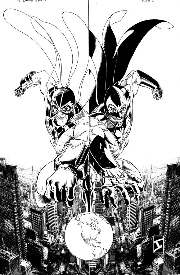
I wanted to make sure that the aesthetic had a certain feel with each figure. Dragonflyman was inked primarily with a sable-haired brush, Dragonfly was inked mostly with Copic multiliner pens. This process continues with all the other covers as well.
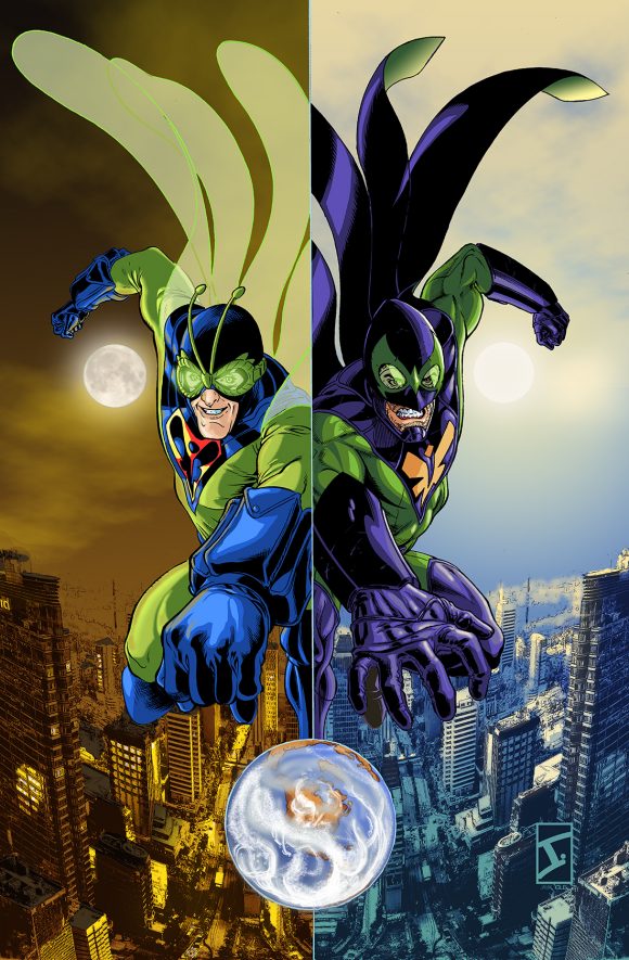
The color palettes for the background were based on two of my favorite films visually (The Crow: Salvation and October Sky) and completed in Adobe Photoshop.
—
ISSUE #2
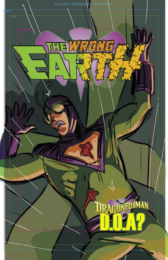
Issue #1 ended in a huge cliffhanger, so I thought to myself, “Why not homage classic comic covers and pick up those threads?” As you can see, the original idea was to have cover copy that read “Dragonflyman : D.O.A.?” but that idea was nixed when the final cover design was completed.
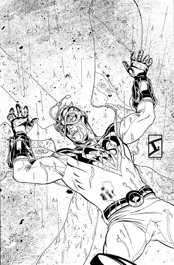
Again, working primarily with brush and Japanese sumi-e ink on the figure, you’ll also see a bit of digital manipulation. I shot a photograph of the asphalt pavement outside of my apartment building and, using several filters, created an “inked version” to insert in the background of the image. That’s the only digital element, however, in the line art.
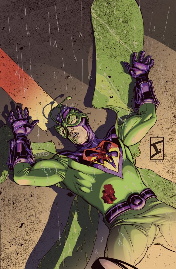
In the coloring stage, I decided to color it as you would normally. Then, once I had the colors laid down, I added a layer of solid red on top, set at a 15 percent opacity. I’m a big advocate of the process of color grading as a tool.
—
ISSUE #3
The idea for this cover was simple. This issue focuses a bit on Deuce and Numbers 3 through 5, so I wanted to establish who they were in one image. I started with the initial sketch, including the color treatment and pitched it to Tom. While I wanted to have them all on the cover, I needed to show that Deuce was in charge.
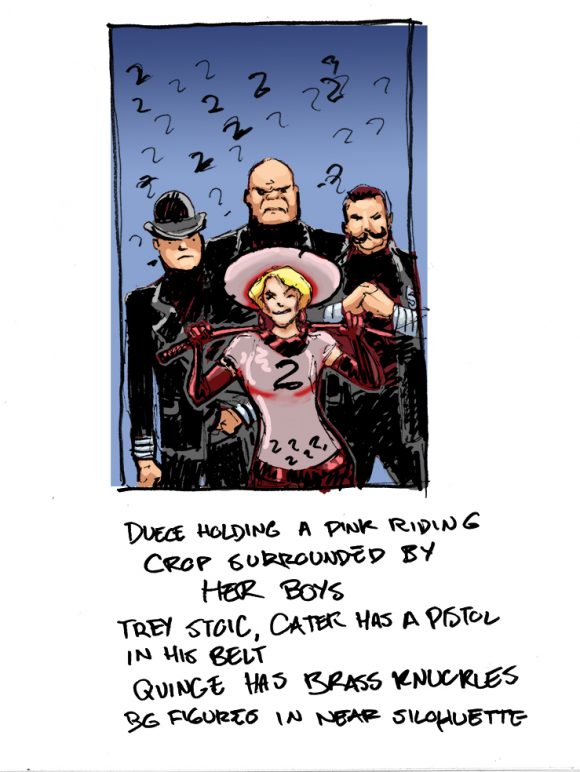
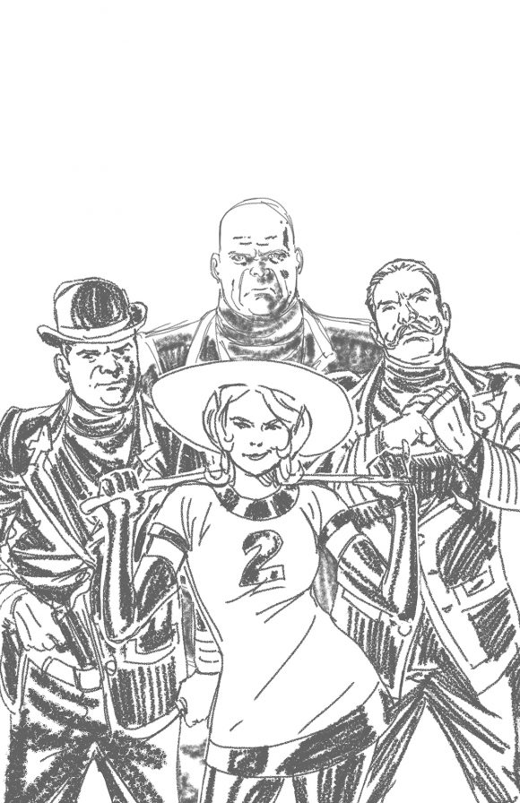
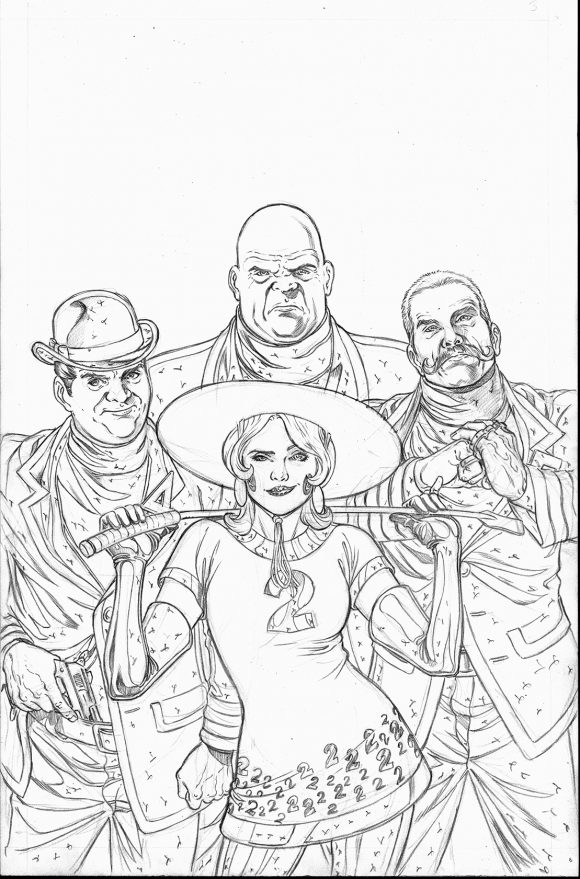
After the layout was drawn in Manga Studio — which was done by doing each character separately and then combining them in layers — I drew the cover in pencil on paper. I then inked the piece primarily with a brush, cleaning and refining as I went along.
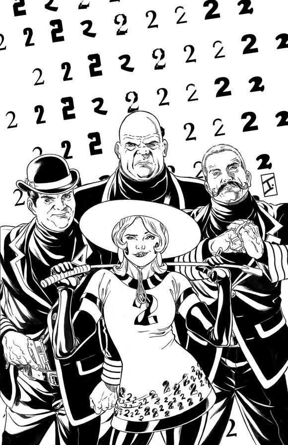
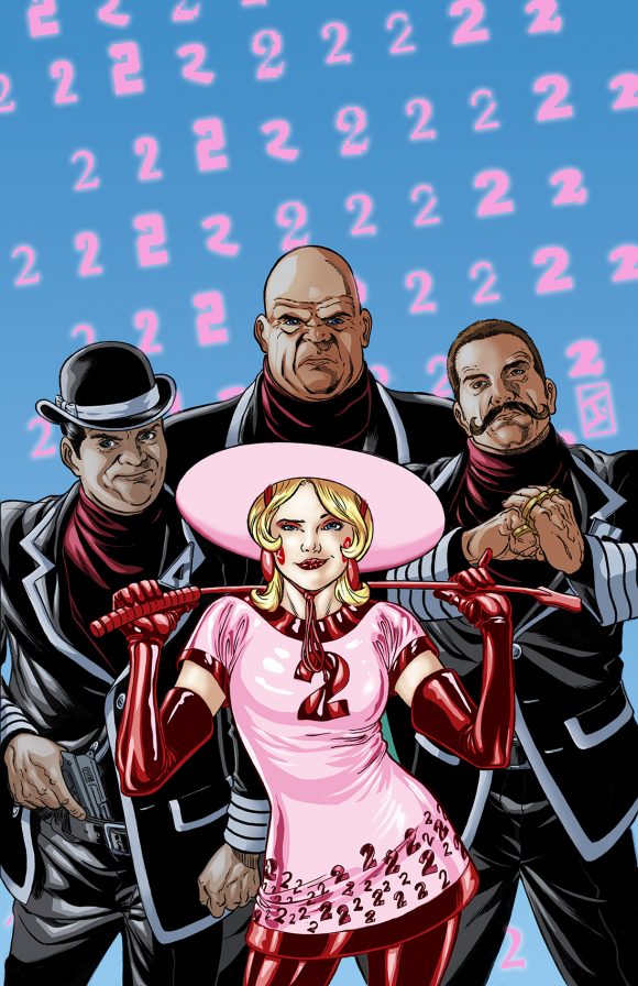
Once I scanned the artwork, I created the background 2s in Adobe InDesign, then colored the cover in Adobe Photoshop CS6. The key was to focus on Deuce as a character, so I placed a slight shadow over her boys in order to pop her out of the image.
—
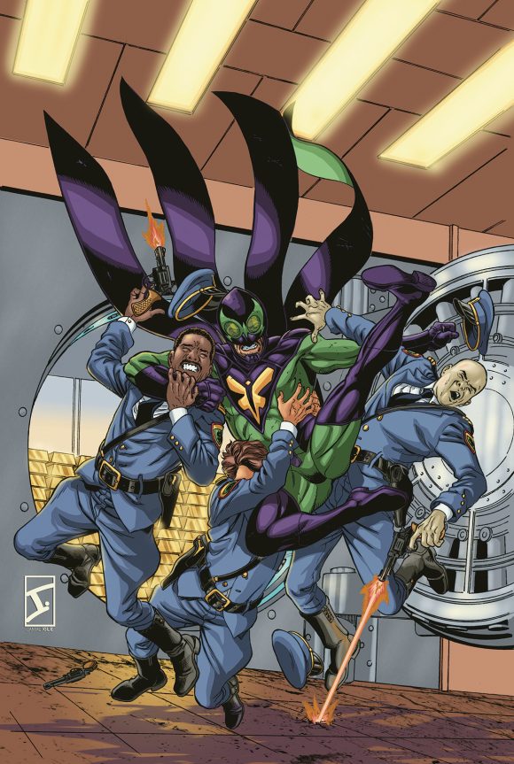
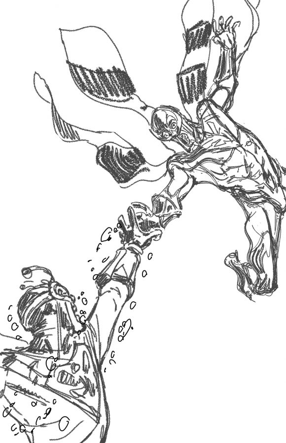
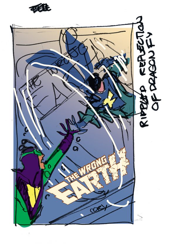
ISSUE #4
The one thing that had happened with the covers at this point was that we hadn’t seen Dragonfly on a cover since Issue #1. We needed to rectify that!
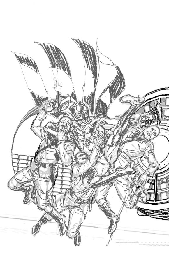

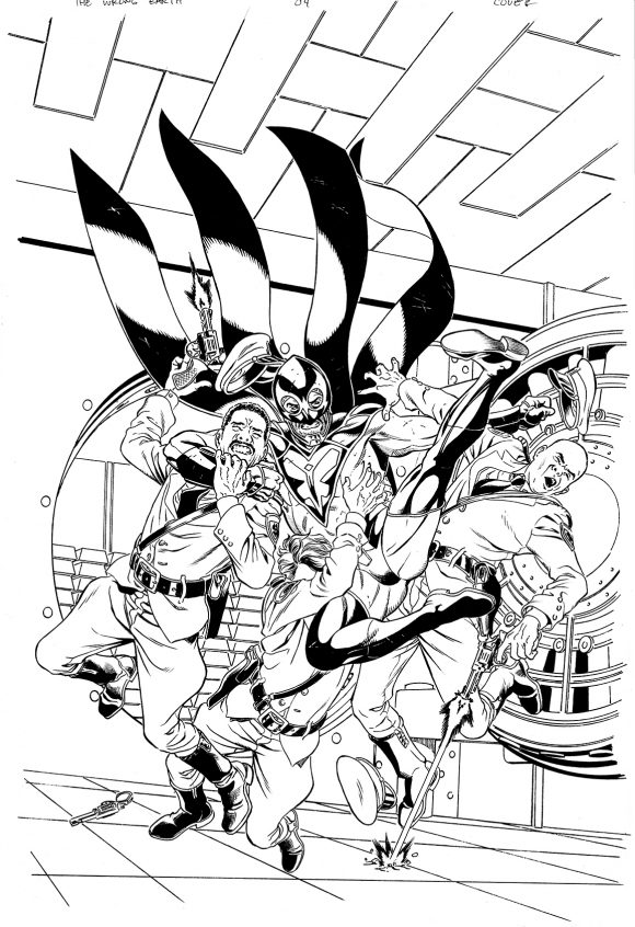
I thought the best way to re-establish that Dragonfly may not be all he’s cracked up to be was to have him fighting authority figures. I didn’t want to have him fighting the police but then I thought, “The issue takes place in a bank, so let’s have him fighting the guards.”
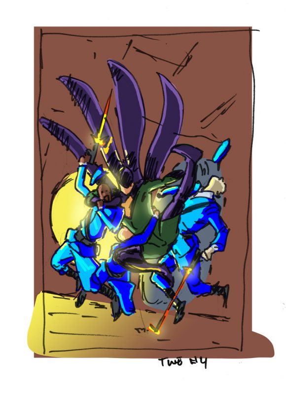
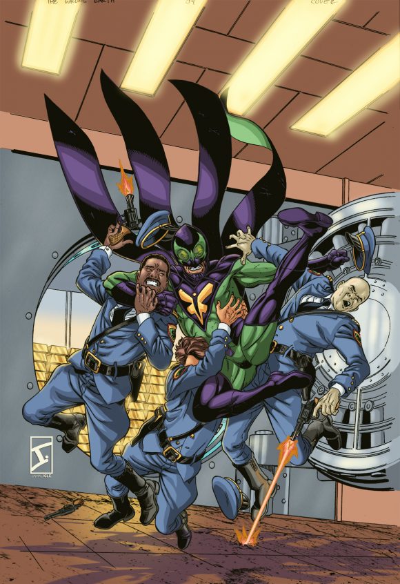
As opposed to the last three covers where it was a mix of traditional and digital line art, this cover is entirely hand drawn. Laid out digitally in Manga Studio, the vault was designed in Sketchup Pro, based on photo reference of bank vaults. Dragonfly and the guards were colored on separate layers to keep them from bleeding together digitally.
—
ISSUE #5 (Out in January)
Again, we found ourselves in a situation where we had not had one of our principals on any of the covers, namely the villainous Number One Omega.
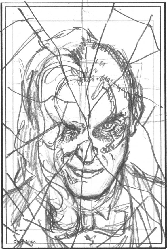
This was the simplest concept, of course. The cracked mirror, the smirk, the sell. Drawn entirely by hand, colored with a ton of filters and color masks to replicate the look of mirrored glass.
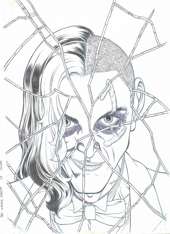
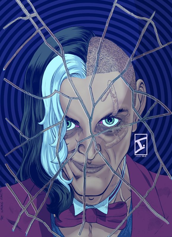
The only thing I did differently is that I went “straight to board,” meaning that I penciled it loosely with non-photo blue lead and inked it. A huge thank-you to my wife, Karine, who helped me with the final image in terms of color management.
—
ISSUE #6 (Out in February)
We wanted to repeat the mirror motif of Issue #1, but I didn’t want to simply re-do what had been done, nor did I want it to be blatant. I decided that the best way to handle it was to go more conceptual.
Again, there’s a lot of digital that went into this cover. The figures were laid out in Manga Studio, to get the placement I wanted. Then I imported the sketch into Photoshop, and used the ripple filter to warp Dragonfly. I then drew the figure by hand.


Everything was colored as I usually do, building the figures separately. When it came to the water effect, I did what any smart person does and went on YouTube to find a tutorial on creating water-ripple effects.
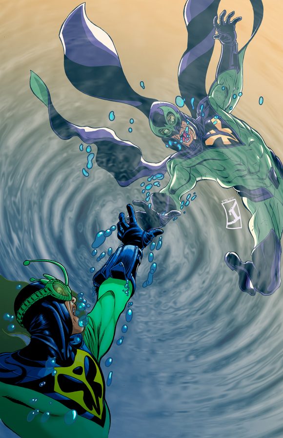
All the elements combined and color corrected, I was thrilled with the final product.
—
The Wrong Earth #4 is out 12/5.
—
MORE
— BUILDING A MULTIVERSE: Jamal Igle Designs THE WRONG EARTH. Click here.
— Why You Should be Reading THE WRONG EARTH. Click here.
Trackbacks/Pingbacks