A vision of gorgeous graphic design that combines modern and retro aesthetics.
Funny thing, timing.
Right now, we’re in the middle of NEAL ADAMS MONTH, featuring daily commentary by the comics legend focused on his 27 DC Comics variant covers. You can read more about that here, but the gist is that Adams and his guest inkers are discussing Adams’ classic covers and the modern spins they’ve put on them.
Over “across the street,” metaphorically speaking, is Canadian artist Michael Cho and Marvel. Cho’s style is about as radical a departure from Adams’ as you’re likely to find — but it’s a style that’s intoxicating. I love it in the same way I love the art of Darwyn Cooke and Dave Bullock, both of whom take up shelf space in my personal library.
As soon as I saw Cho’s covers, I wanted to do a “director’s commentary” with him — and he agreed. So it’s an embarrassment of riches here at 13th Dimension: Every week for the month of February, we’ll be featuring commentaries by Cho on the latest batch of books — including EXCLUSIVE work-in-progress art and outtakes!
Here’s WEEK 1, featuring covers released 2/3.
—
By MICHAEL CHO
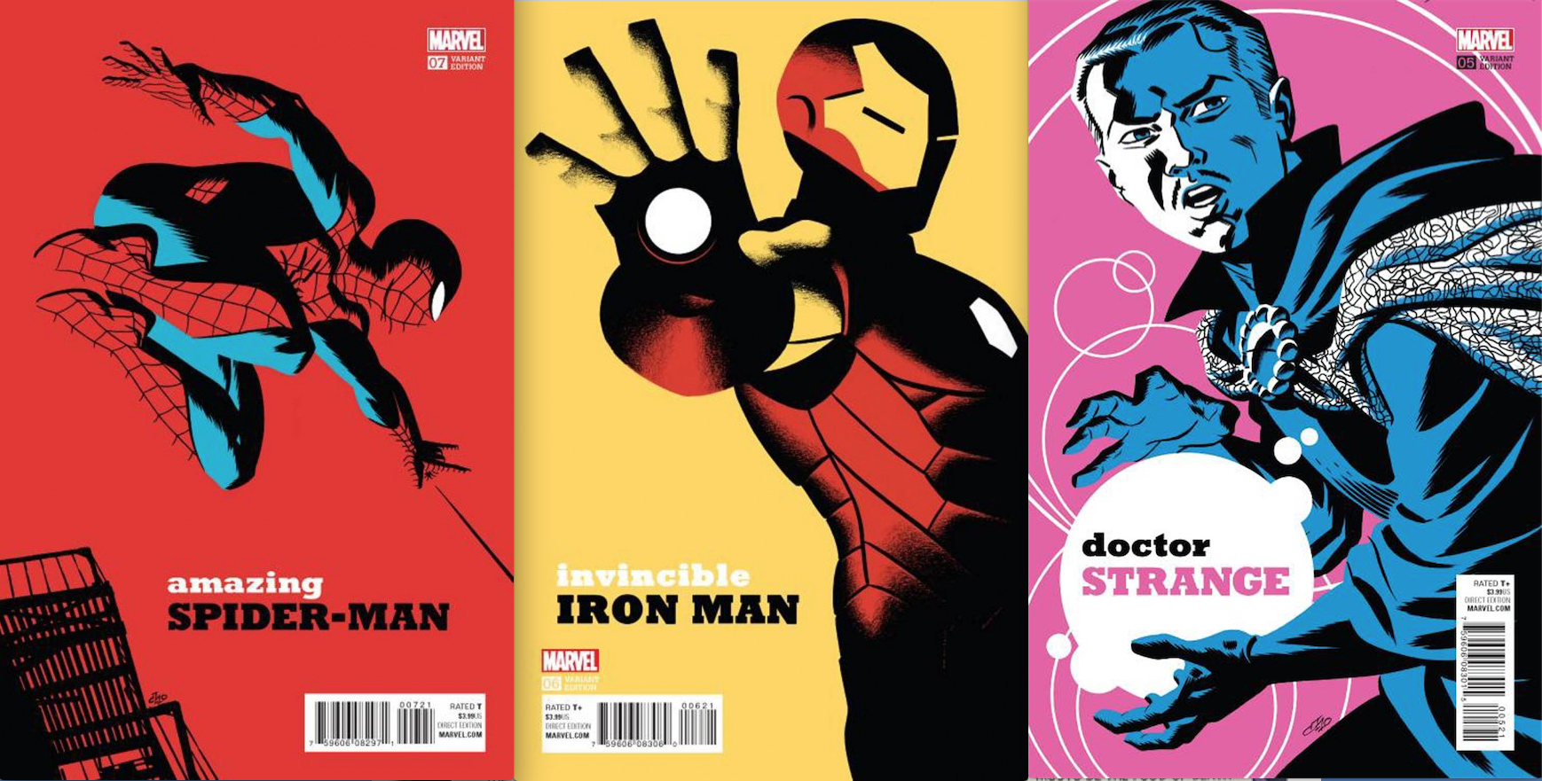
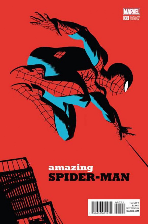
Amazing Spider-Man #7. Spider-Man is my favorite Marvel character (well, maybe it’s a tie with Iron Man). I was just trying to find a simple, iconic pose here and present him in a full-figure shot, as a change from the many cropped-image covers I did.
I drew two pages full of Spider-Man poses, then picked the one that had the most energy. I added the fire escape at the last minute to give it some depth. As with all the covers, since I only used a few elements in the image, I took special care to balance them all, including the placement of the type treatment.
—
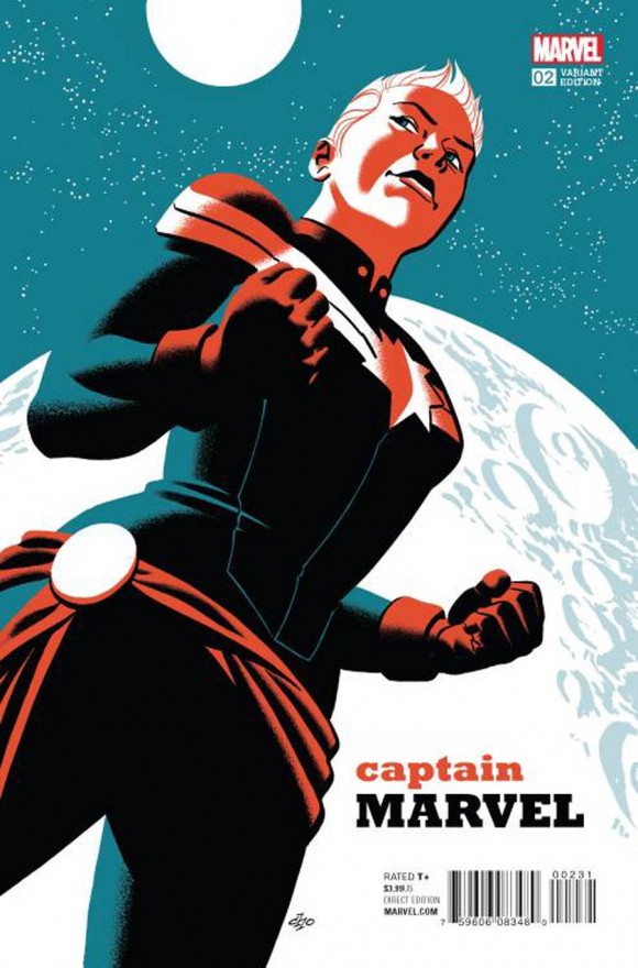
Captain Marvel #2. I tried to represent Captain Marvel’s strength and integrity in this pose, using an up-angle to accentuate her iconic status. The rendering here is simplified a bit more as I was trying to add a hint of of those old WPA and World War II posters. I drew her body with a bit more solidity and heft, as I pictured a military commander to look. My wife was the reference for her face in this drawing, by the way.
—
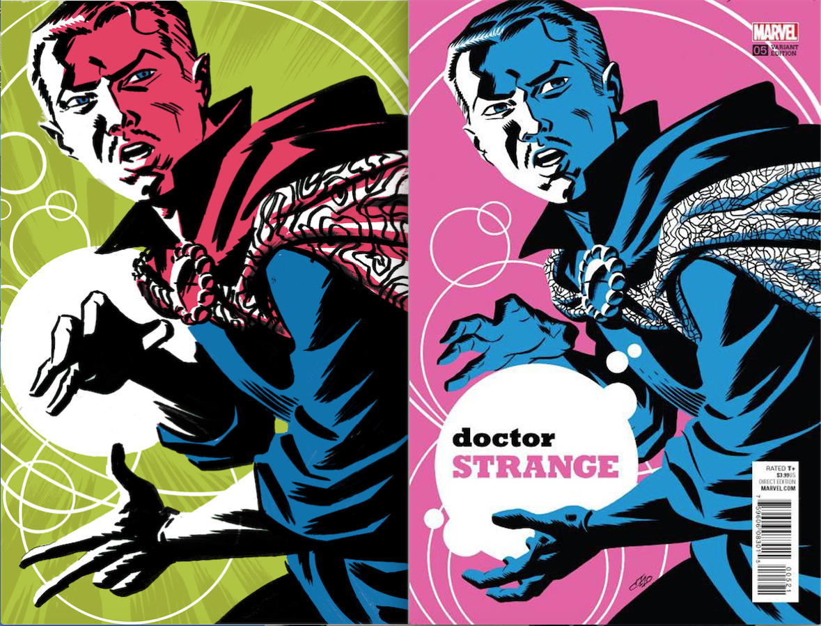
Doctor Strange #5. I love Ditko’s Doctor Strange, so I was glad that the recent redesign hewed closely to the original. This was the second cover I laid out, when I still didn’t have a firm grasp of how I wanted to unify these covers. Initially, I had him casting a spell and posed his hands differently, but when I figured out the type treatment as a key to unify the images, I had no idea where to put the type. Hence, I reposed his hands to accommodate a bubble holding the type treatment. Problem solved!
—
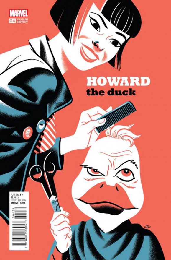
Howard the Duck #4. This one was one of the hardest covers to work out. I drew a lot of different options — some based on detective novel covers, others as a simple iconic drawing of Howard. The rough for this had a darker palette and was rendered with a lot more shadow and a noir feel. In the end, I focused more on the humour — right call, I think. There’s a little shout-out to writer Chip Zdarsky and artist Joe Quinones in the chip and (cup of) joe buttons on the jacket.
—
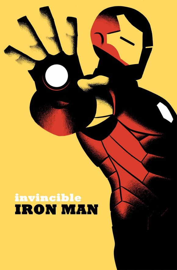
Invincible Iron Man #6. Half the work here was in the cropping, as I wanted to present a simple and subtle image of Iron Man’s power. Remember the scene in Daredevil’s “Born Again” storyline where Iron Man holds up his hand and tells DD to stand down? That’s the kind of subtle insinuation of power I had in mind as I worked this one out.
I lit it so the repulsor ray is the source of light and threw out anything extraneous after that. Once I threw the shadow across his face, I thought the image worked. Again, the rendering is stripped down, as I was going for a WPA poster feel.
—
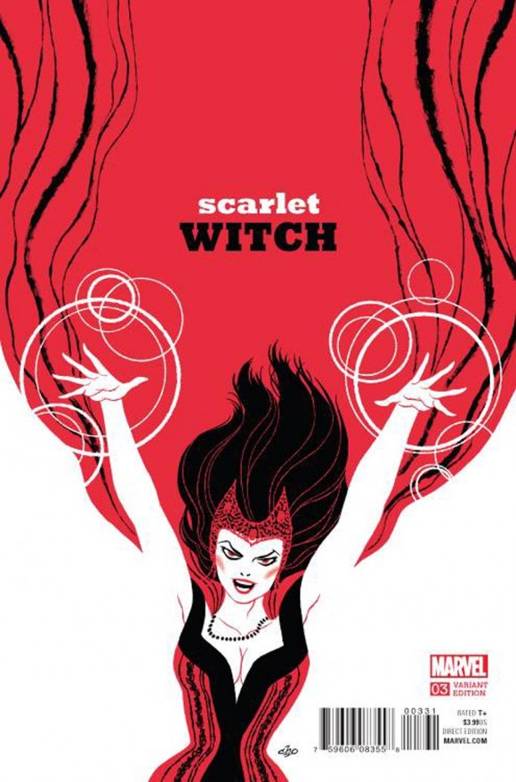
Scarlet Witch #3. I was just looking for a non-traditional comic cover image, one that used design to carry the concept. If I’m not mistaken, Kevin Wada did the costume redesign and it’s fantastic, so I was trying to bring in a bit of the feel of fashion illustration here with loose, flowing lines.
I built contrast through the big fields of red and white versus the thin lines and corset details, and added a hint of chaos with the ragged brushwork on the cape. I think this one was one of my favourites.
—
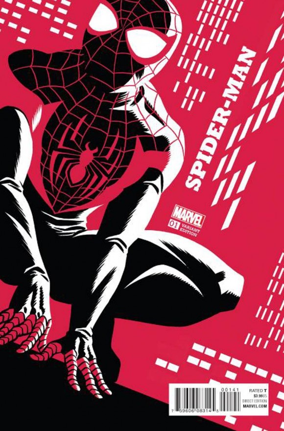
Spider-Man #1. Again, I was trying for a stripped-down feel here — with only one accent colour. It’s a simple, iconic pose and the interest and movement in the scene is created by the windows suggesting the night-time city haze. I like trying to suggest backgrounds more than drawing all the details — I think viewers do a better job filling in the details in their heads anyway. I didn’t know where to put the type treatment, but then realized it works if it’s crawling up the building. Y’know, ’cause it’s Spider-Man.
—
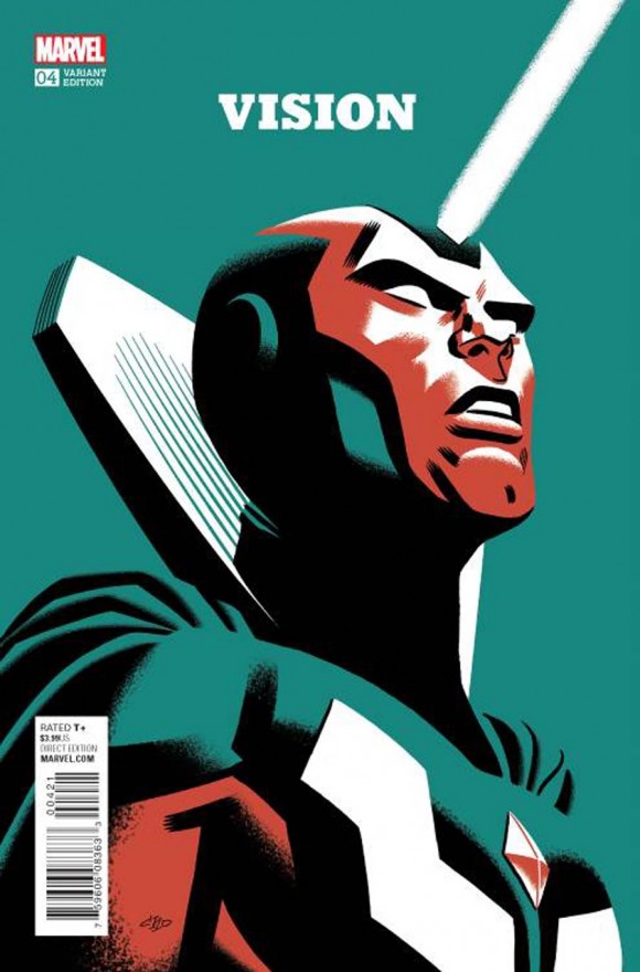
The Vision #4. This was another hard one. I drew up three different concepts in colour, all involving him phasing through something. None of them worked very well no matter how much I tweaked them.
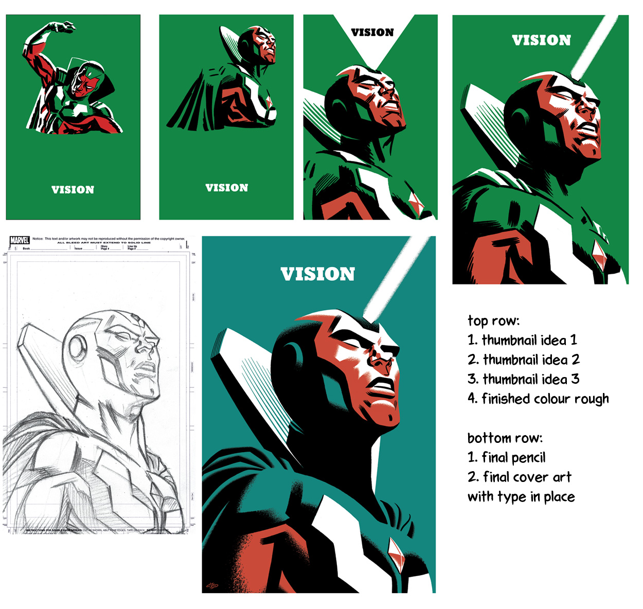
Finally, I went for a big, iconic portrait, inspired by that Shepard Fairey Obama poster, but emphasising Vision’s “alien” kind of presence. I stripped down the rendering once again to big shapes of colour and shadow, trying to give it a WPA poster feel (a common theme through several of these covers, as you’ve noticed by now).
At the last minute, I added the beam from the crystal and that made the whole thing work for me. For some reason, I had David Bowie’s “Starman” looping in my brain as I drew this.