
Eight decades, eight covers: A walk through Catwoman history…
The one-shot Catwoman 80th Anniversary 100-Page Super Spectacular #1 is finally due to be released June 3 and we’ve spent quite a lot of time celebrating 80 years of the Feline Fatale over the last couple of months. (Her actual first appearance — in Batman #1 — was April 24, 1940.)
One of the issue’s biggest selling points — aside from the stories themselves, of course — is DC’s decade-tribute variant covers, which you can click here to check out.
There are also retailer-exclusive variants, such as Neal Adams’ (click here).
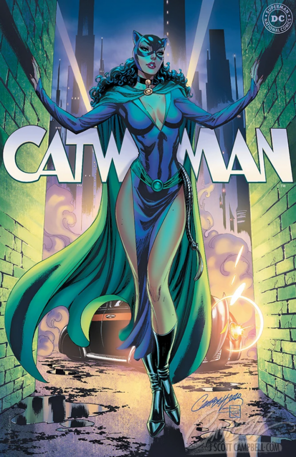
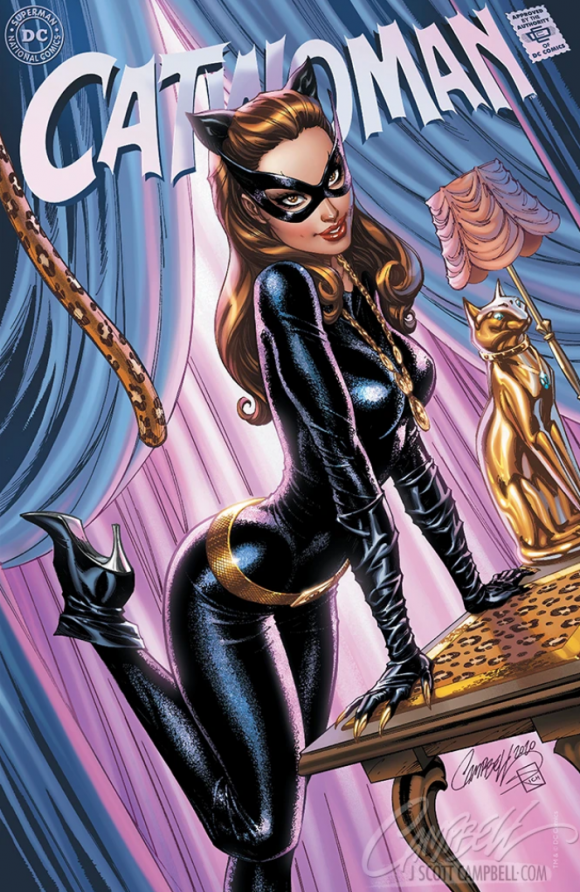
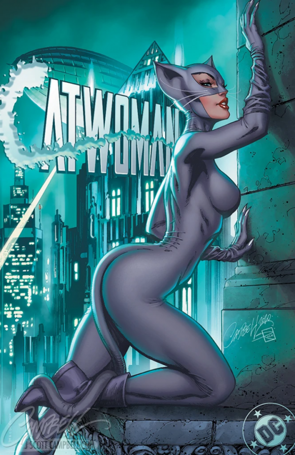
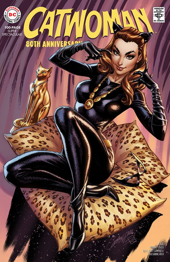
But I’ve happened upon another cool set, as well: Artist J. Scott Campbell — in addition to his 1960s decade-tribute cover starring Julie Newmar — has produced eight retailer-exclusive variants, each featuring a different Catwoman costume, including a second Newmar homage.
Check these out:
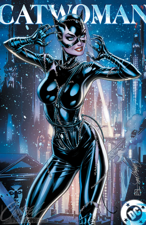
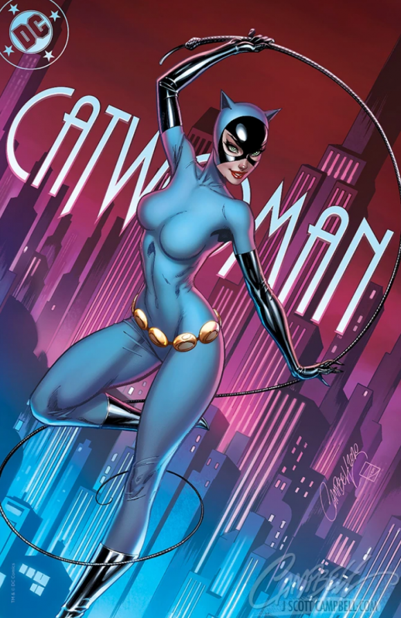
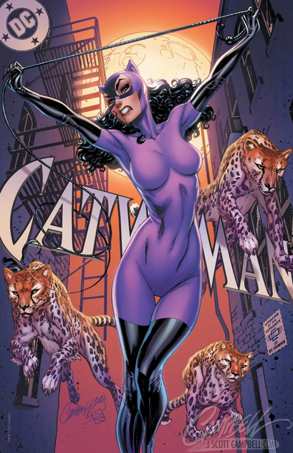
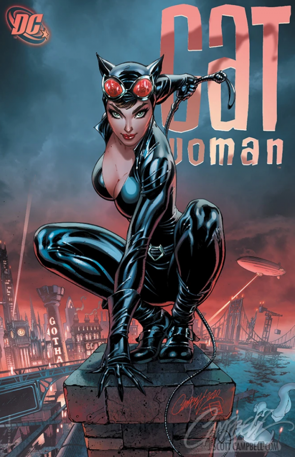

—
A few thoughts:
— Unsurprisingly, my fave is that second Newmar cover. Also unsurprisingly, I really dig that Golden Age piece, with the old-school Batmobile cameo in the background.
— If you want to get your hands on these, hit up Campbell’s website. There’s a fairly complex pricing and packaging system, so do check it out.
— Oh, and here’s Campbell’s 1960s cover, which will be available at shops:
—
MORE
— Dig the Final Versions of the CATWOMAN 80th ANNIVERSARY Variants. Click here.
— NEAL ADAMS Reveals the Secrets of His JOKER and CATWOMAN Anniversary Covers. Click here.
May 28, 2020
May 28, 2020
J. Scott Campbell really nailed it with these variant covers.
May 28, 2020
I’m not that big a fan of his work, but I love the background details on each piece & how they tie into the particular Batman “version” (i.e. The Animated Series, the 1992 movies)
May 28, 2020
Wow, those are really nice, and I kind of feel they capture the spirit of each decade a bit better than some of the standard covers, through the background details, use of logos, etc.
May 28, 2020
Yeah, I agree. One thing that has fans upset with some of these is that they’re too modern. I agree with a lot of that but I think Campbell gives us the best of both worlds. It’s modern styling but the DNA of the time periods are evident. It’s really nice work.