
There have been so many covers, it’s easy to forget a lot of the great ones…
This 13 UNDERRATED COVERS thing we started recently as a lark has been really well received, so we’re just gonna keep doing it as a recurring feature.
Last week, we did 13 UNDERRATED ACTION COMICS COVERS (click here), so it’s time to bookend it with 13 UNDERRATED SUPERMAN COVERS.
Once again, this a Bronze Age selection.
Dig it.
—
Superman #236. OK, this might not actually be underrated at all but it’s still not usually listed among the greats. Either way, it’s a legitmately scary cover from the early ’70s, when DC had a habit of giving even its brightest mainstream superhero comics a horror spin.
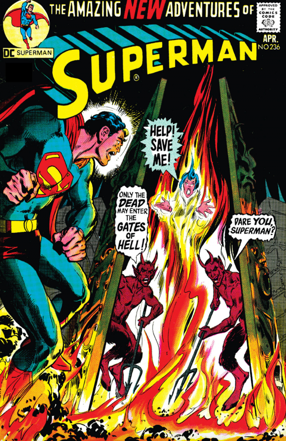
Neal Adams pencils, Dick Giordano inks
—
Superman #412. Superman going rogue is as hoary as chestnuts get but this deserves points for the sheer power that Klaus Janson gives the Man of Steel. You can believe just how spectacularly horrible and painful it would be if Superman jammed his hand through your battle armor so he could disembowel you. Poor, agonized Lex!
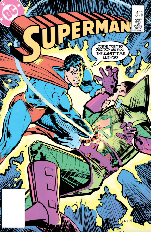
Klaus Janson
—
Superman #323. It’s a pretty standard cover but I just want to take a moment to say that the Atomic Skull is one badass-looking bad guy on the page — which is why comics rule. Because if some knucklehead dressed in that lemon-lime get-up in real life, they’d be laughed out of Metropolis.
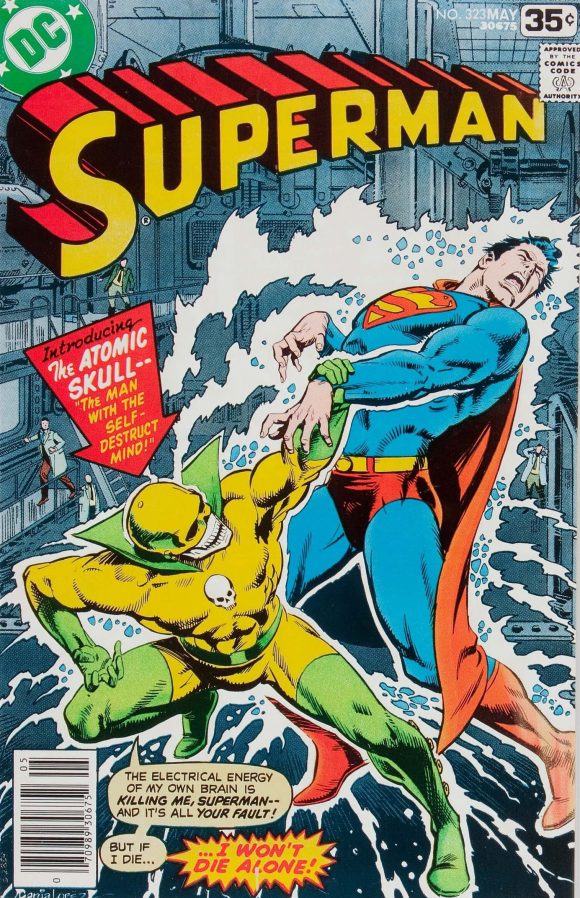
Jose Luis Garcia-Lopez
—
Superman #334. That’s not a weird creature, Lana. That’s Mysterio paying a visit to the DC Universe.
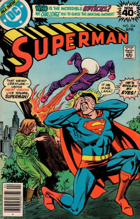
Ross Andru pencils, Giordano inks
—
Superman #406. Really, do you think that guy would have a chance against Superman? No, of course not. Especially since Supes can disembowel Lex Luthor at will. Still works though, even if it’s a bit silly.
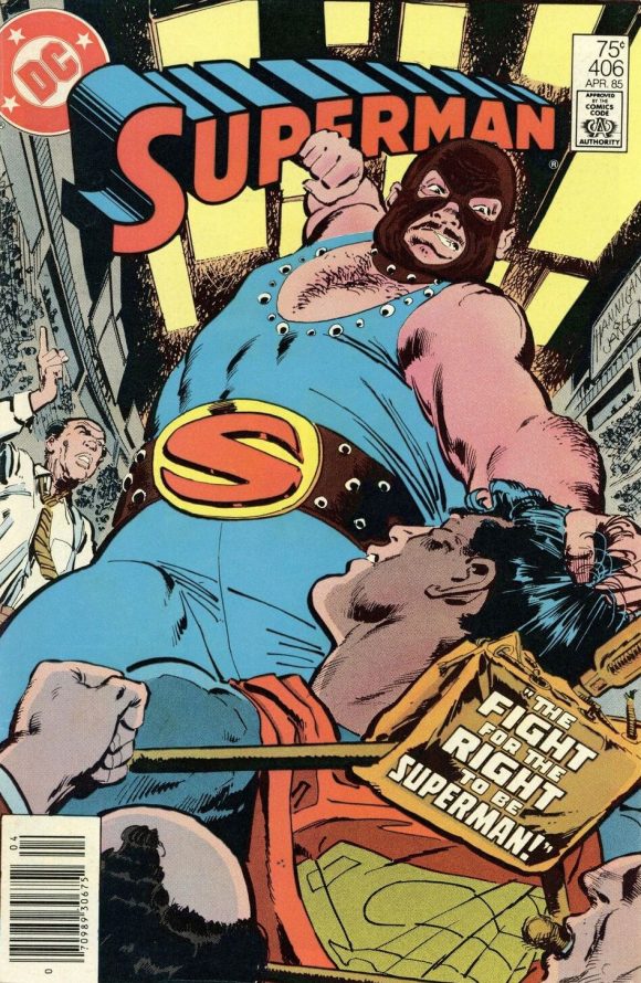
Ed Hannigan pencils, Janson inks
—
Superman #314. If you look at this cover quickly, it looks like it came out in, oh, 1968 instead of 1977. You got your evil space hippie. You got your groovy, dated lettering across the image. You got your guest appearances by fallen Justice Leaguers. It all adds up to a funky cover. And, where can I get a space kazoo?
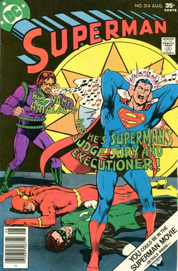
Curt Swan pencils, Adams inks.
—
Superman #320. Speaking of the Silver Age, this is classic, old-school wackiness done up Bronze Age style. “Great moons of Krypton! Solomon Grundy is stealing my cape! But — WHY?” Why indeed? I must know.
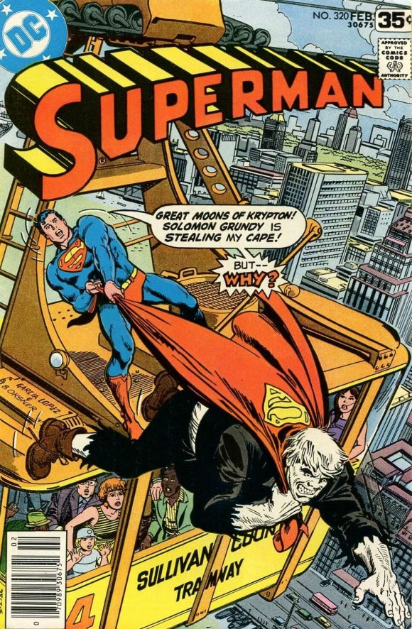
Garcia-Lopez pencils, Bob Oksner inks
—
Superman #343. As I mentioned in the 13 UNDERRATED ACTION COMICS COVERS, few artists could draw Superman flying as well as Ross Andru could — and this is a bold showcase. But doesn’t it look like Supes just soared into the Star Trek episode Who Mourns for Adonais?
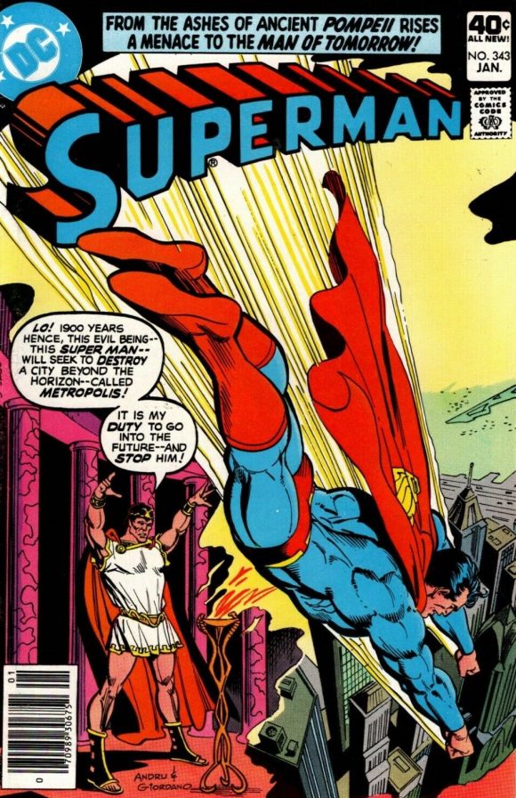
Andru and Giordano
—
Superman #333. Totally self-indulgent choice: This is the first Superman book I bought after I saw the 1978 movie. Unfortunately, it cemented in my young mind that the movie was much more interesting than the comic and I wouldn’t become a regular Superman reader until John Byrne came along years later.
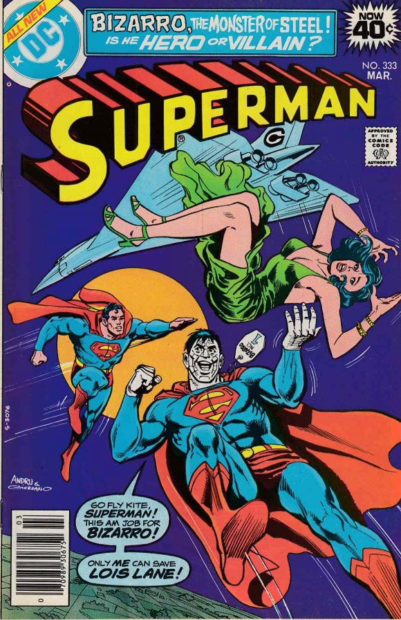
Andru and Giordano
—
Superman #294. The concept isn’t new but Ernie Chan’s execution is solid. The colors definitely help — especially the sunset contrasted with the darkening city — so if you know who did the work, please post it in the comments. A haunting, affecting image.
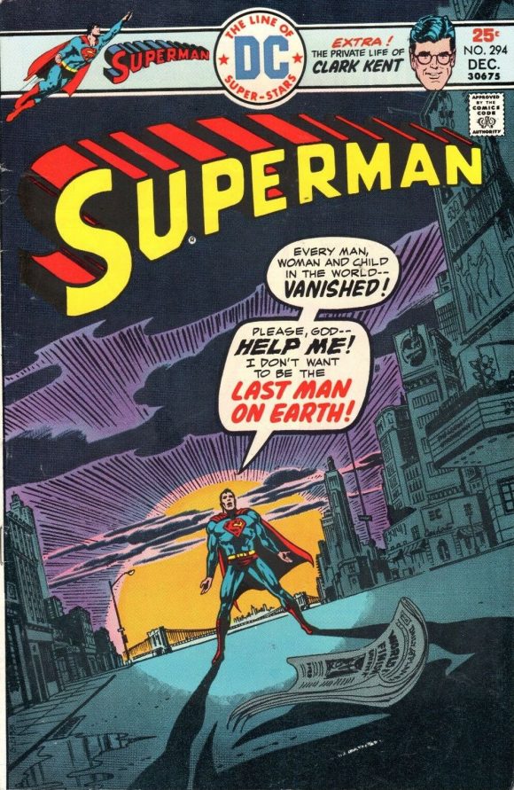
Ernie Chan
—
Superman #421. DC often struggled with the relevance of its pop-culture references. The MTV angle was right on because the network was at the height of its popularity. But Thriller? That video came out more than two years earlier. Anyway, this cover is a different look — and I especially dig the lighter shades of the logo colors.
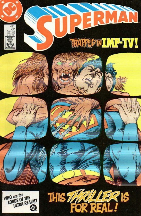
Denys Cowan pencils, Jerry Ordway inks
—
Superman #374. If I’m gonna put together a list of 13 UNDERRATED COVERS, I gotta include at least one starring Vartox.
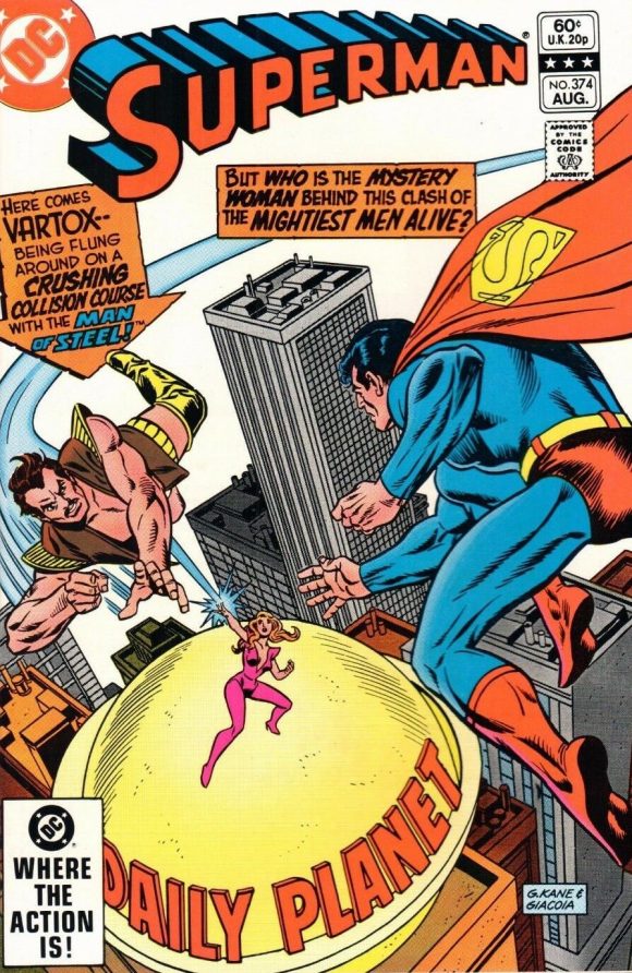
Gil Kane pencils, Frank Giacoia inks
—
Superman #354. I’m not an artist so I really don’t understand how they do negative images like this — but I love it. Love it. And, hey bonus points for the Man of Steel’s grandson — Superman, 2020! I wonder where he is now?
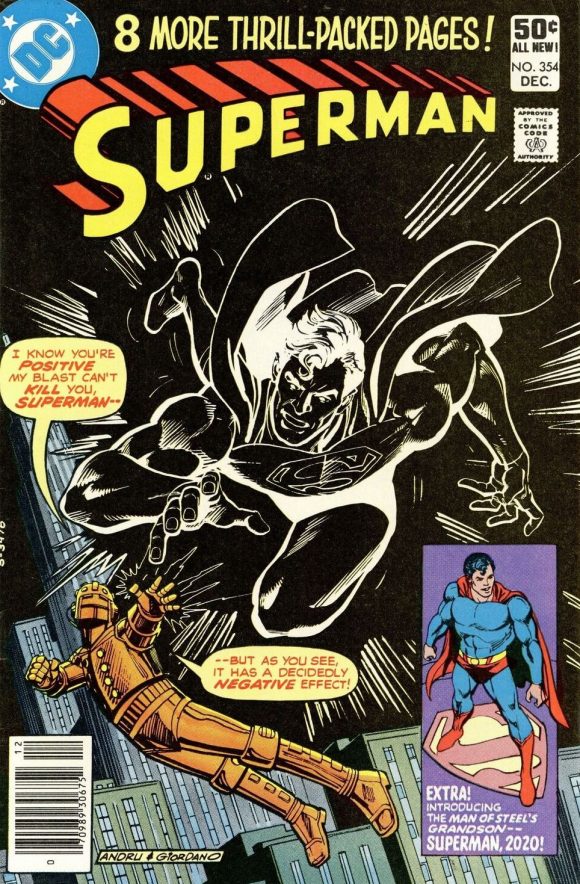
Andru and Giordano
—
MORE
— 13 Underrated ACTION COMICS Covers. Click here.
— 13 Underrated BATMAN Covers. Click here.
November 13, 2020
These covers all scream retro-awesomeness in their own way!
November 13, 2020
Excellent selection!
A great walk down memory lane as I had all if them prior to 1985!!
November 14, 2020
Some great memories on that list!
November 14, 2020
Top selection. If I could add one, it would be another José Luis Garcia-Lopez (praise be his name) masterpiece, Superman #340, featuring NRG-X. Extra points for the extra-colour on the DC bullet.
November 15, 2020
R.e. #294 : without taking anything away from Ernie Chan but that’s gotta be a Carmine Infantino layout, with colors likely by Tatjana Wood (around the same time she colored all of DC’s covers)
R.e. #421 logo and #354 Superman figure : these are photostat camera tricks where the line art is photographed and then ‘reversed’ – black is white and white is black – similar to a negative from a photograph; very easy to do nowadays with Photoshop but even back then it was pretty straightforward, though it did require some time and materials i.e. more money to pull it off, so it was sparingly used (and therefore more impactful when it did happen IMHO)
p.s. – hard to tell with the scan but the colors themselves on the #421 logo may be faded from poor printing rather than a deliberate effect
Hope this helps