
LETTERER APPRECIATION DAY: The unsung art, explained.
—
UPDATED 9/1/19: Today is Letterer Appreciation Day, did you know that? It’s the brainchild of Blambot’s Nate Piekos and timed to coincide with the birthday of the great Gapsar Saladino (click here), who was born 92 years ago. (He died in 2016.) Nate put this piece together for us in 2016, but obviously it’s timeless, so check it out. And thank your favorite letterer. They make your comics so much better! — Dan
—
It’s only recently that colorists began getting regular credit on comics covers. Letterers? They’re still on the back bench, even though their work is essential to the stories being told.
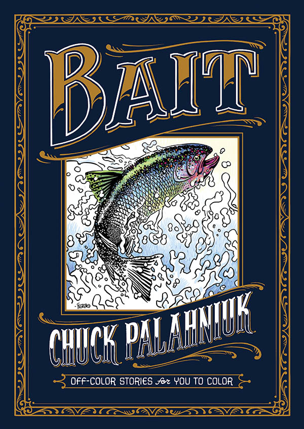
Maybe that’ll change. For example, Nate Piekos’ work on Chuck Palahniuk’s Fight Club 2 earned him a spot on the Library Edition cover. Piekos is also involved in Bait — Palahniuk’s (exceptionally) adult coloring book, out 10/26 from Dark Horse. Just look at that cover he designed.
I became more interested in the art of lettering in the last year or so, thanks to historian Arlen Schumer’s outstanding exhibit on DC legend Ira Schnapp (click here) and during a conversation I had with Neal Adams, who told me how much he enjoys doing his own.
But even though I’ve been reading comics for about 45 years or so, I know precious little about what goes into lettering.
So here’s Piekos with an insightful explanation — 13 Things You Didn’t Know About Comic-Book Lettering:
—
By NATE PIEKOS
1. The comic-book letterer is responsible for creating the dialogue lettering, sound effects, and titles on a comic book, and doing so while stylistically complementing the artwork, so that the reader is never confused about the reading order on a page.
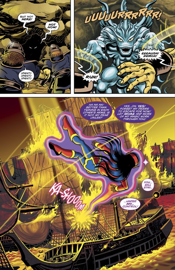
ElfQuest: The Final Quest #13 (Dark Horse)
2. Originally, comic-book lettering was done with ink and a pen (usually either a Hunt Crowquill or a Rapidograph pen) directly on the original art. Since the ’90s, almost all comic lettering has transitioned to digital lettering, using Adobe Illustrator, and fonts specially crafted by comic-book letterers.
3. The best letterers are essentially graphic designers. Whether the letterers know it or not, expertise with page layout and typography are the hallmarks of graphic design. You’ll find the most experienced letterers also designing exciting title pages and cover logos.
4. The all-caps style of comic-book dialogue started in the earliest published comic strips in order to counteract the poor print quality of the time. Using all capital letters was easier to read, even if the printing press was subpar. The trend stuck, and it’s now a tradition even though printing presses have greatly improved.
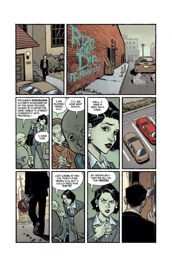
Fight Club 2
5. The average professional digital letterer can turn around a finished, lettered comic of 20 or 22 pages in a day. The fastest letterers can do it in 4-6 hours.
6. Letterers are usually the last person on the creative team to work on a comic book. The issue must be written, penciled, inked and sometimes colored before the letterer gets the materials to letter it. Sometimes the colorist and letterer are doing their jobs at the same time.
7. In the modern age, publishers have gone digital—a letterer accesses the publisher’s server, downloads the script, the art and sometimes placement suggestions from the editor, before starting a project. When the letterer is done, he/she uploads the finished lettering files back to the publisher’s server.
8. Most letterers are either self-taught, or are taught on the job, in-house at a publisher. There are a few college courses out there that focus on lettering, but the majority of professional comic-book letterers still fall into the two categories above.
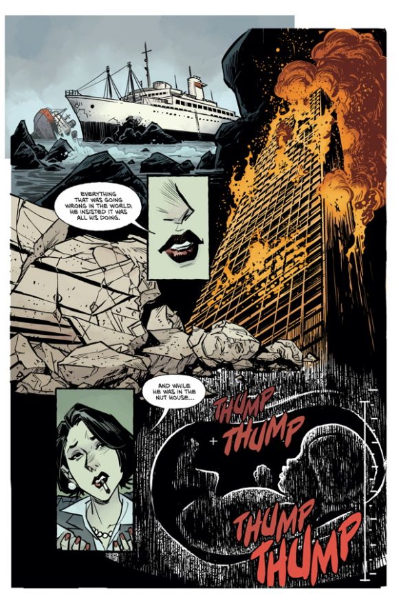
Fight Club 2
9. Professional comic-book letterers do not use Comic Sans. Our fonts are specialized and crafted by experienced letterers who have either custom-made their own software, crafted fonts specifically for the publisher, or sell them to the public online.
10. The majority of letterers are freelancers, working out of their home studio. The days of a bullpen of letterers on-site at a publisher’s offices have mostly ended.
11. Despite the switchover to digital lettering, many letterers still do some hand lettering. Sometimes the best option for a specific task is still just sitting at the drafting board and picking up a quill pen… or a hybrid of the two approaches. Since the advent of the tablet and Cintiq (a monitor-sized screen that the letterer “draws” directly on using a stylus), many letterers hand-draw into digital-art programs. I do quite a bit of this on titles and sound effects, and when creating new fonts.
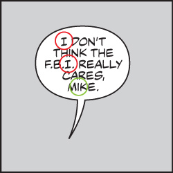
12. While comic-book lettering is generally all caps, the letter “I” has two variants. The letter I with “crossbars” on top and bottom is used only for the person pronoun, “I”—“I lettered a comic book.” “I like horror novels.” The other version of I is a simple, straight line and is used for all other instances.
Fight Club 2
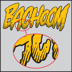
13. Letterers have an entire lexicon of unique terms for the elements of lettering. For instance, a “squink” is the little burst at the end of a balloon tail when a person is speaking inside a building or vehicle.
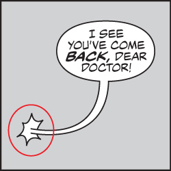
Squink
“Breath marks” are the three little dashes before and after a word that is said with a gasp.
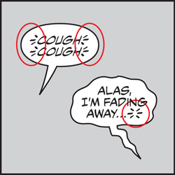
Breath marks
“Roach chew” are ragged little lines inside a title or sound effect that makes it look worn or tattered. For a comprehensive list of these terms with examples, you can read the article I wrote here.
Roach chew
—
Nate Piekos graduated with a bachelor of arts degree in graphic design from Rhode Island College in 1998. Since founding Blambot.com, he has created some of the industry’s most popular fonts and has used them to letter comic books for Marvel Comics, DC Comics, Dark Horse Comics and Image Comics, as well as dozens of independent publishers. Nate’s work has not only been utilized in comics, but in product packaging, video games, on television and in feature films. His software has been licensed by such companies as Microsoft, Six Flags Amusement Parks, The New Yorker, The Gap and many more.
In his spare time, Nate plays guitar, cooks, and draws webcomics. He’s married and lives in the woods of Rhode Island.
October 25, 2016
I always thought the lettering have as much importance as other elements in comic pages. For example, Chris ware’s comics uses lettering to increase the personality of the characters, like straighter fonts for rational characters and cursive fonts for emotional characters. Sometimes, in a moment of mind change, the letters can change their style in a character to represent the new way he thinks.
Thanks for the tips and for the links!
Cheers from Brazil 🙂
October 25, 2016
Thank you, thank you, thank you.
November 10, 2016
Lettering makes a HUGE difference, especially when reading a dialogue-heavy script like those Chris Claremont epics back in the glory days of the X-Men. And even now, the ability to read things clearly and in order cannot be stressed enough. BTW: Thanks for the informative article and your great fonts!
November 10, 2016
Lovely article which so true & Nate never fails to reiterate the importance of letterers to the comic-book industry even on Blambot. I’m raising the awareness over on my end of the globe from Nigeria.
February 11, 2017
It was great to get a real insight into lettering for comics which isn’t obvious for your average comic reader.
October 9, 2021
I kinda figured Comic Book Letterers were making their own Fonts. Thanks for the confirmation on that.
September 2, 2023
Oh, thank you for this! I knew next to nothing about lettering or the wonder workers who do it! Am I not remembering or was there a comics letterer named “Joe Lettersie?”
September 2, 2023
Joe Letterese!