
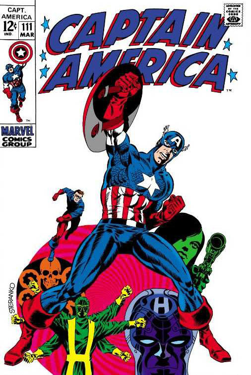
Just three issues. That’s all it took for Jim Steranko to make his mark on Captain America in 1969.
—
(UPDATED 11/5/16: A while back, John DiBello wrote this piece on Jim Steranko’s lasting impact on Captain America, timed to the release of the movie Captain America: The Winter Soldier. With Jim Steranko turning 78 today, it behooved me to republicize John’s effort. Because I gotta tell you, this piece is great. If you’ve never read it: Enjoy. If you have read it before: Enjoy it again.)
—
By JOHN DiBELLO
After spending five years co-starring with Iron Man in Tales of Suspense, Captain America had finally received his own full title in ’68, drawn by the legendary Jack Kirby — but still something was missing.
The letter pages of Tales of Suspense had been filled with pleas to set Cap’s escapades in the modern day, but under Kirby, the Star-Spangled Avenger’s adventures were still rooted in the past: fighting the Red Skull, flashing back to the death of Bucky, punching an Adolf Hitler impersonator. Kirby introduced Batroc during this period, but also gave us Captain America battling — and actually being challenged for more than 30 seconds by — Paste-Pot Pete. (You can give him a snazzy new outfit and redub him the Trapster, but he’s still that guy with a sticky paste gun.)
Then, with Issue #110, like he’d done with WWII warhorse Nick Fury, Jim Steranko kicked Steve Rogers into the swinging ’60s with hard-hitting action, groovy psychedelia, and the first (of many) fake-out “deaths” of Captain America.
He gave us a new kind of Cap, a new sidekick, new adversaries and a new Steranko-designed logo. Under Steranko, Captain America absolutely thawed out from his decades-long deep-freeze.
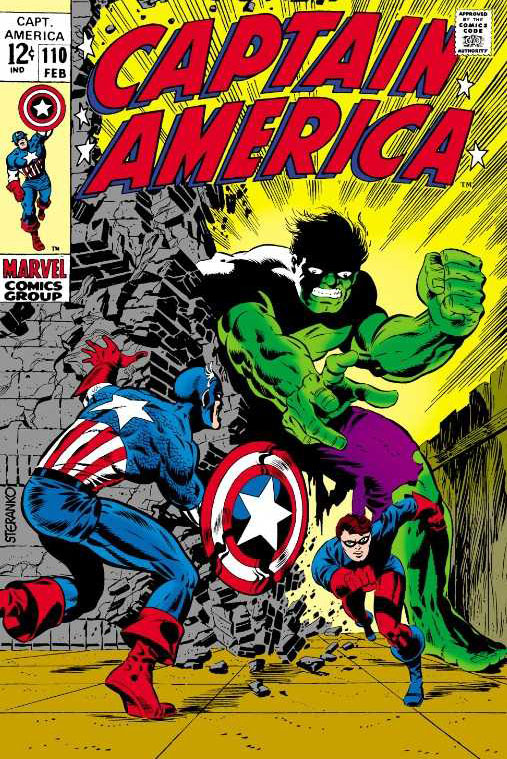
Captain America #110 (1969), art and colors by Jim Steranko
Stan Lee’s script for #110 picks up on two dangling sub-plots: Captain America revealing his identity as Steve Rogers to the public (in Tales of Suspense #95) and many painful memories of working alongside Bucky in the 1940s. Compelling plots, if standard comic-book stuff.
Steranko’s noirish first page, however, is anything but ordinary: Rather than the uniformed Cap leaping into action, a series of small panels shows the progression of Steve stepping into the spotlight before lighting up a cigarette (!) underneath a giant promotional poster of Cap. It has more in common with a Will Eisner Studios Spirit splash page than any previous issue of Captain America.

Captain America #110 (1969), script by Stan Lee, pencils and colors by Jim Steranko, inks by Joe Sinnott
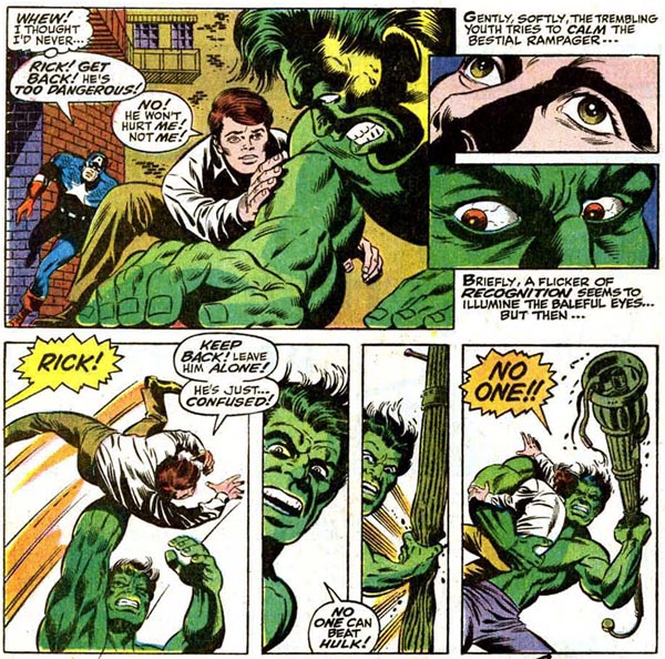
The first half of the book features a swift but brutal fight between Cap and the Hulk, who’s being pursued by American military forces through Manhattan. Needless to say, the Hulk’s not in a good mood. What would be a major character crossover in most other books, however, takes a back seat to setting up the plot: After Hulk pal Rick Jones is placed in the line of fire to be rescued by Captain America, the Hulk leaps away — battle over.
Steranko’s Hulk is actually slightly off-model: though massive, the Hulk’s head is proportionately sized to his muscled body, rather than the smaller head-to-body ratio with which the Green Goliath usually is drawn.
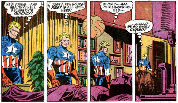
Cap nurses the knocked-out Rick to health using one of my favorite artistic visual shorthands in comic books, a tier of multiple panels showing the moving progression of time against a static foreground and background, as Steve walks through the scene of the sleeping-still Rick, Steve’s head bowing and his shoulders slumping as he reflects on his own troubles.
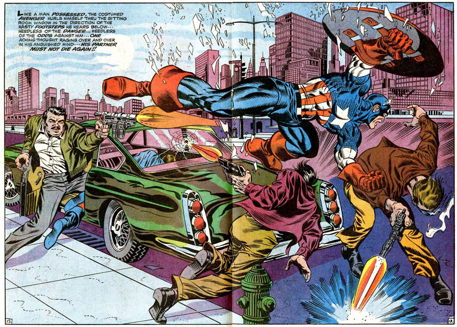
Another of Steranko’s trademark visual tricks is the sudden and abrupt cut to BIG! DRAMATIC! ACTION! — frequently in a double-page spread when the page is turned, to burst point-blank at you! Here, Captain America and Rick — whom Cap has reluctantly agreed to allow by his side as the new Bucky — stealthily sneak through a sewer on Page 11 of the story …
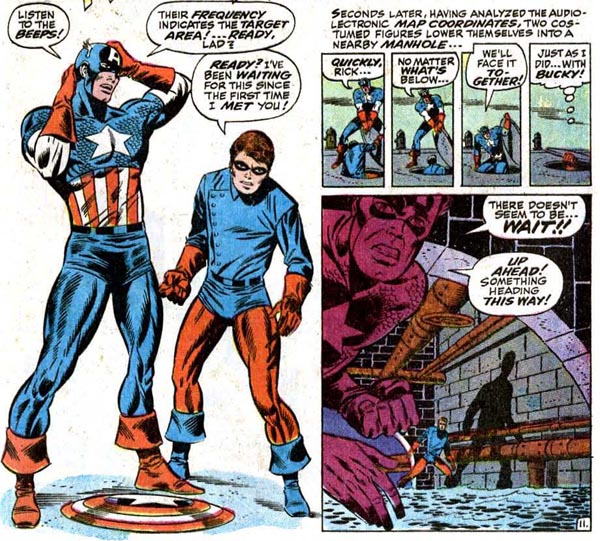
But flip to Page 12 and BAM! The action explodes immediately, Cap and Bucky leaping, fists flying, into a lair of 28, count ‘em, 28 Hydra soldiers. Even James Bond usually only encountered one or two SPECTRE agents when he entered a hidden volcano lair!
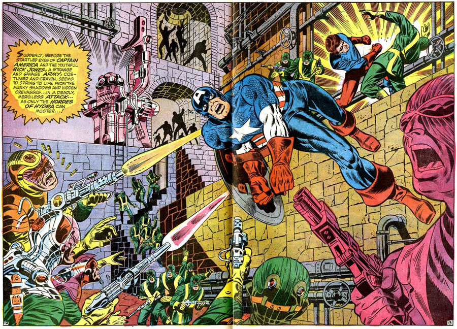
Like Steranko’s work on the Nick Fury, Agent of SHIELD feature, his Captain America books are filled with futuristic high tech and gorgeous women.
Both femmes fatale are dangerous and deadly antagonists for Cap, not only the never-again-mockable Power Vest, but the debut of sensual and slithery Madame Hydra (later to be known as Viper), one of the Marvel Universe’s top villains. In her skintight, halter-top green leather catsuit, she’s truly a villain for the modern age: vicious and venomous. She wasn’t the first of this new breed of female killer — Madame Masque, over in the Iron Man feature, had debuted the year before — but after a long period of supervillainy being largely the sole province in the Marvel Age of male characters, Madame Hydra was a breath of poisonous air.

And whoops! Cap’s dead. (He gets better.)
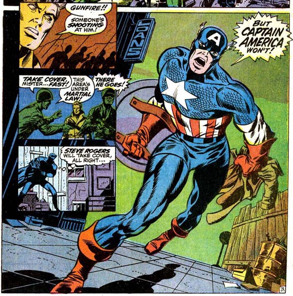
Issue #111 features one of the most distinctive and intriguing comic-book splash-page sequences still to date: a series of colorful small panels set at a carnival arcade from the point of view of Steve Rogers.
The multi-colored panels mirror bright flashing fairground lights. During this time it was unusual for a penciller to color his own work — most of Marvel’s comics were colored by coloring-department manager Stan Goldberg. Steranko’s keen sense of shading and coloring is as important a story-telling tool as his anatomy and dynamic movement, and for an artist to color his own work is still the exception rather than the rule in superhero comics.
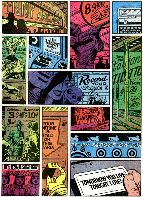
Captain America #111 (1969), script by Stan Lee, pencils and colors by Jim Steranko, inks by Joe Sinnott
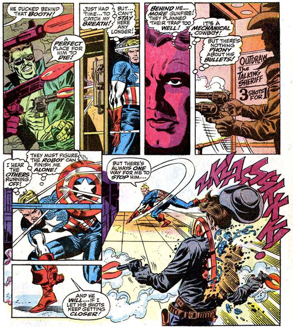
In the sequence below, Steranko’s sharp sense of coloring helps to “pop” the top tier sequence by shading Cap’s attackers in single tones and a close-up of Steve’s face in brilliant red-alert vermillion.
The bottom tier features another set of artistic tricks: the bullet that bisects the panel; Cap’s huge wind-up swing and toss so mighty his shield rips through a robot’s torso in panel two, the power of the toss increased by the perspective lines of the panels on the floor drawing our eyes along Cap’s attack.
Steranko’s not inventing these techniques — for example, a tiled floor to indicate perspective into the distance is a visual characteristic of Carmine Infantino. But Steranko is mixing and matching artistic tricks and techniques here, combining and blending them in ways that spotlight the energy and dynamism of his characters and fight sequences.
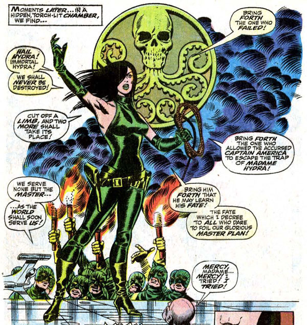
Tiled platform panels in the following scene draw our attention to Madame Hydra standing dramatic and tall before her minions (not-at-all symbolically standing beneath her).
The background is blank to avoid distracting us from the detail of the figures, but Steranko fills it with the smoke of burning torches and the giant Hydra symbol to fill the white area and immediately express a tone of a dangerous mob, obsequious before a powerful leader. Also, Madame H is wearing high stiletto heels. Because there’s no reason you can’t be stylish and deadly.
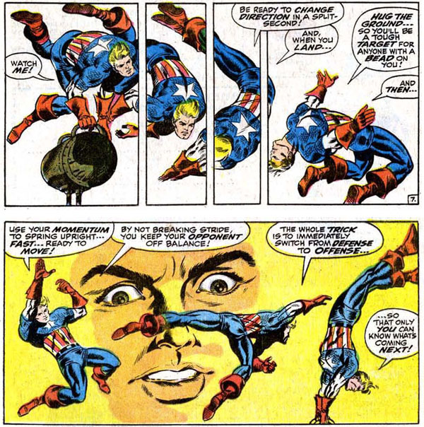
Here Cap trains Rick to be Bucky through a pair of action-packed tiers (from different pages), full of fluid motion and vigorous, almost realistic action. The top tier uses the “action continues across panels” technique to deftly express physical movement in a static medium — we can see the sequence of Cap leaping and landing and declare it feasible, even though the movement between his third and fourth figure is physically impossible. (Not to mention that long-winded speech throughout what must be two seconds of movement.)
The second tier’s similar effect is heightened by the large face of Rick Jones in the background, taking it all in with astonishment. Steranko’s a master at combining realistic-looking (not “real”) movement with anatomy. It doesn’t matter if the motions Cap is going through are probably physically impossible (even with Super-Solider serum running through your veins). What matters is the way Steranko draws our eyes across the sequenced portrayal of each physical action to make it look eminently believable.
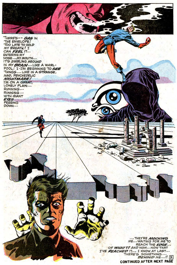
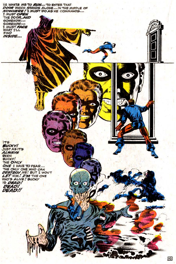
And of course, there’s Steranko’s trademark surrealism, even if he has cribbed some visual notes from Salvador Dali. In this two-page sequence, Rick hallucinates after inhaling a hypnotic substance. Whew! They say that if you remember you were at Woodstock you weren’t really there, but if you see this comic sequence just once, you’ll remember it all your life.
Issue #111 features another double-page spread where Cap explodes into action, again accompanied by narrative text rather than dialogue.
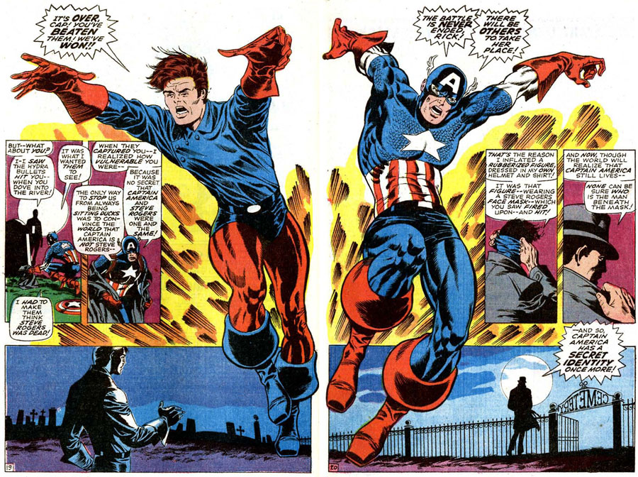
By the end of the issue it appears that Captain America has been defeated permanently. Steranko doesn’t let us see the events first hand but relays them through the shocked, jubilant, expedient and eagle-eyed reactions of the onlookers in brilliant single tones. In this sequence, only the down-to-earth, nameless cop gets real-life hues, pulling us back to the real world after so much fantastic adventure.
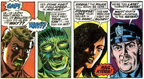
Cap is dead! (But that trick never works!) What does work is the MacGuffin rubber mask of Steve Rogers’ face found with Cap’s tattered uniform. So, aha, the general public can see, Captain America really wasn’t Steve Rogers after all!
In this current day of casual “no secret identities” for the major Marvel superheroes, it’s important to remember how vitally a hero would protect his identity even after it had been logically revealed to everyone. Only the civilian identities of the Fantastic Four, and later, the Hulk, were known to the public during this period.
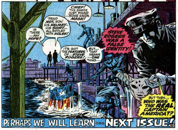
There’s no set-up or foreshadowing of the rubber mask — we don’t see Steve use it or mention it earlier in the issue. It’s just there when we need it for plot purposes. It’s easy to critique this sort of storytelling and it’s impossible to tell whether the casual wave of the retcon hand rests with Lee or Steranko, but the technique does fit well with Steranko’s style. It occurs blindingly fast, and hits hard. We haven’t seen all of the steps that led up to it, but it’s a spectacular reveal.
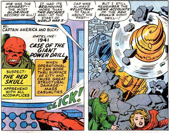
Steranko, a stage illusionist and escape artist (Jack Kirby’s Mister Miracle was inspired by Steranko), didn’t have to explain the trick to get the awe. Will we learn all the secrets, as the tag line teases, next issue? Well, nope. Mostly because #112 is a competent but jarring fill-in issue by Kirby in which Iron Man revisits Cap’s origin and greatest cases. Since Captain America’s full origin and life highlights had already been the focus of #109 — three months earlier — it’s easy to be impatient with this issue, waiting for the return of Jim Steranko in #113.
Captain America #112 (1969), script by Stan Lee, pencils by Jack Kirby, inks by George Tuska
It’s worth the wait. Under a beautiful, moody, danger-approaching cover, Steranko kicks off the final chapter of his Cap saga.

Captain America #113 (1969), art and colors by Jim Steranko
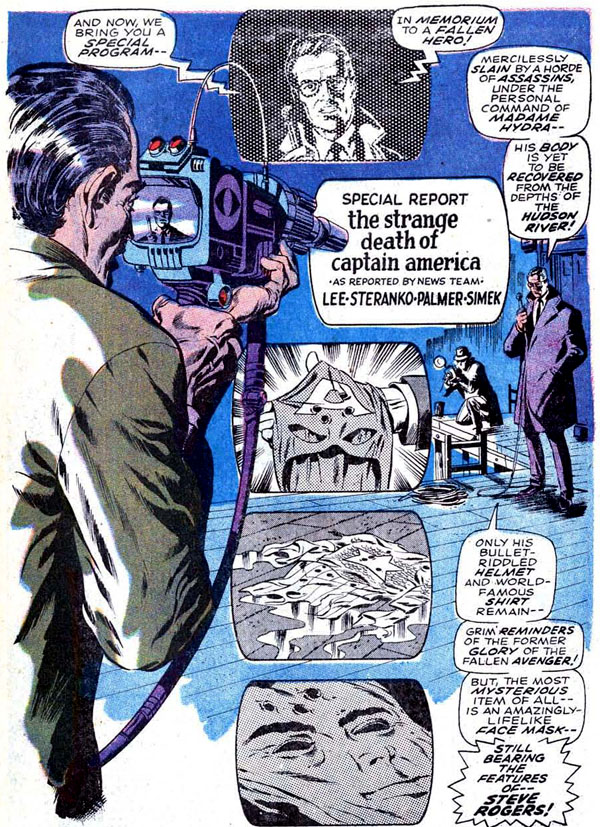
The third of three distinctive and unique splash pages — Steranko’s hit home runs on every one of these — frames a recap of the previous issues in a black-and-white news report neatly lined from top to bottom on the page while the newsman (for CBS?) narrates.
Much later in Marvel history, editor-in-chief Jim Shooter would issue the edict that “every issue is somebody’s first,” and insist on in-story recaps of what had gone before, leading to lengthy dialogue exposition — think Claremont’s X-Men — to bring the reader up to speed. Steranko does it in great visual style, on only a single page.
Captain America #113 (1969), script by Stan Lee, pencils and colors by Jim Steranko, inks by Joe Sinnott
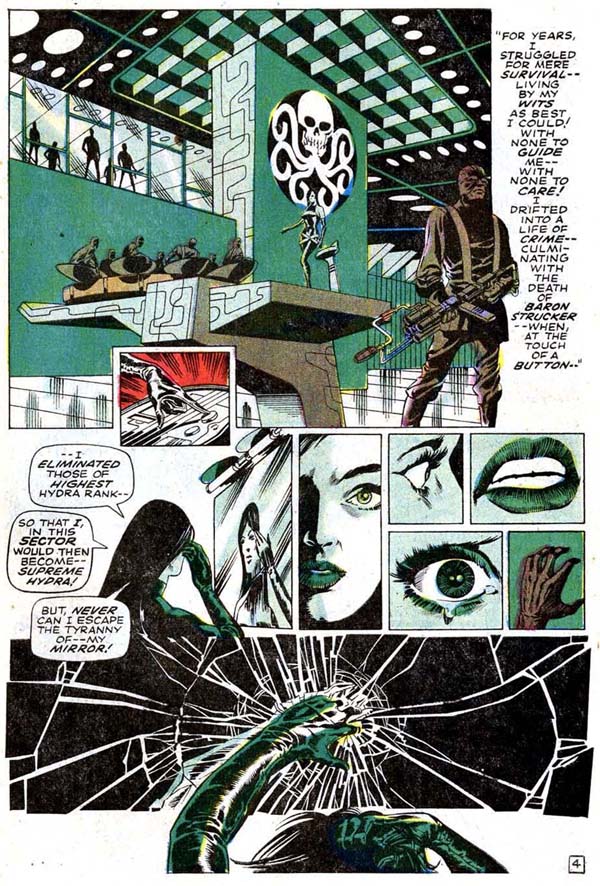
There’s plenty to love about Cap #113. A two-page origin of Steranko’s Madame Hydra is suitably chilling and deftly colored in trademark Hydra green and paced almost cinematically, text and larger images slowing down the narrative, and the smaller, almost tiny panels targeting elements of Madame Hydra’s scarred face in the mirror as rapid-fire, sharp, short jump cuts, culminating in a chilling, mirror-smashing chord.
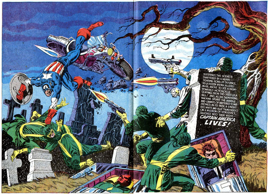
The issue also features three large-scale splashes of signature action, the first heralding the surprising and sudden return of Captain America, crashing into a graveyard scene where Hydra is set to bury the captured Nick Fury and the Avengers (don’t worry).
It’s the first appearance of Cap in this comic book but its power and drama more than makes up for his absence in the first part of the story. Steranko lettered this two-page spread himself — giving us his Cap artwork in almost its purest form.
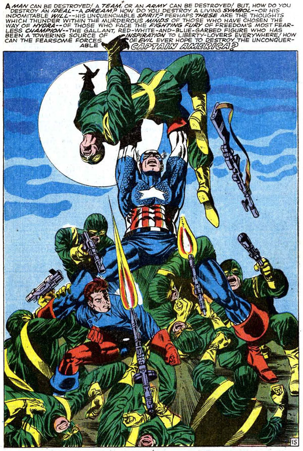
The verbose and hyperbolic hand of Stan Lee is pretty evident in the text at the top of the following full-page panel, but it’s in combination with the spectacular image — Cap and Rick battling a veritable mountain of Hydra agents. Two-page spreads and big splash pages can be a gamble within the limited space of a single comic book; they advance the story by no more than one panel while taking up the space of several. In today’s age of decompression and big cinematic scenes in modern Marvels, it’s easy to dismiss this technique: it’s showboating, it makes the comic read too fast, it has even been disparaged as doing artwork for resale purposes rather than in the service of the story.
I doubt, however, that Steranko can be accused of taking an easy out on these pages. His spreads and splashes highlight major action and grand dramatic moments and are always vital to the tone and energy of the saga.
Sure, I suppose Steranko could have drawn these moments as sequences of smaller panels; we’ve certainly seen that he’s almost magically capable of those action portrayals. But what these big, colorful, eye-catching spreads give us best is the glory and the grandeur of Marvel Comics, an energy and power equivalent to the superhuman feats of their heroes.
1969 was a watershed year in American culture. The revolution of the big-screen, awe-inspiring visual blockbuster had kicked off the previous year with 2001: A Space Odyssey. At the same time, the year’s films brought a gritty new breed of American protagonist to the screen with Midnight Cowboy, The Wild Bunch and True Grit. The Beatles broke up. Nixon became president. Monty Python’s Flying Circus premiered. We went to the moon.
Everything was changing, and Marvel’s flagship superhero was no exception. In these three short but sparkling issues, Steranko finally fully brought Captain America, fist punching and shield slinging, into our contemporary age.
Captain America #111 (1969), art and colors by Jim Steranko
Steranko’s total Marvel work could be collected in a single volume. He drew (and later wrote) Nick Fury, Agent of SHIELD for not-quite two years (much of which was 10-page stories in Strange Tales). He did two X-Men issues and a cover for a third, not to mention designing the iconic three-dimensional X-Men logo still seen today. Three issues of Captain America, a few random romance and horror stories. A relatively short Marvel career, then, especially alongside longtime stars from the Timely, Atlas and Marvel ages like Kirby and Ditko and artists whose careers spanned Silver to Bronze ages like Gene Colan and Herb Trimpe.
All great artists, indeed, but what Steranko brought — to Captain America and others — is of such a brightness, energy, and immediacy, that it’s not off base to declare his Marvel work absolute true classics, the work of a master illusionist who makes us, shall we say … marvel at his skill.
—
For the full CAPTAIN AMERICA WEEK Index of stories, click here.
—
April 3, 2014
Thanks for this beautiful reminder that at some point in our early lives, we could go to a spinner rack and pick up genuine works of art for mere pennies.
May 24, 2014
I re-read these stories recently and enjoyed them, but noticed a couple of odd things: First, Viper might have a small scar above her right eyebrow, but Jim shows us the rest of her unscarred face. Second, how weird is Nick Fury meant to be? Burying an effigy of Cap is one thing, creating one with visible bullet holes for an open coffin is weird. It’s a bit sensation over story.
August 13, 2014
Excellent article, thanks!
A little error found, in this caption: “Captain America #113 (1969), script by Stan Lee, pencils and colors by Jim Steranko, inks by Joe Sinnott”
— no, it was the superb Tom Palmer who inked #113.
August 13, 2014
You’re absolutely right, Klaus! Thanks for the correction!
August 13, 2014
It’s my understanding that Steranko was always running late on his deadlines, if only so that Stan wouldn’t have time to continue to meddle, edit or change the narrative. As a result, he continued to send in the finished issue right before deadline, and this time, it burned him. When the issue wasn’t there, Stan ordered a filler, and turned to his right hand solution-man, Jack Kirby, to pull an issue out of a hat. As you can see, it’s nothing but a space-holder, a filler issue, and composed mainly of large quarter-panels and flashbacks. (Frankly, the appearance of the Savage Hulk on the cover and the abuse of Rick was downright scary! I barely was able to find the first issue, when I saw the dramatic developments of the second issue, and decided to get on board!)
August 14, 2014
I disagree on that “smaller head” to body ratio comment. Although that may be true NOW, back then the Hulk was drawn with a “larger” head. Of course, many artists (and especially current ones) make the mistake of drawing the human head too small for the body. The human head is generally bigger than many think … and that tells me those artists are not using enough reference for the human head and physique.
May 5, 2016
I believe it’s called the Comic Book ratio, and if I recall correctly it si generally 10 heads equal one full body, so yes, the industry does draw superhero heads smaller in proportion to the body than they would be in real life, or in realistic artwork. The movie industry posters also distort the human figure for their own effect. Legs are shown as longer than in real life. Check out the Roger Moore figure in the Octopussy artwork for a good example.
May 27, 2015
Great analysis and appreciation.
November 8, 2016
OH, GEEZUS… 2 paragrpahs in, and he already gets it WRONG….
JIM STERANKO wrote these stories.
JIM STERANKO write the DIALOGUE for these stories.
The CREDITS are DELIBERATELY misleading.
When the HECK are “fans” ever going to get this right?
June 11, 2023
The writer’s heart is in the right place but his tunnel vision has gotten the better of him.
Steranko’s Cap issues are some of my favorites, of any era, but let’s never forget that Steranko was profoundly influenced by Kirby. The improbable anatomy that’s so praised here is straight from Kirby’s playbook. More importantly, it was Kirby who took Nick Fury out of the ‘40s and transformed him into a super spy, not Steranko.
This isn’t meant to diminish Steranko’s achievements, which were extraordinary. He’s a freaking genius, but he didn’t invent himself out of whole cloth.
It should be noted that the issue Kirby was forced to crank out because Steranko missed a deadline was done in less than three days and is pretty damn good. Is it essential? No. Does it deserve to be dismissed as it is here? Hell no.
The thing I hate most about this story is the careless credit given Lee, who was as usual riding a far greater talent’s coattails. This has been proven time and again by the tireless efforts of John Morrow in The Kirby Collector.