
BRONZE AGE BONANZA: Kirby! Adams! PLUS: A big month for Ernie Chan — and the showdown you’ve been waiting for! Sort of!
—
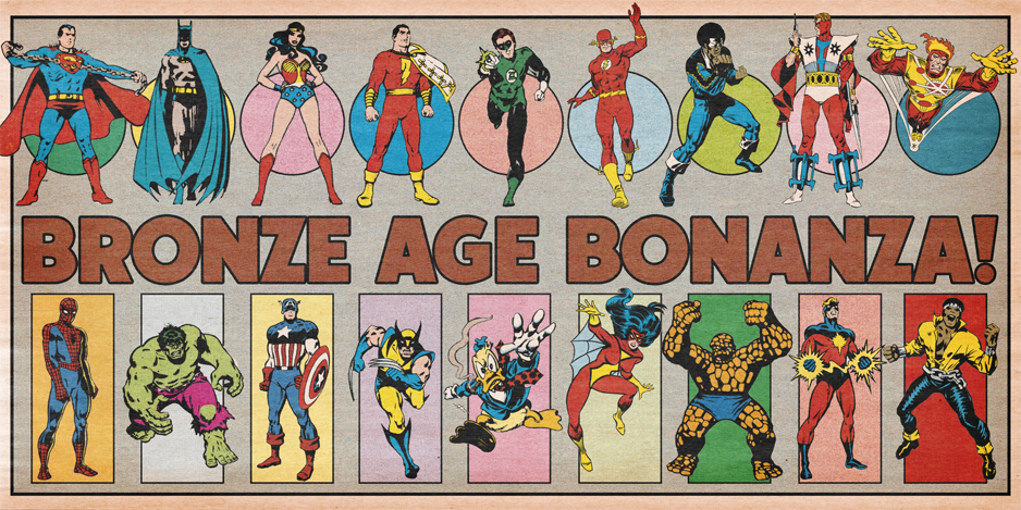
Welcome to BRONZE AGE BONANZA — our monthly series that looks at the greatest covers of the Bronze Age — exactly 50 years later. For more info on this feature, click here.
—
Neal Adams back at DC! Kirby times three! Chan times four!
Dig the TOP 13 COVERS OF SEPTEMBER 1976 — RANKED:
—
13. Devil Kids Starring Hot Stuff #79, Harvey. Just a fun, clever little cover by Warren Kremer.
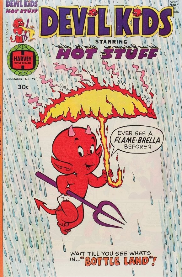
Warren Kremer pencils (and maybe inks)
—
12. DC Super-Stars #10, DC. I love comics. I love sports. Rarely do they mix well. And, frankly, this cover isn’t all that great except for its inherent silliness. But it’s here because, oddly, it’s a theme this month.
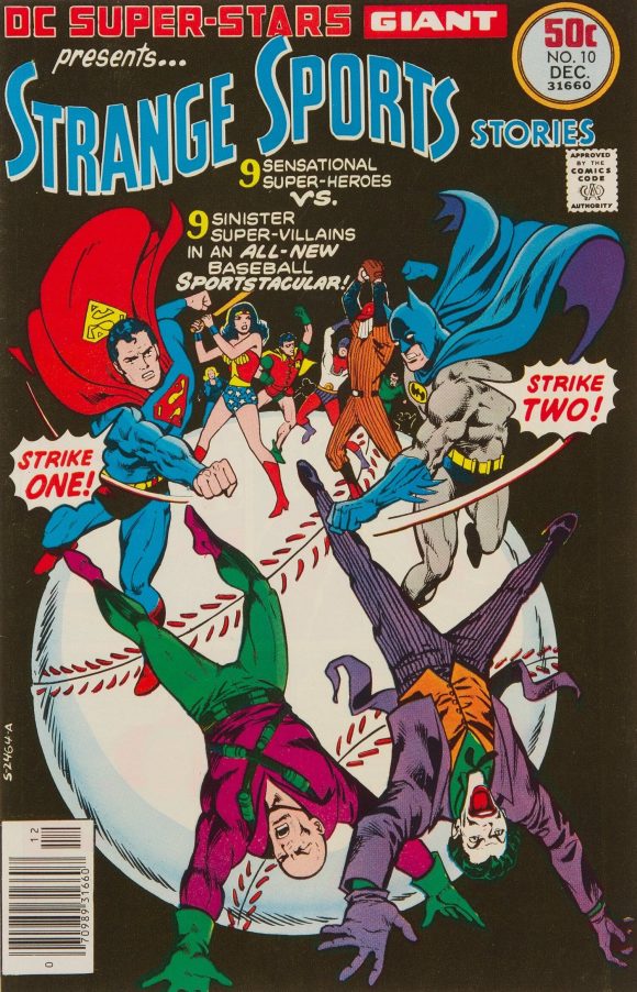
Ernie Chan pencils, Vince Colletta inks
—
11. Creepy #84, Warren. See? What are the chances? Maybe because it was the Bicentennial and so baseball and apple pie and… I dunno? Really, ahem, striking cover by Ken Kelly, though.
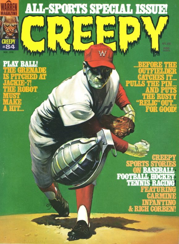
Ken Kelly
—
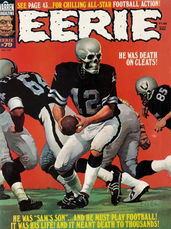
10. Eerie #79, Warren. And Kelly just flat-out outdoes himself with this one. I love that he picked Oakland too, because in the 1970s, the Raiders were the baddest, nastiest, and scariest team on cleats. If I were John Madden, I’d have papered the locker room with these. (Not that the team needed it; they went on to win the Super Bowl that season.)
Ken Kelly
—
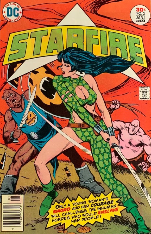
9. Starfire #3, DC. What I appreciate is the practicality of her outfit.
Mike Vosburg pencils, Vince Colletta inks
—
8. The Avengers #154, Marvel. What’s better than floating heads? Floating heads that narrate the action!
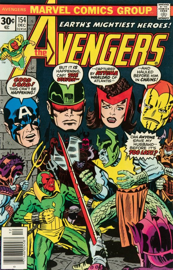
Jack Kirby pencils from a layout by Al Milgrom, who also did the inks
—
7. Fantastic Four #177, Marvel. And what’s better than floating heads that narrate the action? Floating heads that narrate the action… in 3-D!
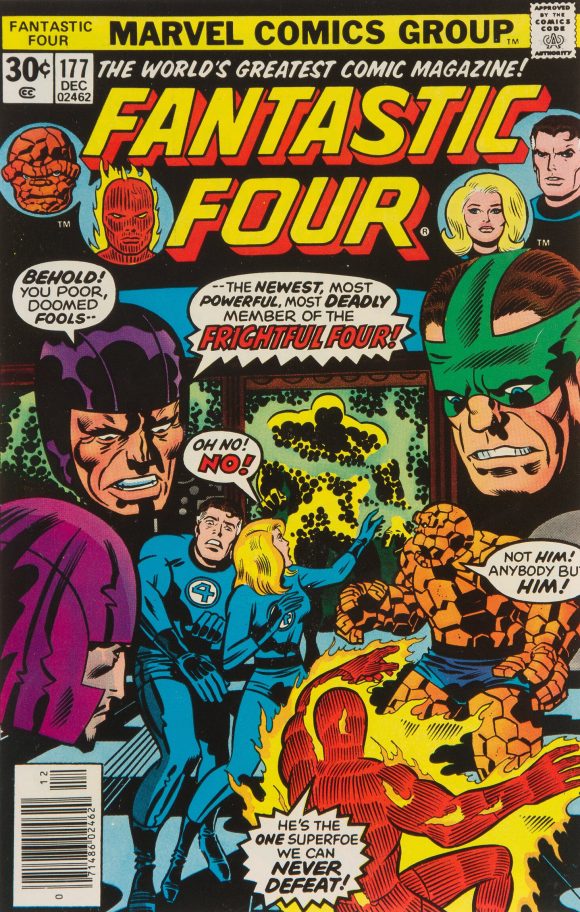
Kirby pencils, Joe Sinnott inks
—
6. Detective Comics #466, DC. One of Ernie Chan’s best Batman covers, though it’s Signalman’s outfit that does the heavy lifting. And here’s the thing about that costume: It’s one of the dumbest ever — but it’s GREAT! (Thank you, Sheldon Moldoff!) It’s something that only works in comics (and, by extension, animation), reminding you why comics are so great to begin with. Nowhere else can the outlandish be passed off as the everyday — unless it’s camp. And this isn’t camp. It just is. “Why does Signalman wear a costume like that? Because.” (Bonus: They’re fighting on the Batsignal.)
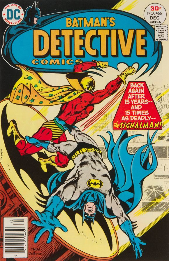
Chan pencils, Vince Colletta inks
—
5. Vampirella #56, Warren. Seriously, guys, what the fuck?
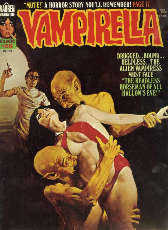
Enrich Torres
—
4. Marvel Double Feature #19, Marvel. It’s not Captain America #176, but the King does it his way.
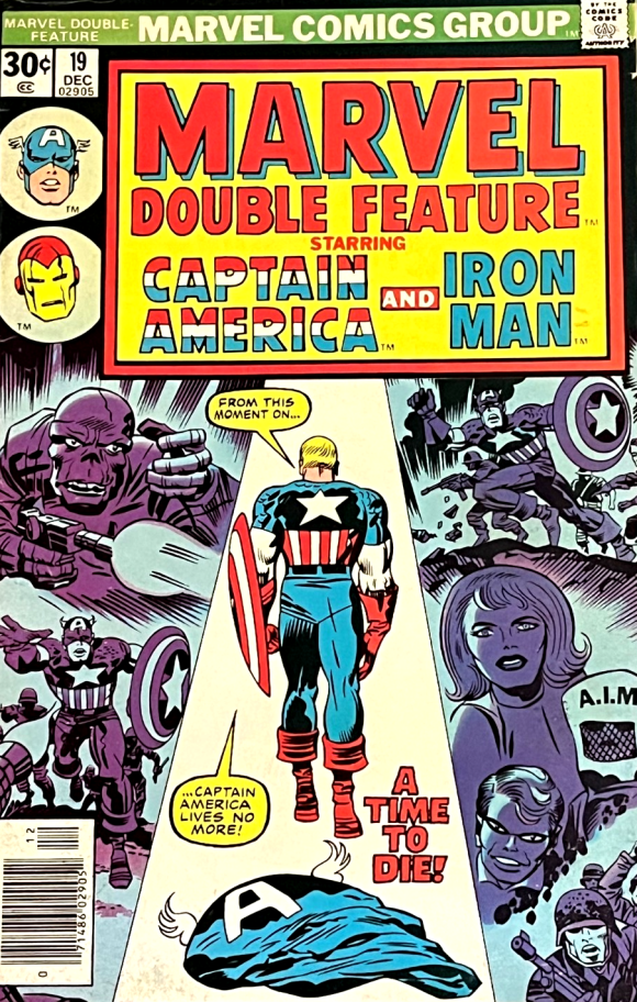
Kirby pencils, John Verpoorten inks
—
3. Super-Heroes Battle Super-Gorillas #1, DC. Requires no explanation.
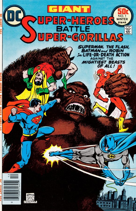
Chan pencils, Colletta inks
—
2. Action Comics #466, DC. From the Department of That’s Not Funny, That’s Sick.
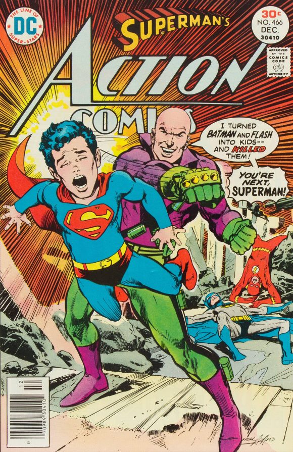
Neal Adams
—
1. Justice League of America #137, DC. The ending is a pretty much a dry hump, but we’re talking covers and this is what every comics fan wanted to see since the 1940s. No teasy Superman vs. Captain Thunder, “THIS IS IT — THE ENCOUNTER YOU’VE BEEN WAITING FOR — THE BIG RED CHEESE MEETS THE BIG RED ‘S’!” Finally, the Man of Steel and Captain Marvel, face to face, and (almost) fist to fist.
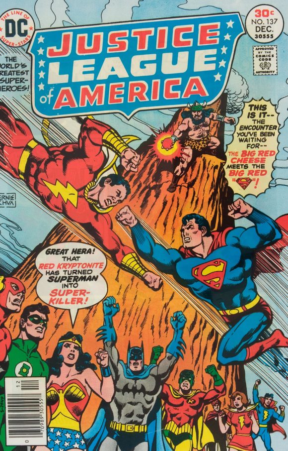
Chan pencils, Frank McLaughlin inks
The draftsmanship isn’t the best, but the concept and layout are everything. And the JLAers, JSAers — including Earth-Two Batman and Robin, no less — as well as the Marvel Family, are the icing on the cake. Sargon Ibis can’t believe his good luck making it onto this cover.
—
MORE
— The TOP 13 COVERS of AUGUST 1976 — RANKED. Click here.
— BRONZE AGE BONANZA: The 1976 INDEX. Click here.
—
Comics sources: Mike’s Amazing World of Comics and the Grand Comics Database.

September 20, 2026
That Strange Sports Stories is a favorite of mine. and I agree the cover, although consistent with several DC covers of the day, was much better executed on the reprint by Rich Buckler on DC Special Blue Ribbon Digest 13.
https://www.comics.org/issue/1687815/cover/4/
September 20, 2026
In the nit-picky corrections dept: That’s not Sargon The Sorcerer rocking that turban. It’s Ibis The Invincible. Earth-S, remember? He’s one of the Fawcett heroes. Ibis even rated his own comic book back in the 50’s. The only thing Sargon ever rated was a backup feature.
September 20, 2026
Correction: Ibis had his own book in the 40’s. That’s what I get for typing on a phone.
September 20, 2026
Ah. Yes. Even luckier then.
September 20, 2026
Kenny Stabler never looked so good!
September 20, 2026
You are hitting childhood comic book cover gold for me on this list. Super Heroes Battle Super Gorillas and Justice League 137 are absolutely the two earliest covers that I remember getting off the spinner rack and the ones that had the strongest visual impact on me. Justice League 137 led me to collect all of the Superman-Shazam confrontations, and all of DC’s Shazam books. The Super-Gorillas book was so well curated and had such classic, distinctive likenesses of Superman By Boring, Flash by Infantino and Batman & Robin by Paris that it really opened up my young impressionable mind to the rich history of DC, which I have enjoyed ever since.
September 21, 2026
Sargon, Shazam… what’s in a name?
September 20, 2026
At first I was wondering, “Why the Hell would DC publish a comic about superheroes fighting super gorillas?” But then I remembered that the December 1976 release of “King Kong” was on the radar.
September 20, 2026
The DC SUPER STARS #10 Strange Sports issue has always been a childhood favorite…enough for me to collect original art pages from the issue’s main story of super heroes vs villains baseball game drawn by the great Dick Dillin and Frank McLaughlin team that made my JLA memories so happy, and of course written by one of the 1970s most fun story writers ever to grace a typewriter (and a personal favorite of mine) Bob Rozakis. *(If anyone owns any original art pages from this story, please reach out to me at JONMANKUTA@aol.com). It read like a great JLA story with some fun and clever creative moments of humor mixed in, and I for one enjoyed that cover too (as well as the really cool Rich Buckler version later done for the DC Digest reprint as another poster pointed out on here).
Action #466, one of my earliest comic book memories…Neal Adams took a real risk at this powerful and shocking cover showing Lex Luthor punching a young child gleefully… and the cover spoke to me personally as a physically abused child also bullied and punched by a large powerful bald man (my father unfortunately), I wanted to know how Superman dealt with the painful physical abuse as I did…ouch. I own the original art to this cover for that very reason.
September 20, 2026
The baseball issue and the Super Heroes vs Super Gorillas were two of the first three comics my mom bought for me after I got hooked into Bat-fandom by reruns of the Batman TV show.
Super Heroes vs Super Gorillas was my “gateway drug.” I bought it for Batman but became a fan of Superman and the Flash after reading the issue. Batman was always my favorite, though. He still is.
September 21, 2026
I remember these! Keeping with the theme, let’s hope DC releases a big volume of the original “Strange Sports Stories” from the 60s and 70s. (Creepy and Eerie probably would have been too strange, hmmm?)