
BRONZE AGE BONANZA: A collection of fun stuff by KIRBY, CHAN, ANDRU and MORE…
—
Welcome to BRONZE AGE BONANZA — our monthly series that looks at the greatest covers of the Bronze Age — exactly 50 years later. For more info on this feature, click here.
—
Not all months in BRONZE AGE BONANZA are created equal. Some are utterly fantastic, while others… aren’t. It’s just the way the timing sometimes works out, so this month isn’t what I’d call a gallery of masterpieces. That said, as always, there’s a lot of fun stuff!
So, dig the TOP 13 COVERS OF AUGUST 1976 — RANKED:
—
13. Freedom Fighters #5, DC. There’s a lot wrong with this Rich Buckler/Vince Colletta cover. Black Condor and the Ray are awkwardly positioned, there’s a blank yellow background and a spotlight on the floor, and it looks like it was done in about 10 minutes. (Save the Colletta jokes.) So, why did it make the list? I like it anyway, and I like the Wonder Woman aspect of the whole thing. It fits, especially in 1976.
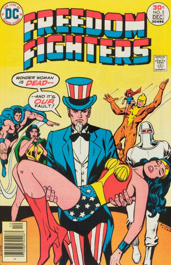
Rich Buckler pencils, Vince Colletta inks
—
12. Justice League of America #136, DC. Total sentimental choice. (You’ll see that a number of times this month.) Any JLA cover that prominently features Batman — and Earth-Two Robin! — is a good thing, but like the one above, it’s clearly rushed. No background whatsoever, and that doesn’t feel like a design choice. What I do love is that it’s Earth-Two Batman in action, which was rare, even though Chan/Colletta drew his chest bat like it was Earth-One, just without the yellow oval. And if it’s Earth-S, why no Earth-S heroes? That said, again, it’s here because I really like it despite all that.
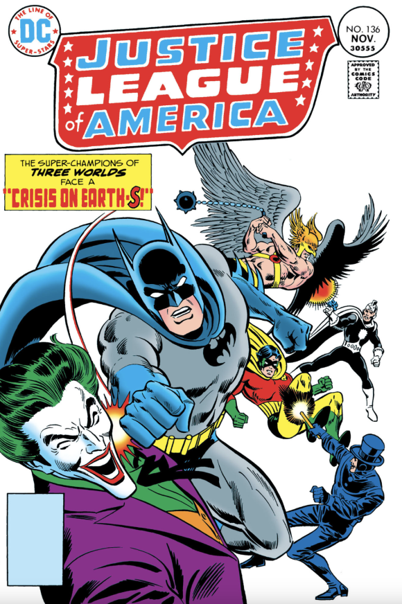
Ernie Chan pencils, Frank Giacoia inks
—
11. Fantastic Four #176, Marvel. The King is here three times this month, because even average Kirby is better than most. Fun cover, if standard.
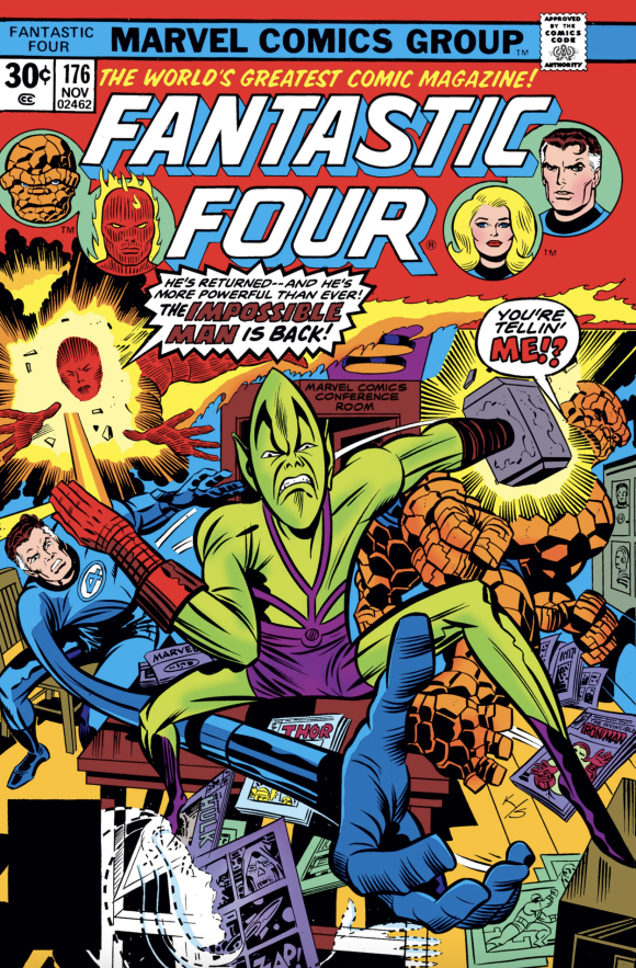
Jack Kirby pencils, Joe Sinnott inks, John Romita alterations (evidently)
—
10. The Amazing Spider-Man #162, Marvel. Hey, have you seen Spider-Man: Brand New Day yet? No? OK, here’s some info that isn’t a spoiler but is a point of fact: The climax takes place on Roosevelt Island, and I couldn’t help thinking about this cover when I watched the movie. (No, Nightcrawler doesn’t make a cameo, so don’t even ask.) I do like that Andru had Spidey and Kurt upside down from one another; adds a bit of extra BAMF! to the cover.
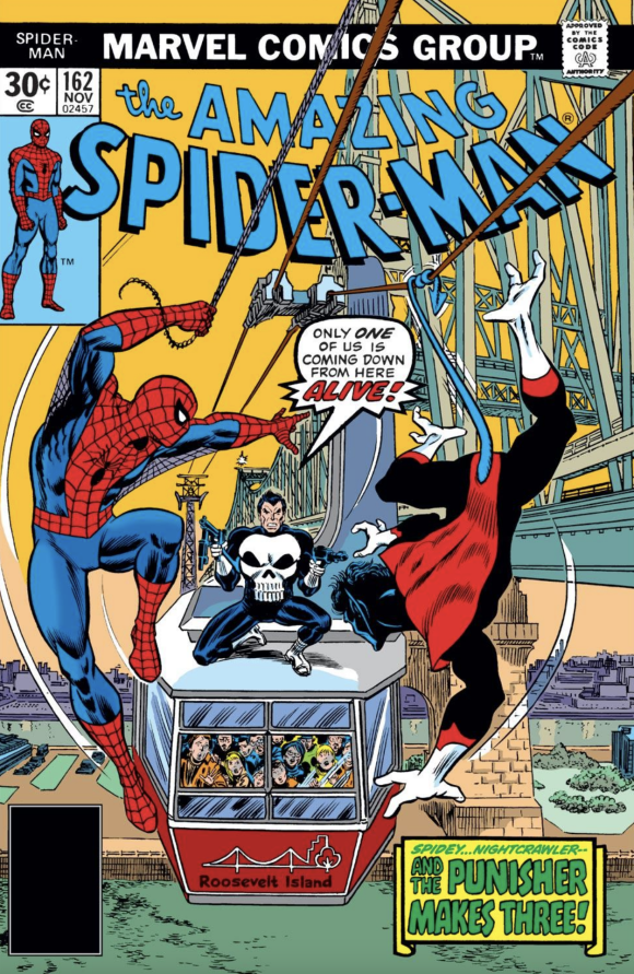
Ross Andru pencils, John Romita inks
—
9. Fast Willie Jackson #1, Fitzgerald Periodicals. Very interesting story behind this short-lived series and its publisher. Clearly, this is designed to be a Black version of Archie Comics, and man, that is far out. Just like Archie, those fashions are of the moment too! Kick it with those bell-bottoms, platform shoes and wild lapels! Can I dig it? Yeah, I can dig it, too!
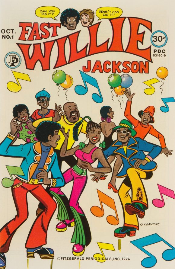
Gus Lemoine
—
8. Batman Family #8, DC. Another sentimental favorite. This is the ish where the Joker’s Daughter saga really kicks in, with that great, dominant Catgirl image in the foreground. This is a comic I’ve read countless times since the ’70s and it never, ever gets old. That said, that main image is still pretty basic — again with the no background — but its better than No. 12 and No. 13 by virtue of the framing and the Batgirl and Spinner (!) figures down the left. Never did like the brown, though, and so I can’t blame DC for making the frame red for the digital version.
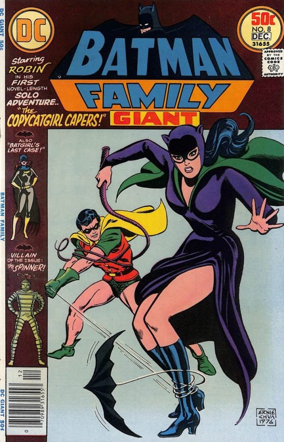
Chan
—
7. The Defenders Annual #1, Marvel. First-rate, group-running-at-you cover, though Hulk’s right arm and hand look a little wonky.
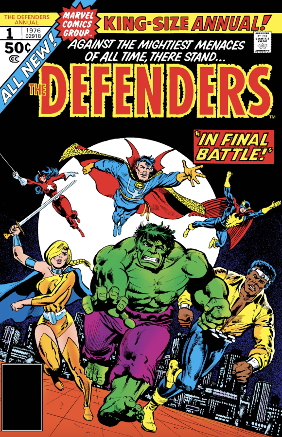
Al Milgrom pencils, Klaus Janson inks
—
6. The Eternals #5, Marvel. A cool cover to look at, no question. But — and I know I’m not breaking new ground when I say this — it’s so obvious that Kirby was still working on New Gods in his head.
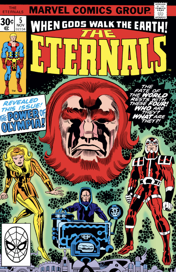
Kirby pencils, Giacoia inks
—
5. Adventures on the Planet of the Apes #10, Marvel. The first — and only — Apes comic I got as a kid, not counting the Power Records Escape From the Planet of the Apes adaptation. Here’s a mystery for you to solve, though: The cover pencils are credited online as Paty Anderson. It’s Paty Anderson’s only known cover credit. So I don’t think I’m going too far out on a limb by saying it’s Paty Cockrum, but that the mistake just keeps getting repeated. Before she was Paty Cockrum, she was Paty Greer, her first husband’s last name. So is Anderson her maiden name? Help us out, folks.
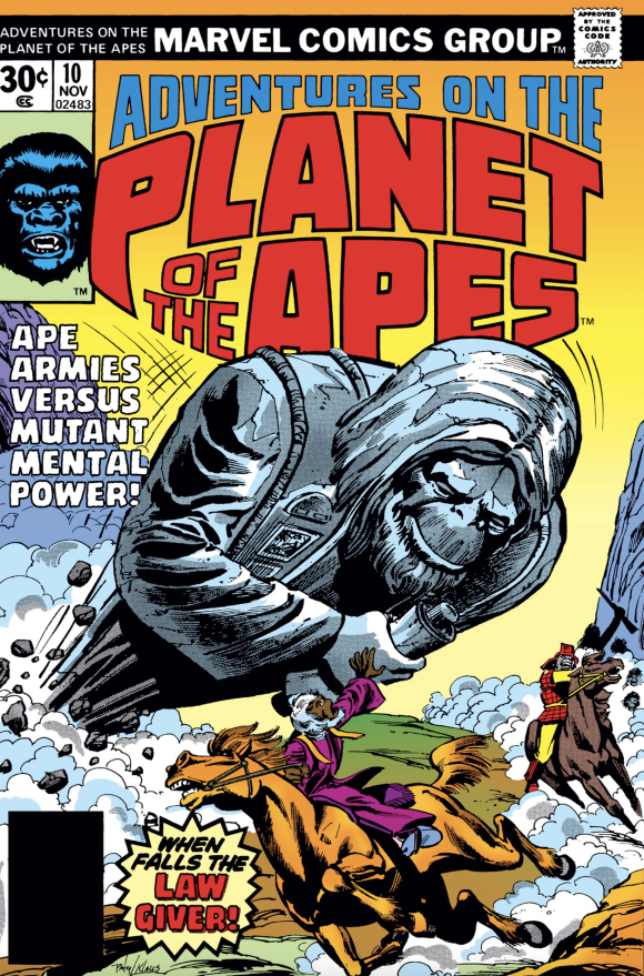
Paty Cockrum pencils, Janson inks. Note to unnamed colorist: Dr. Zaius’ hair was orange.
—
4. Mad #186, EC. Here’s what I wrote about this cover a couple of months ago, in The 13 Grooviest MAD COVERS of the SILVER AND BRONZE AGES: “Fascinating. Star Trek had been off network TV for seven years and even the cartoon had ended two years earlier. But its endurance through syndication and a religiously devout following kept it relevant, leading to this surprisingly timely satire.”
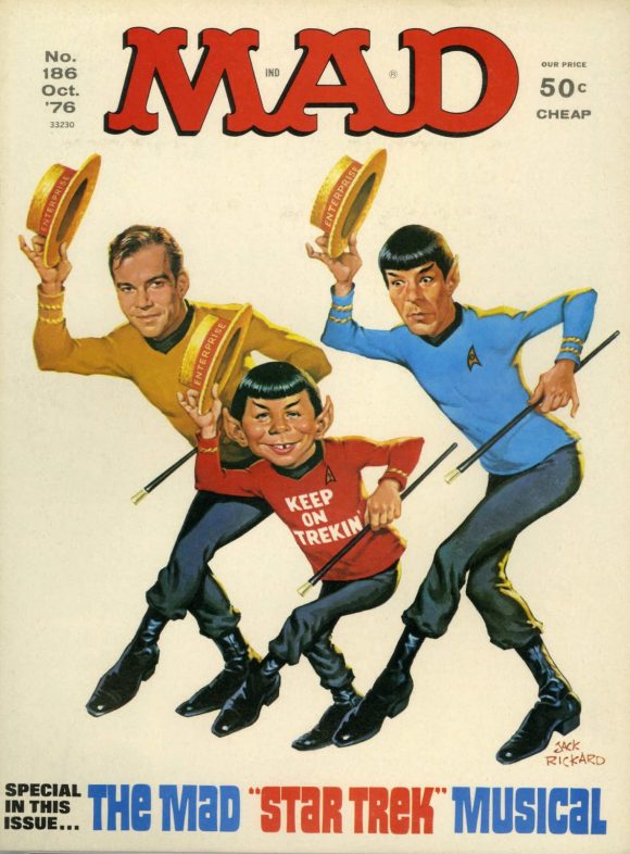
Jack Rickard
—
3. Thor Annual #5, Marvel. This is just a Tuesday afternoon for Jack Kirby. The foreground brawl reminds me of the end battle in The Dark Knight Rises — which should have featured a lot more gunfire and a lot less hand-to-hand combat, except for Batman and Bane, y’know? Not that I’m bloodthirsty or anything. I’m just saying that it’s not how it really would have played out. Wait, where was I?
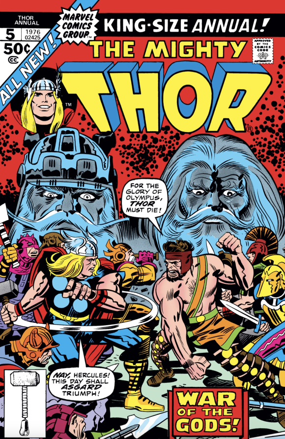
Kirby pencils, John Verpoorten inks
—
2. Marvel Two-in-One #21, Marvel. Not a terribly original concept but I don’t care. It is just too groovy to see Doc Savage and the Thing bashing their way toward you like this. I love that Doc had his own Marvel Slurpee cup.
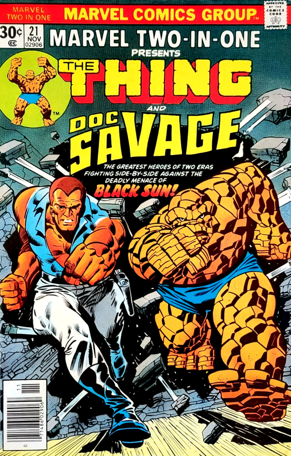
Ron Wilson pencils, Sinnott inks
—
1. The Unexpected #176, DC. When you have a month like this, just go for the laughs. Because this is fucking hilarious. Putting the creepy, touchy “head counselor” aside, it’s THE SKELETONS IN THE SHORTS. I mean, how the hell do they even stay up?? The only thing that would make this better is if they were cutoffs. THAT would have been very 1976! Camp Surprise, indeed!
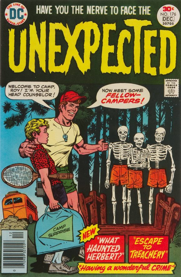
Jack Sparling pencils, Colletta inks
—
MORE
— The TOP 13 COVERS of JULY 1976 — RANKED. Click here.
— BRONZE AGE BONANZA: The 1976 INDEX. Click here.
—
Comics sources: Mike’s Amazing World of Comics and the Grand Comics Database.

August 16, 2026
Ernie Chan/Chua was a talented man and probably the best embellisher John Buscema had on Conan but his covers were almost uniformly static, had no sense of space and often plagued by a complete lack of backgrounds and awkwardly posed characters. Why he was DCs main cover guy in the mid 70s, especially when they had Garcia-Lopez and Aparo on staff is something I’ve never understood
August 16, 2026
Is a Freedom Fighters omnibus too much to ask for?
August 17, 2026
So it would seem. I know Bob Rozakis is on board, so I don’t know what the hold up is.
August 16, 2026
Shrinkflation meant backgrounds came at a premium
August 16, 2026
MAD’s musical parodies were always hilarious, but that 1976 Star Trek send-up was in a class by itself. For those interested, you can check out the scans here:
https://mystartrekscrapbook.blogspot.com/2008/11/1976-mad-star-trek-spoof.html
August 16, 2026
I’ve been reading the book “The DC Implosion”. Seeing those first two comics are having me reflect on what I’ve read.
August 16, 2026
Great book!
August 17, 2026
The 70s weren’t the best time for me. I had a great family but Jnr. High and High School sucked! That said, I’d go through it all over again just to read cool stuff like Freedom Fighters and Batman Family brand new again! Thanks!
August 18, 2026
>> 13. Freedom Fighters #5, DC. There’s a lot wrong with this Ernie Chan/Vince Colletta cover.
>>
I think Butler should be the credited penciler. That said, Chan’s BATMAN covers hold a strong hold of my comics memories.
As for an omnibus, luckily a whole run can be picked up – rather inexpensive. When I was limited to a $1 comic allowance I couldn’t pick this title up in the day. But I loved their appearances in JLA summer team-ups.
August 18, 2026
You mean Buckler? Yeah, your right. Good catch! Thanks!
August 18, 2026
Argh. I hate typos and mistakes. I blame brain fog and insufficient coffee this morning. Sorry, Mr. Buckler.