
Gil Kane, the man of the month!

—
Welcome to BRONZE AGE BONANZA — our monthly series that looks at the greatest covers of the Bronze Age — exactly 50 years later. For more info on this feature, click here.
—
Well, Gil Kane had a great month, that’s for gotdamn sure. But we’ve also got some groovy Adams, Wilson, Kirby and more for ya!
Dig the TOP 13 COVERS OF SEPTEMBER 1971 — RANKED:
—
13. The Microbots #1, Gold Key. No, not the Micronauts — the Microbots. This one-shot was a tie-in to a Kenner toy line that just didn’t catch on. But hey, guess what: It was written by Len Wein! The cover artist is unknown, but it certainly bears the hallmarks of a George Wilson illo, so perhaps it was him.
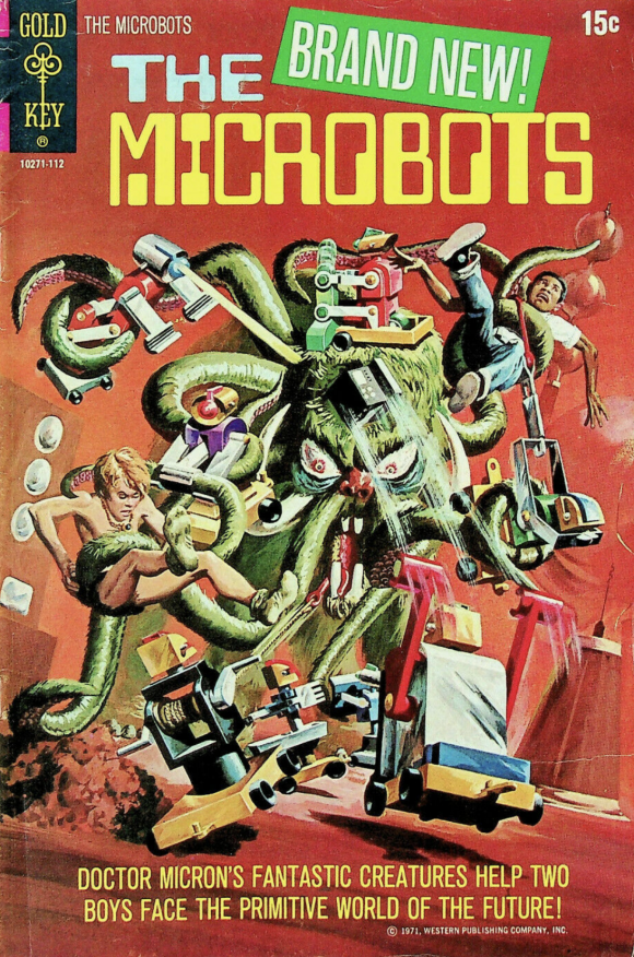
Artist unknown
—
12. Star Trek #12, Gold Key. Speaking of George Wilson, here he is with some classic, insane off-model Trek. Ain’t nothin’ wrong with that!
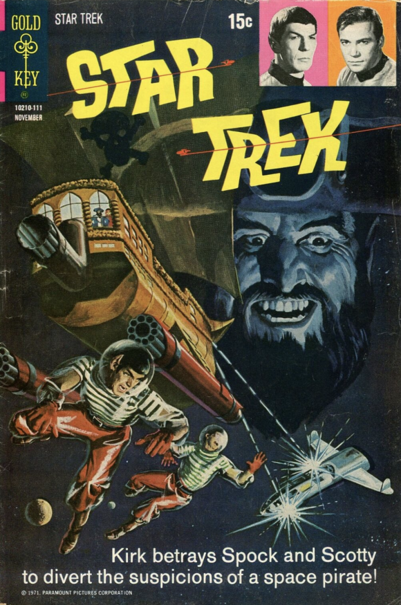
George Wilson
—
11. House of Mystery #196, DC. Kids in peril! Of course! It’s a DC horror book! But what the hell is happening here? Did the preciously dressed children follow Fido only to see him get sacrificed by some demonic cult? The exclamation point is the look of recognition on the purple-robed woman: Dick and Jane are gonna be joining Fido in the great beyond!
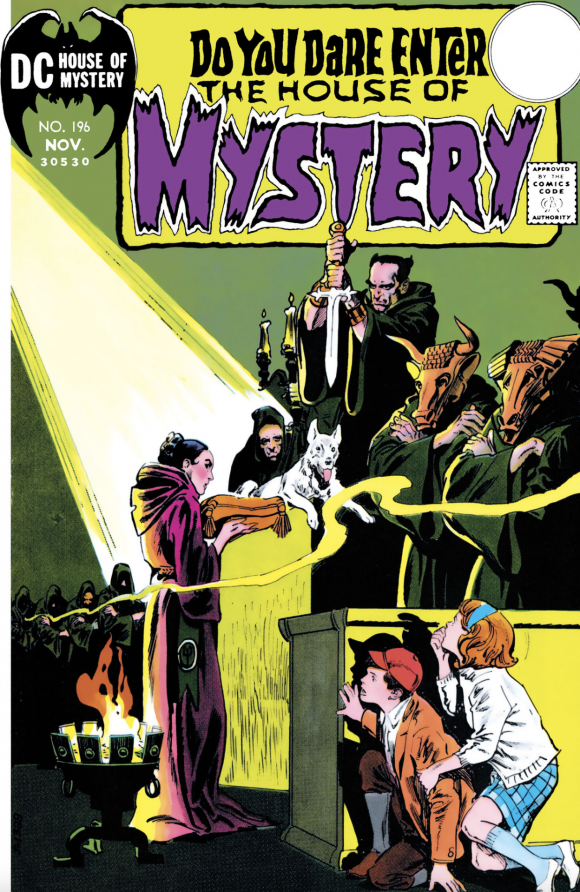
Tony DeZuniga
—
10. The Avengers #94, Marvel. The Kree-Skrull War continues with this dramatic tableau pencilled by Neal Adams.
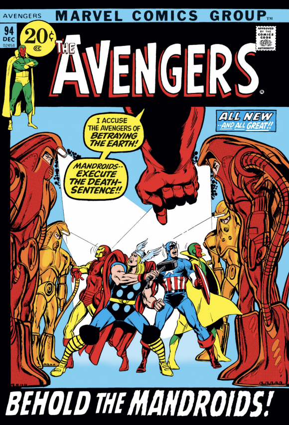
Neal Adams pencils, Tom Palmer inks, John Romita alterations
—
9. Action Comics #406, DC. The best thing about this cover, other than the fact that it was drawn by Swanderson, is that I could easily re-create it with my Mego Superman.
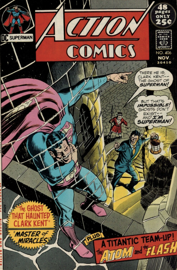
Curt Swan pencils, Murphy Anderson inks
—
8. Adventure Comics #412, DC. Supergirl the fashion plate trots out her superpants outfit. I dig it! By the way, did anyone draw a prettier Supergirl than Bob Oksner? Probably not.

Bob Oksner
—
7. Haunted #2, Charlton. Steve Ditko’s cover for Issue #1 made this list in July and the follow-up is even more inscrutable. But that’s Ditko for you! The funky weirdness really begs you to open the mag.
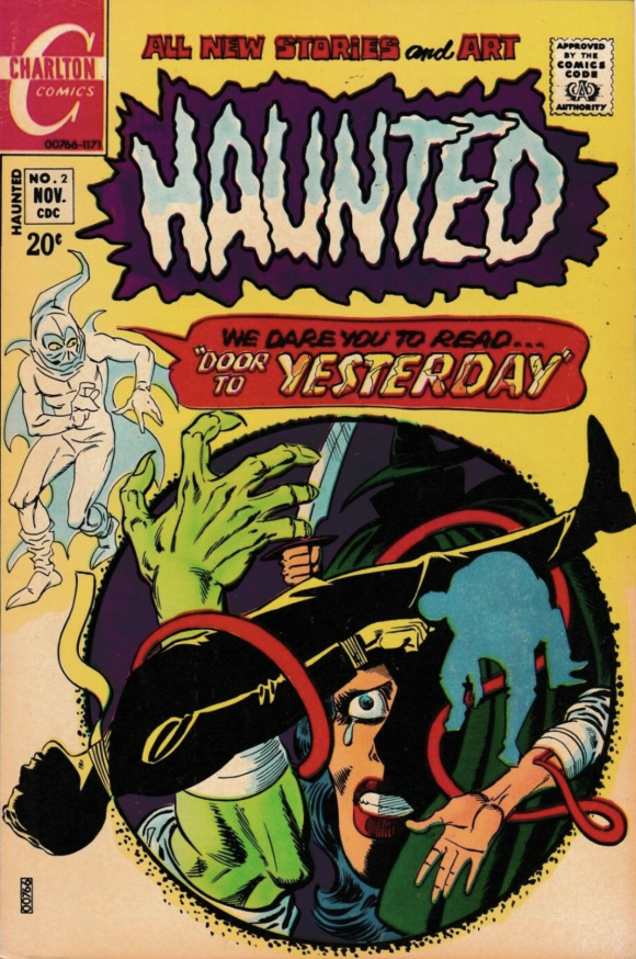
Steve Ditko
—
6. Conan the Barbarian #12, Marvel. Typical Conan tableau, with the Cimmerian rising above overwhelming numbers as he do. But it’s Kane’s incredible ability to make it all so intimate that makes it soar. The close-quarters combat. Conan’s coiled torso. All the muscled forearms and elbows. Brilliant.
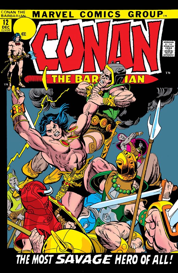
Gil Kane pencils, Vince Colletta inks
—
5. Marvel Spotlight #2, Marvel. Neal Adams once told he he wasn’t a fan of sequential covers. Even so, he was as talented at these as he was at everything else. (Naturally.) The man-changing-to-werewolf trope was already ancient by 1971, but Adams gives us a compellingly horrifying series of panels introducing Jack Russell, the Werewolf by Night.
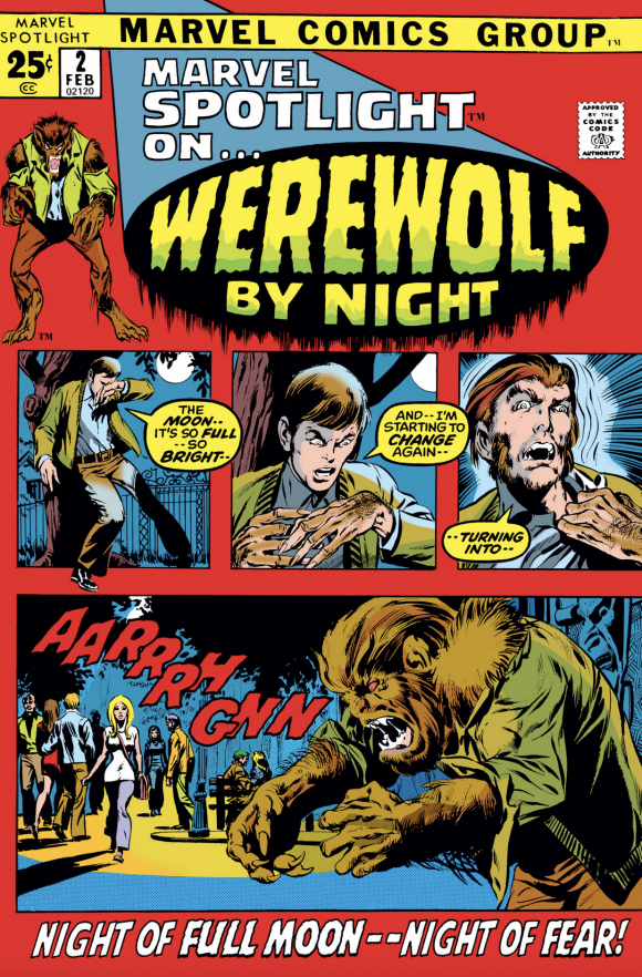
Adams and Palmer, with Romita alterations
—
4. Justice League of America #94, DC. I don’t think Deadman has ever looked more menacing than he does here, as he floats into Aquaman’s body. Just as importantly: floating heads!
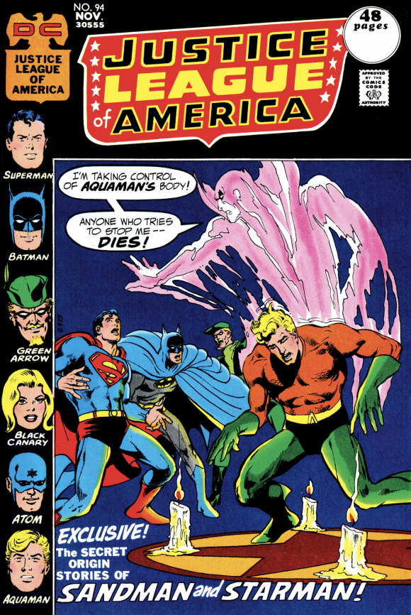
Adams
—
3. Superman’s Pal Jimmy Olsen #143, DC. I’m not an artist. I’m not a production manager. I have no idea how they get negative images like that. I really don’t. But dammit, I love that every time I see it. Every time.
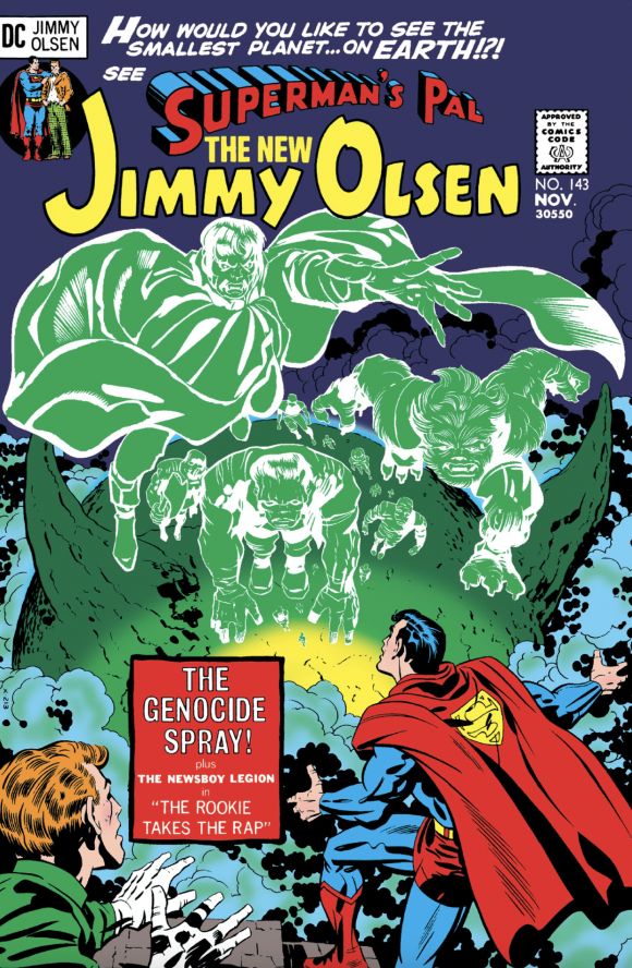
Jack Kirby pencils, Mike Royer inks
—
2. The Amazing Spider-Man #103, Marvel. I kept going back and forth between this cover and the eventual #1. Like the Conan cover above, Kane is a master of the form here. There’s a ton of action and palpable anticipation, with no less than five characters jammed into the truncated cover space. But Kane makes the limitations work for him by breaking the panel lines — and giving us a spectacularly hideous, gigantic serpent monster ready for a big lunch. I would have given good money to see Ray Harryhausen film this sequence.
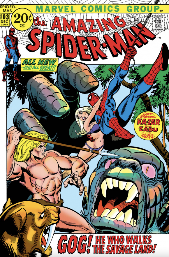
Kane pencils, Frank Giacoia inks
—
1. Daredevil #82, Marvel. In the end, I went with the simpler Kane/Giacoia image. As usual, Kane plays with the perspective in a way that gives the illusion of intense movement. But what really sells it for me is the sheer power of the Scorpion’s strike. That looks like it hurts, and Hornhead is understandably bowled over. As are we, the viewers.
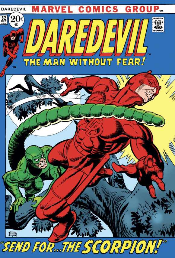
Kane and Giacoia
—
MORE
— BRONZE AGE BONANZA: The 1971 INDEX. Click here.
— The TOP 13 COVERS of AUGUST 1971 — RANKED. Click here.
—
Sources: Mike’s Amazing World of Comics and the Grand Comics Database.
September 26, 2021
I particularly dislike this period of Marvel covers when they put the art in those square boxes and left empty space around the logos.
September 26, 2021
They’re called picture frame covers in hobby parlance. I don’t care for them either.
September 26, 2021
I never had a problem with those boxes since the artists often went outside of the lines with them. That kind of gave those covers more impact. There were a lot of great covers in that brief era!
September 26, 2021
I barely see Adams’ hand in those Marvel covers.
September 26, 2021
What incredible covers these are!
September 26, 2021
The answer to the question asked in #8 is, “No. No, absolutely not.”
September 26, 2021
The only ones I can think of who came close are Adams and Giordano but Oksner had something extra.