
BRONZE AGE BONANZA: The temps get cooler but the comics stay hot!

—
Welcome to BRONZE AGE BONANZA — our monthly series that looks at the greatest covers of the Bronze Age — exactly 50 years later. For more info on this feature, click here.
—
Hey, I have no clever patter for you this month, so let’s just get right to THE TOP 13 COVERS OF SEPTEMBER 1970 — RANKED:
(And don’t forget: These entries are based on sale dates and not official publication dates.)
—
13. Archie’s Girls Betty and Veronica #179, Archie. Yeah, laugh it up, Mrs. Cooper. In 50 years, your daughter’s world will become a hellscape of wildfires, hurricanes and melting ice caps.
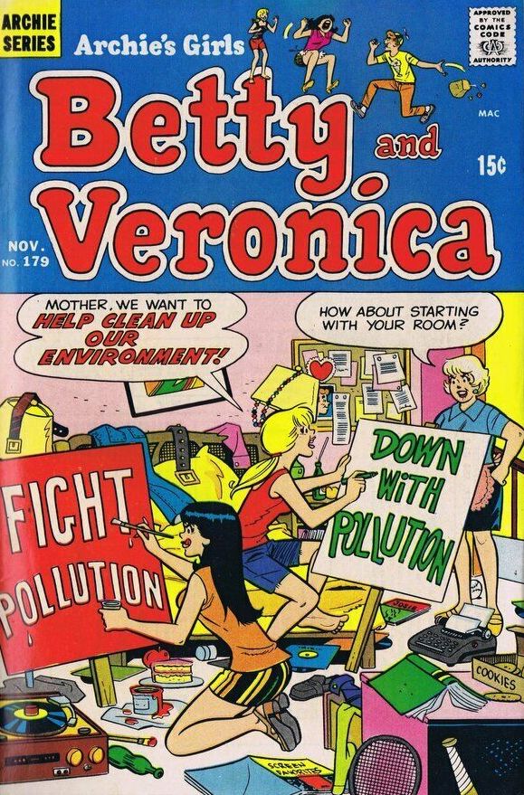
Dan DeCarlo
—
12. UFO Flying Saucers #2, Gold Key. I guess the editors weren’t taking any chances by putting the words “UFO” and “Flying Saucers” on the cover. I also love that these are really rudimentary, old school flying saucers. And, hey, is it just me or should George Wilson have been a much bigger deal? Damn, I love his work.

George Wilson
—
11. Weird #23, Eerie Publications. There’s so much to say here, I’m actually speechless. I think I could do a TOP 13 UNSETTLING THINGS ABOUT THIS COVER but who’s got the time? No. 1 would be the decapitated dude vampire’s beard.
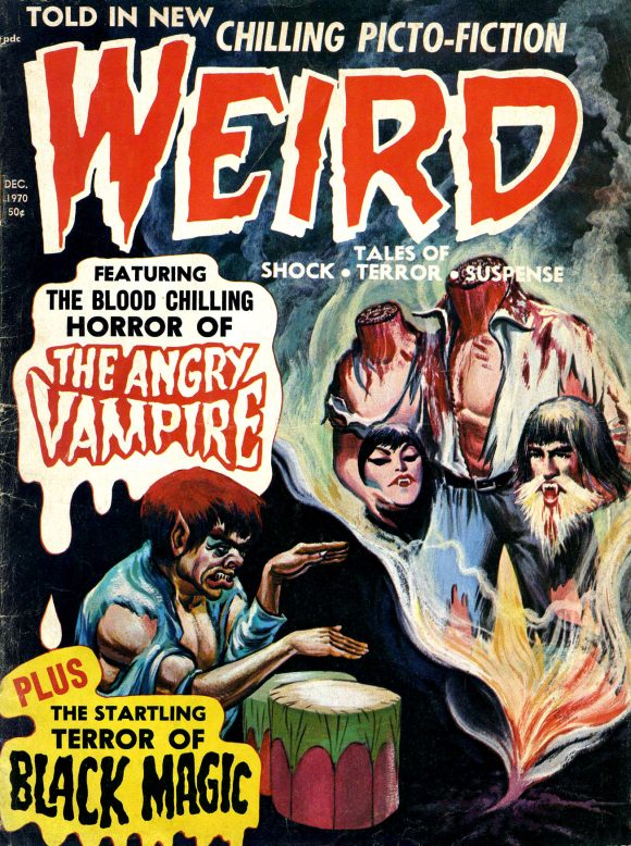
Artist unknown
—
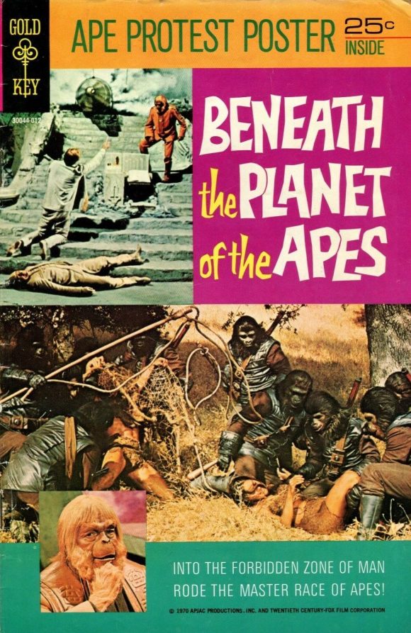
10. Beneath the Planet of the Apes #1, Gold Key. I think I have to get myself a copy of this. I just have to know how goody-goody Gold Key handled a story where everyone dies in the end and the Earth is annihilated. Plus: APE PROTEST POSTER!
—
9. Adventure Comics #399, DC. Like a lot of early Bronze Age covers, this is provocative and unsettling with notes of camp creeping around the edges. The story inside’s pretty grim, though. But at least Supergirl looks fashionably fab!
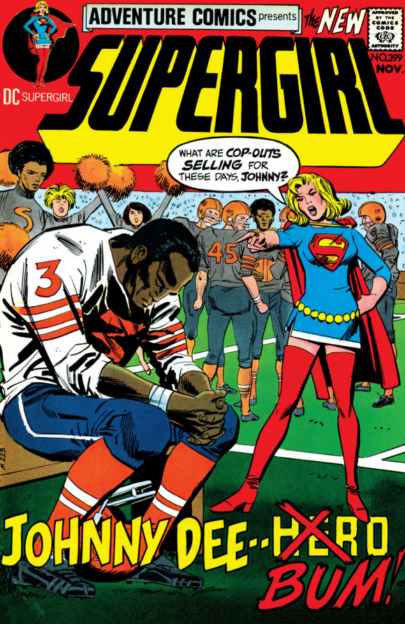
Mike Sekowsky pencils, Dick Giordano inks
—
8. Captain America #132, Marvel. Bucky — alive in 1970?! M.O.D.O.K. appearing to pull the strings?! Marie Severin pencils?! Well, alright!
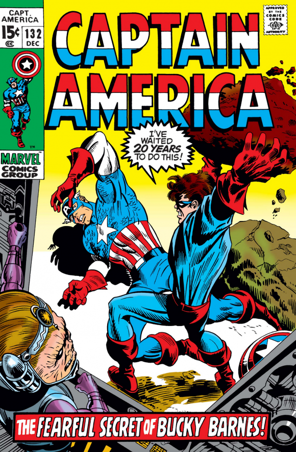
Marie Severin pencils, Frank Giacoia inks, with John Romita alterations
—
7. The Phantom Stranger #10, DC. Neal Adams was a machine who was so prolific he couldn’t help but repeat themes and concepts, in this case riffing on a classic gothic horror trope. But got-damn, he did it better than anyone else. Prime Adams textural trickery.
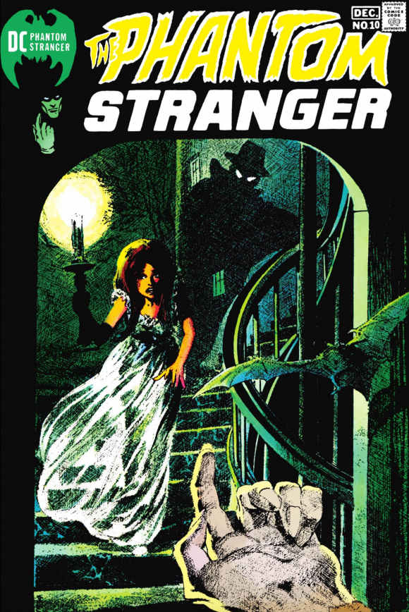
Neal Adams
—
6. The Avengers #82, Marvel. I’m a sucker for an “Avengers Assemble!” cover. Yes, Quicksilver, let the cry ring out!
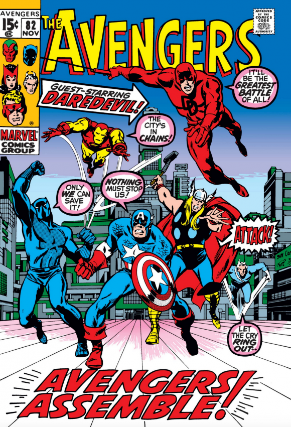
John Buscema pencils, Tom Palmer inks, from a Marie Severin layout
—
5. Our Army at War #225, DC. I’ve said this before: Joe Kubert was a master at combat suspense. Rock is taking on six Nazis at once, with four swaskita-emblazoned bombs in the foreground just waiting to explode once that fuse goes off. How will Rock get out of this one?! HOW?!
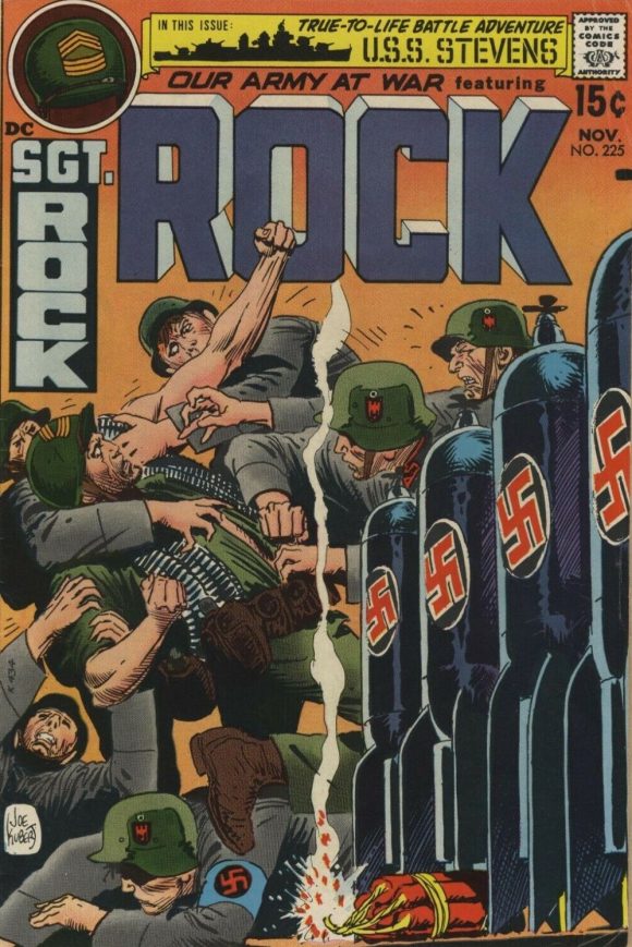
Joe Kubert
—
4. Wonder Woman #191, DC. This is kind of a cheat, I know, because it’s a pretty static cover introducing a (mostly) reprint issue. But it’s a dynamic layout, the black background lets the figure and slanted covers do the heavy lifting, and Diana looks like the coolest woman alive in September 1970. You can’t stop looking at this.
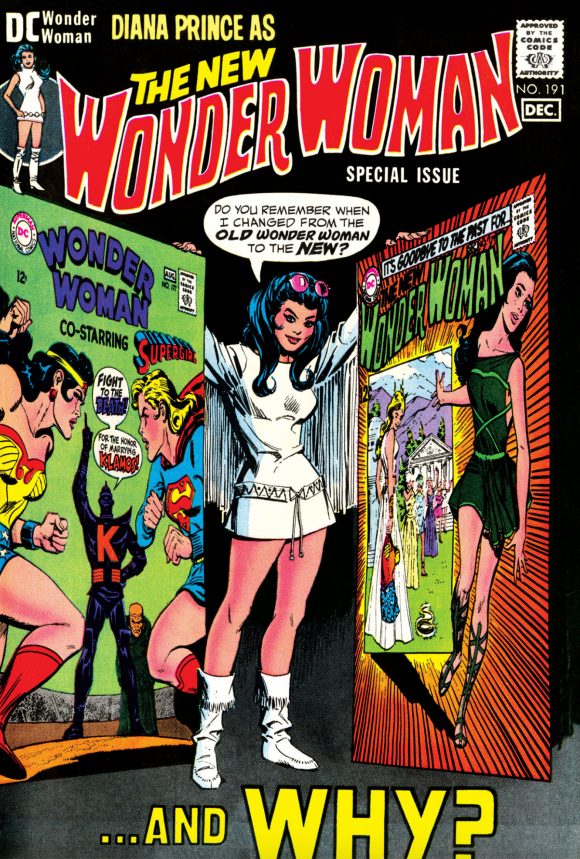
Sekowsky and Giordano
—
3. World’s Finest #198, DC. Superman vs. the Flash III! DC hammered at this hoary chestnut quite a bit but this is one badass layout. Come to think of it, has there ever been a bad Superman vs. Flash cover? I don’t think so. Love the black nighttime sky. I don’t remember the particulars of the story but this makes it look like they’re gonna just fly off the planet and into the cosmos.
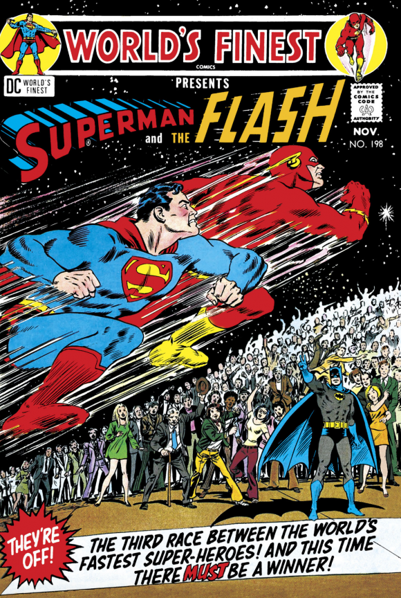
Curt Swan pencils, Murphy Anderson inks
—
2. Detective Comics #405, DC. Batman did a lot of lurking on his early Bronze Age covers (still does), so the concept isn’t exactly new. Is he being pursued or lying in wait? Perhaps both. But the main thing is he looks like he’s up against a team of killers he’s unaccustomed to fighting. Which makes sense, because, y’know, this was the debut of the League of Assassins.
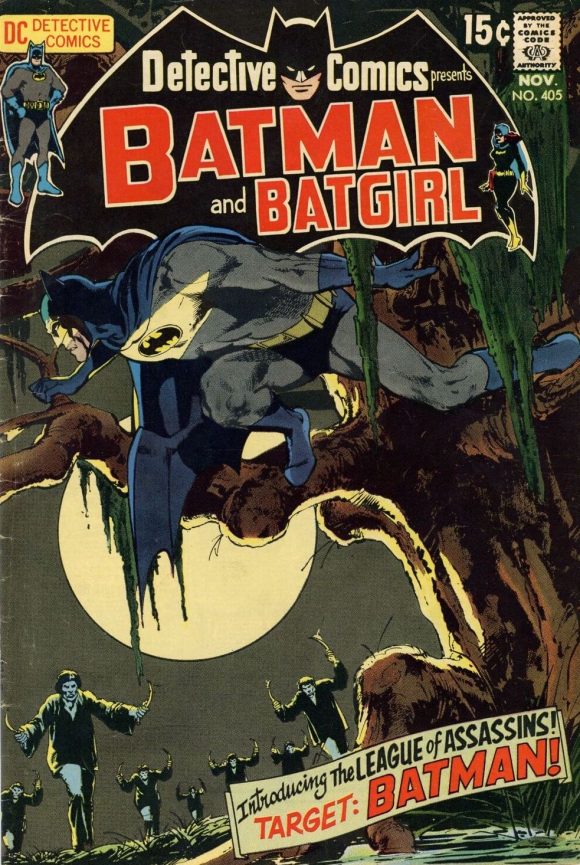
Adams
—
1. Superman’s Girl Friend Lois Lane #106, DC. The most misguided cover in mainstream comics history? It’d be hard to top. Regardless of the exceptionally questionable taste, it’s easily the most compelling cover on this list. A dubious classic that refuses to be ignored.
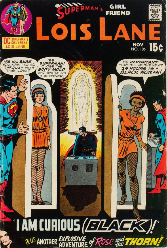
Swan and Anderson
—
MORE
— The TOP 13 COVERS of AUGUST 1970 — RANKED. Click here.
— BRONZE AGE BONZANA: The 1970 INDEX. Click here.
—
Sources: Mike’s Amazing World of Comics and the Grand Comics Database.
September 20, 2020
Great selection as usual but may I point out you have two #4’s and no #11?
September 20, 2020
Thanks! Fixed!
September 20, 2020
I had a lot of these…mostly DCs, Marvels and that Betty and Veronica comic! Memories! Pressed between the comic pages of my mind!
September 20, 2020
These covers are really amazing, especially the selected Swanderson ones.
September 21, 2020
That Wonder Woman cover… HOW did they put those two covers in perspective, like that??? Today, it’s simple, in Photoshop, but in 1970, how did they do that photographically/optically? I am dumbfounded.
September 23, 2020
I love that Wonder Woman #191 cover and I even have both issues that Diana is holding. The WW vs. Super Girl story was a snooze, but they totally sell that cover since both heroes look like they are going to kill each other which I’m sure sold lots of copies.