
BRONZE AGE BONANZA: A cornucopia of captivating covers…

—
Welcome to BRONZE AGE BONANZA — our monthly series that looks at the greatest covers of the Bronze Age — exactly 50 years later. For more info on this feature, click here.
—
It’s the stretch run for the year. We’ve got this installment and in a few weeks we’ll cover December 1970. Then at the end of the year, we’ll have THE TOP 13 COVERS OF 1970 — RANKED. Come January, we’ll kick off 1971.
But first, here’s November 1970.
Let’s get to it.
—
13. Mod Wheels #1, Gold Key. A very basic, very colorful cover with a nice, smooth sense of movement. The cover was inked by Sal Trapani but it’s not clear whom the penciller was. Did you know this series lasted 19 issues, into late 1975? I didn’t.
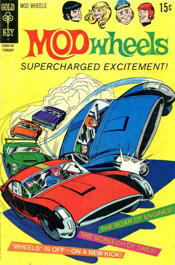
Inks by Sal Trapani
—
12. Underdog #4, Charlton. Only because it appeals to my sophomoric sense of humor. Just imagine Simon Bar Sinister’s little shveng. How is that not funny?
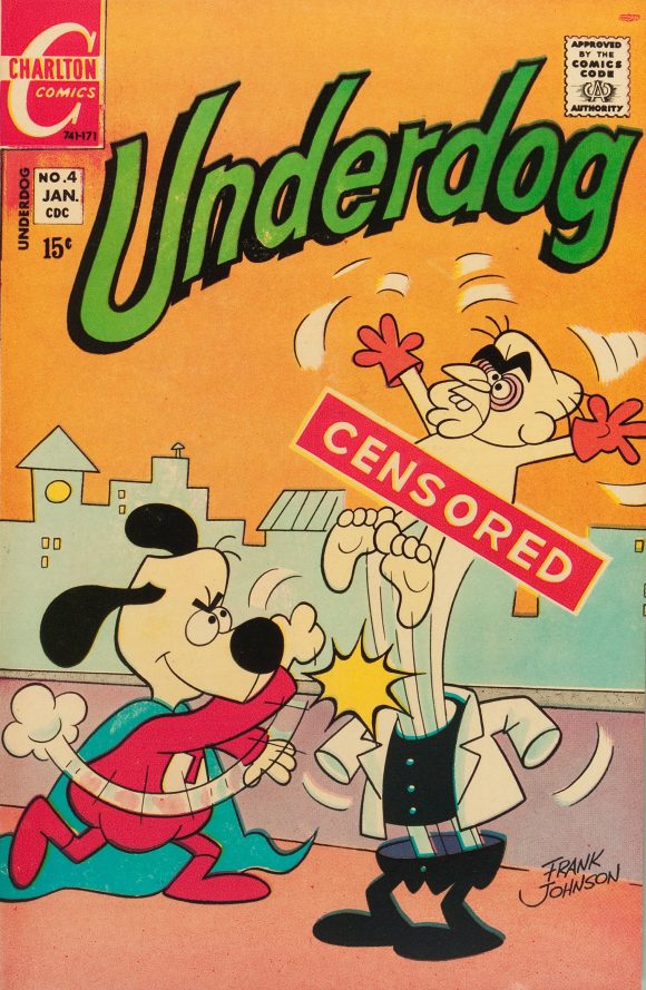
Frank Johnson
—
11. Ghost Manor #16, Charlton. There’s a lot going on here, with at least three colliding perspectives that make it difficult to pick up what’s happening. Not Pat Boyette’s best work by any stretch, it’s a consfusing mess that is nevertheless oddly entertaining.
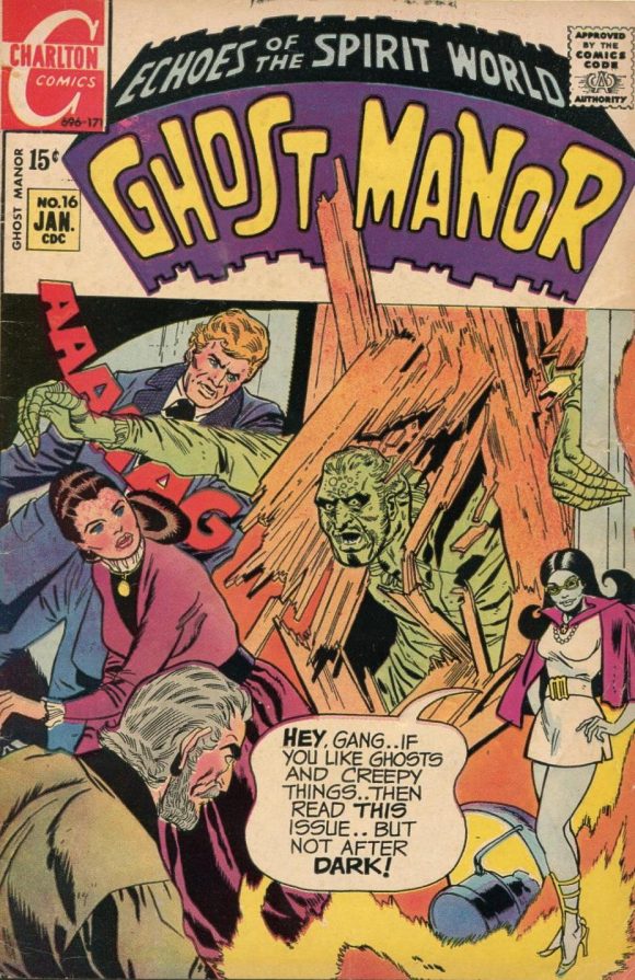
Pat Boyette
—
10. The Phantom Stranger #11, DC. A compelling cover that gives you everything and nothing at the same time. Who is this woman? Why has she been chosen for the Army of Evil while wearing a peace medallion? What’s with the trippy statue heads? It’s a downright freaky image, even if it looks like Neal Adams was half-finished when the deadline hit and he opted for the blank special effect that dominates the right half.
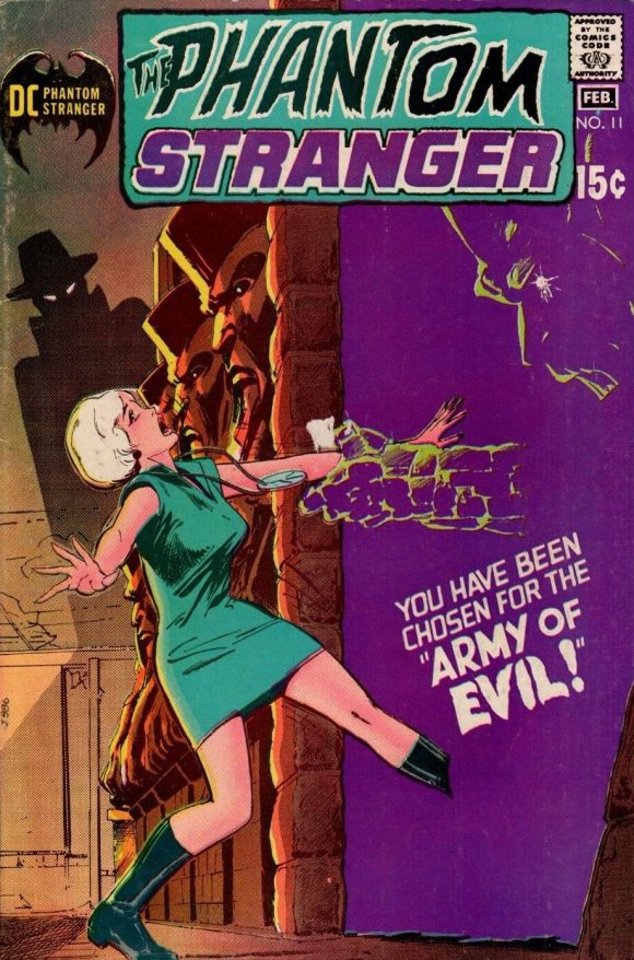
Neal Adams
—
9. Dark Shadows #8, Gold Key. I really have a thing for George Wilson’s painted covers. You’ll be reading more about that soon. Meantime, he takes the cliche of the vampire rising from the casket and turns Barnabas into a terrifying, monstrous threat.
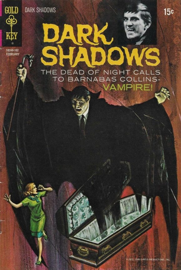
George Wilson
—
8. Aquaman #55, DC. A striking composition. This would be a routine move in animation, but Nick Cardy pulls out his bag of tricks, utilizing 15 Aquamans and 10 word balloons to depict the shrinking Swift and Powerful Monarch of the Ocean’s disappearance into a magenta ring made large by the foreground perspective. Cardy could do anything and make it look easy.
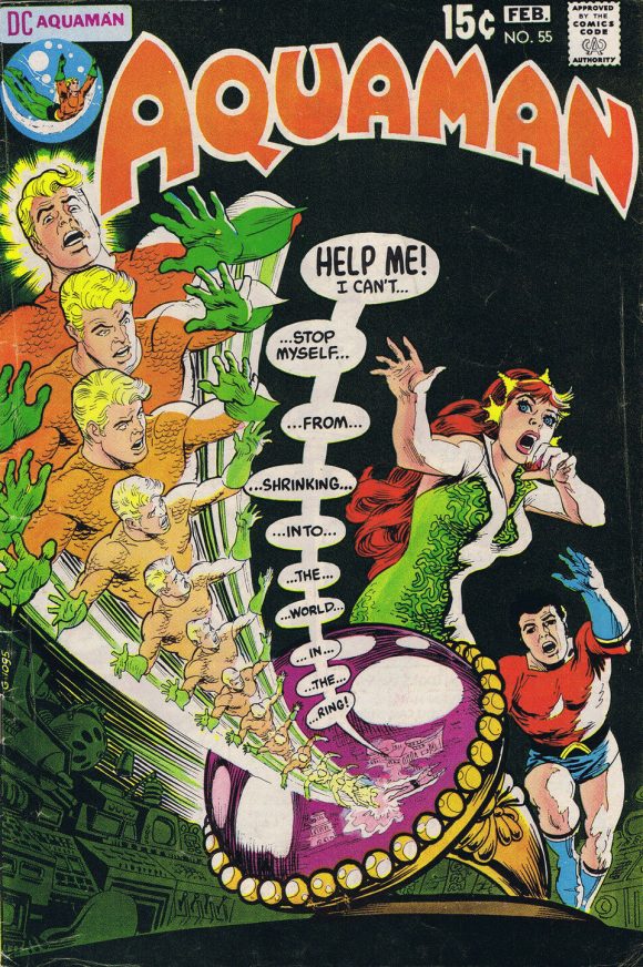
Nick Cardy
—
7. Superman’s Pal Jimmy Olsen #135, DC. Everyone talks about Superdickery but Jimmy Olsen was often an asshole to Superman too. Really, this is just an excuse to have Neal Adams draw the Man of Steel in various action poses. Obviously, it works.
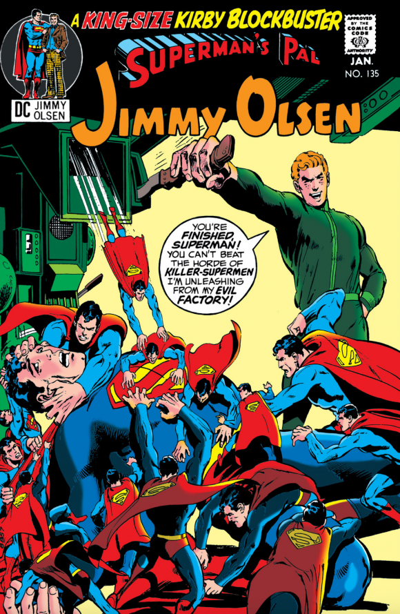
Neal Adams
—
6. The Avengers #84, Marvel. Just a solid, straight-up action cover by the Buscemas. ‘Nuff said.
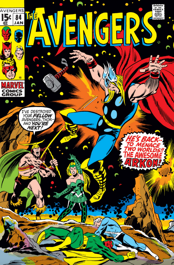
John Buscema pencils, Sal Buscema inks
—
5. Super DC Giant #S-21 (LOVE 1971), DC. So colorful, so enchanting, so of its time. Groovy. Far out. Right on.
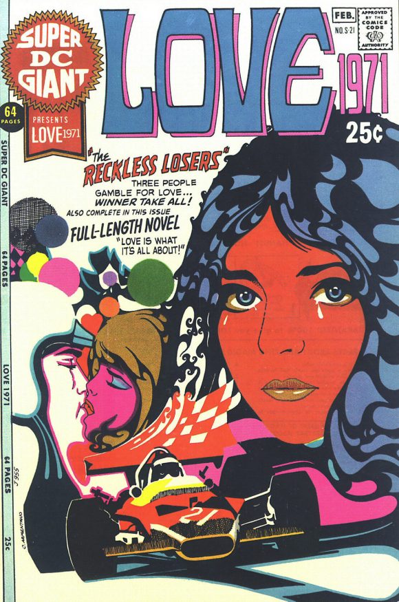
Charlie Armentano
—
4. Fantastic Four #107, Marvel. If anyone had reason to worry that Jack Kirby’s departure would mean ruin for the Fantastic Four, they only needed to look at this bold cover that was destined to become a classic.
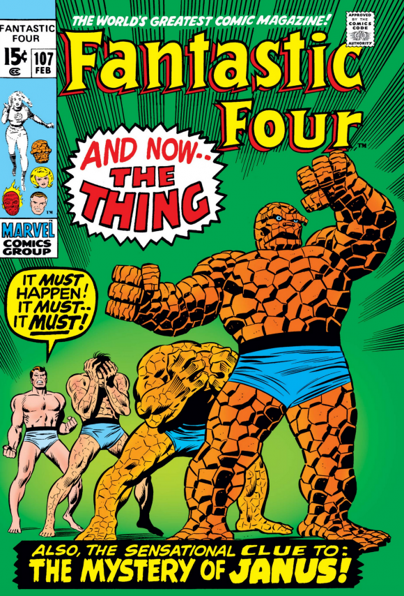
John Buscema pencils, Joe Sinnott inks
—
3. The Amazing Spider-Man #93, Marvel. Exhibit 4,541 in the case of Why John Romita is the Best Spider-Man Artist Ever. Ever.
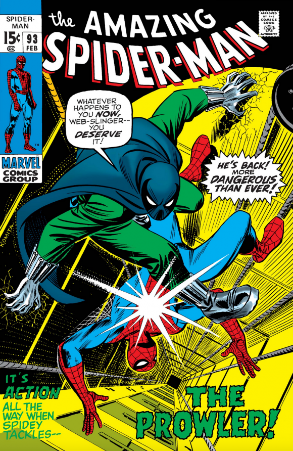
John Romita
—
2. DC Special #10 (STOP… You Can’t Beat the Law!), DC. Go up to No. 8, then come right back. Like I said, Nick Cardy could do anything — and these two very different covers, with very different concepts and subjects are a testament to that. This is a brilliant illustration and for once the smaller image box works in the cover’s favor. Fabulous.
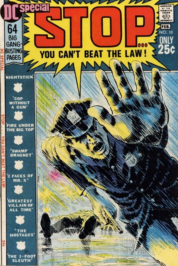
Cardy
—
1. Superman #233, DC. Greatest Superman cover ever? It’s certainly in the running — even if Neal Adams himself says he hates it. There’s no question this one’s in the running for the best cover of 1970.
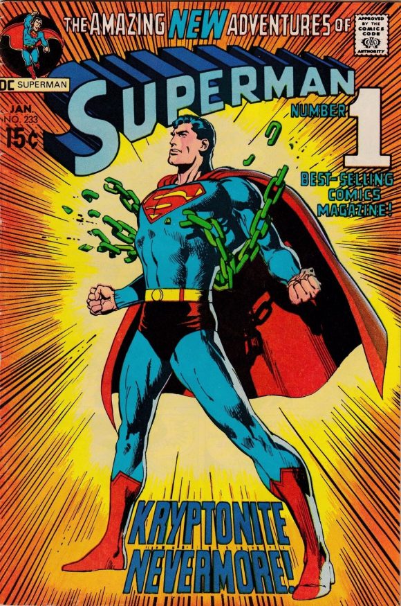
Adams
—
MORE
— The TOP 13 COVERS of OCTOBER 1970 — RANKED. Click here.
— BRONZE AGE BONZANA: The 1970 INDEX. Click here.
—
Sources: Mike’s Amazing World of Comics and the Grand Comics Database.
November 22, 2020
Those two Neal Adams “Superman” covers are my absolute favorites!
November 22, 2020
I still remember buying that Superman issue in a book store in Florence, AL when I was in high school.
November 24, 2020
Cool list with some really great books!! Always nice to see Charlton and Gold Key gettin’ some love.
You sure love your Cardy, don’t you? I didn’t always appreciate his stuff because it looked somewhat unfinished. Still, I don’t level that same criticism at artists like Williamson or Kinstler, so these days I tend to appreciate Cardy for his powerful compositions, which is an admittedly easy task when you consider just his work on Titans and Aquaman. His layouts are so imaginative!
December 25, 2022
I think that Aquaman cover should be higher. I really dig it.
And I agree that John Romita sr is the best Spider-Man artist ever.