BRONZE AGE BONANZA: You can just hear the lamentations of their women…
—
Welcome to BRONZE AGE BONANZA — our monthly series that looks at the greatest covers of the Bronze Age — exactly 50 years later. For more info on this feature, click here.
—
Last month was a bit lackluster, but now we’re back with a number of bona fide classics — and covers that should be.
So dig THE TOP 13 COVERS OF JULY 1970 — RANKED:
(And don’t forget: These entries are based on sale dates and not official publication dates.)
—
13. Archie Giant Series #178, Archie. There were a gazillon summer-themed Archie issues that came out this month (natch), but this one was the most colorful. I also dig the perspective. And boy, Archie’s enjoying the gag, isn’t he?
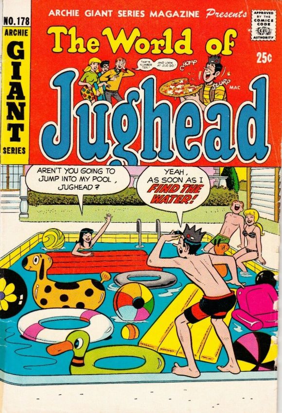
Artist unknown
—
12. Action Comics #392, DC. More summer fun! Actually, the cover’s a bit wonky — just look at Batman’s head — but it’s a camp classic. That’s called toxic parenting right there.
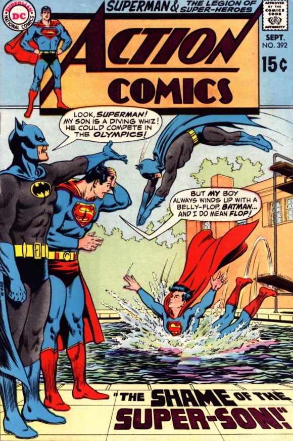
Curt Swan pencils, Murphy Anderson inks.
—
11. Aquaman #53, DC. More water! Of course, this is Aquaman we’re talking about, so it figures. Nick Cardy could do just about anything and he was particularly adept at giving Aquaman covers an unsettling, horror feel. Not sure who the colorist was but the palette gives the whole thing an appropriately polluted feel.
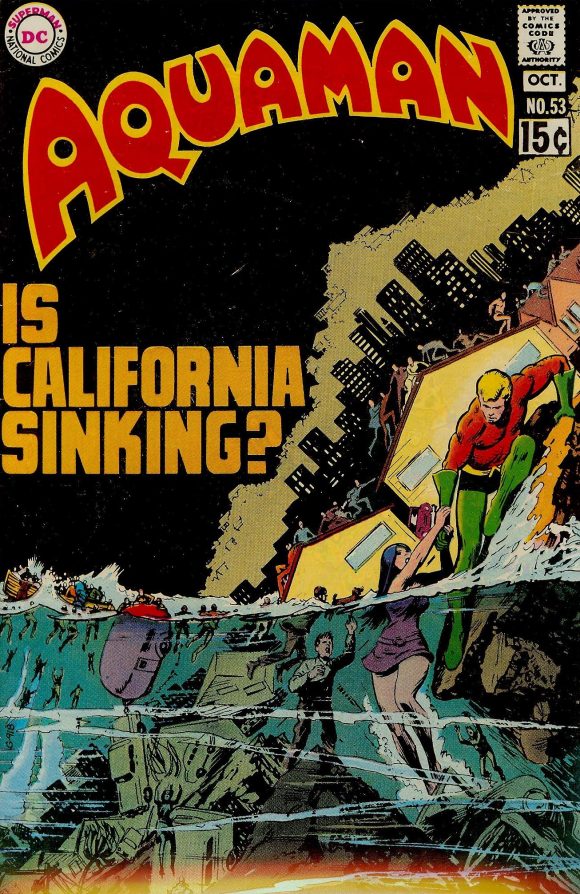
Nick Cardy
—
10. Daredevil #68, Marvel. This cover asks so many questions, but what I’ve always appreciated was DD’s body language, especially the taut way he’s pulling at his mask with a grimace. Marie Severin would be a superstar if she were working today. I’ve said this before, of course.
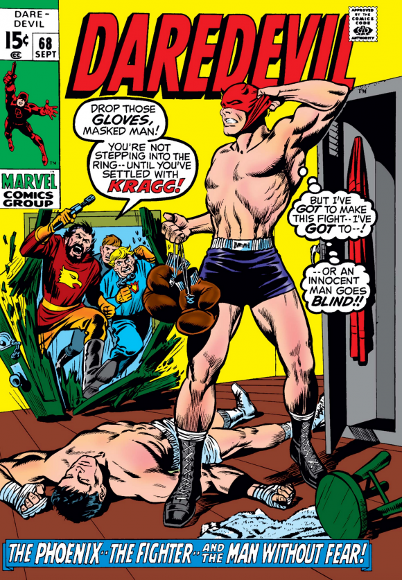
Marie Severin pencils, Syd Shores inks
—
9. Fantastic Four #103, Marvel. The first issue without Jack Kirby interiors but John Romita and John Verpoorten seemed hell-bent on telling readers that this would remain a kinetic, action-packed series. Lots going on here and Romita gives it that oomph by training the reader’s eye in a satisfying circular motion. I just dig how this is framed. Oh, and more water!
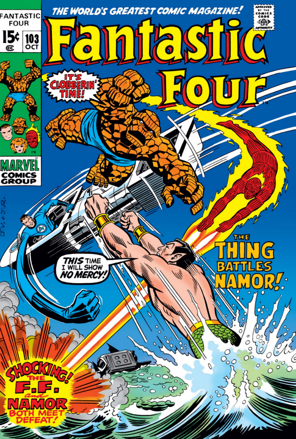
John Romita pencils, John Verpoorten inks.
—
8. Wonder Woman #190, DC. DC injected a lot of horror themes in its superbooks in the early ’70s and this cover plays like an especially sinister version of the Scooby-Doo show opening. Those magenta eyes!
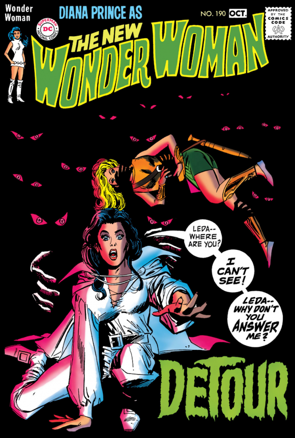
Mike Sekowsky pencils, Dick Giordano inks.
—
7. Superboy #168, DC. The people turning on the hero is a hoary chestnut but Neal Adams gives it such drama because, well, y’know, he’s Neal Adams. Great perspective and bold presentation of the classic Super-costume and pose. If I have a quibble it’s that the Teen of Steel seems a little overmuscled given his age. But hey, who am I to question a master?
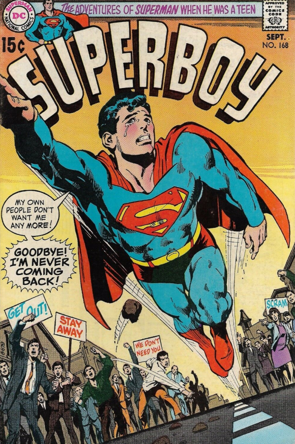
Neal Adams
—
6. Detective Comics #403, DC. Classic Adams visual trickery, with the misty fog effect. This isn’t one of my favorites by the artist — just personal taste, mind you — but you have to give big props to the mad skill. The following year, Adams would improve upon the concept with the classic Batman #232.
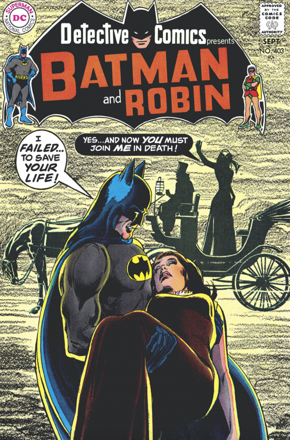
Adams
—
5. The Amazing Spider-Man #89, Marvel. I tend to prefer covers that are a single, basic image as opposed to a sequence. But when it works, it works. This is classic Romita Spidey — and a classic issue besides, leading up to the death of Capt. Stacy.
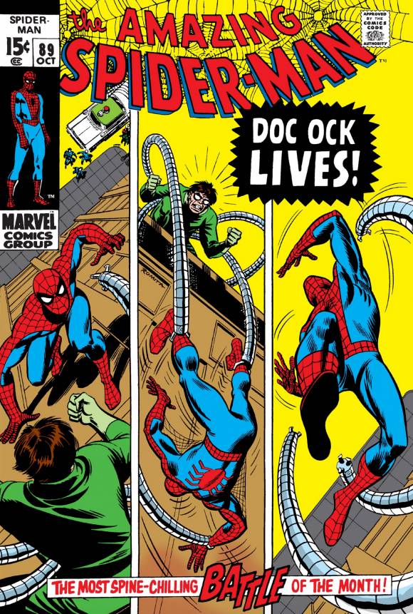
Romita
—
4. Super Dc Giant #S-17, DC. Truth to tell, I’d never seen this Cardy cover until I researched this month’s feature. But man does this, ahem, pop. Most romance covers are a combination of camp and unrequited longing. This one is just plain HOT. And more water! (Summertime, folks. Summertime.)
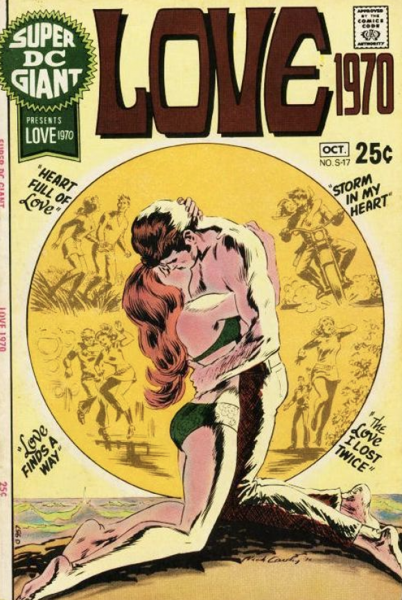
Cardy
—
3. Strange Adventures #226, DC. Just an absolutely jarring primary image by Joe Kubert, made even more effective by the eight portraits. (Note to DC in 1970, though: Africa is not a nation.) It’s kind of unfair that the grim main visual has to play off the much more Silver Agey promos on the left, but all that white on the cover only serves to frame the bright colors central to the overall presentation. Knocks your socks off, doesn’t it?
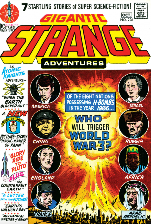
Joe Kubert
—
2. Adventure Comics #397, DC. An all-time classic, and one of the best-known Supergirl covers ever. I kind of like Business Suit Supergirl but no matter what it’s a real kick that DC would dedicate a cover to fans’ contributions.
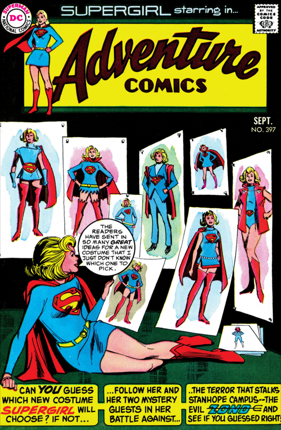
Sekowsky and Giordano
—
1. Conan the Barbarian #1, Marvel. How could this one NOT be No. 1? Even if Barry Windsor-Smith wasn’t really Barry Windsor-Smith yet, this is one of the iconic images of Marvel’s Bronze Age.
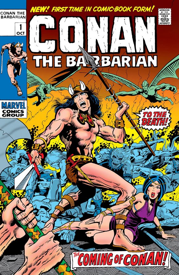
Barry Windsor-Smith pencils, Verpoorten inks
—
MORE
— The TOP 13 COVERS of JUNE 1970 — RANKED. Click here.
— BRONZE AGE BONZANA: The 1970 INDEX. Click here.
—
Sources: Mike’s Amazing World of Comics and the Grand Comics Database.

July 18, 2020
The Archie cover looks to be by Dan DeCarlo and Rudy Lapick
July 18, 2020
Thank you!
January 14, 2024
I love that Archie cover! That’s something I’ve seen in a few swimming pools and I bet the artists had too!
July 18, 2020
And 50 years later, these covers still stand out.
July 18, 2020
Wow- I was too young at the time, but I would have just loved seeing these at the store a kid. The Wonder Woman cover would have grabbed me, The Aquaman cover would have had me asking questions to my brother all day (Why would it sink? Why would they live there?), and Super Dc Giant #S-17 would have given me the cooties.
July 18, 2020
And Batman’s son wears a full costume and utility belt to dive. I know, some would say that’s the appeal, but there was a reason I could never fully go with DC.
July 18, 2020
That Strange Adventures cover caught me while we were on vacation heading to Maryland to see family. Actually found it at some lobby newstand at a Holiday Inn in Ohio. I had to read about the nuclear war – i was already obsessed with post-holocaust stories since I’d read Andre Norton’s “Daybreak 2250 AD” & this didn’t disappoint. Even the DC version of mole people as the cause worked thanks to my long-time comic reading.
July 24, 2020
Maybe #14 could be Teen Titans #29, also by Nick Cardy. It included an appearance by the Hawk & the Dove, appropriate to the time period, and oh yeah … more water!