Something a little different for this week’s Neal Adams Interviews: The artist discusses what just might be his most famous image of Batman:
—
The gist of this series of interviews – an offshoot of my BATMAN’S HOT-LINE column – is to get Adams’ perspective on some of his best-known covers featuring the Darknight Detective.
But there’s one image of Batman he drew that bears its own discussion – an image that became a cover only after the fact.
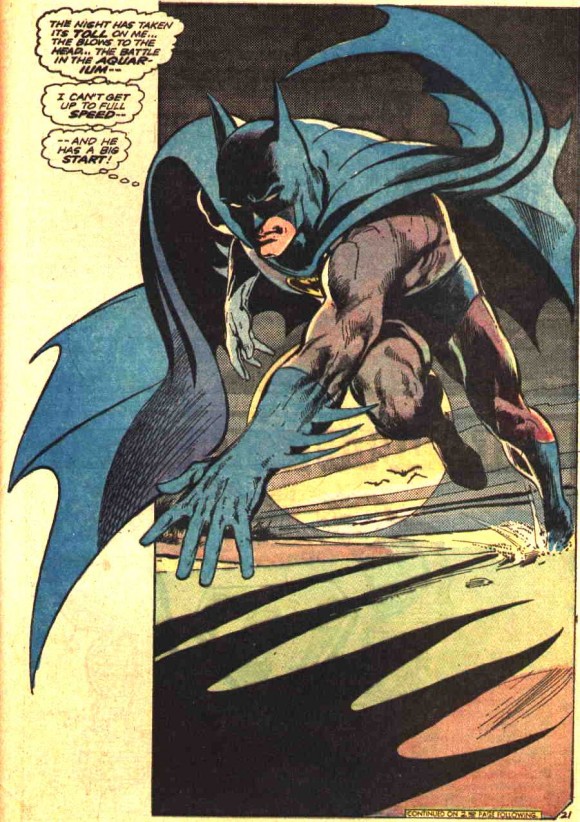
In the climactic sequence of 1973’s Batman #251 – a classic showdown with the Joker written by Denny O’Neil – the Caped Crusader bolts down the beach in pursuit of the Clown Prince of Crime.
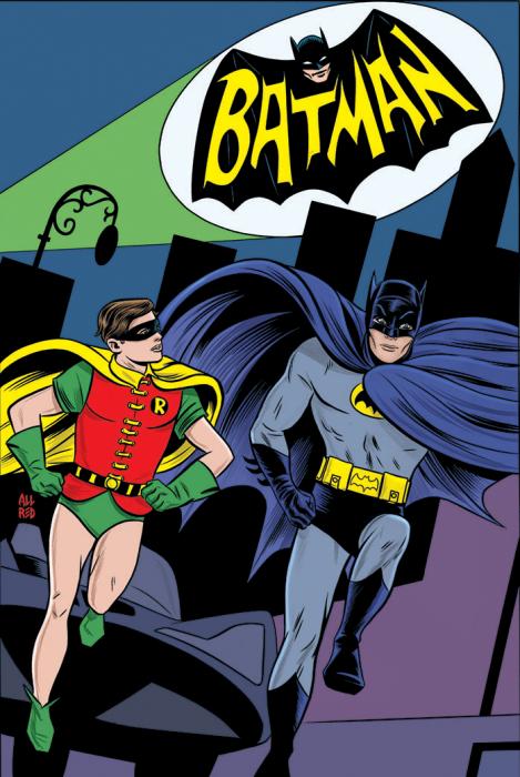
Readers had become accustomed to seeing their comics heroes running upright, often stiffly, as emulated here in Mike Allred’s homage to the Batman TV show opening credits for the recent Batman ’66 #1:
Adams explained that his Batman image was borne of watching sprinters and speed skaters.
“Well, if you really watch runners,” he explained, “when they take off, they’re right on the ground. They go forward and until they reach their speed, they can’t straighten up. Because they’ll fall. So they run like that. And their hands are right by the ground.
“Same thing with speed skaters. I used to do speed skating and when you take a turn, your hand is on the ground. You’re guiding yourself as you go by putting your hand on the ground. Your fingertips are touching the ground. And it doesn’t seem logical to a person who doesn’t do any of these things that you can run with your fingertips on the ground.”
But he was right, and its what gives the image its explosiveness.
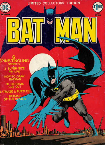
DC loved the image so much, the editors trotted out a version of it to front its treasury-size Batman Limited Collectors’ Edition #C-25. (Notice Batman wearing his utility belt. The Joker had removed it in the original version.)
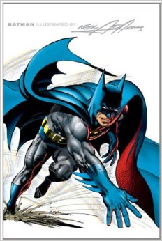
And in 2003, another version was used for the cover of the hardcover collection “Batman Illustrated by Neal Adams Vol. 1,” which is now available in paperback.
NEXT: Superman #233. Click here.


October 17, 2013
Thanks, that was fascinating! I love the treatment of the image on the Treasury edition, blood red background and all.
October 17, 2013
That treasury edition is gorgeous, you’re right! — Dan
August 25, 2019
There’s something about that slightly purple tint on the grey part of Batman’s uniform that gives it that late 60s / early 70s feel. Still gives me goosebumps.