
So very clean…
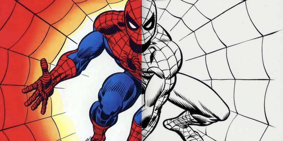
I’ve said before that 1974’s Marvel Treasury Edition #1: The Spectacular Spider-Man juuuuuuust might be my favorite Spidey cover ever.
Just look at the pretty by John Romita:
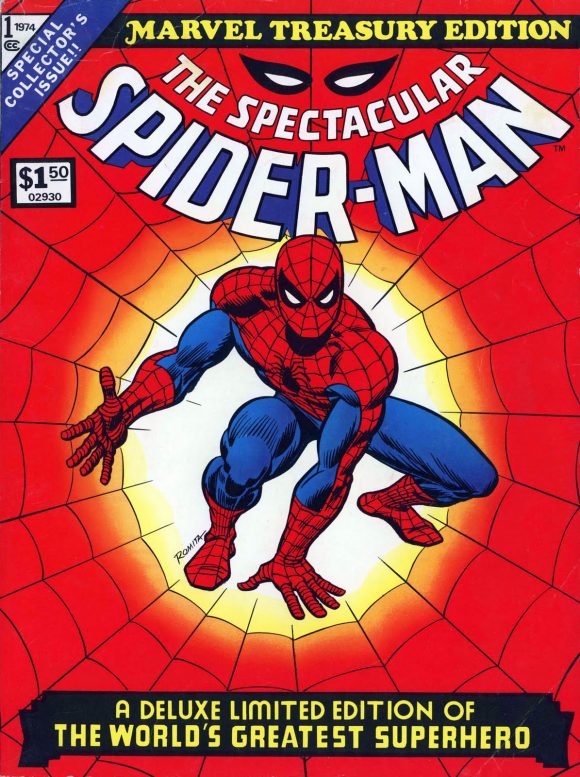
Anyway, for whatever reason, this cover popped into my head the other day, so I decided to track down the original cover art, which I found (of course) at Heritage Auctions’ website.
Dig this:
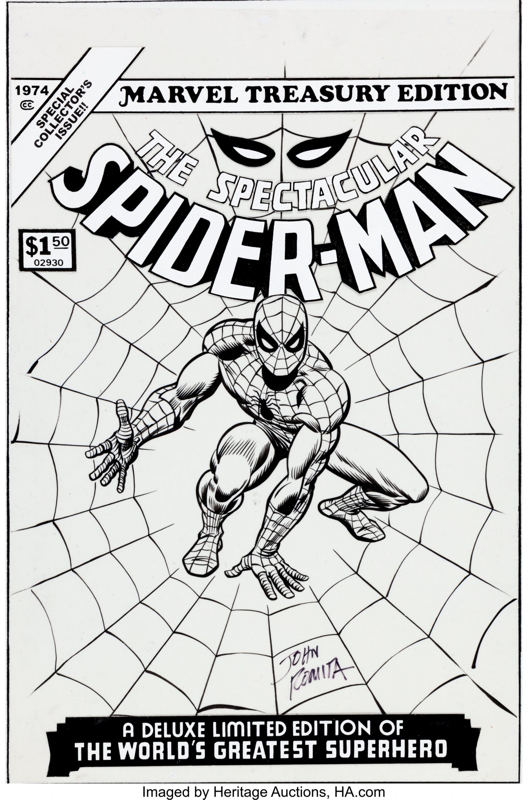
Here’s what the Heritage Auctions site says about the piece: “With an image area measuring 11″ x 17″, this large-sized masterwork will certainly be the prized showpiece of any collection. The original illustration, drawn on a sheet of vellum, was affixed to another board. The logo and type are replacements; otherwise, the art is in Excellent condition. Signed by John Romita Sr. A signed hand-written 2009 Letter of Authenticity from John Romita Sr. is also included with this fabulous lot.”
It sold back in 2013 for $44,812.50, including buyer’s premium.
What I love about the original is just how damn clean it is. It’s as if Romita rolled out of bed, drew it perfectly, and then took a nap.
Seriously, this looks effortless. Of course it never is but damn Romita is one of the all-time greats.
But you knew that.
—
MORE
— 13 GORGEOUS ILLUSTRATIONS: Create Your Own Virtual ARTIST’S EDITION. Click here.
— The TOP 13 JOHN ROMITA SPIDER-MAN Covers — RANKED. Click here.
October 30, 2021
It’s so clean…. no blue lines or margin comments. It’s a shame they added new logo etc. I’d prefer it un-touched by time. I remember wanting this comic something horrible back in the day.
October 30, 2021
While it is a beautiful piece, the original art shown appears to be a re-creation. None of the fine details like the webbing or hatching lines are quite right between the two.
October 30, 2021
Always possible, I suppose. And it did occur to me. But the Heritage site insists otherwise.
November 2, 2021
They’re both a joy, but I prefer the cover as printed. It underpins a perfect little memory bubble for me.
It does appear that the shading is noticeably different in some places, but dutifully similar in others – perhaps workmanlikely so. The right bicep seems to me to be the makeweight in my personal assessment.
October 30, 2021
Also, the figure in the second is smaller and Romita’s signature is in a different place. But it’s still pretty cool, and obviously it was done by “Jazzy Johnny,” too..
November 1, 2021
Maybe that Romitaman Mike Burkley has the original?
August 13, 2023
Clearly a reproduction! If you blow-up the hand in the foreground, it has multiple differences that wouldn’t have occurred through printing bleed. Someone pulled a “Fast one!” John Romita was a “Brush” Inker and no two pictures would be the same if reproduced, as is the case here.