
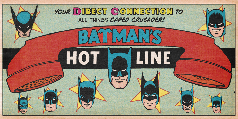
A BIRTHDAY TRIBUTE to the late Silver Age stalwart, who was born 119 years ago on June 18, 1906…
—
UPDATED 6/18/25: Inker Sid Greene was born 119 years ago! Perfect time to reprint this piece from 2022! Dig it. — Dan
—
By WALT GROGAN
You don’t have to read many DC comics of the 1960s before you start recognizing a variety of house styles. DC assigned its lead characters and the titles they appeared in to a group editor. For example, Superman, his titles, and ancillary characters were under the purview of Mort Weisinger.
Likewise, the Batman family of titles were the domain of Jack Schiff and later, Julius Schwartz. Schwartz also controlled Justice League of America, The Atom, The Flash and Green Lantern titles.
Each editor gave assignments to a select number of writers and artists, so when a reader returned month after month to a favorite title, they became familiar, either consciously or not, with an artist’s style. If he was a Superman fan, he’d get to know the Man of Steel through Wayne Boring or Curt Swan’s artwork or if she was a Batman fan, she’d start to recognize the style of Bob Kane, er, Sheldon Moldoff or later Carmine Infantino.
Curt Swan pencils, George Klein inks
Because most of the stories were short, plot-based, procedural stories with little characterization and typically done in one — unlike the serialized nature of today’s tales — it was unusual for characters to crossover from one editor’s stable of titles to another. It was rare but not unheard of, for instance, for the Flash to speed into a Superman story.
One of the outlier titles was Justice League of America, which teamed Superman, Batman and Wonder Woman with the Martian Manhunter, the Flash, Green Lantern and Aquaman. The JLA was written by Gardner Fox with artwork by Mike Sekowsky. Sekowsky’s style was unusually blocky, which gave readers a starkly different rendition of Superman, Batman, Wonder Woman and the other heroes than they were used to. It was a bit jarring to read Justice League after Action Comics or Detective Comics because of the different styles but that difference was what triggered me to start recognizing the art of different pencillers at the young age of 6, back in 1966.
JLA #27, inks by Bernard Sachs
So what does this preamble have to do with Sid Greene whose birthday we’re celebrating? Greene, along with his contemporary, Murphy Anderson, was one of the inkers whose distinctive style I started recognizing as I read more and more DC Comics.
Anyone who has read a fair amount of Silver Age DC titles is undoubtedly familiar with both the inking and pencilling of Murphy Anderson. Anderson had a strong style that subjugated the pencillers he inked; for example, he softened and rounded the angular, kinetic energy of a Carmine Infantino or Gil Kane while adding a touch of realism prior to the debut of the hyper-naturalism of Neal Adams.
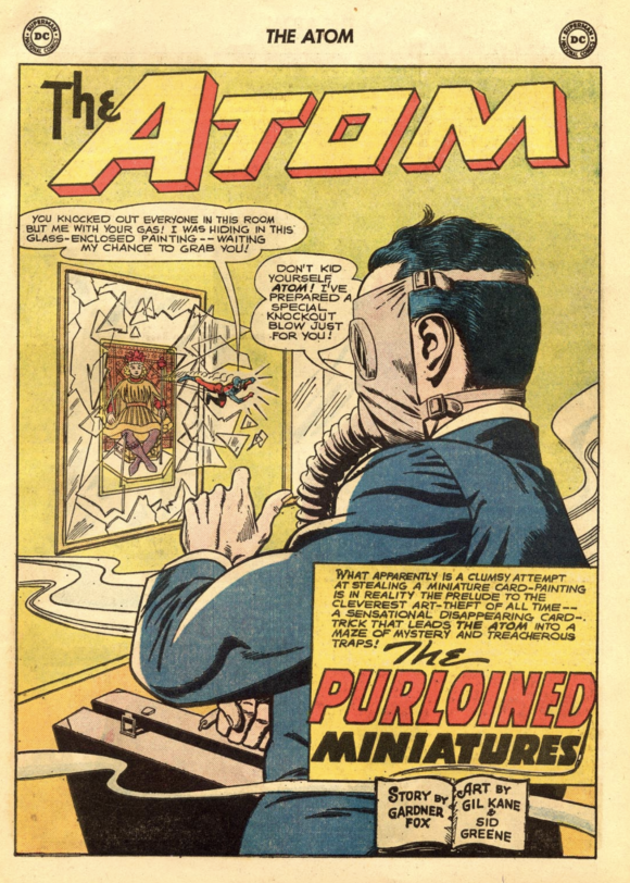
Sid Greene did exactly the same thing as Anderson yet he doesn’t garner the same accolades. Greene was known for pencilling and inking stories in Mystery in Space and Strange Adventures but started superhero work with “The Purloined Miniatures” in The Atom #8 (Aug.-Sept. 1963). He added Green Lantern to his assignments with Issue #29 (June 1964) and then Elongated Man in Detective Comics #332 (Oct. 1964).
With Batman #169 (Feb. 1965), Greene started inking the adventures of the Dynamic Duo. Greene had an impressive output in the life of Batman. Along with inker Joe Giella, whom Greene often traded stories — Sid helped crystallize the style of the “New Look” Batman introduced in 1964. But due to his short, three-year stint, his efforts are often overshadowed. Although there are a couple of dates in contention for when Sid Greene was born, we’re going with June 18, 1906. Greene died in October 1972 at the age of 66.
Here, then, are 13 Bat-Panels celebrating the birthday and legacy of Sid Greene:
—
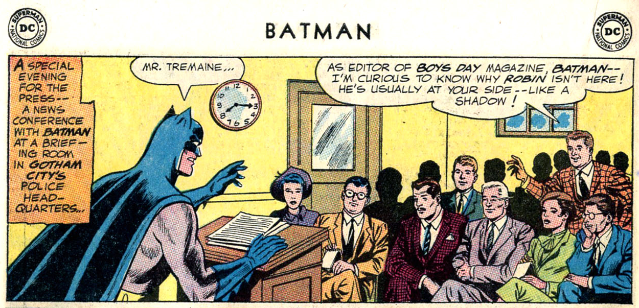
1. Here’s Greene’s first foray with Batman in “A Bad Day for Batman” from Batman #169 (Feb. 1965) over Sheldon Moldoff’s pencils. While Sid doesn’t change Batman’s facial appearance, sticking with Moldoff’s line work, you can see his signature facial style on Mr. Treymaine and the others in the briefing room.
—
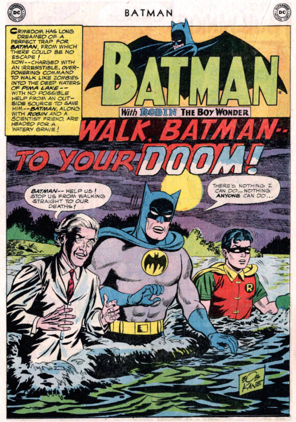
2. Although there’s not a lot of Sid’s style on Batman and Robin in this splash page from “Walk, Batman — To Your Doom!” in Batman #173 (Aug. 1965), you can see his facial style in scientist Grover — plus, I love what he did with the water and background to set the mood. Pencils by Sheldon Moldoff.
—
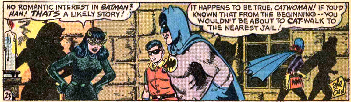
3. Once again, Sid is a master of mood in this panel from “Catwoman Sets Her Claws for Batman!” in Batman #197 (Dec. 1967). I always thought that this Catwoman costume was borrowed directly from the TV show but colored green rather than black for some strange reason. Pencils by Frank Springer.
—
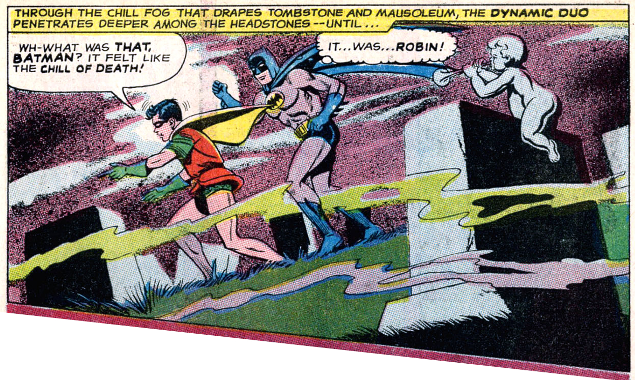
4. Here’s another example of Greene’s moody inking style — this time in a cemetery from “Gateway to Death!” in Batman #202 (June 1968). Pencils by Chic Stone.
—
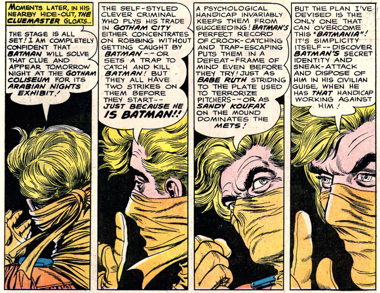
5. OK, this isn’t one panel, it’s four from “The Cluemaster’s Topsy-Turvy Crimes!” in Detective Comics #351 (May, 1966). Look at what Sid does with Carmine Infantino’s Cluemaster! You can see a lot of Sid-isms here in the hair, eyes and ears! Plus look at the line work on the Cluemaster’s mask — the texture is fantastic.
—
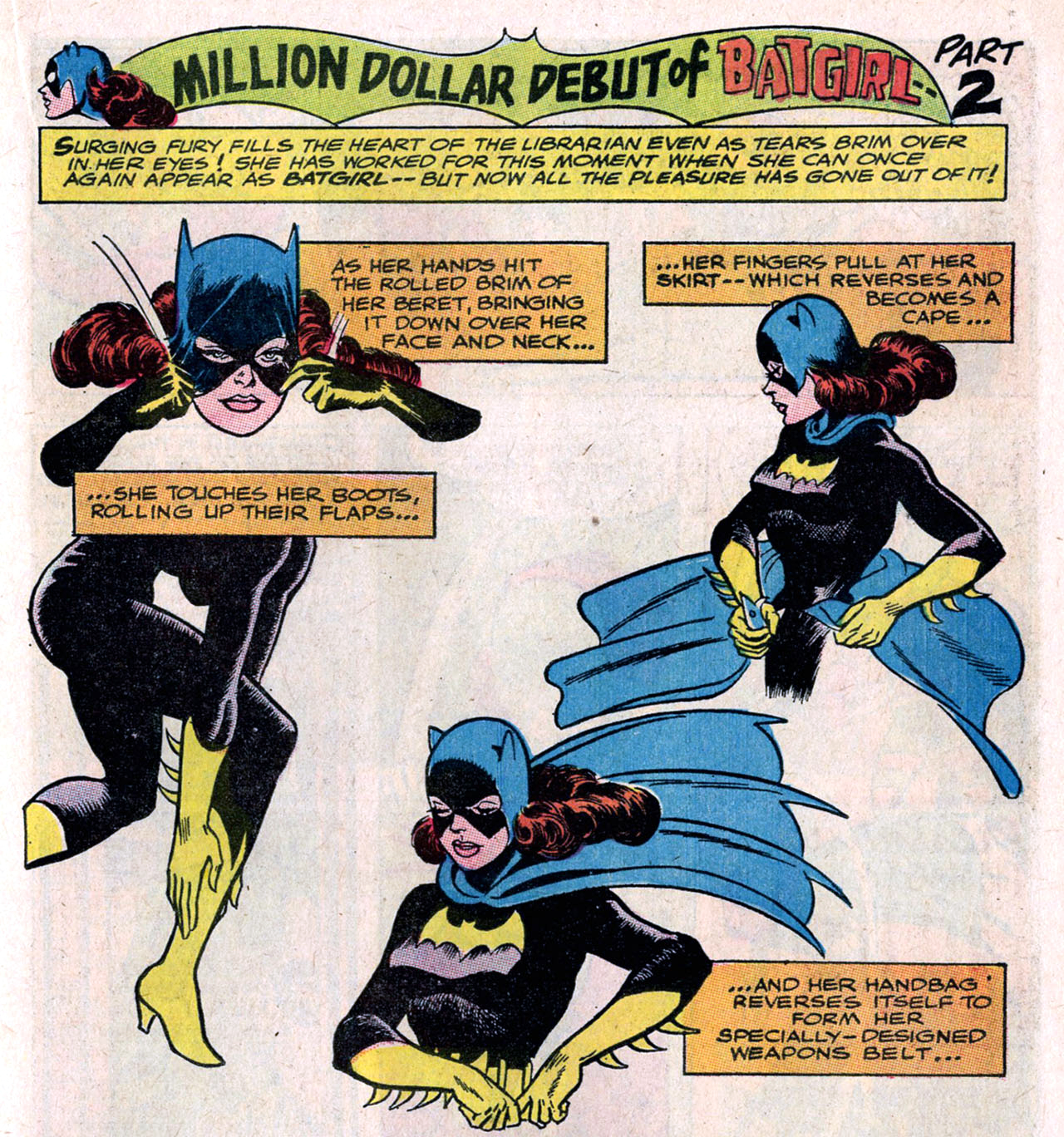
6. Wowser! Here’s an excellent panel from “The Million-Dollar Debut of Batgirl” from Detective Comics #359 (Jan. 1967)! I love Sid’s texture on Batgirl’s costume — he gives it a beautiful sheen. Pencils by Carmine Infantino.
—
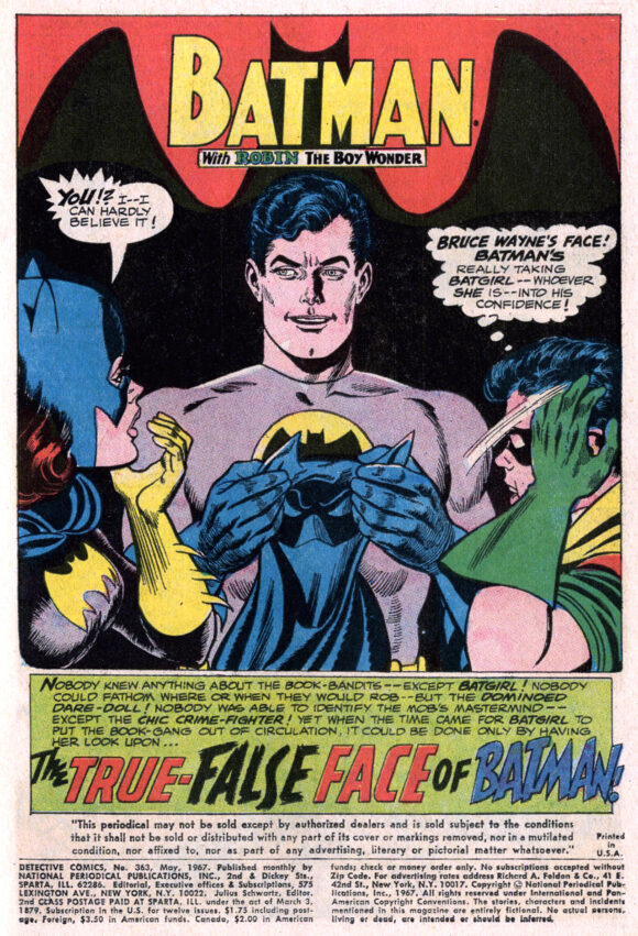
7. I really dig this splash page of the Terrific Trio from “The True-False Face of Batman!” in Detective Comics #363 (May 1967). It’s a beautiful panel and while it’s clear that
Carmine Infantino pencilled it, Sid grounds it with a bit of realism, especially in Bruce Wayne’s face!
—
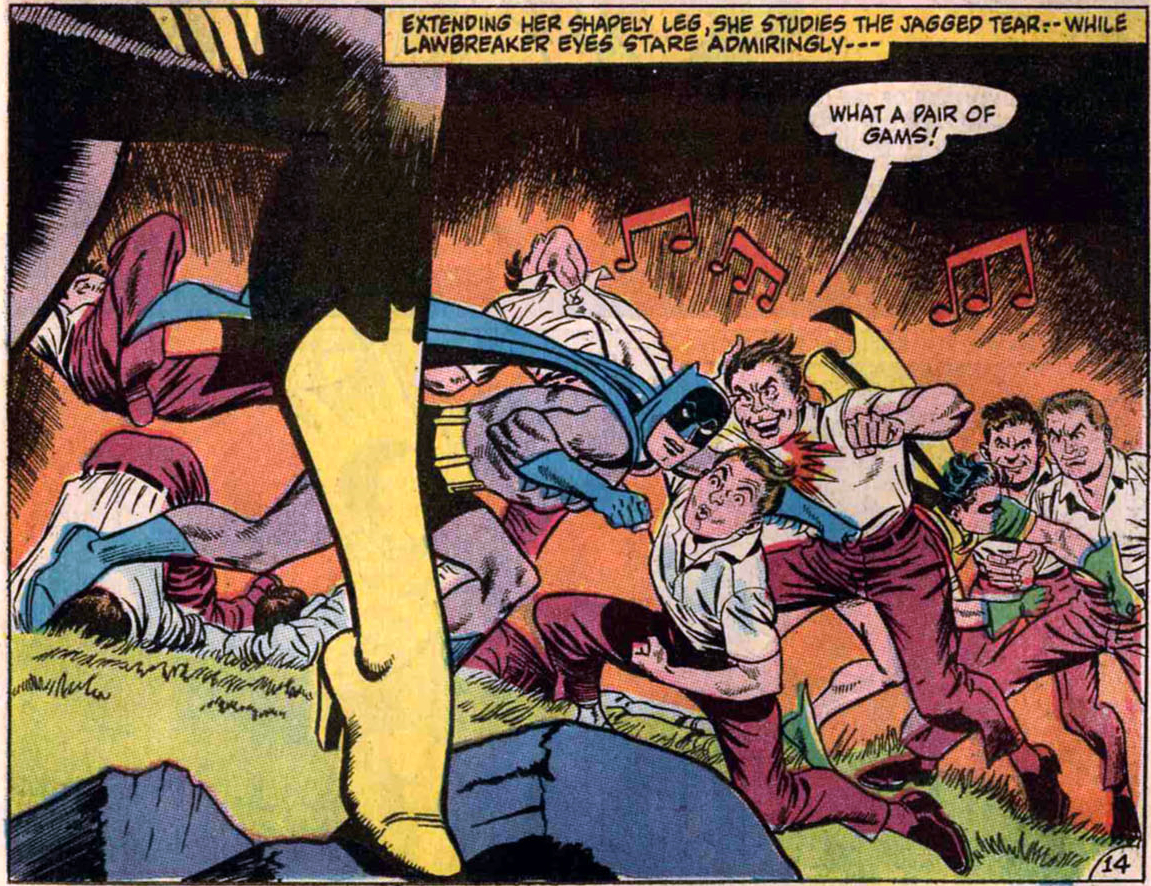
8. This panel from “Batgirl’s Costume Cut-Ups!” in Detective Comics #371 (Jan. 1968) is probably my favorite panel of all! I just can’t get over its glorious and absolute silliness and its epitome of male chauvinism in the 1960s. The fact that these apparently, red-blooded male hoodlums would stop in the middle of a fight to admire Batgirl’s “gams” — especially since the Dynamic Duo has already dispatched two of their comrades — just cracks me up! Look: One guy is giving a wolf whistle, another has a pretty scary leer, and one of the guys in back has his tongue out — it’s pretty intense stuff for a Batman story! Pencils by Gil Kane.
—
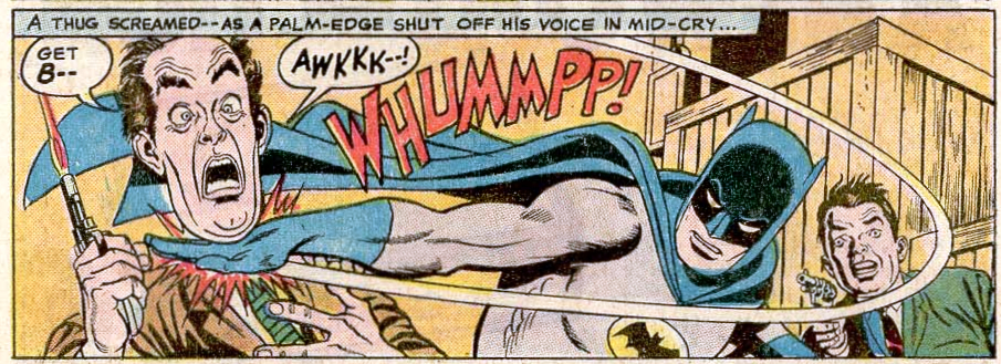
9. This panel from “Hunt for a Robin-Killer!” in Detective Comics #374 (April 1968) just kills me! Sid’s contribution to Gil Kane’s pencils gives the thug’s face a slapstick quality and I’m still trying to figure out if he’s intended to look like Don Knotts. The key question is — did Batman just kill this guy by breaking his windpipe?!? Kids, don’t try this move with your friends!
—
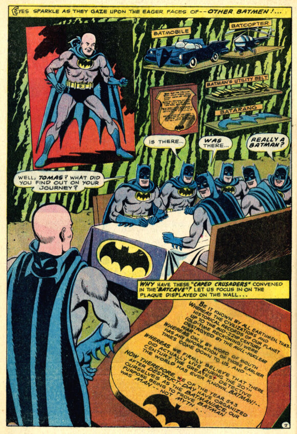
10. How can you not love a splash page with six smiling Batmen sitting around a banquet table with a tablecloth bought from a Batman birthday store?!? And with scale models of the Batmobile, Batcopter, plus a utility belt and a Batarang! Those Greene faces just make me want to smile, too! Pencils by Chic Stone. From “Hunted or –Haunted” in Detective Comics #376 (June 1968).
—
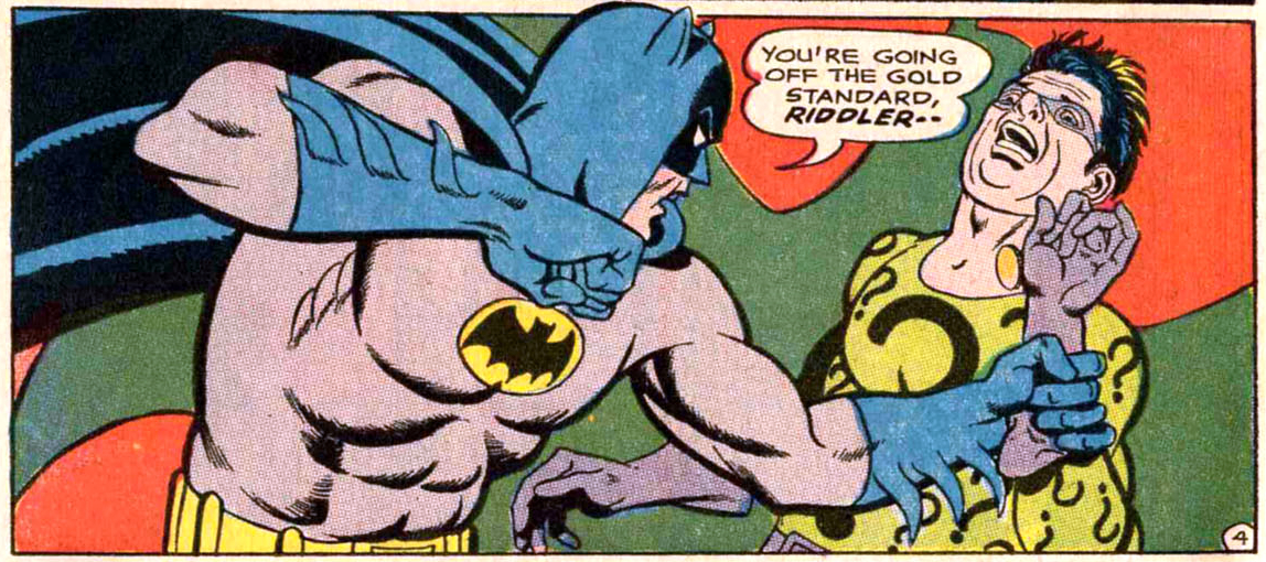
11. This is a classic example of Sid Greene inks — this time over Frank Springer’s pencils as Batman gets ready to give the Riddler a Bat-Knuckle Sandwich! Look at the Riddler’s face and hair — perfect! Pencils by Frank Springer. From “The Riddler’s Puzzle Problem!” in Detective Comics #377 (July 1968).
—
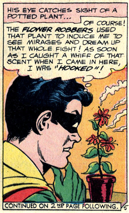
12. When the Comics Code Authority won’t let you depict the use of drugs in a story, you have to get creative! Robin gets “hooked” on the aroma from these flowers and starts to hallucinate! How many kids tried to track this plant down at their local florist? Pencils by Sheldon Moldoff. From “Robin’s Unassisted Triple Play!” in Batman #172 (June 1965).
—
13. Technically two panels here but I love the layout! Sid does what he can with the first panel but you can’t beat Batman doing a slide and kick on a green shag carpet! I hope he didn’t get rug burn! Pencils by Chic Stone. From Detective Comics #375 (May, 1968).

—
MORE
— 13 COVERS: A CARMINE INFANTINO Birthday Celebration. Click here.
— 13 COVERS: A MURPHY ANDERSON Birthday Celebration. Click here.
—
Credits courtesy of The Grand Comics Database.
—
A 10-year-old Walt Grogan fell in love with the original Captain Marvel thanks to essays written by Dick Lupoff and Don Thompson in the paperback edition of All in Color for a Dime, released in 1970 and bought for him by his father off a paperback spinner rack in a liquor store on the South Side of Chicago. Walt runs The Marvel Family Web Facebook page devoted to all incarnations of the Fawcett/DC Captain Marvel and blogs about Captain Marvel at shazamshistorama.com.
June 18, 2022
Always liked Sid Greene inking Gil Kane and Carmine Infantino as it made the finished art stronger.
June 18, 2022
Have to agree with you, Doug…always liked how Sid’s inks smoothed out that jagged edge look of Infantino’s pencils and always liked his inks over Mike Sekowsky’s art as well.
June 30, 2024
I agree! I especially loved Sid’s inks over Gil Kane’s pencils on Batman and Green Lantern!
June 18, 2025
Walt, great breakdown. Not sure if this is possible but I’d love to see the pencils side by side so these things you point out are obvious. Did scans of the pencils even exist back in the ‘60s? Was the inking always done on the originals?