
A birthday salute!
By PAUL KUPPERBERG
I don’t think a lot of us fully appreciated what Frank Robbins was doing on Batman in the 1970s.
Robbins’ art was different from that of the DC Comics superhero illustrators of the day. Even among the diverse talents drawing the Dark Knight in Batman and Detective Comics like Neal Adams, Irv Novick, Jim Aparo and Bob Brown, Robbins stood out.
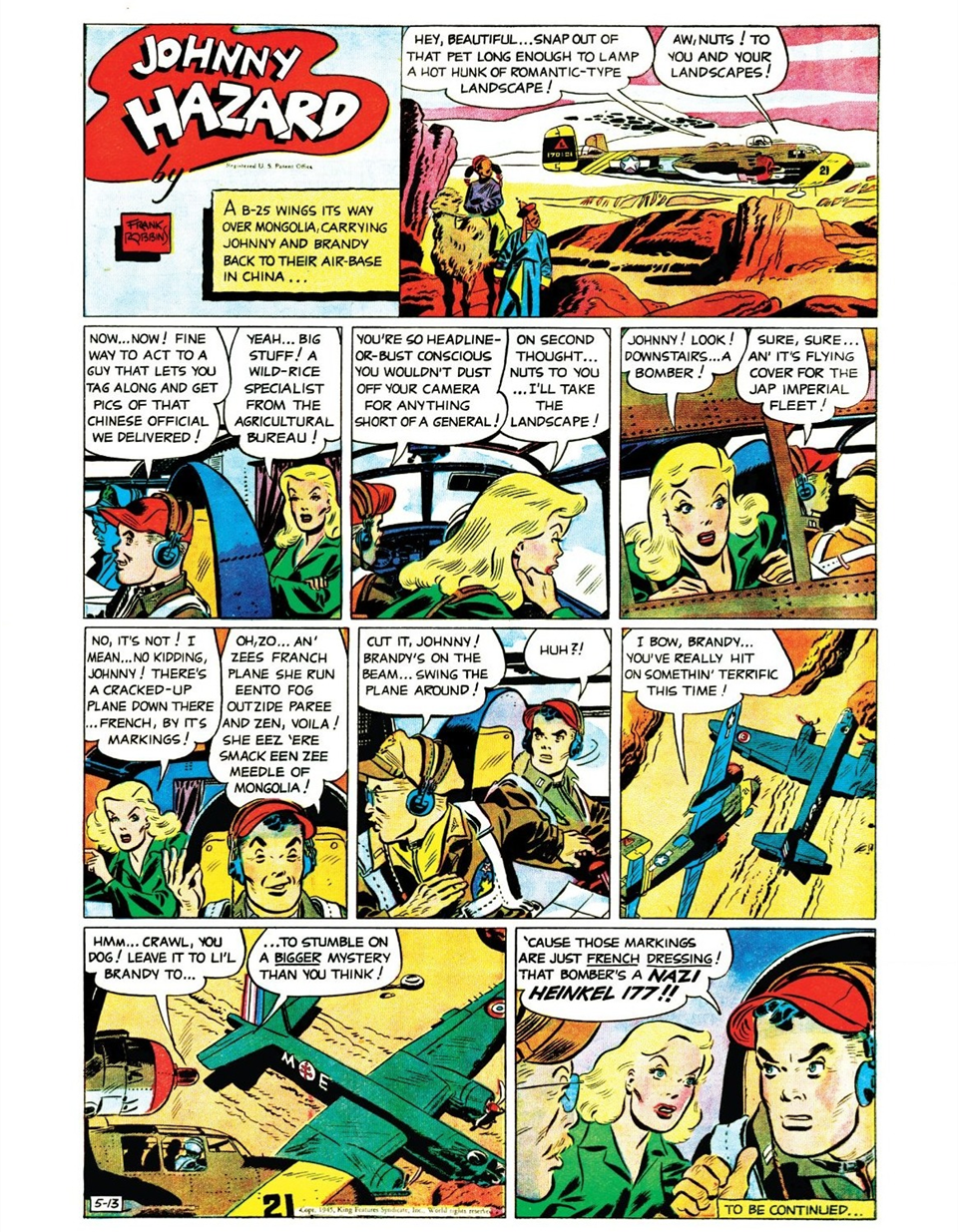
Fans like me, accustomed to the slick realism of Adams and the others, had a hard time easing into Robbins’ expressionistic and often cartoony approach, a stark, high-contrast style developed over more than three decades on his syndicated Johnny Hazard (1944–1977), one of the great newspaper adventure strips of the 20th century. Launched at the height of World War II, it starred a rugged American pilot whose postwar adventures took him into espionage, international intrigue, and exotic locales around the globe. While it bore all the trappings of a wartime aviator feature, it quickly grew into a long-running vehicle for Robbins’ storytelling and distinctive graphic style.
Robbins’ figures were angular, rubbery, and full of movement, and his use of heavy blacks and bold shadows gave the strip a moody, noirish atmosphere. He experimented with film techniques, breaking away from comics’ rigid grid layout in favor of dramatic angles, close-ups, and panoramic action scenes. His more exaggerated, cartoony style enabled him to treat his cast — square jawed Johnny Hazard himself aside — with a caricaturist’s touch.
Robbins made the leap from comic strips to comic books in the late ’60s, originally as a writer on Superman’s Girlfriend, Lois Lane and Superboy, then scripting the Dynamic Duo in Batman and Detective. He introduced private investigator Jason Bard into the Batman continuity and co-created Man-Bat with Neal Adams, and the Ten-Eyed Man and the Spook with Irv Novick and wrote and/or drew a number of titles and features until moving over to Marvel in 1974.
At Marvel, Robbins’ unconventional style found new outlets. He became a mainstay of The Invaders, the World War II-era series written by Roy Thomas, in which Captain America, Namor, and the Human Torch fought Axis powers alongside lesser-known heroes. Robbins’s penchant for wartime action, honed on Johnny Hazard, made him a perfect fit. He also contributed memorable runs on titles such as Captain America, Ghost Rider, and Marvel’s horror and war comics.
It took me a while to warm up to the art of Frank Robbins, but I’ve always had a fondness for wonky artistic styles, and once I saw what was going on behind the art itself — the layouts, the storytelling, the acting by the characters — I began to see what I had been missing. And it reminds me, even today, that comics thrive not on conformity, but on the strength of singular voices.
Here then, MY 13 FAVORITE FRANK ROBBINS COVER AND SPLASH PAGES:
—
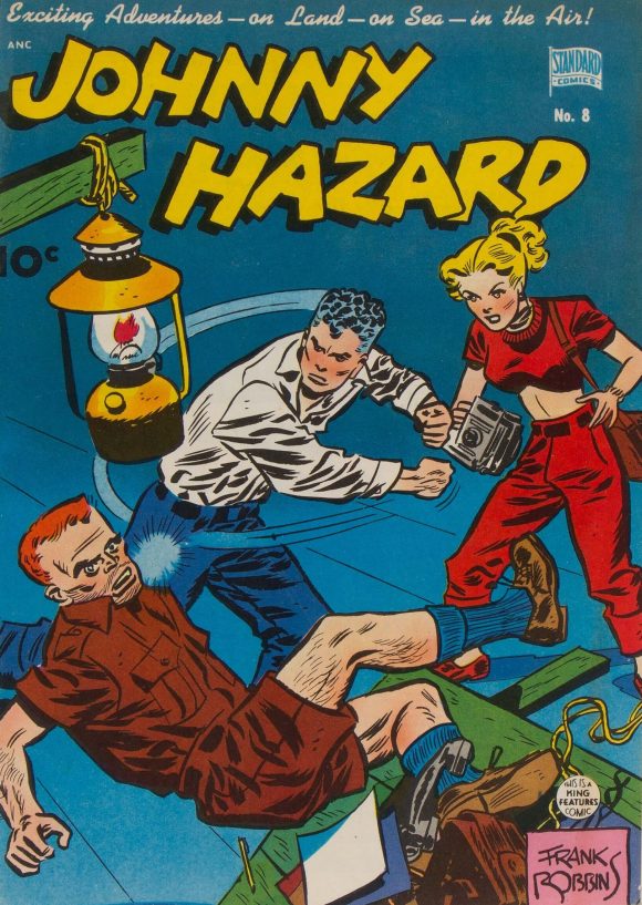
Johnny Hazard #8 (May 1949, Standard). One of the very earliest Frank Robbins covers, done for the Standard Comics comic book reprint of the Johnny Hazard newspaper strip.
—
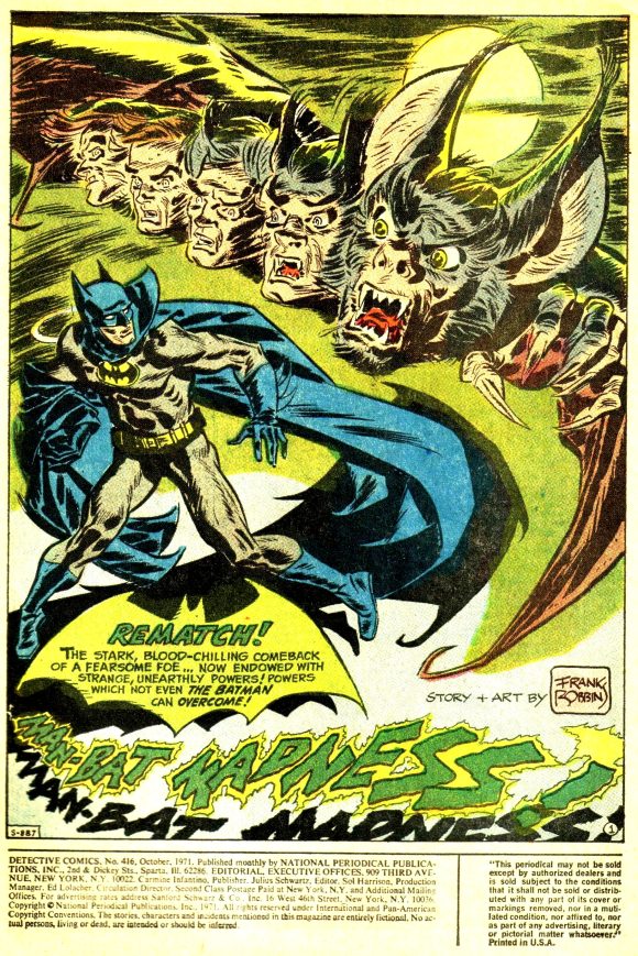
Detective Comics #416 (October 1971, DC). Batman and Man-Bat come face-to-face-to-face-to-face-to-face-to-face!
—
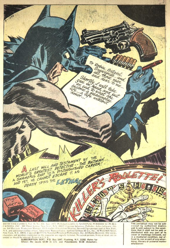
Batman #426 (August 1972, DC). Lighting and mood, masterfully rendered.
—
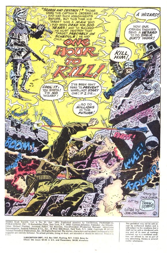
Weird War Tales #21 (January 1974, DC). War is hell.
—
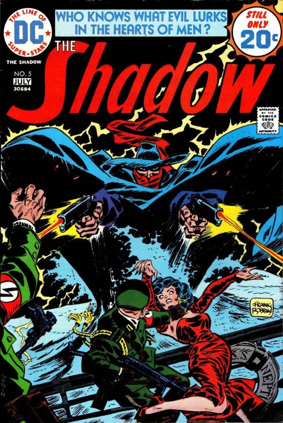
The Shadow #5 (June/July 1974, DC). You’d think following the likes of Michael Kaluta and Bernie Wrightson on a title would be intimidating but I can just imagine Robbins saying the 1974 equivalent of “Hold my beer!” and sitting down at his drawing board to whip out this noir classic.
—
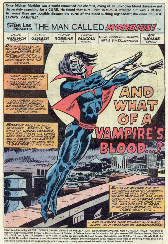
Adventures Into Fear #25 (December 1974, Marvel). What of it? While at DC, Robbins had mostly inked himself, but once at Marvel, he began to get paired up with a variety of inkers and I’d be hard pressed to think of a better finisher for him than Frank Giacoia.
—
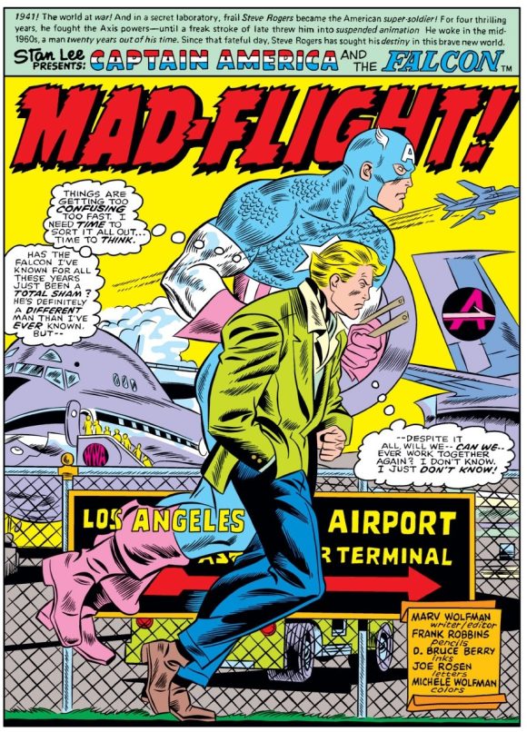
Captain America #192 (December 1975, Marvel). D. Bruce Berry took a turn on Robbins’ pencils with a slick job that evoked the clean lines of Joe Sinnott, but I didn’t find him a good match for the penciller’s rougher style.
—
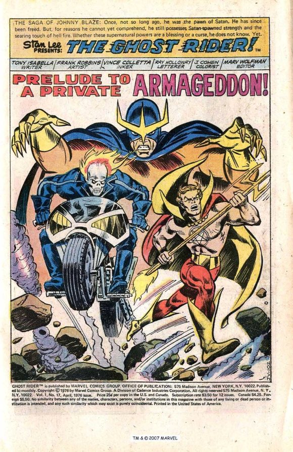
Ghost Rider #17 (April 1976, Marvel). Vinnie Colletta wasn’t the answer either…
—
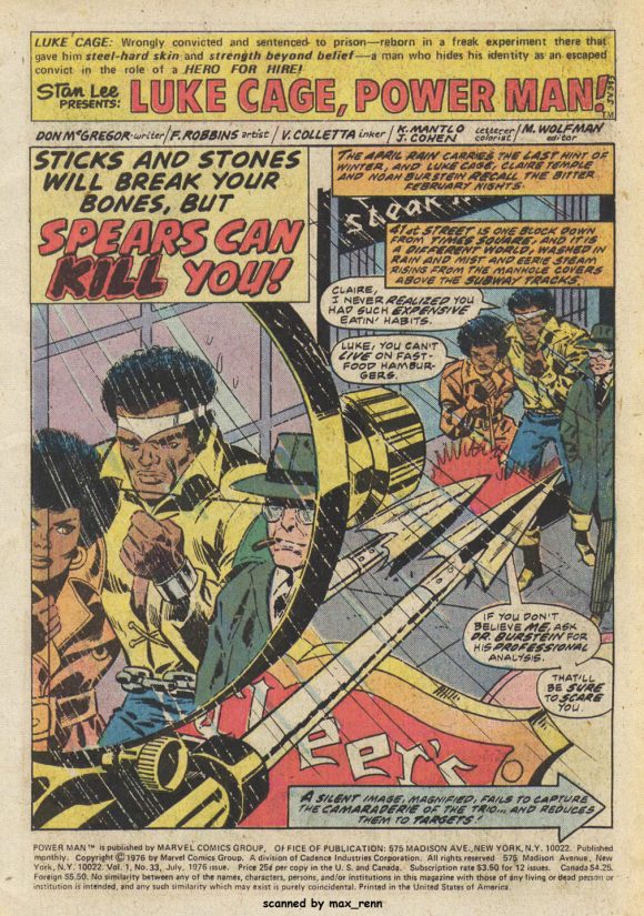
Power Man #33 (July 1976, Marvel). … (Some jobs with even less success than others) …
—
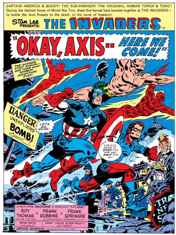
The Invaders Annual #1 (1977, Marvel). …And then came Frank Springer! Another artist with a style a few degrees off kilter from the mainstream, Springer understood Robbins and was, to my mind, the artist’s definitive inker after Robbins himself.
—
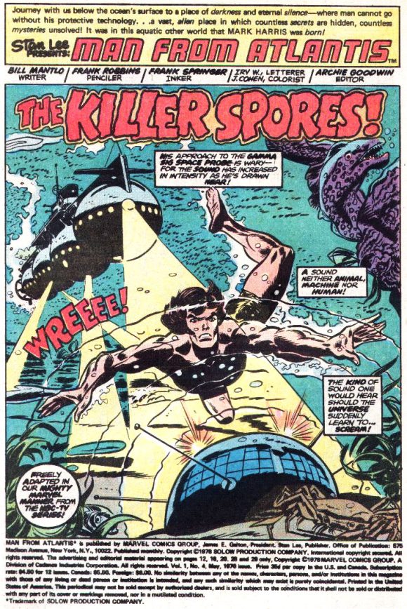
Man From Atlantis #4 (May 1978, Marvel). Another collaboration of the Franks.
—
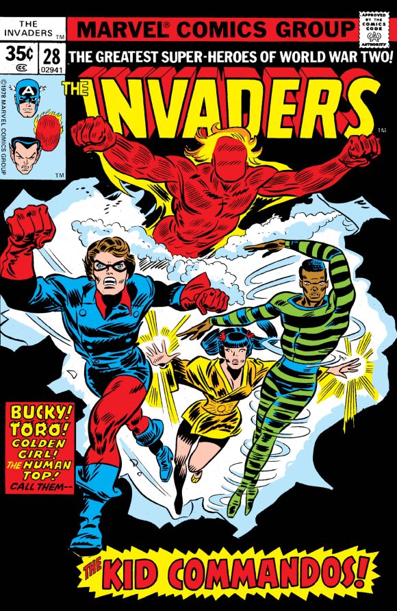
The Invaders #28 (May 1978, Marvel). The kids are alright, courtesy of Robbins and Springer.
—
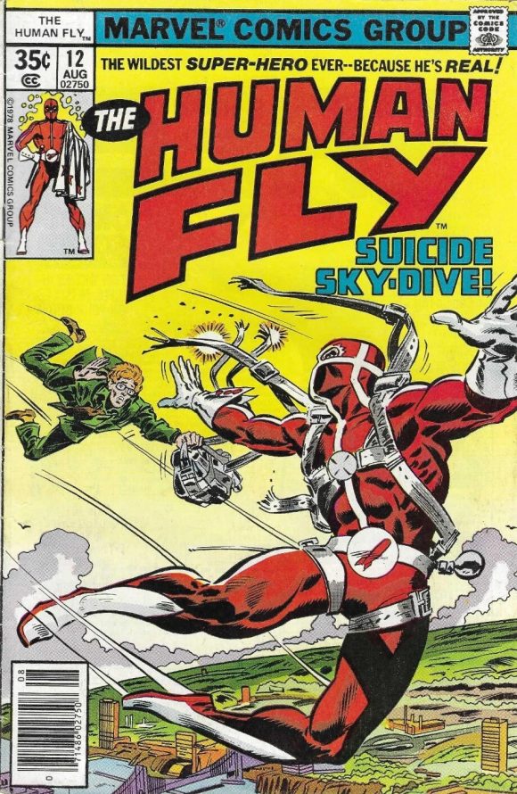
The Human Fly #12 (August 1978, Marvel). Robbins and Springer, making lemonade out of this lemon of a title about a supposedly real guy who survived death to become a money-raising stuntman in support of charities serving the sick and disabled. At least the pictures were pretty.
—
MORE
— Frank Robbins’ JOHNNY HAZARD: An 80th Anniversary Salute in 13 STRIPS. Click here.
— 13 COVERS: The BATMAN Stories of FRANK ROBBINS. Click here.
—
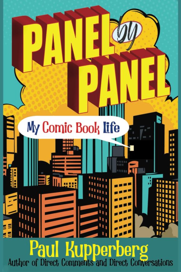
PAUL KUPPERBERG was a Silver Age fan who grew up to become a Bronze Age comic book creator, writer of Superman, the Doom Patrol, and Green Lantern, creator of Arion Lord of Atlantis, Checkmate, and Takion, and slayer of Aquababy, Archie, and Vigilante. He is the Harvey and Eisner Award nominated writer of Archie Comics’ Life with Archie, and his YA novel Kevin was nominated for a GLAAD media award and won a Scribe Award from the IAMTW. Check out his new memoir, Panel by Panel: My Comic Book Life.
Website: https://www.paulkupperberg.net/
Shop: https://www.paulkupperberg.net/shop-1
September 9, 2025
This will remain one of my very favorites of any internet article. I was stunned by the savage nature of Marvel’s lettercols for a short time- focused almost exclusively against two of my favorite artists/writers: Robbins and Kirby. I don’t know what was going on, but it pushed me away from Marvel comics for awhile.
September 9, 2025
I loved Frank’s work in the Invaders. His distinctive style lent to the time period of the book. I know he’s not everyone’s cup of tea but I enjoy his style.
September 9, 2025
I was a Robbins-sceptic at the time, but I enjoy his wild style now.
September 9, 2025
Robbin’s was so far from the norm back then, remember liking his Shadow (which I wish would be reprinted sometime), and his Invaders run. The Ghost Rider, Capt. America, Morbius, Tigra, and Batman, etc. was not a big fan of, but looking back now decades later he had a flair and style all his own. Back in the day Marvel had a certain artistic style (and DC to a certain extent (remember Kirby drawing Jimmy Olsen but Superman’s face was altered and drawn by someone else)), so can understand the backlash of criticism back in the day. The readers were use to a certain style and Robbins was unique and original. Loving all his art these days, a true original.
September 10, 2025
The words “acquired taste” often appear whenever Robbins is discussed. Some of his anatomy is charmingly wonky and likely annoys fans accustomed to more realistic styles. I like his art more in some instances than in others. For example, he is my definitive Invaders artist.
September 13, 2025
I love Robbins, I remember getting Invaders #20 off the spinner rack and thinking how cool it was, that splash page with Union Jack is awesome. I like his Human Fly work,fun stuff.
I’m lucky to own 3 Robbin’s pages: Fear # 26 pg 6 inked by Giacoia , Invaders #12 pg 2 and Power Man # 34 last page both inked by Springer luckily.