EXCLUSIVE: The Wrong Earth co-creator takes you through the cover of the first issue of the AHOY Comics series’ prequel…
—
Jamal Igle is not only a 13th Dimension fave and occasional contributor, he’s the co-creator of one of the funniest, most subversive comics of the last couple years — AHOY Comics’ The Wrong Earth, written by Tom Peyer.
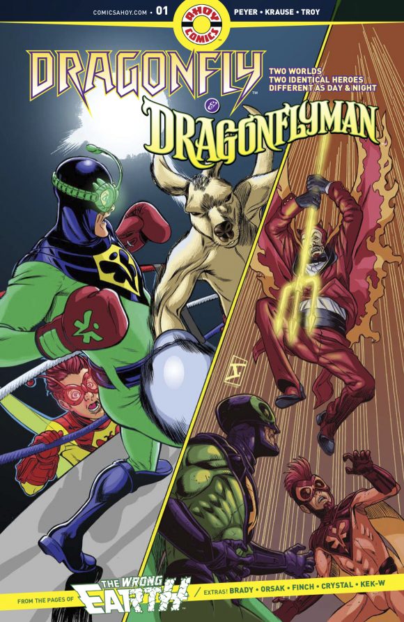
Well, now the series is back — in a fashion. On Wednesday, AHOY launches Dragonfly and Dragonflyman #1 — the first in a 5-part series that tells the story of the sunny Caped Crusader and the grim Dark Knight before they crossed over into each other’s universes.
Jamal’s not pencilling this series — that’s Peter Krause this time around — but he is providing covers and the artist will be here to take you through each of them as the series rolls out over the next several months.
Oh, and be sure to check out Peyer and Krause’s commentary on the first several pages of Issue #1. (Click here. It’s as sly as the book itself.)
—
By JAMAL IGLE
Ahoy, Dragonflies! First, I want to say thank you to 13th Dimension for inviting me back. For those of you who aren’t already fans of The Wrong Earth and Dragonfly/Dragonflyman, let me get you up to speed.
The Wrong Earth features two versions of the same hero, who through circumstances beyond their control, end up on each other’s respective Earth. The brooding and somewhat lethal Dragonfly ends up on Earth-Alpha, a world of retro fashion and unseen wonders populated by the good citizens of Fortune City. Dragonflyman, a cheery, stalwart champion of good, winds up on the dark and dismal Earth-Omega surrounded by corruption and grim versions of his traditional rogues gallery.
Dragonfly & Dragonflyman is a prequel of sorts. Focusing on our heroes in their respective universes, we’re exploring them more and fleshing out the past as we build toward the future of both heroes.
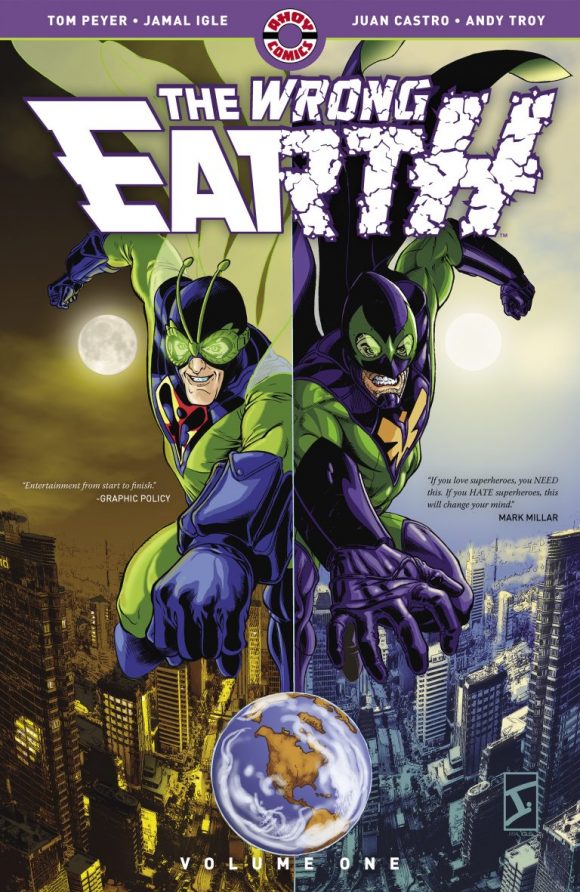
The original series
While I’m not personally drawing this series, we’re joined by the incredible Peter G. Krause (Insufferable from Boom! Studios, DC Comics’ The Power of Shazam!) and I have the honor of drawing covers for this series.
I have a very clear visual mandate for these characters, and that feeds my approach for these covers. Tom Peyer (the co-creator of The Wrong Earth and all-around great guy) will present me with an idea, based on the story he has in mind. For me, much of the success with these covers has been about making the characters feel the same but different.
—
ISSUE 1
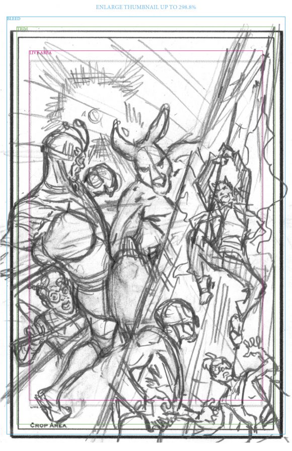
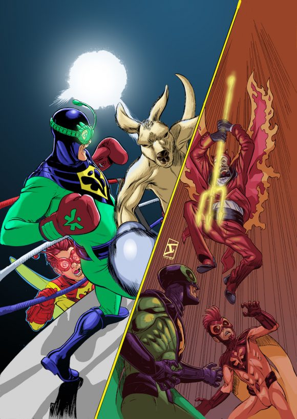
Tom wanted a split cover, one half with Dragonflyman and Stinger involved in a boxing match with a kangaroo. The other half with Dragonfly and his version of Stinger confronting a new version of a character we briefly cameoed in The Wrong Earth, Joe Devil.
For the first issue cover, I really needed to not just nail what I thought the concept should be, but the color scheme as well. The key to me, for Earth-Alpha vs. Omega, in terms of color is primary color vs. desaturated color. It gives you a visual cue, on top of how the figures are drawn and rendered, that there are different worlds representing different eras of superhero comics. I immediately started looking at spilt cover ideas from previous eras like old Tales to Astonish and Kid Colt covers.
After the initial concept for the cover is pitched and approved, the next step usually is to flesh out the layout for the cover. Solidifying the poses and the background elements, I then begin the penciling and inking.
As opposed to my approach when I was drawing the covers for The Wrong Earth, everything is inked in brush (Series 3000 red sable from Scharff brushes with Japanese sumi ink).
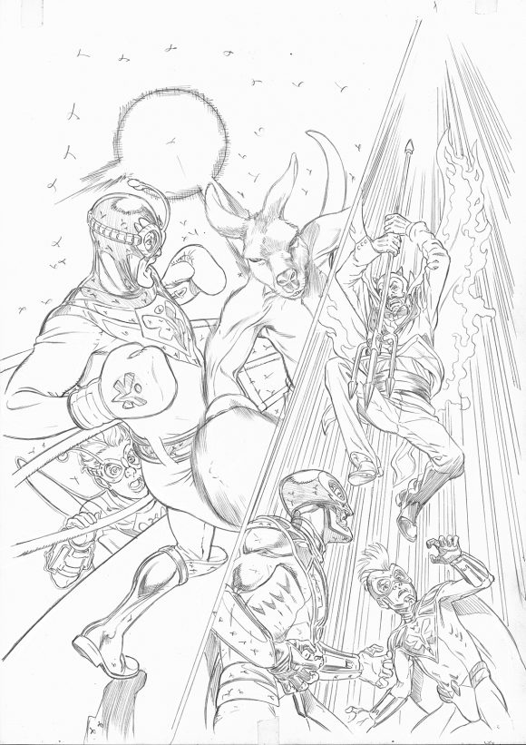
In terms of the inking, I leaned very heavily, influence-wise, on the works of both longtime Alan Davis collaborator Mark Farmer for the Earth-Alpha sequence and Jim Lee’s inker of choice, Scott Williams, for Earth-Omega’s half.
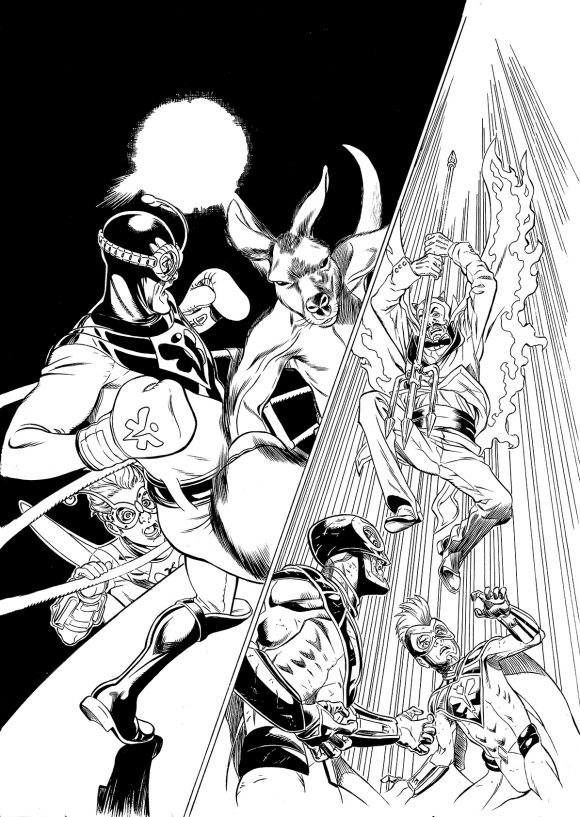
In the coloring stage, as with the covers for The Wrong Earth and anything Earth-Omega centered, I decided to color it normally. Once I had the colors laid down, I added a layer of solid red on top, set at a 15% opacity, using color grading as a tool. That theme will continue through all of the covers.
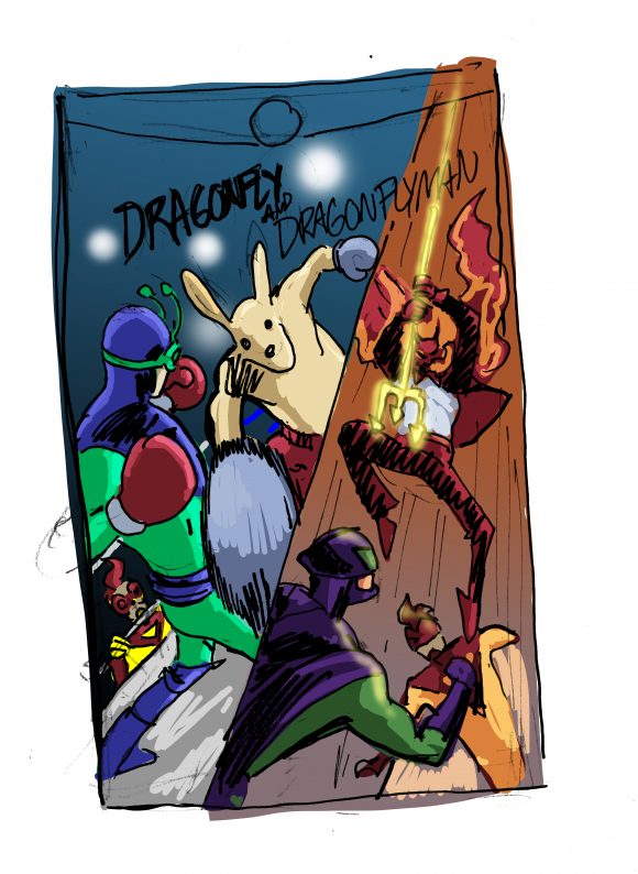
The only reference used for this cover were for our kangaroo boxer and the ring and boxing gear. I’ve literally never drawn a kangaroo before this. It was interesting because I wanted to get it right.
—
Dragonfly and Dragonflyman #1 is out now from AHOY Comics.
—
MORE
— INSIDE LOOK: The Brilliant Return of DRAGONFLY & DRAGONFLYMAN. Click here.
— THE WRONG EARTH: The Surprise Comic Every BATMAN ’66 Fan Should Read. Click here.

Trackbacks/Pingbacks