
A look at a classic comic based on a movie based on a comic — 35 YEARS LATER…
—
UPDATED 6/23/24: Batman came out 35 years ago! Perfect time to reprint this piece from 2019’s BATMAN ’89 WEEK! Dig it! — Dan
—
It’s BATMAN ’89 WEEK! Tim Burton’s groundbreaking Batman was released June 23, 1989. All this week, we’re publishing a series of retrospectives and celebrations spotlighting various aspects of a movie that was less a film and more a pop-culture phenomenon. Click here for the complete index of features.
—
In this BATMAN ’89 WEEK edition of REEL RETRO CINEMA, columnist Rob Kelly shows you how the Batman comics adaptation veers from the Tim Burton film — often for the better:
—
By ROB KELLY
In an age where movies based on comic books (specifically superhero comic books) come at you every few months, if not weeks, and literally dozens of other superhero films are available on the phone in your pocket, it’s hard to convey to those too young to remember just what a pop culture-shattering event the 1989 Batman movie was at the time.
Other than the Superman film series (which crashed and burned two years earlier), superhero movies were mostly excuses to poke fun at the characters, the medium they came from, and sometimes even the fans that loved them. Comic book readers had to learn to accept some pretty rickety contraptions just to see some of their favorite characters in live action.
All that changed when a build-up of unprecedented proportions crested on June 23, 1989, with the nationwide release of Batman, directed by Tim Burton and starring Michael Keaton, Jack Nicholson, and Kim Basinger.
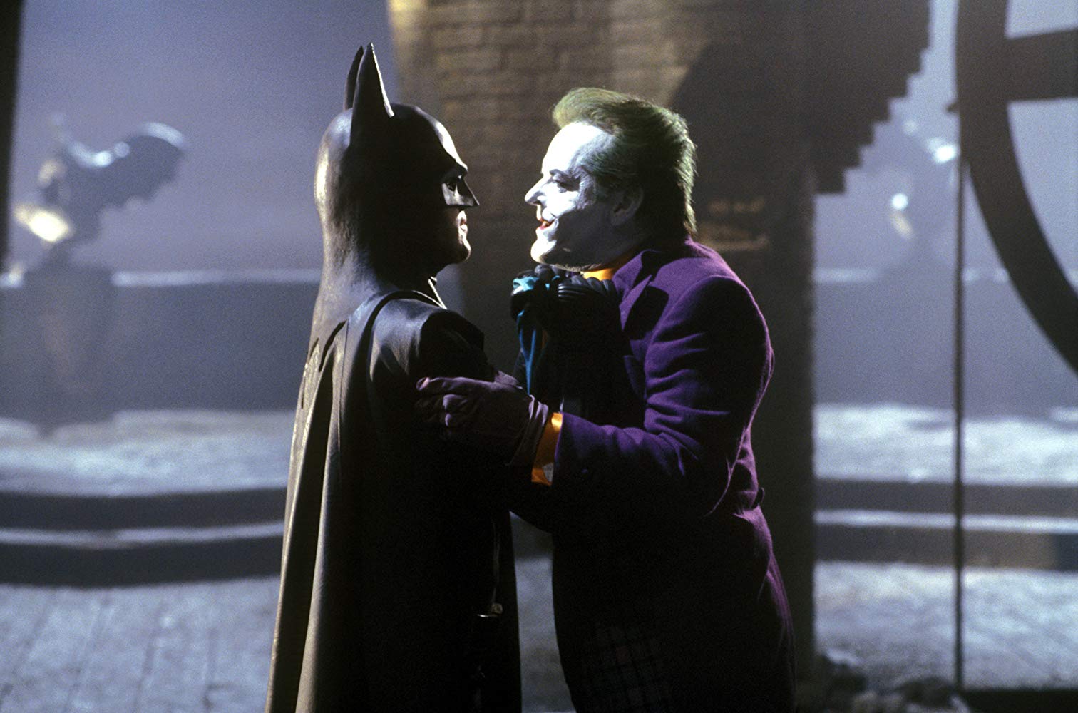
I was a teenager when the film was released, and this dark, serious take on the Darknight Detective was, at the time, pretty much everything I wanted out of a Batman movie: an all-star cast, eye-popping visuals, and a tone that respected the source material. Don’t get me wrong: I loved the 1960s Batman TV series (13th Dimension major domo Dan Greenfield probably wouldn’t speak to me if I didn’t), but I couldn’t stand how it became the avatar for all things comic books to the wider world: some iteration of Bam! Sock! Pow! was featured in every single article written about comic books in the Western world, because headline writers just couldn’t imagine anything else. So here was the chance to reestablish Batman in a way we all knew he could be: basically really, really cool.
I ended up seeing Batman nine times in the theater that summer, and of course purchased it on home video the day it came out (one of the first films to be priced to own, Warner Bros. shrewdly guaranteed) and it quickly made the list of one of my favorite films of all time. It ushered in numerous direct sequels of course, but its pointy-eared shadow was much longer than that: It basically started the era of the “serious” superhero comic book film adaptation, still in effect to this day.
Of course, as Batman became less and less unique, its cracks began to show. As I grew up (hollow laugh), and revisited the film every few years, I could see that, in fact, maybe it wasn’t one of the greatest films ever made. It is, at its heart, a noble effort to bring everything Hollywood had to offer to a world only really ever seen before in the pages of DC Comics.
Speaking of DC Comics, they of course weren’t going to repeat the same mistake made with the aforementioned 1978 Superman film, which had no accompanying tie-in comic: No, they would offer a full-color comic book adaptation of Batman, written and drawn by two of the greatest talents ever to work in the medium.
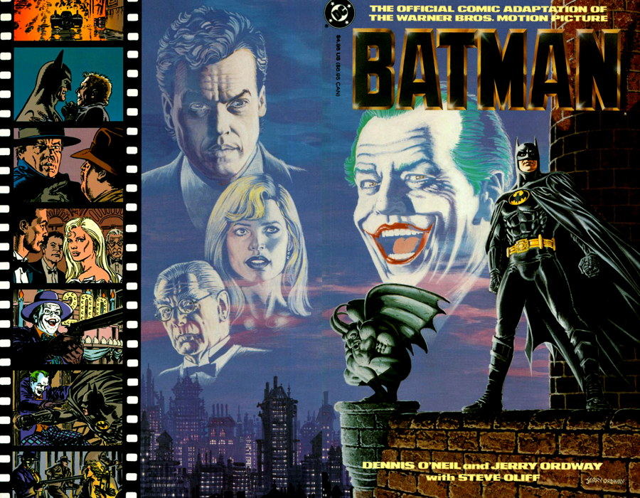
Batman: The Official Comics Adaptation of the Warner Bros. Motion Picture (or Batman: TOCAOTWBP for barely shorter) is written by the legendary Denny O’Neil and drawn by the incomparable Jerry Ordway. With only 64 pages at their disposal, O’Neil and Ordway had to make some hard choices when it came to what scenes had to be altered, shortened, and in some cases outright deleted.
Like most comic book adaptations of movies, Batman is based off the film’s original screenplay, which would of course be subjected to numerous revisions up to and during shooting. One of the first, most notable examples is when we first meet our hero, and his intro is a little more florid:
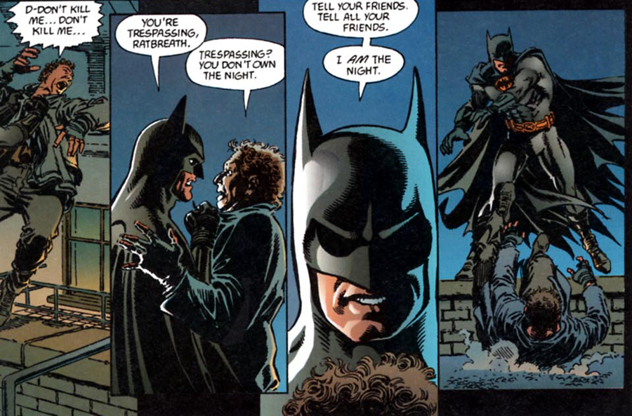
From what I have read, this exchange was shot as written, and it was Michael Keaton himself who offered the now-iconic alternative intro, “I’m Batman” and it’s that take that Tim Burton decided to use. That scene was featured prominently in the first teaser trailer, and little kids all across the country lowered their voices to a growl, declaring that, no, they were Batman. Remembering that, it’s hard to see “I am the night” having the same effect, so points to Michael Keaton!
Another structural change is when Jack Napier visits the back-alley plastic surgeon to get his face repaired after taking a bullet at Axis Chemicals. In the finished film, we never see what Jack looks like, only his reaction and quick descent into madness. In the comic, we get a big close-up, which is essentially repeated on the very next page when Napier, now christened the Joker, gets revenge on his boss Carl Grissom.
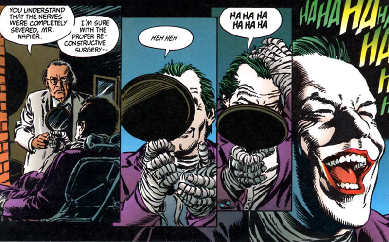
It’s a bit of an odd choice, having two Joker “reveals” right on top of each other, but of course by this point everyone had seen what Nicholson looked like in the Joker make-up, so I guess it’s not really spoiling all that much.
Not all the changes found in the comic are for the worse: Probably for the sake of space, it completely eliminates the scene of Jack Napier confronting the other crime bosses (a scene I never thought really worked, but I’m betting was left in because it’s such a showcase for Nicholson), yet retains a moment cut from the film but in my opinion was essential. After the Joker and his gang throw the parade in Gotham and start hurling money at the crowd, we see his “generosity” is not quite what it’s cracked up to be:
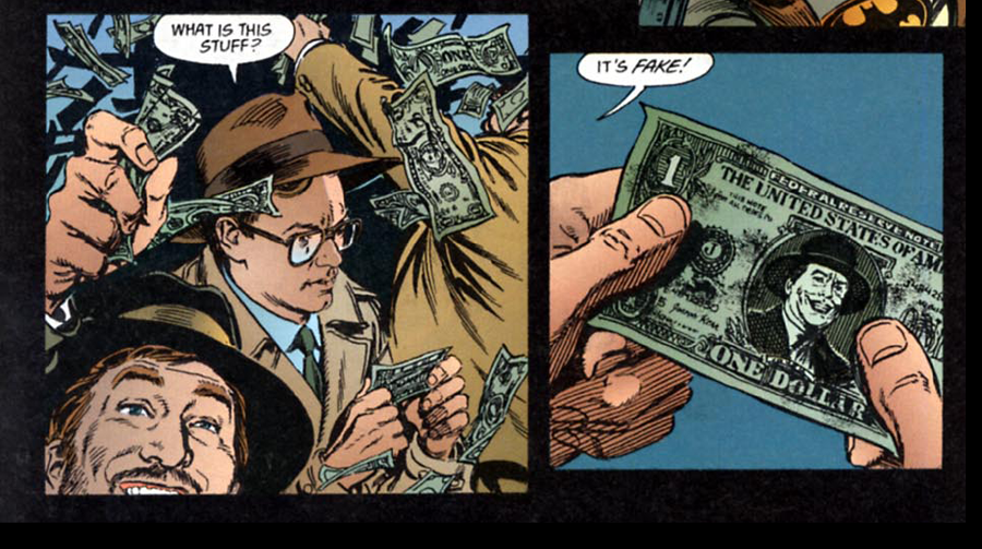
For the life of me, I have never understood why this scene was cut from the movie. It underscores how the Joker cannot be trusted, it’s a classic prank (on brand!), and would have added 5 seconds, tops, to the finished movie. Instead, we’re left with the Joker actually giving away money to the crowd which, I don’t know, maybe he isn’t so bad?
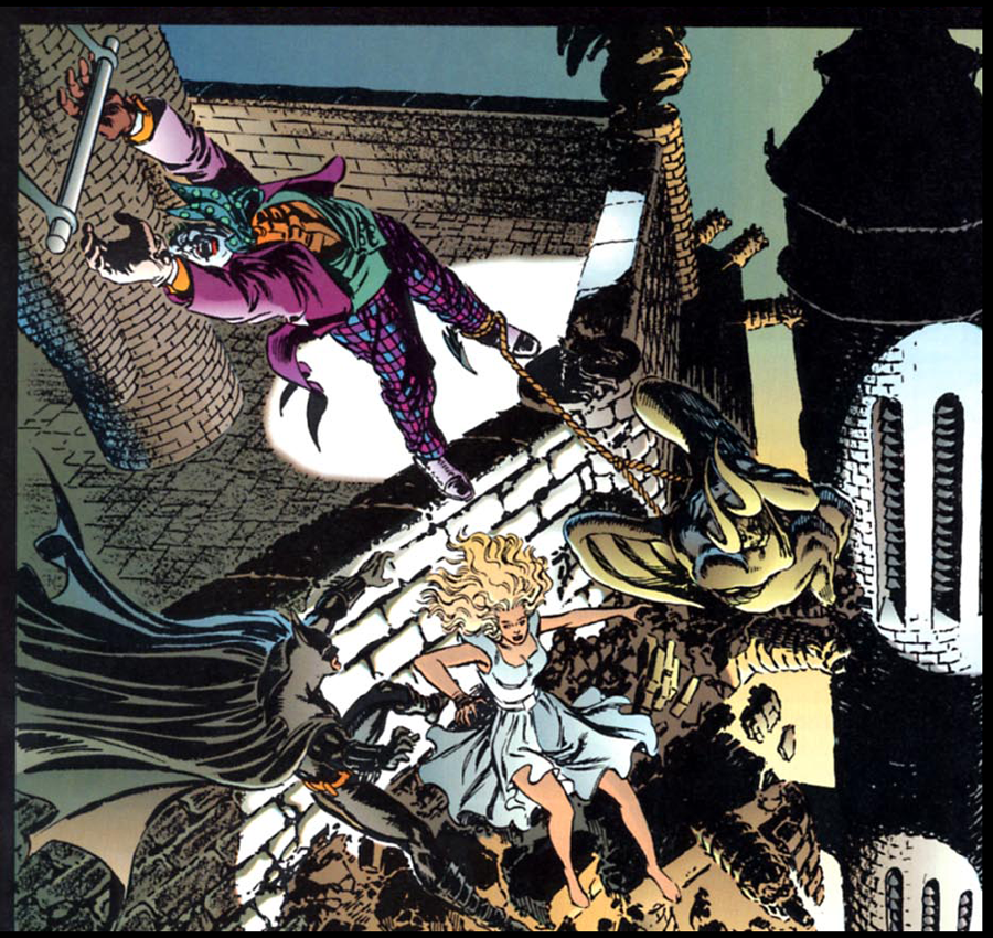
Another change for the better can be found in the film’s climactic battle atop the Gotham Cathedral. When the Joker finally plummets from the rope ladder dangling off his helicopter, we get a quick shot of the Clown Prince of Crime screaming as he falls to his death. It’s so quick because the shot is animated, and the filmmakers desperately wanted to hide that fact, so it goes by in a flash (and is optically darkened to make it even murkier). Why they couldn’t/didn’t shoot a process shot of the Joker falling, I don’t know, but artist Jerry Ordway wasn’t constrained the way the filmmakers were, so we get a much more satisfying, full-on action scene, more befitting the film’s scope and ambition:
At this point, the comic book also features a brief set-piece completely cut from the movie: Gordon and the GCPD find an unconscious Batman laying on the ground, only to discover it’s Alexander Knox serving as a decoy. Vicki Vale notices Bruce, in a skin-tight black jumpsuit and carrying his utility belt, making a quick escape. While this scene isn’t essential, it’s a nice follow-up, reminds everyone how deceptively clever Batman is, and gives Knox a nice “Batman’s Pal Alexander Knox” moment.
Finally, we all remember how Batman ends: a moody shot of the Dark Knight standing on a rooftop, gazing at the newly built Batsignal in the sky. A great shot, but to this Batman fan it feels a little too static: Come on, Bats, the signal is lit, get moving!
Thankfully the comic book delivers, with the final page being a big glossy shot of Batman swinging into action:

As we have discussed in previous REEL RETRO CINEMA columns, comic book adaptations of films can be a dubious proposition. Adaptations of superhero films can get even weirder, because you’re getting a translation of a translation. The Batman seen here essentially doesn’t exist in any other comic book ever published (except the 1992 Batman Returns adaptation, I guess), so they can feel like Elsewords stories, not that that’s necessarily a bad thing.
But for my money, the real reason to check out Batman: TOCAOTWBP is for the work of Jerry “The Extraordinary” Ordway, who manages to capture exact likenesses of the actors while never making any of the action scenes look stiff or unconvincing. His superb draftsmanship and natural fluidity make this an actual comic book story, not a series of movie stills reproduced in black and white line — overall, it still feels like a Batman comic book.
DC could not have chosen a better artist to handle the job, and it’s a fitting tribute that the book is getting a hardcover deluxe edition reprint later this year.
Holy 30th Anniversary!
—
MORE
— The Complete BATMAN ’89 WEEK Index. Click here.
— BATMAN ’89 Movie Adaptation to Get Deluxe Hardcover. Click here.
—
Rob Kelly is a writer/artist/comics and film historian. He is the host or co-host of several shows on The Fire and Water Podcast Network, including Aquaman and Firestorm: The Fire and Water Podcast, The Film and Water Podcast, TreasuryCast, Superman Movie Minute, MASHCast and Pod Dylan.
June 22, 2019
A really great post about the ’89 comic adaptation of that year’s “Batman” movie.
June 24, 2019
Great article, Rob! I would argue this is the best movie-to-comic adaptation…EVER. At the very least the best comic-to-movie-back-to-comic adaptation!
Chris
June 24, 2019
The “fake Joker money” omission has always bothered me too. They even set it up earlier in the movie when Vicki asks the Joker what he wants and he replies, “My face on the one dollar bill.”
June 24, 2024
Hey, the guy in the hat commenting on the fake Joker money…doesn’t he look a little like George Reeves as Clark Kent? Just sayin!