
Another classic cover turned upside down…
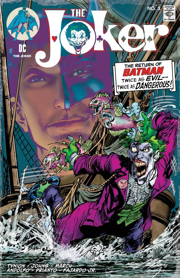
Ryan Hetkowski’s State of Comics in Plymouth, Michigan, is having a field day with their retailer-exclusive variant covers for DC’s new ongoing The Joker series — getting none other than Neal Adams to riff on some of his most famous Batman covers, only with a Joker spin.
We’ve had homages to Batman #251 and Batman #227 and now we’ve got another to show off for The Joker #3 — Adams’ take-off on 1971’s Batman #234:
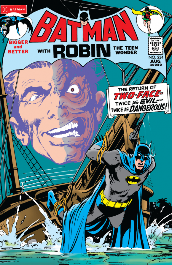
And, of course, here’s the original:
There will be two more of these types of homage variants — for Issues #4 and 5 — that Adams will be doing for State of Comics.
As usual, you can get raw editions, signed editions, CGC editions, you name it. Click here for what State of Comics has planned. The book will also be available at Adams’ online store, which you should check out here.
—
A few thoughts:
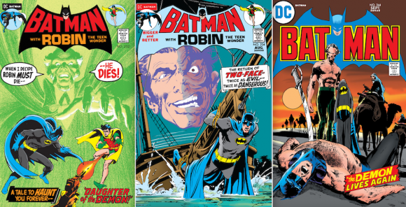
— When we wrote about Issue #2, I suggested three other covers that’d be really cool for this run of variants. So, I’m 1 for 1 so far! Time will tell on those last two…
— Y’know what’s fun? Seeing Neal Adams drawing Joker fish, which were created by Steve Englehart and Marshall Rogers.
— If it’s been awhile since you’ve read Batman #234, go check it out again. It most definitely holds up 50 years later.
—
MORE
— Dig NEAL ADAMS’ BATMAN #251-Inspired Variant Cover for THE JOKER #1. Click here.
— Dig NEAL ADAMS’ BATMAN #227-Inspired Variant Cover for THE JOKER #2. Click here.
April 9, 2021
Nice work… Adams is still such an excellent draftsman! One thing, tho…
Comparing this cover to it’s inspiration points out a personal gripe of mine concerning modern cover design… with DC in particular, since about New52, or so. Modern DC covers are confusing, hard to read, and “flat”.
I think it’s got a lot to do with the difference between old-school flat coloring, vs. subtle computer coloring (which should look better, right?). It’s objectively “better” but subjectively less readable. Look at a cover my Mike Allred, or anyone who tends to lean towards flat or “cel shaded” colors… there’s a more profound sense of depth and they are more instantly readable.
Also, these covers have a tendency to fill every bit of “negative space”, making it less readable and less of a sense of depth. Just a flat, tangled mess, regardless of how well they are drawn. Also, in rendering, I think there is a recent revival of the 90’s sense of comics art aesthetic, where the more lines on the page means the better the drawing.
That old cover, containing the EXACT same basic elements and text boxes, is infinitely more readable and appealing. Just my two cents.
April 9, 2021
A very interesting spin on an old cover.