Hopefully a “signal” of things to come …
—
The first month of DC’s new, post-Rebirth cover design wraps up 12/27, with the publisher’s Week 4 books.
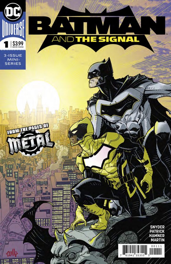
We’ve got a couple more corner-box logo debuts (see below) but to me, the coolest thing around the corner is the Batman and the Signal title logo debuting next week, on 1/3:

That’s the kind of Batman logo I like to see: Bold and simple.
Of course, this is just for a miniseries but now that DC has unveiled these nifty new corner boxes, maybe they’ll start rolling out some new title logos too. Many of the ones in use were launched in 2011 with the New 52. Personally, I’ve still not warmed to most of them and would welcome some significant changes. (More on that down the line.)
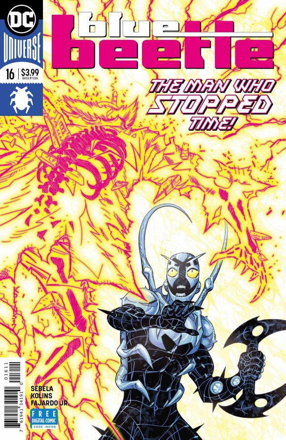
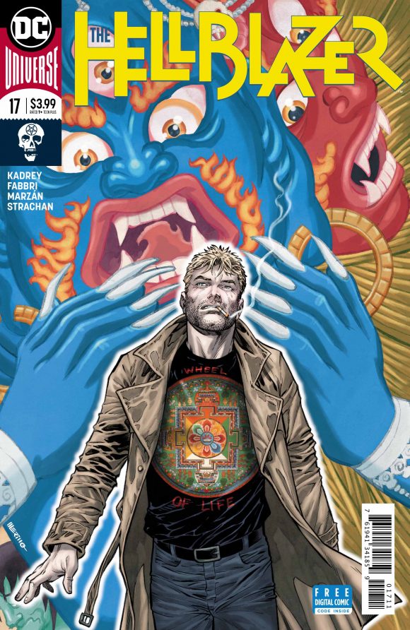
In the meantime, here are the last two corner-box logos to be unveiled by DC this month:


Beetle’s is one of my favorite corner-box logos yet, while Hellblazer’s is appropriately badass.
—
MORE
— DC Officially Launches New Cover Design. Click here.
— Hey, Look! MORE New DC Corner Box Designs. Click here.
— Week 2’s Corner Boxes. Click here.
— Week 3’s Corner Boxes. Click here.
— 13 DC Logos — RANKED. Click here.

December 26, 2017
I agree about the logos since 2011; I have not warmed to them either. Many are too generic looking (Justice League) or downright ugly (Batman). How I miss the Ira Schnapp era.
December 27, 2017
Am not a fan of the new Batman logo. Ugly. Too simplistic. Could have been drawn by a fourth grader.