Clean and crisp.
—
Rebirth is officially over.
Starting with December’s titles — the first batch hits 12/6 — DC Comics is dispensing with the Rebirth banner that’s topped its main line of comics for the last 18 months or so.
In its place is a sharply designed, colorful left-corner box that displays the company’s logo; adds the word “universe”; provides the issue, price and rating info; and includes an emblem signifying the star of the book.
Here are some examples:

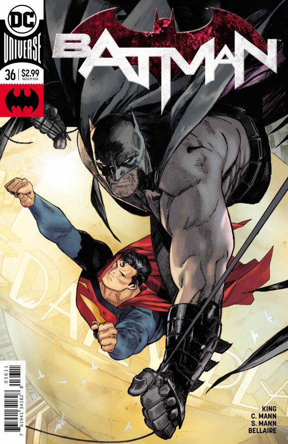
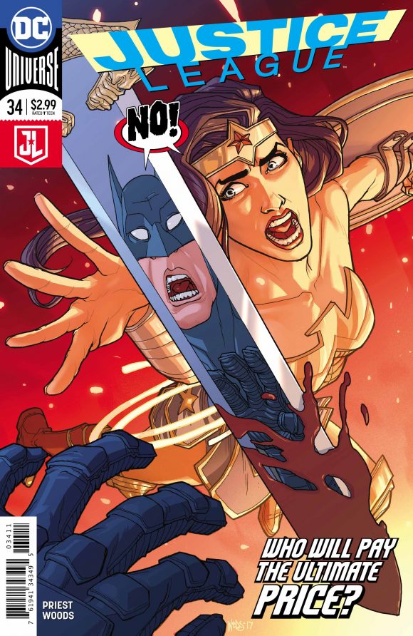
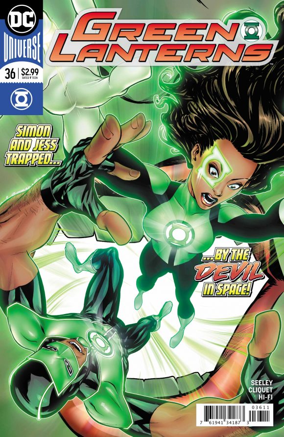
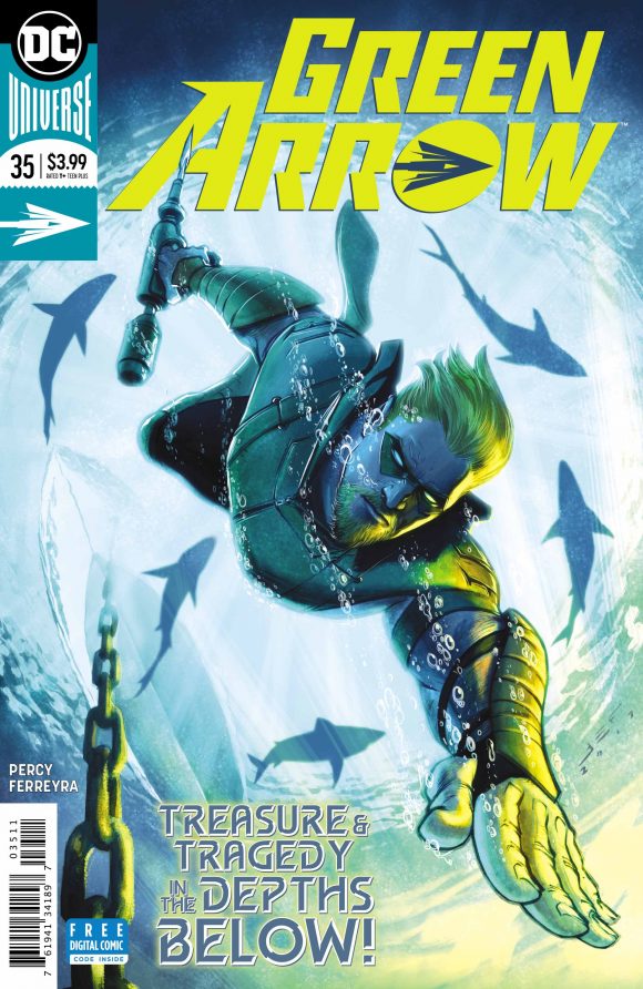
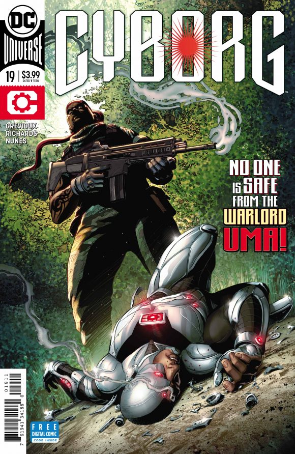
The redesign was shown at New York Comic Con in October but this is the first time we’re seeing it in full practice. The boxes feature a variety of colors and contrasts that play off the rest of the cover and, like the book’s title logo, don’t necessarily adhere to the hero’s own well-established hues. (Also note the movie-flavored Justice League logo.)
What’s particularly refreshing is that the design allows for bolder cover imagery while maintaining a linewide cohesiveness beyond the DC bullet itself. The Rebirth banner and trade dress effectively shrank the art but now there’s more room for the title logo to breathe and for the action itself to get bigger play.
The Rebirth banner served its purpose, clearly defining DC’s line as it hit the reset button, but it probably should have been ditched about six months ago. That said, with Metal and Doomsday Clock here now, the publisher has clearly entered a new phase, so the timing makes some sense.
—
MORE
— Hey, Look! MORE New DC Corner Box Designs. Click here.
— 13 DC Logos — RANKED. Click here.
— Week 2’s Corner Boxes. Click here.

November 30, 2017
So…