
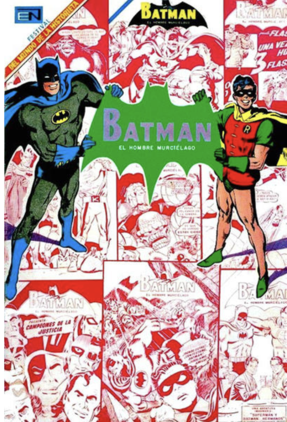
Editorial Novaro’s take on the Bronze Age Darknight Detective…
When I got back from Down Under, I posted 13 TIMES Australian Publishers Did BATMAN COVERS Better Than DC COMICS in the Bronze Age, and a reader asked, “Any chance for a similar article about Editorial Novaro?”
My response? “Yes. Sooner than you think.” But what I didn’t say is that I was planning something for Cinco de Mayo, in this case 13 COVERS by Neal Adams that were reprinted by the Mexican publisher in the 1970s.
I chose Adams because he’s Adams and because it’s interesting to see how EN’s approach differed from DC’s. Most of the time the difference was in the trade dress, sometimes the color choices. Sometimes the differences are obvious, other times subtle. On the whole, the American versions are superior because of their production values. But that doesn’t mean the Mexican versions aren’t fun!
Here are 13 I picked that I found particularly interesting, paired with their American versions. Adams penciled and inked all of them, except where noted. Also, forgive the low resolution of the Mexican covers. High-res versions are not readily available on the web.
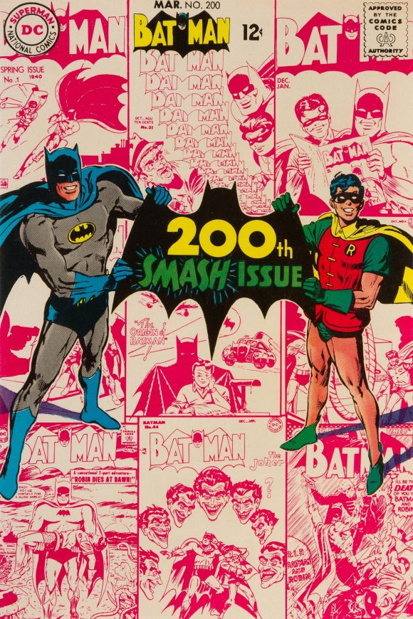
You’ll notice the crazy difference in the issue numbers. For example, the American Batman #200 was #470 in Mexico. That’s because the latter version was published with greater frequency, featuring an array of alternating DC characters or teams, like so:
1969’s Batman #480
EN’s series — subtitled El Hombre Murcielago — ran for 1,301 issues, from 1954 to 1985. (I myself picked one up when I visited Mexico in 1981.)
Oh, and before we get started, you should check out this piece about the oddball world of Mexican Spider-Man.
Now, let’s go. Exact release dates can be difficult to come by, but these are in chronological order:
—
Batman #470, 1969. This cover is probably the most different from the original (Batman #200, which came out in January 1968). Aside from the big, green bat the Caped Crusaders are holding, notice that the editors replaced the background covers with a selection including other characters featured in the series. (They don’t exactly fit cleanly, either. Weird.)
—
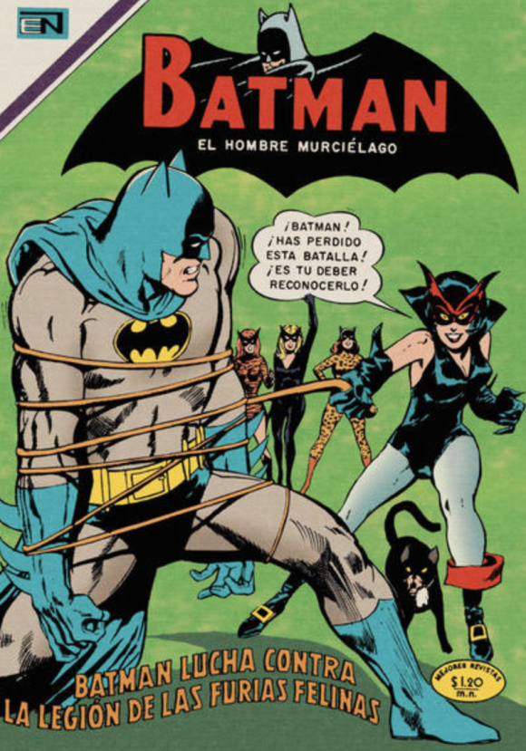
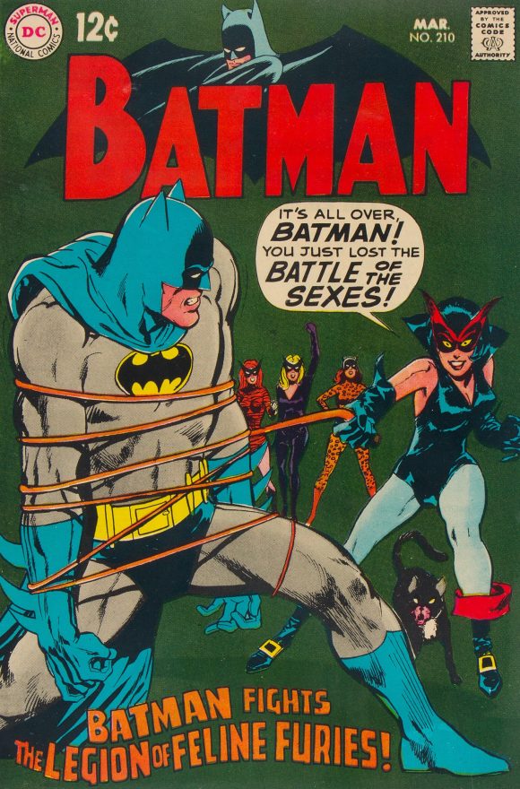
Batman #516, 1970. Based on Batman #210 (released January 1969), this is Adams working from a Carmine Infantino layout. The main difference is the shade of green in the background and the trade dress. I think I might prefer the lighter color.
—
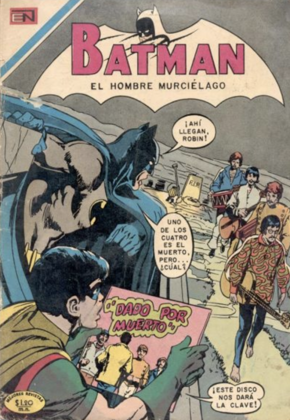
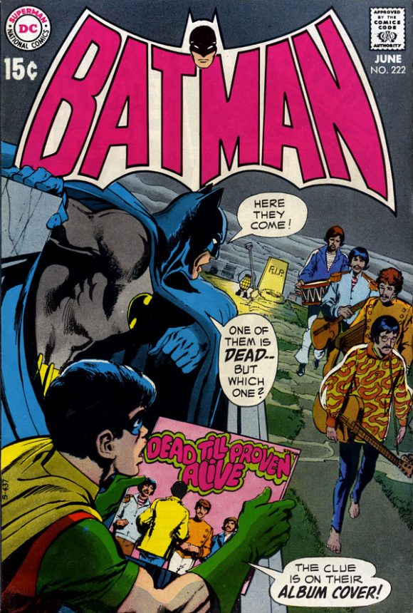
Batman #552, 1970. Batman and Los Beatles! I mean, Los Oliver Twists! What I appreciate here is that the EN editors chose to retain the logo colors of April 1970’s Batman #222. The looser logo gives it a slightly different effect, but I still dig it.
—
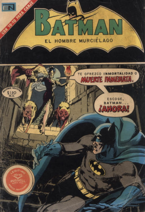
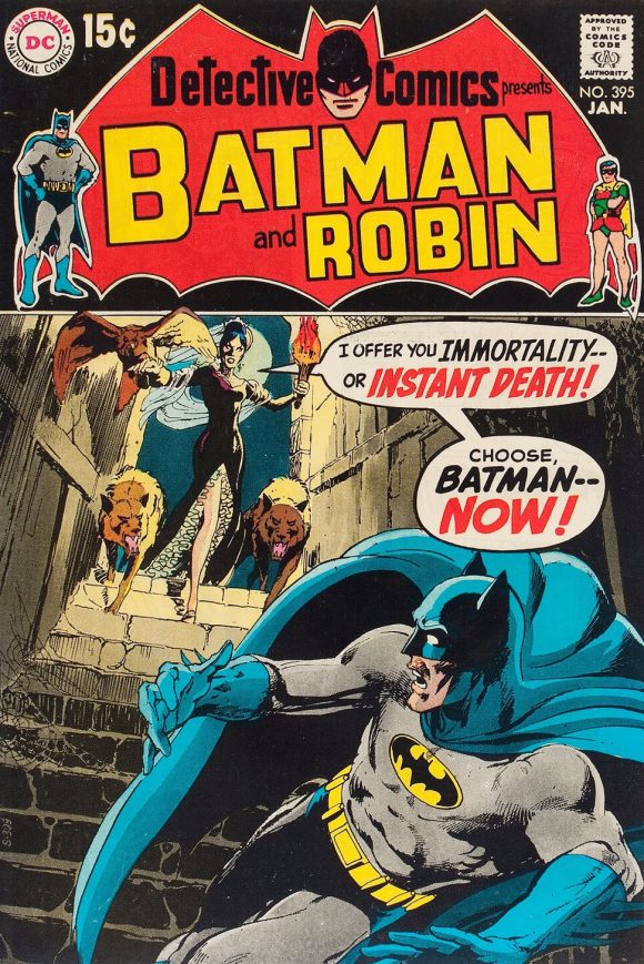
Batman #569, 1971. EN didn’t always print its stories in order; Detective Comics #395 came out in November 1969, months before Batman #222. Anyway, the cover layout is basically the same, box and all. Which color scheme for the logo do you like better? I probably give the edge to DC because the red works especially well to sell the alarming image, and that Detective Comics logo is an all-time fave. Still, green and yellow on a black background works too.
—
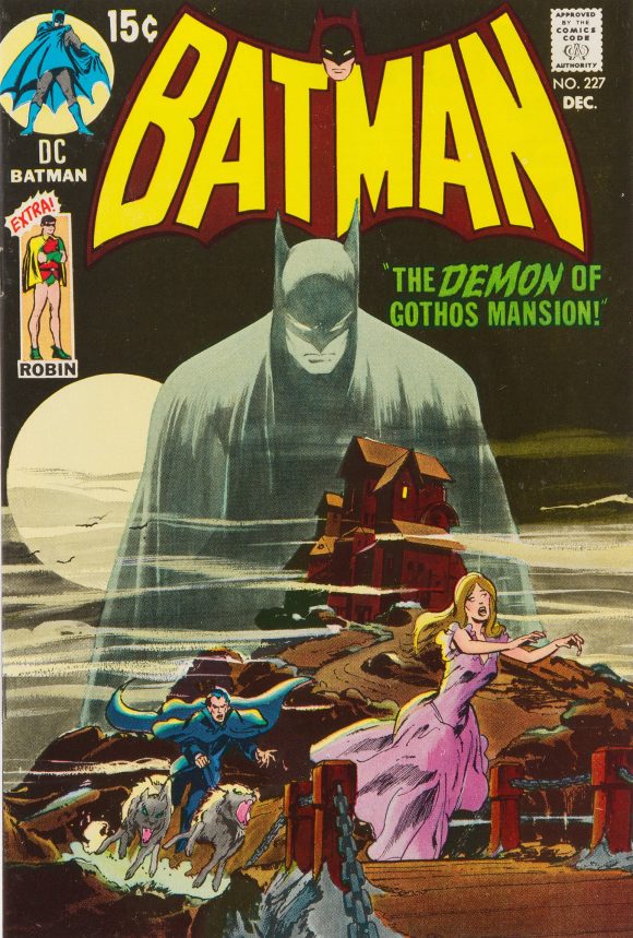
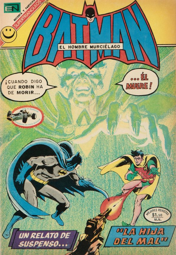
Batman #591, 1971. On the other hand, the fluorescent pink and yellow knocks this classic — Batman #227, released in October 1970 — down a few pegs. It’s tough to tell for sure because of this image’s quality, but it also looks like the Mexican printer didn’t translate the looming Batman that well. Side note: I’ve never loved the yellow and brown logo on the original. The one on the upcoming Batman Bronze Age Omnibus may have it beat.
—
Batman #623, 1972. A much better version of April 1971’s Batman #232 than what the Australians came up with.
—
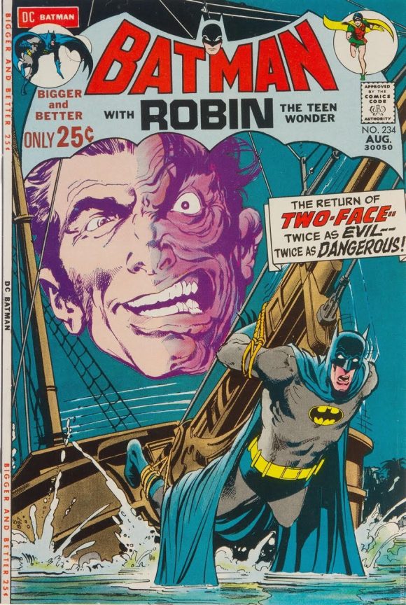
Batman #627, 1972. Toss-up between this and the original, June 1971 Batman #234.
—
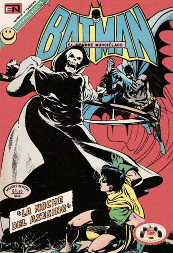
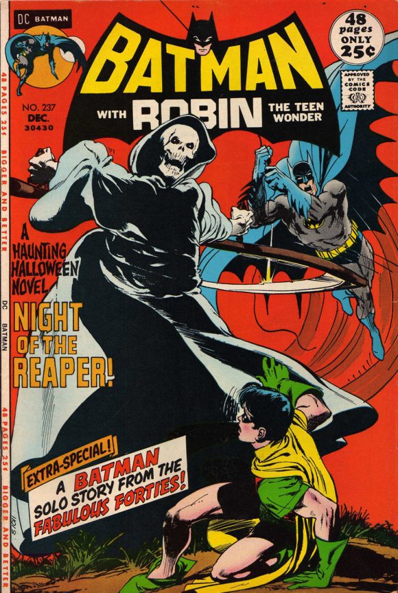
Batman #646, 1972. Again a case where the logo colors are a downgrade from what DC did, here with October 1971’s Batman #237. Yellow and white on black really makes this terrifying image pop that much more. I can’t judge whether the lighter (and lesser) shade of red on the EN version is accurate or due to the picture quality.
—
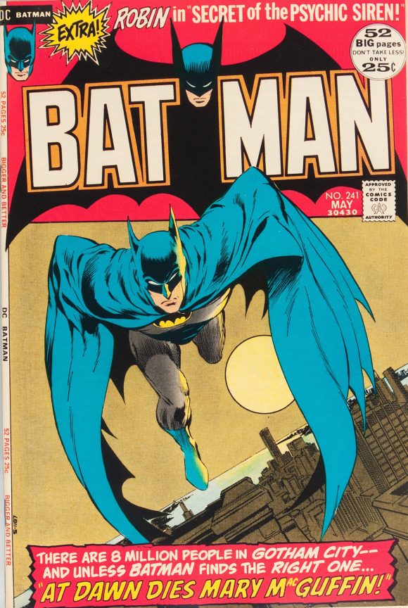
Batman #664, 1973. March 1972’s Batman #241, inked by Bernie Wrightson, is one of the most memorable Batman covers of the era, showing up today on T-shirts and drinking glasses and whatnot. Alex Ross did a marvelous version in 2023 that improved on the layout. As I’ve said many times, I’m not always a fan of the box design for a cover, so I like the use of the full image by EN. But the use of red on the DC version is so much more potent. I don’t think that mucus green works well as a full background.
—
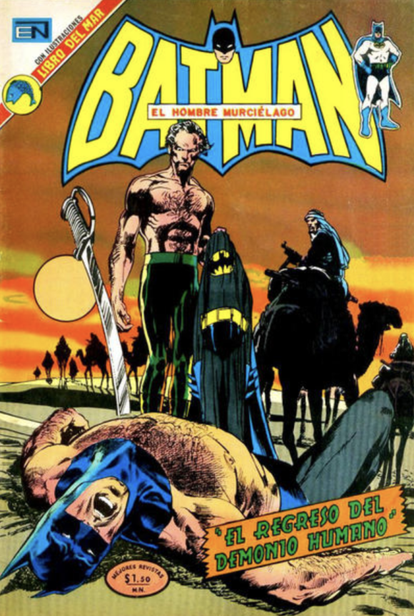
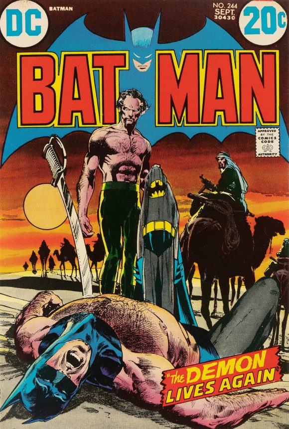
Batman #682, 1973. Since I can’t tell whether the background color is accurately depicted here, I’ll focus on the trade dress. It definitely works on the EN version, but July 1972’s Batman #244 is something else entirely. Adams once told me that the logo color scheme was chosen specifically because the pale blue plays off the bold red and yellow to create a 3D effect, which takes what was already a tremendous cover to another level.
—
Batman #690, 1973. I’m totally down for the color scheme of the EN logo vs. Aug. 1972’s Batman #245. The latter is fine, but the yellow just works better. Interesting attempt at the new Batman banner too, seeming to retain the way the head was approached in the previous emblem.
—
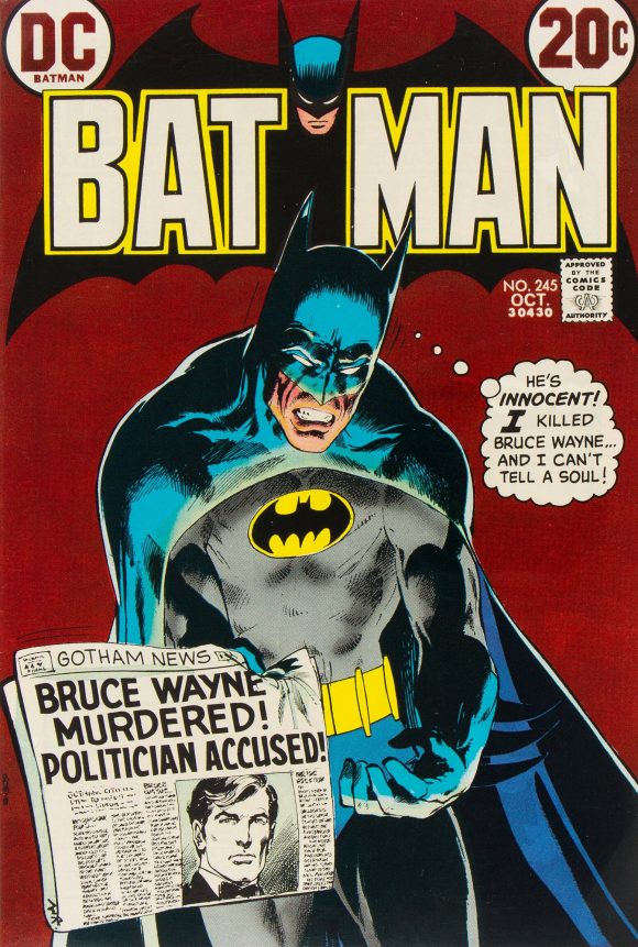
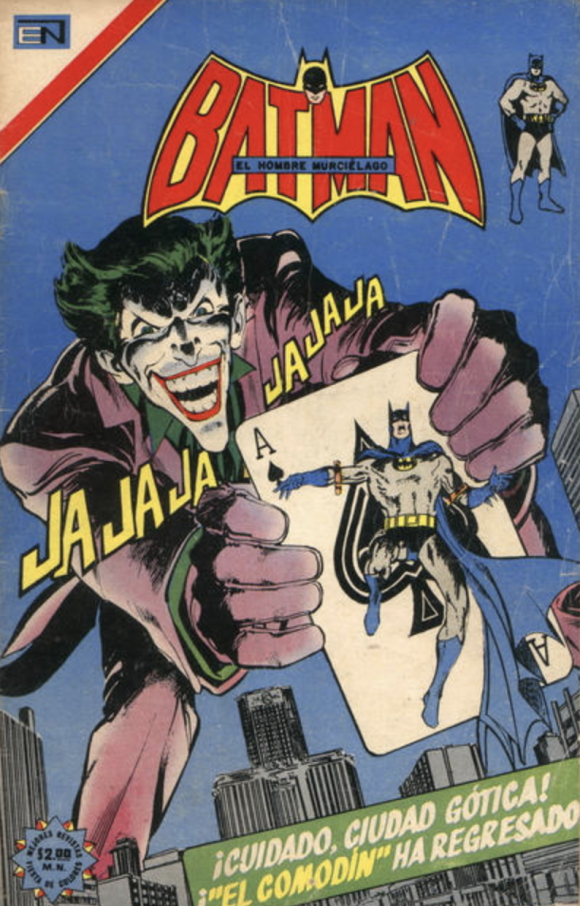
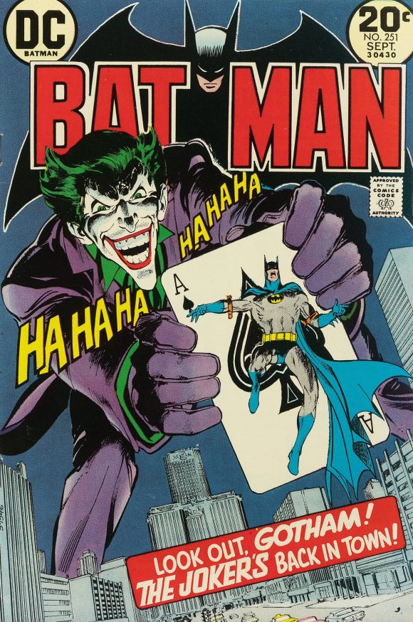
Batman #729, 1974. EN also would switch back and forth between Batman logos. Anyway, you can’t beat the American version of June 1973’s seminal Batman #251 but I do get a kick out of what EN did with their version. Best part though? “JA JA JA JA JA JA,” because of course!
—
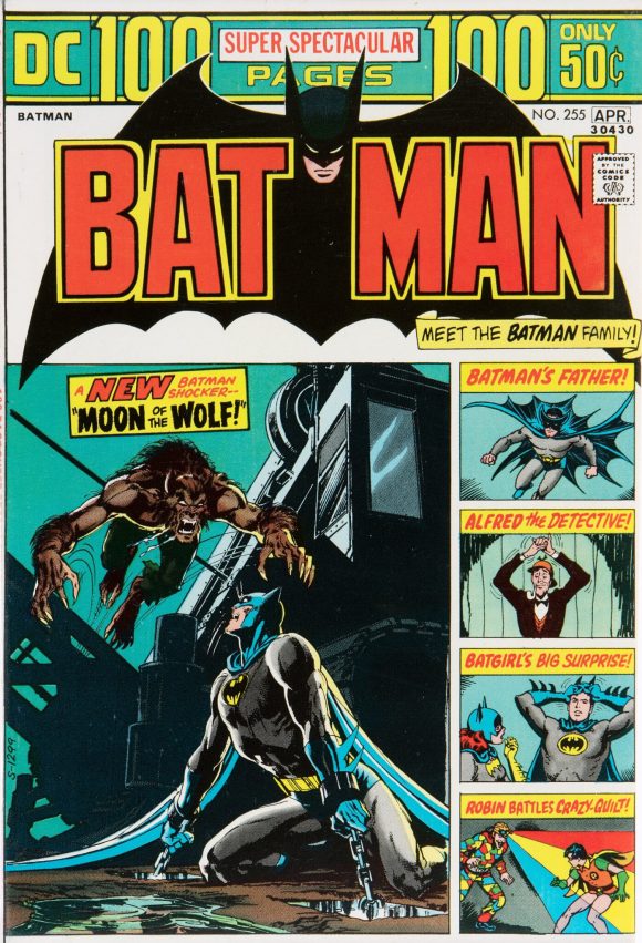
Batman #765, 1975. And once again we return to December 1973’s Batman #255, whose layout fans have long moaned did Adams’ main image no favors. The Australians killed it on their version, and I’d say EN is somewhere in the middle.
—
MORE
— 13 TIMES Australian Publishers Did BATMAN COVERS Better Than DC COMICS. Click here.
— 13 WILD MEXICAN SPIDER-MAN COVERS: It’s Cinco de Mayo! Click here.
May 5, 2026
Excelent choices! And thanks for the article.
I learned to read with Novaro comics, they had a lot of licenses, and for many years they published an amazing amount of comics, including some original series. Their Fantomas was so well received that it shaped the perception of the character in many countries. And the Novaro Fantomas (and later on, Vid’s) was a very different character from the original, cruel villain from the French pulps as to be completely opposite!
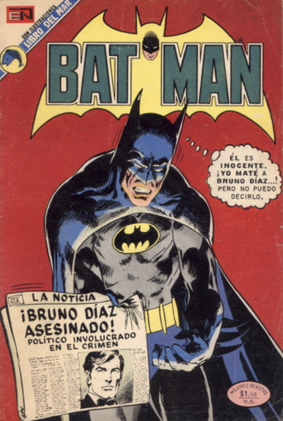
Back to DC, Novaro was justly derided by their strange translations. I think it was a government/censure imposition to translate names into Spanish equivalents, or something. Like turning Hal Jordan into “Raul Jordan” (changing the given name and transliterating the surname), or Oliver Queen to the very literal “Oliverio Reina”. The most influential of these was, precisely, the civilian names of Batman and Robin. Bruce Wayne to Bruno Diaz, and Dick Grayson to Ricardo Tapia (only Ricardo has any equivalence to the original).
However, there are some names that were accurately translated by Novaro, but changed in the dub of the 1966 TV series. The Joker was turned into “El Guasón” (somebody who laughs constantly and annoyingly), and Catwoman to “Gatubela”, a nonsensical word that actually works for the character. Novaro used “El Comodin” (for the playing card); and the literal “La Mujer Gato” Even in recent years, Bruno Diaz, Ricardo Tapia, Guasón, and Gatubela, are so entrenched into the popular culture it’s almost impossible for many people to use the original names.
May 5, 2026
I’m glad you enjoyed the article, Lex! This is wonderful information. Thank you!
May 5, 2026
Love these ‘foreign’editions!! With their weird color choices and other choices!
May 6, 2026
For those who didn’t know, Novaro held a huge number of licenses between 1949 and 1985, including DC, Archie, Gold Key (later Dell), certain Marvel titles (Conan The Barbarian, The Incredible Hulk and Star Wars) and their own series produced in Mexico. The company was acquired by Western Publishing in 1962. Having the licenses for many series such as “The Pink Panther,” “Road Runner,” and “Bugs Bunny,” among others, it began hiring local artists to create new stories.
A curious fact: they published many DC series packaged in some titles: Superman (Superman, Action Comics, Super Friends, World’s Finest, Justice League America, The Fury of Firestorm, Black Ligthning, Aquaman, Superman Family), “Super Comic” (Superboy and the Legion of Superheroes, The New Adventures of Superboy, Mr. Miracle, New Gods, The New Teen Titans, Forever People), Batman (Batman, Detective Comics, Batman Family, The Brave and the Bold, Green Lantern, The Flash, Justice League of America, Shazam!, World’s Finest), Wonder Woman, My Greatest Adventure (Hawkman, Atom, Aquaman, Adam Strange), Planetary Titans (Mystery on Space, add-ons such as Tommy Tomorrow, Congo Bill, Vigilante, Space Cabby), Ultra Grave Stories (House of Mystery, Swamp Thing, various titles from horror), Sugar and Spike, Fox and Crow (Stanley and his monster), Jerry Lewis, Susy: Secretos del Corazon (Young Romance, Falling in love, Girls romance, Young Love, Secret Romance), Tomahawk.
The oil crisis of the 1970s (with the subsequent rise in the price of paper and printing raw materials), mismanagement, and other factors led to Novaro’s closure in 1985. Few companies outside the US handled such a large number of licenses and generated millions in sales at their peak.
By the way, very good article.
May 7, 2026
I think one of the factors that helped Novaro to reach its popularity was their publishing schedule. Many of their titles had a weekly schedule, so they were always at hand. Even if the stories themselves didn’t strictly follow from one issue to the next, the reader didn’t have to wait a month (or two) for the next adventure.
Ironically, their policy of shortening the texts might have helped too. The dialogue was brief, crisp, and direct.
Other publishers followed the weekly schedule, like Novedades and Vid (I’m not sure about La Prensa or MACC)