CINCO DE MAYO: Dig These 13 Muy Bueno NEAL ADAMS MEXICAN BATMAN COVERS
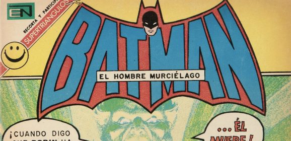
Editorial Novaro’s take on the Bronze Age Darknight Detective… When I got back from Down Under, I posted 13 TIMES Australian Publishers Did BATMAN COVERS Better Than DC COMICS in the Bronze Age, and a reader asked, “Any chance for a similar article about Editorial Novaro?” My response? “Yes. Sooner than you think.” But what I didn’t say is that I was planning something for Cinco de Mayo, in this case 13 COVERS by Neal Adams that were reprinted by the Mexican publisher in the 1970s. I chose Adams because he’s Adams and because it’s interesting to see how EN’s approach differed from DC’s. Most of the time the difference was in the trade dress, sometimes the color choices. Sometimes the differences are obvious, other times subtle. On the whole, the American versions are superior because of their production values. But that doesn’t mean the Mexican versions aren’t fun! Here are 13 I picked that I found particularly interesting, paired with their American versions. Adams penciled and inked all of them, except where noted. Also, forgive the low resolution of the Mexican covers. High-res versions are not readily available on the web. You’ll notice the crazy difference in the issue numbers. For example, the American Batman #200 was #470 in Mexico. That’s because the latter version was published with greater frequency, featuring an array of alternating DC characters or teams, like so: EN’s series — subtitled El Hombre Murcielago — ran for 1,301 issues, from 1954 to 1985. (I myself picked one up when I visited Mexico in 1981.) Oh, and before we get started, you should check out this piece about the oddball world of Mexican Spider-Man. Now, let’s go. Exact release dates can be difficult to come by, but these are in chronological order: — Batman #470, 1969. This cover is probably the most different from the original (Batman #200, which came out in January 1968). Aside from the big, green bat the Caped Crusaders are holding, notice that the editors replaced the background covers with a selection including other characters featured in the series. (They don’t exactly fit cleanly, either. Weird.) — Batman #516, 1970. Based on Batman #210 (released January 1969), this is Adams working from a Carmine Infantino layout. The main difference is the shade of green in the background and the trade dress....
Read more