
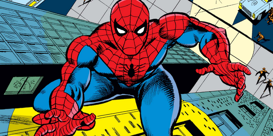
A selection from a series that itself was underrated…
It’s time for another 13 UNDERRATED COVERS gallery and we’re heading back to Marvel for Peter Parker, The Spectacular Spider-Man — a title that has long been in the shadow of big brother Amazing Spider-Man. So it’s underrated covers from an underrated series.
Dig it? Cool.
Let’s swing with this Bronze Age selection.
—
Peter Parker, The Spectacular Spider-Man #1. Might as well start with the first issue: Just because something is seriously derivative (see Amazing Spider-Man #134) doesn’t make it bad. It’s an action-packed cover with a villain in a badass costume.
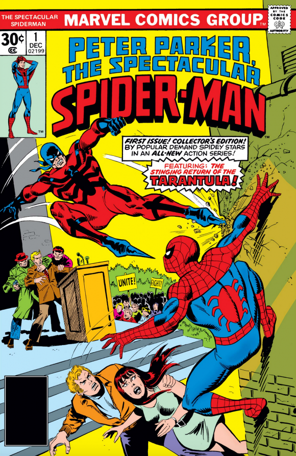
Sal Buscema, with possible John Romita alterations
—
Peter Parker, The Spectacular Spider-Man #4. Don’t you just want to wait for Petey to get home and give him a big mug of hot chocolate? Such a good kid.
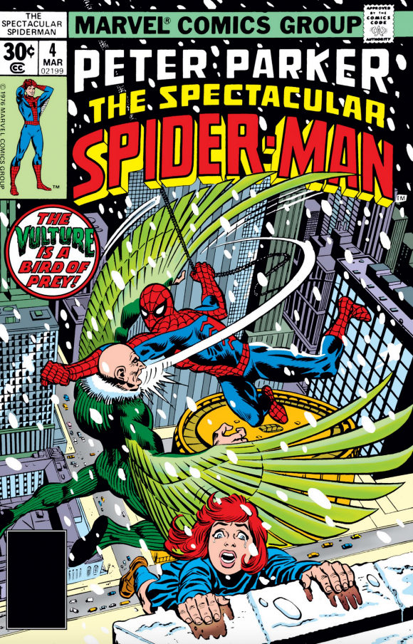
Dave Cockrum pencils, Frank Giacoia
—
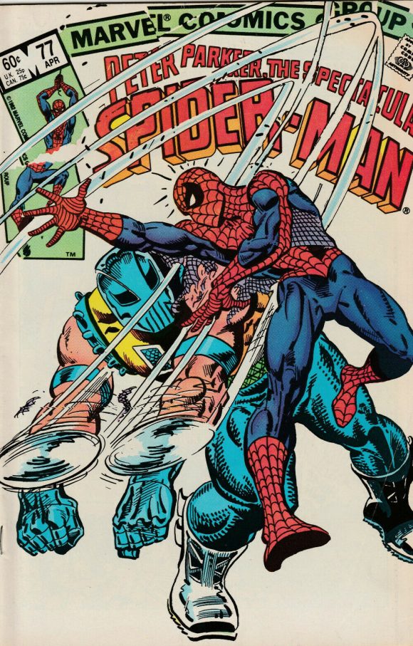
Peter Parker, The Spectacular Spider-Man #58. A great way to spot an underrated cover: If you’re featuring a Z-List villain and it still looks good? You win. Of course, this is the A-List team of John Byrne and Joe Rubinstein and that certainly helps.
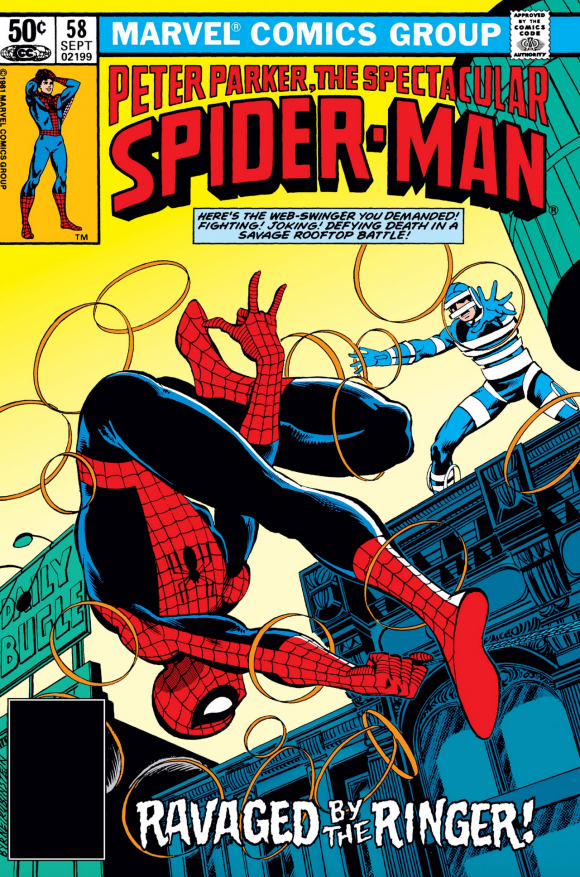
John Byrne pencils, Joe Rubinstein inks
—
Peter Parker, The Spectacular Spider-Man #114. Again derivative. Again, I don’t care. Keith Pollard does a nice job with a classic Spidey tableau.
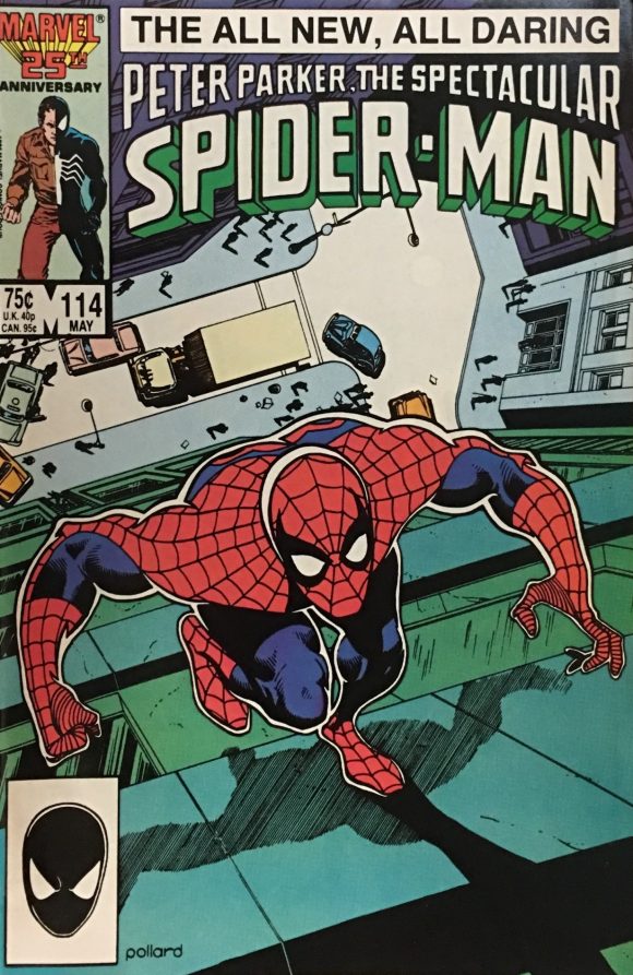
Keith Pollard
—
Peter Parker, The Spectacular Spider-Man #38. Is it just me or does Morbius have his arms outstretched on every cover he appears? You’d think he always walks around like that. But at least this cover is electrifying. (Get it? I crack me up.)
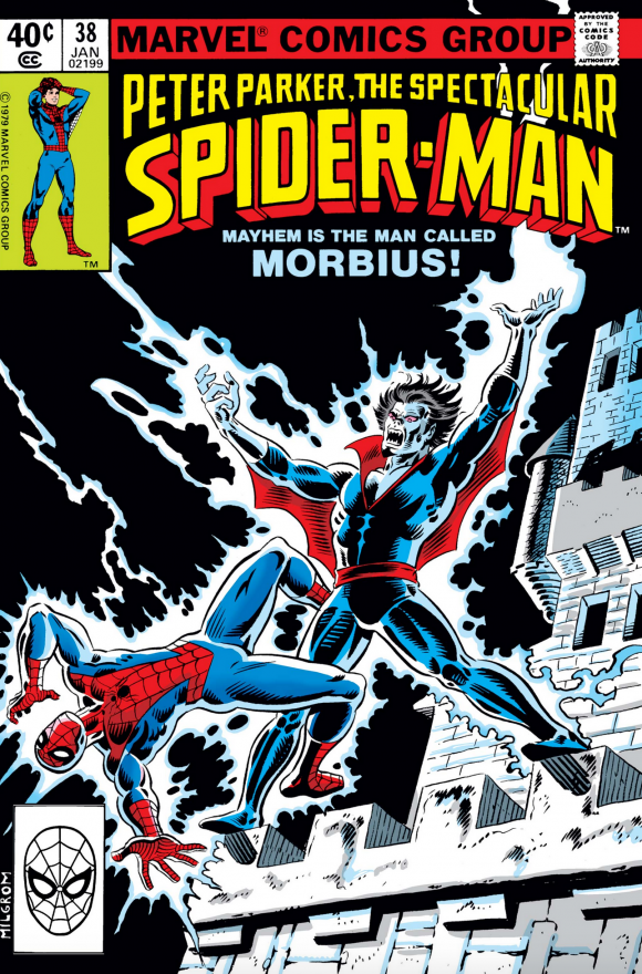
Al Milgrom
—
Peter Parker, The Spectacular Spider-Man #38. Another solution to the Z-List villain conundrum: Go all Eisner and bring the title into the image. You may not care about Gladiator but at least Al Milgrom’s cover rocks.
Milgrom
—
Peter Parker, The Spectacular Spider-Man #38. Superhero comics — and covers — often try for real terror and rarely succeed. This one by Rich Buckler, however, is downright horrific and frightening. Well done.
Rich Buckler
—
Peter Parker, The Spectacular Spider-Man #5. Another case where our hero looks like he’s in legit danger — and kudos for making the Hitman look even more lethal than a classic villain like the Vulture.
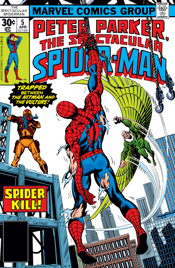
Cockrum
—
Peter Parker, The Spectacular Spider-Man #16. Pretty standard battle cover but it gets extra points because I have a weird soft spot for the Beetle.
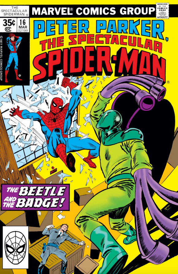
Marie Severin pencils, Sal Buscema inks
—
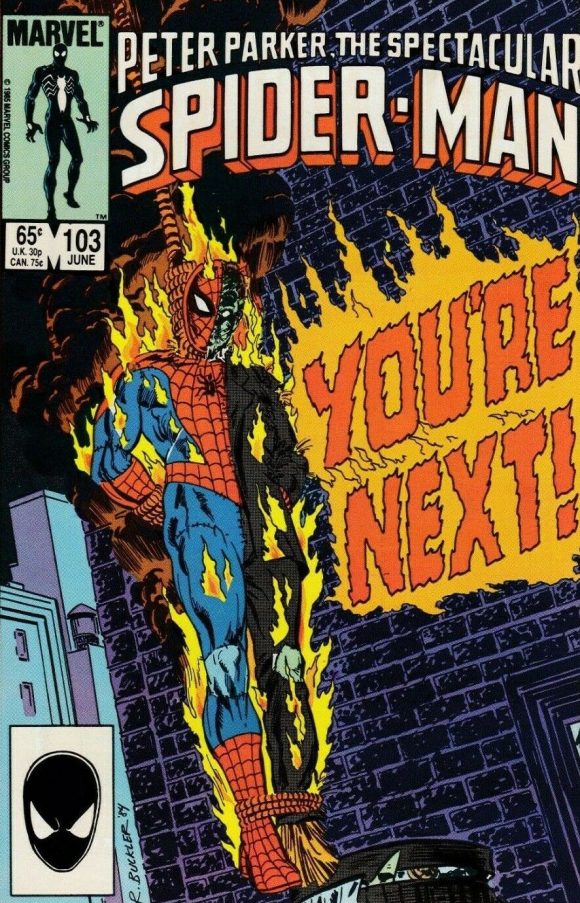
Peter Parker, The Spectacular Spider-Man #109. This one’s from the mid-’80s so it’s not surprising that Rich Buckler went outside the box. Very cool image — sparse, yet atmospheric all the same.
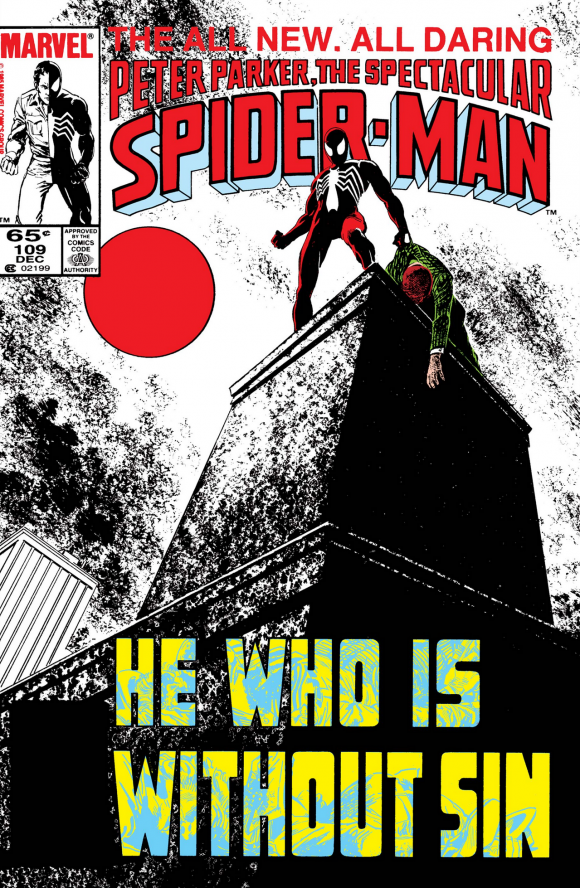
Buckler, with possible Brett Breeding inks
—
Peter Parker, The Spectacular Spider-Man #85. A straight-up good cover by Milgrom. The angle only kinda-sorta makes sense but it’s a cool image nonetheless. I dig it.
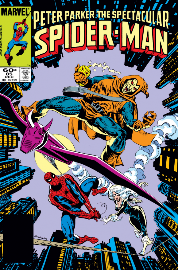
Milgrom
—
Peter Parker, The Spectacular Spider-Man #34. The Iguana! The Iguana?! The Iguana! In a lot of respects, Spidey is the best character to show off the cityscape and that makes his covers that much more exciting. Even if the Iguana is front and center.
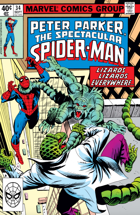
Milgrom
—
Peter Parker, The Spectacular Spider-Man #35. Like Pollard’s cover, we’ve seen this before. The difference here is that this was pencilled by Carmine Infantino — the former boss of DC Comics. I can only imagine what he was thinking at his drawing board, working on the character who not long before best symbolized the bane of his existence. (Actually, I imagine him thinking, “Hey, it’s a paycheck.” And who could blame him?)
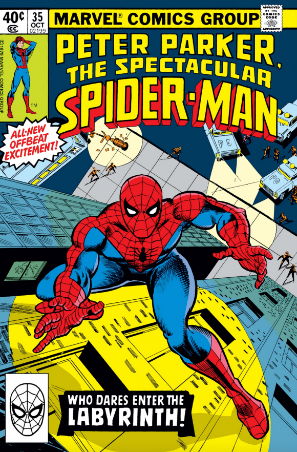
Carmine Infantino, with possible Mike Esposito inks.
—
MORE
— 13 Underrated CAPTAIN AMERICA Covers. Click here.
— 13 Underrated SUPERMAN Covers. Click here.
December 3, 2020
I always thought Ed Hannigan’s cover to PPSSM 62 was seriously cool. Though I confess I don’t know if it was ever rated or overrated.
December 3, 2020
These classic Spidey covers give off majorly epic Spider-Senses.
December 3, 2020
It’s interesting to me how the cover by Byrne doesn’t scream that those are his pencils. While, the Milgrom’s issue 77 says Ditko to me. I’ve got to get me a copy of #35; I never realized Carmine did any work for Marvel.
December 4, 2020
I had that Ringer issue as a kid. I’m sure that cover is what caught my attention. Poor Ringer, there’s a reason he ended up being thrown in as one of Scourge’s victims in the late 80’s…
Also a little surprised you didn’t include the infamous Santa cover from issue #112…
December 4, 2020
I didn’t include Santa because it’s not underrated! 😉
December 6, 2020
Fair point! 🙂
December 4, 2020
Thanks for the groovy gallery! You’ve brought back a lot of great memories.
I was a complete Spidey fanatic when most of these issues came out. I still get a thrill when I remember that day in October ’76 when my family was staying with friends in Wenatchee, WA. My brother had gone to the drugstore with instructions from me to check out the spinner rack for any new comics. He returned with a HUGE smile and bestowed upon me the very first issue of PETER PARKER, THE SPECTACULAR SPIDER-MAN! Somehow we had missed the announcement in “Bullpen Bulletins” of a new Spider-Man title and John, being a few years older than I, knew that buying a new series from the beginning was a VERY…IMPORTANT…EVENT in our young lives. And he was right. From that day it became my mission as a Spidey fanatic to never miss an issue of PPTSSM! Of course that didn’t quite work out thanks to spotty newsstand distribution in my hometown, but I bought every issue I could get my hands on because I was in on the ground floor and this was MY Spider-Man title.
My original comic collection is long since gone. But I have the five volumes of ESSENTIAL PETER PARKER… proudly displayed on my bookshelf next to the eleven volumes of ESSENTIAL AMAZING… in glorious black & white. And when I feel nostalgic for better days I take them down and lose myself for a few hours in the Spectacular adventures of the swingin’est super-hero of the Seventies.
“Groovy” Mike Decker