
These come from a land Down Under…
Whenever I travel abroad, I make it a point to go comics shopping. Not buy current comics that are merely imported from here in the States, but do a deep dive into a country’s publishing past to see how they differed from their American counterparts.
Generally speaking, countries like Australia — where I just visited — Italy, the Netherlands and many others, would reprint American stories but repackage them for their own markets. (In 1960s Japan, they got the bonus of Jiro Kuwata’s famed Batman manga adaptations, as well as reconfigured U.S. content.)
A classic, both American and Italian styles
I’ve written about this many times in the past, but having just been Down Under, I was reminded how often foreign publishers did a better job with their covers than the American companies — in this case, K.G. Murray and DC, specifically Batman. Not always, mind you. Usually, in fact, the American covers are tighter, sharper and much more professional looking. But many times — typically when a cover used art that was truncated on a U.S. edition or in a different form — the foreign versions are superior. (On the other hand, black-and-white interiors were common.)
So here are 13 examples, along with their American editions and publication dates.
(Also, if you want to get lost in the world of Australian comics, check out the website AusReprints.)
—
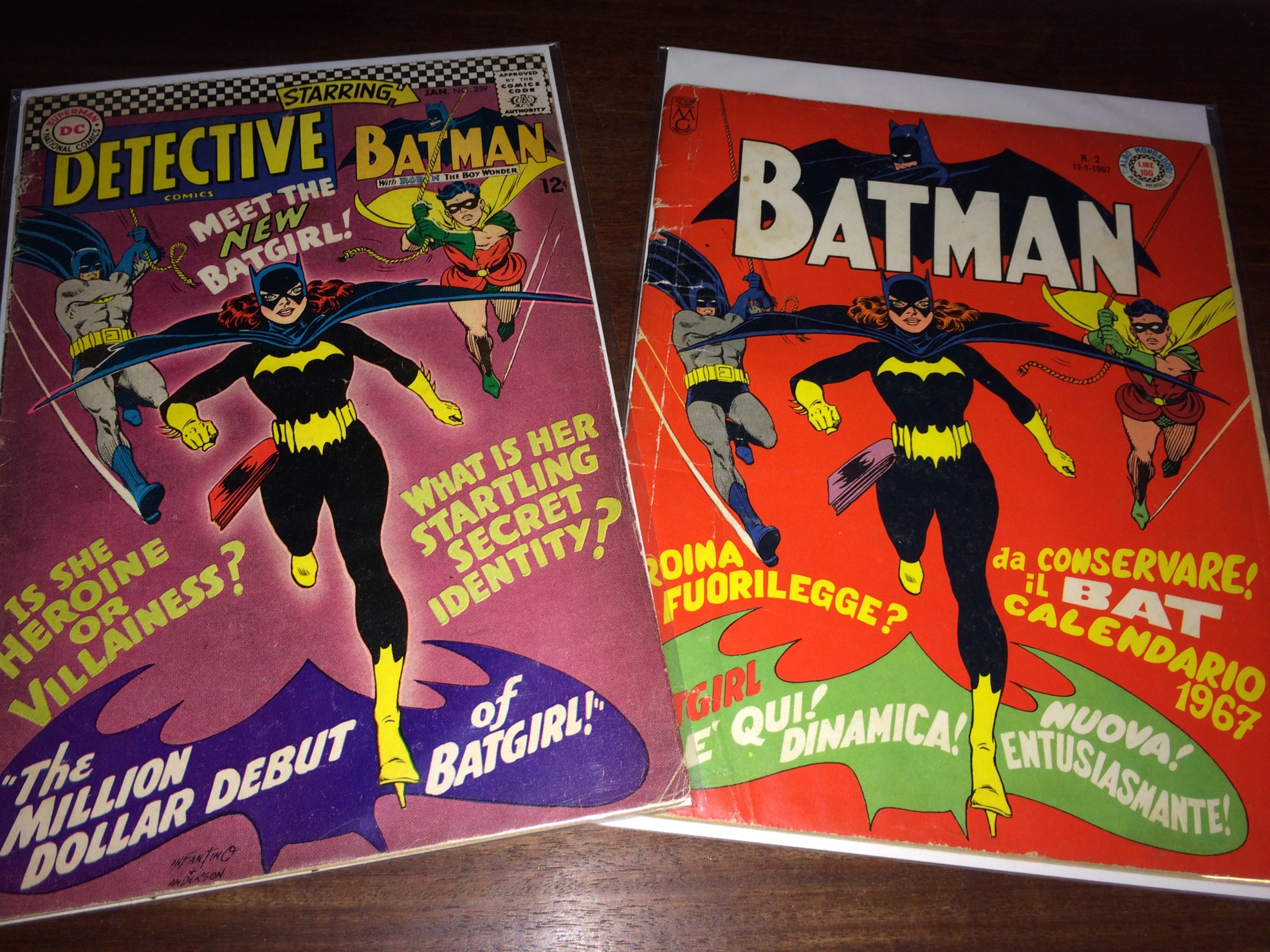
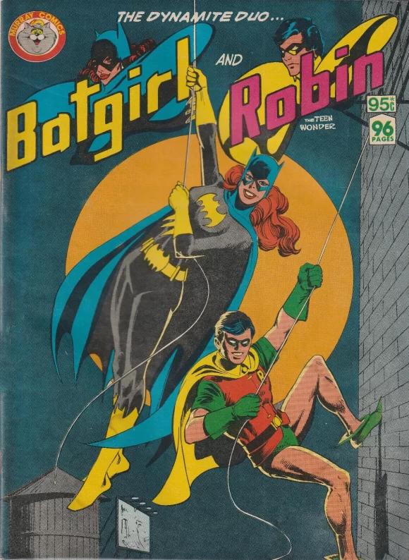
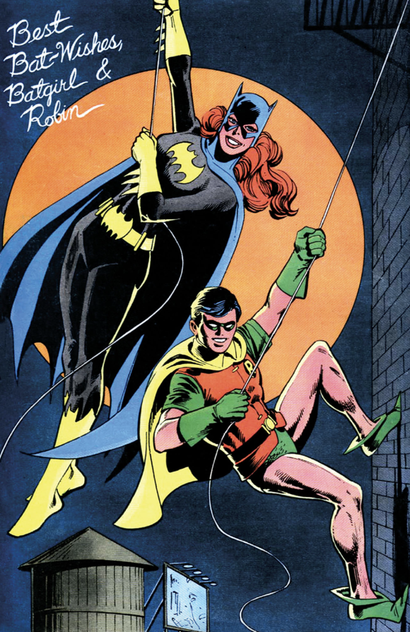
Batgirl and Robin (circa Feb. 1982). I put this one-off first because I like it the most; the rest are in chronological order. (I’ve also scored a copy.) It’s based on a back-page pin-up by Dick Giordano from 1979’s Detective Comics #495. Besides the image being a fave, I love that the Aussies put out a magazine-size one-shot straight up called Batgirl and Robin, using stories from Detective and Batman Family.
—
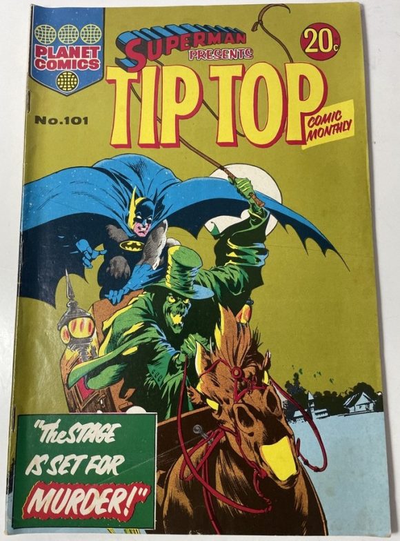
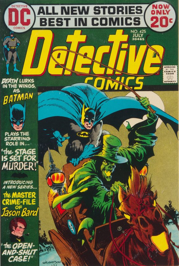
Superman Presents Tip Top Comic Monthly #101 (circa Oct. 1973). This catch-all title, like the other non-mags on this list, had larger dimensions than its American counterpart. This cover is based on Bernie Wrightson’s Detective Comics #425 (July 1972). I was never a big fan of the boxy Detective cover layout of the early ’70s, so it’s nice to see the image breathe. That said, you could argue it’s a little too loose.
—
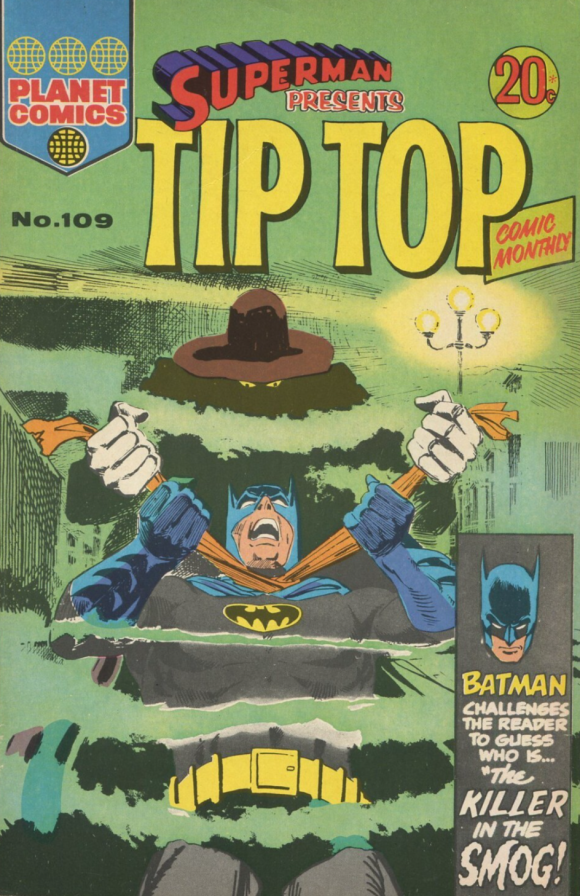
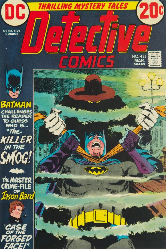
Superman Presents Tip Top Comic Monthly #109 (circa May 1974). A more effective version of the one above. Based on Giordano’s cover for Detective Comics #433 (March 1973).
—
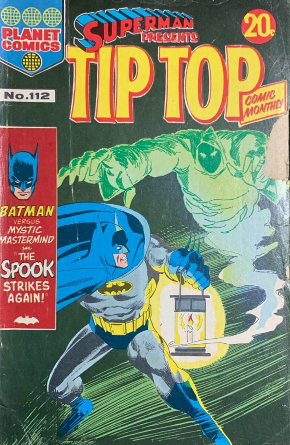
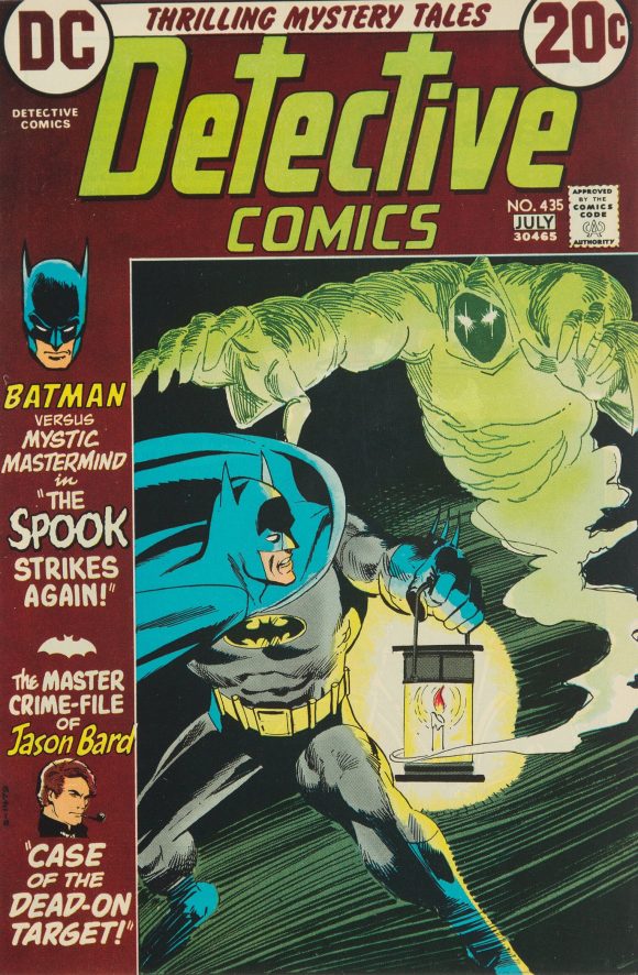
Superman Presents Tip Top Comic Monthly #112 (circa Aug. 1974). Not all that different from the original — Detective Comics #435 (June-July 1973) by Giordano — but I still prefer it, especially over the brown.
—
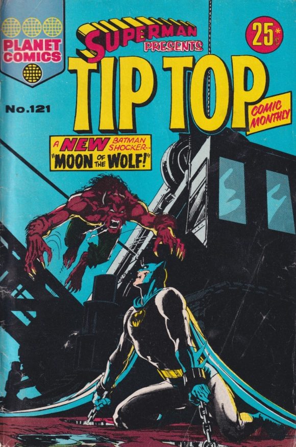
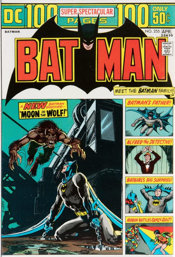
Superman Presents Tip Top Comic Monthly #121 (circa May 1975). This one’s a killer — and the best example on this list. Fans have long clamored that DC’s 100-page format squeezed the life out of Neal Adams’ main image for Batman #255 (March-April 1974). Click here for much more about this star-crossed illustration.
—
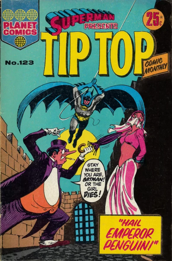
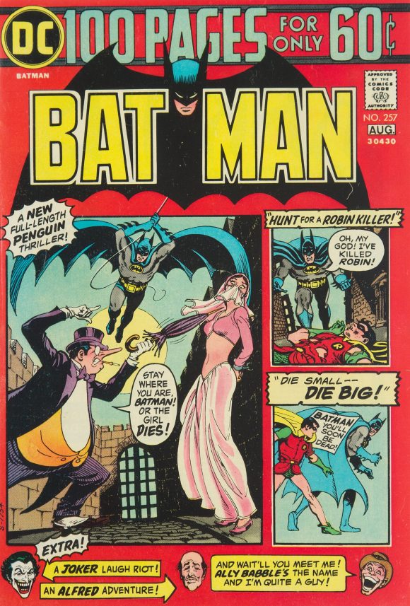
Superman Presents Tip Top Comic Monthly #123 (circa July 1975). Let me make this clear: I love DC’s 100-pagers and I love their Batman covers. But there’s no question that, like the issue above, they didn’t do the main images any favors. So compare this to Nick Cardy’s Batman #257, (July-Aug. 1974). I miss the red, though.
—
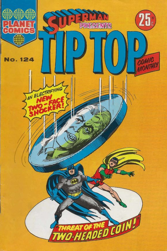
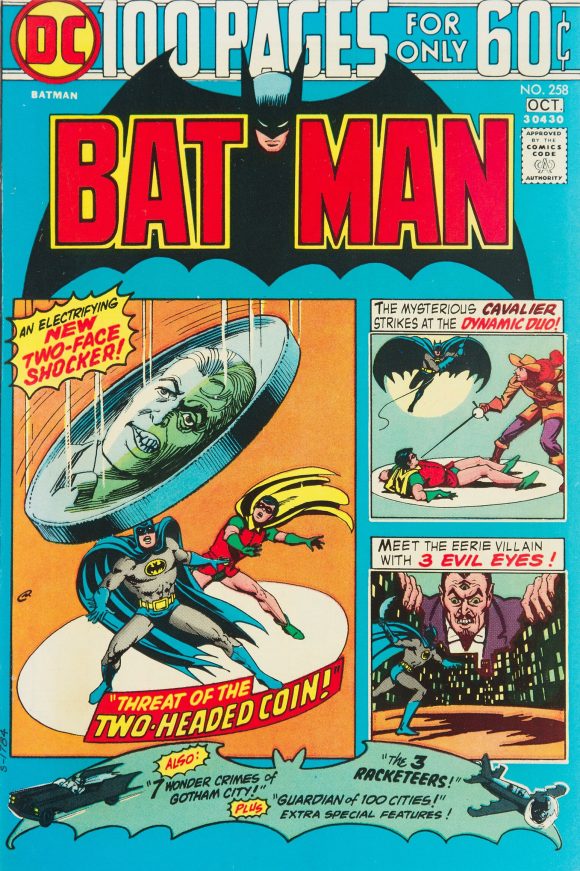
Superman Presents Tip Top Comic Monthly #124 (circa Aug. 1975). See above. Based on Cardy’s Batman #258 (Sept.-Oct. 1974).
—
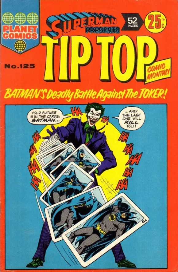
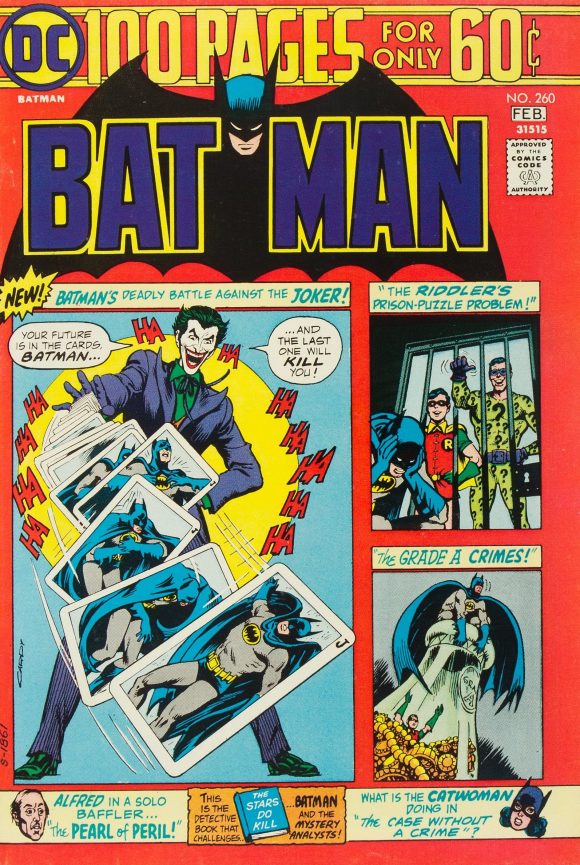
Superman Presents Tip Top Comic Monthly #125 (circa Sept. 1975). Another one that improves vastly on the original. That’s a great Joker image by Cardy (Batman #260, Jan.-Feb. 1975) and it deserved a more potent layout. In fact, European publishers did it even better.
—
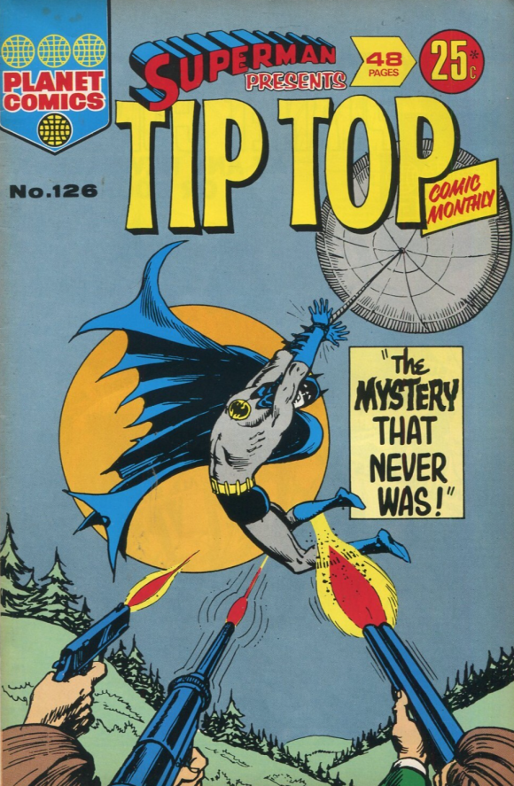
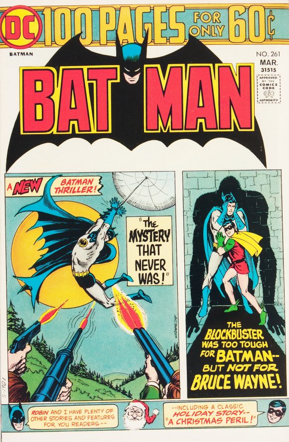
Superman Presents Tip Top Comic Monthly #126 (circa Oct. 1975). Too loose but I always thought the Batman #261 (March-April 1975) cover by Cardy was a bit of a snooze, so this is a step up.
—
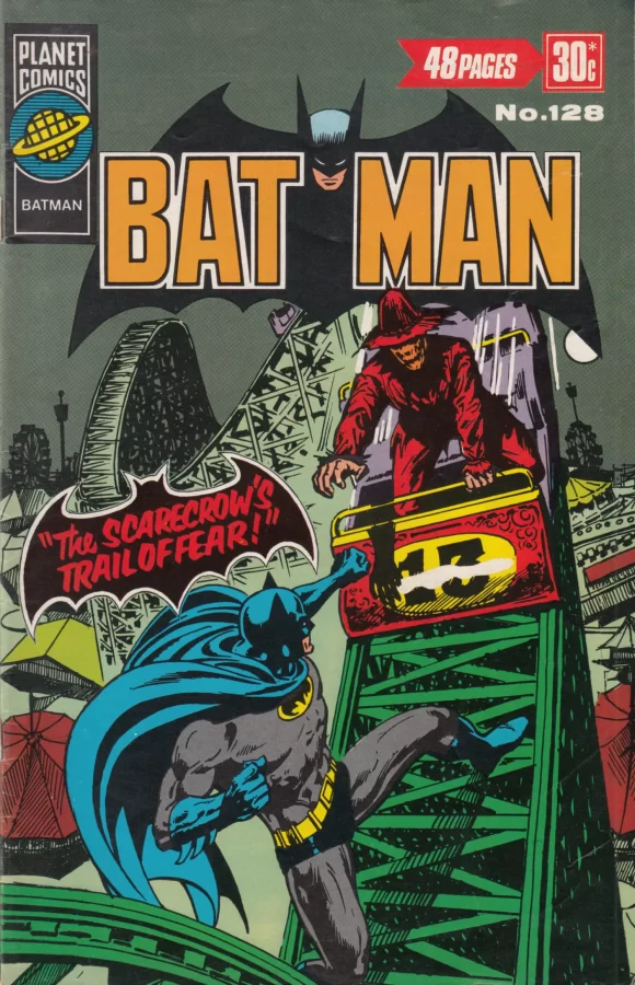
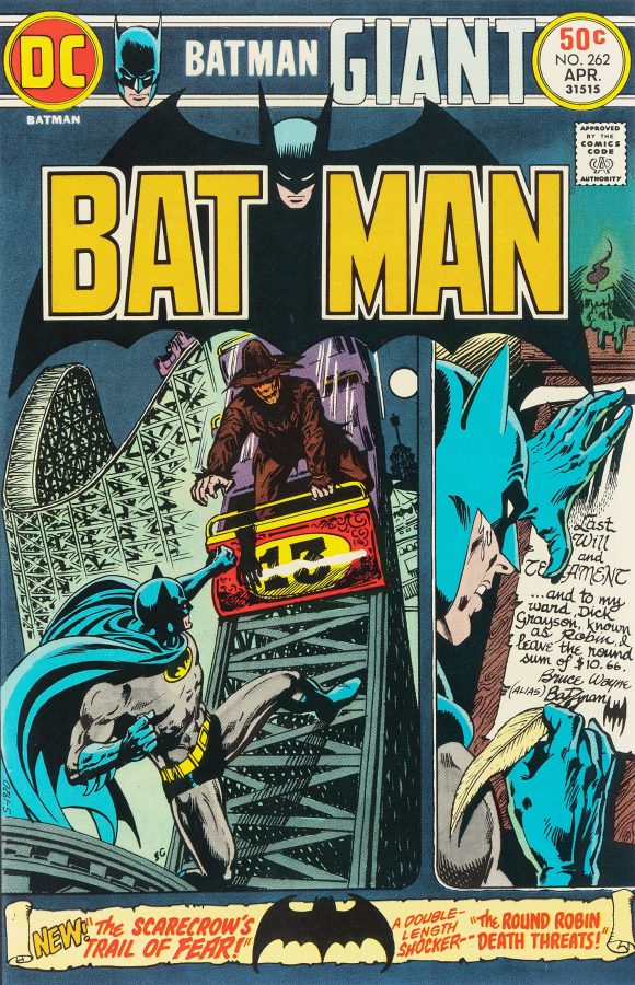
Batman #128 (circa Dec. 1975). A substantial improvement over Ernie Chan’s Batman #262 (April 1975), which always felt too mashed together. The Australian edition makes for a more memorable cover. The bat silhouette with “The Scarecrow’s Trail of Fear!” in bold red letters is a nice addition.
—
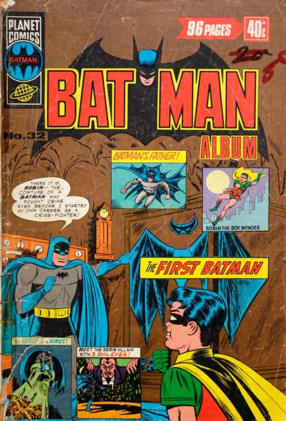
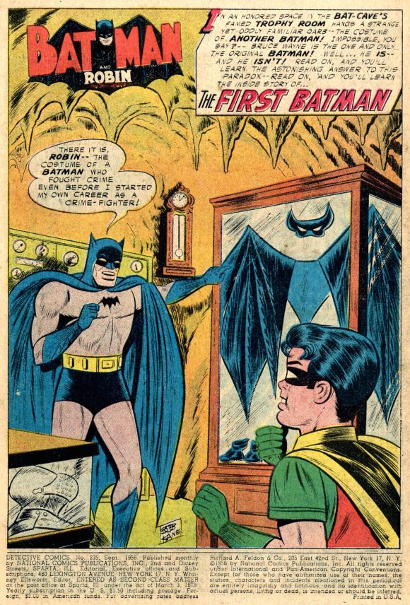
Batman Album #32 (circa April 1976). In all fairness, this one is actually a hot mess in terms of layout. The vignettes are thrown on there willy-nilly and one of them echoes the main image itself — “Batman’s Father!” But I like that they used the Sheldon Moldoff/Stan Kaye splash page from 1956’s Detective #235 (lifted from the reprint in Batman #255) for the dominant cover illustration, making for a delightfully anachronistic approach in the mid-’70s.
(Most of the vignettes are by Cardy, from other Batman 100-pagers. I’m not sure where the Robin one comes from, or who drew it. Curt Swan, maybe? UPDATED: Our pal Chris Franklin reports that it’s from 1965’s 80 Page Giant Magazine #8 and is drawn by Murphy Anderson.)
—
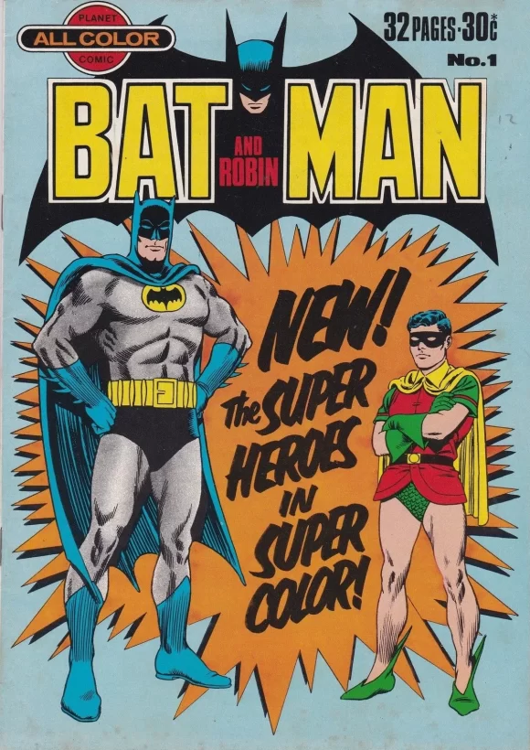
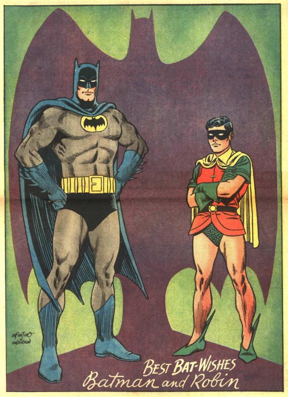
Batman and Robin #1 (circa Oct. 1976). One of the most famous images of the Dynamic Duo, dating from a 1966 center-spread pinup in Batman #181 by Carmine Infantino and Murphy Anderson. The Batman and Robin illustrations were used widely by merchandisers and by DC on trade dress and the like, but never as a cover. The Aussies took care of that here. (Robin’s placement makes him appear too small, though.)
—
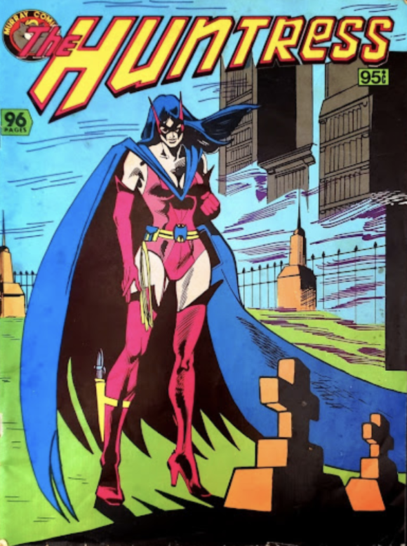
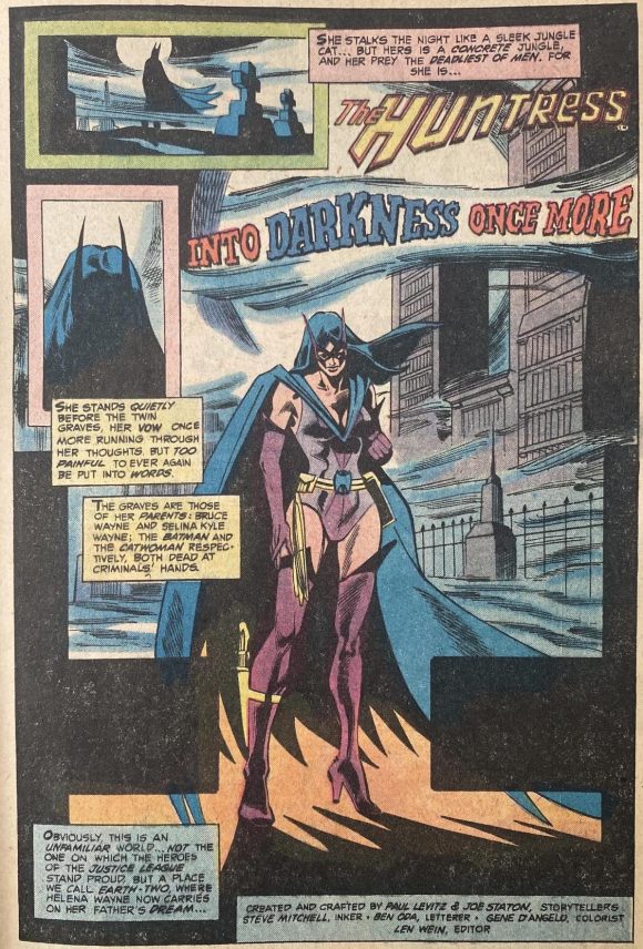
The Huntress (circa July 1982). Another mag-size one-off, giving the Huntress the headline treatment she hadn’t yet enjoyed in the States. Collects her first 15 back-up stories from Wonder Woman, which started in Issue #271 (Sept. 1980). The cover, by Joe Staton and Steve Mitchell, is from #271’s splash.
—
So, that’s 13.
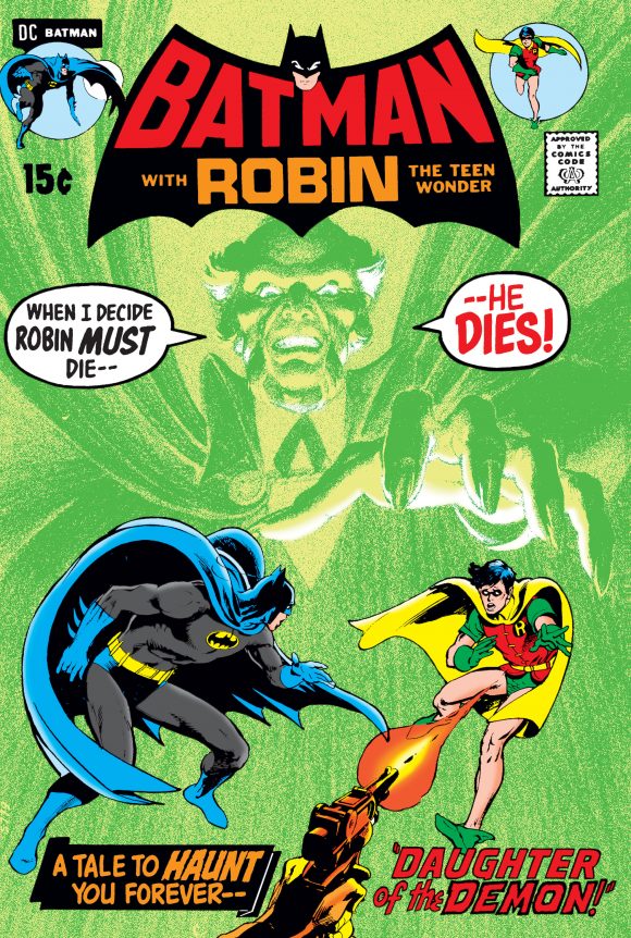
But it bears mentioning that they didn’t always get it right in Australia. Check out Superman Presents Tip Top Comic Monthly #99 (circa Aug. 1973), based on Neal Adams’ classic Batman #232 from 1971:
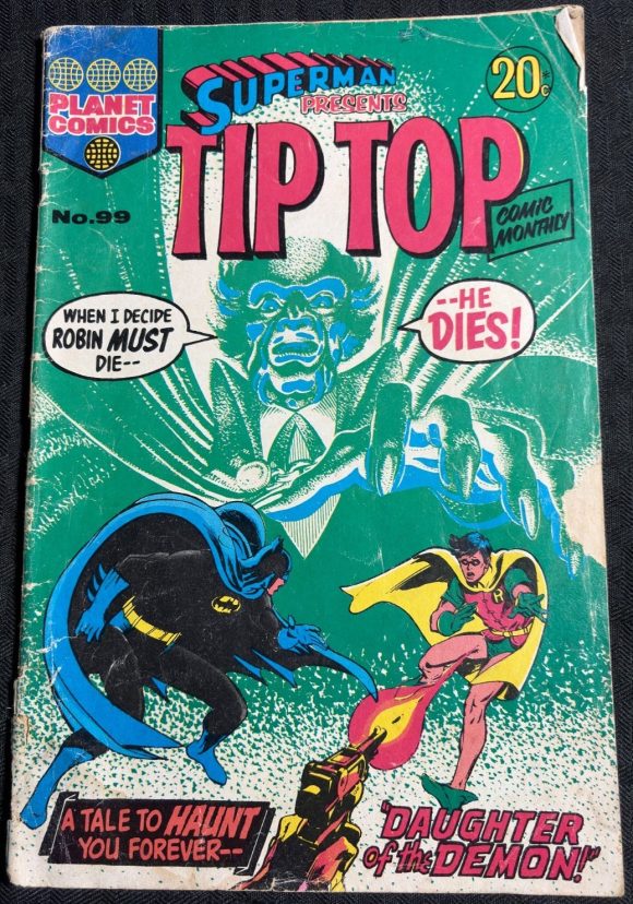
Crikey!
—
MORE
— 13 COVERS: The Colorful World of Italian BATMAN Comics. Click here.
— The Magnificent NICK CARDY BATMAN Cover That Could Have Been. Click here.
April 23, 2026
Any chance for a similar article about Editorial Novaro?
They had the DC license for about 30 years! And they exported comics to most, if not all, Latin America and even Spain.
Nowadays they are rather infamous for their idiosyncratic translations, but they did a lot to popularize DC characters back then.
April 23, 2026
Yes. Sooner than you think.
April 23, 2026
Great article, and fascinating stuff! I have the Giordano image of Robin from that Detective #495 pin-up on a Slurpee cup. It was also reused by him in the Super Friends Valentine Playbook I wrote about earlier this year.
The Robin vignette image from Batman Album #32 is from 80 Page Giant Magazine #8 (More Secret Origins) and is drawn by Murphy Anderson. https://static.wikia.nocookie.net/marvel_dc/images/a/aa/80-Page_Giant_8.jpg/revision/latest?cb=20210611190331
April 23, 2026
Thanks, Chris!!
April 23, 2026
Hey – thanks for posting this Dan. I’m from Australia and picked up many of those issues you’ve featured here when I was a kid. 100% agree that the reason they work better is of the tendency to spotlight a main image, rather than reduce it and put clutter around it. That “Moon of the wolf” Neal Adams cover still gives me goosebumps!
Another side note – what many of these reprinted comics great is that they had many pages and featured various tales from the golden, silver and bronze age – so you were really getting a great education or overview of the history of DC superhero comics at an affordable price.
April 23, 2026
Not related to the article, but looking at the DC 20-cent-ers, I notice how Marvel had a similar bordering on their 20-cent-ers, as well.
April 23, 2026
This was very interesting. I confess, in light of these more dynamic Australian versions of comics covers, I was never really a fan of those tripartite cover designs for the 100 Page Super Spectaculars back in the 1970s. Like the Aussie formatting here, only Archie Goodwin had it right during his editorial run on Detective Comics of the 100-Pager era of keeping to a strong singular image for the covers.
April 23, 2026
I love these “foreign”editions. I’m from the Netherland and have loads of examples of Dutch, German, French, Italian Spain and Portugese. Would love to share some scan and help out with an article about “foreign”comics.
There are some examples like Batman 255 which is also a full cover image on the Dutch edition. Our TEC 359 is also very differnt from the US and Italian (ours is White!).
April 23, 2026
Are there other cases of foreign English-language comics collecting backup features from DC Comics?
April 23, 2026
Gotta wonder if DC was pinching pennies and not paying artists for a full cover on those “boxy” issues. Great article!
April 24, 2026
Reading TipTop, eating TimTams.
I’m a huge fan of boxed cover images, so I prefer the originals; also, any Batman illo looks better with a dedicated Batman logo.
April 24, 2026
I found KG Murray, the Australian comics publisher, had collected the Firestorm backups from Flash with an issue of DC Comics Presents featuring him through a listing by an online comics dealer. This website has more information about them and comics covers for many of their DC reprints: https://themagicrobot.wordpress.com/category/kg-murray/
April 25, 2026
Check out thr complete Detective Comics 359 world cover set as well as many other foreign sets here:
https://www.instagram.com/p/CzboIO3RKYK/?igsh=MXF1azM5bzk4MnBjOQ==
April 27, 2026
Coming from NZ, we used to get a lot of these Murray/Federal Comics publications. They were only published in B&W (to begin with), but it was good that each comic could have up to three regular issues. Good value for money. eg, their Daredevil No #3 had Marvel Daredevil issues #159, #160, and #161