
The art behind the artistry of American Gods.
—
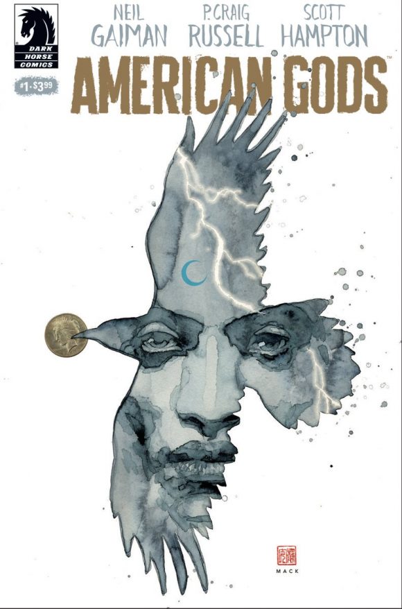
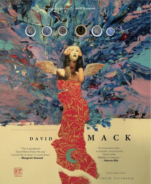
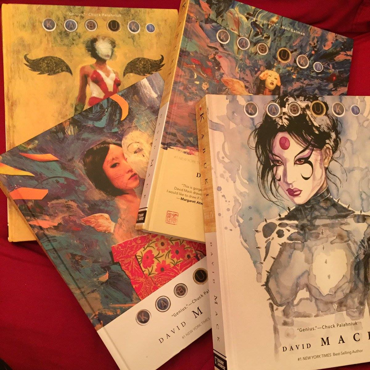
Neil Gaiman, P. Craig Russell and Scott Hampton’s American Gods adaptation is out 3/15 from Dark Horse. Who’s doing the variant covers? None other than David Mack, one of the best in the biz.
Producing an effective cover is an art in its own right, and we’ve got Mack here with 13 QUICK THOUGHTS: How to Create a Great Comic-Book Cover:
—
By DAVID MACK
1. One duty of the cover is to make a potential new reader notice it. You want the cover to work even at a distance and catch the reader’s eye from across the room.
—
2. It’s important to remember that when people see the cover, they are often not only seeing that cover, but a wall of other covers that it shares a shelf with in a busy room, or it may be seen among many other images of all kinds online.
—
3. You want the cover to stand out from all the other images on the shelf or online. You want the cover to motivate the reader to physically walk toward the cover and then physically pick it up in their hands based on the connection they have with the cover image. Or if it is seen online, you want them to click on it.
—
4. One tool that I use for this is to ensure the edges of the cover separate themselves from the book’s unpredictable surroundings. Considering that the books next to it may have many colorful characters and busy colors all the way to their covers’ edges, I like to give a buffer space on the edges of my cover, sometimes white, or a light color, or a texture, to separate this book from any other book that it is next to on the shelf. The books beside it, below it, above it. This space on the edges makes the cover I’m doing stand out from all of those around it, and lets the reader clearly see the central image on the cover I have created, even from a distance.
—
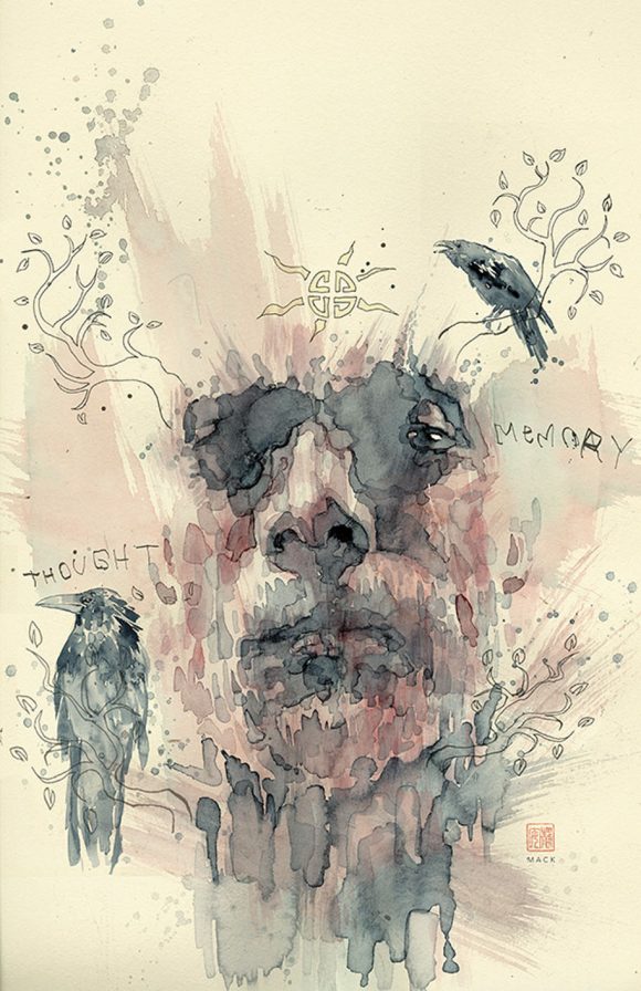
5. Shapes. I like to create a bold shape of the central image that works from a distance. Then there is a layer of more nuance and detail available when you see it closely. The cover has to work in both of these capacities. A bold shape or color arrangement that is visible from a distance, and something personable and nuanced up close that reveals a new layer of interest.
—
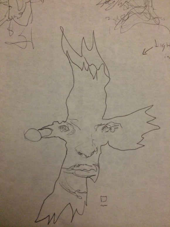
6. I start with many ideas and many details, do many drawings, often beginning with very graphic shapes and then I try to zero in on the most powerful shape and image idea.
—
7. I tend to simplify multiple ideas for the same cover down to three central iconic elements. More than three can work, but at that amount they may fight for clarity or importance. With three powerful ideas or iconic ingredients, I can create a hierarchy of ideas and images and then orchestrate them to make sure the reader sees them in a specific order. These may be three images or objects or characters or metaphors from the story.
—
8. Consider the ratio of real to surreal, and detail to mystery. Often the focus of interest of the cover image, where you want to ultimately direct the reader’s eyes, may have a certain realism. A calm in the eye of the storm. Often this can be the eye contact of the main character of the cover. Eye contact can be a tool of focus. The rest may have a ratio of abstraction to subconsciously direct to that point. Contrasts in color is also a tool for this, but you don’t want a uniform level of detail that cancels itself out without creating a hierarchy that points to the focus.
—
9. I like the cover to say something about the character, about the books themes; perhaps crystalizing a pivotal point in the story that is also a metaphor for the character and arc of the character in the story.
—
10. The cover is an icon, a totem, an artifact of the magic of the story that may also suggest to the reader how to view the story, how to approach it. The cover can contextualize the reader’s state of mind for this specific reading experience in a similar way as the opening titles to a film or TV show can prepare the viewer for how to experience the film.
When I was working on the opening titles for the Jessica Jones Netflix show, I was thinking of the title sequence in terms of setting the mind state of the viewer for the episode. When I drew the art on the film titles for Captain America: The Winter Soldier, I was thinking of the title’s art sequence as crystalizing and contextualizing the feeling of the film. A cover works in a similar way, as a graphic metaphor for the story.
—
11. A very important ingredient: mystery. Always err on the side of mystery, rather than overstating something. Mystery is what makes people want to open things. I consider the cover the door of the book. It sets up the expectations of the reader and invites them to walk through the door.
—
12. The cover gets the reader’s mind thinking and moving about the experience of the book. The more you can get the reader’s mind to engage with the imagery on the cover (both consciously and subconsciously), the more the reader’s mind is already an active participant in the book, and has a mental and emotional connection and investment in it.
—
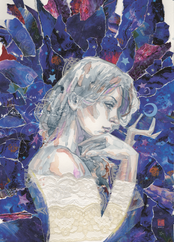
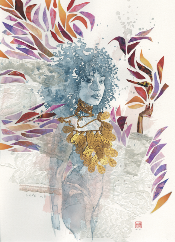
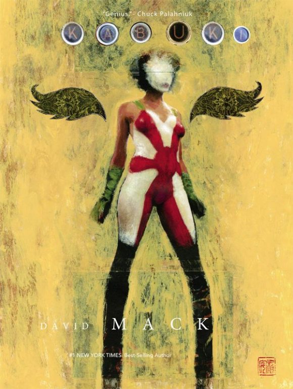
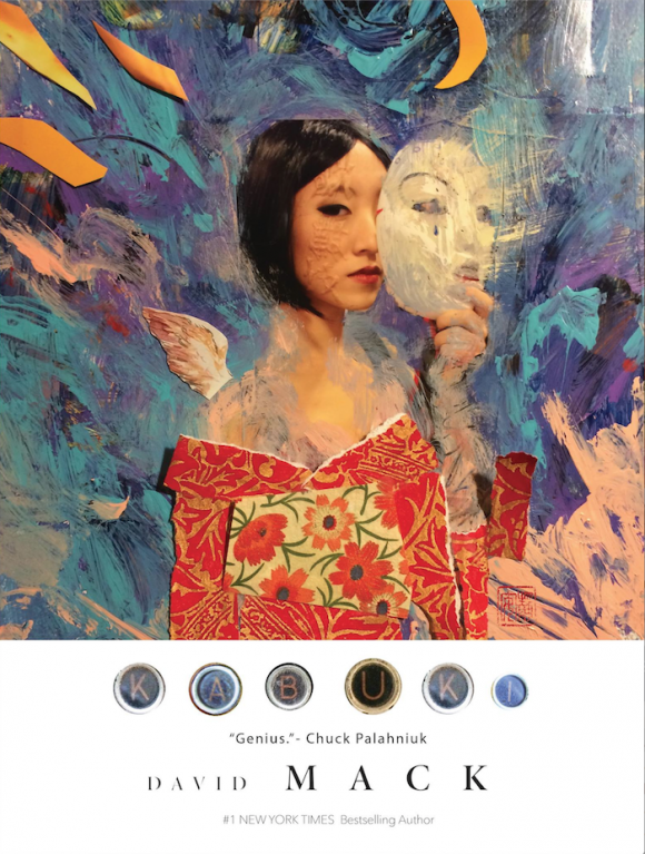
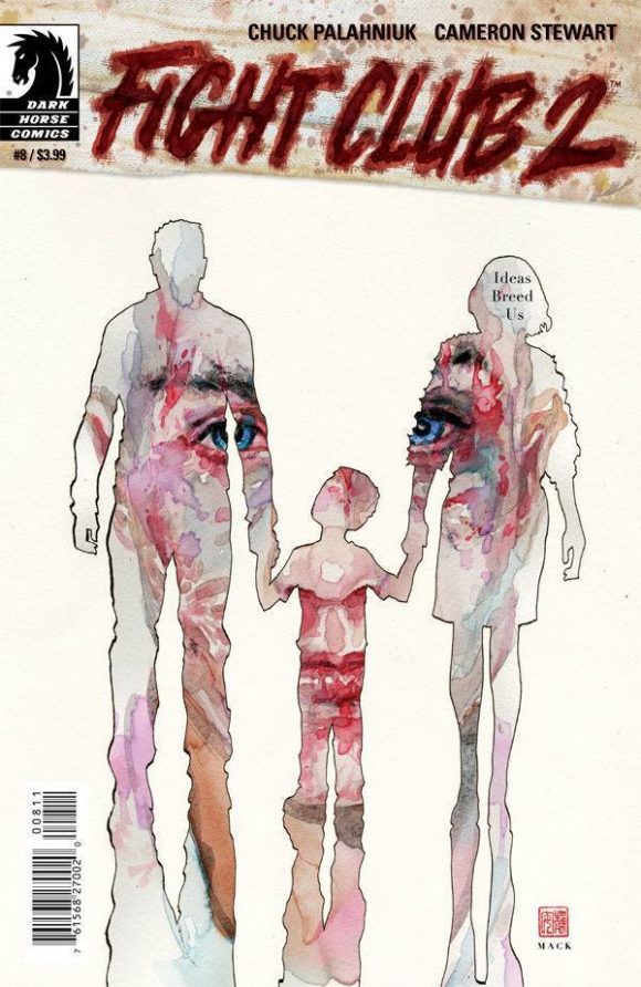
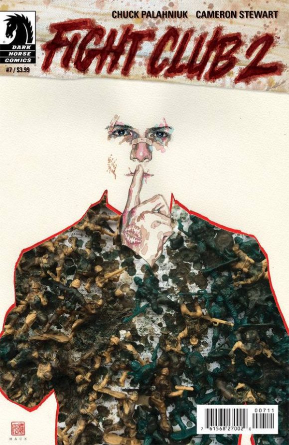
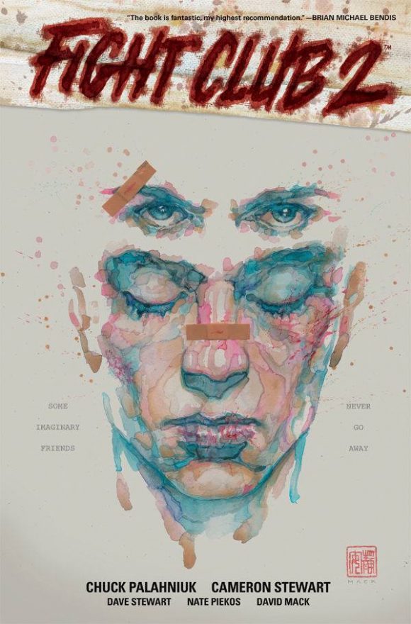
13. In most cases (American Gods, Fight Club 2, Jessica Jones, Kabuki, Daredevil) I am doing all of the covers of the series, and complete arcs. In that case you want each cover to feel like it is part of a family of that sequence, a story identity of covers, with each cover still showcasing the contrasts and themes of that particular issue, but inclusive to the themes of the overall story arc.
—
American Gods is out 3/15 from Dark Horse.
Trackbacks/Pingbacks