
A BIRTHDAY SALUTE: Our resident Marvel expert, Jim Beard, pays homage to the late creator, who was born 78 years ago…
By JIM BEARD
The late, great Dave Cockrum was an all-around comics creator, being both an artist and writer, but when I think back on his legacy in the industry, my mind’s eye goes zooming to his character designs. To that end, I’ve cobbled together 13 FABULOUS DAVE COCKRUM MARVEL CHARACTER DESIGNS to celebrate the man’s birthday. (He was born Nov. 11, 1943.)
NOTE: You may be saying, “Oh, same-old, same-old, we all know Dave was a fantastic designer,” but just to shake things up a bit, I’ve seeded this list with some off-the-beaten-path favorites of mine… and you won’t know what they are unless you take a leap of faith with me, True Believer!
In no specific order…
—
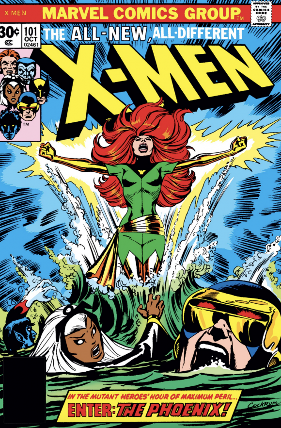
Phoenix. Let’s start with greatness, shall we? Dave’s costume for the transformed Jean Grey in X-Men #101 is a stunner, plain and simple. It has his requisite sash, sure, but I love that black wedge-shape with the abstract avian symbol, and the colors combined with Jean’s red hair make for a splash in X-Men history that will never be forgotten.
—
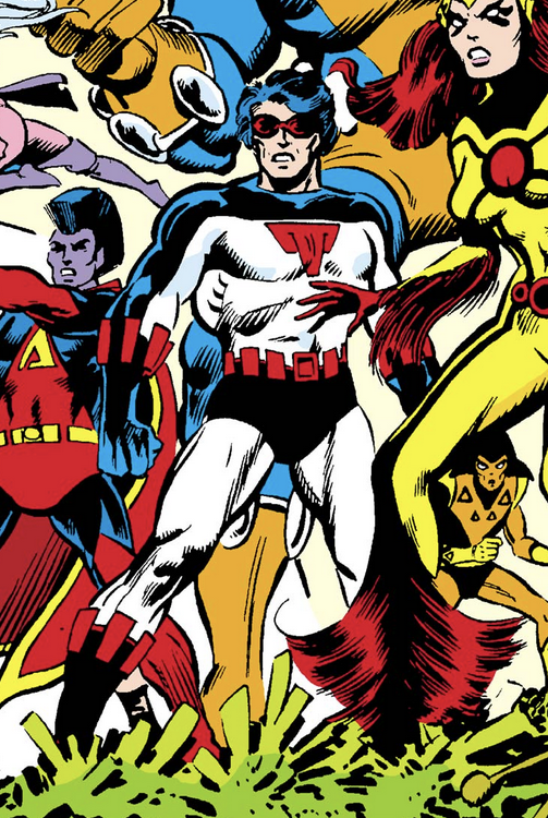
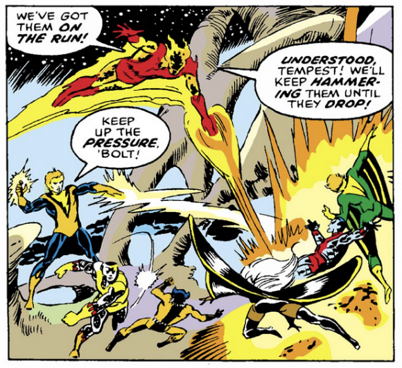
Smasher. Ah-ha! Yes, I’m going places no Cockrum Costumes list has never gone! First appearing in X-Men #107, the dashing dude designated as Smasher made a smashing impact on my eyeballs with that get-up. I really dig the simplicity of the suit, as well as, again, the color combination. Extra points for a cool chest symbol that may or may not have anything to do with “smashing.”
—
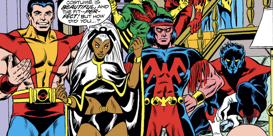
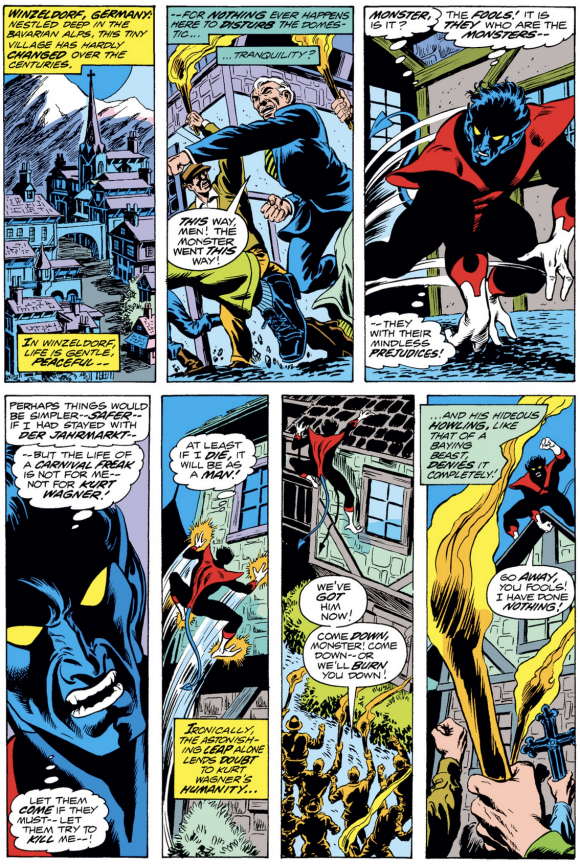
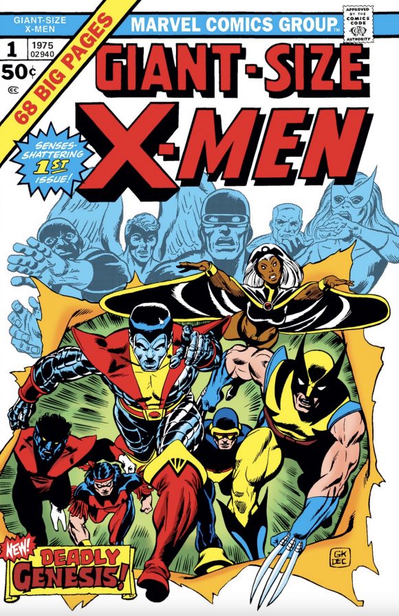
Nightcrawler. Legend has it that Nightcrawler was brought over from DC to Marvel when Dave jumped ships, and in doing so made mutant memories at the House of Ideas. This is one of those times when it’s not just a costume design, but an overall character visual for the win. Kurt Wagner’s Giant-Size X-Men #1 look just screams “swashbuckler” while his physical form screams “demon from Hell.” This has to be one of Cockrum’s best.
—
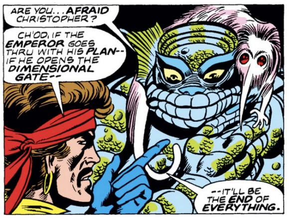
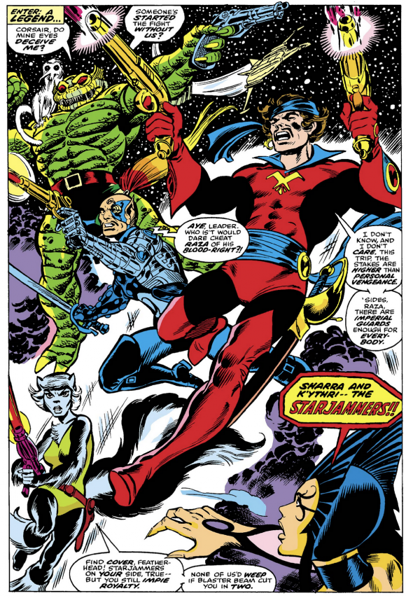
Ch’od. Who doesn’t love the Starjammers, right? X-Men #104 introduced Dave’s space-faring squadron to an unsuspecting readership, and towering above them was this gorgeous guy. A little bit Creature from the Black Lagoon, a little bit Incredible Hulk, and all stuffed into the Thing’s trademarked trunks. Ch’od reminds me a bit of Marvel’s Manphibian—no surprise since they were both designed by Dave.
—
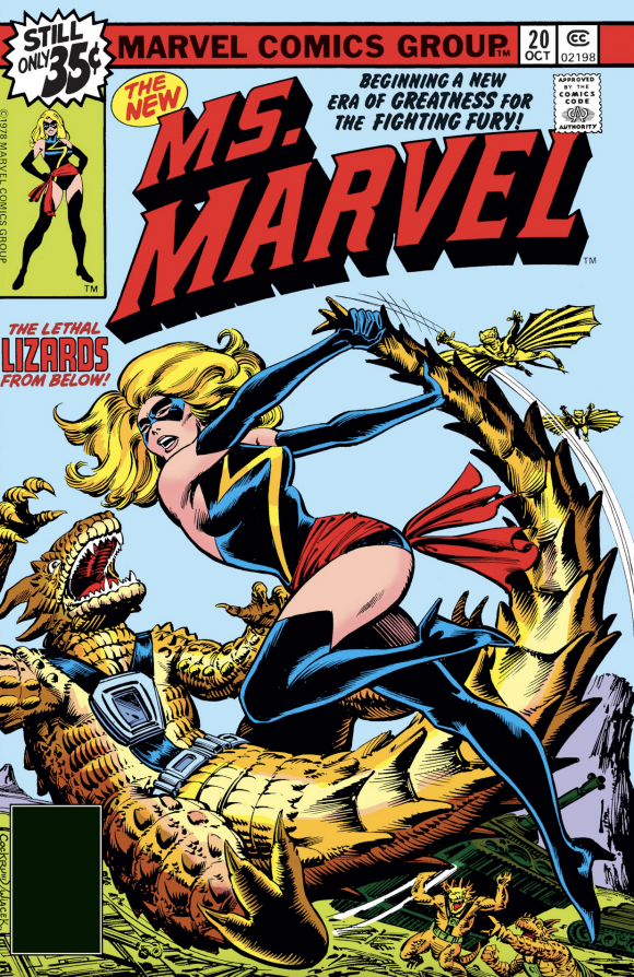
Ms. Marvel. Let’s take a break from the X-Universe and return to the lovely ladies. Where better to go than Dave’s delicious design for Carol Danvers’ second sartorial stunner, as seen in Ms. Marvel #20. It’s got all the Cockrum clichés, sure—sash, high-top boots, etc.—but with color and a whole lotta pizzazz, he brought it together and absolutely boggled the mind of my 13-year-old self when I first saw it on the stands.
—
Colossus. This is another example of Dave’s overall character design of combining physical attributes with a uniform. Piotr made his debut in Giant-Size X-Men #1 and what I love about this is not only the banded look of the man-mountain’s armored skin and the “empty” eyes, but the bold Russian red and the detail work on his boot tops and the belt.
Gil Kane pencils, Cockrum inks
—
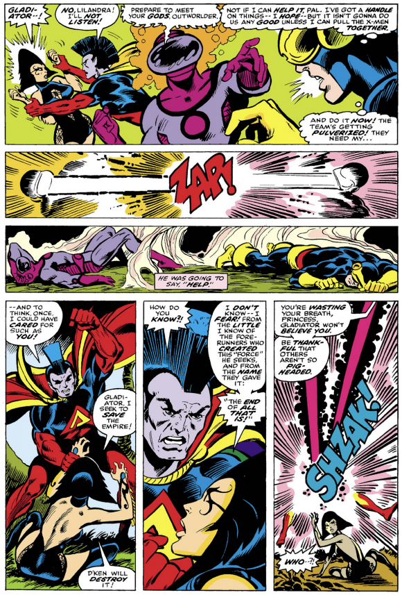
Gladiator. Look past the mighty mohawk you first saw in X-Men #107 and feast your eyes on the glory that is Dave’s design for the leader of the Shi’ar Imperial Guard. The colors! The cape! And another weird chest emblem that only made sense to Dave! The whole ensemble just seethes with power—which is a pretty good thing for a Marvel analogue to DC’s Superboy/Superman.
—
Starbolt. Let’s stay with the Imperial Guard for a moment, shall we? When I pursue the length and breadth of these characters in Cockrum’s illustrations for the Official Handbook of the Marvel Universe, my peepers pop at the cosmic crackle of Starbolt. Look at those wisps of energy coming off his “boots” and “gloves” and “tunic”… and just look at that menacing deep-space face. Just love this guy.
—
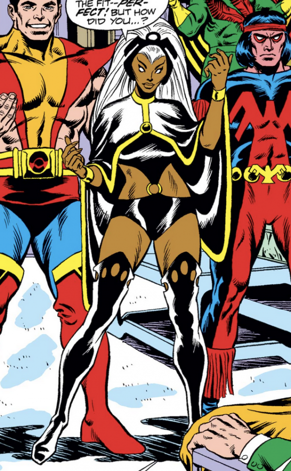
Storm. Would this list really be anything without Ororo? There’s just so much of Dave’s favorite motifs in her design, but I give extra credit for the way her cape flows, being almost a part of her tunic, and that incredible headdress. Let’s not forget Dave’s boot-top touches with those oval cut-outs, and the white hair and white eyes… kind of chilling in a way, eh?
—
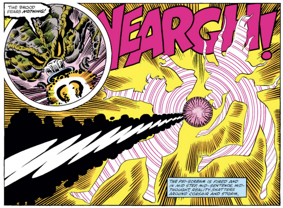
The Brood. I always saw these guys as a Marvel version of the “xenomorphs” from Alien, etc., so when compiling this list I looked it up and found they first appeared in X-Men #155 in 1982, so I’m figuring I’m not too far off the mark. (The movie came out in ’79.) Still, Dave endowed these buggers with a lot of buggy baggage, making them some of the creepiest creatures to ever haunt the nightmares of the Marvel Universe’s denizens. Pure evil.
—
Corsair. I’m going to go back to that idea of “swashbuckling” in Dave’s designs, and what better example after Nightcrawler than Cyclops’ old man, Corsair, from X-Men #104. It’s got it all: headband, sash, high-top boots, color scheme… and porn ’stache. And of course, one of Cockrum’s best abstract chest emblems. This one might be my favorite.
Issue #107
—
Black Cat. Didja know Dave designed Marvel’s Black Cat? According to Felicia Hardy’s co-creator Marv Wolfman, the original visuals for the feline thief were crafted by Cockrum, but were drawn by artist Keith Pollard for the Cat’s first turn in Amazing Spider-Man #194. I’ve always liked the look; sleek and simple.
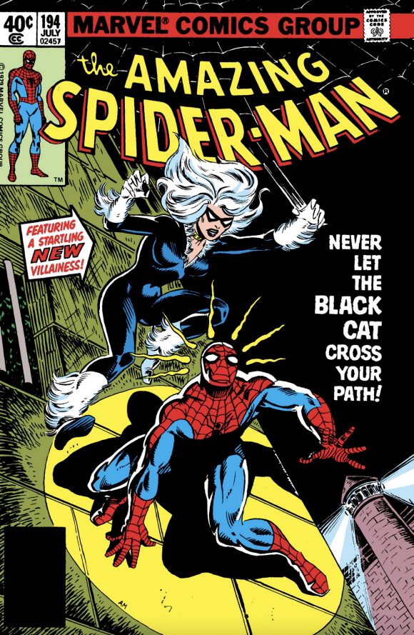
Al Milgrom
—
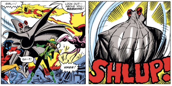
Webwing. I’ve saved the very best, my most favorite, for last. Ladies and gentlemen, I give you the gruesome glory of… Webwing! Introduced in Uncanny X-Men #157 as neither a Starjammer nor a member of the Imperial Guard — Ha! Gotcha! — this dastardly dude’s debut still turns my stomach, a testament to Dave’s genius with way-out weirdies. And you don’t get more way-out than this one.
—
MORE
— ROY THOMAS Details DAVE COCKRUM’s Role in Revamping the X-MEN. Click here.
— 13 GROOVY THINGS About Jim Starlin’s CAPTAIN MARVEL #32. Click here.
—
Jim Beard has pounded out adventure fiction since he sold a story to DC Comics in 2002. He’s gone on to write official Star Wars and Ghostbusters comics stories and contributed articles and essays to several volumes of comic book history. His prose work includes his own creations, but also licensed properties such as Planet of the Apes, X-Files, Spider-Man, Kolchak the Night Stalker and Captain Action. In addition, Jim provided regular content for Marvel.com, the official Marvel Comics website, for 17 years.
Check out his latest releases, a Green Hornet novella How Sweet the Sting, his first epic fantasy novel The Nine Nations Book One: The Sliding World, and the most recent Batman ’66 books of essays he’s edited: Zlonk! Zok! Zowie! The Subterranean Blue Grotto Essays on Batman ’66 – Season One and Biff! Bam! Ee-Yow! The Subterranean Blue Grotto Essays on Batman ’66 – Season Two.
November 11, 2021
I always saw a lot of Colossus Rex in C’hod’s design.
November 11, 2021
The Imperial Guard are the Legion of Super Heroes. Smasher’s chest design identifies him as the Ultra Boy of the group.
November 11, 2021
I never say “same old same old” with Cockrum. He gets a lot of push back these days from people who look at his stuff and say its cliche or old. But i think thats because HIS design elements have been used so much that newer readers today forget that he set the patterns for flashy , cool looking costume designs when he was on Legion of Super Heroes. The sash and high boots may be “tropes” now – but when Phoenix emerged from below Jamaica Bay’s waters – it wasn’t. Like you, Mr Beard, it was a cool and stunning design that set Phoenix apart from even the coolest LSH design (like Phantom Girl – one of my favorites).
I absolutely agree with you on Smasher too. He drew his men as sexy as his women. I think of the Guard – he hit a lot of home runs or at least third base with them. Nightside and Oracle (especially when compared to that hideous redo in the 90s) among my favorites .
So. What do you think are some of his misfires? (not limiting to Marvel)? One if my misfires is the Shi’ar costume for Polaris. I just like her original costume better and wish he would have “Cockrumes” it. I’d even take a green sash! Lol.
Thanks for sharing these
November 11, 2021
Thanks for taking the journey with me. I don’t know if Dave ever had a true misfire, but there are ones I just don’t care for, like Oracle of the Guard, and Hepzibah of the Starjammers.
November 11, 2021
Happy birthday to the late Mr. Cockrum.
November 11, 2021
Dave always told me that the Imperial Guard was his homage to the Legion of Superheroes, which he re-costumed for DC.
This was a nice article. thanks for remembering him on his birthday!
November 11, 2021
Thank you, Paty! All the best!
November 11, 2021
Thank you so much, Ms. Cockrum, for your kind words! I had such a fun time doing this – Dave’s designs made it such a pleasure. He really lives on in these characters.
November 11, 2021
Wonderful list. Gladiator panel and Corsair evoke happy memories . Fabric of my youth.
November 12, 2021
That was a fun trip through Cockrum’s wonderful designs. In addition to being just an all-around great artist and storyteller, Cockrum stands apart with his costume design work. Many comic artists are called upon to create character looks out of thin air, but few excelled at it like Cockrum.