BRONZE AGE BONANZA begins its sixth year!
—
Welcome to BRONZE AGE BONANZA — our monthly series that looks at the greatest covers of the Bronze Age — exactly 50 years later. For more info on this feature, click here.
—
Wow, we’ve completed the first half of the ’70s and now we’re plowing ahead to 1975! Like January 1974, Gil Kane starts the year in dominant form, with no less than five covers on the list. But does he take the top slot? Or is it maybe Jim Aparo? Or Mike Kaluta? Or Dick Giordano? Read on!
Dig the TOP 13 COVERS OF JANUARY 1975 — RANKED:
—
13. Plop! #11, DC. With the number of times Basil Wolverton shows up in BRONZE AGE BONANZA, you’d think I was a fan. I’m actually not. I find his work so grotesque that it’s repellent. But, like a car crash, I cannot look away — and it always gets a reaction out of me. I also marvel at his precision and outrageously bizarre inventiveness. And, that my friends, is art.
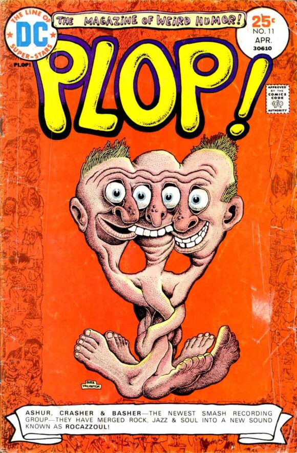
Basil Wolverton
—
12. Wonder Woman #217, DC. No, Green Arrow, you have not freaked out, In fact, this is a little much, don’t you think?
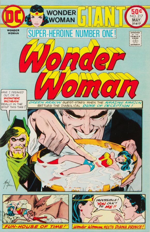
Mike Grell
—
11. Spidey Super Stories #7, Marvel. Spider-Man vs. the Lizard by John Romita is a virtual lock to make this list. Just on principle. Plus, I really like the dominant green background up top. And two appearances by Easy Reader!
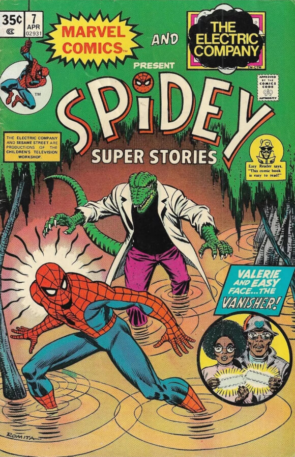
John Romita
—
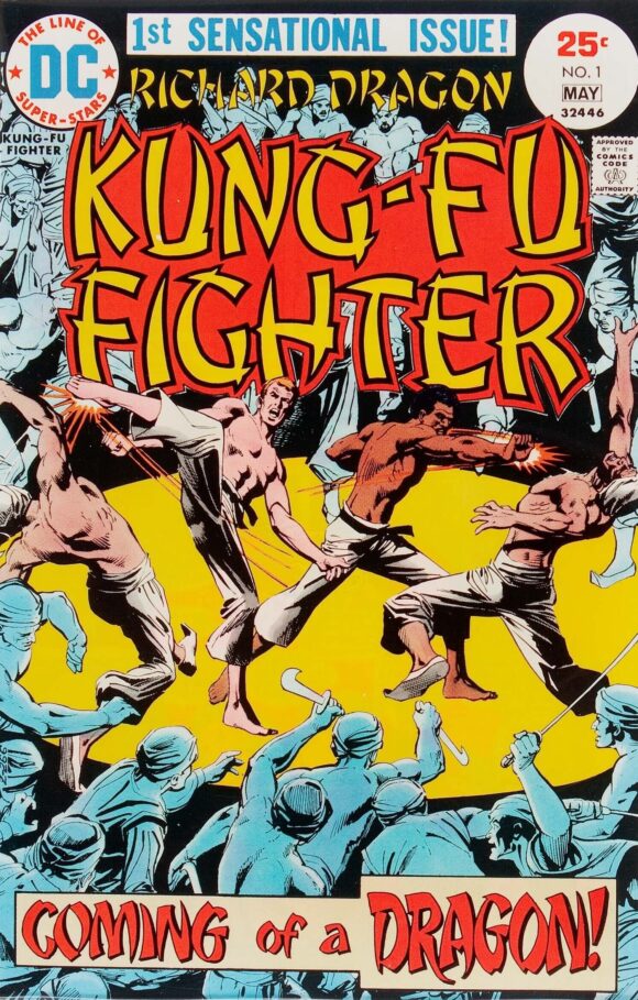
10. Richard Dragon, Kung-Fu Fighter #1, DC. Carl Douglas was right.
Dick Giordano
—
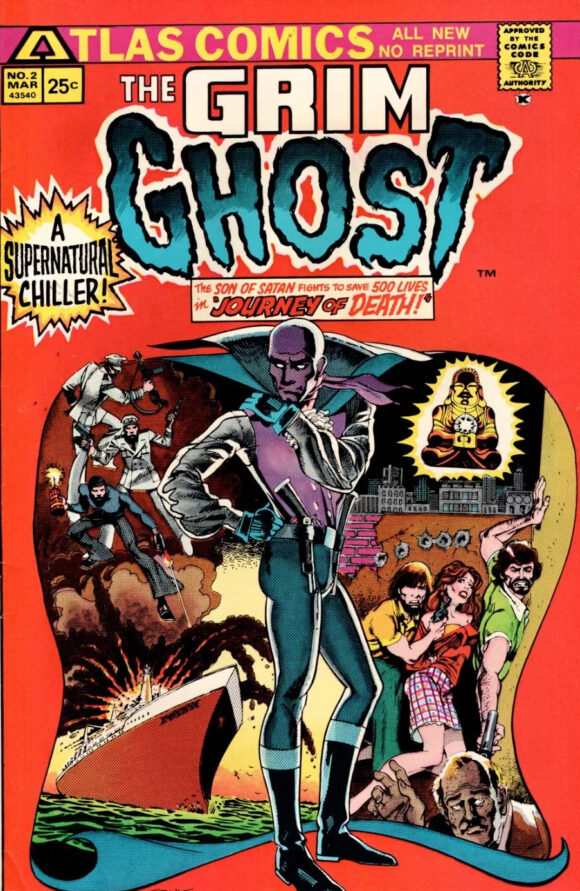
9. The Grim Ghost, Atlas/Seaboard. Like Atlas itself, this cover is all over the place. Plus, the Ghost’s legs are oddly skinny and I can’t quite get a read on his facial expression. But I still like it, particularly the striking color background. Also: “All New No Reprint.” Ha!
Ernie Colon
—
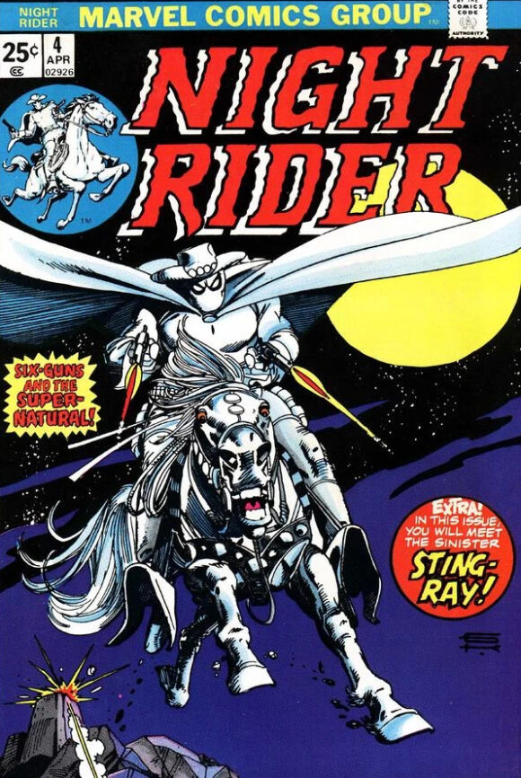
8. Night Rider #4, Marvel. Just a terrific, posterish cover by Gil Kane. The linework on Banshee is particularly impressive. Fantastic colors, too, though the colorist is unknown.
Gil Kane
—
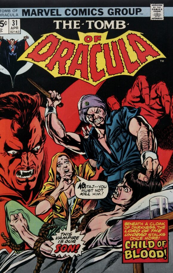
7. Tomb of Dracula #31, Marvel. Get ready for a run of Kane covers here. Drac looks particularly ferocious as a looming presence and Taj appears to be a little too eager to kill his son. Drama! Dracula all in red on top of a black background is an inspired choice. Inker Tom Palmer may have also been the colorist.
Kane pencils, Tom Palmer inks
—
6. Marvel Team-Up #32, Marvel. I love Kane’s kineticism but I’m not sure any human could contort themselves the way the Torch does here. No matter. It looks great. And check out Johnny’s head: Kane gives him a skull-like appearance that is downright creepy and off-putting. Because, really, if you saw a guy with his head on fire, you’d probably be terrified.
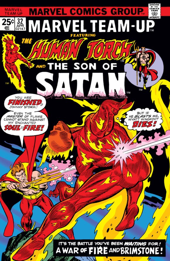
Kane pencils, Frank Giacoia inks
—
5. Marvel Double Feature #9, Marvel. I’m always impressed when artists throw themselves at a reprint-book cover with the same verve they do a regular comic. Kane (with fab Romita inks) takes advantage of the limited space afforded him by the oppressive banner to give us a gripping, intense, close-quarters battle between Captain America and Batroc. The yellow background and its lack of detail also work to force Cap and the Leaper into the foreground, with the shield overlapping the banner intensifying the 3D effect. Outstanding.
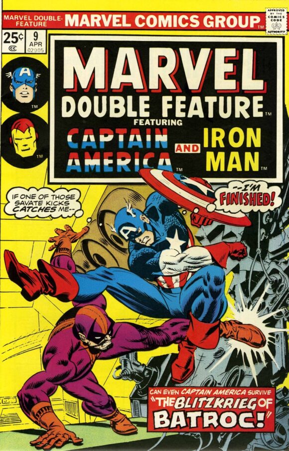
Kane and Romita
—
4. Giant-Size Spider-Man #4. Five in a row for Gil Kane! This just looks like it hurts.
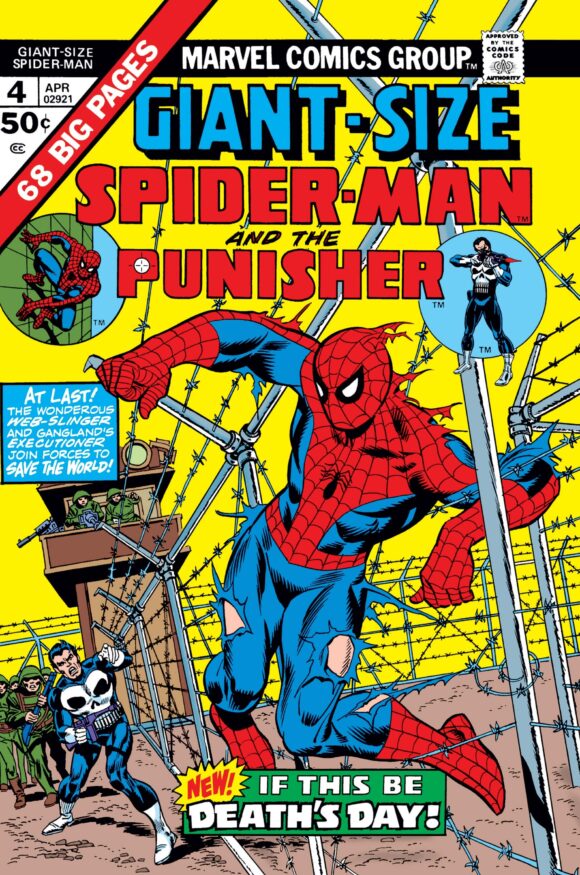
Kane and Giacoia
—
3. Limited Collectors’ Edition #C-35, DC. Great use of the Jackson Bostwick publicity shot and smart choice to frame it all in bright yellow. Fair to compare a photo cover — and a treasury edition at that — against standard covers? A cover is a cover, and that’s what this is all about. So, yes.
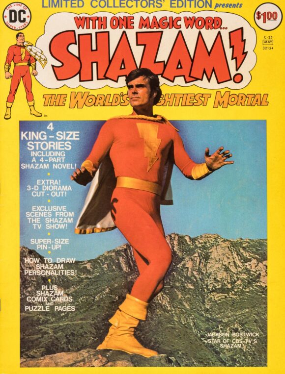
—
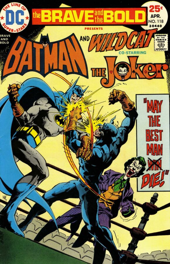
2. The Brave and the Bold #118, DC. One of Jim Aparo’s all-time best B&B covers. Batman and Wildcat were always a natural pairing (continuity be damned) and Aparo uses their inherent physical strength — and human vulnerability — to bring you an in-your-face slugfest for the ages. These are not two superheroes, these are two men and they are in an all-out brawl.
The Dutch angle, the spotlight effect and — most importantly, by far — the sheer power of the artist’s trademark exploding punches make this a masterpiece of muscular violence. Plus, the Joker is absolutely having the time of his life! (BONUS: I do believe that this is the first appearance of the classic, never-should-have-been-changed Bronze Age Joker logo.)
Jim Aparo
—
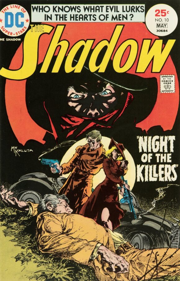
1. The Shadow #10, DC. One of Mike Kaluta’s best Shadow covers, which is saying something. The Shadow has never looked this frightening (or pissed) — you’d think he was the villain — and the orange moon, offset by the black background, provides a dramatic frame. Actually, come to think of it, there are two moons on the cover — and they complement each other perfectly. This is harrowingly, hauntingly beautiful pulp.
Mike Kaluta
—
MORE
— BRONZE AGE BONANZA: The 1975 INDEX. Click here.
— BRONZE AGE BONANZA: The 1974 INDEX. Click here.
—
Comics sources: Mike’s Amazing World of Comics and the Grand Comics Database.

January 19, 2025
Good selections as always, Dan! This is a great feature! I love the Aparo cover for B&B #118 & echo your sentiments regarding Wildcat and the Joker logo! I also would include Aparo’s cover for Detective #446, which has always been one of my favorites. Interesting note, I believe that January 1975 was the first month since July 1973 to have all 3 of the Batman titles at the time (Batman, Brave & Bold, Detective) on sale.
January 19, 2025
No. 12. Props to Grell for (it appears) drawing the little illustrations for the reprint stories, instead of (as was the custom with most artists on the 100 pagers) leaving them for the production office to paste up from the interior artwork.
No. 2. As goofy as Haney could be, his Joker stories were every bit as a good as the ones the main bat-books of the era and, sometimes, arguably better. His Joker was every bit the insane killer that you got in “the Joker’s Five Way Revenge” and, of course, Aparo was at his peak, with a Joker that rivaled even Adams’ version. And Wildcat never-ever-looked better than when Aparo drew him. I can see why they brought him back more than any other JSA’er other than, maybe, the Spectre.
January 20, 2025
Agree with you 100% on the Bronze Age Joker logo. Also, I prefer Wildcat with just basic blue boots. You put claws on the boots? Now you’re getting silly!
January 21, 2025
Great covers! Totally agree regarding the Joker logo!
January 23, 2025
funny how cap is the one leaping, not Batroc…the Leaper.
Gil Kane was everywhere at this time.