
BRONZE AGE BONANZA begins its fifth year!

—
Welcome to BRONZE AGE BONANZA — our monthly series that looks at the greatest covers of the Bronze Age — exactly 50 years later. For more info on this feature, click here.
—
Here we are, gearing up for another year of BRONZE AGE BONANZA and this month features familiar names — most notably Neal Adams, Nick Cardy and Gil Kane, who dominates the list with no less than five covers. But does Kane take the top slot? Read on!
Dig the TOP 13 COVERS OF JANUARY 1974 — RANKED:
—
13. Fear #21, Marvel. We begin with Kane right off the bat. A nice, atmospheric “looming cover” with a surprising reliance on the color brown. I tell you, though, Kane gave Morbius the best head of hair in comics this side of Mar-Vell.
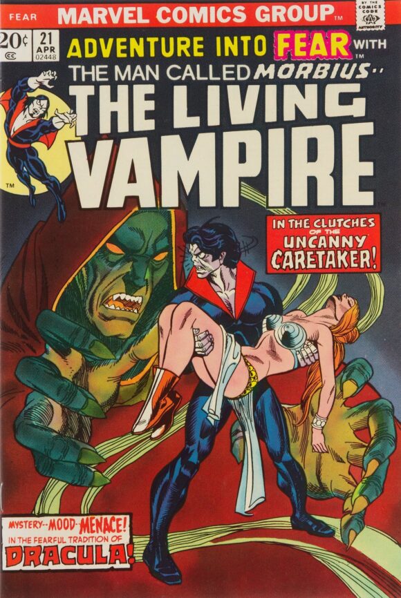
Gil Kane pencils, Frank Giacoia inks
—
12. Action Comics #434, DC. Is it safe?

Nick Cardy
—
11. Captain America #172, Marvel. I really dig the layout with the concentric circles of Banshee scream making everyone’s head explode. What really makes it though is the Falcon, the absolute picture of overwhelming distress. I mean, he’s even more freaked out than the Running Guy on the cover of Action Comics #1.

Kane and Giacoia
—
10. The Witching Hour #41, DC. When you see such clean covers by Nick Cardy like the one above, you tend to forget that he was just as capable of turning in disgusting ones like this.

Cardy
—
9. Archie Comics #233, Archie. Oh, Archie, enough with the bitching over your allowance. I don’t care what this day out cost, but you’re getting to spend it with the two prettiest girls in Riverdale, each wearing really cute winter fashions. Seriously, if you’d just turn around, you’d see the absolutely stunning sunset over the mountains as the other colorful iceboats whiz by. That’s a helluva sight and you’re wasting it feeling sorry for yourself. C’mon, what would you rather spend your money on? Comics? Jeez, man.
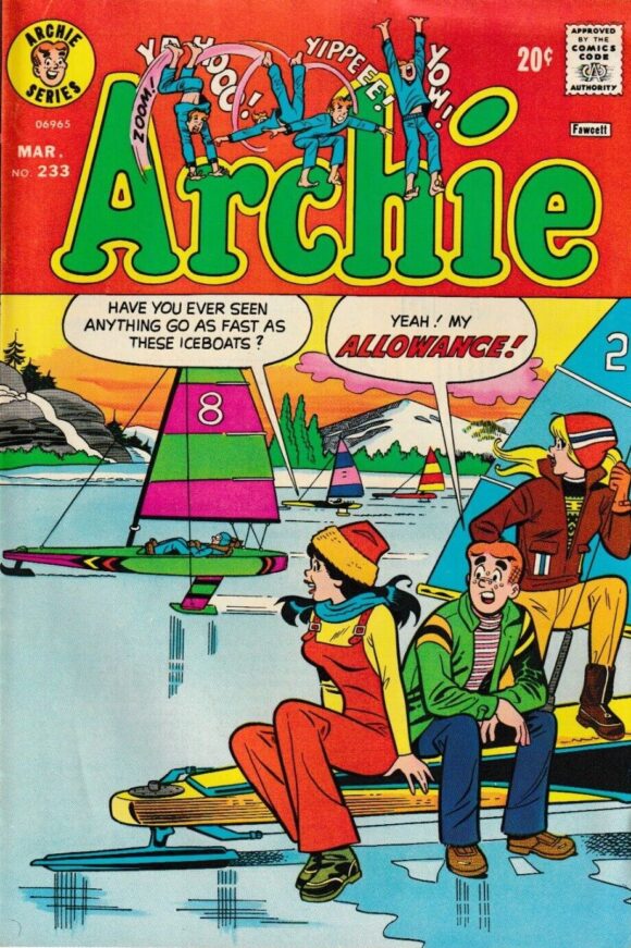
Dan DeCarlo pencils
—
8. Astonishing Tales #23, Marvel. I’ve said this before but I’ll just reiterate: Kane’s It is as good as any monster illustrated by Jack Kirby himself.
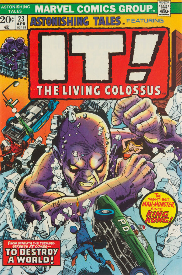
Kane pencils, Mike Esposito inks
—
7. The Shadow #4, DC. Mike Kaluta’s The Shadow #1 cover shocked Vegas oddsmakers by finishing a strong second in our TOP 13 COVERS OF 1973. This doesn’t quite hit that height but it’s a damn good pulpy cover nonetheless.
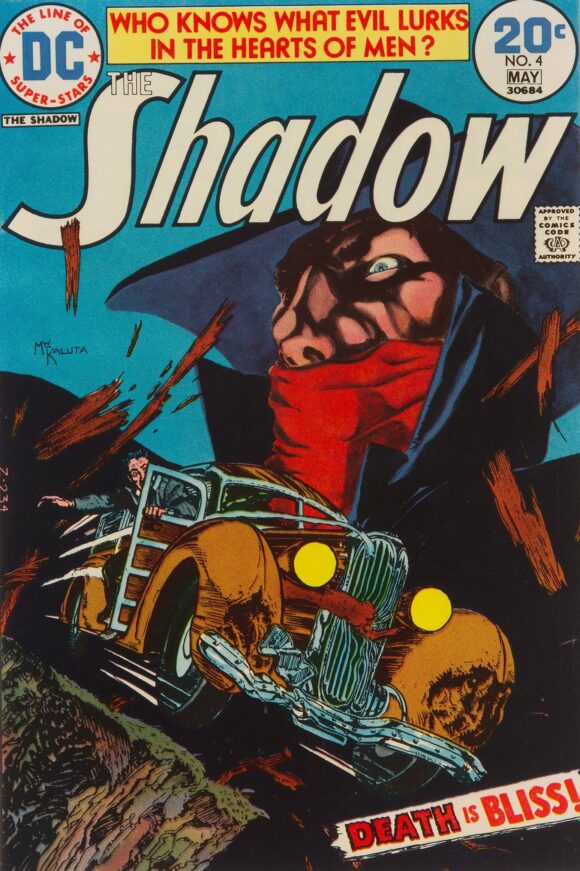
Michael William Kaluta
—
6. The Avengers #122, Marvel. I really love “Avengers Assemble!” covers where Earth’s Mightiest Heroes are comin’ atcha! You can call it a cliche if you like. I call it a mainstay. And when you have them bursting through comics pages, it’s just that much more fun.

Kane pencils, John Romita inks
—
5. The Amazing Spider-Man #131, Marvel. The whole Ock-May romance thing is so creepy but it’s also hilariously subversive. Gotta say, though, I much prefer gentle but wise Aunt May (think Rosemary Harris in Spider-Man 2) over gentle but vaguely dimwitted Aunt May. Anyway, this one’s a classic. Plus, how about that throwaway gag on the bottom right?

Kane and Giacoia
—
4. FOOM #4, Marvel. For the next three covers we get into dicey territory: repurposed art made more stunning by a powerful layout in an oversize format. Jack Kirby was gone from Marvel but editor Jim Steranko used this piece to create a fabulously bold cover by putting Dr. Doom against a blank background. The artwork pops, especially with that gigantic hand thrust at the reader. Like the next two covers, you could make a strong argument for best of the month, but I generally lean toward all-new art for that distinction.

Jack Kirby… probably. Most sources say it’s the King but at least one suggests it’s Steranko aping Kirby’s style.
—
3. The Spirit #1, Warren. Gorgeous launch to the Warren series. Basil Gogos, painter extraordinaire, based this cover on a Will Eisner splash from 1950. So, again, wonderful work that’s probably worthy of the top slot but just misses because of the image’s provenance.
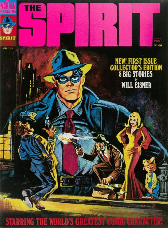
Basil Gogos/Will Eisner
—
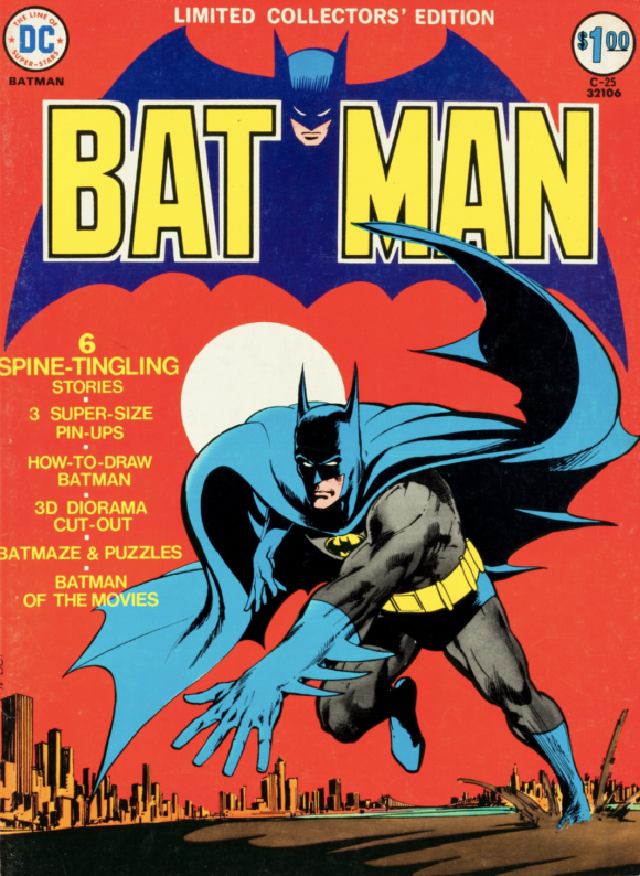
2. Limited Collector’s Edition #C-25, DC. It took Hal Jordan-level willpower not to put this in the No. 1 spot because, again, it’s a rejiggered image. Batman’s pose isn’t just Adams’ most recognizable, it’s one of the Darknight Detective’s most iconic. (Overused word that fits here.) It’s not a direct lift from the climax of Batman #251, but a recreation. Even with Sol Harrison’s spectacular colors, I can’t bring myself to place this at the top. Feel free to argue the point in the comments. (Side note: Batman’s first treasury! What a start!)
—
1. Conan the Barbarian #37, Marvel. But if I can’t put Adams’ Batman at the top, I can put Adams’ powerful, creepy and sexy Conan #37 at No. 1. One of the most memorable Conan covers ever, which is really saying something. Superb piece.

Neal Adams
—
MORE
— BRONZE AGE BONANZA: The 1974 INDEX. Click here.
— BRONZE AGE BONANZA: The 1973 INDEX. Click here.
—
Comics sources: Mike’s Amazing World of Comics and the Grand Comics Database.
January 14, 2024
I wish someone would make a T-shirt of that Dr. Doom pose.
January 14, 2024
I’m sorry, but the–iconically–striding Batman still beats Conan.
January 14, 2024
I have my doubts that the Doom is Kirby at least the left foot is definitively not his pencils. Ow! It looks mashed. The Limited Collector Edition should be #1 for no other reason than how fast it sold out. My 8 year old mind could not handle never owning that issue….. would be 50 years before I finally did. Thank you, eBay. Funny…I just picked up a used copy of the Spider-Man issue last week. Now I’m off to see if I can find a copy of Adam’s’ Conan.
‘74…..What a great start to the year.
January 14, 2024
I was today years old when I first saw the ‘throwaway gag’ on the Spider-Man No. 131 cover (and I’ve owned that issue since its publication 50 years ago). In my lame defense, the rest of the cover is pretty riveting.
January 14, 2024
BATMAN cover is #1 for me.
January 14, 2024
The Batman cover would be #1 for me, too. I have a lot of nostalgia for it since it was used on a good bit of merchandising in the 1970s.
Speakiing of merchandising, I believe some of the characters from that Avengers cover have popped on us some of the Marvel shirts that have composites drawn from different sources.
Nick Cardy did some of my favorite Superman covers, but that Action isn’t one of them. It is a unique situation, however.
January 14, 2024
“Is it safe?” LOL! I have the issue somewhere and my copy of Marathon Man which I read years later! Wonderful choices!
May 18, 2024
THE SHADOW #4 is one of the reasons I still enjoy The Shadow today. It was my first exposure to the character, when I was just about 10 years old.