
BRONZE AGE BONANZA enters its fourth year!

—
Welcome to BRONZE AGE BONANZA — our monthly series that looks at the greatest covers of the Bronze Age — exactly 50 years later. For more info on this feature, click here.
—
Hey, it’s January and we get to start covering a whole new year. It’s an eclectic slate this month and we’ll get right into it.
Dig the TOP 13 COVERS OF JANUARY 1973 — RANKED:
—
13. Casper Space Ship #5, Harvey. I just like it, OK? It gives me the warm and fuzzies.
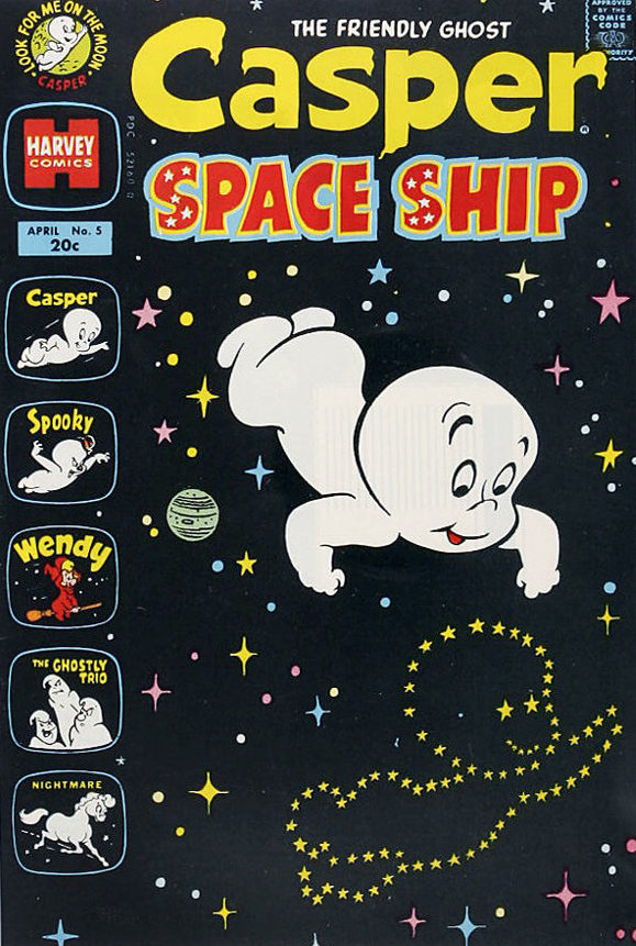
Unknown artist
—
12. Thor #210, Marvel. I’m pretty much a sucker for a good close-quarters battle cover a la Kirby, Buscema or, in this case Gil Kane (inked by Joe Sinnott).
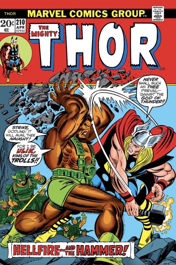
Gil Kane pencils, Joe Sinnott inks
—
11. Daredevil #98, Marvel. Nicely framed urban catastrophe with a kinda cool-looking villain and a fab Black Widow. This kind of explosive tableau can be hackneyed or effective. This one’s effective.
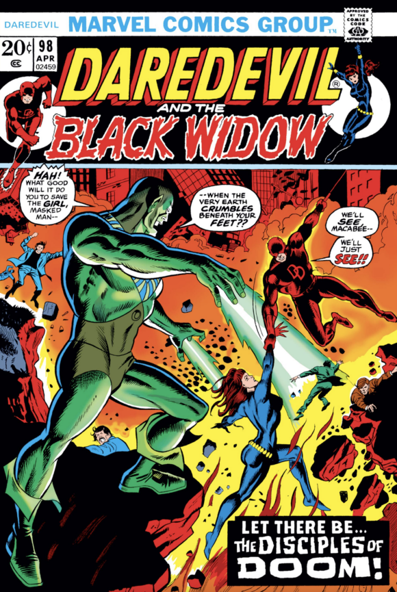
George Tuska pencils, either Tuska or Ernie Chan inks
—
10. Strange Adventures #241, DC. A nice, clean Nick Cardy cover. The menacing angle of the giant, misty hands is what makes it — it’s as if the cover were pulling you toward it on the spinner rack. Groovy.
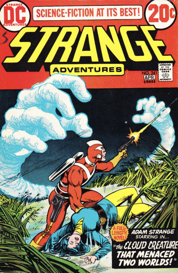
Nick Cardy
—
9. Astonishing Tales #17, Marvel. I never think of Ka-Zar fighting guys who look like this but maybe I haven’t read enough Ka-Zar. Either way, it’s that contrast between sleek Gemini and loin-clothed Ka-Zar that sells this one, beyond the dramatic action.
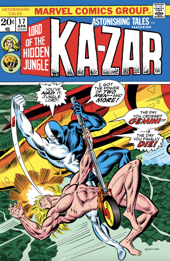
Dan Adkins
—
8. Korak #51, DC. You could argue that this one’s a bit too dark but the bold red behind Korak and the uplighting effect bring this one to the fore. Joe Kubert was another master at intense, close combat.
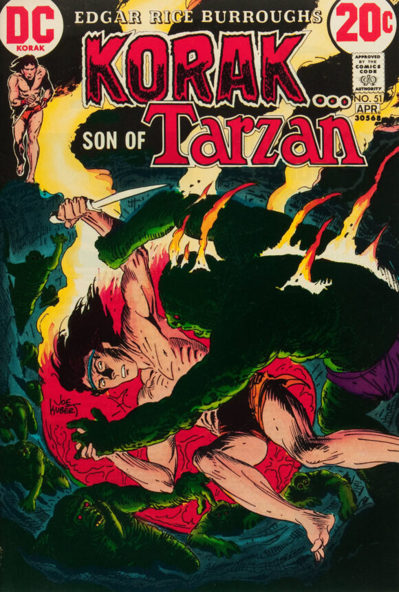
Joe Kubert
—
7. Star Spangled War #168, DC. The reaction-shot cover is a hoary chestnut but Kubert always made the concept work, especially when he was tapping into his antiwar leanings. To hell with you, Captain Gloryhound!
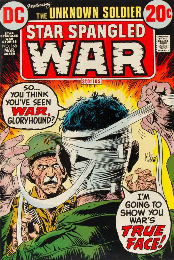
Kubert
—
6. Iron Man #57, Marvel. Dig that looming, ethereal visage of the Mandarin — it beautifully ties together an otherwise pedestrian layout. Major props to the colorist too. (Marie Severin?)
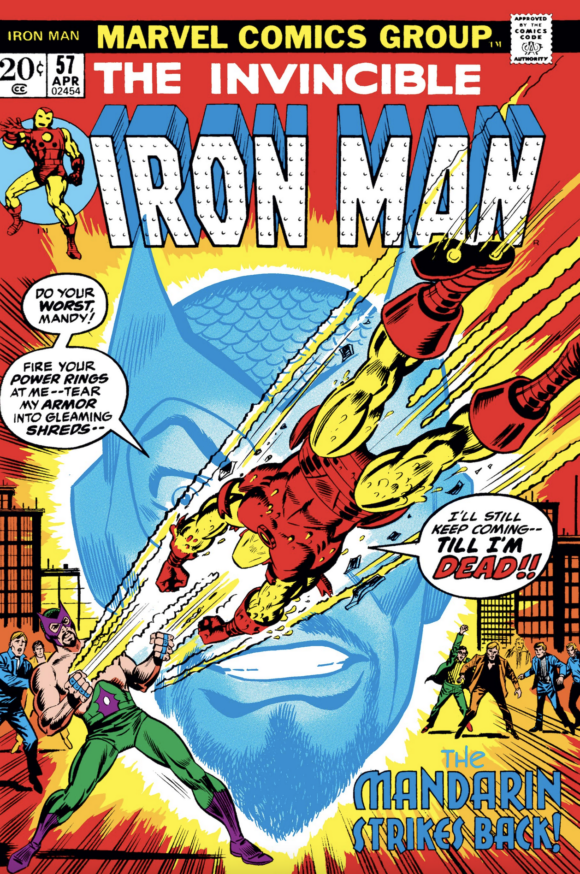
Tuska pencils, Frank Giacoia inks
—
5. Kamandi #4, DC. One of my fave Kamandi covers. Kirby brings on the danger, the bright red background really pops and we get a very 1970s shopping center, to boot. What’s not to like?
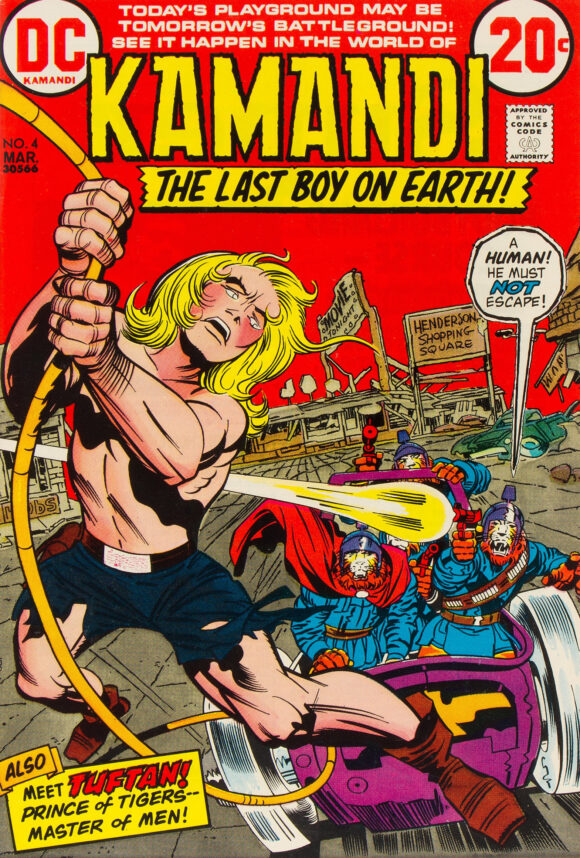
Jack Kirby pencils, Mike Royer inks
—
4. SHIELD #2, Marvel. A blaze of glory.
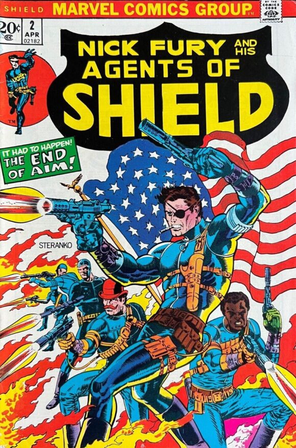
Jim Steranko
—
3. Wonder Woman #205, DC. One of the most (in)famous Wonder Woman covers of the era. It’s not just a bondage cover, it’s a mightily suggestive image that set adolescent boys a-twitter. I appreciate the return of the classic WW logo, which emphasized that Diana was back at her full powers after having lost them for years.
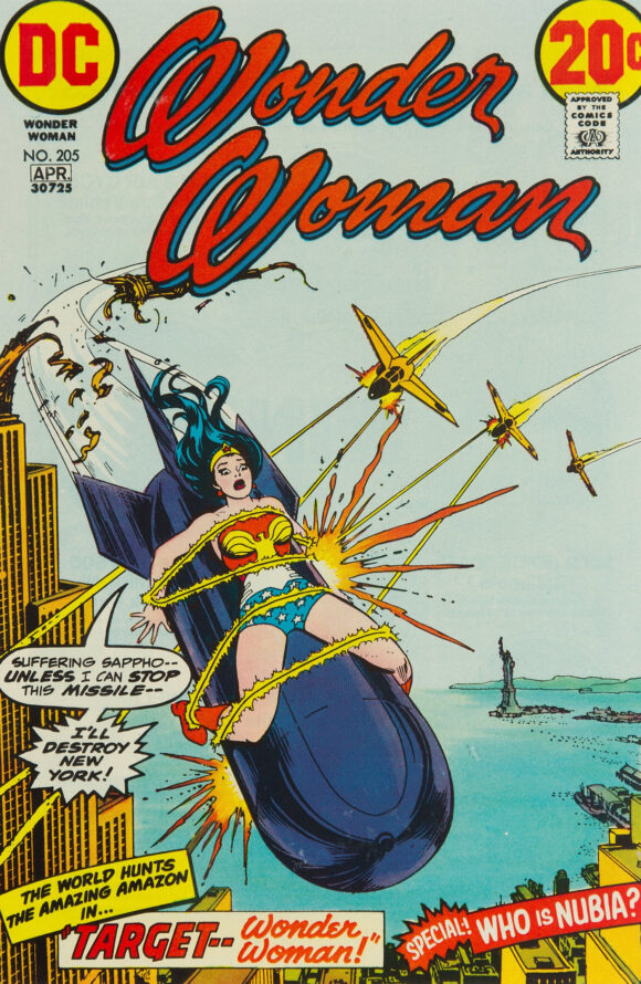
Cardy
—
2. The Amazing Spider-Man #119, Marvel. The first Spidey comic I ever got. Little did I know (or understand) what was coming in just a couple issues. That said, it’s a terrific showdown piece that’s dominated by the furious Hulk — which led Young Dan to believe that the green giant was a bad guy.
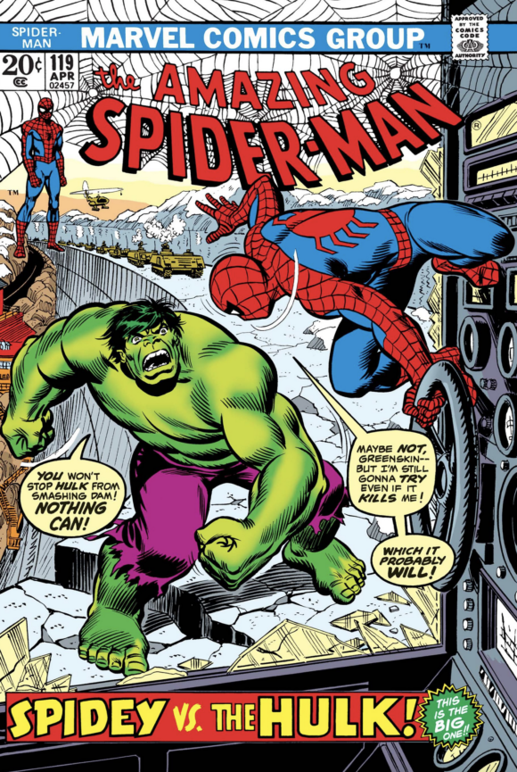
John Romita
—
1. Supernatural Thrillers #3, Marvel. I don’t know how long Gil Kane had to work on this one but it seems even more detailed and dramatic than his typically great fare. Niord’s ferocity is striking and that is one disgustingly beautiful giant worm. A powerful portrait of Robert E. Howard carnage.
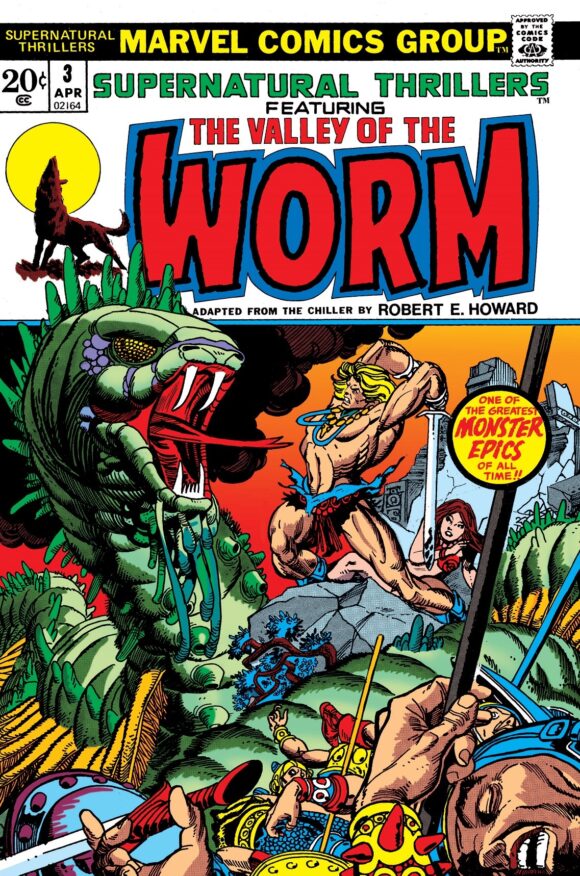
Kane
—
MORE
— BRONZE AGE BONANZA: The 1973 INDEX. Click here.
— BRONZE AGE BONANZA: The 1972 INDEX. Click here.
January 15, 2023
I always smile at Spidey’s two right hands on that cover. A rare flub by J.R.
January 15, 2023
I never noticed that!
January 16, 2023
are you sure?I see what you mean but don’t think is the case……. It’s a bit weird looking but looks like a left hand to me, with thumb facing up..
January 15, 2023
Gil Kane’s cover for The Valley of the Worm looks like proto-Sword of the Atom 10 years later.
January 15, 2023
particularly #3
January 15, 2023
I see Kane was capable of swiping from himself. Sword of the Atom #3 is VERY reminiscent of Valley of the Worm.
January 15, 2023
I always enjoy your monthly cover countdowns! Two things surprised me this month. First, you didn’t find a spot on the list for Jim Aparo. This was his heyday and he drew two great covers for Jan. 1973 – Phantom Stranger #24 and Brave & Bold #106! More shocking to me was the placement of Amazing Spider-Man #119. I consider this one of the iconic covers of the 1970s (I also never noticed the two right hands)!
January 24, 2023
What can I tell ya? Ya pays yer money, ya takes yer chances! 😉