
BRONZE AGE BONANZA: Kirby! Kaluta! Wrightson! Windsor-Smith! MORE!

—
Welcome to BRONZE AGE BONANZA — our monthly series that looks at the greatest covers of the Bronze Age — exactly 50 years later. For more info on this feature, click here.
—
We’ve been doing BRONZE AGE BONANZA for more than 2 1/2 years now and rarely have I seen a month with as an eclectic assortment as we have this time around.
There are all-time greats, a bunch of #1s, fun weirdness, quite a bit of horror and an array of artists that stretches from Jack Kirby to “Unidentified.”
So dig THE TOP 13 COVERS OF AUGUST 1972 — RANKED:
—
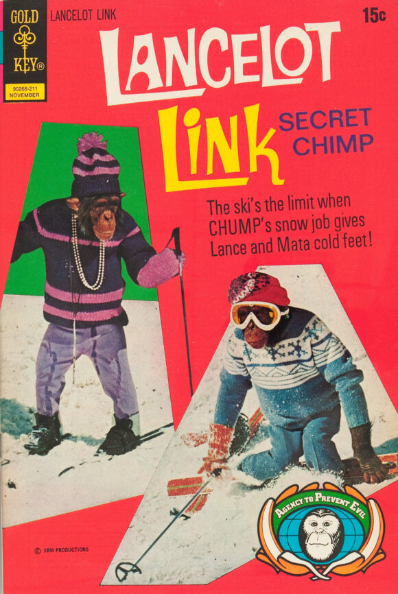
13. Lancelot Link, Secret Chimp #7, Gold Key. Again, as long as there’s a Lancelot Link comic, it makes this list by default. Sadly, there’s only one more to come.
—
12. Casper’s Ghostland #69, Harvey. Harvey Comics don’t typically make this list. Not that I have anything against them, it’s just that there’s a sameness to them. At least to these jaundiced eyes. But this one is so dang colorful and so dang cute, I had to include it. Sweet.
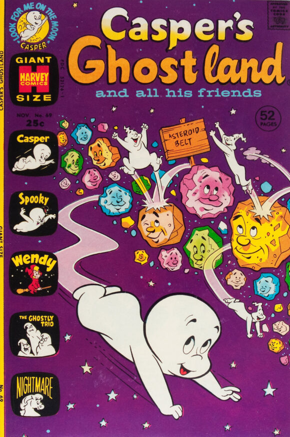
Unidentified
—
11. The Cat #1, Marvel. For a character who only lasted only a few stories in this iteration — the Cat later became Tigra and Patsy Walker took over the act as Hellcat — this is one of the more enduring covers of the Bronze Age. Because it’s a good one.
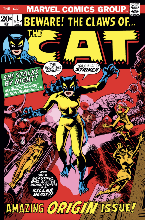
Marie Severin pencils, Wally Wood inks
—
10. Night Nurse #1, Marvel. Like the Cat, Night Nurse was created to try to lure female readers. Didn’t really work out that way. Anyway, I’m sure I’m not the first to make this joke, but how about a Night Nurse/Lady Cop, Marvel/DC crossover?
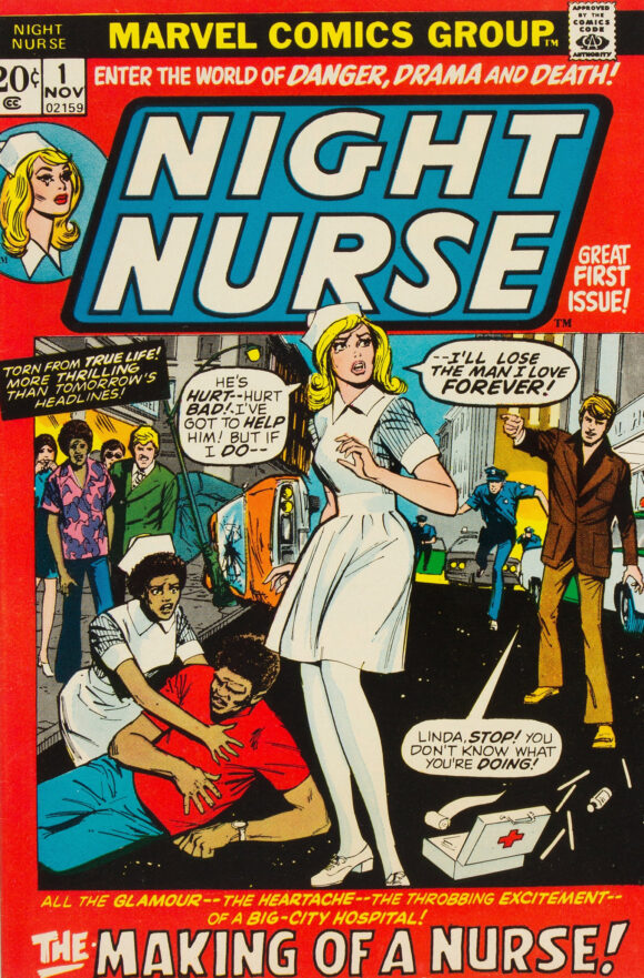
Win Mortimer
—
9. The Flash #218, DC. This is one of the more memorable Flash covers of the ’70s and it’s definitely groovy. But what really make it are the details: The yellow framing is a really interesting design choice and the dude on the left making the universal “He’s crazy” sign is a funny gag that you could easily miss if you weren’t paying attention.
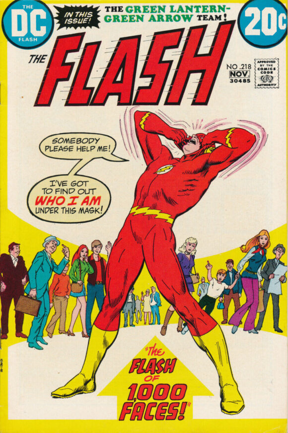
Nick Cardy
—
8. Haunted #8, Charlton. Just wait until you get closer to No. 1. We’ll talk then.
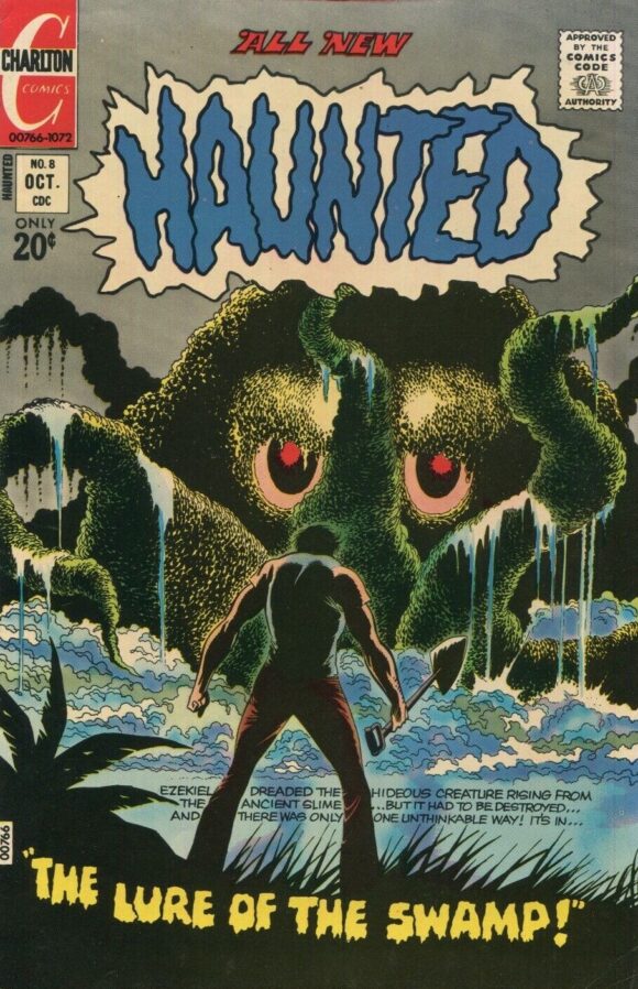
Jack Abel
—
7. Conan the Barbarian #20, Marvel. Barry Windsor-Smith just plain made comics better.
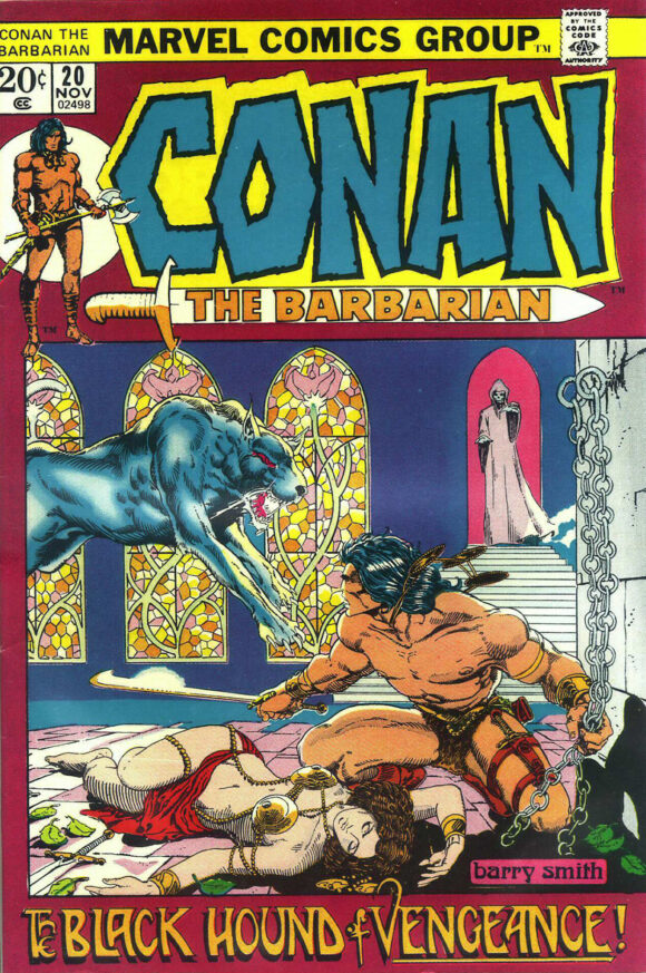
Barry Windsor-Smith
—
6. Weird Western Tales #14. This is a great cover, beautifully executed by Tony DeZuniga — the sun is smack in the middle while everything else is skewed angles and intense suspense. DC wisely chose to leave the image alone, accompanying it only with the trade dress, but the unsung hero here is the unidentified colorist. Damn!
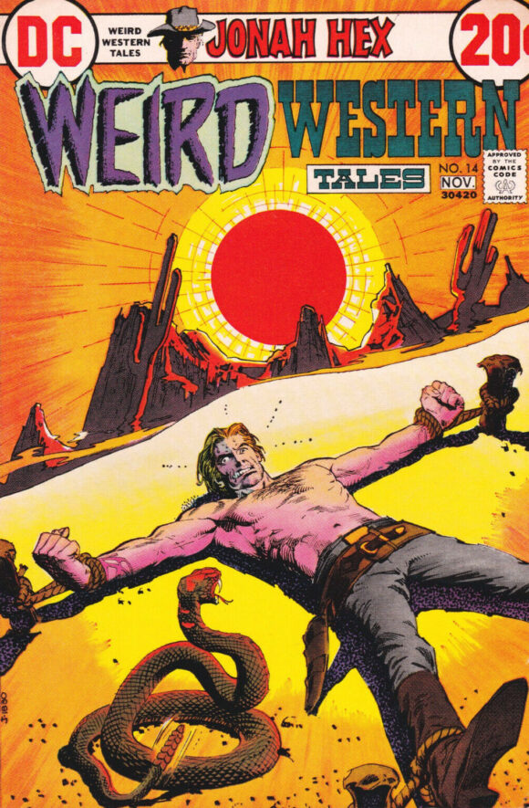
Tony DeZuniga
—
5. Captain America #155, Marvel. A classic Cap cover that would be the top pick in many other months. It just so happens this is a particularly tough month.
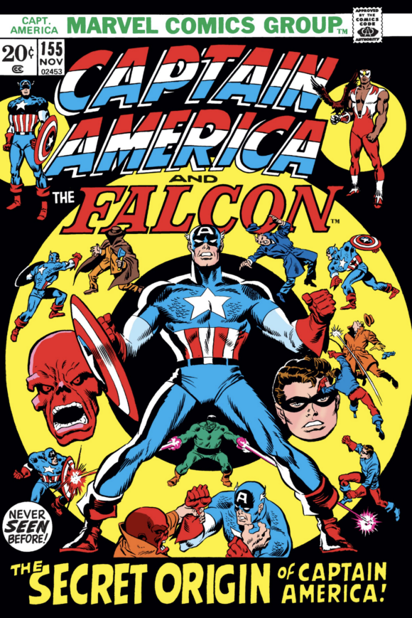
Sal Buscema pencils, Jim Mooney inks
—
4. The Unexpected #140, DC. I never saw this cover before I began putting this month’s column together, but my goodness do I love it. The concept is as old as time but THAT MONSTER. THAT NEGATIVE SPACE. THOSE COLORS. I just want to keep looking at it. Great choice of trade dress color too. First-rate.
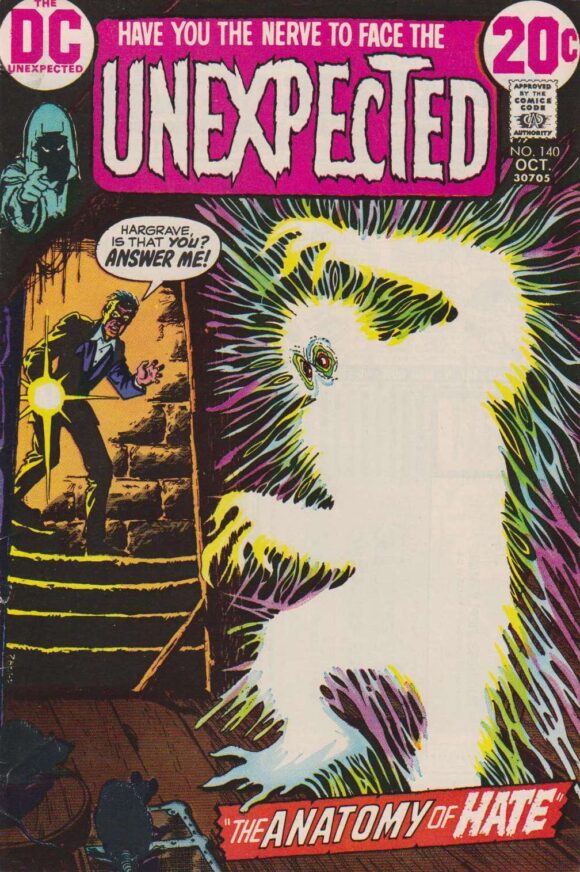
Cardy
—
3. House of Secrets #101, DC. One of the great Kaluta covers. Comic-book monsters can frequently come off as silly or kitschy but that thing’s a freakin’ nightmare on paper. But as with The Flash above, the details add that extra oomph — namely the purple, the negative space and the writer’s sideways glance. Is he in for the shock of his life or is he just used to this kind of thing? All I know is that’s pretty much how I look when I’m writing, except my hair is gray.
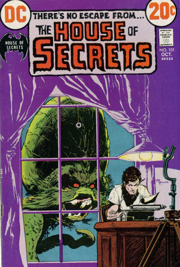
Mike Kaluta
—
2. Swamp Thing #1, DC. OK, now go back up to No. 8. Now look at this. Now look at that again. And then this again. IT’S THE SAME COVER from opposite viewpoints! I kid, but not really. Anyway, Abel’s version is fab, while Bernie Wrightson’s is an absolute classic. So why isn’t this landmark issue No. 1 on the list?
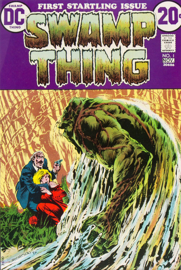
Bernie Wrightson
—
1. Kamandi #1, DC. Because Jack Kirby and Mike Royer destroy the competition along with the rest of the world. Yeah, it’s Planet of the Apes derivative but so what? This cover is pure epic magic and it just might be my favorite Kirby cover ever. If you never have, you should definitely check out Jack Kirby’s Kamandi Artist’s Edition Vol. 1. (Side note: If you feel compelled to swap the No. 1 and No. 2 slots here, I won’t hold it against you. I admit my Kamandi bias but I really do believe it’s the better cover. Nevertheless, you could make a really persuasive case for Swampy.)
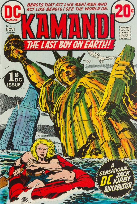
Jack Kirby pencils, Mike Royer inks
—
MORE
— The TOP 13 COVERS of JULY 1972 — RANKED. Click here.
— BRONZE AGE BONANZA: The 1972 INDEX. Click here.
August 14, 2022
#5 – Sal, not John?
August 14, 2022
Sal, yes! Fixed! Thanks!
August 14, 2022
>> 4. The Unexpected #140, DC.
>>
That cover seems to borrow from BATMAN. The spook definitely looks like the ‘70s BATMAN villain and the cover stairs looks like the cover #20 of Super Spectacular. That said, I love all Cardy covers. They scream 70s for me.
August 15, 2022
Swamp Thing #1: absolute classic of a cover. Wrightson was such a master of giving life to the printed macabre! And… am I in the minority that The Cat’s costume looks to me like a more interesting version of what would later be designed for Wolverine? I just love the color combination, and the design elements!
August 15, 2022
Some great covers here. This was obviously a strong month for horror titles.
August 15, 2022
Night Nurse fails the Bechdel Test! Haha!
January 10, 2023
I love that Conan cover-especially the colors!