BRONZE AGE BONANZA completes another year with the best of the best…
—
Welcome to BRONZE AGE BONANZA — our monthly series that looks at the greatest covers of the Bronze Age — exactly 50 years later. For more info on this feature, click here.
—
Welcome to our fifth BRONZE AGE BONANZA annual wrap-up! That’s right, BAB has been a 13th Dimension staple for five years now, and for the second year in a row, our TOP 13 COVERS of the year were voted upon by 13th Dimension’s regular (and recurring) contributors, via weighted ballots. (I used to do it all by my lonesome.)
Anyway, here’s how the vote worked: I took the winners of each month and included some wild-card picks, as we do every year. (Gotta have 13, right?) A couple of monthly winners didn’t make the final cut simply because some months were stronger than others. For example, a No. 2 in Month A might be a better pick than a No. 1 in Month B. It’s all subjective but it gives a better survey of the year overall. Here, by the way, are the three No. 1 picks that missed the final cut:
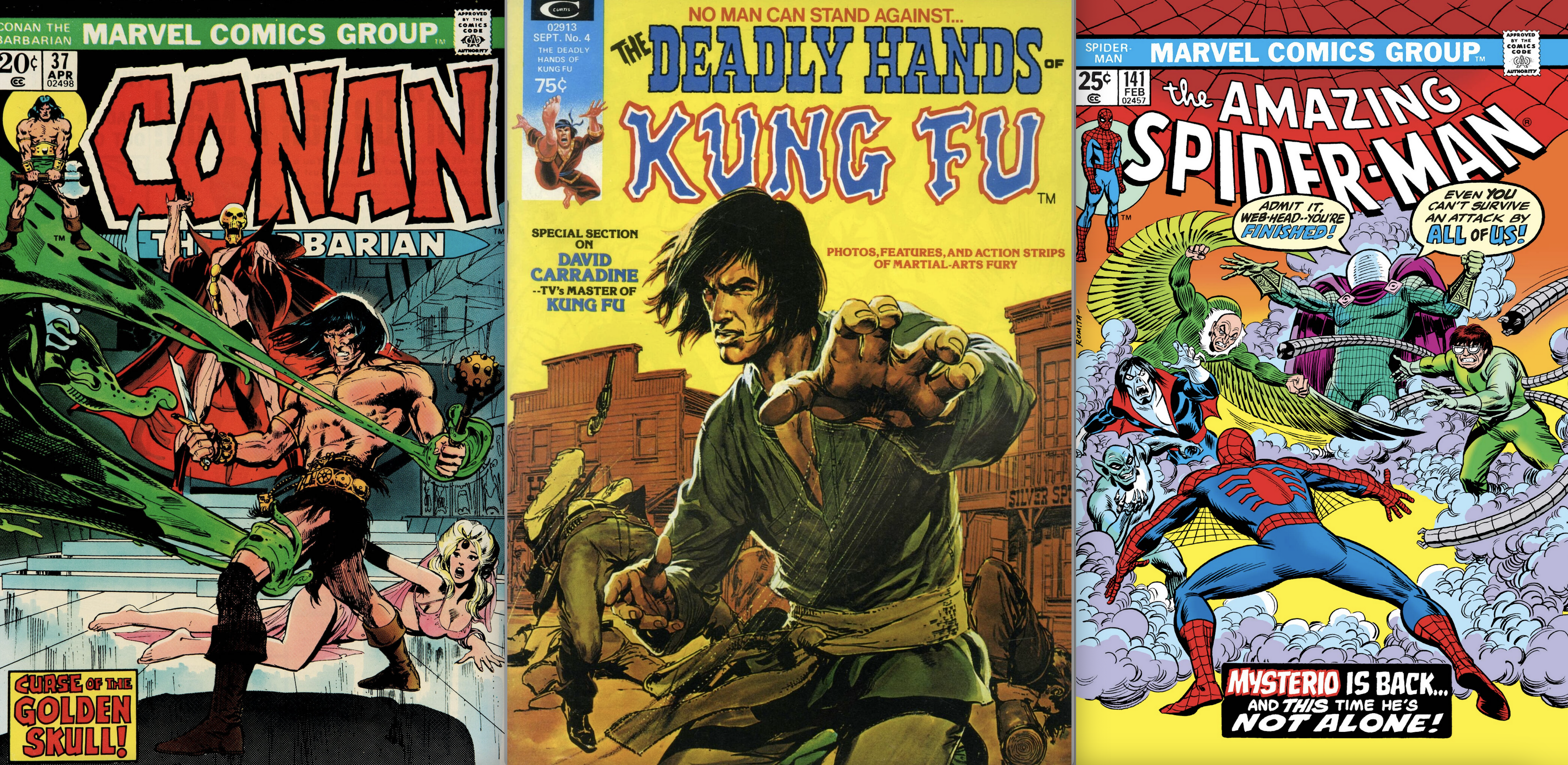
Left: January’s No. 1, by Neal Adams. Center: August’s No. 1, by Neal Adams. Right: November’s No. 1, by John Romita.
OK, so who voted, besides me? A Murderer’s Row of comics writers, artists, experts and superfans: Paul “The Celebrated Mr. K” Kupperberg; Mighty Jim Beard; Prolific Peter Bosch; Merry Kerry Callen; Cavortin’ Chris Franklin; Wallopin’ Walt Grogan; Ramblin’ Rob Kelly; Bill “The Thrill” Morrison; Killer Chris Ryall; Pistol Pete Stone; Scrappy Scott Tipton; and Fab Freddy Van Lente.
Each voter listed their preferences in order, with 13 points going to the top pick, 12 points to the No. 2 pick, and so forth. The max number of points, then, was 169. (There were 13 of us this year!) For each entry, you’ll see the point total, overall observations, whether someone picked the cover as No. 1, plus the comments (slightly edited) I made in the monthly BRONZE AGE BONANZA columns. (To check out each month, click here.)
Got it? Good. Let’s get to it! Dig THE TOP 13 COVERS OF 1974 — RANKED:
—
13. Deadly Hands of Kung Fu #2, Marvel: Wild Card, April. (54 Points.) I actually expected this one to place a bit higher, but I’m not entirely surprised either. And remember, there’s no shame in No. 13 — we’re covering an entire year here — and for the purposes of BRONZE AGE BONANZA, 12 months of 13 covers each. That’s 156 covers, for those keeping score. Earned No. 1 Votes From: Nobody.
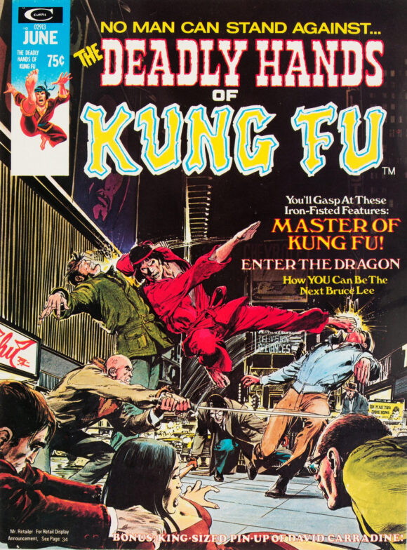
Neal Adams
Comments From April: One of the great Shang-Chi illustrations, by the great Neal Adams. At least I think it’s supposed to be Shang-Chi; his gi is off model, but who’s to say he didn’t like to change outfits from time to time? It’s perfect that the setting is Times Square, a place where you did not want to be at night in 1974 — but one filled with theaters that showed grindhouse fare like this. The layout is so good, Adams colleague Dick Giordano borrowed it for DC’s 1978 calendar, making Batman the central figure.
—
12. Amazing Spider-Man #142, Marvel: Winner, December. (59 Points.) I actually had this pegged for last. It’s a great cover and a personal favorite, but there are plenty on the list that are more compelling. Earned No. 1 Votes From: Nobody.
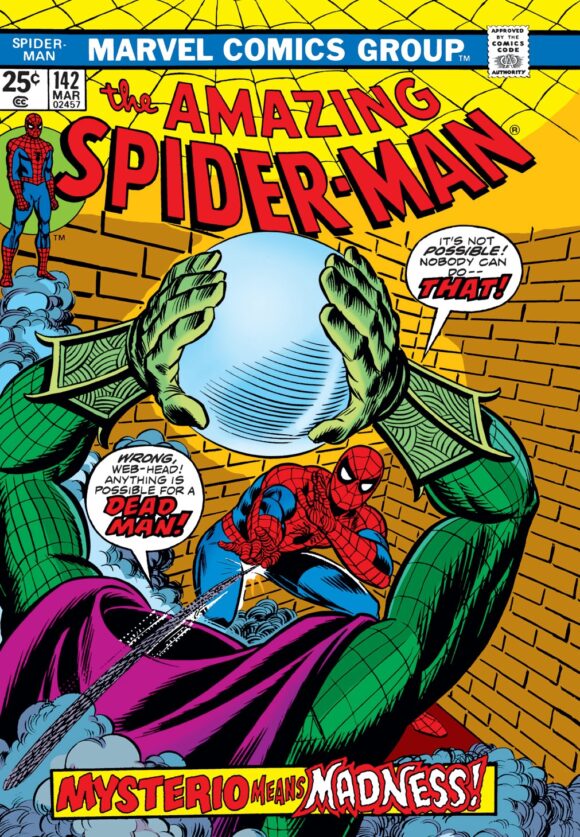
Either Gil Kane or John Romita pencils, Romita inks
Comments From December: I knew who Mysterio was in broad strokes but it was this cover that made me fall in love with him (even though this is an ersatz version). I picked this issue up when it came out because I was completely sucked in by the bright eerieness of the image — the whole point of a cover to begin with. I also didn’t know that Mysterio couldn’t actually do that, but it didn’t matter — it was such a striking bit. (Actually, when I found out he couldn’t lift his head off, I was a little let down.)
On another personal note, this marked the end of my personal Spidey Golden Age of Comics. I cut my teeth on a lot of the issues from #119 to #142 and have since read them all (plus all those that led up and many that came after). I still say Gerry Conway is the best writer Peter Parker’s ever had.
Anyway, yet another terrific Amazing Spider-Man cover this year, which should make for a fascinating annual roundup!
—
11. Captain America #180, Marvel: Wild Card, September. (64 Points.) Like the two previous slots, I wasn’t completely surprised by where this landed. It’s a terrific, memorable cover but there are a lot of stronger ones here. Earned No. 1 Votes From: Nobody.
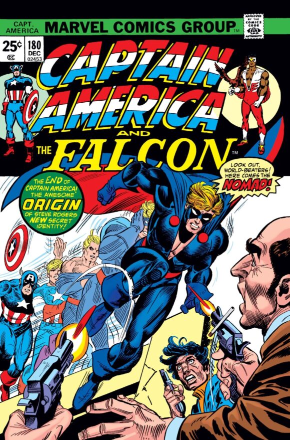
Kane pencils. Possible combination of Mike Esposito and Frank Giacoia on inks.
Comments From September: Brilliant way to introduce Steve Rogers’ new costumed identity. I never thought of Rogers as having Flash-like super-speed but no matter: Gil Kane deserved the license to do anything he wanted and it’s a really striking way of bringing Nomad to the fore. One of the best Cap covers of the era and one that really grabbed my attention when it came out. (Also: I love Nomad’s sumptuous, Redford-like hair.)
—
10. Mad Magazine #171, EC: Winner, October. (67 Points.) I had a hunch this would finish last, simply because it’s One Of These Things Is Not Like the Others. But I’m happy to say it got decent support, even though Bill Morrison hoped it’d make at least the Top 5. He was the only one to vote it at the top, which, given he’s the former editor-in-chief of Mad, didn’t shock me in the least. (“It’s in my contract,” he said.) Earned No. 1 Votes From: Morrison.
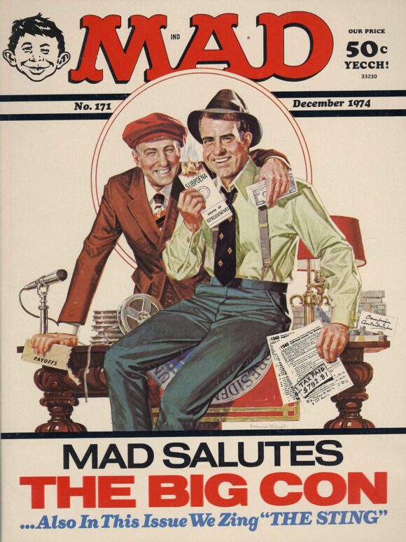
Norman Mingo
Comments From October: One of the most memorable Mad covers of my childhood — and one of the absolute best of the 1970s. Norman Mingo flips the script on The Sting movie poster, on which handsome-as-hell Paul Newman and Robert Redford gleefully congratulate themselves for their clever, hustling spirit. Here, just two months after Richard Nixon resigned in disgrace (and about a year after Spiro Agnew did the same), the usual Gang of Idiots rub their corrupt noses in it. This isn’t just a magazine cover, it’s a savage political cartoon targeting two men who deserved every ounce of contempt hurled their way.
—
9. Superman #276, DC: Winner, March. (77 Points.) Fun cover that got a bit more love than I’d anticipated. It’s the Captain Thunder of it all that really makes it. (Can’t wait for the McFarlane Toys’ action figure in 2025!) Earned No. 1 Votes From: Nobody.
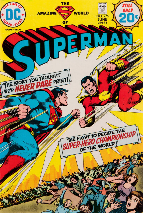
Nick Cardy
Comments From March: As hero vs. hero covers go, this is one of the best you’ll find — and seeing Superman take on an ersatz Captain Marvel was such a tease. DC had already been publishing Shazam! but, other than on covers, the company was taking great pains to keep the Big Red Cheese out of the DCU proper, so this helped scratch the itch for all those fans who for decades wanted to see the Man of Steel go head to head against the World’s Mightiest Mortal. The primary colors pop, especially against that yellow background. And is it just me, or should DC have just thrown in the towel right here and said, “Screw it, we’re just gonna re-name him Captain Thunder. It’ll work out better in the long run.”
—
8. Captain America #176, Marvel: Winner, May. (92 Points.) One of comics’ most evocative covers and one that very much speaks to its era. I personally had it at No. 3 and was expecting it get to more support. Glad Peter Bosch stood up for it. Earned No. 1 Votes From: Bosch.
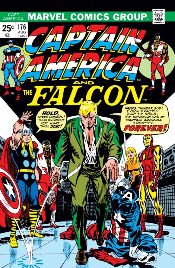
Romita
Comments From May: As I like to say, “iconic” is a word that is grossly overused. But this time it fits. Steve Rogers has plain fucking had it in a fictional world very much inspired by the real-world disillusionment of Watergate. Romita plays up the shadows to convey man-out-of-time Rogers’ angst and disgust, and his Captain America outfit doesn’t look thrown away as much as it looks utterly deflated. A perfect metaphor for the time and a masterpiece of comic book drama.
—
7. Amazing Spider-Man #136, Marvel: Wild Card, June. (93 Points.) Deeply disappointed that this didn’t place higher. (I had it at No. 2) Right in the middle isn’t shabby, mind you, but I hold this as one of John Romita’s greatest Spider-Man covers ever. My colleagues didn’t seem inclined to agree, but that’s precisely why I decided to make this annual list a vote. It evens out the bias. Earned No. 1 Votes From: Nobody.
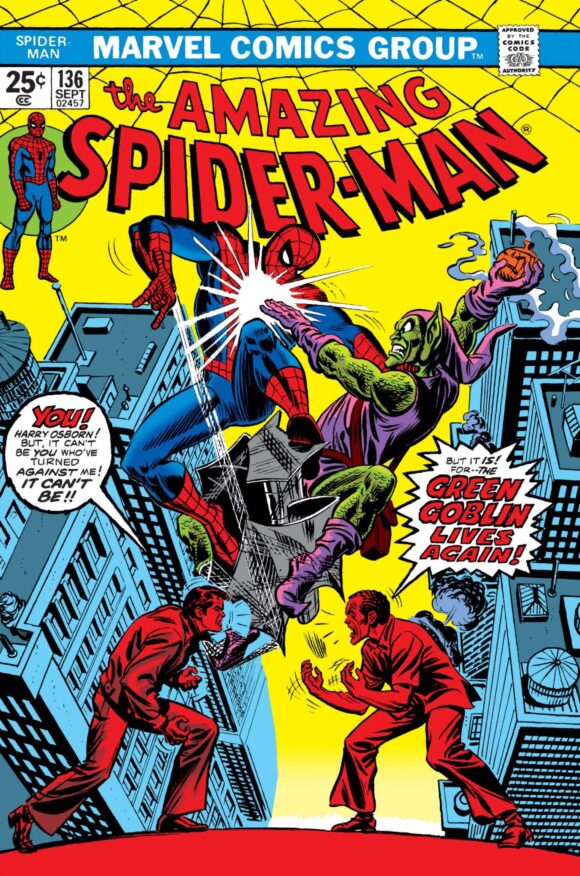
Romita
Comments From June: I would entertain any argument that this is John Romita’s greatest Spider-Man cover ever. It’s way, way up there in the pantheon, for sure. The layout is perfect, with a classic airborne Spidey vs. Green Goblin close-quarters battle dominating the image. But there’s so much drama added by Peter and Harry facing off at the bottom, each exploding with angst and rage. The curvature of the abstract platform they’re standing on has the effect of distorting the perspective of the whole cover, elongating it and emphasizing its intensity, like a Hitchcock dolly zoom.
And the colors — the colors! The yellow background, gradient shading on hero and villain, and the cool blue buildings all say Showdown at Sunset. Plus, having Parker and Osborn all in red turns up the fury to its highest level. (The colorist is unidentified, unfortunately.)
—
6. Jungle Action #10, Marvel: Winner, April. (95 Points.) On the other hand, I didn’t expect this to finish in the top half — but I’m really glad it did. This was the first image I ever saw of Black Panther, and what a way to start! Damn, Gil Kane could make even a static image sing. Earned No. 1 Votes From: Nobody.
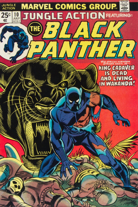
Kane pencils, Frank Giacoia inks
Comments From April: Not just the best cover of the month, it’s the best Black Panther cover ever. It’s as gripping to me now at 57, as it was when I got it at 7. A masterpiece.
—
5. Limited Collectors’ Edition #C-31, DC: Winner, July. (106 Points.) Full disclosure: I almost didn’t include this in the final list, but ultimately did precisely for the reasons I state below. As I was counting the votes, this seemed destined for a higher finish before landing at No. 5. Earned No. 1 Votes From: Beard, Kupperberg.
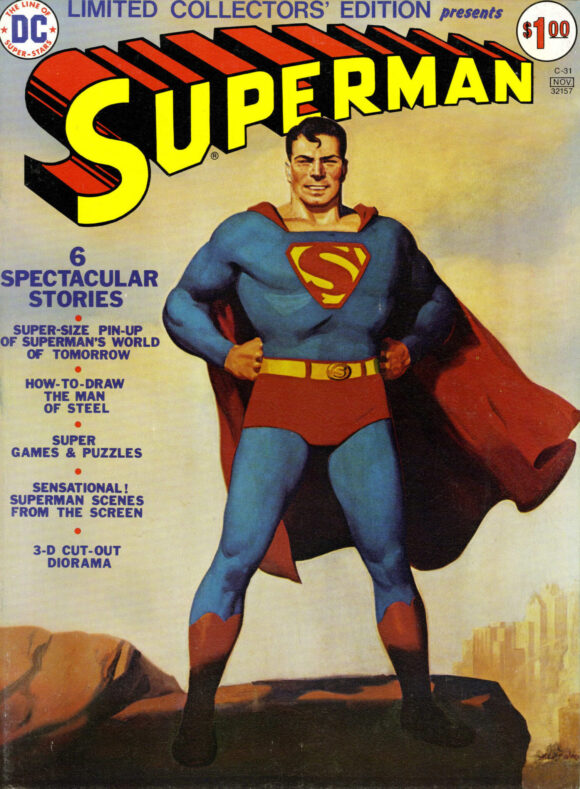
H.J. Ward
Comments From July: The painting — which has a really weird history — was done by HJ Ward in 1940 but wasn’t used in a comic until here. Should that disqualify it? No. No way. It was still an incredibly smart and sharp choice for Superman’s first treasury edition — he didn’t get one until the ninth of the series! — and the image is spectacular in its own right. Arguments can be made in either direction (again, respectfully) but to me, this is a no-brainer. It’s one of the most beloved images of the greatest superhero of them all.
—
4. Deadly Hands of Kung Fu #1, Marvel, Winner, February. (110 Points.) Ladies and gentlemen, Neal Adams’ four-year run atop the annual BRONZE AGE BONANZA list is officially at an end. Neal topped out here this year, but that’s understandable given A) by this time, he wasn’t doing too many covers, and B) it was an extraordinary year for John Romita, who owned the list with no less than six covers. Still, it did get a couple of No. 1 votes, so it’s a list-topper in some eyes. Earned No. 1 Votes From: Stone, Van Lente.
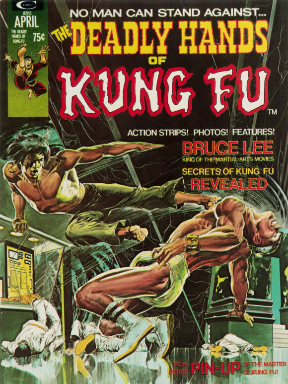
Adams
Comments From February: Neal Adams has topped the annual BRONZE AGE BONANZA list every year in the feature’s first four years. Here’s what I wrote in December 2023: “I expect that streak will be snapped in 1974.” I might have been wrong. He’s already got the first two months.
—
3. Amazing Spider-Man #135, Marvel: Wild Card, May. (111 Points.) The shocker of the list, to me at least. (My reasoning is the same as I wrote back in May, below.) To get this high with only one No. 1 vote, however, meant it got a ton of broad support. And in the end, I suppose it’s hard to argue. It is great. Earned No. 1 Votes From: Ryall.
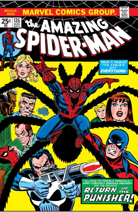
Romita
Comments From May: Tough call. Was really tempted to put this at No. 1. The spider-vignette motif dates back to the Ditko days and all the heads and color scheme remind you of the classic Issue #121. So you could be forgiven for calling this derivative. But so what? This is still one of the great Spider-Man covers of the Bronze Age, with John Romita using everything in his arsenal to remind you that there is always A LOT going on in Spidey’s life. I’m especially taken with wild-eyed, enraged Harry Osborn on the lower left. That scene could have been the whole cover… except next month’s issue takes care of that very nicely, thank you very much.
—
2. Marvel Treasury Edition #2, Marvel: Winner, September. (115 Points.) Same happened here. Nobody picked this for No. 1. Not a single voter, but it was close to the top for so many that it ended up the overall runner-up. It’s one of the most iconic FF images ever, so not exactly a head-scratcher. I did cock an eye when it challenged for the top slot for awhile, though. Earned No. 1 Votes From: Nobody.
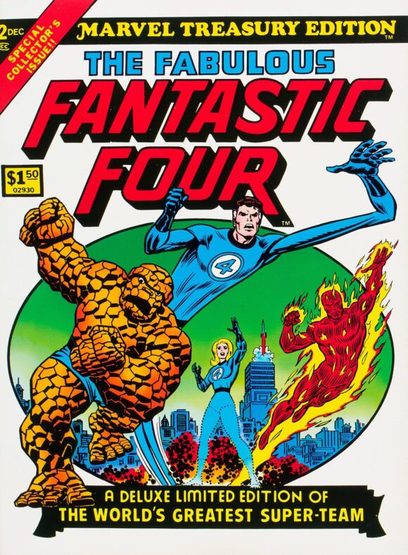
Romita
Comments From September: You can’t deny the iconography of Marvel Treasury Edition #2. Like he did with Spider-Man on the cover of Marvel Treasury Edition #1, John Romita gives us an image of the Fantastic Four that was an instant benchmark. In other words, this is one of the most famous images of the FF ever — and rightly so. Simple, clear, potent, as your eye follows the circular pattern of the illustration. Superb.
—
1. Marvel Treasury Edition #1, Marvel: Winner, June. (140 Points.) But in the end, it wasn’t even close. Six of us put this at No. 1 and the point total would have been even higher if not for one voter — who shall remain nameless — who put it last. Not quite as dominating as last year’s No. 1, but still a, ahem, spectacular showing for what some believe is the greatest Spider-Man cover ever. (By the way, Romita is not the first to land the top three annual slots; Adams did it in 1970 and 1972.) Earned No. 1 Votes From: Callen, Franklin, Greenfield, Grogan, Kelly, Tipton.
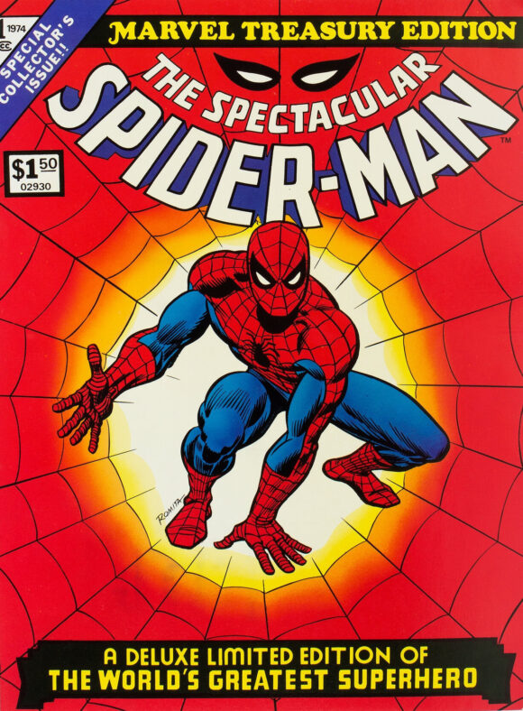
Romita
Comments From June: This is one of the most famous Spider-Man images ever and certainly one of the boldest. This and #136 are yin and yang: One is a study in incredibly dramatic kineticism, while the other is a testament to iconic cool. The cover of Marvel Treasury Edition #1 is perfect in every way, from the Spidey illustration, to the web effect, to the color scheme, to the trade dress. ASM #136 is right there in its magnificence, but I tip the scale slightly to a cover that stands as a definitive depiction of a definitive superhero.
—
MORE
— BRONZE AGE BONZANA: The 1974 INDEX. Click here.
— BRONZE AGE BONZANA: The 1973 INDEX. Click here.
— BRONZE AGE BONZANA: The 1972 INDEX. Click here.
— BRONZE AGE BONZANA: The 1971 INDEX. Click here.
— BRONZE AGE BONZANA: The 1970 INDEX. Click here.
—
Comics sources: Mike’s Amazing World of Comics and the Grand Comics Database.

December 29, 2024
I couldn’t even muster an argument for numbers 1 through 3. Iconic all.
December 29, 2024
Way early in the morning here and I’m grinning like an idiot making my way through the covers and the memories! Thanks so much for this! (Am I the only one who always misses the rocket taking off from the Baxter Building on the FF cover?)
December 29, 2024
I bought all of those at the newsstand when they came out. Proud to say that I still have them all in my collection.
December 29, 2024
Great selections!
The Fantastic Four Treasury at no.2 is fantastic! I remember having this as a kid and loved it.
I enjoy these every year. Thank you all for doing this.
December 29, 2024
Great article. And you’re right, Captain America DOES look like he has super speed. I’ve never thought of that! Ha Ha! Now I’m imagining the crooks waiting patiently as he changes in real time.
December 29, 2024
Just my opinion, but I’m not a big fan of the top two. They are special editions and don’t feature any action with a foe (see ASM 136). FF definitely not top two worthy, in MY opinion. Thanks for sharing.
December 29, 2024
For me, the top two work because of the flood of memories they evoke. I hope both of them along with the first “Superman vs Spider-Man” treasury are eventually re-published.
“And is it just me, or should DC have just thrown in the towel right here and said, “Screw it, we’re just gonna re-name him Captain Thunder……..” I personally say call the title “whatever” and keep the name as it was originally in the stories. I’m not a lawyer but as I understood it, it was using it as a title that was the issue. I also think Marvel should just not care and let it go. Nobody is confusing the two characters. Honor and respect the history of the character and let Billy keep his name!