
It’s Letterer Appreciation Day!
By PETER STONE
Lettering is one of the least appreciated parts of any comic book and one of the least appreciated skills an artist can have — yet it’s the direct conduit between the comic book itself and the reader. You read comics as well as look at the pictures.
The rule about writing is to show, not tell… so a caption (if you choose to use them) should add to the story, not simply explain what the image is showing you. It must be clean, clear and readable with a good font. Another, often overlooked, skill is the placement of the lettering. Balloon placement. It may seem simple, but it is actually a form of art.
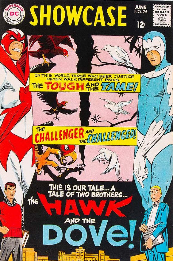
A Gaspar Saladino, um, showcase. 1968.
Looking back decades on this Letterer Appreciation Day — so named for the late, great Gaspar Saladino, who was born Sept. 1, 1927 — EC Comics had a very distinct style, looking for all the world like someone was typing out the captions and pasting them down on the art, when it was actually done by hand. DC Comics used a variety of letterers with different styles (like Saladino) while Marvel Comics did the same.
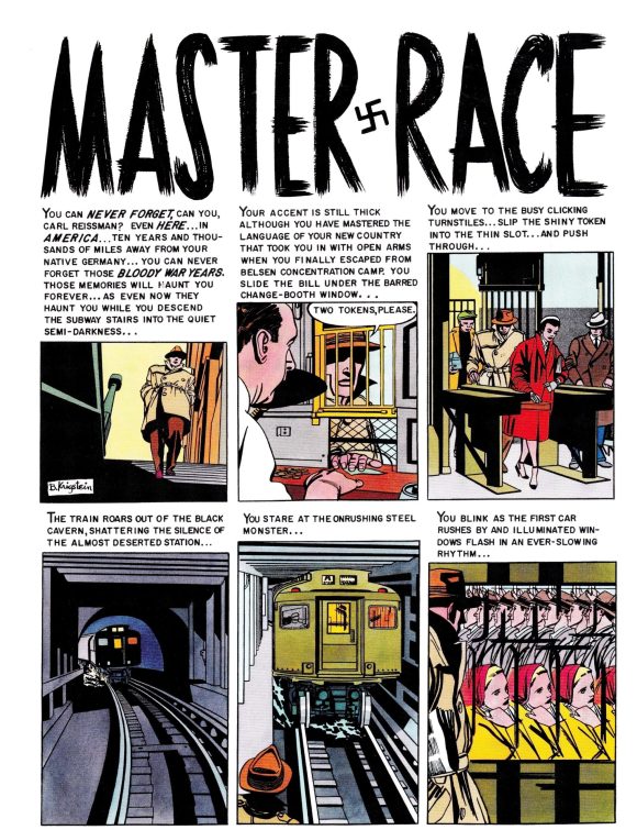
Impact #1 (Mar.-Apr. 1955). “Master Race.” Script: Al Feldstein. Plot: Al Feldstein and Bill Gaines.
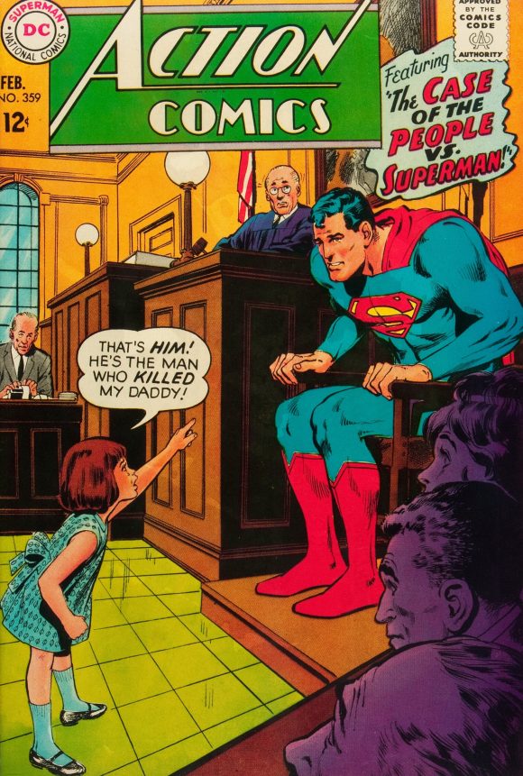
The lettering was often designed and inked onto the original page. In other cases, balloons and logos were on separate paper and rubber cement was used to stick them into place. This is when we had balloons on the covers to sell what was going to happen on the inside. These days, with poster-style covers necessitated in part by direct-market deadlines, there are very few word balloons, which, in my opinion, is a tragedy. Who doesn’t love the 1967 Action Comics #359 cover, where a little girl wails in a courtroom and points at Superman, “That’s him! He’s the man who killed my daddy!” It sure made me want to read that story.
Letterers also have to create what is called display lettering. Boom! Bang! Thoom! KKKKKKrackle! They have to work within the panel, adding a sound effect to the action, but not being the focus of the panel itself. These days, display lettering is done through Photoshop or Illustrator. It is warped and twisted to fit, but in my mind some of the artistry is lost. Hand lettering is far more unique and interesting.
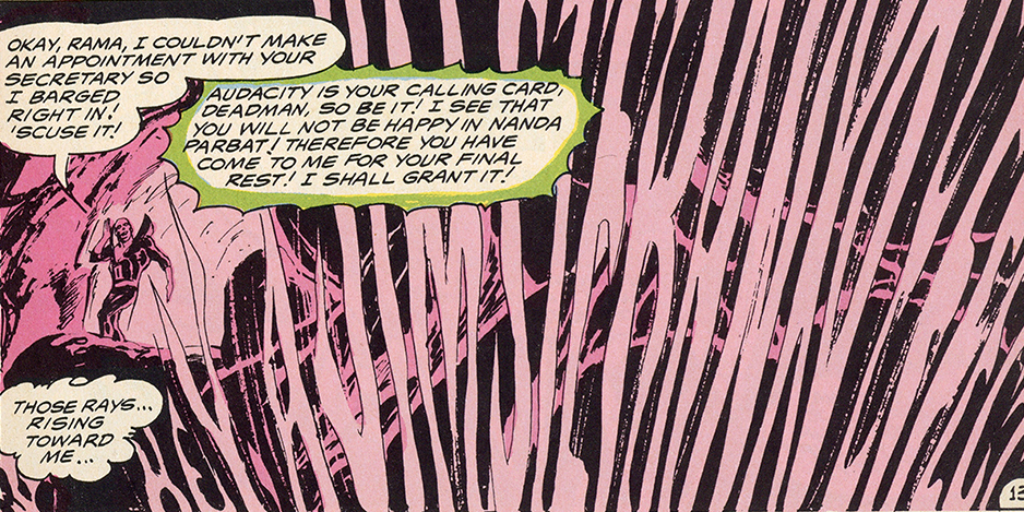
Today, letterers often scan their work and create a font that based on their style. Others use a font found in Photoshop that resembles hand lettering. When I entered the industry, I was told by Neal Adams that all dialogue and captions had to be the same font and the same size. There is nothing more confusing then reading a page with three or four fonts and multiple sizes. It takes you out of the story. And because display lettering is a lost art, sound effects are less exciting than they used to be. Neal would often letter his own sound effects as they wrapped around a character or looked like something completely unique. Take, for example, “Hey, a Jim Steranko Effect” from this Deadman story: Neal made the lettering look like smoke and you could only read it if you tilted the comic.
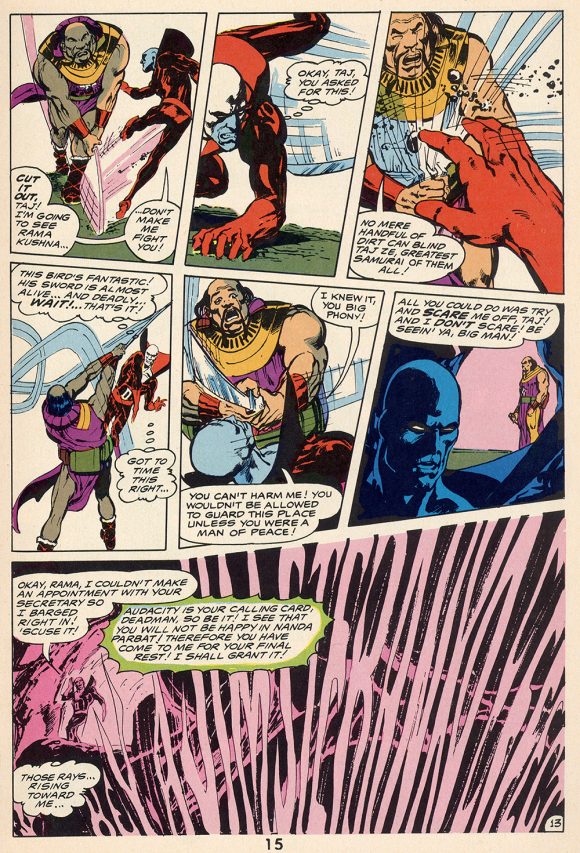
1968’s Strange Adventures #216
Now, balloon placement: If a character is speaking in a close-up, where do you put the balloons? What is important, artistically, about a face? What are the things a balloon can cover up without destroying the intensity of that close-up? The back of the head. The cheek. A balloon that bleeds into the next panel. The forehead sometimes. It requires a level of common sense and understanding of what a comic book is. And you have to make sure the balloons are read in the right order. That’s also an understanding of the story and the character.
One of my favorite memories is filling in for Neal and my wife, Kris (his daughter), at the Kubert School in New Jersey when Joe was still running it. They were super busy with advertising and I, well, I volunteered. How cool was it to go to the Kubert School to represent Neal? The coolest! Representatives from Marvel, DC and Dark Horse were there, along with a few others. Joe asked the group whether he should continue to teach hand-lettering at his school because so many of the companies were using computer lettering. Everyone told him it was a waste of time.
I, however, disagreed. The computer is just a tool… like a pencil or a brush. If you don’t know the rules, how can you use the newer tools? Yes, I said, Y-ou should continue to teach hand lettering. Joe agreed with me, totally. Joe Kubert agreed with ME! OMG! That was truly amazing.
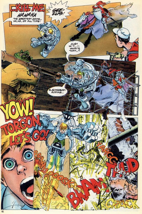
Toyboy #7, 1989
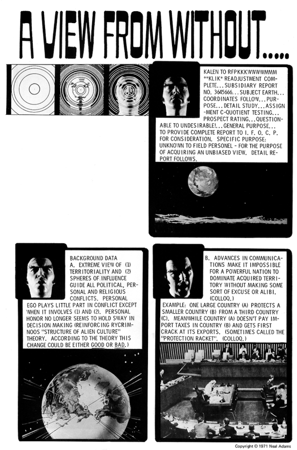
Another example was when Michael Golden agreed to pencil and ink Continuity’s Toyboy #7. He insisted on a complete script that he would letter himself. Not only is the art amazing, but the lettering is inspired. His sound effects are absolutely incredible. The entire page is a work of art. Just like when Neal thought about reprinting his 1975 Thrillkill story, or his 1971 A View From Without. He insisted I (since I had studied lettering under him) re-letter the jobs. Watch the spacing, the letting, and don’t break up the words. Personally, I think they came out great and maybe someday they will be reprinted.
One last thing. Air. Yep, air within the balloon. Make sure the copy doesn’t get too close to the balloon circle. When it’s airy, the balloon looks and reads better. Otherwise, it feels like the balloon is crushing the copy.
All these things have to be considered when lettering a page. Font, size, placement, and air. As I said, an underappreciated skill. Those who are good at it make the reading experience smooth and easy. Neal, Michael, Ben Oda, Tom Orzechowski, Richard Starkings, Will Eisner (look at those splash pages!), Ken Bruzenak, John Workman, and so many others know/knew how to do it.
Here’s to the letterers of the past, the present, and the future. You make our comics readable because, as much as we all love the drawings, this is a medium that is meant to be read!
—
MORE
— 13 THINGS You Didn’t Know About Comics Lettering. Click here.
— 13 GROOVY Silver Age GASPAR SALADINO DC Comics Logos. Click here.
—
Peter Stone is a writer and son-in-law of the late Neal Adams. Be sure to check out the family’s online Facebook auctions, as well as the NealAdamsStore.com.
September 1, 2025
Once the computer becomes “point and click, done!” it stopped being a tool. Computer art today is not art in this fan’s eyes. We’ve taken the artist (in this example, the letterer) out of the art.
September 1, 2025
“Yes, I said, Y-ou should continue to teach hand lettering. Joe agreed with me, totally. Joe Kubert agreed with ME!”
Oh, the irony—my go-to font for digital lettering is ComicCraft’s “Joe Kubert” font. 🙂
I once had the pleasure of speaking with John Workman, back in the late ’90s (he was lettering a comic project I was assistant editor on). I told him I was hand-lettering my own work, and asked how he did his sound effects; the only way I could do it was by using a broad-tipped marker on a piece of paper to figure out the letter forms, then lightboxing the outlines on the art pages.
“Well, that’s how I do it,” he said. Mind blown! I’d thought it was more complicated than that.
September 1, 2025
Excellent piece, hand lettering is the best. I love that in the days before letterers were credited you could always spot a John Costanza job by the reversed out/WOB p13 page number.
September 1, 2025
I wish there had been a mention of the two main Marvel Comics letterers during the Silver Age: Sam Rosen and Artie Simek. Rosen’s style, particularly, produced some of the cleanest yet exciting letters on the comics page. And while I though Simek was sloppier than Rosen, his style changed over the years and became more solid as he entered the 1970s. (And I’d hate to ignore Joe Rosen, whose style was smaller and more rounded than his brother, but was ultra-consistent over the years.)
Speaking of style changing over the years, John Costanza’s really evolved. From his earliest, very narrow letters (frequently credited as “Jon Costa”), to his more broad but ultra-consistent style that eventually inspired some of the early computer lettering fonts, his work spanned multiple decades, as did many of the names that were mentioned in the article. And there were a couple of letterers who started with a very solid style, only to loosen up within a few years; Annette Kawecki and David Hunt are two examples.
September 1, 2025
As we’re discussing the art and craft of comic book lettering, here’s my shout out to Jim Aparo, esp. during his classic early to mid-70’s phase (c. 1971 – 1976) with his gutsy illustrative realism. I always loved his lettering as it seemed wonderfully thought out and well integrated with the layouts of his pages, including how he could use speech balloons as overlapping or overlapped compositional elements with the respective speakers on the page.
As a one-time art student, I was just as fascinated by this as I was with his dynamic penciling and calligraphic inking. That he did it all is a testimony to his craftsmanship.
September 1, 2025
Thank you for this wonderful appreciation of a wonderfully unappreciated craft! The name that stuck out to me when I was younger was Joe Letterese (Yes, his real name!) He mainly worked for DC and his claim to fame was he lettered the sound effects that blasted across the screen on the 60’s “Batman” TV show. BIFF!! BAM!! POW!!
September 2, 2025
I didn’t always appreciate Tom Orzechowski’s lettering in X-Men until I read other comics where the lettering wasn’t up to par. Once you’ve seen it done well, it’s hard to un-see it. And Artie Simek must lead the world in “most nicknames given to a letterer”.