
It’s Letterer Appreciation Day — timed to the birthdate of the late, great Gaspar Saladino, who was born 96 years ago on Sept. 1, 1927…
The late Gaspar Saladino was one of comics’ greatest letterers and his Sept. 1 birthdate has been dubbed Letterer Appreciation Day in his honor. (The clarion call to celebrate an essential, yet frequently overlooked, part of the comics experience is the brainchild of letterer Nate Piekos.)
For this year’s tribute, we’ve tapped the mind of another of comics’ greatest letterers — Todd Klein, who is doubtlessly the world’s foremost expert on the subject. You absolutely, positively, need to check out his website, kleinletters.com.
With Todd’s gracious permission, here are 13 GROOVY SILVER AGE GASPAR SALADINO DC COMICS LOGOS. I made the picks, but the commentary and images are from Todd’s site. (Naturally, this is just a small sampling of Saladino’s work and Todd’s website.)
In chronological order, by publication date:
—
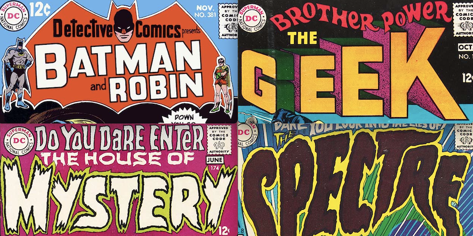
SGT. ROCK

Showcase #45, July-Aug. 1963
Editor and writer Robert Kanigher was one of Gaspar’s biggest fans at DC, and Gaspar lettered the majority of Kanigher’s war comics stories from the beginning of the line forward. Kanigher was the first to assign Gaspar a cover logo as far as I can tell, this Sgt. Rock logo from 1963. Notice how the indent on the right side of the R falls below the center, as if it was a P with the right leg added. This is a style point characteristic of Saladino’s block lettering throughout his career, and one of the surest ways to identify his logos. Otherwise these block letters might have been done by Ira Schnapp, though the thin lines meant to separate the color stripes have a delicate energy that also suggests Saladino. The sergeant’s stripes in place of a period after SGT is a clever and creative touch. I think this was the first appearance of this logo, but it’s possible it appeared earlier. I haven’t found any logos before this one that look like the work of Saladino.
—
INFERIOR 5

Inferior 5 #7, March 1968
Carmine Infantino’s shift of logo work from Schnapp to Saladino happened some time in 1967, but because of the lag time between when work was done and when it appeared, PLUS the intentional post-dating of comics to try to keep them on display longer, the first Gaspar revamps of existing DC logos began hitting newsstands with March 1968 cover dates, like the one above. Ira Schnapp’s logo for the first six issues of this series was an odd one that didn’t fit the space very well. Gaspar’s revised version fills the logo area better. The first three words are very 1960s psychedelic, similar to rock posters of the time, with a variety of colors enhancing that idea, while the large 5 (replacing Ira’s spelled-out FIVE) seems to hold things together and command attention. The series might already have been selling poorly, as it was canceled with Issue #10.
—
THE CREEPER

Showcase #73, March-April 1968
Steve Ditko was best known for his work at Marvel Comics on Spider-Man and Dr. Strange. He came to DC with this new creation, and Gaspar did the logo. There are actually two versions of it on this cover along with other fine lettering by Saladino.

Beware the Creeper #1, May-June 1968
A third version of the logo was used on the character’s new series, which began two months later. All three are similar enough to pass as the same logo, but if you look closely you’ll see that there are minor differences in each. Here Gaspar was revealing his talent for rough, scary letter shapes that would become one of his trademark styles. No one before him had hit on this approach, which combines rough edges with organic letter shapes to create the unsettling appearance of something alive and sinister. Perhaps furry rather than drippy or explosive like many previous “scary” logo styles. Though separated, BEWARE THE is part of the logo and uses another effective rough style. This is Gaspar finding his talent for logo design. Though there are three variations, I will count them as just one logo.
—
HOUSE OF MYSTERY

House of Mystery #174, May-June 1968
Editor Joe Orlando was charged with returning some of DC’s “mystery” titles to their scary origins, and Gaspar Saladino’s logos were a big help. This one follows the same general style as The Creeper, but with thicker and somewhat more square letter shapes, at least in places. The double outline leaves room for a second color to help MYSTERY read well, while THE HOUSE OF seems to be in a dry-brush style with a few small gaps in it, something Gaspar would develop more later. I don’t like the top line so much, but it was not a permanent part of the logo.

Gaspar’s original logo is in the DC files, though heavily trimmed and the worse for wear. Clearly someone cut it out and pasted it onto a cover instead of making a photostat and using that, as was the correct method. Parts of the first M are missing. White paint corrections are visible, but it’s unclear if they’re from Gaspar or some later user. This is why many original logos have a warning in large letters on them, “DO NOT USE! MAKE COPIES!”
—
THE HAWK AND THE DOVE

Showcase #75, June 1968
Another Steve Ditko creation was tried out in Showcase with an unusual multiple panel layout, lots of lettering by Gaspar, and a new logo by him at the bottom. He contrasts the warring personalities and ideologies with a rough treatment for HAWK and a calm, smooth one for DOVE but adds an exclamation point. The same logo was used on their brief series minus the exclamation point.
—
BROTHER POWER, THE GEEK

Brother Power, the Geek #1, Sept.-Oct. 1968
DC’s sales had been losing ground to Marvel Comics through much of the 1960s, and after some foot dragging they were now trying all kinds of new things to see what might sell. This was one of the oddest efforts, and it only lasted two issues. Gaspar’s logo plays with three dimensional letters that go in two directions in GEEK, while BROTHER POWER looks toward the psychedelic styles of 1960s rock posters. An interesting logo, but the color choices don’t help it, and it’s not really a success in my view.
—
DETECTIVE COMICS Detective Comics #381, Nov. 1968 With this issue, Detective gained a new Saladino logo, using a large bat shape and Batman head, similar to past logos on the character’s own title, with DETECTIVE COMICS in upper and lower case at the top and BATMAN and ROBIN in large open letters below. Character figures on each side complete the branding, just in case anyone needs more visual confirmation. This works fine, but the bat shape takes up a lot of space. Note the Saladino R in ROBIN with the notch just slightly lower than center. — DOLPHIN Showcase #79, Dec. 1968 This logo shows that Gaspar did not always go for eye-grabbing emphasis. The lower case letters here are calm, elegant and graceful with just some up and down bounce to indicate her underwater nature. That awful SHOWCASE version is back, though. This character went no further. — THE SPECTRE The Spectre #8, Jan.-Feb. 1969 The Spectre had been trying a series of one-shot logos, but this one with art by Nick Cardy blows them all out of the water. I only regret that such a dark brown was used inside the letters, obscuring Gaspar’s thick, rough outlines, but for scary, this is hard to beat. Even the top line lettered to fit the space works well. Only THE above the P is a bit hard to read. — TEEN TITANS Teen Titans #19, Jan.-Feb. 1969 With Issue #19, Teen Titans arrived at a Saladino logo style that would stay for a while. These are standard slanted block letters made interesting by the lower case i between the two T’s of TITAN. On later issues it was often in a banner. — THE PHANTOM STRANGER Showcase #80, Feb. 1969 Phantom Stranger had had a brief series in the early 1950s. Joe Orlando brought him back first in this Showcase tryout, then in his own series using this new logo by Saladino. The top line is in Gaspar’s horror style, the bottom word is block letters with a rough outline around it. This seems a good mix for the character who walked the line between horror and heroics. Saladino R’s in use. — GREEN LANTERN Green Lantern #72, Oct. 1969 Thus far, Gaspar’s revamps had been taking place around the outer edges of the DC lineup, but with this new logo he tackles the superhero center for the first time. Collaborating with cover artist Gil Kane, who did the figure and lantern, Saladino’s take adds energy, depth and style to the book. He retains the flames from the Schnapp versions, but his are along the edges of beams coming from the lantern, and are made with a large wedge-tipped pen that adds to the effect. The letters are tall block ones, very vertical except for the rounded G. Note the Saladino R’s in each word with the divider below center on the right side. The original logo has been heavily modified. The Gil Kane figure has been painted out and the lantern lines completed. Other areas of white paint probably cover the DC bullet and code seal. Later changes to the series like a team-up with Green Arrow made the figure no longer useful, but it’s a shame the original logo was changed and not a photostat of it, as could easily have been done. — UNEXPECTED Unexpected #115, Oct.-Nov. 1969 With this issue, Unexpected received a new Saladino version of his previous logo that removes the swaying, wind-blown effect and the word THE, which is now part of the top line. It works fine, but I don’t like it as much as the previous two versions, it seems too calm by comparison. I do like the word balloon treatment, though. The original logo shows the outlines better and reveals that the top line is pasted on. It looks hand-lettered, but perhaps it’s type, it is very regular. I don’t recall seeing a font like that, though. Gaspar’s technique with the rough-edged, organic letters is terrific, as always, and you can see they were done here with a pen point that had a wedge or oval shape to produce variations in line thickness depending on the direction it was held. Great stuff. — MORE — PAUL KUPPERBERG: My 13 Favorite DC HOUSE ADS Lettered by IRA SCHNAPP. Click here. — 13 THINGS You Didn’t Know About Comics Lettering. Click here.


September 1, 2023
I love Gaspars and Mr Schnapps work so much. They don’t seem to get much recognition for their work. I wish someone line Twomorrows Publishing would put out a book about them.