I would have bought every issue…

By WALT GROGAN
Here are a few things that will always bring a smile to my face: a dog popping its head out of the window of a moving car to catch the wind in its face, a toddler learning to talk and tossing out swear words with abandon, and a sketch/commission featuring the Earth-2 Robin in his Batman duds!
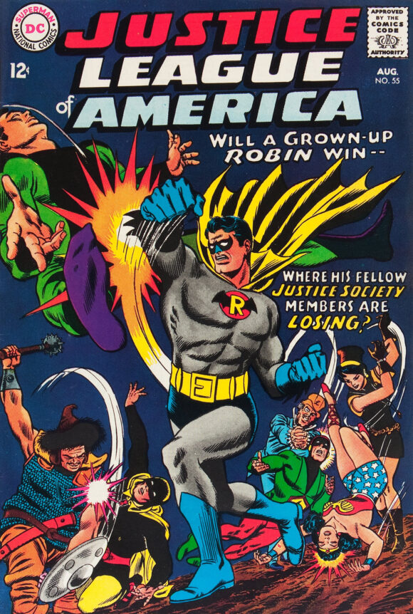
Justice League of America #55 (Aug 1967) with Robin’s nose colored correctly
And that’s because I absolutely adore the Batman-inspired Earth-2 Robin costume from the cover of Justice League of America #55! So, whenever I see a great sketch or commission of The Grown-Up Boy Wonder, I am compelled to color it!
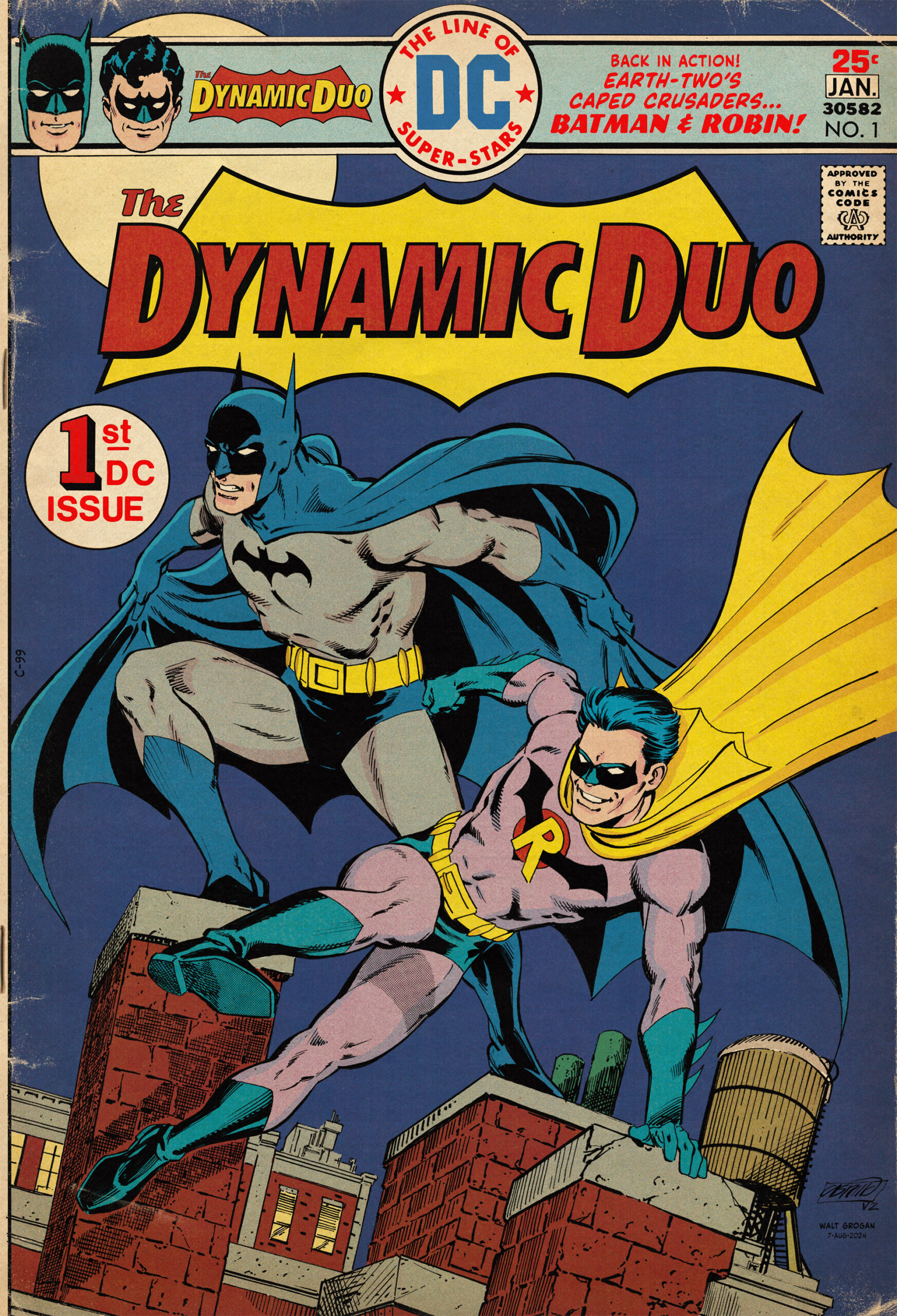
I’ve even gone so far as to create faux covers, like this one by Jerry Ordway!
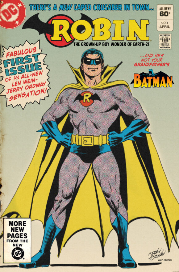
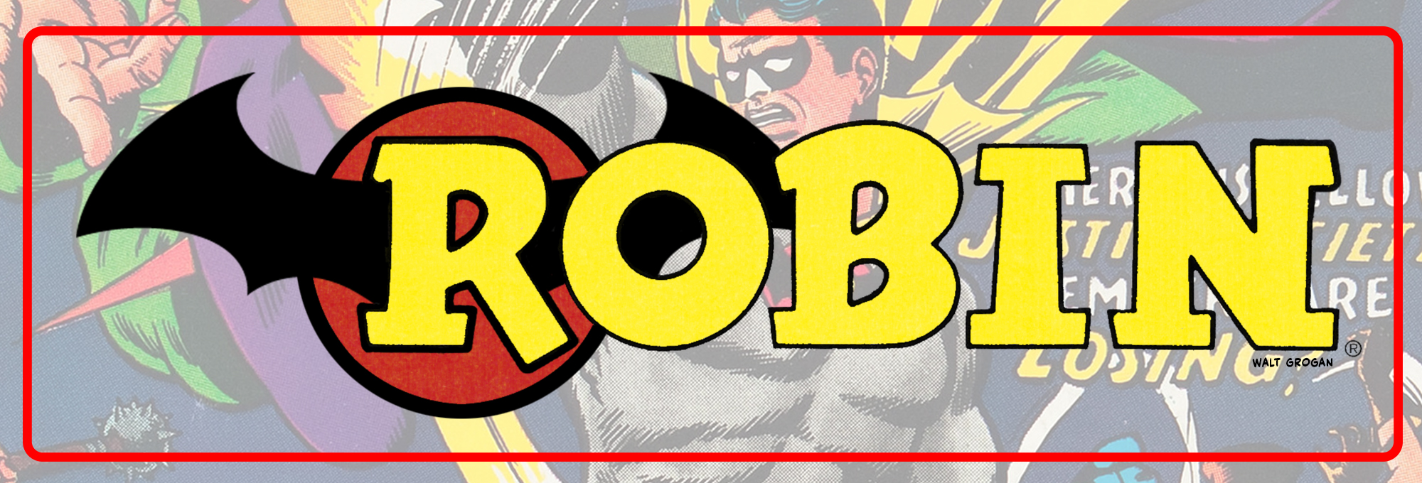
And, as you can see, I created a logo to go along with it by repurposing one of the Boy Wonder’s original logos and wrapping his chest symbol around the “R”.
When artist Anthony Castrillo dropped this stunning piece featuring a rooftop Earth-2 Batman and Robin (featuring that most glorious costume) in the Justice Society of America Facebook group, well, I knew I was going to color it up!
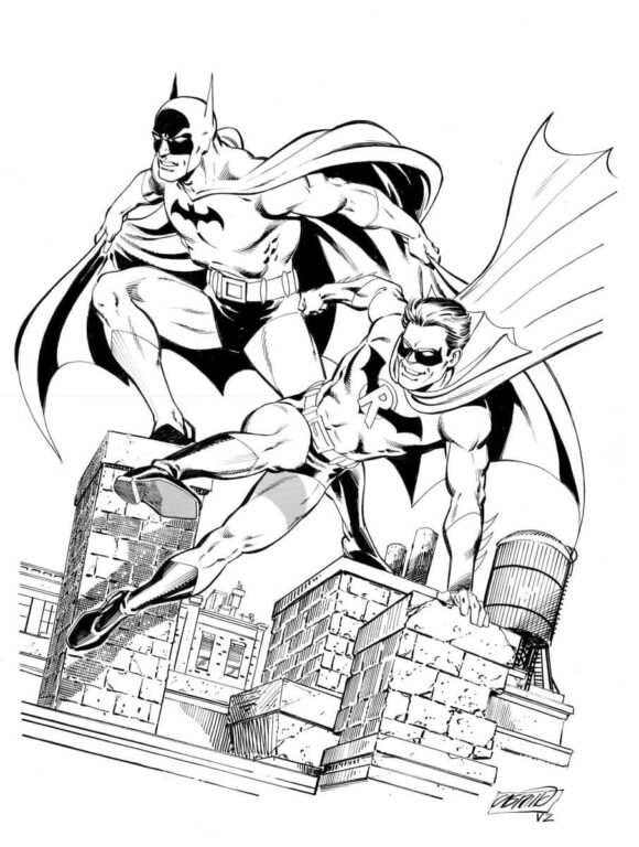
I dig that Anthony gave Robin a great, big grin! Because everybody knows that even with tragedy in his life, the Grown-Up Boy Wonder is still a happy guy. And you can see that revelry as he leaps across the rooftop even as Batman takes a reconnoiter pose!
This beautiful piece is a riff on an Earth-1 Batman/Robin commission that Anthony did for Lee “The BatFan” Johnson.
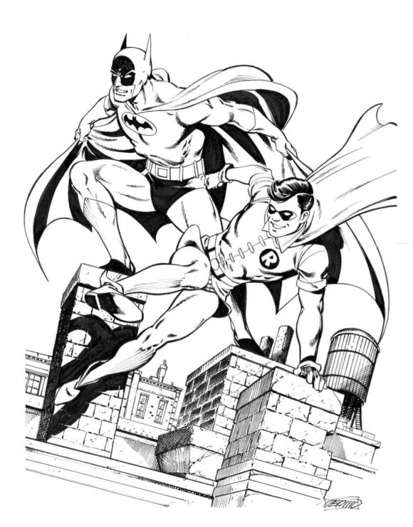
And, perhaps, one day we’ll see Lee’s distinctive, vintage coloring on that piece!
That said, I wasn’t surprised when Lee added that same brand of vintage coloring to the Earth-2 Robin version, turning it into a faux newspaper insert folded poster!
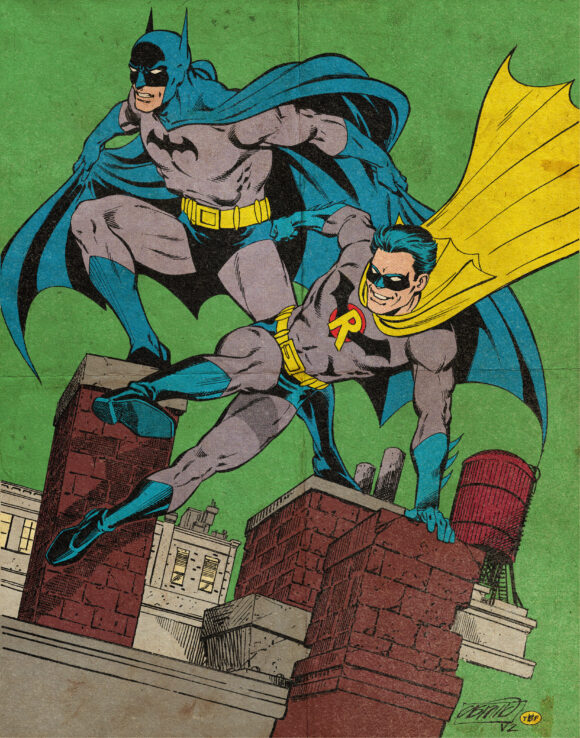
There’s a lot to love about that Silver-Agey poster — from the crazy green sky that was common in Golden and Silver Age comics to the grimy and oily effects on the paper. I absolutely remember coming away with ink-stained fingers after handling a page like this when I was a kid! It’s an excellent job by Lee. And you can just imagine it hanging up on a Batman fan’s bedroom wall.
But then, Anthony upped the ante by coloring his own artwork and adding the trade dress from my coloring of Jerry Ordway’s cover! I was honored! And, boy, does it work well!
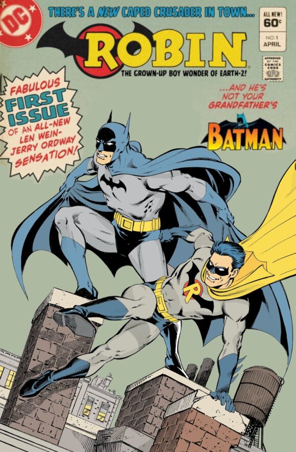
I mean, how could you resist picking that up if you saw it at your local shop for a measly 60 cents?
When Anthony’s black-and-white piece first popped up, I was in the middle of doing some other things for 13th Dimension but I was already thinking about how I was going to color it. And then Lee and Anthony’s coloring started to drop!
Thankfully, neither chose the direction I had planned to take. While Lee anchored his piece firmly in the Silver Age and Anthony’s was set in the post-DC Explosion days, I had already decided to place mine smack dab in the middle of the Bronze Age!
I knew I was going to “release” my colored cover just prior to All-Star Comics #58, which featured the return of the Justice Society of America in their own book as well as the introduction of the Super Squad and the debut of Power Girl.
It also featured the return of Earth-2 Robin but sadly, for me at least, in his Neal Adams-designed costume rather than his Batman duds! But boy, did I love that book and that spectacular Mike Grell cover. All-Star was one of the titles in what was known as Conway’s Corner — books edited by, and some written by, prolific Marvel and DC scribe Gerry Conway:
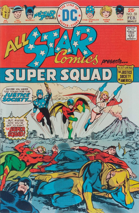
Mike Grell
There are many things to like about the Earth-2 Robin but my favorite thing, which I previously mentioned, is his sense of joy. I mean, look at that grin Anthony gave him!
In my coloring of the Earth-2 Robin, I typically lean into that upbeat attitude as much as possible. The Grown-Up Boy Wonder should be a parkour-practicing, gymnast-tumbling, Golden Gloves-punching, bad-joke spouting, fearless circus acrobat!
His costume should be a bright, attention-grabbing, even garish spectacle! That’s why I love his Batman-inspired duds — they’re a combination of the great design of Batman’s union suit fused with Robin’s brightness. It’s the reason I always amp it up with a purplish leotard, to give off those Batman 1966 TV show vibes. And why, in this case, I wanted to make him pop off the cover.
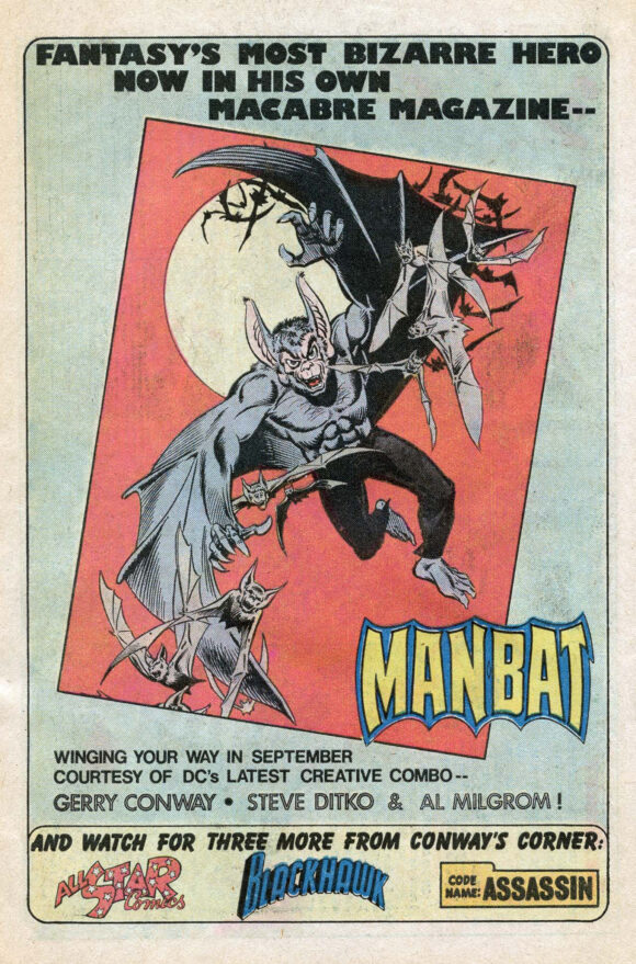
Conway’s Corner house ad, Action Comics #451 (Sept. 1975)
I had to wonder: What if an Earth-2 Batman and Robin comic had been released as part of Conway’s Corner just prior to All-Star Comics #58? It needed the period trade dress and maybe it would have been titled The Dynamic Duo!
Well, I had to create a new logo — one of my favorite things to do. And no Batman logo is complete without a Bat silhouette; to my surprise, I realized I’d unconsciously modeled it after Adam West’s chest symbol. Serendipity!
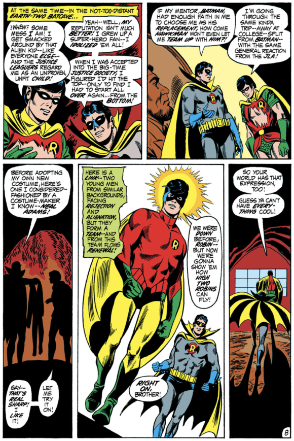
Justice League of America #92 (Sept. 1971). Written by Mike Friedrich, pencilled by Dick Dillin, inked by Joe Giella.
I imagined that maybe the Robin who appeared in the Super Squad would have been this Richard Grayson. And, perhaps, Neal Adams’ Robin costume design would have been given to his Earth-1 counterpart, as happened in 1971’s Justice League of America #92.
Hopefully, I’ve given the cover that “What the–?!?” feeling as if you had spotted it on the spinner rack at your local drug store in 1975. And it’s all due to Anthony’s amazing artwork!
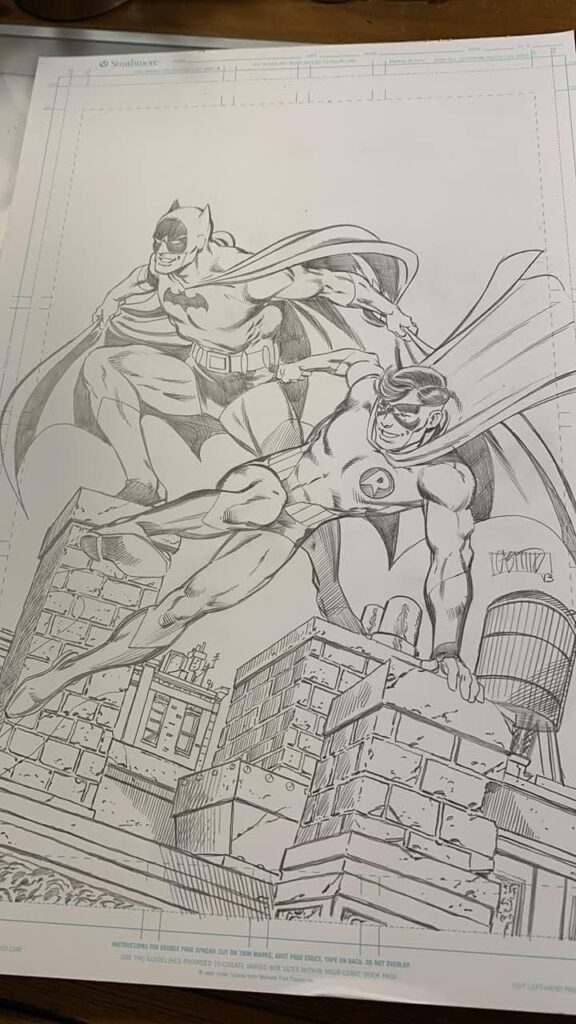
And, for you fans of Neal Adams’ design, here’s Anthony’s pencils of a third version! If he inks it, I’ll probably color this one up as well:
Now, Anthony likes to let his work speak for itself but if you’d like to see more, you can sometimes spot it in the Justice Society of America Facebook group.
—
MORE
— ROBIN DIES AT DAWN: Dig This Homage With an EARTH-TWO Twist! Click here.
— EARTH-TWO ROBIN: Crisis of the Megos That Need to Be Made. Click here.
—
A 10-year-old Walt Grogan fell in love with the Big Red Cheese thanks to essays written by Dick Lupoff and Don Thompson in the paperback edition of All in Color for a Dime, released in 1970 and bought for him by his father off a paperback spinner rack in a liquor store on the South Side of Chicago. Walt runs The Marvel Family Web Facebook page devoted to all incarnations of the Fawcett/DC Captain Marvel and blogs about Captain Marvel at shazamshistorama.com.

August 14, 2024
Hey Walt, (and thanks Dan for the larger font so I get the attribution right . . . )
I love both of the Earth-2 grown-up Robin costumes (even if fandom, IMO, could be more negative about the first one). I will say, the 1st one, the more-Batman-inspired one could look esp. good but as based on the artist. I confess, I was never a big Mike Sekowsky fan concerning JLA art (to me his art looked, well, boring), even if he did design the 1st costume (with Sid Greene)–but which he also drew inconsistently (compare the cover of Justice League # 55 with its interior–esp. on the chest logo and cape’s big, flared collar). Dick Dillin OTOH could do very well with it with a good sense of a lithe, dynamic, active human figure (compared to the more tepid Sekowsky) with a wonderful flowing cape (esp. as I recall the JLA-JSA crossover in Justice League issues 123 and 124 which in my kiddy days was the first time I was exposed to the look of a grown-up Robin), even if his best inker was Dick Giordano (which never came to pass for the Earth 2 Robin) rather than Frank McLaughlin (for said issues) or Joe Giella (who I wasn’t crazy about either . . . ).
But I love the Neal Adams-influenced one as well, which in many respects makes the Earth 2 Robin look more, well, like Robin (always thought whether in short pants or long undies, Robin’s colors of red, yellow and green were quite striking–and they esp. do give something of that more “joyous” look you mentioned). (As a side note, loved Batman # 300 (in 1978) as presumably an older Earth-1 Batman on a possibly final case yet still active with Robin now grown-up as looking fantastic in the Adams’ costume as drawn by the illustrious Walt Simonson and Dick Giordano and with the great story by David V. Reed). And here, if Bats and Robin are going to work together I think I like the starker contrast in costuming better. In the Sekowsky costume, I think of Robin as more Batman’s replacement than partner . . . Hence, why I also much like The Brave and the Bold # 182 when the Earth 1 Batman teams up with the Earth 2 Robin–with Batman noting the costume change (in another great story by Alan Brennert and art by the wonderful Jim Aparo–yet I would have loved to see this story illustrated during Aparo’s prime [c. 1971 – 1976] with that great gutsy illustrative realism he could do, even rivaling Neal Adams [for me anyway]).
And I’ve always been curious about the switchover–its editorial motivations at DC. From 1967 to 1975 it was the Sekowsky/Greene costume. Then from 1976 (with All-Star Comics # 58) to the Crisis, it was the Adams costume. I have the sense that Sekowsky and Greene designed the first costume the way they did as capitalizing on the height of the Batman TV show–so for greater noticeability make Robin look more Batman–as he certainly does in his barrel-chested presence on the JLA # 55 cover (one of the few instances when Sekowsky could draw a really dynamical figure). I assume the costume switchover was a part of that wave beginning in 1969-1970 when there was a conscious effort to get Bats away from the identification with the TV show–but I really don’t know. Esp. as the costume switch didn’t happen until 1976. In the meantime, while O’Neil and Adams are trying to re-capture Bats as the grim avenger of the night, the Earth 2 Robin is still showing up in the Sekowsky/Greene costume in various JLA / JSA crossovers (Justice League #s 82, 91-92, 101 -102 and 123 – 124–after that, it’s the Adams’ costume)
Apologies for length. But always an Earth 2 Robin fan. I was sorry to see him go . . .
August 14, 2024
I’ve also long wondered the same thing about the editorial motivation behind the E-2 Robin costume changes. As well, it bothered me that Robin was already a full-fledged JSAer at that point, no need for him to crash the party along with Power Girl & the Kid. But I bet it probably has to do with the old/new vibe that Conway was going for (and that sustained the JSA throughout the much later Geoff Johns run): Robin in his Sekowsky garb wouldn’t really fit within the cover image of All-Star #58: he’d instead belong in the foreground with the other defeated mainstream JSAers. But in his bright yellow green & red duds, he works just fine emerging with PG & the Kid to save the day.
August 14, 2024
RE: Robin in his Sekowsky garb wouldn’t really fit within the cover image of All-Star #58: he’d instead belong in the foreground with the other defeated mainstream JSAers. But in his bright yellow green & red duds, he works just fine emerging with PG & the Kid to save the day.
That argument works–giving Robin the newer Adams’ look for the new Super Squad with a recently revived Star-Spangled Kid and the brand new Power Girl. And yeah, the Sekowsky costume means that Robin would be better placed with our foregrounded dazed and unconscious JSA members as established JSAers.
Thanks for this! That idea had not occurred to me.
August 14, 2024
Yeah, the new font seems to be working. Thanks!
August 14, 2024
JLA 55 is an absolute favorite cover of mine. It was the Silver Age at its best.
August 14, 2024
I too, would have bought every issue! It’s such a shame as to what happened to the Earth-2 characters as we knew them then. To me, Crisis on Infinite Earths was never worth the loss of Earth-2. Never then, and never to this day.
August 15, 2024
Amen…completely agree
August 17, 2024
Preaching to the choir here…..but, I completely agree. We lost so many great characters. Editorial side of things it makes no sense to remove such a character rich world. To have that hard set rule seems like such a weight to any creator/artist.
I think with Dan off to the Islands we should try to keep things rolling. I propose a “Top 13 Things Lost to Crisis”. I’ll get things started….
13. Earth-2 and all it brought.
12. Summer JLA/JSA Cross-Over events
11. Joe Staton’s Huntress
Anyone else?
August 17, 2024
#10. No potential JSA Robin and Nightwing team-ups / crossovers. The two Graysons last met in Justice League #s 91 – 92 and from the latter issue on p. 8 we have the younger Grayson getting his Adams-inspired costume change in what would be the older Grayson’s later costume.
With the older Grayson now in the Adams-inspired outfit and the younger Grayson’s adoption of Nightwing as motivated by frustrations of always being the ancillary, back half of “Batman and . . . ,” that costume conversation and its implications for how Grayson each regards his respective mentor, can continue as they team up and strive to work together in light of that difference (and it would be fun and interesting to have the older Grayson recollect to his Earth-1 counterpart his team-up with the younger Grayson’s Batman in The Brave and Bold # 182).
August 18, 2024
# 9. No more Powergirl and Huntress team-ups (at least as paralleling “The World’s Finest” of Superman and Batman as our two ladies are actual family members, a Zor-el and a Wayne.). What Supergirl and Batgirl should have been but who were instead played more for camp during the late 60s issues of World Finest. The Earth 2 pair, which might be regarded as the variant of the main continuity, proved to be the better prototype for the main continuity.
August 18, 2024
These are all good. I fear however WordPress is “pressing” us out of space here. I’m going to do a fresh reply to the main thread to break us out a bit. Look for #8 there.
August 18, 2024
Hey Buck,
I understand about spaces for replies. Thanks for the update. I’ll do the same by posting to the main thread as I can think up these possibilities.
August 14, 2024
Fantastic work Anthony and Walt! I am more of a red/yellow/green Adams man myself, but I love both. I hope he gets around to inking that one so you can color it Walt!
August 14, 2024
I actively hated that first Earth 2 Robin costume, even as a child. But the second one was great.
August 14, 2024
Awesome Article and you killed your version.. and yup I will get around to my coloring on the initial commission of the Bronze Age Batman and Robin which is inspired by a mix of Giordano and Aparo and JLGL… I think all of us of a certain age miss that inky chemical smell and the wait whats on my fingers when you would be reading a comic you had just gotten off a spinner rack and had gotten a candy bar along with it and you look down and try and make up your mind do you worry about the weird smell and ink on your fingers go wash your hands then eat your candy bar or… yeah you just shoved the candy bar in your mouth ink and chemicals and all in with it and kept going lol todays modern glossy over colored over filtered on slick magazine paper comics will never have the same place in peoples hearts that a cheaply printed off printed crooked on the page comic will… Yankee candle needs to make a Old comic scent candle for us old comic lovers I think lol personally I keep a pile of old battered and loved comics on my desktop for inspiration and reference when coloring and yup I do sniff them as they have now gotten the old age smell to them as well its all a time machine for the senses… We may have to grow older but we dont have to GROW UP ..always let that inner child have his daily free run in your brain….
August 14, 2024
This is an absolutely DYNAMIC article you’ve written up.
August 14, 2024
Bosh says I! Fox, Schwartz and Sekowsky missed an opportunity on this one! Dick Grayson should have appeared in a Full Batman costume with a Roman numeral II on his chest!
https://www.comics.org/issue/16753/cover/4/
August 14, 2024
I remember that story! Not from the original printing as I wasn’t around yet in 1962. But from its reprint in Batman # 254 (1974–when I was around, with memories of buying this at my local drug store)–of the 100 Page Super Spectacular era (with the main story of Batman vs, Manbat).
Definite pre-Schwartz-Broome-Infantino pre-New Look hokiness if mildly entertaining in its way. I confess, in terms of homage to his mentor, I’d rather see Robin in the Sekowsky / Greene costume rather than a straightforward Bats outfit with a Roman numeral II–even if we called him Batman.
If Richard Grayson kept the “Robin” name, it raises the question of what his male kid or younger sidekick would be named assuming he acquired one with the kid still wearing the short pants Robin outfit. Unsure about the “Adventures of Robin and Robin.” (or, to spoof a Teen Titans Go! episode title: “The Best Robins!”) Reversing the dynamic of making Robin the adult and Bats the kid sounds interesting (esp. if there was an Earth 2 Damien Wayne). But young bats are called pups and the “Adventures of Robin and Pup” is a non-starter. Batlad, maybe? Or some other name entirely. “Damian” is such a cool wicked name anyway (recalling his “Demon’s head” grandpa)–but that might give away secret identities.
But the Adventures of Robin and Huntress sounds great if the younger partner was a girl, and even his mentor’s daughter (so keeping with the family theme of “The Son of the Joker.”)!–and it’s a shame this wasn’t exploited more fully, esp. as main stories and not just backup ones like in Wonder Woman before the big kablooey Crisis slate cleaning.
August 15, 2024
Love the logo. I have always believed that there was miscommunication in the Schwartz office concerning the debut of Robin of Earth 2. Carmine did the cover for JLA 55 and that uniform was designed to attract Batman fans (as was almost every issues of the JLA during the go go checks era) since we were in the midst of Batmania. however the issue itself had a different uniform. JLA 56 has Sekowsky and Greene doing the Carmine version and that was the look that stuck until the Adams design came about. I adore that Neal Adams design…except for the mask. Throughout the years artists have drawn it differently. My solution in the commissions I have done ( seen in my CAF gallery is to use the Sekowsky/Infantino mask and then use the Adams uniform it is a great combination.
August 16, 2024
Michael! Although I prefer the Batman duds costume, I agree that using the mask from it on the Adams version is a winning combination!
August 18, 2024
I think you’re correct: We should really be calling it the Infantino design rather than the Sekowsky design.
August 18, 2024
(Continues from above)….an unsanctioned “Top 13 Things Lost to Crisis”.
#8 – others earths; their lost history takes away the uniqueness of match-ups like “Superman vs Captain Marvel” or, “Freedom Fighters Join JLA to Fight Nazis” or, “Flash Meets Cary Bates”.
August 19, 2024
I love this. Thanks!