
A look at the art within the artform…
It’s no secret around here that I dig the work of David Mack and Bill Sienkiewicz — anyone, really, who stretches the boundaries of what comics art can be, even as much as I love the classics.
Well, if you also dig that kind of art, you’ll be interested in The Misplaced, by Chris Callahan, a startlingly evocative new series coming from Source Point Press that takes its artistic cues from the likes of Mack, Sienkiewicz, Dave McKean and many other top-notch creators.
Just check out the trailer:
Chris wears his influences on his sleeve and with The Misplaced #1 due out this week — Wednesday, Nov. 27 — he’s here with THE 13 GREATEST MIXED MEDIA COMIC BOOK COVERS (including a few that are fantastic but not quite mixed media).
Right on.
—
By CHRIS CALLAHAN
I remember the moment a comic book cover changed my life…
My grandpa was waiting out in the car, reading the paper. I was in the comic shop with a stack of Marvel and DC comics held in my hand. Then I saw it: Sandman #38. Far as I could tell it was the only thing like it in the shop. Photo textures, painted face, twisted candlestick holder. Pencils and ink made sense to me, but I couldn’t figure out how the hell this guy even created that image.
This guy, of course. was Dave McKean. And his style, I came to find out, was called “mixed media.”
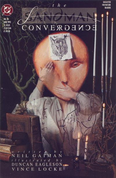
Crazy to think one image can tweak your mind so much, but it did. Years later, that Detroit boy is living in Los Angeles, designing projects for some of the top companies in television. And using the tools I’ve learned in my graphic design, I now have my own mixed media comic, The Misplaced, coming to shops.
All because of a cover that looked a little different.
So with that in mind, here are, in no particular order, some of what I think are the best mixed media or alternative comic book covers to hit store shelves. The ones that stepped outside of a more traditional format and succeeded in a typically pen and ink industry.
—
Sandman #1, cover by Dave McKean
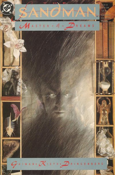
You could make the case that pretty much every Sandman cover should be on this list. If the title changed to “The 13 Best Sandman Covers,” there’d still be an argument over which ones make the cut. It all started with issue #1 though.
—
American Gods: Shadows #1, variant cover by David Mack
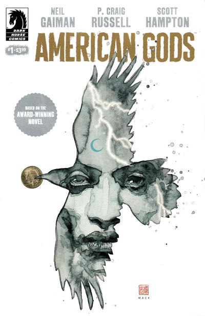
This is one of my favorite images of the last few years, particularly because of how much narrative is packed in a deceptively simple image. This mixed media piece shows Shadow trapped within the outline of one of Mr. Wednesday’s ravens. The photographic coin sits in a separate plane of reality, outside of Shadow’s view, emblematic of its role in the story and of his awareness. A lightning bolt cracks, just like it does on the night his journey begins.
—
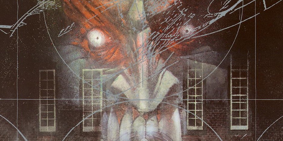
The Dreaming #15, cover by Dave McKean
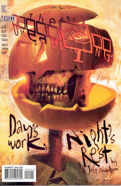
What shocks me the most about this image is that almost no one I know remembers it. Hopefully this article changes that. Enjoy having a nightmare about Merv Pumpkinhead this evening.
—
Batman: Harley Quinn #1, cover by Alex Ross
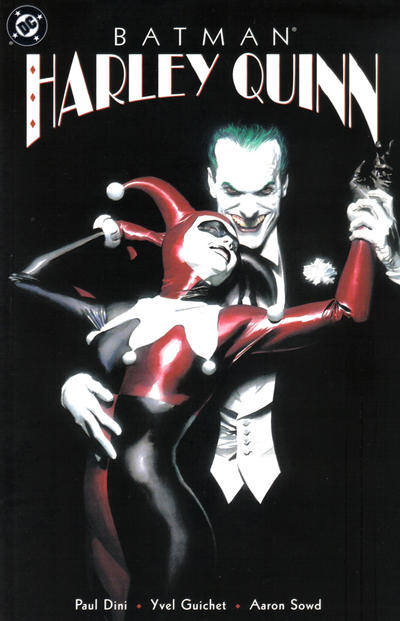
“Is that a photo?” was my first reaction to this cover back when it came out. But nope, not a photo. Just Alex Ross doing his thing and creating arguably one of the most iconic images in comics history. Completely void of highlights on his suit, our eyes are guided first to Joker’s horrifyingly realistic face staring back at us, then to Harley’s more reflective form.
—
Sandman Mystery Theater #28, cover by Gavin Wilson & Richard Bruning
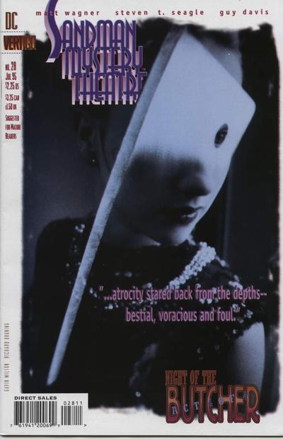
This image is my favorite of the series, but it’s worth a Google search to check out the rest if you’re not familiar. Covers were created using photographs from Wilson with computer enhancements by Bruning. All of them capture the noir feel of the stories (which is independent of the Gaiman series).
—
Doom Patrol #67, cover by Tom Taggart
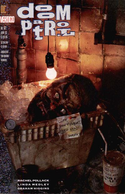
Taggart created this unique cover by sculpting each piece and arranging them into a miniature set. The resulting photograph is one of the more disturbing/darkly amusing covers to ever hit shelves. “Cliff, don’t forget, feed head!!”
—
The New Mutants #26, cover by Bill Sienkiewicz
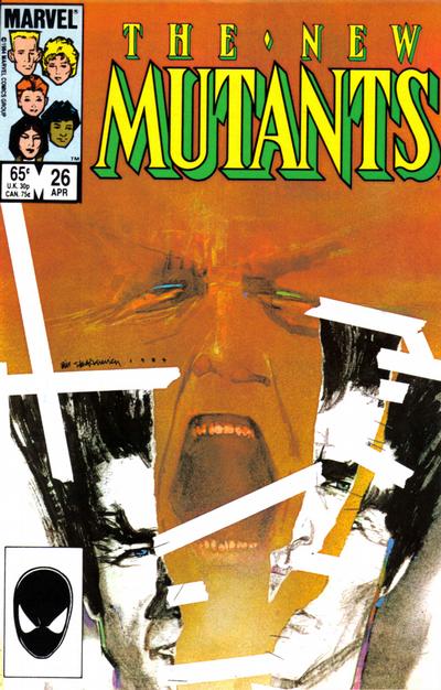
Sienkiewicz has done incredible work over his career: Elektra, Dazzler, New Mutants, Sandman: Endless Nights… But my favorite cover of his will always be this one. Multi-layered with solid primary and secondary focus, the torn photo and screaming background make for the perfect mood-setter to introduce David Haller. Note: If you’d like interiors with the same flare, make sure to check out the New Mutants Demon Bear Saga.
—
Alice Cooper #5, cover by David Mack
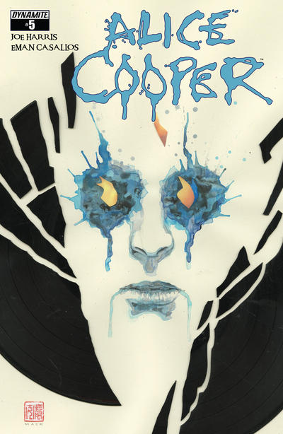
Anytime Mack is designing covers on a series, you’re pretty much guaranteed something incredible. This one stands out though. Look once, and it appears Mack is just playing effectively with negative space. Lean in a little closer and you realize this is a photograph of broken record shards laying on top of a watercolor painting.
—
Nick Fury, Agent Of S.H.I.E.L.D. #4, cover by Jim Steranko
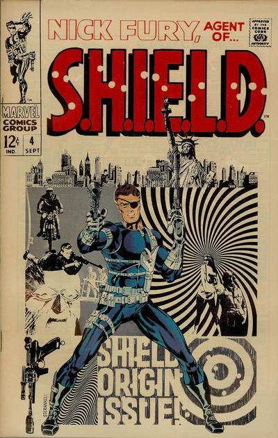
Photo collage on a cover back in ’68? That’s why any list of “alternative” covers couldn’t be complete without at least one nod to Steranko. As the story goes, he walked into the Marvel offices, threw down his portfolio and walked out with a job. A couple Kirby cleanup assignments later, he took control, and the comics world was gifted with Nick Fury, Agent of S.H.I.E.L.D., a series that infuses pop art, psychedelic art, surrealism, photo- montage, and bends time on the page like no series before it. Much like this cover.
—
Fight Club 2 #7, cover by David Mack
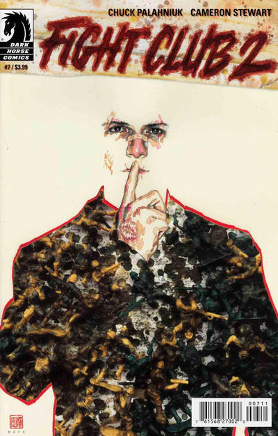
As mentioned above, Mack is a master of the second glance. What at first appears to be nothing more than a watercolor camouflage painting, is actually a photographic texture of melted plastic toy soldiers.
—
Rai #0, cover by Jim Shooter
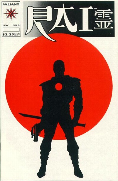
Sometimes a good way to judge a cover is by how much it stands out amongst the other items on the shelf. Walking past a collectors table at a con a few years ago, my eye traveled across the wall of comics behind. Surrounded by other more cluttered images, the first full appearance of Bloodshot shone bright with its minimalist and striking graphic design. (According to the Grand Comics Database, Shooter swiped the silhouette from a Mike Zeck Punisher image.)
—
Arkham Asylum, covers by Dave McKean
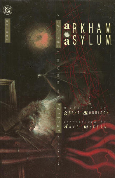
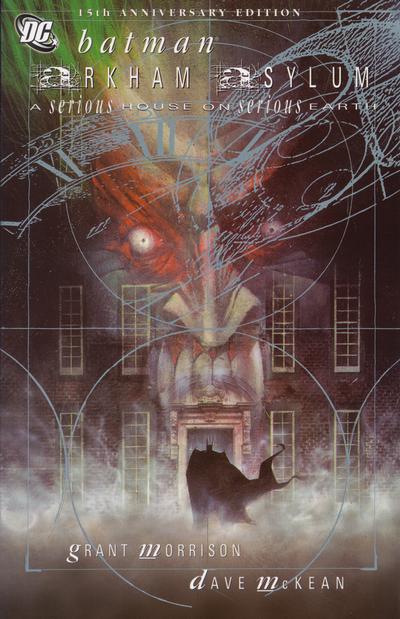
Same story, two great covers…so I’m going to cheat with a 2-for-1 here. The first is from the original hardcover, the second from the 15th anniversary edition. Non-traditional art from cover to cover. There’s a reason it’s regarded as a classic.
—
Hawkeye #3, cover by David Aja
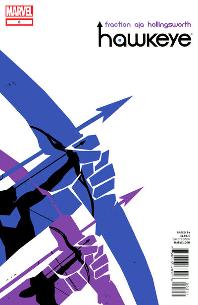
Aja’s cover work on this series is incredible. Every piece is an example of how great a design-heavy, minimalist cover can be. I particularly like this one as it plays like a direct Saul Bass artistic descendant. (Bass is famous for doing title sequences for North by Northwest, Vertigo, Psycho, etc. The X-Men: First Class title sequence is an homage to his style.) I’m also a big fan of the silhouette in a silhouette.
—
MORE
— The BILL SIENKIEWICZ INTERVIEWS Index. Click here.
— 13 QUICK THOUGHTS: How to Create a Great Comic-Book Cover, by DAVID MACK. Click here.
November 26, 2019
Comic book covers can be very creative. 🙂
November 27, 2019
Howard Chaykin beat Alex Ross to the punch, and his cover to Blackhawk #3 (Here: https://storage.googleapis.com/hipcomic/p/61710475087a19ebe8d6d40246d76844.jpg) should be listed instead of the Batman: Harley Quinn one. Both Howard and Alex were paying homage to J.C. Leyendecker’s Arrow Shirt ad seen here: https://www.decoweddings.com/wp-content/uploads/2011/07/deco-poster-Arrow-Dress-Shirts.jpg.
November 27, 2019
Check out the cover to 100 Bullets #21 by Dave Johnson.
November 27, 2019
Some really great covers here, but I do think you missed out by not having Colleen Doran’s cover to Warren Ellis’ “Orbiter” on the list 🙂
https://www.comicartfans.com/gallerypiece.asp?piece=258046
November 27, 2019
Arkham Asylum 15 over was issued as a poster when the book came out- I still have it- has none of the text on it
November 28, 2019
For every one you listed here, there are two you missed – but that’s no surprise in the comic world – SO many (mixed media or not) great covers…
November 28, 2019
Of course. That’s the nature of it.