A birthday salute to the late comics letterer and designer…
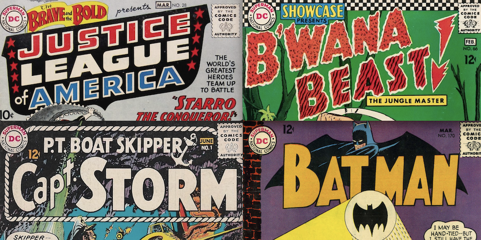
By PAUL KUPPERBERG
Ira Schnapp (October 10, 1894 – July 24, 1969) is one of those legendary comics creators whose work behind the scenes make them perhaps not as well known as the artists, writers, and even editors with whom they share the comic book page but who deserve every bit as much credit and recognition as those other artisans.
Schnapp was a letterer… was the letterer for DC Comics for the better part of three decades. His first job for then National Periodical Publications was to standardize Joe Shuster’s original design for the Superman logo, and he continued doing freelance logo design for the company until he joined the production department in 1949.
In 2021 I celebrated his birthday with My 13 Favorite DC House Ads Lettered by Ira Schnapp, which includes a bit more biographical information about the surehanded calligrapher, although for a deep dive into that career—and into the world of comic book lettering in general—I highly recommend you check out Master Letterer Todd Klein’s truly fascinating website Todd’s Blog, Presenting Klein’s Compendium of Calligraphic Knowledge.
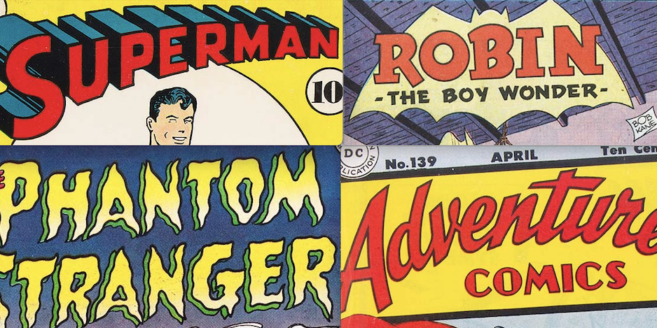
And as that Man of Letters Dan Greenfield had earlier seen fit to reveal his 13 Superb Ira Schnapp DC Comics Logos From the Golden Age, I’m going to continue with that idea with My 13 Favorite Ira Schnapp DC Comics Logos From the Silver Age:
—
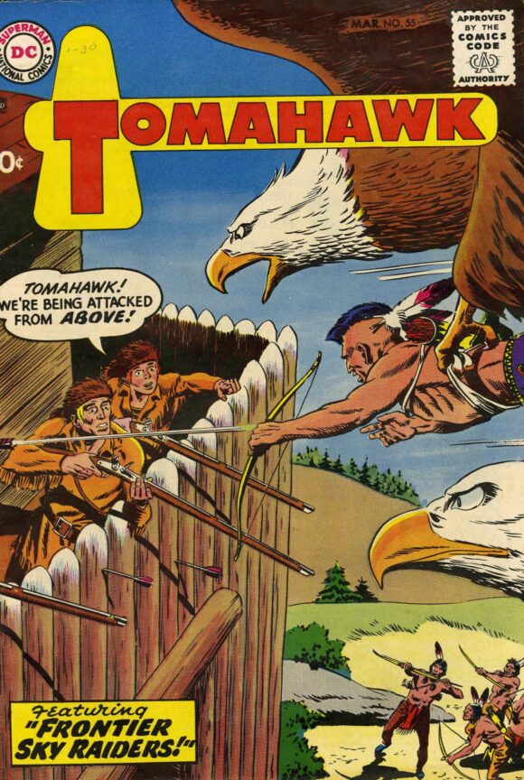
Tomahawk #55 (March 1958). Simple and elegant, and I remember being a proud 7-year-old the first time I saw this Ira Schnapp logo because I recognized the visual pun. Cover art by Bob Brown.
—
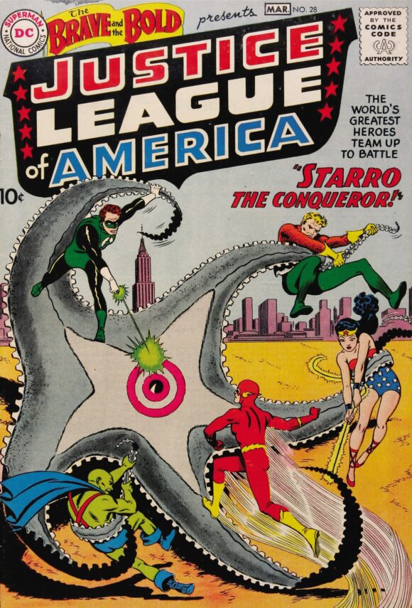
The Brave and the Bold #28: Justice League of America (February/March 1960). Simply iconic! Cover art by Mike Sekowsky and Murphy Anderson.
—
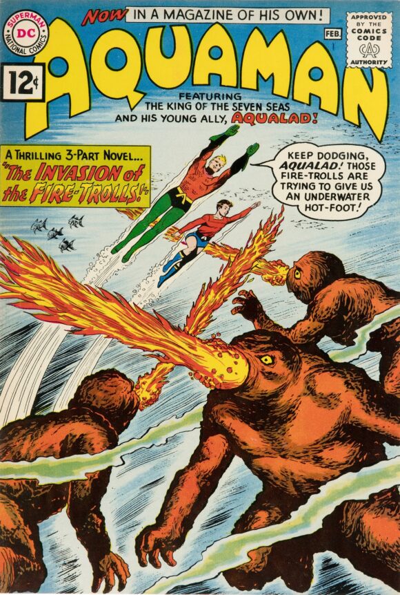
Aquaman #1 (January/February 1962). A bubbly logo that seems to float atop the cover. Cover art by Nick Cardy.
—
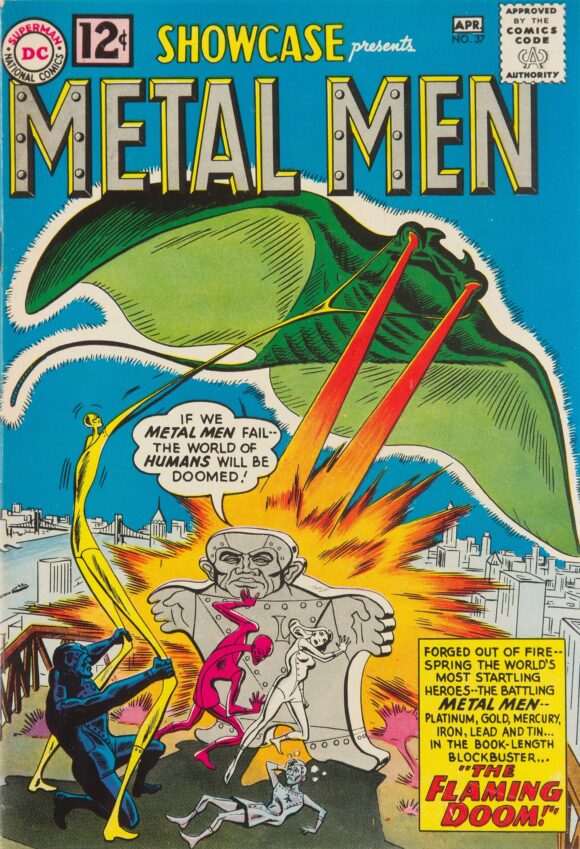
Showcase #37: Metal Men (March/April 1962). Metal Men. Rivets. Done! Cover art by Ross Andru and Mike Esposito.
—
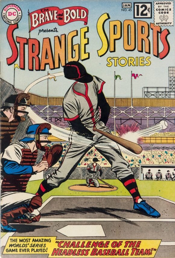
The Brave and the Bold #45: Strange Sports Stories (December 1962/January 1963). Never a sports fan, I was nonetheless drawn to the title by the strong visual and solid logo. Cover art by Carmine Infantino and Joe Giella.
—
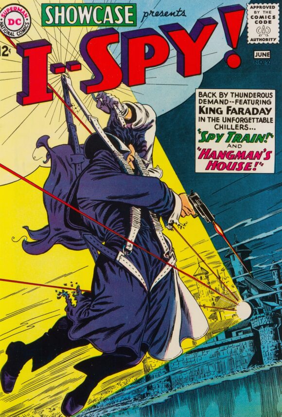
Showcase #50: I—Spy! (May/June 1964). Another strong visual and a bold logo that slapped the reader in the face! Cover art by Infantino and Anderson.
—
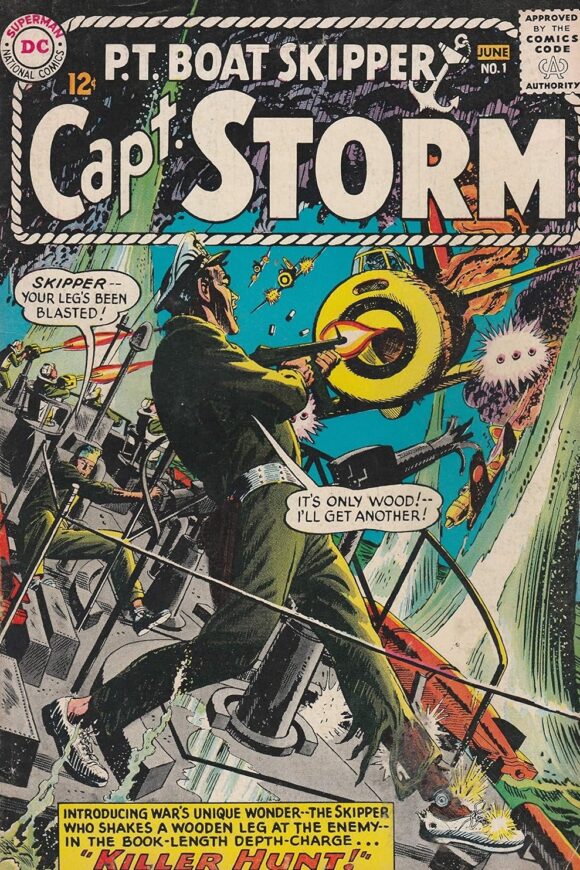
Capt. Storm #1 (May/June 1964). Yo-ho-ho and a logo by Schnapp! Cover art by Irv Novick.
—
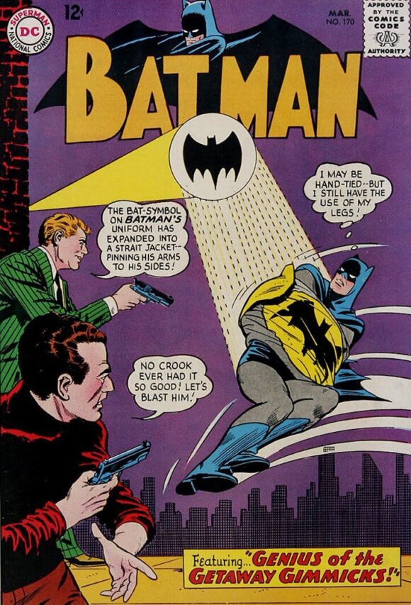
Batman #170 (March 1965). Julie Schwartz’s New Look Batman got a new look logo. Cover art by Infantino and Giella.
—
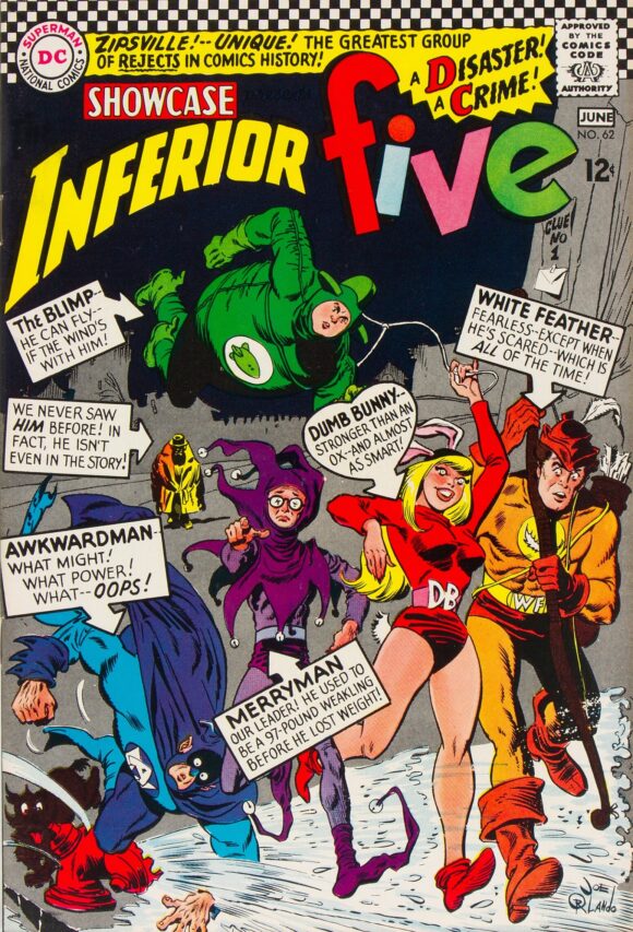
Showcase #62: Inferior Five (May/June 1966). Is it superhero or is it satire? This Schnapp logo brings the two great tastes together with opposing styles. Cover art by Joe Orlando.
—
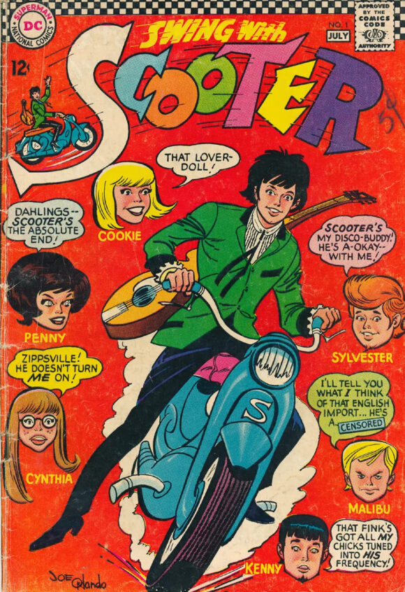
Swing With Scooter #1 (June/July 1966). Too groovy for words, but the logo strikes just the right balance of wacky. Cover art by Orlando.
—
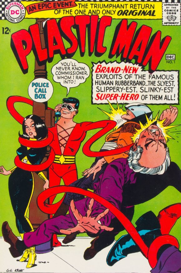
Plastic Man #1 (November/December 1966). Aside from the art by Gil Kane, Schnapp’s logo for this revival of a Golden Age great was the best thing about this series.
—
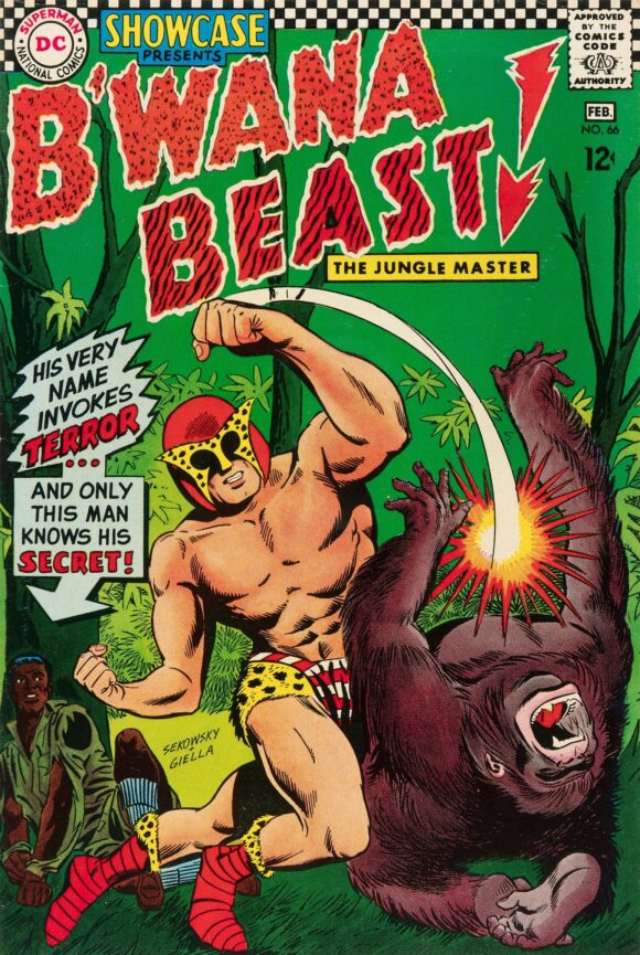
Showcase #66: B’wana Beast (January/February 1967). The concept was a dog, but I loved Schnapp’s logo. Cover art by Sekowsky and Giella.
—
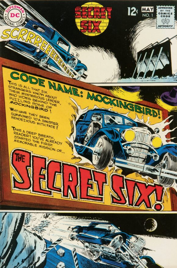
Secret Six #1 (April/May 1968). Schnapp’s final logo for DC Comics before he retired (the rest of the cover lettering is by Gaspar Saladino). Cover art by Frank Springer.
—
MORE
— PAUL KUPPERBERG: My 13 Favorite DC HOUSE ADS Lettered by IRA SCHNAPP. Click here.
— 13 Superb IRA SCHNAPP DC Comics Logos From the Golden Age. Click here.
—
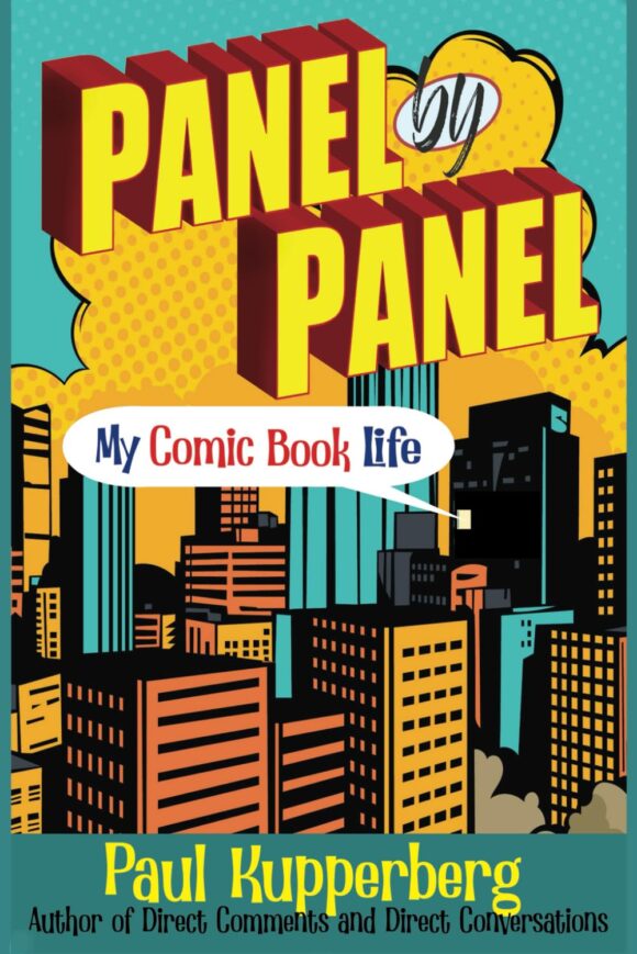
PAUL KUPPERBERG was a Silver Age fan who grew up to become a Bronze Age comic book creator, writer of Superman, the Doom Patrol, and Green Lantern, creator of Arion Lord of Atlantis, Checkmate, and Takion, and slayer of Aquababy, Archie, and Vigilante. He is the Harvey and Eisner Award nominated writer of Archie Comics’ Life with Archie, and his YA novel Kevin was nominated for a GLAAD media award and won a Scribe Award from the IAMTW. He also wrote an essay for DC’s Aquaman: 80 Years of the King of the Seven Seas. Check out his new memoir, Panel by Panel: My Comic Book Life.
Website: https://www.paulkupperberg.net/
Shop: https://www.paulkupperberg.net/shop-1

October 10, 2024
Wow! Thanks!
October 10, 2024
Hand drawn lettering is part of the lost to the art itself. Today’s computer generated art can’t compare or compete. Great look back, Paul.
October 10, 2024
What Buck said. Couldn’t agree more.
October 10, 2024
“Today’s computer generated art can’t compare or compete.” TOTALLY AGREE. I don’t like the current logos very much. That recent Batman logo starting with the New 52 was atrocious.
October 10, 2024
I would love if there were recreations of those fonts.